The R2 2018 release of Progress Telerik Reporting and Report Server is here. Learn how to effortlessly present JSON within your reports.
The latest release of our Reporting and Report Server products is out, delivering a brand-new data source component that enables you to connect report items to data located on a service in JSON format without any code required.
WebServiceDataSource Component
We are happy to announce that Telerik reports can connect out-of-the-box to data located on a web service.
In this article, I will write about the process of creating a report which retrieves data from the Ticketmaster Discovery API using the new WebServiceDataSource component.
Get Access to Ticketmaster Discovery API
To connect to the Ticketmaster Discovery API first we need to get access to the API. For this how-to we are going to use an API key that is necessary for the calls made to all URLs throughout this portal.
Creating and Configuring the Report
Create a new report using the report designer of your choice. We are going to use the Standalone Report Designer for this article. Select Web Service Data Source from the Data tab where the WebServiceDataSource wizard should be started automatically.
Setup the web service HTTP request properties. We are going to use the GET https://app.ticketmaster.com/discovery/v2/events endpoint which finds events and could filter your search by location, date, availability, and much more. In this how-to we are going to retrieve data from the APIs according to query parameter size. We enter the exact service URL in the wizard page and select the appropriate HTTP request method. Since we will be using an API key, no authentication type is required at this point.
We need to send the API key with the query parameters on step two - Configure the HTTP request parameters. So, we add an apikey parameter with type Query and enter its Value, which we got in the Get access to Ticketmaster Discovery API section. The Design-Time Value in this case will be the same key. It is used to retrieve the data schema and for the live preview of some data items during design-time.
In addition, we are going to add a size query parameter, which according to the API reference will be used to return the page size of the response. This API parameter will be connected to a corresponding report parameter which we can control at run-time. To do that select <New Report Parameter> in the drop-down for the Value of the query parameter and follow the wizard to configure it.
In the next step, Preview data source results, click the Download button to retrieve the data according to the current settings. The preview shows raw JSON data returned from the service. When the service returns a JSON array, the preview displays multiple rows of raw data. The Ticketmaster Discovery API returns a single JSON object containing _embedded, _links and page properties. We are going to use the inner array of objects of _embedded property.
Effortlessly Create Reports with JSON Data Located on a Service
Now, we can use the retrieved data from the Ticketmaster Discovery API. Since the data for the actual events is inside the _embedded data field we need to use a nested data item to display the inner event objects. Insert a new Table item into the Detail section of the report. Instead of creating a new data source for this table, we will reuse the already retrieved data from the report's data source. We can do this by adding a new Binding to the Table item:
Similarly, you can access the inner properties of event's images in order to get a URL of an image.
Preview the Newly Created Report
We can preview the report's data at run-time.
Thank You!
We are constantly trying to improve and strengthen the features in Telerik Reporting and Telerik Report Server based on your constructive feedback. You can feel free to request an improvement on our Feedback Portal, or leave a comment below. With your help, we're working hard to continue making our solutions the best for your reports.
You can get Reporting and Report Server with Telerik DevCraft. Make sure you’ve downloaded a trial or learn more about DevCraft bundles. DevCraft gives you access to all the toolsets, allowing you to say “no” to ugly apps for the desktop, web, or mobile.
Watch the Webinars
And don't forget to look at our Telerik and Kendo UI release webinars, where our technical experts provide a deep dive into all our new features and functionalities.
Join us as we recap the latest enhancements to the Progress Telerik UI tools, including Conversational UI and plenty of new features. If you missed the webinar, you can now watch the recording on demand.
The R2 2018 release of our Telerik UI tools, covering the latest features and our new Conversational UI controls, was announced live earlier this month. Sam Basu, Stefan Stefanov, and I hosted a live webinar from the ProgressNEXT conference in Boston! Conversational UI is a set of chatbot framework-agnostic user interface controls that enable .NET and JavaScript developers to create modern conversational chatbot experiences in their web, mobile and desktop applications.
Webinar Recording
Don't worry if you didn't get a chance to watch the webinar live. We've posted it to YouTube. You can watch it now!
Make sure to check out our what's new page for an overview of the latest features we've added to Telerik R2 2018.
Webinar Questions and Answers
Historically, we've answered questions on Twitter using the hashtag, #HeyTelerik. This time around, we decided to answer most of them during the webinar. That's why it's a good idea to watch the recording. We got through a lot of them in a short period of time! That stated, here is a small sampling of questions we got (along with their answers):
Any plans to make a Xamarin-like framework for AR/VR so we can code once for all?
Yes! This is our plan, but in the meantime, we'd love to hear what you think about a HoloLens sample app that we've posted online: AR for LoB Unveiled by Progress Telerik. We've also published an article entitled, AR VR And What It's Good For.
Are you working on making widgets compliant with the new WCAG 2.1?
We're definitely looking at WCAG 2.1, but don't have compliance at the moment. Keep an eye out for future updates and roadmap pages as we want to make sure we can work with this updated standard.
Can the chatbots be integrated with Cortana or Alexa?
We covered this live during the webinar. In short, the components are framework-agnostic so you can tie them to any framework you use for your bot backend.
Will there be any support for SSRS reports for MVC web applications?
Telerik Reporting uses its own report definitions format (https://docs.telerik.com/reporting/upgrading-xml-report-definition-versioning) which you may consider for your next reporting project. Supporting other formats is out of the scope of the product.
Can we use chatbot to develop an app like WhatsApp?
Absolutely!
Webinar Prize Winners
What would a Progress Telerik webinar without some cool prizes? Here are the winners for this webinar:
Thanks as always to everyone who joined for the webinar, and for all the great feedback. We hope all the improvements we've made across our .NET tooling give you what you need to develop your apps faster. Don't forget to check out everything our DevCraft bundles have to offer, and feel free to leave your thoughts at our Feedback Portal or in the comments below.
Enjoy more than 120 improvements plus new features in Telerik UI for WinForms and Telerik UI for WPF in the R2 2018 service pack release.
The latest service pack (for R2 2018) of Telerik UI for WinForms and Telerik UI for WPF is now live! In this update, we have focused our attention on addressing client feedback and resolved 120+ public items (around 60 for each of the suites). While most of these items are improvements, we also managed to add some new features in the controls as I'll describe below.
Let's dive into what's new for UI for WPF/Silverlight and Winforms.
New Features
Telerik UI for WPF/ Silverlight
RadDomainDataSource (Silverlight):Introduced the Telerik.Windows.Controls.DomainServices.OpenRia45 assembly, which is built against the latest version of OpenRiaServices.
RadVirtualGrid (WPF):Introduced a couple of new methods of the control that will help you achieve even more:
GetRowIndexAtMousePosition/GetColumnIndexAtMousePosition - the methods return the row/column index for a given mouse position.
CloseFilteringControl - allows you to easily close the FilteringControl if open. (link)
RadTreeListView: Added the AutoExpandItemsAfterFilter property, which controls whether the hierarchy items should be expanded after filtering. (link)
RadWatermarkTextBox: Auto-opening of the Touch keyboard on Windows 10 with Anniversary update now works out of the box for all input controls that contain WatermarkTextBox.
RadPdfViewer:We’ve extended the number of supported PDF document scenarios by handling invalid concatenation of content streams.
Telerik UI for Winforms
RadMap:The route request of the Bing map provider now supports ViaWayPoints. This will allow a route to be calculated with intermediate points. For example, making a trip from Seattle to L.A through Las Vegas.
(link)
Another update in the RadMap control is that the TileSize can now be specified when LocalMapProvider is used. In addition, the MapVisualElementFactory is now responsible for the initialization of the tile elements. (link)
RadMaskedEditBox:The standard mask provider now exposes a MaskCompleted property, indicating whether all the required input has been entered into the mask.
RadChartView: We have added a new LassoSelection controller for easy selection of data points. The selected data points can be retrieved by handling the LassoSelectedPointsChanged event of the controller. (link)
RadBreadCrumb:A new mode allowing a selection in the associated tree directly after clicking an element in the breadcrumb. (link)
Improvements
As I mentioned earlier this Service Pack is filled with improvements, so don't forget to check the full release notes for WPF here and for Winforms here..
Share Your Feedback
Make sure to download and try the latest versions of UI for WPF/Silverlight/Winforms and explore all the new features and themes. They are already available for download in your account.
Are you new to our UI tools? You can download a trial right here.
We would love to hear what you think, so please drop a comment below sharing your thoughts. You can also visit our Feedback Portals about UI for WPF/Silverlight, Winforms and Document Processing Libraries and let us know if you have any suggestions or if you need any particular features/controls.
Check out the two new components in Telerik UI for Xamarin: RadCheckBox and RadBorder, as well as other improvements to the suite coming with the latest Service Pack.
Last month, with the Telerik R2 2018 release, we shipped Conversational UI, TreeView and BarCode, as well as multiple improvements to the Telerik UI for Xamarin suite. Now, a month later, the Service Pack release is out bringing two more components and numerous new features.
Those of you who have already seen the new RadTreeView may have noticed the 3-state checkbox we use to manage the UI where a parent item might have both checked and unchecked child items. Well, it seems to be a nice control and we decided not to keep it for ourselves, when it could come in handy for you as well.
Introducing the Xamarin CheckBox Control
Now RadCheckBox is a fully-fledged, standalone control, ready to be used in your applications. It comes in two or three states and with commands and theming support.
Easily Add Borders to Items in Your Xamarin Apps
In a similar manner, the Conversational UI features a container with various message types in it. These messages are surrounded by a very flexible border that allows for different corner radii and border widths. So that you can do the same in your apps, we're happy to introduce you to the new RadBorder.
RadBorder comes in handy when you need to make a circle image, add a rounded or rectangular border for a control, or highlight an element with a thicker border. With its simple, yet powerful API (BorderColor, BorderThickness and CornerRadius) you can easily shape your content in the form you need.
Other New Features and Improvements in the Service Pack
This release also features some major performance improvements in RadDataGrid and a number of bug fixes across the suite. For full details on what’s new in 2018 R2 SP1 check out our Release History.
Finally, with the rise of UWP, the decline in Windows Phone 8.0 and Windows Universal was imminent. We have decided to stop supporting Windows Phone 8.0 and Windows Universal 8.1, so that we can focus on delivering value for platforms that really matter – Android and iOS (through UI for Xamarin and NativeScript) and UWP (through our open source UI for UWP).
This post will get you familiar with the TreeView component in the Telerik UI for Xamarin suite – how it can be used, some of its key features and how to set it up for your mobile applications.
One of the reasons the TreeView component (AKA, RadTreeView) was created is to cover the scenarios where a hierarchical data presentation is needed. Of course, this is not the only scenario in which the control can be used, but it is the best fitting one.
The control features the following built-in functionalities:
Hierarchical navigation
Expand/collapse APIs
Commands support
CheckBox support
DataBinding
UI Virtualization
Customization capabilities via ItemTemplateSelectors
Theming
We will take a closer look at the Customization example from our TreeView QSF (quick start framework) and see how the TreeView is configured.
Defining the Scenario
The example shows all cities worldwide in which an organization has at least one office. The cities are grouped by their country, and the countries are grouped by their continent.
Setting up the Data
The two most important steps here are providing the ItemsSource and HierarchyAdapter. In other words, users should provide the raw data that will be visualized and an adapter which can retrieve the children of each data entry. Based on this, the RadTreeView creates the hierarchy. In the example below the ItemsSource is a simple ObservableCollection containing business objects describing a continent.
Without the HiearchyAdapter, the RadTreeView will only display the root level items of the ItemsSource. To properly display the hierarchy, the Telerik.XamarinForms.Common.IHierarchyAdapter interface must be implemented. It has two methods – GetItems() and GetItemAt(). In GetItems(), the adapter should return all children of the item passed as the only parameter. The GetItemAt() should return a specific child of a provided item. For more details you can refer to the source code of the example. Once these steps are made the hierarchical data will be visualized.
Most likely at this point the visualized result will not fit your design requirements. That is because when no ItemTemplate or ItemTemplateSelector is applied, the RadTreeView will render whatever the ToString() method of each business item returns. To beautify the visualization, additional steps should be taken.
Creating Item Templates
Now that the data is set, we can proceed with customizing the look of the items. The RadTreeView allows you to apply a different DataTemplate for each item through a DataTemplateSelector. In the example this is achieved by the ItemTemplateSelector class. The specific implementation can be seen in the GitHub repo. As you can see, in addition to the selecting logic the class exposes several properties of DataTemplate. This allows setting the properties in XAML like so:
In the different <DataTemplate> declarations, you can create the required design for each of the items in the hierarchy. Once this is done you can sit back, relax and enjoy your work.
Wrapping Up
Now you should be able to properly feed data to the RadTreeView as well as to implement a custom design for the items. As always, more information about the rest of the features of the component can be found in our online documentation. You can also share your feedback and suggestions for the suite through the Feedback Portal.
If this is the first time you are hearing about the Telerik UI for Xamarin suite and want to try it our for your mobile application development, you can do so by going to the website or directly downloading a free trial.
Telerik Reporting and Report Server R2 2018 SP1 brings you localization, UI enhancements and more. Read on to learn what's new.
The first service pack update for the 2018 R2 release of Telerik Reporting and Telerik Report Server is live. This update delivers Report Server localization, Reporting engine stability enhancements, better Azure deployment support and many UI tweaks and improvements.
Report Server
The Report Server Manager web application has been heavily modified in order to support localization out of the box. All string resources used throughout the application are now available in a common file where they are ordered by logical groups and can be easily modified or translated into another language.
Another important change has been introduced in the way users are managed. Now users can not only be disabled, but also deleted entirely from the management application.
HTML5 Report Viewer
The report viewer template file now uses string resource keys for all of its string resources. These keys can be found in a string resource file where their values can be replaced with custom ones. In addition, such string resource files can be added for a specific culture such as sr.ja-JP.js. When loaded the localized strings from the file will override the default ones.
Desktop Report Viewers
The print action initiated by any of the desktop report viewers (Windows Forms, WPF, etc.) has been extended to support bitmap image formats. This improvement enables the desktop report viewers to consume reports from a remote report engine hosted as WebAPI in Azure. Windows Forms viewer now supports rendering in bitmap format, which makes it possible to connect it to an Azure-hosted reporting service.
These viewers also received refinements of their recently introduced Search functionality in the form of small tweaks of the search window. One such change is the ability to apply themes to the search window of the WPF Report Viewer.
You can get Reporting and Report Server with Telerik DevCraft. Make sure you’ve downloaded a trial or learn more about DevCraft bundles. DevCraft gives you access to all the toolsets, allowing you to say “no” to ugly apps for the desktop, web, or mobile.
Our Telerik UI for WPF and UI for Silverlight suites have a new feature - the Format Painter. Learn the functionalities and APIs it supports, and how it will help the end-users of your applications to perform in-app image editing.
With the R2 2018 release of our Telerik .NET tooling for WPF and Silverlight, the newest addition to the features of the RadRichTextBox is the Format Painter, which allows the easy transfer of formatting from one place to another in the text. You can see it in action below:
How to Use the Format Painter
It's simple to use the Format Painter. Clicking the button once will copy the current formatting under the caret and it will be pasted on the next selection. After this, the format painter is disabled and will not paste further. Double-clicking the button will once again copy the formatting, but it will be pasted as many times as necessary, on each subsequent selection, and the user will have to manually deactivate it.
The Format Painter is smart enough to make subtle changes to the copied formatting when pasting, in order to adapt to the current context. For example, if the selection you are pasting on does not contain an entire paragraph, the properties of a paragraph style may be copied as character properties. For another example, when you copy from a place which has only the normal style, the target text will have its properties cleared, instead of having new ones applied on top of the old ones.
The power users of your rich-text apps may also find the two new associated keyboard shortcuts useful: Ctrl+Shift+C for format copying, and Ctrl+Shift+V for format pasting.
New Format Painter API
If you would like to use the Format Painter programmatically, you can do this most easily using the IDocumentEditor interface, which is implemented by both RadRichTextBox and RadDocumentEditor (for UI and for non-UI related scenarios, respectively). It exposes two self-explanatory methods:
CopyFormatting– copies the formatting of the current selection
PasteFormatting– pastes the currently copied formatting on the current selection
The upper methods don't affect the state of the UI button. If you would like the button to reflect what you've done programmatically, you can use the ChangeFormatPainterState command, which can be found in RadRichTextbox.Commands. The parameter it expects is of type ChangeFormatPainterStateCommandParameter which can be as follows:
CopyForSinglePaste– The format painter copies the current formatting and prepares to paste it once
CopyForMultiplePaste– The format painter copies the current formatting and prepares to paste it in multiple places
Cancel– The format painter cancels pasting
What the Future Holds
We hope you'll be as happy with the UI and API functionality of the Format Painter as we are. In the next release (R3 2018), we've planned something small but very useful for the RadRichTextBox, the SYMBOL field implementation. It will allow problem-free pasting of text with symbols created in and copied from MS Word. As one of our flagship WPF controls, we are continuously investing in the quality of RadRichTextBox, so expect a ton of fixes and small improvements as well.
And don't forget that our roadmap is heavily dependent on your requirements. Make sure to review the items in the Telerik UI for WPF feedback portal, and cast your votes and/or log your specific requests.
If you are new to Telerik UI for WPF and Silverlight, or this is the first time you are hearing about the suite, you can check out the webpages for WPF and Silverlight, download a trial to try them out for yourself and visit the documentation to get a hang of how they work.
With summer comes longer days, warm air, fireflies... and a great line up of events for .NET developers. Read where you can find us in the summer months and plan to join us!
Not sure about you guys, but I truly love this time of year – summer in the northern hemisphere. Longer days, sunshine, warm air, fireflies... and an awesome lineup of events for us to go to to meet with all of you!
Here's a shortlist of some of the places .NET developers can find us.
Progress Telerik's Summer Lineup of Events for .NET Developers
Developer! Developer! Developer! June 23 | Reading, UK DDD (also known as Developer! Developer! Developer! or Developer Day 2018) is a free developer conference hosted at the Microsoft UK headquarters in Reading. Progress is a platinum sponsor of the event. Come by the booth to meet with some of our local team to learn what's new in Telerik and Kendo UI, grab some swag, and enter to win a set of Bose QuietComfort headphones.
Developer Week Germany June 25 – 28 | Nuremburg, Germany Progress is a silver sponsor of Developer Week Germany. Stop by the booth to meet with the folks who built our tools. Learn more about the latest in Telerik and Kendo UI, get a sneak peek at some of innovations – like Conversational UI and AR/VR controls, and more. We will have swag to give out and a drawing for Bose QuietComfort headphones.
Microsoft Inspire July 15 – 19 | Las Vegas, Nevada Can you say hot?! While we will not have a booth at Inspire, we will have boots on the ground in balmy Las Vegas. We will share from a developer's perspective what we are hearing at the event and share why you might care. We may have some more surprises on the social media front – so stay tuned. And, if you are planning to be at the event, let us know by commenting below!
The Modern Web Tour July 24 | Berlin, Germany · July 25 | Zurich, Switzerland · July 26 | Munich, Germany We are joining forces with Microsoft and ".NET Rocks!"'s very own Richard Campbell to host the Modern Web Tour in Berlin, Zurich and Munich. This free event is designed to entertain and educate you about the path ahead for the modern web developer. With speakers like Richard Campbell, Laurent Bugnion, Jessica Engstrom, Christian Weyer, and Sam Basu, you won't want to miss it. Lunch will be served. Knowledge will be imparted. And surprises will occur. It's all free – register today!
Visual Studio Live! August 13 – 17 | Redmond, Washington You really can't beat the weather in Redmond in August. Join Sam Basu and Ed Charbenau on the Microsoft campus for Visual Studio Live! As a silver sponsor of the event, you will find at least one of them at the booth at any given time. They can give you a demo of our newest tools, answer product questions, and maybe give you a sneak peek of what's to come in our next release. And, of course they will have swag and a drawing for cool prizes.
We hope to see you at some of these events. If you don't see your favorite summer conference on the list, let us know! We'd love the opportunity to get your feedback on our products, share with you what's new and what is coming and in general, talk tech!
Find out how to use the new Conversational UI in Telerik UI for Xamarin to easily build custom chatbots and chat rooms.
Chatbots are definitely on the rise and people are already exploring various ways to use them for their business and in their applications. However, no matter what you're developing, the UI of your chatbot also needs to be consistent with the overall look & feel of your app. In this article, I will give you an overview of our new Conversational UI for chatbots in Xamarin-based applications, how it works and how to set it up yourself.
At Progress our mission is to empower developers and boost their productivity. We strive to make straightforward UI components that are powerful and flexible, while following the latest trends in application development. We put a lot of effort into making an API that is easy to use and which also allows you to handle complex scenarios based on your project requirements. A good example of a control that encompasses all of that is the new RadChat for Xamarin Forms, which shipped with the R2'18 Release of Telerik UI for Xamarin.
Why We Created a Chat UI
One of the reasons for creating a chat control is the rise of the chatbots. Chatbots can be very convenient, effective and efficient, and this is why we see more and more apps implementing them today. We created RadChat so that you can build such an app with ease.
While our main focus was bots, we did not forget about chat rooms - you can easily use the RadChat to get a multi-participant chat room up and running as well.
Chatbot Service Compatibility
Before conceiving the RadChat API, we thorough researched the available bot services. As expected, services have different APIs and a service would often have its own notion of conversation flow and data transfer. Needless to say, we insisted on having the ability to support all services, so that you can use a bot of your own choosing.
The previous paragraph may seem a bit abstract, but what it really means is this - we do not have built-in support for any one service, but you can effectively connect it to any service you choose.
This is because RadChat works with a collection of items. These items are the messages that are sent to or received from the bot. You can maintain your own collection and keep it MVVM or simply add these messages to the chat's Items.
You can check out our QSF examples (source code) where Azure and Dialogflow services have been consumed.
Easy to Use
I'm very excited about the new RadChat and in a few seconds, you will see why. Let's put a RadChat somewhere in XAML.
That's it! You have a chatbot UI up and running! A basic bot that just waits a couple of seconds and repeats back what you wrote, but still a fully functional chat UI. Let's take a look at the echo-bot implementation.
Essentially what we did was to put a RadChat on the page and attach a handler for the SendMessage event. This event is raised when the user taps the send-message button, or clicks enter. In the event handler we need to send the message to the bot. When we receive a message from the bot, we need to add it to the chat Items.
Surely connecting to an actual service will require more attention, and we have created several QSF and SDK examples to showcase some scenarios.
And That's Not All (Other Key Features)
There are many features that will come handy when developing a chat UI.
Pickers
A built-in mechanism that allows a choice to be made with a tap, instead of having to write text. We have a few built-in pickers (DatePicker, TimePicker, ItemPicker) and an option to plug in custom ones.
Cards
Some pickers have a more complex layout and need to display more information, and require cards. We have a few built-in cards (BasicCard, ImageCard) and an option to plug in custom ones.
Styling
You can style everything and change the appearance to fit your requirements by using implicit styles, templates, and taking advantage of the Telerik theming mechanism. When necessary you can plug in custom chat item views via a template selector.
MVVM
You can go full MVVM by utilizing the ItemsSource and ChatItemConverter.
Flexible
You can change much of the default behavior. This includes intercepting the automatic message addition, the auto scrolling to a newly added item, focusing the keyboard and so on.
Try It Out and Let Us Know What You Think
Well, we do not claim to have it all yet. At the moment of writing this blog post, we do not have a typing indicator, or load-on-demand functionality to load old messages, but as we develop the product, we would first love to hear your ideas about how to best enhancing this component. We urge you to let us know what features you need in order to develop your chatbot app in the Feedback portal.
If this is the first time you are hearing about Telerik UI for Xamarin, it's a comprehensive suite of over 70 UI controls and Visual Studio Templates for building native cross-platform mobile applications. You can lear more about the toolkit at our website and take it out for a spin with a free 30-day trial.
The Chat control in Telerik UI for WinForms (a.k.a. RadChat) can handle messages, cards, suggested actions, time and/or date picking and so much more. In this blog we look at what RadChat has to offer and how it can help your users interact more easily with your chatbot.
The purpose of the new Conversational UI (RadChat) control in Telerik UI for WinForms is to make it easier for you to build chatbots and embed them in your applications using the various bot services out there, such as Azure Bot Service, Google’s DialogFlow, Amazon Lex, etc. The component is also applicable if you plan to create peer-to-peer chats.
The obvious thing here is that RadChat can show messages and can take text input from the user and send it to you, the developer. This is the absolute bare minimum for a chat client - text-in and text-out. However, we are now in the age where most chat clients should do so much more than simple text exchanges.
Suggested Actions
Let’s dive directly into what RadChat offers by looking at suggested actions. Leaving the user with an open question can lead the conversation in a direction your chatbot is not prepared to handle. Humans react and behave unexpectedly, and the best thing you can do is give the client choices instead of leaving the answer to their imagination. Here is a question a bot might ask the user complimented by a set of prebuilt replies they can choose from.
this.chat.AddMessage(new ChatTextMessage("Please, select the type of service you want!", bot, DateTime.Now));

List<SuggestedActionDataItem> suggestedActions = new List<SuggestedActionDataItem>()
{
  new SuggestedActionDataItem("Hair cut"),
  new SuggestedActionDataItem("Shave"),
  new SuggestedActionDataItem("Both")
};

this.chat.AddMessage(new ChatSuggestedActionsMessage(suggestedActions, this.bot, DateTime.Now));
This has several other benefits in addition to navigating the client through the conversation. There are no typos, and there is no need for validation or autocorrection to account for all sorts of common human errors. When the user clicks on an action you get the value you have set, which uniquely identifies this action, and you can know for certain where the conversation is going.
Cards
The next feature we will look at is cards. There is a saying that "a picture is worth a thousand words." Well, in that case a card says more than a thousand words as cards usually have both an image and description text. If you need to show graphical and/or structured information, cards are a great tool for that. There are several popular card formats that we have prebuilt card layouts for. These are a product card, a flight card, a weather card and an image card. Here is an example of how you can quickly say more than a thousand words:
this.chat.AddMessage(new ChatTextMessage("Here is your flight itinerary:", bot, DateTime.Now));

List<FlightInfo> flights = new List<FlightInfo>()
{
  new FlightInfo("Los angelis", "LAX", DateTime.Now.AddMonths(3), "Tokyo", "HND",DateTime.Now.AddMonths(3).AddHours(11.55)),
  new FlightInfo("Tokyo", "HND", DateTime.Now.AddMonths(3).AddDays(7), "Los angelis", "LAX",DateTime.Now.AddMonths(3).AddDays(7).AddHours(10.05))
};

ChatFlightCardDataItem card = new ChatFlightCardDataItem("Steven Holmes", flights, Properties.Resources.Plane, "$430", null);

this.chat.AddMessage(new ChatCardMessage(card, bot, DateTime.Now));
Of course, all cards are highly customizable, and you can also create your own cards if you need something different.
You can also group identical or different cards into a carousel which the user can scroll through, and then select or perform an action on the card or cards of their choice.
Overlays
Overlays are UI elements that overlay the chat interface and require some user interaction. The built-in overlays currently allow the user to choose from a list, to select a date from a calendar or to choose date and time from a calendar and a time picker. These again give you the ability to guide the user in the conversation by, for example, allowing them to choose only specific dates or to restrict his time choice to working hours only.
this.chat.AddMessage(new ChatTextMessage("Select a date for your visit.", bot, DateTime.Now));

ChatCalendarOverlay overlay = new ChatCalendarOverlay("Select a date for your visit.");
overlay.Calendar.RangeMinDate = DateTime.Now.AddDays(1);

this.chat.AddMessage(new ChatOverlayMessage(overlay, true, bot, DateTime.Now));
Toolbar
The control also features a built-in toolbar, where you can add toolbar actions to aid the user by performing automated tasks or anything you might fancy.
Conclusion and Next Steps
I hope you found this run through of the features of the RadChat control in Telerik UI for WinForms useful. Let me also add that, all features of the control are highly customizable, and you even have the ability to add your own type of elements by extending the base classes. Of course, as with all our controls, full support for our themes is also in place.
In conclusion, we hope our our Conversational UI offering will help you when you need to build a chatbot or a P2P chat in your WinForms desktop apps. The control is part of the Telerik UI for WinForms suite, which you can learn more about via the product page and comes with a 30-day free trial giving you some time to explore the toolkit and consider using it for your current or upcoming WinForms development.
There's no better time to be a web developer. Join us on the Modern Web Tour to have some fun and learn the past, present and future of web development.
This July, the Progress Telerik team, Microsoft, and .NET Rocks!'s very own Richard Campbell are hitting the road for the Modern Web Tour—a free event designed to entertain and educate you about the path ahead for the modern web developer.
To understand the present and the future, you need to understand the past, and Richard Campbell is just the storyteller to do that.He will kick off each event with a history of the web. If you haven’t heard him speak, you are in for a real treat.
Then our very own Sam Basu will talk about “Modern Web Development with Polished UI.” He’ll review the web development options—WebForms, MVC, Razor, .NET Core paired with JavaScript—and walk you through the polished performant UI tools available from Progress, like our Telerik and Kendo UI products. Word has it, he may also provide insight into what our product teams are working on for the modern web.
Laurent Bugnion from Microsoft and Microsoft Regional Director Christian Weyer will follow Sam. They will cover ASP.NET Core & Azure—and maybe even give you a sneak peek at Blazor, Ooui and Uno.
We'll end each day with a live .NET Rocks! show with a different special guest in each city, including the likes of Jessica Engstrom.
We will make three stops on the tour:
Berlin, Germany | Tuesday, July 24
Microsoft Atrium
Charlottenstraße 46
10117 Berlin
Zurich, Switzerland | Wednesday July 25
Microsoft Switzerland
Richtistrasse 3
8304 Wallisellen
Munich, Germany | Thursday, July 26
Microsoft Germany
Walter-Gropius-Straße 5
80807 München
Each event will run from 9:30 a.m. til 2:30 p.m.
Lunch will be served. Knowledge will be imparted. Surprises will most definitely occur.
It's all free. And in person. But seating is limited so register today.
Oh! We are exploring the idea of bringing the Modern Web Tour to other cities around the world. If you want us to add your hometown as a tour stop, let me know! Leave me a comment below or tweet the city of your choice using the hashtag #heyTelerik.
Learn how you can leverage the context of the items in the TreeView control in Telerik UI for Xamarin — the first Xamarin TreeView control on the market.
This blog post is a continuation of my initial publication on the release of the TreeView control in Telerik UI for Xamarin. Below, I will go over how to get started with the TreeView control, defining the requirements and seeing the results. I hope that this will give you a deep dive into the control, so that you can start using it for your mobile application development.
Getting Started
Two important requirements for visualizing hierarchy are the ItemsSource and HierarchyAdapter. Based on what is provided for these, every business object gets indexed and a dedicated context is created. The context is a class which contains meta information describing the hierarchy. It also optimizes and simplifies operations like adding, removing, expanding and collapsing items.
After creating all contexts, the layout of the RadTreeView uses them instead of the business items. Each context is of type TreeViewDataItem and is set as the BindingContext of the respective visual representation of the business item, and exposes the following properties:
Item: object, contains the business object
Header: string, contains the text extracted from the property set as DisplayMemberPath
Level: uint, describes how deep in the hierarchy the item is
IsExpanded: bool, true if the children of the item are visible, otherwise false
IsChecked: nullablebool, true if the checkbox of the item is checked, false if it is unchecked, null if the children are both checked and unchecked
IsLeaf: bool, true if the item has no children, otherwise false
This metadata can be utilized when a custom ItemTemplate is used. With the help of triggers and/or converters, you can dynamically modify the DataTemplate.
Explaining the Default Template
The default ItemTemplate of the RadTreeView also uses this approach to achieve the hierarchical look and feel. The indentation on the different levels is just left Margin applied to the Label visualizing the Header. The expand/collapse indicator is another Label whose Text is changed depending on the IsExpanded and IsLeaf properties. And lastly a RadCheckBox is bound to the IsChecked in TwoWay mode to keep the UI synced with the actual status of the item and vice versa.
Defining Requirements and Actions
I will create a custom ItemTemplate to cover the requirements:
Items with and without children should have different TextColor
All items, except levels 0 and 1, should visualize right-aligned Switch instead RadCheckBox
The Switch should serve for checking the item
Here is how I will cover the requirements:
Keeping in mind that all leafs of a tree structure have no children, I will use the IsLeaf flag of the context to differentiate between the items with and without children.
To understand if the Switch should be visualized I will use the Level property.
I will bind in TwoWay mode the IsToggled property of the Switch to the IsChecked property of the context. To test if the checking functionality works, I will print the content of the CheckedItems collection of the RadTreeView. This is a collection containing all checked items.
Presenting the Solution
The following DataTemplate covers all requirements:
Here is how it looks like with a simple ItemsSource:
Wrapping Up
Now you should be know how to leverage the full potential of the underlying TreeViewDataItem object. More information about the specific implementation can be found in the small application I created especially for this demo.
In conclusion, we would love to hear what you think about the TreeView control and how we can continue to improve it. It's part of the Telerik UI for Xamarin suite, which you can learn more about at the product page, or download a free 30-day trial and play around with the available 70+ Xamarin controls and Visual Studio Templates.
You can always check out to the detailed documentation for more developer examples, and we we always welcome you to help or share your feedback through our feedback portal.
Thank you and I can't wait to see all the great mobile apps you are going to create!
We're happy to say that in the latest release of Fiddler, we now offer official support for all Chocolatey users.
Seven months ago, the unofficial Fiddler package was removed from the Chocolatey package list. Since that time, official Chocolatey support has become the highest voted item in our Feedback Portal. We've heard you, and are happy to say that the wait is now over.
Fiddler Package for Chocolatey
We’re happy to inform you that Fiddler is back for all Chocolatey users. And this time it’s officially supported by Progress. You can now easily install Fiddler on your machines using the package manager.
How Can You Use It?
To install Fiddler using the Chocolatey package manager, just type the following command in the console.
choco install fiddler
Package parameters:
--install-arguments "/D=install path" - (optional) Sets the install directory.
NOTES:
Fiddler installs for the current user so you need to execute the `choco install fiddler` command with the user account you intend to use FIddler with. If this account does not have admin rights, you could use the [Non-Administrative install](https://chocolatey.org/install#non-administrative-install) flavor of Chocolatey.
The default install directory is *`%LOCALAPPDATA%`\Programs\Fiddler*. If you prefer to install Fiddler somewhere else, please use the `--install-arguments "/D=install path"` parameter.
We hope you enjoy this official support for Chocolatey, and all the other improvements we've made with the latest release. You can try it out by downloading the latest version of Fiddler for free right here.
Learn how to quickly build a chatbot with Bot Framework and connect it to RadChat control in Telerik UI for WinForms.
Every journey has a starting point and this one starts at azure.com. The first thing we need is a Microsoft account and an Azure subscription. If you already have one you can use it. If you don't, you can create a free one.
Deploying the Bot Application
Once we have our account and subscription, our journey goes to the Azure portal. Here we will create and manage the app for our bot. We can even edit the source code of our bot right in the browser, but let's not get ahead of ourselves. First, go to “Create a Resource” (1). If this is your first time in the portal, you will have the option right in your dashboard, in all cases you can use the button on the menu on left hand side. The type of resource we are interested in is called “Web App Bot” (4) which can be found under the “AI + Machine Learning” group (2). Note that clicking on (3) is optional but will help you understand the next window.
On the next step, fill in the required fields and leave the Bot Template to “Basic (C#),” then hit Create. This will create an echo bot that will repeat back any messages we send to it.
In a few moments, the bot app will be deployed and we will be ready for the channel setup.
Enabling the DirectLine Channel
When we open our newly created app, the only way to reach it is through Web chat. To enable DirectLine, which will be our channel of communication, click on the Channels option (1) and then on the DirectLine button (2).
After you enable the channel, the channel's settings dialog will open. Since we are there and we are close to being done with the part of the project on the Azure portal side, you can hit show (1) on either secret key and then copy the actual secret from the text box (2). In the end, hit Done (3) and we are done with the setup.
If you ever need to come back to this dialog, you can hit the Edit button in the channels list.
Hooking Up the Chat UI Control
Now, we will create a new WinForms project in Visual Studio and open the app.config file. Inside it, we will place the secret we just copied and the bot ID. The bot ID will usually be the same as your app name but to be on the safe side, you can go to Application Settings in your app options and scroll through the options--you should be able to find it. Here is how the app.config looks:
Now we need to add references to the necessary assemblies. Go to the Solution Explorer of your Visual Studio, right click on the new project and click “Manage NuGet Packages.” In the “browse” section, search for “Microsoft.Bot.Connector.DirectLine” and hit install. Then repeat for the “websocket-sharp” package. After installing the NuGet packages, you can update the ones that have newer versions if you want to.
Next, we place a RadChat control on the main form and we can begin writing code.
We start by defining some fields. I will place all the code and explain the purpose of it below:
The first two lines read the settings we placed in the app.config file and store them into variables. The web socket client is used for listening for messages from the server. The direct line client helps with starting the conversation and sending messages to the server. The conversation is used to hold information for the current conversation. The two authors are there so RadChat can display the messages from both parties appropriately.
Next, we have the initialization code in the form's constructor. Again, here is the code and the explanation follows:
public Form1()
{
  InitializeComponent();

  Conversation tokenResponse = new DirectLineClient(directLineSecret).Tokens.GenerateTokenForNewConversation();
  this.directLineClient = new DirectLineClient(tokenResponse.Token);
  this.conversation = directLineClient.Conversations.StartConversation();

  this.webSocketClient = new WebSocket(conversation.StreamUrl);
  this.webSocketClient.OnMessage += WebSocketClient_OnMessage;
  this.webSocketClient.Connect();

  this.radChat1.Author = this.client;
  this.radChat1.ChatElement.SendMessage += this.ChatElement_SendMessage;
}
Here we have the standard code for starting a conversation through the DirectLine API, then we have the code for receiving messages from the server and finally the code for getting the user messages from RadChat. Note that we set the client author to the chat control so that RadChat knows who is the author of the messages written in its input field.
Now let's consider the code for receiving messages from the server and displaying them in the chat control:
private void WebSocketClient_OnMessage(object sender, MessageEventArgs e)
{
  // Occasionally, the Direct Line service sends an empty message as a liveness ping. Ignore these messages.
  if (string.IsNullOrWhiteSpace(e.Data))
  {
    return;
  }

  if (this.radChat1.InvokeRequired)
  {
    this.Invoke(new MethodInvoker(delegate { this.AddMessageToChat(e.Data); }));
  }
  else
  {
    this.AddMessageToChat(e.Data);
  }
}

private void AddMessageToChat(string data)
{
  var activitySet = JsonConvert.DeserializeObject<ActivitySet>(data);
  var activities = from x in activitySet.Activities
                   where x.From.Id == botId
                   select x;

  foreach (Activity activity in activities)
  {
    if (activity.Type == ActivityTypes.Message && !string.IsNullOrEmpty(activity.Text))
    {
      this.radChat1.ChatElement.AddMessage(new ChatTextMessage(activity.Text, this.bot, DateTime.Now));
    }
  }
}
Here it is a matter of getting the right elements from the JSON that the web app sends and then adding the message to RadChat.
The final part of the code deals with sending messages from the user through RadChat to the server:
private void ChatElement_SendMessage(object sender, SendMessageEventArgs e)
{
  string message = ((ChatTextMessage)e.Message).Message;

  Activity userMessage = new Activity
  {
    From = new ChannelAccount(name: this.client.Name),
    Text = message,
    Type = ActivityTypes.Message
  };

  directLineClient.Conversations.PostActivityAsync(conversation.ConversationId, userMessage);
}
With this, our journey concludes. All the steps and code to have a working chatbot brought us here and now we can start the application and send a message to the bot which he should echo it back.
Closing Words and Next Steps
Hopefully, you found this article interesting and it helps you to set up your first chatbot. The RadChat control used in the last section is available through the Telerik UI for WinForms toolkit. You can find the related documentation and feel free to share your feedback through our feedback portal.
If you are new to Telerik UI for WinForms, you can check out the Demo application and Sample apps or try the controls out for free for 30 days.
The Barcode control (added to the Telerik UI for Xamarin toolkit with the R2 2018 release) enables you to quickly generate the most commonly used types of barcodes in your Android, iOS and UWP mobile applications. This blog post aims to familiarize you with the key features of the control and shows you how to easily include the element within your application in a matter of seconds.
Let me start off by showing you an example of a generated barcode used within a custom view that we created for our Xamarin Sample Application:
This image is a snapshot of the SpecialOffer example, which is available in the QSF Sample Application. You can check the QSF application (located in the QSF folder within your local Telerik UI for Xamarin installation) for more examples that include different Barcode scenarios.
The Key Features of the Xamarin BarCode Control
First, let"s have a look at the key features the control provides:
Support for one-dimensional barcodes:Codabar, Code 11, Code 25 Standard, Code 25 Interleaved, Code 39, Code 39 Extended, Code 93, Code 93 Extended, Code 128, Code 128 A, Code 128 B, Code 128 C, MSI, EAN 8, EAN 13, GS1-128, Postnet, UPC A, UPC E, UPC Supplement 2, UPC Supplement 5. Go to 1D barcodes section for more information about each barcode.
Support for different two-dimensional barcodes: Such as the popular QR code and PDF417. Check out the 2D barcodes documentation.
Three sizing modes:RadBarcode provides three sizing modes that will help you fine-tune the rendering of your codes.
Styling capabilities:RadBarcode exposes ForegroundColor and BackgroundColor properties that can be used to customize its visual appearance.
Adding the Control to Your Application
Visualizing a QR code requires only five XAML lines:
The result from adding the above code to your XAML is the following barcode:
To show your barcode with the perfect quality (no matter the screen density), you could use one of the three sizing modes:
Manual: You could define the size of the smallest line or dot of the code through the Module property and the other lines and dots multiply to that size. The Module property is measured in device pixels.
Snap: The barcode is stretched to the available size, while each line or dot is drawn with exact number of pixels so they look sharp.
Stretch: The barcode is stretched in such a way to fit exactly the available size; each line or dot size is calculated so they snap to the device pixels. In order for the lines to stay sharp and stretch the barcode to the available size, some of them are slightly thicker than others.
As you can see, the API of the control is quite simple and it is very easy to include it in your application. We encourage you to give it a try and boost the effectiveness of your application with minimum effort from your side.
As always, your feedback regarding the control would be greatly appreciated. Any suggestions are welcomed so we can make the process of integrating any type of barcodes within your Xamarin application as smooth and easy as possible.
Join the unofficial #MSInpire dev party from the comfort of your own home or office.
In the third week of July, Microsoft will be hosting its annual partner conference—Microsoft Inspire. Held this year in Las Vegas, Inspire will be co-located for the first time with Microsoft Ready, which is Microsoft’s internal sales and marketing kickoff. The idea, apparently, is that by bringing partners and employees together in one place, there will be more opportunity for collaboration.
So as a developer, why would you care? Sounds like a business/sales/marketing-type thing. Other than not wanting to miss the opportunity to be in Vegas in July, you’re probably right. However, with that many people in one place, waiting to hear what Microsoft thinks is important, there are bound to be some developer folks around to tell the story.
So on Tuesday, July 17, I’m heading to Vegas with Dee Dee Walsh from Mobilize.net and Richard Campbell from .NET Rocks! to bring the party and info to you. A summer staycation for developers, if you will. We’ll have a party on Twitter where you can win cool prizes from various Visual Studio partners (kind of like being on the show floor) and we’ll have some interviews with Microsoft folks (and some surprise guests) on Facebook Live (like some lightning round sessions).
Here’s the skinny about how to join in the fun on Tuesday, July 17.
Time
(all times PT)
What
Where to Tune In
9:00 a.m. – 10:00 a.m.
Facebook Live from Vegas
We’ll start the day with Facebook Live interviews with folks from Microsoft. Tune into facebook.com/MobilizeNet to watch throughout the hour.
Party on Twitter
Join us for a party on Twitter! Hosted live from .NET Rocks! Richard Campbell’s Twitter account, we will share technical demos/facts from Visual Studio partners, give away cool prizes for answering questions, and surprise you with a few live twitter broadcasts. To participate, simply tune into twitter.com/richcampbell between noon and 1 p.m. PT on July 17 and answer questions using the hashtag #MSInspireDev
We’ll finish the day the way we started—with Facebook Live interviews with folks from Microsoft. This time, tune into facebook.com/Telerik to watch throughout the hour.
Telerik Reporting and Telerik Report Server provide out of the box components to connect your reports to various data-providing sources (more than 15). They can be set up in design time using dedicated DataSource Wizards that will guide you through the component setup. This makes the configuration process very intuitive with little to no programming involved.
Some of our DataSource components are dedicated to specific platforms. They are described briefly at the end of the blog post.
The Most Popular SqlDataSource
Our SqlDataSource component enables connections with Microsoft SQL Server, MySQL, Oracle, OLE DB or ODBC databases. You only need to provide a connection string and define the SQL statement or the Stored Procedure to retrieve the data. The SqlDataSource Wizard features a built-in Query Designer that further improves the user experience.
The SqlDataSource also supports parameterized SQL queries. The parameters in its Parameters collection are associated with placeholders in the SelectCommand query and can be evaluated with any valid Expression.
To further facilitate the database connection, Telerik Reporting is coming with a bundle of Progress DataDirect ODBC drivers that can connect your reports to some of the major databases.
Flexibility with the ObjectDataSource
The ObjectDataSource component provides a way to bind the report Data Items to a business object or other class (middle tier in a multi-tier architecture) without extra code. With ObjectDataSource, the data is provided to the report by executing custom code, which gives the flexibility to use virtually any data source that is accessible in the .NET environment.
The security is assured by letting the ObjectDataSource resolve only types that are declared either in the current report's assembly or in the application configuration file.
Use CsvDataSource When Data Comes from a Text Source
CsvDataSource component links to data located in a Comma Separated Values (CSV) document, including files (*.csv, *.tsv, *.txt, etc.), inline string or stream. It is extremely useful for test purposes as the data can be embedded inside the report definition.
Platform/Framework-Specific DataSource Components
We provide you with the means to seamlessly integrate Telerik Reporting with applications or websites that utilize popular frameworks, platforms or services:
You can get Reporting and Report Server with Telerik DevCraft. Make sure you’ve downloaded a trial or learn more about DevCraft bundles. DevCraft gives you access to all the toolsets, allowing you to say “no” to ugly apps for the desktop, web, or mobile.
Visual Studio’s John Montgomery recently began discussing Visual Studio 2019, so we took to Twitter to see when the dev community thought the new release would launch. Read on to see the results of our informal survey.
At the beginning of June, Visual Studio’s Director of Program Management John Montgomery teased the .NET community about the launch of Visual Studio 2019. If you are anything like us, this line piqued your interest:
“As for the timing of the next release, we’ll say more in the coming months, but be assured we want to deliver Visual Studio 2019 quickly and iteratively.”
Personally, I had my money on an early release—January. Not only is John hinting at a fast release, but I also think Microsoft has learned a lot from shipping VS Code fast, on a monthly basis with a transparent and predictable roadmap. Additionally, Microsoft has acquired a few companies known for lean and agile delivery—Xamarin and GitHub, to name a few. As the engineering and leadership teams merge more, there is a case to be made that we could be looking at an earlier launch.
For anyone anxious or looking forward to the new launch of Visual Studio 2017, I'd pay attention to the Visual Studio Preview program. Currently it still has 2017 messaging on the page, but the program promises to offer users “the latest features not yet in Visual Studio 2017.” Looks like a great place for early adopters to stay on top of new features coming out in the future.
That said, our community thought differently. We conducted a short and not-very-scientific survey just for the fun of it. With over 8,000 votes cast, the .NET community (30% of you) is expecting the release right around the Microsoft Build conference, which is traditionally around the May timeframe. This shouldn’t be a shocker given Build is a premier developer conference. But Microsoft has surprised us in the past. If anything, 48% of the survey takers would love to see Visual Studio ship AHEAD of the Build conference. Hey Visual Studio team, hope you are reading this blog—give the people what they want!
In the past, we sim-shipped Telerik controls at the same time as Visual Studio (i.e. Visual Studio 2017 support announcement, Visual Studio 2015 support announcement to name a few) and we made sure they were compatible on 'day 0' of the release. As a Visual Studio partner, we will be aiming to do the same for the next version too. The Microsoft team has been great in working closely with us and the rest of the partner ecosystem to ensure that we are well aware of the plans for the next release.
However, we also try to go beyond that traditional partner role and watch the wider Microsoft trends and act on them. Microsoft has been very active on the AI front, and in his blog post, John hints at more AI-related features for the next version of Visual Studio. We have kept pace with Microsoft on the AI front and have already developed Conversational UI components so you can add modern UI elements to your .NET and JavaScript apps. Give them a shot and let us know what you think.
In this article, Ed Charbeneau walks you through one of the newest (and most-requested) controls we've introduced for ASP.NET MVC and ASP.NET Core developers: the DropDownTree!
With the R2 2018 release came the top-most voted feedback item to our list of UI components, the DropDownTree for ASP.NET MVC and the DropDownTree for ASP.NET Core. The DropDownTree is a TreeList component embedded inside a ComboBox. This bit of UI makes for easy selection of hierarchical values in a small footprint. Included in the update is the option for ASP.NET Core Tag Helpers, an HTML like syntax for declaring UI elements. In addition, the DropDownTree features easy to use enhancements, on demand loading, and client-side filtering. In this article we'll discuss how to use the DropDownTree in several scenarios and which features best fit your application.
Tag Helper or HTML Helper: The Choice is Yours
As of the R2 2018 release, Telerik UI for ASP.NET Core supports Tag Helpers for every UI component available including the new DropDownTree. Tag Helpers work similarly to Razor HTML Helpers with some added benefits. While both Tag Helpers and HTML Helpers produce the same output there are key differences in how the two are expressed. Tag Helpers utilize HTML like “tags” and “attributes” which provide a syntax that requires less context-switching (from HTML to C#).
The following example uses an HTML helper to initialize a DropDownTree component. The properties chain from the DropDownTree() method and set the data-source, describe the model, and enable features.
<!-- Html Helper -->
@(Html.Kendo().DropDownTree()
              .Name("dropdowntree")
              .DataTextField("Name")
              .HtmlAttributes(new { style = "width:300px" })
              .DataSource(dataSource => dataSource
                .Model(model => model
                  .Id("EmployeeID")
                  .HasChildren("HasChildren")
                )
                .Read(read => read
                  // The action method which will return JSON
                  .Action("Employees_Read", "Home")
                )
            )
)
Expressing the same component using a Tag Helper produces a syntax that closely resembles HTML. Instead of using methods to set properties, the Tag Helper uses attributes.
<!-- Tag Helpler -->
<kendo-dropdowntree name="dropdowntree1" datatextfield="Name" placeholder="Employee name" style="width:300px">
  <hierarchical-datasource>
    <transport>
      <!-- The action method which will return JSON -->
      <read url="@Url.Action("Employees_Read", "Home")" datatype="json" />
    </transport>
    <schema type="json">
      <hierarchical-model id="EmployeeID" has-children="HasChildren">
      </hierarchical-model>
    </schema>
  </hierarchical-datasource>
</kendo-dropdowntree>
Developers get great IntelliSense support with both HTML Helpers and Tag Helpers. However, when using Tag Helpers, developers benefit from IntelliSense for standard HTML and CSS as well. This was often lost with HTML helpers as standard HTML and CSS needed to be defined with C# anonymous types.
Load On Demand
When working with large hierarchical data sets, performance is often a concern. Fetching large hierarchical data sets from the server could be a potential performance bottleneck in terms of both database and network traffic. The DropDownTree has built-in feature to compensate for this scenario. By enabling the Load On Demand, the DropDownTree will only load data for visible nodes within the DropDownTree's view.
In the following example we'll see how the DropDownTree behaves with and without On Demand loading.
On the server-side, we'll use a controller action Employees_Read to return a list of Employees as JSON data. If the parameter employeeId is passed to the method, it will return a list of employees that are child records of the corresponding employeeId. If no employeeId is supplied, the root node is returned.
public JsonResult Employees_Read(int? employeeId)
{
  // Get employees who report to employeeId (null for root nodes)
  var employees = db.Employees.Where(employee => employeeId.HasValue ? employee.ReportsTo == employeeId : employee.ReportsTo == null);

  // Project the results
  var result = employees.Select(employee => new
  {
    EmployeeID = employee.EmployeeId,
    Name = employee.FullName,
    HasChildren = employee.Employees.Any()
  }).ToList();

  return Json(result);
}
On the client-side of the application we'll setup a DropDownTree with on demand loading disabled, this is the default behavior for the DropDownTree.
On the initial call, employeeId will be null, thus Employees_Read will get the root node for the tree. As each Tree node is bound to the data-source an additional call is made to the Employees_Read for each record that has child nodes. Even though the DropDownTree nodes have not been expanded, the data is fetched.
We can see the calls being made within the browser's console.
By adding the load-on-demand property to the DropDownTree and setting the value to true we can modify the behavior so it only fetches data as needed.
<kendo-dropdowntree ... load-on-demand="true">
As before, the initial call to employeeId will be null fetching the root node for the tree. However, the DropDownTree will not fetch child nodes until the user expands a tree node.
Inspecting the network traffic in the browser's console shows that each node is loaded only when the user needs the data.
Performance improvements when using “load on demand” will depend on the number of nodes within the data set and its size. With this approach unnecessary database calls and network requests are avoided.
Client-Side Filtering
Allowing users to quickly find data in a list is a common UI pattern in combo boxes. Enabling users to search within a given data set provides a fast and efficient means to selecting the desired item. With the DropDownTree, client-side filtering can be enabled with multiple search patterns: Contains, StartsWith, or EndsWith. Selecting any of these three search options prompts the user with filter input which is capable of traversing the entire tree and displaying only items that match the query.
To enable client-side filtering, the filter property is set to one of aforementioned FilterTypes.
When a user filters a DropDownTree matching items are shown while parent items remain visible in the view. By keeping parent items visible, the filtered items remain in context to their relationship. The simplicity of search and subtitle details like maintaining the parent-child relationship are what make an elegant user experience.
But Wait, There's More!
While Tag Helpers, Load On Demand, and Client-Side filtering are some of the top reasons to check out the new DropDownTree, there's still many more features worth checking out. Like many components in the UI for ASP.NET Core, the DropDownTree offers keyboard navigation for out-of-the-box accessibility, localization support, custom templates, themes and much more.
If you're not currently using Telerik UI for ASP.NET Core in your .NET apps, then start a 30 day free trial and see what they have to offer.
With support for VSM in Xamarin.Forms 3.0 and Telerik UI for Xamarin, UI definition and behavior can now live close together, leading to less-verbose and easily understandable code.
With the Xamarin.Forms 3.0 update comes support for a feature that hardcore XAML developers have been craving for a while now: Visual State Manager (VSM). VSM provides developers with a structured way to define user interface behaviors directly in UI markup language. This provides a lot of flexibility for developers to bake in some of the user interaction changes in the UI markup itself—without having to revert to verbose code-behind or MVVM code.
And if building apps with Xamarin.Forms 3.0, you'll likely need polished UI controls that extend the default Xamarin toolset, which means you don’t have to reinvent the wheel for every project and can ship apps faster. This is where Telerik UI for Xamarin shines—a comprehensive suite of sharp, performant cross-platform UI components for Xamarin.Forms apps. Now, if you are a fan of Visual State Managers, you'll be happy to know that VSM support doesn't just work for what's out of the box, but also for complex UI. It also provides you with the option to customize VSM behaviors by writing custom visual states for UI controls. This article showcases custom VSM in Xamarin.Forms working with Telerik UI. So, let’s get going and let the good times roll!
Visual State Manager
VSM support in Xamarin.Forms 3.0 introduces the concept of Visual States for UI. A Xamarin.Forms view/control can have several different visual appearances depending on its underlying state. And developers get to define UX behaviors by laying out rules as to how the UI looks in various visual states. The best part—this can all be done in XAML markup.
Visual states for a UI are defined together in Visual State Groups—a collection of which defines a combined UX behavior. All the visual states within a visual state group are mutually exclusive, and everything is identified by simple text strings.
The Visual State Manager in Xamarin.Forms defines the three most commonly used visual states, all defined within one visual state group named CommonStates:
Normal
Disabled
Focused
This visual state group is supported for all classes that derive from VisualElement, which is the base class for View and Page - so this covers pretty much all UI controls in Xamarin.Forms. VSM can now be utilized to control UI behaviors across these three common visual states, and all of the visual state group definitions can be described in XAML markup.
Custom Visual States
The built-in visual states are great, but what if you wanted to extend the functionality to define some more states? Turns out, defining custom visual states is easy, every class that derives from VisualElement uses the Visual State Manager in the same way. We simply need to invoke VisualStateManager.GoToState() to force the VSM to shift the UI control's state to the corresponding visual state.
Let's take a simple example: a button. While the normal, disabled and focused states come built in, the pressed state of a button is also a common visual state. Let's try adding a custom visual state that recognizes the button's pressed state. Sure, we can use the default Xamarin.Forms button, but the button that comes with Telerik UI for Xamarin is just on steroids. It offers a ton of developer flexibility—rounded corners, rotation, transparency, background images and theming options.
Wouldn't it be cool if we could define custom visual states that work with Xamarin.Forms VSM, but apply toward Telerik UI? Well, we can! First, start a project and get our dependencies right—the only two needed are Xamarin.Forms 3.0 forward and Telerik UI for Xamarin.
The fancy button in Telerik UI for Xamarin is called RadButton - how RAD! The easy way for us to define a custom visual state is to inherit off the RadButton class and define a new button that is aware when it is pressed. Here's some code:
You'll notice that once our button is aware of its pressed state, we can simply ask the Xamarin.Forms VisualStateManager to forcibly go to a defined state accordingly (that being Pressed).
Hooking Up UI
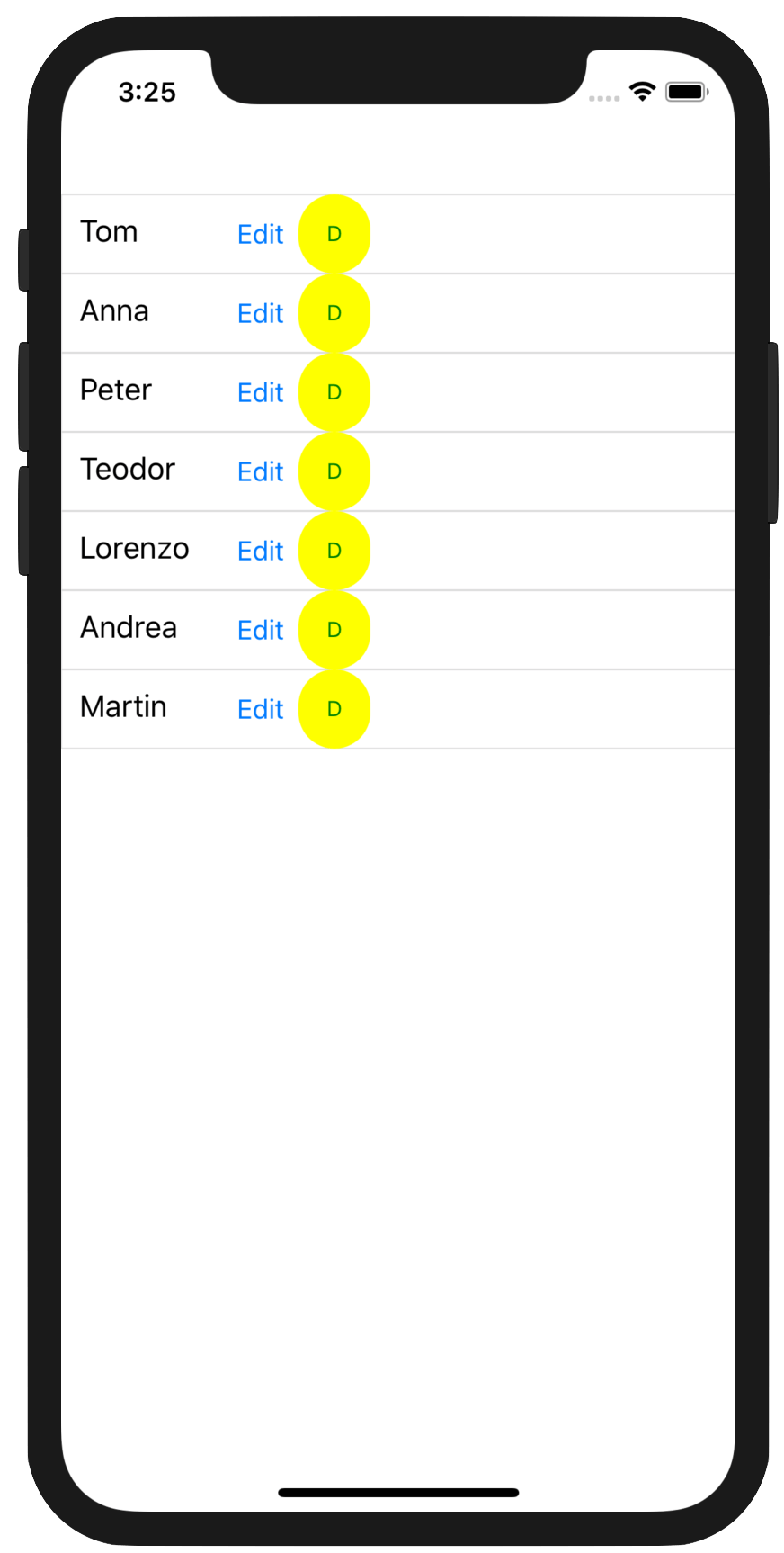
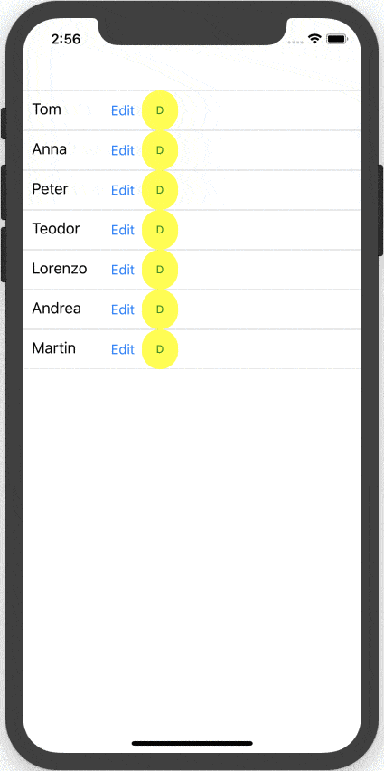
Now that we have a button that understands a custom visual state, let's use it in our Xamarin.Forms UI. To make things a little more interesting, let us try to embed this button in a repeatable DataTemplate - VSM simply works and trickles down the stack. Let's use one of the most common UI paradigms in mobile apps: a list of things. We need some sample dummy data first, so here's some code in our code-behind file:
public MainPage()
{
  InitializeComponent();

  ViewModel VM = new ViewModel();
  this.TelerikListView.ItemsSource = VM.Source;
}

public class SourceItem
{
  public SourceItem(string name)
  {
    this.Name = name;
  }

  public string Name { get; set; }
}

public class ViewModel
{
  public ViewModel()
  {
    this.Source = new List<SourceItem> { new SourceItem("Tom"),
                                         new SourceItem("Anna"),
                                         new SourceItem("Peter"),
                                         new SourceItem("Teodor"),
                                         new SourceItem("Lorenzo"),
                                         new SourceItem("Andrea"),
                                         new SourceItem("Martin") };
  }

  public List<SourceItem> Source { get; set; }
}
Clearly, this is sophisticated code. Okay, fine—we are literally new'ing up a bunch of strings. Now that we have a list of people's names, it's time to bind the collection to a ListView - a label for names, and two buttons each to edit or delete. Here's the XAML markup:
Notice how the Telerik button provides additional APIs to round up corners, use custom backgrounds and more - just more ammunition for developers to make their UI look exactly as desired. With UI markup in place and code-behind providing the data to bind, our app screen lights up with the list of names and buttons for each.
Using Custom VSM
With our UI markup bound to our data, we have our app screen showing the list we want. But let's not forget, we used a special button in our ListView's DataTemplate, one that is aware of its pressed state. And we have VisualStateManager being forced to go into a custom visual state when the button is pressed. Now it is time to put it all together. Here's some more UI markup code:
You'll notice that we're declaring a custom style in our XAML page's ResourceDictionary - and the style applies to our custom StateButton. Inside, we simply define a custom visual state as a part of the visual state group that Xamarin.Forms VSM already supports - the CommonStates. We are declaring the Pressed state as a new custom visual state that the VSM would understand. The style setters set the border width and color properties of the afore-mentioned button. In effect, every time we press our custom StateButtons, we want them to glow with a green border. This is specific UX behavior, defined entirely in XAML markup, possible through the support of Visual State Manager.
Summing Up
Support for Visual State Manager in Xamarin.Forms 3.0 should be a very welcome feature for XAML aficionados. VSM would allow developers to define UI behavior through simple visual state changes, declared entirely within XAML markup. And VSM supports works not just for what's out of the box, but also for custom complex UI like Telerik UI for Xamarin. Xamarin.Forms has built-in support for VSM across all controls now, and developers get to extend functionality by defining custom visual states as needed. UI definition and behavior can now live close together—leading to less-verbose and easily understandable code. Hallelujah to that!