Quantcast
Channel: Telerik Blogs | .NET
Viewing all 1954 articles
Browse latest View live

One HamburgerMenu, Please—Modern Navigation for Your WPF App

$
0
0

WPF application developers rejoice! You can have an intuitive and modern navigation in your application - look no further than the NavigationView (HamburgerMenu) in Telerik UI for WPF. Learn all about this powerful navigation control below.

I recently heard the term “conscious control,” and asked myself, "what does this mean, do controls have actual consciousness (duh!)?" However, that was just for a few seconds.

They are actually controls that can adapt to different window sizes layouts, which is essential for apps that scale across various devices and dimensions. To create conscious controls, you can either code your own adaptive UI to optimize for different screen sizes, or you could save yourselves a considerable amount of time and simply use the new NavigationView (HamburgerMenu) control, which arrived in Telerik UI for WPF in R1 2019.

In case you missed our new release, the NavigationView is just a small (but essential) part of it. Let's have a minute of glory for the new DiagramRibbon and HyperlinkButton controls, the support of Charts for RadSpreadsheet and RadSpreadProcessing and last, but not least - .Net Core 3 and VS 2019 support!

Now, let’s not forget who the “star” of the show is. That’s right – the brand new NavigationView.

Does your app need to:

  • Provide a consistent navigational experience
  • Preserve screen real estate on smaller windows
  • Organize access to many navigation categories

If the answer to at least one of the following key points is YES, then this is the right control.

For more information on how to create a sample application that contains a RadNavigationView (HamburgerMenu) control, jump into its Getting Started article.

Anatomy

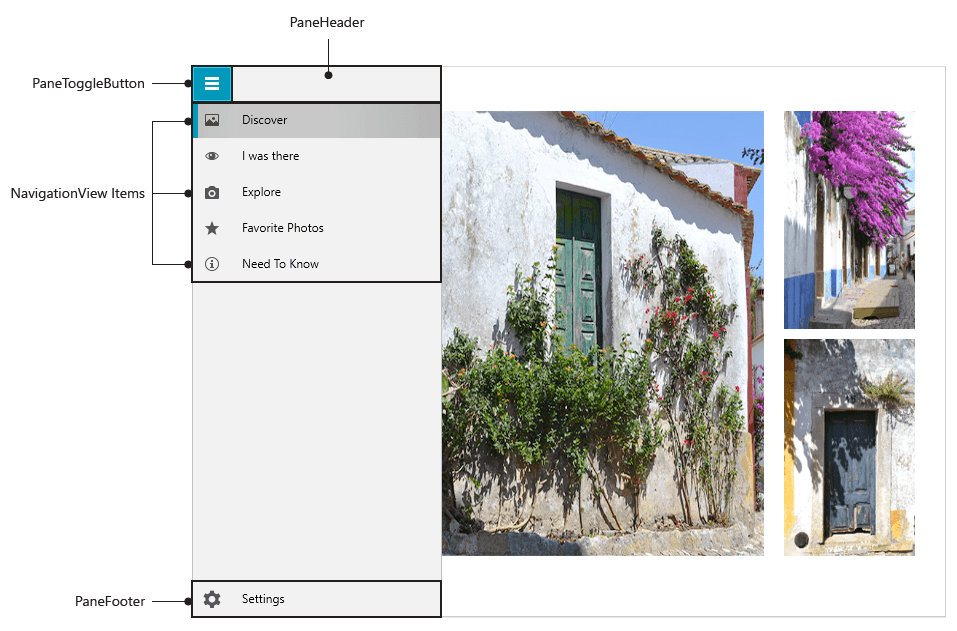
Reading this title, you thought for a second of Grey’s Anatomy, didn’t you? Now let’s lift the curtain and look at the hamburger menu’s control layout.

The recipe for the hamburger menu consists of:

  • PaneHeader - the Header (or the top burger bun) of the NavigationView
  • PaneToggleButton – the one that opens/closes the NavigationPane, which hosts the NavigationViewItems
  • NavigationView Items – the most important “ingridients” of the HamburgerMenu, used for navigating to specific content, which can be populated statically or through databinding
  • Pane Footer - the Footer (or the bottom burger bun) of a RadNavigationView

NavigationView Visual Structure

Adaptive Behavior

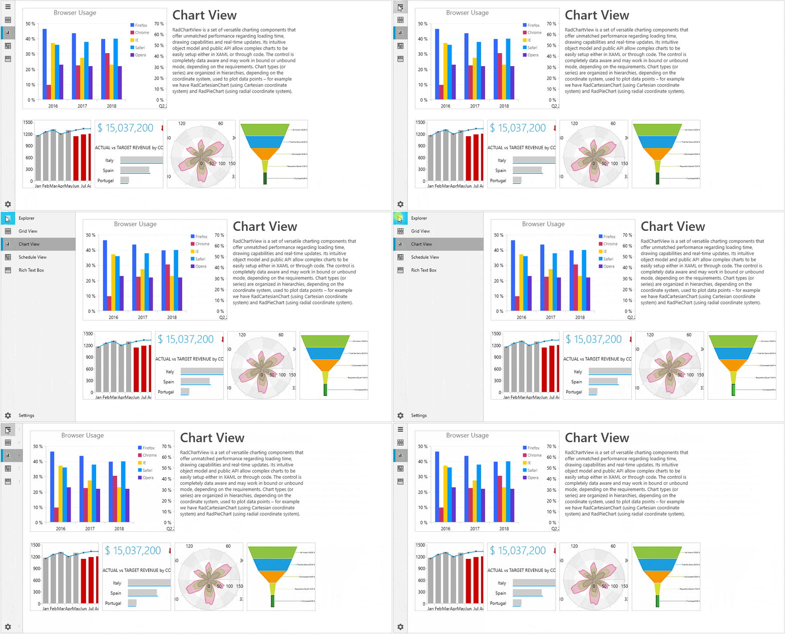
By default, the navigation view automatically changes its DisplayMode depending on the amount of available size. It has three display modes - Minimal, Compact and Expanded.

ExpandedModeExpanded mode – the pane stays open alongside the content

CompactModeCompact mode – the pane always shows as a narrow sliver
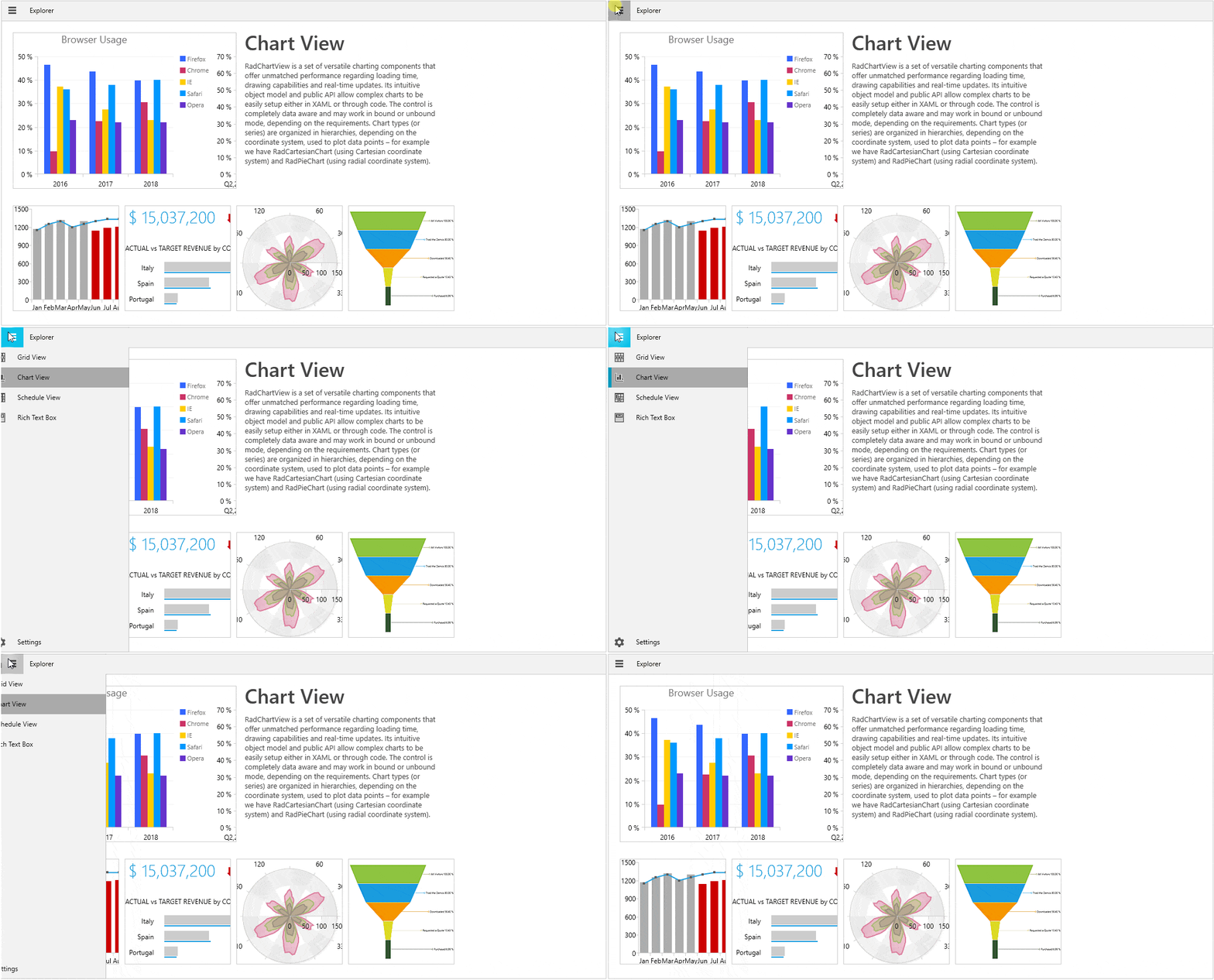
MinimalModeMinimal mode – the pane shows/hides on PaneToggleButton click; the button remains fixed
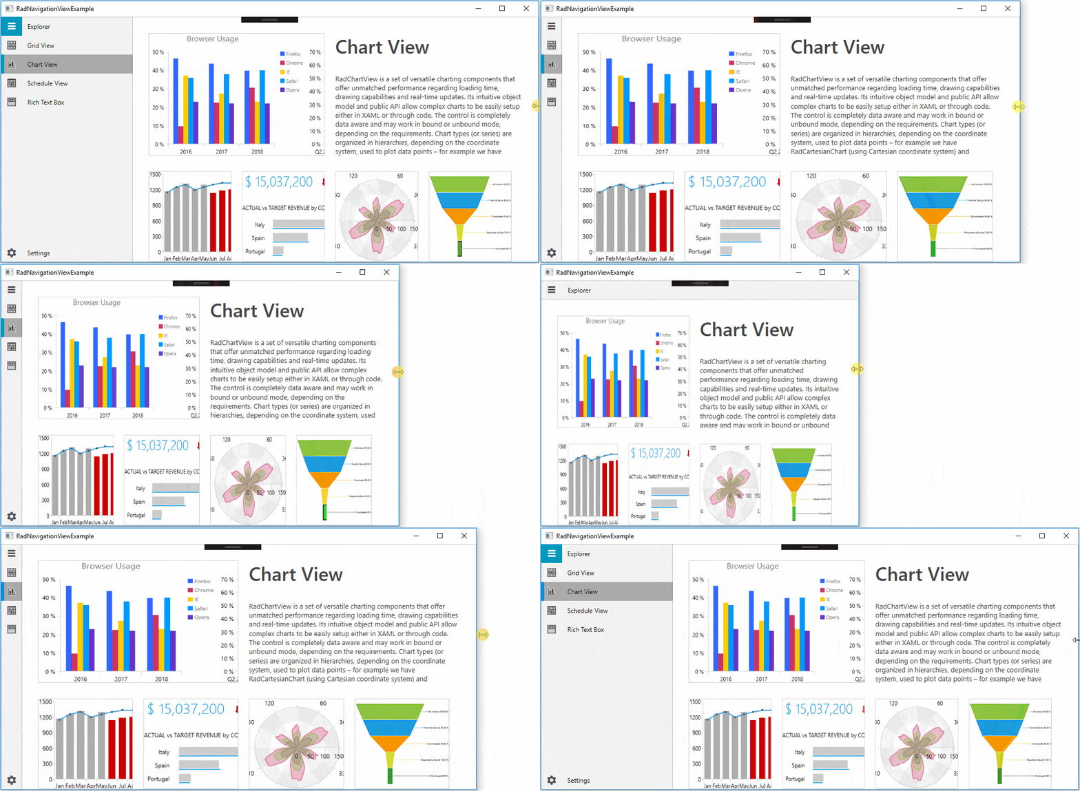
By default, the control changes its DisplayMode when its size passes certain thresholds. The CompactModeThresholdWidth and ExpandedModeThresholdWidth properties specify the breakpoints at which the display mode changes. The default value for the compact one is 641 and the default value for the expanded - 1008. You can modify these values to customize the adaptive display mode behavior.

NavigationViewDisplayModeTransition

If you want to be in control of this adaptive behavior, you can do that. The only thing that you need to do is set the AutoChangeDisplayMode property to False:

  • In Xaml:
    <telerik:RadNavigationViewx:Name="navView"AutoChangeDisplayMode="False"/>
  • In Code:
    this.navView.AutoChangeDisplayMode = false;

Flexible Customization

I love the power of customizable components! Who doesn’t? Many of the NavigationView’s parts are fully customizable.

Customizing the PaneToggleButton

You can customize the look and feel of the PaneToggleButton using PaneToggleButtonContent, PaneToggleButtonContentTemplate and PaneToggleButtonStyle properties. If you do not need it, you can just use the PaneToggleButtonVisibility property.

Customizing the Header/Footer

The list of properties that allow customizing the control’s header are: PaneHeaderPaneHeaderTemplate and PaneHeaderHeight.

The footer can be customized using the PaneFooter and PaneFooterTemplate properties.

Wait, there is more.

I forgot to mention that you can change the color of pane components at glance with PaneBackground, PaneHeaderBackground and PaneHeaderForeground properties.

Customizing the Items

The RadNavigationViewItems are fully customizable, too, especially their icons.

The Icon and IconTemplate properties are the key here. With the help of the IconTemplate, a single DataTemplate can be set to many RadNavigationViewItems. More information on how to set the Icon of an item to a RadGlyph or use the IconTemplate property in a databinding scenario can be found in this article.

As Selector and ItemsControl classes are part of RadNavigationView’s base classes, the following properties can also be used to style the control items: ItemTemplate, ItemTemplateSelector, ItemContainerStyle.

Customizing the Open/Close Animations

By default, RadNavigationView defines three animations named ResizePaneAnimation, MinimalPaneOpenAnimation and MinimalPaneCloseAnimation.

  • ResizePaneAnimation - played when the DisplayMode of the RadNavigationView is either Compact or Expanded and the NavigationPane is opened or closed
  • MinimalPaneOpenAnimation - played when the DisplayMode of the RadNavigationView is Minimal and the NavigationPane is closed
  • MinimalPaneCloseAnimation - played when the DisplayMode of the RadNavigationView is Minimal and the NavigationPane is opened

This article demonstrates how you can customize these animations.

Events

Here is the list of most important events that you need to know when it comes to RadNavigationView:

  • ItemClick - occurs each time an item in the menu gets clicked
  • PaneOpened - occurs when the pane is open
  • PaneClosed - occurs when the pane is closed
  • SelectionChanged – occurs when the selection changes

All mentioned event handlers receive two arguments - the sender argument which contains the RadNavigationView (type - object, can be cast to the RadNavigationView type) and a RoutedEventArgs object.

Theming

There is no need to mention that the HamburgerMenu comes with the great and colorful variety of UI for WPF Themes Suite, right? And you remember that if the theme brushes are not colorful enough, we offer seamless color customization and fast palette creation with the help of the Color Theme Generator, don’t you?

Try It Out and Share Your Feedback

Enough talking. The Telerik R1 2019 Release is already live, so do not hesitate and give RadNavigationView a try right now by downloading the latest:

Try Telerik UI for WPF

Wait, what? You are just hearing about Telerik UI for WPF for the first time? Well then, head over to the product page to explore the key features, various controls and themes ready for the taking.

Feel more than welcome to share your thoughts as a comment below, or… wait! You can visit our revamped Feedback portals about UI for WPF/Silverlight and Document Processing Libraries and let us know if you have any suggestions or if you need any particular features/controls.


Introducing a Customizable Crystal Dark Theme for WinForms

$
0
0
Brush up your WinForms desktop application with a modern and personalized look and feel, thanks to the MacOS-inspired Crystal Dark theme available in Telerik UI for WinForms.

A lot of people these days are staring at screens for extended periods of time. Having a bright and glaring background on something you use constantly leads to eye fatigue. Therefore, more and more people use the eye-friendly alternative to the traditional bright user interfaces sported by most applications – dark mode. Instead of displaying the hegemonic light background with dark text, the typical dark mode features a dark background with white or light-colored text, which makes reading easier to read at midnight without feeling like you’re staring into the sun.

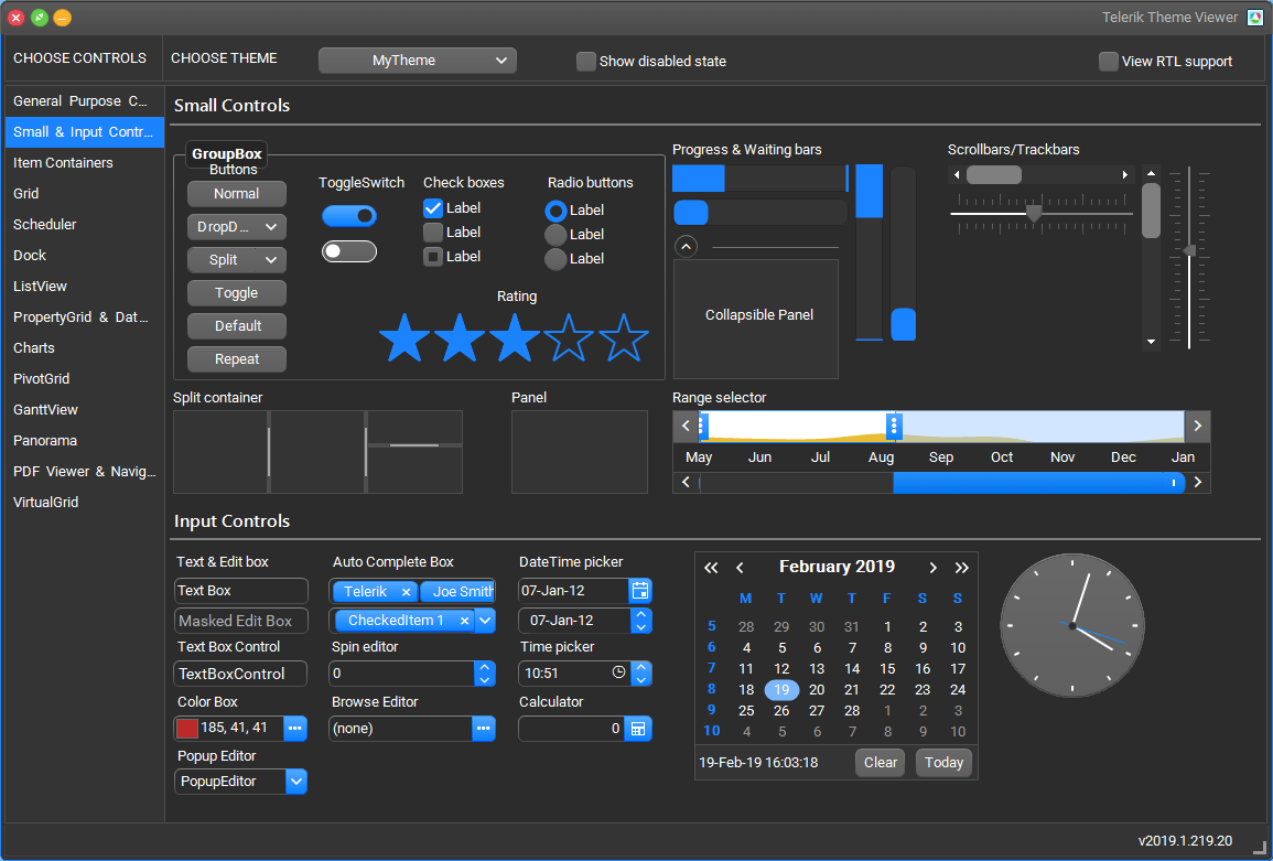
If you are a fan of dark themes, you may use Visual Studio, Chrome and even Windows 10 in dark mode. If you're on the lookout to provide the same experience to the users of your desktop application, we are pleased to introduce the new Mac-inspired dark theme in Telerik UI for WinForms - CrystalDark (a dark alternative of our Crystal theme).

theme viewer crystal dark

crystal-dark-shot-2

Creating a Custom Theme for Your Application

Just as you can blend and customize our Material and Fluent themes, the Crystal themes are also designed to work with a predefined set of colors. Thus, using Visual Style Builder you can generate different color variations of the Crystal and CrystalDark themes. A completely new theme can be created in a couple of minutes. Just open the VisualStyleBuilder and select Tools -> Generate Crystal (Dark) Theme. In the Crystal Blend Dialog, you can select one of the predefined accent colors palette, modify it or create a new one.

crystal themes blending

When you are ready with modifications of the accent palette you are ready to generate the new theme.

Result for the Regular (Light) Crystal Theme

crystal light variations

The Crystal Dark Variation

crystal dark variations


Try It Out and Share Your Feedback

You can learn more about the Telerik UI for WinForms suite via the product page. It comes with a 30-day free trial, giving you some time to explore the toolkit and consider how it can help you with your current or upcoming WinForms development.

We would love to hear what you think, so should you have any questions and/or comments, please share them to our Feedback Portal or in the comment section below.

Integrating Web Services with KendoGrid, Blazor, and Razor Components

$
0
0

Here’s a Blazor Component that uses C# to retrieve data from a Web Service and display it in the new Blazor-Enabled KendoGrid. To put it another way: Client-side updates with no JavaScript required.

As you'll see here, thanks to the Telerik UI for Blazor Early Preview, you can already start using Telerik UI components in a Blazor environment. The biggest problems you'll have in using this technology is creating the environment that it runs in – the components themselves just work as advertised.

Setting Up

Fundamentally, this is all preview technology so you're going to need to use both the previews for Visual Studio 2019, and .NET Core 3.0 SDK.

Once you've installed those downloads, you'll create your project by starting up Visual Studio 2019 Preview and selecting Create a New Project from the choices on the right of the initial dial. In the ‘Create a new project' dialog that appears, select ASP.NET Core Web Applications and click the Next button. The next dialog will let you name your project (among other configuration options). Click the Create button after you're done with this page and (finally!) pick the kind of project you want to create. To work with Blazor, you'll want to use the Razor Components template, so select it, and click the Create button to initialize your project in its solution.

This is your first opportunity to check that you've successfully installed the right “bundle of everything”: If your Visual Studio solution contains a single project that has, in its Components/Pages folder, files with the .razor extension, then you've got the right combination of Visual Studio and .NET Version 3.0.

Razor Components aren't “true” Blazor in the sense that you'll have C# code running in the browser. Instead, Razor Components execute your C# code on the server and use SignalR to communicate between the client and server. This obviously limits the scalability of your application compared to fully executing all code on the client. However, it also avoids the two megabyte download that “Blazor on the client” currently requires (and, to be fair, in ASP.NET Core with the right topology, the scaling limit for SignalR is pretty high). The major benefit of experimenting with Razor Components is that it's an official technology that's included in .NET Core 3.0, while “Blazor on the client,” despite being in version 0.9.0, is still — and I'm quoting Microsoft here — in “pre-alpha.” However, the code and HTML in this post should work as-is with “Blazor on the Client” when (or if) that technology comes out of alpha.

The one wrinkle that I found after I got everything set up was that I would make changes to my code and it would make no difference to my running application until I selected Build | Rebuild Solution. If you get tired of constantly requesting rebuilds (or, as I did, just kept forgetting to do it) then the simplest solution is to trigger a rebuild every time you debug in every project by going to Tools | Options | Projects and Solutions | .NET Core and unchecking the Up to Date Checks option. If that solution seems too heavy-handed to you, then you can fix the problem for the project you're working on by going into the project's .csproj file and adding this:

<ItemGroup>
  <UpToDateCheckInput
    Include="@(Content->WithMetadataValue('Extension', '.razor'))" />
</ItemGroup>

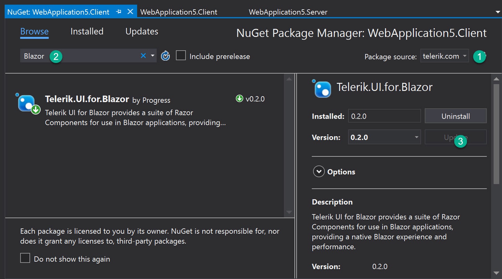
You're now ready to add the Telerik components to your project. The Telerik team, not surprisingly, provides the best description of how to set up your application to use the new Blazor-enabled components. You'll also need to tweak your project file.

Hey, no one said that exploring the future of technology was going to be easy.

The Case Study

For the case study I'm going to use here, I added a second ASP.NET Core API project to my solution. This Web Service will provide a set of Customer objects. I defined my Customer object in another Class Library (.NET Standard) project that I referenced from both my Razor Components and API project. I added both of these other projects just by right-clicking on the Solution node in Solution Explorer and selecting Add | New Project.

My Customer class is ridiculously simple:

namespace Customers.Common
{
  public class Customer
  {
    public int Id { get; set; }
    public string FirstName { get; set; }
    public string LastName { get; set; }
  }
}

And my API class wasn't much more complicated. I created a List of Customer objects in the constructor for a controller class (cleverly called Customers) and returned that collection from my controller class's Get method:

[Route("Customers")]
[ApiController]
public class Customers : ControllerBase
{
  List<Customer> custs = new List<Customer>();
  public Customers()
  {
    custs.Add(new Customer
    {
      Id = 1,
      FirstName = "Peter",
      LastName = "Vogel"
    });

    // more customers added
  }

  [HttpGet]
  public ActionResult<IEnumerable<Customer>> Get()
  {
    return custs;
  }
}

I also set up the Solution to start debugging with two Startup projects by right-clicking on the Solution node, picking Set Startup Projects and selecting the ‘Multiple startup projects' option in the resulting dialog. In the list of projects that follow that option, I set the Action dropdown list to “Start” for both my Razor Components project and my API project before clicking the OK button.

Creating the Blazor UI

If you've put all that in place, then you're ready to create a Razor Components page that uses the KendoGrid to display a list of Customer objects retrieved from a Web Service. To add the page, right-click on the Razor Components' project's Components/Pages folder and select Add | New Item. Unfortunately, the Add New Item dialog currently doesn't include a template that generates a Razor Components class. However, if you select the Razor View template and set the file name to end with the .razor extension, everything will work out fine (it's the .razor extension that defines a Razor Component). I called my file DisplayCustomers.razor.

At the top of my Razor component, I set the URL path to retrieve this component, added the namespace for the Class Library holding the definition of my Customer class, and enabled the Tag Helpers in the Kendo.Blazor namespace (I could also have done that last step in one of my project's _ViewImports files). Here's what that looked like:

@page "/displaycustomers"
@using Customers.Common
@addTagHelper *,Kendo.Blazor

Within my page, I added a header and used the Kendo Tag Helpers to define my KendoGrid. This gives you another checkpoint to see if you've got the “bundle of right stuff”: If your KendoGrid tags aren't in boldface, then the Telerik.UI.for.Blazor NuGet package didn't get installed correctly.

<h1>List Customers</h1>

<KendoGrid Data=@customers Sortable=true>
  <KendoGridColumns>
    <KendoGridColumn Field="Id" Title="Customer Id" />
    <KendoGridColumn Field="FirstName" Title="First Name" />
    <KendoGridColumn Field="LastName" Title="Last Name" />
  </KendoGridColumns>
</KendoGrid>

This grid is attached to a field in my Razor Component that will provide the data for the grid to display (I also turned on automatic sorting because, well, why not?). I've defined three columns in my grid, one for each of the three properties on my Customer object. I also set the title for the columns those properties are displayed in.

Now, I need to define the field that will hold that data. That code looks like this:

@functions {
  private IEnumerable<Customer> customers = null;
}

At this point, all the page will do is display a blank grid. To start retrieving the data from the Web Service, I need, in my component's functions block, to override the component's OnInitAsync method. That method is automatically run as part of initializing the component as it's displayed, so it's a good place to do any initialization for the component. Rather than load a lot of code into the OnInitAsync method, I'll put the code that does all the work in a separate method that I'll call GetCustomers:

@functions {
  private IEnumerable<Customer> customers = null;
  protected override Task OnInitAsync()
  {
    GetCustomers();
    return base.OnInitAsync();
  }
}

For that GetCustomers method, I just write C# code, leveraging the .NET Core APIs. I added this method right below my OnInitAsync method:

public async void GetCustomers()
{
  HttpClient hc = new HttpClient();
  HttpResponseMessage rm =
    await hc.GetAsync("https://localhost:5001/customers");
  customers =
    await rm.Content.ReadAsAsync<IEnumerable<Customer>>();
  StateHasChanged();
}

To use the ReadAsAsync method to call my service, I had to add a NuGet package to my project (Microsoft.AspNet.WebApi.Client). But, I'll point out, that's just another C# package.

Really, only the call at the end of the method to the Razor Component's StateHasChanged method shows that this code is updating client-side resources. The StateHasChanged method notifies Blazor that the client's DOM has been updated which, in turn, causes Blazor to compare the updated DOM to what the user is currently seeing, figure out what's different, and update the user's view to reflect the loaded data.

And there's the beauty of Blazor: efficient client-side updates without a line of JavaScript and with access to the full .NET Core API. My client-side toolkit has suddenly gotten much more focused.

The full project referenced in this article can be found here.

For More on Telerik UI for Blazor

To learn more about the Telerik UI for Blazor and download the preview, don't forget to check out this introductory blog post or visit the product page here.

Telerik UI for Blazor 0.4.0 Just Released

$
0
0

Telerik UI for Blazor has just released its 0.4.0 version, which includes more components and features for existing components! Read on to see what's new.

Telerik UI for Blazor is evolving fast with new components and features getting released hot off the presses as soon as we have them ready. With any rapid growth comes for the potential of some growing pains, which in this case comes for a breaking change with the UI for Blazor release I’m announcing today. However, with this change comes plenty of new features, components, and resources!

Keep on reading to see what’s new with Telerik UI for Blazor 0.4.0!

Breaking Changes

It’s never easy to chat about breaking changes, but I want to make a note of what the changes for 0.4.0 are as well as why we went with this direction. We do not take breaking changes lightly, even with products in early development, but we believe that this is a change that is necessary for the continued success of UI for Blazor which is why we’re going this direction.

What is Changing

First, the actual change: we are moving namespaces from Kendo.Blazor over to Telerik.Blazor. This means that any usage that you see of Kendo in your current projects will be replaced by Telerik.

As an example of our Grid taken from our docs, here’s the old way with 0.3.x:

@using Kendo.Blazor

<KendoGrid Data="@MyData">
    <KendoGridColumns>
        <KendoGridColumn Field="ID"></KendoGridColumn>
        <KendoGridColumn Field="TheName" Title="Employee Name"></KendoGridColumn>
    </KendoGridColumns>
</KendoGrid>

@functions {
    public IEnumerable<object> MyData = Enumerable.Range(1, 50).Select(x => new { ID = x, TheName = "name " + x });
}

Here’s the same declaration, but with the new namespace:

@using Telerik.Blazor

<TelerikGrid Data="@MyData">
<TelerikGridColumns>
<TelerikGridColumn Field="ID"></TelerikGridColumn>
<TelerikGridColumn Field="TheName" Title="Employee Name"></TelerikGridColumn>
</TelerikGridColumns>
</TelerikGrid>

@functions {
public IEnumerable<object> MyData = Enumerable.Range(1, 50).Select(x => new { ID = x, TheName = "name " + x });
}

Overall the API ends up being fairly similar, but note the @using Telerik.Blazor and all of the <Telerik[X]> tags that have changed.

Why is this Change Happening?

There are a couple of reasons as to why we’re going ahead with this change, but I’ll focus on the biggest one for this blog post in order to not bore you: the usage of the Kendo UI name is confusing for people.

Specifically, a lot of the conversations we’ve had around Telerik UI for Blazor is if these components are just wrappers around the Kendo UI jQuery components. Telerik UI for Blazor is built 100% from the ground up in order to ensure deep integration with the Blazor framework itself. So to avoid this confusion and set the record straight we are moving away from the Kendo name and instead going with Telerik, a name very familiar to anyone within the .NET world (at least to you, the reader, since you are on the Telerik blog ).

So, in order for us to convey this more easily to new and existing users alike we’ve moved forward with this namespace change for 0.4.0.

We understand that this may be a bit of a headache for people, especially if your current Blazor project is a larger one. However, we believe that this is a necessary change and it’s overall best to do it now while the product is in its early stages and preview rather than later in the product’s life.

A note to make here is that the CSS and rendering will still be the same for the Telerik UI for Blazor components. Any changes you’ve made to the styling, or the ability to share a design across jQuery/React/Angular/Vue and Blazor projects, are still very valid.

A Quick Note on Interops

An additional thing I’d like to note is that you will be seeing a JavaScript file mentioned in some of our articles, namely telerik-blazor.js. This is in no way an indication of a trend to move over to a more JS-favored implementation of Telerik UI for Blazor, but it is something that we realized we needed to include at this point to add in some of the features and make our components what they are.

This is just a JS resource that has some interop functions to help provide keyboard navigation in the input elements, as well as the SVG and canvas rendering we utilize for our charts.

New Components & Features

Now, on to all of the fun stuff! We have a whole set of new components ready to rock and roll, along with new features for existing components, so let’s take a look at what is new in 0.4.0 Let’s first dive in to the new components.

Calendar 

Telerik UI for Blazor Calendar component showcasing a full month

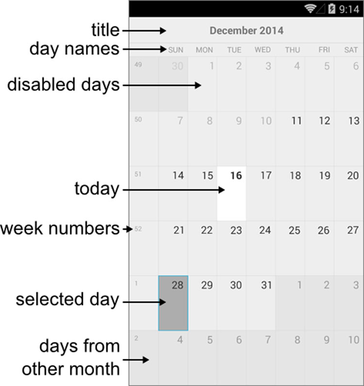
The name gives it away, but the Calendar component is quite simply a calendar that you can add to any page! This is completely standalone, and comes with the ability for users to navigate through the calendar to pick their date (or dates) of preference. Selection comes in both single day and multiple days, and you can prevent certain dates from being selected by setting them as disabled.

For a deeper dive in to the calendar, including the actual API and such, jump over to the Calendar component documentation.

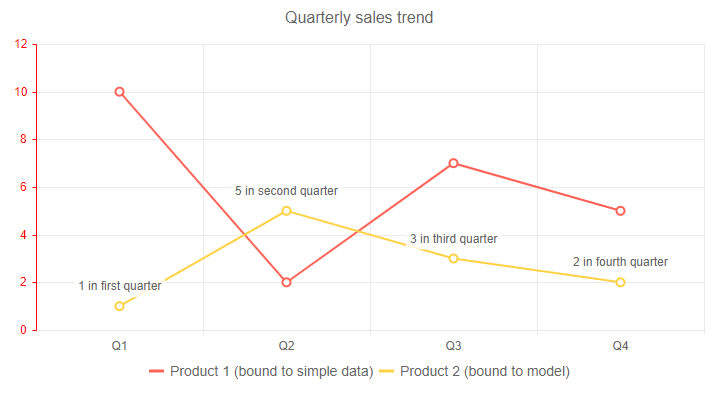
Chart

Telerik UI for Blazor Chart component displaying a couple of line series

This is a big one! With 0.4.0 we are releasing our Chart library for Blazor! This is already primed to come out with a few series and chart types, namely:

  • Area Chart
  • Bar Chart
  • Column Chart
  • Donut Chart
  • Line Chart
  • Pie Chart

This also comes with support for a ton of features including label templates, multiple axes, stacking series, multiple series, and more! Honestly it’s a lot to get into, so check out the Telerik UI for Blazor Chart component documentation to see all of the features and how to get started with this UI component today.

DateInput

Telerik UI for Blazor DateInput Component with a month day year mask

The DateInput component expands on our list of available form elements by providing an input widget that gives a pre-defined date mask. You can customize the formatting, define a placeholder, and of course mind the value to any model you have available. It also integrates natively with the Blazor validation framework, but more on that later in this post.

DropDownList

Telerik UI for Blazor DropDownList displaying sample data in a drop down

Have a long list of data that you want to have assigned to a single input? The DropDownList is your answer! Like our other DropDownList components, this gives your users a list of options to select from without the need to input custom text or searching through the list. Right out of the gate we support features like templates and integration with Blazor validation to ensure that it can fit your application requirements.

TextBox

Telerik UI for Blazor TextBox Component

Simple and easy. Since there’s often more to a text box than just gathering text like max/min length, patterns for valid input, and providing a label with a configuration option, we decided to create the Telerik UI for Blazor TextBox component. Of course, this also supports validation, which we’ll cover in this next section!

Native Blazor Validation Integration

Telerik UI for Blazor Validation example with a text box component

With 0.4.0 Telerik UI for Blazor officially integrates with Forms and Validation within Blazor. This is supported across the board for all of the Telerik UI for Blazor input elements. Our UI components will work out of the box with these elements of Blazor when placed inside an EditForm and will respond to EditContext changes while providing default invalid styles. This doesn’t just happen on OnSubmit by the way, this validation happens in real time.

Taking some inspiration from our documentation, here are the basic steps to validate the Telerik UI for Blazor input components:

  1. Define a model with Data Annotation attributes
  2. Take the input elements that you want to represent your model in an EditForm
  3. Add a DataAnnotationsValidator inside the form
  4. Use the bind-Value syntax to provide value binding to your input elements

And that’s it!

Since this blog post is on the longer side I’ll direct you over to the validation section of our documentation where you can see more examples of this in action.

New Demo Pages

We are trying something new with Telerik UI for Blazor and releasing things early and just as they’re coming out of the oven. As a part of this we are also building out the available resources to make things fleshed out like any of the other Telerik UI products.

As a part of this I can announce that as of today we have released the official Telerik UI for Blazor demo page! Like all of our other UI libraries, this is an interactive set of demos that allows you to see the components in action, quickly look over the source code that goes in to the demo, and get helpful links to our documentation articles.

Getting the Bits

If you’ve already used Telerik UI for Blazor before then you should see 0.4.0 in the Telerik NuGet feed. After that you can just follow our documentation guidelines around adding Telerik UI for Blazor in an existing project.

If you haven’t signed up for the preview yet, all you need to do is head on over to the Telerik UI for Blazor main page and click on “Download Preview”. If you are signed in to a Telerik.com account you’ll automatically get access to Telerik UI for Blazor. If you haven’t signed up for a Telerik.com account yet you will be asked to when clicking on that button.

From there you can follow our detailed First Steps documentation article for help with getting your first Blazor project up and running, how to work with the Telerik NuGet feed, and how to add Telerik UI for Blazor components to your app!

What’s Next? We Want to Hear From You!

The first question I get after any announcement of a release is the question “what is coming next?” or “when is component/feature X coming?” While we’ll be hard at work on the next version of Telerik UI for Blazor we will continue to push out helpful pages, including an official road map page.

Until we get that out what I can say is that we will continue to release more features to the Grid component (like filtering and grouping) as well as add more form elements that you may need. Beyond this we of course have other popular components found across all of our other UI suites that we will take a peek at to see when we can deliver.

We’ve already heard from many of your already and we want to continue to hear your feedback! If there are features you are missing, or components you need, please let us know! We have the official feedback portal for this exact reason. Submit your ideas for new components and features, or vote and comment on existing ones and we will make sure we take this in to consideration for upcoming releases!

Constraining Generics in C#

$
0
0

When working with generic classes or methods, it can be useful to constrain the types that can be used with them. There are many constraints we can apply. Learn what they are and how to use them.

Generics make it possible to design classes and methods that defer the specification of one or more types until the class or method is declared and instantiated by client code. When the compiler encounters a constructor for the class or a function call for the method, it generates code to handle the specific data type. Generic classes can be constrained to be used only on certain data types. This increases the number of allowable operations and method calls to those supported by the constraining type and all types in its inheritance hierarchy. I’ll introduce you to the various ways you can constrain generic types in C#.

Constrain by Value Type

You can constrain a generic type to a value type by setting the constraint of the type as follows.

class ConstrainByValueType<T> where T : struct { }

Here the struct keyword is used to constrain T to a value type. The object can then be instantiated like new ConstrainByValueType<double>, and you can specify any value type as you want. Be aware that you can’t use a nullable value type, so this will fail, new ConstrainByValueType<double?>.

Constraint to Allow Only Reference Types

You can also constrain the type to allow only reference types. Similar to how you would do it for value types, you would use the class keyword to constrain the type to a reference type.

class ConstrainByReferenceType<T> where T : class { }

Interface Type Constraint

You can constrain the generic type by interface, thereby allowing only classes that implement that interface or classes that inherit from classes that implement the interface as the type parameter. The code below constrains a class to an interface.

interface IAnimal { }
class Snake : IAnimal { }
interface IMammal : IAnimal { }
class Lion : IMammal { }
class FuteLion : Lion { }

class ConstrainByInterface<T> where T : IMammal { }

The type T above is constrained to the IMammal interface, which allows only classes that implements this interface (or classes that inherit from a class that implements the interface) to access the generic type. Even if the IMammal inherits from the IAnimal interface, you can’t use Snake as the type for T. You can only use Lion or FuteLion type.

Constrain by Class

We can restrict a generic type to only allow type parameters of a specific class, or classes that inherit from that specific base class. Following the example of the previous section, let’s create a generic class which is restricted to the Lion class.

class ConstrainByClass<T> where T : Lion { }

In this scenario, only the Lion class or a class that inherits from Lion can be used to instantiate this generic type.

Another constraint we can apply is to ensure that the class that’ll be used as the type parameter has a public, parameterless constructor. We do this by using the keyword new() as the constraint for the generic type.

class ConstrainByParameterlessCtor<T> where T : new() { }

With the constraint above, the ConstrainByParameterlessCtor class is restricted to use classes which have a public parameterless constructor.

Using Enum as Constraint

Beginning in C# 7.3, you can specify the System.Enum type as a constraint. The code below is an example of how to use enums as constraint for generics.

class Program
{
  class ConstrainByEnum<T> where T : System.Enum
  {
    public void PrintValues()
    {
      var values = Enum.GetValues(typeof(T));
      foreach (int item in values)
        Console.WriteLine(Enum.GetName(typeof(T), item));
    }
  }

  enum Rainbow
  {
    Red,
    Orange,
    Yellow,
    Green,
    Blue,
    Indigo,
    Violet
  }

  static void Main(string[] args)
  {
    var enumGeneric = new ConstrainByEnum<Rainbow>();
    enumGeneric.PrintValues();
    Console.Read();
  }
}

The type T as you see is restricted to enums, and the class has a PrintValues method prints the enum type values to the console. Running the code should print out the following:

Red
Orange
Yellow
Green
Blue
Indigo
Violet

Microsoft Documentation also shows an example that used to make use of reflection, but with this feature allowed, it no longer uses reflection and has improved performance.

Beginning with C# 7.3, we can use the unmanaged constraint to specify that the type parameter must be an unmanaged type, and System.Delegate or System.MulticastDelegate as a base class constraint. The documentation provide an example and details on using the unmanaged constraint and delegate constraint.

Combining Constraints

You’ve seen how we can apply a single constraint to generic types. While that is valuable, we can also use these constraints in combination.

class Program
{
  interface IMammal { }

  class FuteLion : IMammal
  {
    private FuteLion() { }
  }

  class RainbowLion : IMammal { }

  class ConstrainByCombination<T> where T : IMammal, new() { }

  static void Main(string[] args)
  {
    new ConstrainByCombination<RainbowLion>(); // Valid
    new ConstrainByCombination<FuteLion>(); // Invalid
    Console.Read();
  }
}

In the example you see above, we’re constraining T to use IMammal interface and must have a public parameterless constructor. We have two classes which implement the IMammal interface. The FuteLion class implements this interface but has a private parameterless constructor, and this doesn’t satisfy the condition to use it the type for the generic class. The RainbowLion class satisfies this condition, therefore, can be used as the type parameter for the generic class.

Conclusion

When working with generic classes or methods, it’s sometimes useful to constrain the types that can be used with them. There’s a number of constraints that we can apply and this article sums up those constraints and how we can use them. We also looked at new constraints that are allowed starting from C# 7.3 and how to combine multiple constraints to enforce stronger rules on generics.

How to Create Expressions with the Telerik WPF ExpressionEditor

$
0
0

In the following blog post, learn how to create expressions with the ExpressionEditor control in Telerik UI for WPF.

What is Magic?

Most of us know that behind all illusions or magic is either great dexterity or clever engineering. Now, the former is not often related to software, but the latter is something we employ regularly into our products. In that train of thought one of the most telling characteristics of good software is if it manages to empower users to accomplish complex goals though simple actions. Sometimes an action might invoke simple code or a state-of-the-art algorithm. In any case, if the result is what the user intended to do, and it happened effortlessly, it often feels like magic happened right in front of their eyes.

How Do I Become the Illusionist?

In Telerik UI for WPF, RadExpressionEditor lets users build expressions that are then evaluated automatically. Whether it’s a simple check if a product is in stock or a complex, number-crunching, three-mile-long formula - they can do it. Up until now, the way to create an expression from a real-world formula was by using the available operators inside of RadExpressionEditor. Although all formulas boil down to simple operations, sometimes it takes quite a lot of effort to recreate a complex calculation. Other times, functions are so common in a certain field that not having them readily available and having to build them from scratch feels like The Stone Age.

In our R1 2019 release we have addressed that necessity; you can now add your own functions to the lot. And let’s face it, writing functions in C# is easier and way more powerful than letting your users write them in the editor. Also, you keep the clever engineering behind the curtains and all your users are left to do is enjoy the magic.

Let’s look at an example of adding two functions to RadExpressionEditor:

First you have to create a class that inherits from ExpressionFunctionContext. Inside this class is where the magic happens. For simplicity’s sake we’ll dial down this magic to a mere addition trickery. Here are two functions called OnePlus and TwoPlus that fit our bill:

publicclassCustomExpressionFunctionContext : ExpressionFunctionContext
{
[Description("Increase the value by 1")]
publicintOnePlus(intinput)
{
return++input;
}
[Description("Increase the value with 2")]
publicintTwoPlus(intinput)
{
returninput + 2;
}
}

Next, we assign an instance of this class to the ExpressionFunctionContext.Context static property:

ExpressionFunctionContext.Context = newCustomExpressionFunctionContext();

The last step is to create a class that inherits from ExpressionEditorViewModel and assign it to the ViewModel property of RadExpressionEditor. Inside the class override add the GetFunctionsItemModels method and add two item models describing the new functions:

publicclassCustomExpressionEditorViewModel : ExpressionEditorViewModel
{
protectedoverrideIEnumerable<EditorModelBase> GetFunctionsItemModels()
{
List<EditorModelBase> list = newList<EditorModelBase>(base.GetFunctionsItemModels());
var other = list.First(x => x.Name == "Other") asEditorCategoryModel;
other.Children.Add(newFunctionEditorItemModel(typeof(CustomExpressionFunctionContext).GetMethod("OnePlus", BindingFlags.Public | BindingFlags.Instance), other.Name));
other.Children.Add(newFunctionEditorItemModel(typeof(CustomExpressionFunctionContext).GetMethod("TwoPlus", BindingFlags.Public | BindingFlags.Instance), other.Name));
returnlist;
}
}
this.radExpressionEditor1.ViewModel = newCustomExpressionEditorViewModel();

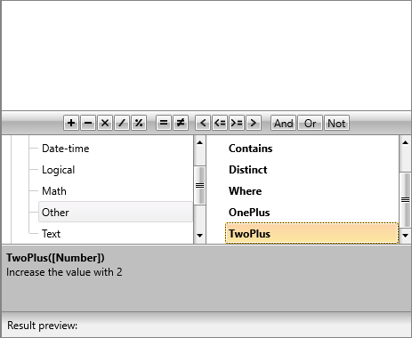
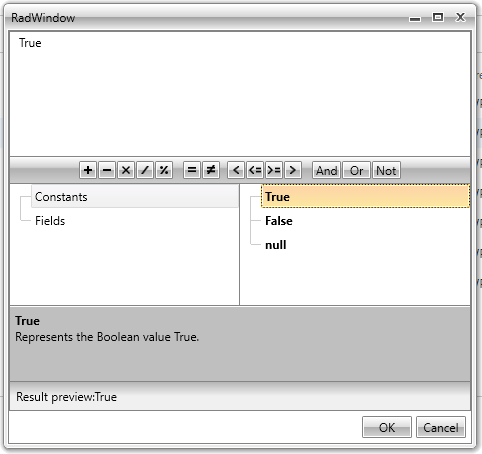
That is all, you will now see these two functions in RadExpressionEditor:

User defined custom functions in RadExpressionEditor

What’s on the Bottom of the Top Hat?

Sometimes you find something interesting and you start digging further into it. Other times you just need to get to the bottom of something out of necessity. Functions, rarely, directly take your view models as arguments. Most of the time you would like them to be decoupled from your business and data-layer logic. You might have a function that calculates the tax for a vehicle based on its power, but most probably this function will take the power as a numeric value instead of the whole vehicle object. For this case and many others, we have added drill down into the properties of your view models.

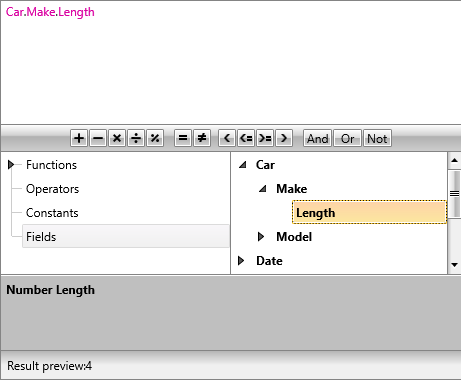
To enable the drill down functionality you have to set the IsFieldsDrillDownEnabled property of RadExpressionEditor to true:

this.radExpressionEditor1.IsFieldsDrillDownEnabled = true;

Drill down in the fields section of RadExpressionEditor

More Tricks up Your Sleeve

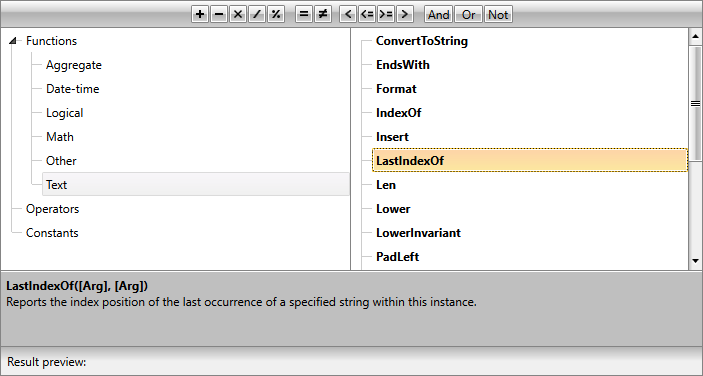
As we were sprinkling magic dust over RadExpressionEditor we decided to add the most popular string manipulation functions. Now your users will have access to them right out of the box.

String manipulation functions in RadExpressionEditor

For the full list of available functions head over to our documentation.

Now You See It…

Now it wouldn’t be a true magic show if things didn’t mysteriously disappear. Well maybe not so mysteriously, but you can now remove or modify the hierarchy of the functions inside of RadExpressionEditor. You have access to the view models of the expression editor and you can rearrange the functions and operators as you see fit.

Let’s make all categories other than the Constants disappear:

First create a custom view model by inheriting from ExpressionEditorViewModel and override the GenerateCategories method where we return only the Constants category view model:

publicclassCustomExpressionEditorViewModel : ExpressionEditorViewModel
{
protectedoverrideIEnumerable<EditorCategoryModel> GenerateCategories()
{
foreach(EditorCategoryModel model inbase.GenerateCategories())
{
if(model.Name == "Constants")
{
yield returnmodel;
}
}
}
}

RadExpressionEditor with some of the default categories removed.

You can see more options to customize the categories and operators in our documentation.

Next Steps and Feedback

It’s now time for you to go out on the stage and amaze your audience. Don’t forget to write back and share your experience playing with the new tricks up RadExpressionEditor’s sleeve.

If you're new to Telerik UI for WPF, you can download a free trial today and test out the latest functionality. Let us know what you think.

New ButtonTextBox and FontDropDownList Controls in Telerik UI for WinForms

$
0
0

Learn all about the new ButtonTextBox and FontDropDownList controls that shipped with the R1 2019 release of Telerik UI for WinForms.

With the latest release of the Telerik and Kendo UI product lines, we've included a variety of new controls and features across all toolkits, where in the case of Telerik UI for WinForms, we were happy to announce official support for .NET Core 3.0 and a bunch of new controls - FontDropDownList, ButtonTextBox, TabbedForm and TimeSpanPicker. In the next few paragraphs we are going to cover the first two in more detail.

ButtonTextBox

The new RadButtonTextBox control allows you to easily add buttons or other elements inside a regular textbox. Elements can be added in front or after the text. Another common case is creating a password textbox where the user can show the typed password  and then hide it. This is easily achievable by just adding a toggle button and setting its image dynamically:

RadButtonTextBox_FontDropDown_blog001

Another case where this control can be used is as buttons container and no text. This is controlled by the ShowTextBox property. Here is an example that shows how this can be used.

RadButtonTextBox_FontDropDown_blog002

Detailed information about this control is available here: RadButtonTextBox.

FontDropDownList

The RadFontDropDownList controls shows the fonts available on the system in a popup and allows the user to preview and select them. It aims to save time whenever you need to allow the end users to select a font in an application. It is already embedded in the RichTextEditorRibbonBar.

RadButtonTextBox_FontDropDown_blog003

Detailed information about this control is available here: RadFontDropDownList.

You can check a complete list of the released features here: New Splendid Release for Telerik UI for WinForms.

We would love to hear what you think, so should you have any questions and/or comments, please share them to our Feedback Portal or in the comment section below.

If you're new to Telerik UI for WinForms, you can start a free trial of the latest version today.

Dynamically Loading the KendoGrid in Blazor

$
0
0

For a preview, there's a surprising amount of functionality in the KendoGrid and KendoButton included in the Telerik UI for Blazor Early Preview. Here's how you can use them together to display data, support user editing and (almost) handle updating.

In a previous blog post I showed how to set up a Visual Studio 2019 project to use the KendoGrid control that comes with the Telerik UI for Blazor Early Preview. That post also demonstrated how easy it is to have the grid display objects retrieved from a web service. And, thanks to Blazor, it was all driven by C# code running in the client.

Note that the full project referenced in this article can be found on GitHub.

Getting Real

However, I simplified things a little in that post. For example, I fetched the data from the web service as soon as my Blazor-enabled page reached the browser. That's not always realistic. At the very least, the user will want to refresh the grid to get the latest data from the web service. Alternatively, the grid may contain data that shouldn't be displayed as soon as the page is loaded. For example, the user might need to enter some criteria to send to the web service to control what data is retrieved or the grid might be displaying “optional” data that should only be fetched when requested.

The Telerik UI for Blazor preview includes the KendoButton, which allows you to implement all those scenarios: When users are ready to see the grid populated with data, all they have to do is click the button. All that's required is to add the KendoButton to the .cshtml file along with the KendoGrid and specify the name of the method in the page that will fetch the data from the web service.

Assuming that method is called GetCustomersAsync, this markup would do the trick:

<KendoButton OnButtonClick='@GetCustomersAsync'>
  Get Customers
</KendoButton>

The declaration I used in my last post for the grid isn't affected at all. For example, I still bind the grid's Data property to a property in my Blazor code (I called the property, customers), and I still bind columns in the grid to properties on the Customer object I'm displaying. Here's that markup:

<KendoGrid Data="@customers">
  <KendoGridColumns>
    <KendoGridColumn Field="Id" Title="Customer Id" />
    <KendoGridColumn Field="FirstName" Title="First Name" />
    <KendoGridColumn Field="LastName" Title="Last Name" />
  </KendoGridColumns>
</KendoGrid>

The next step, of course, is to add the GetCustomers method to the functions block in the Blazor page. In that method, I need to do two things: fetch the data from the web service and update the property that the grid's Data property is bound to. Really, all I do is move the code I had in my startup method in my last blog post into the method that I bound to the button's click event. That code (along with the customers property) looks like this:

@functions
{
  private IEnumerable<Customer> customers = null;
  public async void GetCustomersAsync()
  {
    HttpClient hc = new HttpClient();
    HttpResponseMessage rm =
      await hc.GetAsync("https://localhost:5001/customers");
    customers =
      await rm.Content.ReadAsAsync<IEnumerable<Customer>>();
    StateHasChanged();
  }
}

What I like about Blazor is that this is just “plain old C# code.” The only thing that signals that this is client-side Blazor code is the call to the Blazor component's StateHasChanged method (that method notifies Blazor that the UI has been updated so that Blazor will redraw the affected areas of the page).

Handling Updates and State

In fact, the preview version of the KendoGrid is almost ready to handle simple updates. The grid already lets users change values in the grid just by double-clicking on a cell. What's missing is the ability to tell which rows in the grid have been changed. Ignoring that problem (for now), it's relatively easy to build some initial code that sends changed objects back to the web service for updating.

The first step is to add another button to let the user trigger updates. The markup for that would look something like this (this time I've tied the method to the button click's event using a lambda expression just to show that you have that option):

<KendoButton OnButtonClick='@(() => { SaveCustomers(); })'>
  Save Customers
</KendoButton>

Because I don't have a way to check to see what rows have changed (and am too lazy to compare the current state of the objects to their original state), in the SaveCustomers method I'll always assume that it's the first object in my collection that's changed. Here's the method that sends the first Customer object in the collection back to the web service's PUT method for updating:

public async void SaveCustomers()
{
  HttpClient hc = new HttpClient();
  HttpResponseMessage rm =
    await hc.PutAsJsonAsync("https://localhost:5001/customers",
                            customers.First());
}

Again, however, my code is a little too simple: I shouldn't allow the user to click the update button until some objects have been retrieved (and, really, not until the user has made a change, but I can't check for that with the preview grid). What I need to do is manage the update button based on my page's state.

The page's initial state is “no data retrieved.” After the user clicks the Get Customers button, the state changes to “data is retrieved.” I'll manage that state by adding a field to my page that holds the state (I'll call that field “status”). To represent my page's two states, I'll include an enumerated value (called pageState) that holds two values: NoDataRetrieved and DataRetrieved. I'll also initialize my state property to my first state of NoDataRetrieved. Finally, primarily to support debugging, I'll display the value of the state field at the bottom of my page, just above the functions block.

Putting all that together, the code following my grid and button markup looks like this:

Status: @status.ToString()
@functions {
  private enum pageState
  {
    NoDataRetrieved,
    DataRetrieved
  }

  private KendoGrid<Customer> grid { get; set; }
  private pageState status = pageState.NoDataRetrieved;
}

Because, currently, only the GetCustomers method changes the state of my page, it's the only method I'll enhance it to update the status field (I'll also have it deal with errors to make it a little more realistic):

public async void GetCustomers()
{
  HttpClient hc = new HttpClient();
  HttpResponseMessage rm =
    await hc.GetAsync("https://localhost:5001/customers");
  customers =
    await rm.Content.ReadAsAsync<IEnumerable<Customer>>();

  status = rm.IsSuccessStatusCode ? pageState.DataRetrieved
                                  : pageState.NoDataRetrieved;

  StateHasChanged();
}

All that's left to do is disable the UpdateCustomers button when the page isn't displaying data. I can do that by adding some code to the Enable attribute on the KendoButton and have that code check the value in my status field. My new, enhanced button looks like this:

<KendoButton Enable='@(status==pageState.DataRetrieved)'
             OnButtonClick='@(() => { SaveCustomers(); })'>
  Save Customers
</KendoButton>

And there you have it: A relatively functional page that, like any good AJAX application, offloads all the UI processing to the user's computer. The page only demands CPU cycles from your servers (a shared resource) when it's absolutely necessary. Unlike other AJAX pages, though, this page is written in C#.

For More on Telerik UI for Blazor

To learn more about Telerik UI for Blazor and download the preview, don't forget to check out this introductory blog post or visit the product page here.


Introducing Diagram Ribbon and Smart Routing for WPF Diagram

$
0
0

In this post we take a deeper look at a new update in the Telerik UI for WPF Diagram Framework, the Diagram Ribbon and its new and improved ability to avoid overlapping connections. 

With the latest release of Telerik UI for WPF, we introduced .NET Core 3.0 support, two new controls (NavigationView & HyperlinkButton), as well as a variety of new features and improvements to the toolkitk including the Diagram Ribbon.

In the next few paragraphs, we will go over the newest features and functionalities of the WPF Diagram framework by focusing on the Diagram Ribbon and Smart Routing.

DiagramRibbon Component

Ever wonder how cool it would be to have a ribbon control which exposes the different functionalities of the Diagram Framework, like: save/load, printing, setting the selection mode, adding bridges to the connections etc. Search no more!

In the latest version of Telerik UI for WPF we introduced the RadDiagramRibbon. This control is a predefined, fully customizable and ready-to-use RibbonView, providing UI for the most common features and settings of RadDiagram. The control can be easily configured and wired to RadDiagram using a design-time wizard. With a click of a button, now you can have different kind of settings of the RadDiagram Framework combined in one control.

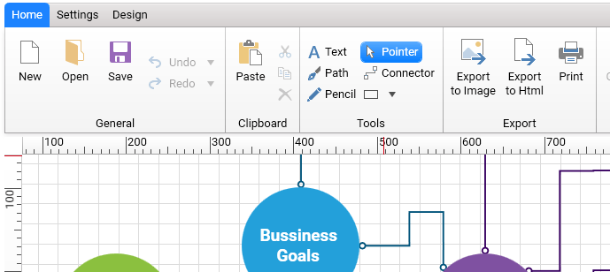
RadDiagramRibbon Main Tab

The DiagramRibbon contains three tabs which hold the most used features of the Diagram.

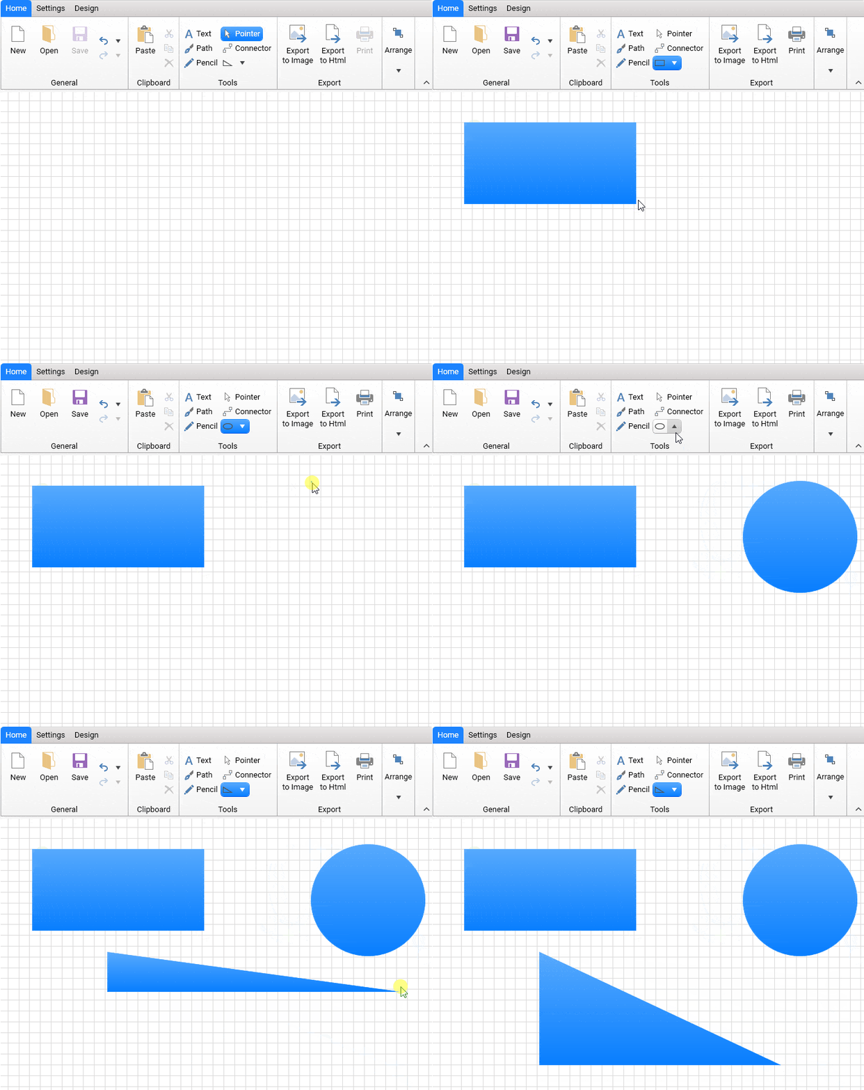
  • Home: The first tab holds functionalities like save/load, undo/redo, exporting to an image etc. I need to point out the special design Shape tool (similar to the shape tool inside Microsoft Visio) which was added to the Tools section. The new tool provides three types of shapes: Rectangle, Circle and Triangle. So, using your mouse you can add one of these shapes to the diagram surface and set their size accordingly.

DiagramRibbon_ShapeTool

  • Settings: The second tab delivers options to set more specific settings to the diagram and its items. Customizing the background grid, changing the size of the shapes or setting the zoom level are a few of the options which can be set out of the box.

DiagramRibbon_SettingsTab

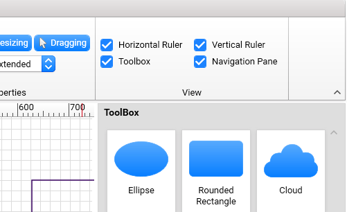
You can plug three other components of the Diagram framework (RadDiagramToolBox, RadNavigationPane, RadDiagramRuler). Using the checkbox in the View section, you can set which extensions to show or hide.

DiagramRibbon_SettingsTab_Extensions

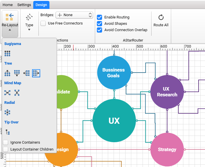
  • Design: The last tab's purpose is to give the user control over shapes layout, connection types and AStar connection routing algorithm. The diagram provides several Layouts out of the box which can be set from the Re-Layout dropdown button: Sugiyama Layout, Tree Layout, Mind Map, Radial, Tip Over. Changing the connection type or adding bridges has never been so easy. If a connection overlap appears, you could turn on the routing mechanism by just checking the Enable Routing checkbox.

DiagramRibbon_DesignTab

Cool, isn't it?

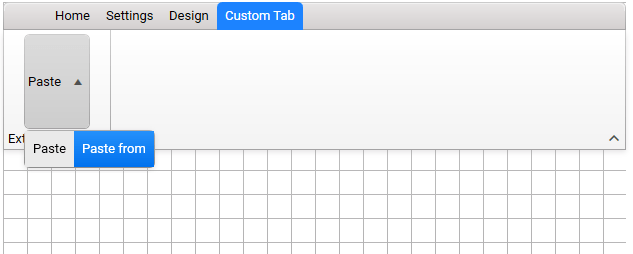
  • Extensibility: In case these built-in tabs do not include your desired functionality, or you have your own magic which you want to add for quick access, the RadDiagramRibbon can be extended to fit your needs. The AdditionalTabs and AdditionalGroups collection properties can be used to add new RadRibbonTab and RadRibbonGroup.
<telerik:RadDiagramx:Name="diagram"/>
<telerik:RadDiagramRibbonDiagram="{Binding ElementName=diagram}">
    <telerik:RadRibbonTabHeader="Custom Tab">
        <telerik:RadRibbonGroupHeader="Extend Clipboard">
            <telerik:RadRibbonSplitButtonText="Paste">
                <telerik:RadRibbonSplitButton.DropDownContent>
                    <telerik:RadMenu>
                        <telerik:RadMenuItemHeader="Paste"/>
                        <telerik:RadMenuItemHeader="Paste from"/>
                    </telerik:RadMenu>
                </telerik:RadRibbonSplitButton.DropDownContent>
            </telerik:RadRibbonSplitButton>
        </telerik:RadRibbonGroup>
    </telerik:RadRibbonTab>
</telerik:RadDiagramRibbon>

Using the above code snippet, you will get the following visualization.

DiagramRibbon_CustomTab

For more information, please refer to the Overview help article of Diagram Ribbon.

Wait, there is more!

Avoid Connections Overlap in RadDiagram

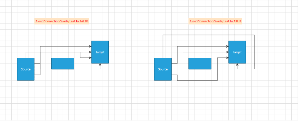
In a complex scenario where a large number of shapes and connections are used, it is hard to understand the relation between the shapes when connections overlap. Our team struggled to reduce these overlaps, but yes, we did it. Improvements were made to the AStarRouter algorithm implementation to cut down on such cases. The new AvoidConnectionOverlap property will enable the AStar algorithm to add a penalty for connection segments overlapping, thus trying to minimize the total number of such 'hard-to-follow' connections.

AvoidConnectionOverlap

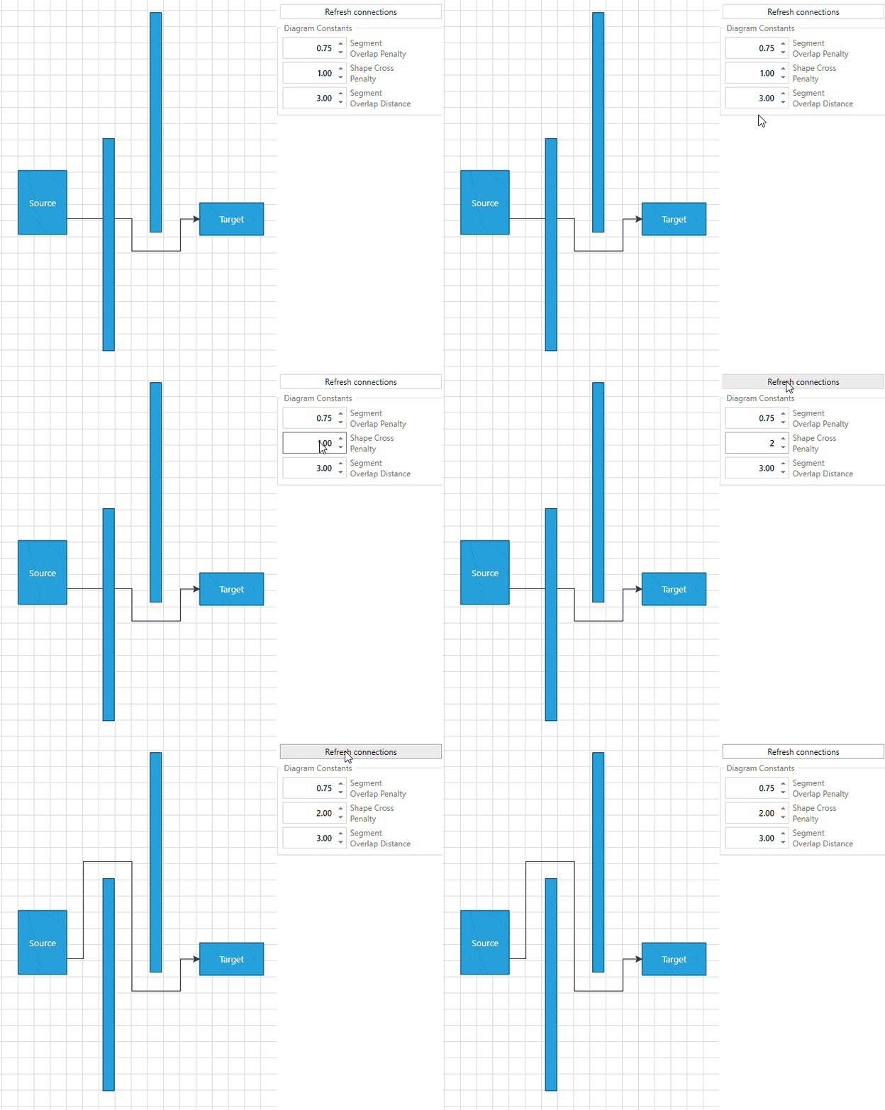
For better configuration of the algorithm we added three more properties to the AStarRouter: ShapeCrossPenalty, SegmentOverlapPenalty, and SegmentOverlapDistance:

  • SegmentOverlapPenalty is a property of type double that indicates a penalty assigned to the cost of a given path when it overlaps an existing diagram connection. By default, it is 0.75. By increasing the value of this property, connections might start to cross a given shape (avoiding a connection will become a higher priority than avoiding a shape) to reduce connection segments overlap.
  • ShapeCrossPenalty is a property of type double that indicates a penalty assigned to the cost of a given path when connections cross a shape. Its default value is 1. Which means that the shortest path between two shapes is multiplied by 1. The AStarRouter will try to draw the connection in a way so that no shape is crossed. Increasing this property to 2 for example, will allow this path to be twice as long, thus reducing the chance of crossing a shape. By setting a higher value, connections may start to overlap each other as avoiding crossing shapes will have a higher priority.

ShapeCrossPenalty_Property

  • SegmentOverlapDistance is a property of type double which sets the distance around a segment in which overlap is detected. The default value is 3px. The algorithm creates a bounding box for every connection segment and considers an overlap if there are intersecting boxes from different connections.

More information about the routing mechanism of the RadDiagram can be found in the Routing help article in our documentation.

Share Your Feedback

Feel free to drop us a comment below sharing your thoughts about the new goodies in the Diagram Framework. Or visit our Feedback portal for Telerik UI for WPF and let us know if you have any suggestions or if you need any particular features/controls which you expect our RadDiagram to have.

And if you haven’t already had a chance to try our UI toolkits, simply download a trial version from the button below:

Telerik UI for WPF 

In case you missed it, here are some of the updates from our last release.

Razor Pages: the Natural Successor to Web Forms

$
0
0

ASP.NET Core Razor Pages is the natural successor to the traditional Web Forms development framework. Mike Brind attempts to demonstrate this with a high-level orientation of comparable features, showing how one maps to the other.

Is Web Forms Dead?

Well, yes and no. ASP.NET Web Forms is not completely dead, but it has pretty much had its day. There are a lot of existing Web Forms applications out there still being supported, maintained and developed further, and a lot of developers are still working with Web Forms. But web development is moving on. Frameworks need to be agile and lightweight. They need to evolve quickly. And they need to support a wide choice of platforms. They also need to include loose coupling as a feature.

Web Forms was never designed to support a loosely coupled approach to web development. The framework was primarily designed to emulate the desktop development experience as much as possible. The entire UI for each page is encapsulated in a <form> element, whether it is needed or not. The tooling promotes a drag-and-drop design experience, at the expense of building any knowledge of the underlying technologies upon which the web is built - HTTP, HTML, CSS. Dependency injection, a technique that underpins loose coupling, was difficult to implement. Extensibility points are rare. You can’t easily swap out the default HTML generation system with something of your choosing.

Over the years, improvements have been added to the Web Forms framework that effectively try to peel back its layers of abstraction. You have more control over the output that server controls generate and how view state is used. Features such as model binding have been transplanted from the more recently introduced MVC framework. And in the latest update, support for dependency injection was introduced.

But the last time that Web Forms was updated was almost a year ago. It still only works with Internet Information Services web server on Windows, and it requires an installation of the full .NET Framework. Developers new to ASP.NET are not learning Web Forms.

How Do You Move on from Web Forms?

For years, the only alternative to Web Forms for existing ASP.NET developers was the MVC (Model-View-Controller) framework. One of the biggest stumbling blocks with MVC is the architecture itself. Page-Controller-based development is pretty easy to understand. Each page has its own controller, which might be the page itself, or in a separate corresponding object such as a “code-behind”.

MVC adds what some would says is needless complexity to the development process. There is no longer a one-to-one mapping between URLs and files on disk. If you want to do anything, you have to add files in several different places. You need to understand the interaction between the various parts of the architecture. Compared to page-centric development models, MVC adds a lot of ceremony to the business of building a web site.

The ASP.NET Web Pages framework was introduced in 2010 as part of the “WebMatrix Stack,” partly to reduce the concept count associated with MVC. While Web Pages provided a return to page controller-based development, it was not without its problems. It was primarily designed to ease beginners into web development and to wean existing PHP developers over to using the Microsoft stack. As such, it provided nothing for the professional developer looking to build robust, testable and scalable web applications. The development model encouraged the mixing of processing logic and HTML markup in the same file, making it very easy for developers to reintroduce the problems associated with “spaghetti code” - difficulties in testing and maintenance. Web Pages also made heavy use of the dynamic type (introduced in .NET 4.0) as part of its data access technology, which is pretty difficult to debug.

It wasn’t long before two of the key pillars supporting the WebMatrix Stack were deprecated - the WebMatrix IDE itself, and the file-based database product, SQL Server Compact Edition, effectively killing Web Pages as a standalone development model. But it left a legacy - the Razor templating syntax upon which Web Pages was built. And the underpinnings of the Web Pages framework still exist today as the Web Pages View Engine, which supplanted the Web Forms View Engine from MVC 3.0 onward.

.NET Core

Then, Microsoft launched .NET Core in 2016, a lighter weight framework designed to have no dependencies on Windows, so that it can work on other platforms. .NET Core is also designed to solve other problems. It is modular in design, enabling the developer to choose the components that they need, rather than being saddled with the overhead of everything in one bucket. It has been designed to support much more in the way of extensibility. Dependency injection is a first-class feature, supporting loose coupling. And it is performs considerably better than traditional ASP.NET.

When it was launched, .NET Core only offered the MVC model for web developers. Version 2.0 of ASP.NET Core included a new page-centric development model called Razor Pages. This paradigm makes use of the (easy-to-learn) Razor templating syntax, and it also sits on top of the MVC framework. But you don’t need to know anything about MVC in order to work with Razor Pages. Razor Pages is the natural successor to Web Forms.

Mapping Web Forms Features to the Razor Pages Model

The remainder of this article explores the key features of the Web Forms development model, and describes how they are mapped to the Razor Pages model. I’ll describe the characteristics of each of the features, without necessarily going too deep into the technicalities. Code is included where it helps to illustrate the basic shape of the feature under discussion.

Request Processing: Code Behind

The controller for each web form is its code-behind file, a separate class file that corresponds with a template - the .aspx file. The class file derives from System.Web.UI.Page. General logic for processing the request is placed typically in the Page_Load method. The verb used to make a request is determined by examining the page’s IsPostBack property:

public class Index : Page
{
  protected void Page_Load(object sender, EventArgs e)
  {
    if (IsPostBack)
    {
      // process the POST request
    }
    else
    {
      // process the GET request
    }
  }
}

The equivalent to the code-behind in Razor Pages is the PageModel class, which has a one-to-one mapping with its content page (which is analogous to the .aspx file). Request processing logic is placed in handler methods. These are named, by convention, after the verb used for the request that they process: OnGet and OnPost (along with their asynchronous equivalents):

public class IndexModel : PageModel
{
  public List<Product> Products { get; set; } = new List<Product>();
  public string Title { get; set; }

  public void OnGet()
  {
    // process the GET request 
  }

  public void OnPost()
  {
    // process the POST request 
  }
}

Ad-hoc public properties can be added to the PageModel class representing items that might be used in the content page.

Presentation: Generating UI

Content Pages

The Razor Pages content page contains a mixture of HTML and server-side logic, which is included in the page using Razor syntax. Server-side logic is usually restricted to that needed-to-control output, such as loops, conditionals, perhaps some formatting strings.

Just like Web Forms, Razor content pages have a page directive, which is required and placed at the top of the file. This is followed by a model directive, which specifies the type of the data that the page is expected to work with (the Model). By default, this is the data type of the corresponding PageModel class:

@page
@model IndexModel
...

Public properties and methods of the PageModel class are exposed to the content page via its Model property:

@page
@model IndexModel

<h1>@Model.Title</h1>
<ul>
@if(Model.Products.Any())
{
  foreach(var product in Model.Products)
  {
    <li>@product.ProductName</li>
  }
}

Master Pages

The master page file in Web Forms is used to centralize control of the layout of all pages that implement it. It is typically declared as part of the Page directive in the template file:

<%@ Page Title="Home"
         Language="C#"
         AutoEventWireup="true"
         CodeBehind="Index.aspx.cs"
         Inherits="Index"
         MasterPageFile="~/Site.Master" %>

Razor’s equivalent to the master page file is the layout file. You can specify the layout file that a Razor page should use by setting the Razor page’s Layout property to the relative path of the specified file:

@{
  Layout = "/shared/_Layout.cshtml";
}

Razor provides an additional convenience in the shape of the ViewImports file - a file that affects all the pages in the folder in which it is placed, and those in all sub-folders. You can specify the layout file to be used by all of these pages in the ViewImports file instead.

In a Web Forms master page, the location of page content is defined by positioning one or more ContentPlaceHolder controls. Content controls that correspond to the placeholders are populated with content in the web form. The usual pattern is to provide a main content placeholder representing the bulk of the web form’s output, and some ancillary placeholders for page-specific meta tags, scripts, style sheets, etc.

A Razor layout page must have one call to the RenderBody method, which is the equivalent to the main content placeholder in a master page. Ancillary placeholders are represented by calls to the RenderSection method in the Razor layout. The following example shows a very simple Razor layout page that illustrates both the RenderBody and RenderSection calls:

<!DOCTYPE html>
<html lang="en">
  <head>
    <meta charset="utf-8" />
    <title></title>
    <link href="/css/site.css" rel="stylesheet" type="text/css" />
  </head>
  <body>
    <div id="main-content">
      @RenderBody()
    </div>
    @RenderSection("scripts", false)
  </body>
</html>

The main content is rendered in the <div> element, and a separate section is defined in the RenderSection method call. In this example, the name of the section is “scripts”, and the second parameter to the method call specifies that the section is optional. It does not have to be populated in every Razor page that makes use of this particular layout page.

Server Controls

Server controls are exclusive to Web Forms. There is no direct equivalent when working with Razor-based templates. The closest thing that Razor Pages offers are Tag Helpers - reusable components for automating the generation of HTML. A tag helper targets specific HTML or custom tags in the Razor template. Through the addition of special attributes, usually prefixed with asp-, server-side code gets involved in the generation of the rendered HTML.
There are tag helpers for form inputs, for example. Mostly, they are designed to facilitate the two-way binding of data. There are also tag helpers for displaying images and hyperlinks. The following example of an anchor tag helper illustrates some of the more commonly used attributes to generat a link to a page called Edit, passing a route value of 1:
<a asp-page="edit" asp-route-id="1">Edit</a>

The more complex data bound server controls, such as the GridView and DataList, don’t have equivalent tag helpers as part of ASP.NET Core, but there are commercial controls available (including some from the owners of this blog). However, there is an equivalent to the DropDownList control - the select tag helper.

The following example binds the selected value to the ProductId property of the PageModel, and specifies that the options should be generated from the items within the ProductOptions property, which will either be an instance of a SelectList, or a collection of SelectListItem:

<select asp-for="ProductId" asp-items="Model.ProductOptions">
  <option value="">Pick one</option>
</select>

User Controls

User Controls in Web Forms represent reusable snippets of HTML which may or may not require some form of server-side processing. The closest Razor Page equivalent to the user control is a View Component. Like a user control, a View Component consists of two parts - a template file and a “code behind” file (or controller) that derives from the ViewComponent class and implements a method called InvokeAsync.

The template file features an @model directive, which dictates the data type of the data that the template is expected to work with:

@model List<Product>

@foreach(var product in Model){
<div>@product.ProductName</div>
...

The InvokeAsync method in the controller class is used to prepare the data and to pass it to the template:

public async Task<IViewComponentResult> InvokeAsync()
{
  List<Product> products = await productService.GetProductsAsync();
  return View(products);
}

Model Binding

Web Forms model binding works by associating an entity type with a databound control. The framework tries to extract values from the control’s inputs and then construct an instance of the specified entity from the submitted values:

<asp:FormView runat="server"
              ID="addStudentForm"
              ItemType="ContosoUniversity.Models.Student" 
              InsertMethod="addStudentForm_InsertItem"
              DefaultMode="Insert"
              RenderOuterTable="false"
              OnItemInserted="addStudentForm_ItemInserted">
  <InsertItemTemplate>
    <fieldset>
      <ol>
        <asp:DynamicEntity runat="server"
                           ID="DynamicEntity1"
                           runat="server"
                           Mode="Insert" />
      </ol>
      <asp:Button runat="server"
                  ID="Button1"
                  Text="Insert"
                  CommandName="Insert" />
      <asp:Button runat="server"
                  ID="Button2"
                  Text="Cancel"
                  CausesValidation="false"
                  OnClick="cancelButton_Click" />
    </fieldset>
  </InsertItemTemplate>
</asp:FormView>

In Razor Pages, the bindable object is added as a public property to the PageModel, and then decorated with the BindProperty attribute:

public class IndexModel : PageModel
{
  [BindProperty]    
  public Student Student { get; set; }

  public IActionResult OnPost()
  {
    if (ModelState.IsValid)
    {
      // save to database
    }
  }
}

Form-based tag helpers are used to bind the property values of the entity both ways in the content page:

<form method="post">
  <label asp-for="Student.FirstName"></label>
  <input asp-for="Student.FirstName" /><br />
  <label asp-for="Student.LastName"></label>
  <input asp-for="Student.LastName" /><br />
  <!-- ... -->
  <input type="submit" />
</form>

When the form is posted, the model binding system takes care of constructing a Student instance from the submitted form values.

Summary

Razor Pages is the natural successor to Web Forms. It continues a long line of page-centric web development frameworks. In fact, with the introduction of Razor Pages, MVC is no longer “king.” The default web application project in Visual Studio is Razor Pages, and the Razor Pages framework is Microsoft’s recommended approach to server-side HTML generation. As this high-level orientation is intended to demonstrate, moving from Web Forms to Razor Pages should not be a daunting experience.


For More Info on Building Great Apps with ASP.NET Core

Want to learn more about creating great web apps with ASP.NET Core? Don't forget to check out Telerik UI for ASP.NET Core, the complete UI component library that allows you to quickly build high-quality, responsive apps. It includes everything you need, from grids and charts to dropdowns and gauges.

Learn More about Telerik UI for ASP.NET Core

Get a Free Trial of Telerik UI for ASP.NET Core

Why Blazor Grid Templates Will Make You Question Everything

$
0
0

With native components, the Telerik UI for Blazor Grid templates can fully utilize the the best features of Blazor to highly customize the user experience.

Using a template in an application implies that you're creating a custom experience for your user by leveraging a component or framework you're working with. Because the Telerik UI for Blazor components are native, built from the ground up using the Blazor framework, it can tap directly in to Blazor's best features. Grid component templates can fully utilize the HTML, Razor, and components to completely customize the user experience.

In this article we'll see an overview of what templates are available and simple use cases. We'll use these as building blocks to see just how dynamic a Blazor grid can be when using templates for advanced ideas like custom editors and master-detail views.

Template Types

There are currently three types of templates available for the Blazor grid: column Template, Editor Template, and Row Template. Each has very specific uses and are powerful tools for adapting the grid to your specific needs. Let's start with a quick introduction to each template type.

Column Template

By default, the grid renders the value of the field in the column exactly as it's provided from the data source. We can override this behavior by using a column Template which allows us to take control over the rendering of the object within the column. The Template provides the entire object currently bound to the row in which the column exists, and this object is the template's context. Through the Template we can apply custom formatting, insert additional HTML and images, and display Razor Components using any value from the context.

<TelerikGridColumn Field="@(nameof(SampleData.Name))" Title="Employee Name">
    <Template>
       Employee name is: @((context as SampleData).Name)
    </Template>
</TelerikGridColumn>

The column Template is visible when the current row is not in edit mode. To customize the grid's editing experience we'll use the EditorTemplate.

Editor Template

The EditorTemplate is a template that bound to the editing context. The EditorTemplate defines the inline template or component that will be rendered when the user is editing the field. Although the EditorTemplate acts much like the column Template, it is only shown when the given row is in edit mode.

<TelerikGridColumn Field=@nameof(Employee.VacationDays) Title="Position">
    <EditorTemplate>
        @{
            var employeeToUpdate = context as Employee;
<KendoNumericTextBox Decimals="1" Format="#.0 days" Max="15" Min="0" Step="0.5m" Value="@employeeToUpdate.VacationDays" />
        }
    </EditorTemplate>
</TelerikGridColumn>

The column and editor templates give excellent control over column rendering in the grid. For even more control we can choose to use a row template and completely customize the grid.

Row Template

Unlike the previously mentioned templates, the RowTemplate spans the entire grid for all columns. The row template allows you to define custom rendering for the entire <tr> element for each record. It can be convenient if you want to use templates for most or all of the columns, as it requires less markup than setting individual templates for many columns.

Since the template isn't bound to a specific column, it can use the Context attribute of the RowTemplate to set the name of the context variable. Its type is the model type to which the grid is bound.

<RowTemplate Context="employee">
    <td>
        <span>@employee.Id</span>
    </td>
    <td>
        Hired on: @(String.Format("{0:dd MMM yyyy}", employee.HireDate))
    </td>
</RowTemplate>
<TelerikGridColumns>
    <TelerikGridColumn Field=@nameof(SampleData.Name) Title="Employee Name" />
    <TelerikGridColumn Field=@nameof(SampleData.HireDate) Title="Hire Date" />
</TelerikGridColumns>

Using the three template types we can tackle a wide variety of requirements. Let's look at how flexible the Telerik UI for Blazor Grid can be - what we can accomplish might just surprise you.

Image Template

We'll begin with a simple yet common scenario, embedding an image in a grid column. Let's assume we have a list of users that we need to manage a broad range of details for. It be nice to associate a face with a name, and with a column template we can do just that. Using a column template we can use one or many values from the currently bound item's properties to generate an image element and display an image directly in the column. In this example we'll assume that our product's images are stored on the server with a relative path of /images/, and each image file name corresponds to the productId.

Let's begin without a template to see how the grid is structured without customization.

<TelerikGrid Data=@GridData Height="500">
    <TelerikGridColumns>
        <TelerikGridColumn Field=@nameof(Product.ProductName) Title="Product Name"/>
        <TelerikGridColumn Field=@nameof(Product.UnitPrice) Title="Unit Price"/>
    </TelerikGridColumns>
</TelerikGrid> 


@functions {
    public IEnumerable<Product> GridData { get; set; }
    
    protected override void OnInit() => GridData = ... //fetch data;
}

grid-plain

Here we have a basic two column grid with just a text display of each Product Name and Unit Price. Using a template we can transform the Product Name column to display an image alongside the product name.

To access the template, the Product Name column needs to have a TelerikGridColumn component with matching begin/end tags. Inside the component we'll add a Template component which will define our custom rendering. Inside of the template we have access to the context object, this is the current Product in scope. A simple cast of context as Product will give us access to the proper type.

<TelerikGridColumn Field=@nameof(Product.ProductName) Title="Product Name">
    <Template>
        @{
            var product = context as Product;
        }
    </Template>
</TelerikGridColumn>

Now that we have our current Product we can render it how we see fit within the column. Let's add an HTML <img tag and create a path from the ProductId property. We can apply CSS to the image using standard HTML markup class="rounded-circle". Also, since this is Razor, C# string literals are a valid way of formating the path src="@($"/images/{product.ProductId}.jpg")". We'll also display the Product Name property along side the image using simple markup.

<TelerikGrid Data=@GridData Height="500">
    <TelerikGridColumns>
        <TelerikGridColumn Field=@nameof(Product.ProductName) Title="Product Name">
            <Template>
                @{
                    var product = context as Product;
                    <img class="rounded-circle" src="@($"/images/{product.ProductId}.jpg")" />
                    <span>@product.ProductName</span>
                }
            </Template>
        </TelerikGridColumn>
        <TelerikGridColumn Field=@nameof(Product.UnitPrice) Title="Unit Price"/>
    </TelerikGridColumns>
</TelerikGrid> 

@functions ...

image-template

Because the underlying Razor Components framework supports templates and the Telerik UI for Blazor Grid is built using the framework's native architecture, the grid is a fully capable solution to many problems.

Custom Form

With templates we can fully utilize Blazor's framework features. Inside the template we can add components, logic, and even trigger events. In addition, templates aren't just scoped to the component they're contained in - we can access events and values outside of the template as well. This opens up new possibilities for creating a custom experience.

Let's assume we want to create a custom edit experience versus using one of the built in grid editors. This will give us full control over every aspect of the form. The challenge is getting the form to interact with the grid. To make a custom editor we'll need to select an item, place its properties on a form, and save/cancel changes. On the surface this might seem like a complex task, however the framework has extremely flexible data binding mechanics.

Identifying the currently selected object would provide most of what we need to accomplish the task since we can bind its properties directly to form elements. The grid's template gives us access to items that are bound to a grid row, all we'll need is a method of selecting the value and creating a reference to the object. Let's start by creating a placeholder for our object reference using a field named selectedProduct. To create an easy way of selecting a product, a column template with a button will suffice. When the button is clicked, we'll invoke an in-line function to set selectedProduct to the current context.

<TelerikGridColumn Field=@nameof(Product.ProductId) Title="Id">
    <Template>
        <TelerikButton Icon="edit" OnClick="@(_=> selectedProduct = (Product)context)">Edit</TelerikButton>
    </Template>
</TelerikGridColumn>

With the data referenced we can now add a form to display the information and provide save and cancel actions. The form will exist outside of the grid, since the object reference is now scoped to the page we can place the form anywhere outside the grid. The form can be hidden or shown based on if an item is selected using a standard Razor @if block.

@if (selectedProduct != null) {
...form
}

Saving and canceling the edit are also straightforward tasks now. We just need to create buttons with corresponding OnClick events. To cancel the edit, the selectedProduct reference is simply reset to null.

<TelerikGrid Data=@GridData Height=@Height Pageable="true" PageSize=@PageSize>
    <TelerikGridColumns>
        <TelerikGridColumn Field=@nameof(Product.ProductId) Title="Id">
            <Template>
                <TelerikButton Icon="edit" OnClick="@(_=> selectedProduct = (Product)context)">Edit</TelerikButton>
            </Template>
        </TelerikGridColumn>
        <TelerikGridColumn Field=@nameof(Product.ProductName) Title="Product Name" />
        <TelerikGridColumn Field=@nameof(Product.UnitPrice) Title="Unit Price" />
    </TelerikGridColumns>
</TelerikGrid>
<hr />
@if (selectedProduct != null)
{
    <div class="form-group ">
        <label class="control-label" for="productName">
            Product Name
        </label>
        <input class="form-control" bind="@selectedProduct.ProductName" id="name" name="name" type="text" />
    </div>
    <div class="form-group ">
        <label class="control-label" for="unitPrice">
            Unit Price
        </label>
        <input class="form-control" bind="@selectedProduct.UnitPrice" id="unitPrice" name="unitPrice" type="number" />
    </div>
    <div class="form-group">
        <div>
            <TelerikButton Icon="save" Class="k-primary" OnClick="@Save">Save</TelerikButton>
            <TelerikButton Icon="cancel" OnClick="@(_=> selectedProduct = null)">Cancel</TelerikButton>
        </div>
    </div>
}
@functions {
    ...
    Product selectedProduct;

    void Save()
    {
// save logic
        selectedProduct = null;
    }
}

CustomEditor

With the ability to share state with other components on the page, the opportunities for template driven experiences are unlimited.

Master-Detail View

Using templates we can completely transform an entire grid row with custom HTML, Razor, and even components. In this next example we'll look at just how advanced we can get with templates by adding a Master-Detail view to a grid.

A likely scenario for any application is one where a data point has many properties with varying importance. Some of those properties should always be front and center, while others might be helpful to have just within reach. This is where a master-detail view can be quite handy. This type of view helps keep extended data out of view until it is requested by the user, while keeping critical data up front all of the time.

Using the RowTemplate we can define two different states for our row which can easily be toggled by a simple button click. We'll start with the default state which only displays two columns of data. This view is nicely tucked away in a custom component called ProductMasterTemplate and takes a parameter of Product to be displayed in a two column format.

<ProductMasterTemplate Product="@product" />

In addition, we'll use a more complex view to reveal all of the data for a given product in a list view. Once again, we'll encapsulate the view in custom component called ProductDetailTemplate.

<ProductDetailTemplate Product="@product"/>

Within each of these custom components are table data cells <td> that contain Razor code for displaying the properties of a given Product. The contents of the row template must be <td> elements and their number (or total colspan) must match the number of columns defined in the grid. Internally both templates contain markup similar to the following example.

<td>@Product.property</td>
<td colspan="2">
... some view logic
</td>

With the two states clearly defined as components we can focus on switching between the two. Let's begin by defining which item is selected by creating a variable where we can hold a reference to the selected product. As such, we'll name it SelectedProduct. To enable the user to toggle between views, we'll need a set of buttons to display for the user. To show the details we'll simply check the SelectedProduct to see if it matches the current item in the row. Since we're using Blazor, we can easily set the state of SelectedProduct directly in the event handler with an in-line function, OnClick="@(_=> SelectedProduct = ...)".

<RowTemplate Context="product">
        @if (SelectedProduct != product)
        {
            <td>
                <TelerikButton Icon="@IconName.Window" OnClick="@(_=> SelectedProduct = product)">Details</TelerikButton>
            </td>
            <ProductMasterTemplate Product="@product" />
        }
        else
        {
            <td>
                <TelerikButton  Icon="@IconName.Close" OnClick="@(_=> SelectedProduct = null)">Close</TelerikButton>
            </td>
            <ProductDetailTemplate Product="@product"/>
        }
    </RowTemplate>

The completed code below is actually quite simple due to the combination of template and component architecture.

<TelerikGrid Data=@GridData Height="@Height">
    <RowTemplate Context="product">
        @if (SelectedProduct != product)
        {
            <td>
                <TelerikButton Icon="@IconName.Window" OnClick="@(_=> SelectedProduct = product)">Details</TelerikButton>
            </td>
            <ProductMasterTemplate Product="@product" />
        }
        else
        {
            <td>
                <TelerikButton  Icon="@IconName.Close" OnClick="@(_=> SelectedProduct = null)">Close</TelerikButton>
            </td>
            <ProductDetailTemplate Product="@product"/>
        }
    </RowTemplate>
    <TelerikGridColumns>
        <TelerikGridColumn Width="100" Field=@nameof(Product.ProductName) Title="Product" />
        <TelerikGridColumn Field=@nameof(Product.ProductName) Title="Product Name" />
        <TelerikGridColumn Field=@nameof(Product.UnitsInStock) Title="Unit Price" />
    </TelerikGridColumns>
</TelerikGrid>

@functions {
    Product SelectedProduct;
}

Clicking the Details button gives us a slick UI that allows us to drill into grid data.

MasterDetail

Conclusion

Because the Telerik UI for Blazor components are native, built from the ground up using the Blazor framework, it can tap directly in to Blazor's best features. Grid component templates can fully utilize the HTML, Razor, and components to completely customize the user experience. Simple templates are useful for formatting or displaying images, while more extensive templates can transform the user interface completely adding entirely new functionality to the grid.

In this post we focused on the grid, however other components like the DropDownList already feature template fields as well. Make sure you download the latest release and try the templates for yourself using our demo repository on GitHub.

Try Telerik UI for Blazor

Meet Telerik UI for WPF's New Family Member—HyperlinkButton

$
0
0

Buttons are everywhere and represent the most fundamental part of any WPF application, serving a variety of use cases. Let's learn all about the new hyperlink button control in Telerik UI for WPF.

The Telerik UI for WPF suite provides a variety of buttons for developers to use in building their desktop applications, yet something was missing - a way to easily add a hyperlink to a button. The good news is, the RadButtons family just got a new member – the HyperlinkButton. No, it's not the stork that is responsible - it's the Telerik UI for WPF R1 2019 Release that brought this finishing touch to your WPF apps.

Buttons Everywhere!

Where is the Hyperlink Button in WPF?

In short - there is no such control in the WPF framework.

If you are one of those people, searching for this "missing link", well I recently did some digging into that myself and followed the below research process:

  • Sources: the best-known communities for computer programmers
  • Topic: where is the link button in WPF
  • Answers Found: a tremendous volume and variety!

There were tons of people looking for such a small, yet it turns out essential, part to put the finishing touches on their WPF applications. They wondered what the control's name was, how to style the existing Button to display it as a hyperlink, and so on.

One commenter even wrote something like Did you try googling it? You would have gotten thousands of hits. P.S. to make his point, “gotten” was written with a larger font size and bolded!

It may sound funny, but the problem exists. There isn’t a straightforward, quick and easy way to have a hyperlink button in your WPF application.

Well, there wasn’t.

Discover the Brand New RadHyperlinkButton

RadButtons - a well-known part of Telerik UI for WPF - define a set of fully customizable button controls, which are feature rich and modern. Most of all, they are a strong weapon that helps in building complex and flawless user interfaces.

RadButtons Family

Cheers to that! No more need to lookup custom control templates for Button’s style, or to create a custom one, then use a bunch of other controls, plus complex bindings and triggers to get to the desired point.

WPF’s Hyperlink element (defined in System.Windows.Documents namespace) is an inline-level content element that is used to add a hyperlink to FlowDocument content. Until now, you were able to add hyperlink support to any Inline element.

If you want to have the awesome RadButton functionality and extend it with Hyperlink capabilities, well you hit the jackpot.

There are several things that you need to know about the brand new link button.

Hosting & Getting Started

One of the main advantages of HyperlinkButton is that it inherits from RadButton class, which simply means that it:

  • Supports all features of RadButton
  • Can be hosted in any UI element depending on your needs and imagination
  • Can become a part of your app in a single line of XAML code

    <telerik:RadHyperlinkButtonContent="Link"NavigateUri="http://www.telerik.com"TargetName="_blank"/>

Navigation

One of the most common properties for utilizing the control is the NavigateUri property, which is intended to be used for navigating to the needed Uri when the control is clicked.

One thing that is worth noticing is that the RadHyperlinkButton saves you the trouble of handling navigation yourself, while navigation can only occur for Hyperlink if either its direct or indirect parent is a navigation host.

Content

Another essential part of the control is the Content property, which sets the content that will be visualized by the control. The sky is the limit here. Literally.

The Content can be set to an Image, for example. In such a setup the link will be opened when the user clicks on the Image. It can be set to Glyph as well, by setting the ContentTemplate property of the control to, for example:

<DataTemplatex:Key="hbContentTemplate">
<telerik:RadGlyphGlyph="&#xe300;"FontSize="32"Margin="5"/>
</DataTemplate>

... and then you can swap it with another glyph when the link is visited, like so:

<DataTemplatex:Key="hbVisitedContentTemplate">
<telerik:RadGlyphGlyph="&#xe301;"FontSize="32"Margin="5"Foreground="White"/>
</DataTemplate>

And the result is:

Telerik UI for WPF GIF

Visual States

The RadHyperlinkButton comes with the full variety of Telerik UI for WPF’s themes (and all their different color variations) which you can apply to your application.

When Hovered or Visited, the control will be underlined, and when disabled – it will have the theme’s specific opacity value to deliver a consistent look and feel for your WPF app.

HyperlinButton Visual States

A great advantage here is that the control implements a VisitedForeground property with the help of which you are in total control of the foreground that the control will have when the link is visited. Information on whether the link is visited is also available through its IsVisited Boolean property, which might be useful.

Try the Latest Telerik UI for WPF Yourself

If you are looking for great flexibility and flawless theme-aware UI, you may want to take advantage of the latest awesome additions to the more than 130+ ready-made Telerik UI for WPF components, like RadNavigationView.

Get yourself a free trial of Telerik UI for WPF today and start developing your apps easier, better, faster.

Check Out Telerik UI for WPF

Share Your Feedback

Let’s continue to build the future of Telerik UI for WPF together, a.k.a. don’t forget to share your thoughts as a comment below or let us know if you have any suggestions and/or need any features/controls by visiting our revamped Feedback portals about UI for WPF/Silverlight and Document Processing Libraries.

UI for Xamarin Deep Dive: Starting Strong

$
0
0

The promise of Xamarin.Forms is that developers get to target major platforms like iOS, Android and UWP from a single shared code base and leverage their existing skills using C#/XAML in Visual Studio for Windows or MacOS. While Xamarin provides the frameworks, IDEs and integrations, most professional Xamarin.Forms apps need polished UX. Developers may be better served grabbing well-engineered performant UI controls out of the box to ship their apps faster. Think of a polished UI as the must-have wow factor. Seriously.

Telerik UI for Xamarin is a collection of Xamarin.Forms controls and Xamarin bindings built on top of the native Telerik UI for iOS and UI for Android suites. The Xamarin.Forms controls also utilize controls and features from the Telerik UI for UWP, providing a common API that allows the developer to use the native Telerik components on all three mobile platforms (iOS / Android / Windows) using a single shared code base. UI for Xamarin provides complex, rich and performant UI controls out-of-the-box so that you can focus on delivering your app functionality.

Today begins a series of articles that celebrate UI for Xamarin, unapologetically. No more fluffy overviews - we're taking a deep dive into each of the controls, their features and usage tactics. By developers, for developers. Here's what you can expect each day of this week - we'll update links as articles go live:

  1. UI for Xamarin Deep Dive: Starting Strong (this article)
  2. UI for Xamarin Deep Dive: Must-have Interactivity with ListView
  3. UI for Xamarin Deep Dive: Solid Organization with SideDrawer
  4. Recurring Appointments and Buid-in Sceduling Dialogs in Calendar
  5. View PDF Documents with PdfViewer for Xamarin.Forms
  6. New AutoCompleteView for Xamarin.Forms

Show Me the Money

Sure we can tell you that UI for Xamarin provides polished UI controls and makes a developer's life easier. But why take our word for it? Why not play around with the UI suite yourself and see if it fits your need? Check out the performance and interactivity of each of the controls, before deciding for yourself if you see the potential for your Xamarin app.

There are beautiful showcase apps that highlight UI for Xamarin controls for each mobile platform and show developers the simple sample code to achieve the results. If you're on iOS, head to the iOS Store and search for the Telerik UI for Xamarin Samples - install and play with the UI.

Telerik Xamarin Samples for iOS

Same story for Android - simply search for the Telerik UI for Xamarin Samples in the Google Play Store. Did we mention you should play around with the controls showcased in the app? Allow us to prove our worth.


Telerik Xamarin Samples for Android 

If you want to check the demos on UWP you can search in the Microsoft Store for Telerik UI for Xamarin Demo

Telerik Xamarin Demos for UWP

Supported Mobile Platforms

First, let's get the Platform support question out of the way - what can you target? You can use UI for Xamarin.Forms for applications running on the following operating systems and supported versions:

  1. Android - 4.0.3 (API 15) or higher
  2. iOS - 7.0 or higher
  3. Windows - Windows 10

That should cover most of your mobile app user base.

Getting Started with the Bits

Next up, let's talk about how you get started with the bits to use UI for Xamarin in your apps. You have several choices here, based on your OS and how you want the integration within your Xamarin project.

MSI Installation

If you're on Windows, an easy option is to download UI for Xamarin MSI Installer, if you already have a Telerik subscription to the product. Simply log in to your account on telerik.com, head to Product Downloads and find Telerik UI for Xamarin - download and fire up the MSI. It will install all the UI for Xamarin bits, provide Visual Studio integration and pull in Telerik Xamarin.Forms template integration.

Your Account Downloads 

Telerik Control Panel

Another convenient option for developers on Windows is the Telerik Control Panel - the one app that manages all your Telerik products in one place. Find UI for Xamarin, if your subscription has it, download it and install it to get the same MSI experience.

Telerik Control Panel 

NuGet

Be it on Windows or Mac, one of the easiest way for developers to integrate UI for Xamarin in their Xamarin projects is the Telerik NuGet Server.
For Windows - the first step is to configure your IDE's Package Manager to point to the Telerik NuGet feed - this is in your Tools menu/Nuget Package Manager /Package Manager Settings. Simply set up a new NuGet source to point to the Telerik gallery at https://nuget.telerik.com/nuget, authenticate yourself for the first time - and done!

On MacOS you should first add the Telerik NuGet Server in the packages source list. For more details please check our help article.

One big advantage of the NuGet route is that, not only do you get an easy way to pull in UI for Xamarin references into your existing project, you also get easy updates too. Any time we update UI for Xamarin bits, NuGet would let you know that package updates are available - you simply need to update to get the latest.

Here's how you use NuGet to pull in UI for Xamarin bits into an existing project - shown for here Visual Studio for Mac. Once you pull in the Telerik UI for Xamarin package, NuGet does the rest of the magic - you'll have the required UI for Xamarin references in your Shared project as well as all the platform specific projects.

 Add Telerik NuGet References
Telerik NuGet Packages

 Add telerik nuget for iOS project

Add Telerik Nuget for Android project

Download & Manual Integration

While NuGet may provide the easiest way to integrate UI for Xamarin in your projects, there is a more basic option in case NuGet isn't quite your cup of tea. To use UI for Xamarin controls, you essentially need the right DLLs referenced properly in your projects, and there is nothing stopping you from doing everything manually. Control freaks rejoice!

Simply get to the product page and hit the big red Download free trial button

Telerik Xamarin Free Trial
 

Once downloaded, unzip the package and take a peak inside.

Telerik UI for Xamarin Binaries iOS 

You get binaries for each supported mobile platform, as well as example apps and project templates. You may choose to add only the DLLs for the UI controls you are using from UI for Xamarin - and the required assemblies can be totally added manually.

Head to the UI for Xamarin docs and check out "Adding the required Telerik References" section inside the Getting Started article for each of the controls. The docs tell you how to integrate UI for Xamarin in both your Shared/ .NET Standard and platform-specific projects one at a time. Drop the DLLs into the specified locations in your project, add references in code and you are golden.

Starting off Right with Templates

It is not often that we developers get to start working on greenfield projects. But, if and when you do, we want to help you out a little with some polished Project Wizards - the goal is to get you to a nice starting point with UI for Xamarin.

Amidst the downloaded bits for UI for Xamarin, you'll find a Project Templates folder that contains .VSIX extension files for Visual Studio for Windows and .MPACK add-in files for Visual Studio for Mac.

If you installed UI for Xamarin from the MSI Installer, the Visual Studio Extension will be automatically added to your IDE. If you're on a Mac, you'll simply need to open up your Addin Manager and point to the .MPACK file - if successfully installed, the project wizard should show up in the IDE Extensions list, like so:

Install mpack file on VS for Mac Telerik Xamarin Add-in 

These extensions include easy project templates to aid in your getting started experience. They work in Visual Studio 2017 on Windows and Visual Studio for Mac. You'll get to pick the Telerik Xamarin UI Application template in Visual Studio and the Project Wizard steps you through your choice target platforms/API levels - the end result is a project customized to your needs and ready with UI for Xamarin bits.

Here is how to pick the template in Visual Studio for Windows:

Telerik Xamarin UI App Project Wizard 

Here's the same project wizard experience - this time on a Mac:

Telerik Xamarin Template for VS for Mac Create New Telerik UI project on Mac 

The end result is a Xamarin project with the correct UI for Xamarin bits added as references in the Portable project and platform-specific projects. Everything is all set for you to start coding up your app. 

App Solution

Conclusion

With Xamarin.Forms democratizing cross-platform mobile development for .NET developers, you should be proud of choosing the Xamarin technology stack. Just don't go reinventing the wheel with complex UI.

Telerik UI for Xamarin is here to help - our engineering efforts behind each control shows up in the performance and polish. Today was the just the beginning to get you started off on the right foot. But we know you are smart and have likely already moved past the starting experience. Come back to the Telerik Developer Network each day this week and we'll showcase a different UI control and how it can augment your app with smart features.

Also, want a rundown of common roadblocks encountered by Xamarin.Forms developers and how to solve them? Grab our new whitepaper for real-world strategies, coding samples and smart UI.

Happy coding!

UI for Xamarin Deep Dive: User Productivity with Calendar

$
0
0
Update: Check out the follow-up blog containing some of the latest new features and functionalities in the Xamarin Calendar control.

This article was co-authored by Rossitza Fakalieva and Sam Basu.

Welcome to Day 4 of our UI for Xamarin article series. Calendars keep our lives organized and productive. Everyone uses them, usually in a digital form. So it is no surprise that your mobile apps may need to display calendars and manage events on them. Turns out, however, that the calendar UI is tricky business - the little details matter.

The Telerik Calendar in UI for Xamarin is designed so you can offer your users ultimate productivity in your apps by implementing various calendar scenarios. And yes, these are truly native calendars on every mobile platform - just rendered through the Xamarin.Forms abstraction.

The Telerik Calendar capitalizes on all the innate benefits of a native UI, but exposes properties/events in C#, allowing developers full customization and flexibility. This article dives head first into leveraging the Telerik Xamarin Calendar and explores all the customization options for developers.

Visual Structure

The Telerik Calendar control offers a lot of customization options and caters to the unique UI paradigms of each mobile platform. Before we start tweaking things, it helps to see the overall big-picture control - the simple rendering of the Telerik Calendar with all visual elements explained.The labels should be self-explanatory.

You get some control to show and hide specific details to suit your needs. For example, by default, the day names show up and the week numbers don't. But here's some code to flip both along with the resulting calendar on each mobile platform:

var calendar = new RadCalendar();
calendar.WeekNumbersDisplayMode = DisplayMode.Show;
calendar.DayNamesDisplayMode = DisplayMode.Hide;

ViewMode

The Telerik Calendar has several supported View Modes that control how the calendar is initially rendered, namely:

  • Month
  • Week
  • Year
  • MonthNames
  • YearNumbers
  • Flow

Not every view mode is supported on all mobile platforms, with only iOS having the distinction of sporting them all. There are some methods exposed for changing up view modes programmatically. Each of these return true if there is support or if navigation is possible, or else they return false:

  • TrySetViewMode: Sets the Calendar to a specific view mode.
  • TryNavigateToUpperView: Navigates calendar to upper view if possible.
  • TryNavigateToLowerView: Navigates calendar to lower view if possible.

The hierarchy of navigation among the view levels is mobile platform dependent, like so:

  • iOS - YearNumbers > Year > MonthNames > Month > Week
  • Android - Year > Month > Week

Here's some simplistic code to instantiate a calendar and set the view mode to year - all programmatically:

var calendar = new RadCalendar();
calendar.NativeControlLoaded += CalendarLoaded;
    
private void CalendarLoaded(object sender, EventArgs args)
{
    (sender as RadCalendar).TrySetViewMode(CalendarViewMode.Year);
}

Date Management

The Telerik Calendar exposes properties that allow the developer programmatic flexibility to manipulate the calendar user experience:

  • DisplayDate: A date in the current view.
  • MinDate: Gets/Sets the minimum date that could be displayed or selected.
  • MaxDate: Gets/Sets the maximum date that could be displayed or selected.

Each of the date properties can be set explicitly or relative to current date, like so:

// XAML Markup
<xmlns:TelerikInput="clr-namespace:Telerik.XamarinForms.Input;assembly=Telerik.XamarinForms.Input" />
    
<TelerikInput:RadCalendar x:Name="MyCalendar" />
// Code Behind
MyCalendar.MinDate = DateTime.Today.AddMonths(-1);
MyCalendar.MaxDate = DateTime.Today.AddMonths(5);
MyCalendar.DisplayDate = DateTime.Today.AddMonths(2);

What do users want to do most with a Calendar? They want to select dates, of course. The Telerik Calendar sports a simple date selection functionality - both through user interaction and programmatically. And date selections can be single, multiple or a range of dates. Two key things make this possible:

  • SelectedDate: Gets/Sets currently selected date.
  • SelectionChanged: Event raised when the selected date is changed.

Here's some basic code that sets up the calendar to display the default month view mode and selects a date programmatically:

RadCalendar calendar = new RadCalendar();
calendar.SelectedDate = new DateTime(2016, 12, 14);

And here's the result - notice the style differences in the calendar controls rendered across different mobile platforms.

Appointments

Any calendar UI needs to display appointments - that's how you keep your users engaged and productive. Appointment support in the Telerik Calendar begins with the Telerik.XamarinForms.IAppointment interface which sports three basic members - StartDate, EndDate and Title. You should definitely consider adding more descriptors to your appointments as needed - a sample Appointment class implementing the interface is below:

public class Appointment : IAppointment
{
    public DateTime StartDate { get; set; }
    public DateTime EndDate {  get; set; }
    public string Title { get; set; }
    
    public bool IsAllDay { get; set; }
    public Color Color { get; set; }
}

A collection of appointments, all stemming from an IAppointment interface implementation, can be fed to the Telerik Calendar control directly. Simply use the AppointmentSource property, which can also be data bound.

Here are some sample appointments being bound to the calendar and the corresponding results in each platform:

calendar.AppointmentsSource = new List<Appointment>() {
new Appointment() { 
    StartDate = DateTime.Today.AddDays(1), 
    EndDate = DateTime.Today.AddDays(2).AddTicks(-1), 
    Title = "Mom's Birthday",
    Color = Color.Red },
new Appointment() { 
    StartDate = DateTime.Today.AddDays(3).AddHours(17), 
    EndDate = DateTime.Today.AddDays(3).AddHours(22), 
    Title = "Big Game",
    Color = Color.Green },
new Appointment() {
    StartDate = DateTime.Today.AddDays(11).AddHours(20), 
    EndDate = DateTime.Today.AddDays(12).AddHours(4), 
    Title = "Progress Party",
    Color = Color.Red }
};

Here's a quick look at how professional Telerik Calendar appointments can look like through the Telerik UI for Xamarin Examples app - find the app in your respective App Stores.

Custom Cell Styling

Sure the Telerik Calendar has a polished UI, but there are times when you may want to customize its look and feel and manipulate the tiniest details. And in true developer-friendly form, the Telerik Calendar allows you to have custom styles for each cell.

You can set a property called SetStyleForCell to a custom function that can style individual Calendar cells. All cells share a common base class - the CalendarCell, with the following properties:

  • Text: Gets the text displayed in the cell.
  • Type (CalendarCellType): Gets the type of the cell. The possible values are:
    1. Date: All cells that correspond to actual dates have this type
    2. WeekNumber: Cells that hold week numbers
    3. DayName: Cells that hold the days of the week

And each cell can be styled using the CalendarCellStyle class, which has the following options:

  • BackgroundColor
  • BorderColor
  • BorderThickness
  • FontSize
  • FontWeight
  • ForegroundColor

Armed with cell styling flexibility, let's say you want to color the first day of spring to be a green cell in the Calendar - here's how:

var calendar = new RadCalendar();
calendar.SetStyleForCell = this.EvaluateCellStyle;
    
private CalendarCellStyle EvaluateCellStyle(CalendarCell cell)
{
    var springStyle = new CalendarCellStyle { BackgroundColor = Color.Green, FontSize = Device.OnPlatform(14, 30, 17), FontWeight = FontWeight.Normal, ForegroundColor = Color.FromRgb(139, 209, 0)};
    var dayCell = cell as CalendarDayCell;
    
    if (dayCell != null && dayCell.Date.Day == 22 && dayCell.Date.Month == 3)
    {
        return springStyle;
    }
    return null;
}

And the result:

Another common customization opportunity may arise with appointments - you may have a need to custom style appointments on a busy calendar. With the Telerik Calendar, you get an AppointmentStyle property which is of the type CalendarAppointmentsStyle. This allows for complete, color-coded customization of appointments with text and shapes.

Here's the visual structure of appointment styling in calendar cells. You can use text or shape or both.

Some of the styling opportunities with CalendarAppointmentsStyle have the following properties:

  • DisplayMode: Defines how appointments are visualized. Values can be
    1. Text
    2. TextWithShape
    3. TextWithBackground
    4. Shape
  • Padding: Defines the padding of the rectangle that holds the events.
  • Spacing: Defines the empty space between two appointments in the same date.
  • ShapeType: Defines the shape representing an appointment. Values can be
    1. Rectangle
    2. Ellipse
    3. TriangleUp
    4. TriangleDown
    5. Rhombus
  • AllDayIndicatorLocation: Defines the location where the all day indicators are visualized.

Some examples of how shapes representing appointments can be visualized are shown below:

An example of an all-day appointment indicator is below - you get to control the location, width and padding of how the indicator is rendered in the calendar cell:

Conclusion

Telerik Xamarin Calendar is a complex piece of UI with lots of features. Just know that when you need to support any type of calendars and events in your cross-platform mobile app, the Telerik Calendar stands ready out of the box - with a myriad of customization options. Look through the detailed docs when you are ready. Keep your users productive with the right calendar support. Cheers!

Other articles in this series:

UI for Xamarin Deep Dive: Typing Efficiency with AutoComplete

$
0
0
Update: Check out the follow-up blog containing some of the latest new features and functionalities in the Xamarin AutoComplete control.

Welcome to Day 5 of our UI for Xamarin article series. You survived the long reads! On the plus side, hopefully your mobile app is coming together nicely using specialized polished UI controls. Let's finish off the week with something lightweight, but important - the icing on the cake so to speak.

Let's face it - other than teenage kids, very few people enjoy typing on their mobile devices. Although keyboards, both physical and digital, have come a long way, mobile device typing is fraught with typos and frustrating auto-corrections. If and when the users of your mobile app have to type, you as a developer should try to ease the pain and aim to make it a pleasurable experience if possible.

The maxim of less is more holds true - offer suggestions and allow the user to type as little as feasible. This is true for any mobile platform, but puts the onus on developers. It turns out that pattern matching and offering suggestions with customizable UI during typing is tricky business.

The Telerik AutoComplete in UI for Xamarin is a simple, yet nifty control - it provides customizable suggestions as the user is typing. With robust data-binding options, the AutoComplete control makes it easy for developers to ease the users' pain by allowing them to choose one or multiple matching items from a list. The corresponding UI is customizable and caters to the nuances of individual mobile platforms.

This article takes an under-the-covers look at the Telerik AutoComplete control and what it can do for developers building Xamarin.Forms apps.

Show Me the Money

Since seeing is believing, here's a quick first look at a working AutoComplete control - allowing multiple selections from a pattern-matched list, along with a custom-colored look.

The Basics

First, let us get started with the AutoComplete control in its most simple form - here's some code showing the XAML markup and essentially feeding the AutoComplete control a list of strings. As the user starts typing, it does default pattern matching and aids in completing user input by offering suggestions.

// XAML Markup
.. xmlns:telerikInput="clr-namespace:Telerik.XamarinForms.Input;assembly=Telerik.XamarinForms.Input" ..
<telerikInput:RadAutoComplete BackgroundColor="White" x:Name="autoComplete" Watermark="Search here..." />
// Code Behind
this.autoComplete.ItemsSource = new List<string>()
{
    "Freda Curtis",
    "Jeffery Francis",
    "Eva Lawson",
    "Emmett Santos",
    "Theresa Bryan",
    "Jenny Fuller",
    "Terrell Norris",
    "Eric Wheeler",
    "Eduardo Thomas",
    "Jarvis Victorine",
    "Dane Gabor"
};

And here's the result - notice the nuanced differences across mobile platforms.

True Data Binding

In reality, AutoComplete usage will need more advanced and controlled data-binding to a data source against which pattern-matching will be performed at runtime. You may have a collection of objects and want the AutoComplete control to treat one text property on each object as the combined data source.

For example, when building my Aviation app that shows various planes and their top speeds, I started with a simple POCO class, like so:

public class JetData
{
    public string JetName { get; set; }
    public int JetMaxSpeed { get; set; }

    public JetData(string Name, int MaxSpeed)
    {
        this.JetName = Name;
        this.JetMaxSpeed = MaxSpeed;
    }
}

Next, here's a faux ViewModel class to hold a collection of jets - sample data being made up in line, like below:

public class SpeedViewModel
{
    public List<JetData> JetDataSource;

    public SpeedViewModel()
    {
        InitializeJetData();
    }

    private void InitializeJetData()
    {
        JetDataSource = new List<JetData>()
        {
            new JetData("Boeing Business Jet",890),
            new JetData("Gulfstream V",965),
            new JetData("Citation X",1125),
            new JetData("Bombardier Challenger 604",882),
            new JetData("Embraer Legacy",834),
            new JetData("Bombardier Learjet 60",839),
            new JetData("Beech Jet 400A",866),
            new JetData("Hawker 800XP",829),
            new JetData("Citation V",932)
        };
    }
}

With a data source in place, now I can proceed to bind the Telerik AutoComplete appropriately, like so:

// XAML Markup
<TelerikInput:RadAutoComplete x:Name="autoCompleteSearchBox" TextSearchPath="JetName"  />
// Code Behind
SpeedViewModel SVM = new SpeedViewModel();
this.autoCompleteSearchBox.ItemsSource = SVM.JetDataSource;

Notice how the ItemSource property of the AutoComplete control is being fed the data collection off the ViewModel, but the TextSearchPath is being set to a specific property of each object.

Flexibility

The Telerik AutoComplete control exposes a few properties that are aimed at providing flexibility to developers as they use the control in their apps. We developers love customization options, right?

  • BackgroundColor: The text background color as the user is typing the text.
  • TextSearchPath: Defines the object property name the search function will be executed against.
  • ImagePath: Defines the object property name holding a path to an image.
  • CompletionMode: Defines pattern matching mode against user-entered text | Values - Contains/StartsWith
  • DisplayMode: Defines whether Autocomplete allows single/multiple selections | Values - Text/Tokens

Back in the aviation app example, the XAML markup could be updated to use some of these properties, as below (the corresponding result follows):

<TelerikInput:RadAutoComplete BackgroundColor="Silver" x:Name="autoCompleteSearchBox" Margin="0,15,0,0" 
    TextSearchPath="JetName" CompletionMode="Contains"  DisplayMode="Tokens" />

Suggestion Templating

Like the pattern-matching capabilities of the Telerik AutoComplete control, but want to customize the user experience further? Sure - developers can have fine-grained control over the way the suggested items list shows up as the user is typing. This is controlled through the SuggestionItemTemplate - a customizable data template that defines how each of the suggestion items should look like.

Let's take a look at customizing the suggestion templates through an example. Say you are using the AutoComplete control in a chat application and want to show the connectivity status of each person, in addition to their name, in the suggestions list - here's a sample business object:

public class BusinessObject
{
    public BusinessObject(string name, string imageSource)
    {
        this.Name = name;
        this.ImageSource = imageSource;
    }
    
    public string Name { get; set; }
    
    public string ImageSource { get; set; }
}

And here's a sample View Model filling in a faux collection of business objects that can act as a data source for the AutoComplete control:

public class ViewModel
{
    public ViewModel()
    {
        this.Source = new List<BusinessObject>()
        {
            new BusinessObject("Freda Curtis", "available.png"),
            new BusinessObject("Jeffery Francis", "away.png"),
            new BusinessObject("Eva Lawson", "available.png"),
            new BusinessObject("Emmett Santos", "away.png"),
            new BusinessObject("Eric Wheeler", "busy.png"),
            new BusinessObject("Eduardo Thomas", "away.png"),
            new BusinessObject("Lauretta Pozo", "busy.png"),
            new BusinessObject("Jarvis Victorine", "away.png"),
            new BusinessObject("Dane Gabor", "busy.png")
        };
    }
    
    public List<BusinessObject> Source { get; set; }
}

Now, here's the XAML markup for the AutoComplete control where we can do the binding to the local View Model - notice the use of the SuggestionItemTemplate that puts the person's name and status side by side:

.. xmlns:telerikInput="clr-namespace:Telerik.XamarinForms.Input;assembly=Telerik.XamarinForms.Input" ..
<telerikInput:RadAutoComplete BackgroundColor="White" ItemsSource="{Binding Source}" TextSearchPath="Name" VerticalOptions="Start" Watermark="Search here...">
  <telerikInput:RadAutoComplete.BindingContext>
    <local:ViewModel />
  </telerikInput:RadAutoComplete.BindingContext>
  <telerikInput:RadAutoComplete.SuggestionViewHeight>
    <OnPlatform x:TypeArguments="x:Double" iOS="400" Android="200" WinPhone="400" />
  </telerikInput:RadAutoComplete.SuggestionViewHeight>
  <telerikInput:RadAutoComplete.SuggestionItemTemplate>
    <DataTemplate>
      <Grid>
        <Grid.ColumnDefinitions>
          <ColumnDefinition Width="*" />
          <ColumnDefinition Width="Auto" />
        </Grid.ColumnDefinitions>
        <Label TextColor="Black" Text="{Binding Item.Name}" FontSize="24" Margin="5" />
        <Image Grid.Column="1" HeightRequest="20" WidthRequest="20" Source="{Binding Item.ImageSource}" Margin="5" />
      </Grid>
    </DataTemplate>
  </telerikInput:RadAutoComplete.SuggestionItemTemplate>
</telerikInput:RadAutoComplete>

And now the result, with a customized suggestion template catering to the nuances of each mobile platform:

Conclusion

The Telerik AutoComplete control looks simple - but is doing a lot of heavy lifting behind the scenes. The performant pattern-matching is powered by sophisticated algorithms, but your productivity can be boosted in not having to think about implementations. Simply drop in the AutoComplete control and customize it for your needs. You will make typing a better experience on your mobile apps. Happy users make for increased app usage and, in turn, happier developers.

This concludes our weeklong UI for Xamarin deep dive articles, showcasing individual controls and their usage. The goal is simple - make Xamarin developers more productive and successful with polished performant UI controls out of the box. We've only scratched the surface though - there are lot more controls in the UI for Xamarin suite. Look for another article series coming up soon. Until then, stay classy developers!

Other articles in this series:


Introducing the Telerik UI for Blazor Early Preview

$
0
0

Introducing the Telerik UI for Blazor Early Preview, .NET UI components for the Blazor framework without legacy JavaScript dependencies. 

Progress Software and the Telerik brand has a long history of supporting the .NET community with products like Telerik UI for ASP.NET AJAX, UI for ASP.NET, and UI for ASP.NET Core. This is why we’re proud to announce the early preview release of Telerik UI for Blazor!

  1. What is Blazor
  2. What is Razor Components
  3. Blazor Recommended Reading
  4. Built from the Ground-Up - 100% Native .NET
  5. Experiment With Us
  6. Telerik UI for Blazor Early Preview

What is Blazor

Blazor is a new framework by the Microsoft ASP.NET team that introduces a next generation component model that allows developers to write Single Page Applications (SPA) without JavaScript. If Blazor sounds new to you that’s because it has only been in development less than a year, and as an experimental project. Initially the Blazor framework targeted the Mono WebAssembly runtime (the .NET runtime compiled to wasm), thus allowing .NET to run on the client’s browser inspiring the name “Blazor” (Browser + Razor).

In this configuration the application’s resources including .dll files are delivered to the client and executed the Mono WebAssembly runtime. While the WebAssembly deployment of Blazor is sill in active development a server-side deployment option was introduced called Razor Components.

Blazor Component Model

The Blazor component model is refreshingly simple in its design. Components can contain markup (HTML) and logic (C#) in a single Razor (cshtml) file. The component is capable of handling data binding, events, and dependency injection all without JavaScript.

The Counter Component below demonstrates the basic composition of a Blazor component.

The counter component uses a basic HTML button to increment a counter field which is displayed within a paragraph tag. Because Blazor operates as a single page application all of the interactions in the component happen on the client. Updates to the browser’s Document Object Model (DOM) are handled by the Blazor framework though data binding.

What is Razor Components

Recently Microsoft has announced plans to support the framework when running server-side in a mode called Razor Components. Even more recently, an announcement was made that the same component model will be backwards compatible with ASP.NET Core (MVC) and Razor Pages. All of these cutting edge news and bits dropping around Blazor has our team at Telerik excited for the future of ASP.NET development. Much like Blazor running on WebAssembly, Razor Components allows developers to write Single Page Applications (SPA) without JavaScript.

The key difference between Blazor and Razor Components is the way the application is deployed. Instead of Blazor running via WebAssembly on the client, the Blazor framework runs on the server as an executable. In this mode, ASP.NET Core hosts the application and provides a communication channel using SignalR technology. Using SignalR the application sends UI updates and receives changes and events as binary packets of data over a web socket connection. Since only the changes are sent over the connection, the payload is small and efficient.

Since Razor Components utilizes the Blazor framework, components can be used in both deployment types.

If all of this is new to you, and it’s most likely that it is, then we have some blog posts to catch you up on all things Blazor. The following articles should bring you up to speed, or if you’re biting your nails to check out what’s below, we’ve included the TLDR as well.

TLDR

Razor Components, is what originally started as Blazor Server-Side in early 2018. Blazor is a .NET (SPA) framework that is generally associated with .NET running on Web Assembly. However, Blazor is capable of running under multiple scenarios including server-side as Razor Components.

  • Razor is a popular template markup syntax for .NET
  • (Browser + Razor) Blazor is a .NET based web framework which can run on the client using WebAssembly or as:
    • Razor Components: The Blazor framework running on the server via SignalR
    • Razor Components via “circuits” - Razor Components running in ASP.NET Core / Razor Pages
  • All Blazor hosting models, both client and server-side, utilize C# APIs instead of JavaScript
  • Razor Components is expected to ship in ASP.NET Core 3.0

Built from the Ground-Up - 100% Native .NET

Telerik UI for Blazor will not wrap existing jQuery/JavaScript products in C# and pretend it’s something new. With Telerik UI for Blazor we are starting from scratch and writing components with .NET whenever possible. Alternatively we could have decided to wrap existing jQuery components, as short-term path, however we feel that the wrapper programming model is a leaky abstraction that would “bleed back” into the .NET API layer. In addition, we feel that a native .NET approach is a long term investment that will fetch larger gains in the long run. Consider this a modern day tortoise vs. hare story.

We can’t express enough how important both the JavaScript and .NET ecosystems are to us. We have UI libraries for developers of all skill types, however a segment of .NET community has expressed the need for front-end web tooling that does not require JavaScript and we’re happy to have the opportunity to serve this community through Blazor.

Experiment With Us

Blazor is an exciting prospect for .NET developers because it allows us to create full-stack .NET web application. We have received countless feedback items asking for our support this next generation platform.

Initially we’re offering Telerik UI For Blazor as an early preview release. This development model closely resembles the effort being made by Microsoft with Blazor as we aim to release small sets of functionality in hopes to gain feedback and knowledge about how our customers use the product. During the experimental phase Telerik UI for Blazor will be a free trial for all and we hope that you will continue sharing with us your use cases, experience, road-blocks, and bugs.

After downloading Telerik UI for Blazor you will receive an email with instructions on how to share your feedback, wishes and Blazor experiments with us.

Telerik UI for Blazor Early Preview

The initial offering will be small with just a few popular UI components including the Data Grid, Tab Set, and Buttons. Through customer feedback we plan to expand the number of components and rage of APIs. We believe that building to our customers needs and recommendations is the path to success.

Prerequisites

Since the ASP.NET Preview's are moving at a rapid place, it's best to update your bits. Make sure you're on the current version of Razor Components (server-side) and Blazor (client-side) since we'll be working with both. Detailed installation instructions for both frameworks can be found on the Blazor getting started page.

Also be sure that you have enabled the Telerik UI for Blazor free early preview. Even if you have previously enrolled in the preview you may need to revisit this page for the latest version to appear in your feed. With this free account you'll be able to add the Telerik NuGet Package Source

Installation

Installing Telerik UI for Blazor requires just a few simple steps. First we'll need to install the package binaries. We'll be using the Telerik NuGet Package Source to install the package. If you don't have the Telerik Package Source already please see the Prerequisites section above.

If you have multiple solutions in your project, install the package to the project which contains the "Pages" folder. These are the views for your application.

We can use the Package Manager dialog, command line, or directly edit the .csproj file of the application.

NuGet

Telerik UI for Blazor Nuget

Command line

$ dotnet add package Telerik.UI.for.Blazor

Edit .csproj

<PackageReference Include="Telerik.UI.for.Blazor" Version="0.4.0" />

Once the Telerik UI for Blazor package has been installed, we'll need to make a reference to the components in the package. This will act as a global using statement for our application. Open the root _ViewImports file and add the @addTagHelper *, Telerik.Blazor directive.

_ViewImports.cshtml

@addTagHelper *,Telerik.Blazor

We also need to register the the library with dependency injection. This will resolve any dependencies needed by the components. In the same solution, open the Startup class and register the AddTelerikBlazor service.

services.AddTelerikBlazor();

Next we'll need to add the CSS theme files to the application. At the time of writing Telerik UI for Blazor supports three of the Kendo UI themes: Default, Bootstrap 4, and Material Design.

Grid themes

If you have multiple solutions in your project, find the project which contains the "wwwroot" folder. These are the static resources for your application. In the root of the project, add a file named libman.json. LibMan is a client-side library manager built into Visual Stuido (with CLI support) that will fetch static resources and save them to your project.

Add the following configuration to your libman.json file. Save the file and all three component themes will be copied to your wwwroot folder.

{
  "version": "1.0",
  "defaultProvider": "unpkg",
  "libraries": [
    {
      "library": "@progress/kendo-theme-default@3.0.0",
      "destination": "wwwroot/css/kendo-themes/default",
      "files": [
        "dist/all.css"
      ]
    },
    {
      "library": "@progress/kendo-theme-bootstrap@3.0.0",
      "destination": "wwwroot/css/kendo-themes/bootstrap",
      "files": [
        "dist/all.css"
      ]
    },
    {
      "library": "@progress/kendo-theme-material@2.0.0",
      "destination": "wwwroot/css/kendo-themes/material",
      "files": [
        "dist/all.css"
      ]
    }
  ]
}

With the themes installed, reference the desired theme from your application's index.html file.

wwwroot/Index.html

<head>
    ...
    <!-- <link rel="stylesheet" href="/css/kendo-themes/material/dist/all.css" />
    <link rel="stylesheet" href="/css/kendo-themes/default/dist/all.css" /> -->
    <link rel="stylesheet" href="/css/kendo-themes/bootstrap/dist/all.css" />
<script src="https://kendo.cdn.telerik.com/blazor/0.4.0/telerik-blazor.min.js"></script> </head>

Blazor (client-side operation)

Telerik UI for Blazor is compatible on the client, but currently has a known issue which requires disabling the Blazor IL Linker. Without digging into IL Linking too deep, the result of disabling it only results in a larger payload size. This is a temporary situation that will be resolved in later versions of the framework.

To disable IL Linker, open the .csproj file and add <BlazorLinkOnBuild>false</BlazorLinkOnBuild> to the top most property group.

<PropertyGroup>
    ...
    <LangVersion>7.3</LangVersion>
    <!-- add the line below to disable IL Linker -->
    <BlazorLinkOnBuild>false</BlazorLinkOnBuild>
  </PropertyGroup>

That's it! Now we're ready to begin building Razor Components or Blazor applications using Telerik UI for Blazor. 

Blazor Data Grid

The Telerik UI for Blazor Data Grid has quite a few features in this preview. The data grid in this release is capable of: data binding, sorting, paging, themes, templates, and in-cell editing, which only supports int, string and DateTime fields.

Let’s see these features in action by replacing the hand coded table in the Fetch Data example with the Telerik Data Grid. First take a moment to run and explore the Fetch Data example at localhost/fetchdata.

Locate the code for Fetch Data under the /Pages folder. Replace the entire table element with a TelerikGrid component.

else
{
    <TelerikGrid Data=@forecasts Pageable=true PageSize=5 Sortable=true>
        <TelerikGridColumns>
            <TelerikGridColumn Field=@nameof(WeatherForecast.Date)>
                <Template>
                    @($"{(context as WeatherForecast).Date:d}")
                </Template>
            </TelerikGridColumn>
            <TelerikGridColumn Field=@nameof(WeatherForecast.TemperatureC)/>
            <TelerikGridColumn Field=@nameof(WeatherForecast.TemperatureF)/>
            <TelerikGridColumn Field=@nameof(WeatherForecast.Summary)/>
        </TelerikGridColumns>
    </TelerikGrid>
}

The TelerikGrid component binds the Data property to forecasts which is an array of the WeatherForecast object. The grid also has the Pageable, PageSize, and Sortable properties enabled. Inside of the TelerikGrid component, we define child components for each field we would like displayed in the grid. Because this is all C# code, we can set the Field property with C#'s nameof operator giving us type safety. In addition, templates can be used to display custom formats, images, and even other UI components. Here a template is used to format the Date field.

Blazor Tab Set

The other major component included in this release is the TelerikTabSet. The TelerikTabSet supports multiple tab positions: Top (default), Bottom, Left, and Right. We can use Blazor’s bind attribute to demonstrate the tab positions at run-time. Locate the index.cshtml page under the /pages folder. Replace the page’s content with the following code.

@using Telerik.Blazor.Components.TabStrip

<h1>Hello, world!</h1>
<select bind=@tabPosition>
  <option value=@TelerikTabPosition.Top>Top</option>
  <option value=@TelerikTabPosition.Left>Left</option>
  <option value=@TelerikTabPosition.Right>Right</option>
  <option value=@TelerikTabPosition.Bottom>Bottom</option>
</select>

<TelerikTabStrip TabPosition=@tabPosition>
  <TelerikTab Title="Sofia">
    <h2>22<span>ºC</span></h2>
    <p>Sunny weather in Sofia</p>
  </TelerikTab>
  <TelerikTab Title="New York">
    <h2>24<span>ºC</span></h2>
    <p>Partly Cloudy weather in New York</p>
  </TelerikTab>
  <TelerikTab Title="Paris">
    <h2>21<span>ºC</span></h2>
    <p>Rainy weather in Paris</p>
  </TelerikTab>
</TelerikTabStrip>

@functions {
  TelerikTabPosition tabPosition = TelerikTabPosition.Top;
}

In this example we start by creating a simple select list element with all of the TelerikTabStrip position values, TelerikTabPosition.<value>. Most importantly, TelerikTabPosition is a standard C# enum type so we get strongly typed values and intellisense here. Next a TelerikTabStrip component is created with several TelerikTab components that display some weather forecast data. The TapPosition property is bound to both the select element and TelerikTabStrip through the a simple backing field tabPosition declared in @function.

Because select is using the bind attribute, it automatically updates the tabPosition value when the option is changed, this allows us to modify the position at run-time.

Summary

We’re excited to be part of the next generation of ASP.NET applications by supporting Blazor. Telerik UI for Blazor Early Preview is available for free today. The package currently includes Data Grid, Tab Set, and Button components written from the gound up to take advantage of Blazor without JavaScript dependencies (there’s no jQuery this time folks). Throughout the year Microsoft will be working on Blazor (aka Razor Components) as part of ASP.NET Core 3.0. We plan on keeping Telerik UI for Blazor up to date as the project progresses and look forward to hearing your feedback, see what you’ve built, and know what components you need for your next app.

Using Telerik Reporting in .NET Core Applications

$
0
0

In R1 2019 we introduced support in Telerik Reporting for .NET Core applications running on Windows, Linux and macOS. Give it a try and leave your feedback!

In the last couple of years .NET Core has grown from a modularized fork of .NET Framework to a fully functional platform that allows you to build and run the same applications on Windows, Linux, and macOS. With each release .NET Core delivers new APIs and adds many optimizations, ultimately positioning itself as a framework-of-choice for more and more .NET Developers. So it's not surprising that the most demanded feature in the Feedback Portal for Telerik Reporting was to provide support for .NET Core applications.

Being naturally curious, we on the Reporting team have long been keeping an eye on the .NET Core evolution, and we recently decided that the framework was mature enough to fit most of our needs. And, lo and behold, in R1 2019 we introduced .NET Core support for the Telerik Reporting runtime. 

Built up to the Standards 

Telerik Reporting assemblies can be referenced via NuGet packages from our Telerik NuGet private feed or through assembly references to local .dll files. If you check the installation directory of our product you will notice that the last release brought a new addition – a netstandard2.0 subfolder. It contains the assemblies you would reference when building a .NET Core application, but the assemblies themselves target .NET Standard 2.0. .NET Standard is a set of fundamental APIs that are available in all .NET implementations. Designed as a formal specification, it determines a base set of functionalities for the .NET ecosystem.

Essentially, the main advantage of targeting .NET Standard is that our assemblies will work in all .NET applications on all supported operating systems.

dotnet-frameworks-diagram

image obtained from blogs.msdn.microsoft.com

A nice feature of the unification of cross-platform development is that the .NET Standard assemblies can be referenced even in your current .NET Framework application. But why would I? – you may ask. Well, it is not mandatory, since we already provide Telerik Reporting assemblies targeting the full .NET Framework. But this approach may have at least two major advantages: it delivers the optimization benefits in .NET Standard and helps to ease the eventual migration process of your application to .NET Core.

What’s Included? 

All the major Telerik Reporting functionalities work in .NET Core command-line and web applications. On Windows, the reporting engine still relies on the GDI+ library because it provides the fastest and most convenient way to process text and images, which is essential to the product. In Windows environments .NET Core runtime manages to resolve the GDI+ calls natively, but for Linux and macOS, one or more additional libraries need to be installed, depending on your distribution (explained in details later in this article). Almost all the processing and rendering features that work in a .NET Framework application will work in .NET Core projects with the new .NET Standard assemblies.

Here is a more detailed list of supported functionalities: 

  • All rendering extensions except MHTML and XPS are supported on Windows.
  • HTML, PDF and OpenXML-based renderings are supported on Linux/macOS.
  • All report items except the obsolete Chart item are supported.
  • The supported report definition types are TRDX, TRDP and report classes, created in Visual studio without the VS designer-specific code.
  • New JSON-based reporting configuration is introduced for both CLI and web applications. For CLI projects the JSON configuration has precedence over the current XML-based reporting configuration. Check here for more details.

What’s not Included?

To design reports for a .NET Core project we recommend using the Standalone Report Designer. Its report definitions are stored in a portable .trdx/.trdp format and can be utilized with UriReportSource where needed.

The Visual Studio Report Designer is available only for class libraries that target the full .NET framework. We cannot provide design-time support for reports in .NET Core or .NET Standard libraries, because we are limited by the current state of the framework and the Visual Studio toolset. For example, the ComponentDesigner class, which is used as a base class for our components, is not yet available in .NET Core. As for migrating the existing report libraries, this KB article will help you pick the right strategy.

How do I Run it on Linux?

When deploying to a Linux machine, make sure it has installed the libgdiplus library, which is a Mono implementation of GDI+ API for non-Windows operating systems. The following snippet performs an update and installs the necessary libraries on Ubuntu/Debian:

sudo apt-get update
sudo apt-get install libc6-dev
sudo apt-get install libgdiplus
Since libgdiplus is not an exact replacement for the Windows graphics library, the rendered reports might not have the same text positioning, word-wrapping and aligning, compared to rendered reports on Windows. We did a lot of improvements to the text and graphics rendering engine, but slight differences are to be expected.  

And How do I Run it on macOS? 

The same way you did on Linux - the difference is only the script that installs the libgdiplus library:
brew install mono-libgdiplus

Wow. What about Containers? 

No problem, as long as the container image meets the GDI+ requirements. The microsoft/windowsservercore images distributed by Microsoft contain the graphics library, but their size is significantly bigger compared to the size of the dotnet runtime in a Linux container. Such container only needs the libgdiplus and its accompanying libraries installed, which can be done through the following dockerfile snippet:
FROM microsoft/dotnet:2.1-runtime AS base 
RUN apt-get update \ 
    && apt-get install -y --allow-unauthenticated \ 
        libc6-dev \ 
        libgdiplus \ 
        libx11-dev \ 
    && rm -rf /var/lib/apt/lists/*

Having these three libraries installed ensures that Telerik Reporting will run on the produced Docker image.

Amazing, but how do I Start? 

Telerik Reporting ships with a ready-made ASP.NET Core example that demonstrates how to show our sample reports in an ASP.NET Core application. The example also shows how to inject an appsettings.json configuration file to the controller and how to initialize a WebHostBuilder so it runs under WindowsLinux, and macOS. The project can be found in the %programfiles(x86)%\Progress\Telerik Reporting R1 2019\Examples\CSharp\Asp.NetCoreDemo directory.

Conclusion 

Building Telerik Reporting for .NET Core was a huge feat for our team. It will allow us to reach to a broader audience of developers that want to build modern cross-platform applications. Adding support for the most rapidly evolving development platform is another step towards delivering a top-quality product to our users.

Try it Out and Share Your Feedback

If you are new to our tools or have only tried some, make sure you download the trial and take them for a spin. You can either download just the Reporting and Report Server tools, or download a trial of our entire set of .NET and JavaScript tools with the DevCraft bundle.

We're eager to hear what you think, so please don't forget to share your feedback as well and help us make Telerik Reporting even better.

DIY IoT for Azure

$
0
0

Learn how to build and program a custom Internet of Things (IoT) sensor device for an Azure IoT Hub, and how to consume and visualize this data in an ASP.NET Core MVC application.

For software developers, working with the Internet of things (IoT) usually means focusing exclusively on the server side. Typical questions and problems are first and foremost the selection of cloud providers or methods for efficient data storage and analysis. However, taking a closer look at the actual "things" - building and programming them - is just as fascinating.

An IoT End-to-End Scenario in Three Acts

In this blog post, we create a basic IoT scenario and look at it from an end-to-end perspective. With just a little bit of tinkering and programming, we can even build a custom IoT sensor device that posts data into an Azure IoT Hub. That data will later be consumed and visualized in an ASP.NET Core MVC application. This whole end-to-end scenario is structured into three acts.

  • Act 1: preparation and configuration of the Azure IoT Hub
  • Act 2: building and programming an IoT sensor device that provides data for the Azure IoT Hub
  • Act 3: processing and visualizing data from Azure IoT Hub in an ASP.NET Core MVC application

Act 1: Preparations

Before we can start building and programming an actual IoT device, a couple of preparation steps need to be made inside the Microsoft Azure Portal.

Creating an IoT Hub

  • First of all, an Azure IoT Hub must be created by selecting Create a resource - Internet of Things - IoT Hub.

Create a new IoT Hub

In the next step, a few mandatory settings have to be configured:

  • Subscription: in case multiple subscriptions are available, one must be picked that is associated with the IoT Hub
  • Resource Group: if no resource group exists, a new one must be created here
  • Region: the geographic location where the IoT Hub will be hosted
  • IoT Hub Name: this can be chosen arbitrarily as long as it is still available

Basic configuration of the IoT Hub

Then, size and scale of the IoT hub must be configured. For a demo purpose like this, Free Tier should definitely be enough.

Determining size and scale of the IoT Hub

Now that the IoT Hub has successfully been created, an actual IoT device (our later sensor) must be registered with it.

Registering an IoT Device

On the newly created IoT hub, select IoT devices and then click Add to register a new device.

Register a new IoT device

In the following step, this new device must be given a name (here: DIY_IoT_Sensor), and after clicking Save it will be registered and associated with the IoT Hub.

Configure the new IoT device

By selecting the device, its property page opens, which provides the information (among others) about this device's connection string. This connection string will be required later for associating an actual physical device with it. So now is a good time to copy this connecting string and save it for later use.

The device's connection string will be needed later

Download the Source Code

As a last preparation step, we will clone the sample application for the whole end-to-end scenario.

$ git clone https://github.com/z1c0/diy-iot-sample.git

This repository consists of two folders/projects:

  • sensor: An Arduino project that contains the code for programming a NodeMCU microcontroller, which acts as a Microsoft Azure IoT sensor.
  • webapp: An ASP.NET Core MVC application, which will consume and visualize the IoT sensor data.

Act 2: The IoT Sensor

Now that everything is in place and all preparation steps have been finished successfully, we can start developing and programming the actual IoT sensor.

Sensor Hardware

Creating a physical sensor device usually requires wiring up pieces of hardware. In this case, the following components have been used:

  • NodeMCU Microcontroller: The NodeMCU is a very popular choice among microcontrollers, since it comes with built-in WIFI, has a Micro-USB connector and can be programmed using the Arduino platform. It's also really cheap with prices starting as low as $3.
  • DHT11 Temperature and Humidity Sensor: This sensor is also frequently used in hobbyist and demo projects. It provides decent accuracy and is available for less then $1.

The following schematic shows how the sensor and the microcontroller need to be wired up.

Schematic of the DHT temperature and humidity sensor connected to the NodeMCU

This is the actual circuit wired up on a breadboard.

Schematic of the DHT temperature and humidity sensor connected to the NodeMCU

Sensor Software

The NodeMCU microcontroller can be programmed using the Arduino IDE. This is a free development environment that can be downloaded from the Arduino website and supports a whole variety of different boards and microcontrollers in a standardized way.

The Arduino IDE

Since the NodeMCU microcontroller is not supported out of the box, an additional software package has to be installed first. For that, the Preferences dialog must be opened through the Tools menu, and this URL http://arduino.esp8266.com/stable/package_esp8266com_index.json must be added to the textbox labelled Additional Boards Manager URLs.

Include support for additional hardware

To download the actual addon package, open Tools - Board: - Board Manager, enter "esp8266" (ESP8266 is the chip used for NodeMCU and other microcontrollers) into the search box and install version 2.4.2 of that package.

Download support for ESP8266 boards

Note: The current latest version of the esp8266 package is 2.5.0. However, this version has compatibility problems with the Microsoft Azure IoT Arduino SDK, so we use version 2.4.2.

Now, the NodeMCU board should be available under the Tools - Board: menu and must be selected there.

NodeMCU support is now available

The last thing to do before we can successfully compile the code from the previously cloned repository, is to install a couple of libraries needed in the sample code.

Arduino libraries can be downloaded opening the Libary Manager through Sketch - Include Library - Manage Libraries….

Installation of new libraries in the Arduino IDE

Those are the libraries which are required in order to use the Microsoft Azure IoT Arduino SDK and collect data from the temperature and humidity sensor:

  • AzureIoTHub
  • AzureIoTUtility
  • AzureIoTProtocol_HTTP
  • DHT sensor library
  • Adafruit Unified Sensor

Now if we open the Arduino sketch sensor/Azure_IoT_Sensor/Azure_IoT_Sensor.ino from the diy-iot-sample repository, it should compile without errors.

Before finally uploading the sketch to the device, a last configuration step is required. Since the NodeMCU has no user interface and the sketch does not provide any interaction mechanism, connection settings for WIFI and the Azure IoT connection string (which we copied for later use in Act 1) are hard-coded.

// TODO: set these values before uploading the sketch
#define IOT_CONFIG_WIFI_SSID ""
#define IOT_CONFIG_WIFI_PASSWORD ""
#define IOT_CONFIG_CONNECTION_STRING ""
Note: For reasons of simplicity, these settings are managed as code constants. Make sure you don’t accidentally commit those into GitHub or any public source control system!

After having configured those settings, the sketch is ready to upload and our brand-new DIY IoT device should already be publishing data into the Azure IoT hub.

Sensor Test

A quick way to check whether the sensor is actually working correctly and publishing data is using a tool called Azure IoT Device Explorer. This is a small (Windows) test application that can be downloaded here and provides quick troubleshooting inside into Azure IoT Hub.

Azure IoT Device Explorer

In case a different operating system than Windows is used, we can still verify whether our sensor works correctly by using the Azure CLI (az command).

After installing and download the Azure CLI, we have to log in initially:

$ az login

Then, we can connect to our IoT Hub by simply specifying its name and monitor incoming events.

$ az iot hub monitor-events --hub-name <IOT_HUB_NAME>

If everything was set up correctly, the command's output should look similar to this:

Starting event monitor, use ctrl-c to stop...
{
  "event": {
    "origin": "DIY_IoT_Sensor",
    "payload": "{ 'humidity': 24.00,'temperature':22.00 }"
  }
}
{
  "event": {
    "origin": "DIY_IoT_Sensor",
    "payload": "{ 'humidity': 32.00,'temperature':22.00 }"
  }
}

Act 3: Visualizing the IoT Sensor Data

Now that we know our custom-developed sensor is actually providing IoT data, we want to visualize this data using an ASP.NET Core MVC application. The source code for this application can be found in the webapp folder of the previously cloned diy-iot-sample repository.

The application uses:

  • The Microsoft.Azure.EventHubsNuGet package to connect to the Azure IoT Hub.
  • ASP NET CoreSignalR is used to provide the collected sensor data to the web browser.
  • Chart.js is used for rendering the actual sensor visualization data on the web page.

Before the web application can be run, a couple of constants need to be set to be able to successfully connect to the IoT Hub:

// Event Hub-compatible endpoint
private const string EventHubsCompatibleEndpoint = "...";

// Event Hub-compatible name
private const string EventHubsCompatiblePath = "...";

// SharedAccessKeyName
private const string IotHubSasKey = "...";

The easiest way to retrieve the correct values for these constants is using the Azure CLI (az command) again.

EventHubsCompatibleEndpoint:

$ az iot hub show \
  --query properties.eventHubEndpoints.events.endpoint \
  --name <IOT_HUB_NAME>

EventHubsCompatiblePath:

$ az iot hub show \
  --query properties.eventHubEndpoints.events.path \
  --name <IOT_HUB_NAME>

IotHubSasKey:

$ az iot hub policy show \
  --name iothubowner \
  --query primaryKey \
  --hub-name <IOT_HUB_NAME>
Note: For reasons of simplicity, these settings are managed as code constants. Make sure you don’t accidentally commit those into GitHub or any public source control system!

Ideally, use ASP.NET Core's built-in mechanisms for properly handling secrets.

After that the application should start up, connect to our IoT Hub and display charts for the incoming sensor device data.

The IoT data visualized in an ASP.NET MVC application

IoT for Everyone!

IoT is an exciting topic since it can be approached from more than one direction. Personal focus and interest may lie on the client side, building hardware and sensor devices. Or it can be processing incoming IoT data inside an IoT Hub, applying machine learning and AI techniques to it. It may also be on the visualization side of things, where the challenge is to condense all that data into easily understandable graphs and charts. Wherever your main area of interest lies, there's probably at least one IoT scenario waiting exactly for your skill set and problem solving capabilities.

Telerik UI for Blazor 0.5.0 Released

$
0
0

Telerik UI for Blazor 0.5.0 has just been released, offering support for ASP.NET Core 3 Preview 4 and new components.

Things are moving fast with the Blazor and ASP.NET Core 3.0 frameworks, which means that things are moving equally fast for Telerik UI for Blazor! I’m excited to let you know that Telerik UI for Blazor 0.5.0 is officially here.

Support for ASP.NET Core 3 Preview 4

One of the biggest items that we took care of with 0.5.0 is official support for ASP.NET Core 3.0 Preview 4. This was just announced last week, but we wanted to jump on this quickly and make sure that we could provide official support for Preview 4. That’s a pretty quick turnaround with only the weekend stopping us from getting support out earlier, even with some big changes between Preview 3 and 4 that we needed to account for.

New Component: DatePicker

Beyond support for the latest version of ASP.NET Core 3.0, we also have a new component with this release: the DatePicker!

The DatePicker provides a slick way to allow users to select a date and can either be used as a standalone component, as a part of a form, or integrated in to the UI for Blazor Grid to help edit dates.

Telerik UI for Blazor DatePicker component selecting a date from a popup calendar

Like all of our other input components the DatePicker has built-in support for the Blazor validation framework.

Demo App News

Many of you have already started to explore our online demos for Blazor. If you haven’t you should definitely head over there! This demo page is the easiest way to see what our components are capable of and see examples of how to implement our components in your own applications.

For those of you that have already seen the page from the day we launched it, one thing that you may have noticed is that we’ve spruced up the demo a bit, including making the loading page a little prettier.

Another thing to bring up here is that currently the demo page is a fully client-side Blazor project, so it takes a bit to load the entire thing. I wanted to make a quick note that we are actively working on getting this up and running with a full server-side implementation! This isn’t quite ready yet, but something to look forward to in the upcoming weeks.

Get the Bits - Give us Feedback!

That’s it for the 0.5.0 release! If you haven’t already tried out the components I recommend heading over to the Telerik UI for Blazor overview page and sign up for the preview bits - it’s as easy as a single button click!

For the rest of you that have already tried out the bits (and some may even be using 0.5.0 already!) we want to continue to hear your feedback! If there are features you are missing, or components you need, please do not hesitate to reach out! We have the official Telerik UI for Blazor feedback portal for this exact reason. Submit your ideas for new components and features, or vote and comment on existing feature requests to have a direct impact on our roadmap!

Hierarchical data sources and RadControls

Viewing all 1954 articles
Browse latest View live