Quantcast
Channel: Telerik Blogs | .NET
Viewing all 1954 articles
Browse latest View live

Impressions from Basta! Fall 2018

$
0
0

Progress was a Gold Sponsor at the Basta! Fall Conference 2018. Basta! has been a leading independent conference for Microsoft technologies and JavaScript in Germany for over 20 years and this year was no different. Below you can find our impressions from the event.

Last week, Progress took part in the Basta! Fall Conference 2018, in Mainz, Germany. Together with a bunch of folks from Telerik & Kendo UI product, engineering and sales teams, we had a great time meeting a lot of .NET and JavaScript (among others) developers on the conference floor to talk tech and app development, as well as give some demos of our Kendo UI for Angular and Telerik UI for WPF, WinForms and Xamarin suites.

Our Keynote: The State of Mobile Development for .NET Developers

Our very own developer expert and Microsoft MVP Sam Basu delivered a keynote session on "The State of Mobile Development for .NET Developers," where he went over the some of the key things to take into account when building native .NET based mobile applications and what developers should have in mind going down that road.

IMG_4606

Both sessions will be available soon on the Basta! Conf YouTube Channel, but you can also get a preview of the keynote at the Progress Telerik Facebook profile.

Basta! Conf Fall 2018 in Pictures

If you didn't get a chance to visit Mainz this September, check out the pictures below:

IMG_4585

IMG_4587

IMG_4595

IMG_4598

IMG_4612

Wrapping Up

We had a great time at Basta! Conf Fall 2018 and we hope that you did as well. We are already looking forward to the Spring edition and hope to see you there.


Faster Frontends in ASP.NET Core

$
0
0

Performance may not be the first thing on your mind when building applications. Often the priorities are building what the customer needs and meeting deadlines - performance tuning tends to take a backseat. However, when it comes time to ship apps, development teams end up hustling, trying to get performance to usable levels. Such last-minute performance tuning kills forward momentum and results in long hours with lots of stress for developers. We can do better.

If performance is made a priority during development cycles, issues can be resolved in chunks, thus preventing the death march and a bunch of stress. Performance is also money - it’s well-documented that even small changes in performance can result in driving up user engagement and surprisingly large changes in conversion rates. Major websites have realized how important performance tuning is to the overall user experience. Time is Money drives this point home.

Besides user engagement and developer sanity, app performance is also important for SEO purposes - Google has made site performance one of their criteria in search engine rankings. Performance is equally a concern for internal enterprise apps, as slows apps are a drag on user productivity, which costs money.

Building for Performance

So you get the point: Performance should be a focus right from the start. But performance can be a complex beast. Based on web technology stack and app pipeline layer, there are various performance concerns to deal with. Thankfully, there is some help from application platforms - let’s talk about frontend concerns when building apps with ASP.NET Core.

Frontend performance usually consists of two things. The first thing is reducing the size and number of requests going over the wire between server/browser - there are several ways to cut down on web traffic including bundling, compression, and caching strategies. The second thing is reducing the time the user has to wait around for things to happen. This is often achieved by making use of asynchronous code and preventing blocking actions from blocking the user. ASP.NET Core has built-in features that help developers achieve both of these performance goals.

Measuring Speed

While it’s easy to tell if an application is slow, it’s a lot harder to get usable measurements of performance. There are dozens of different metrics and data flows you can measure that contribute to overall performance. Additionally, variables like network traffic render exact measurements difficult. This doesn’t mean measuring performance is hopeless. As long as you can recognize the variability and limitations of benchmarks, you can still make progress.

When gauging performance, there are two different types of measurements you can take. The first is individual measurements - this is you working your way through an application flow and figuring out how long stuff takes. While you can do this with a stopwatch, there are lots of tools you can use to get more granular measurements.

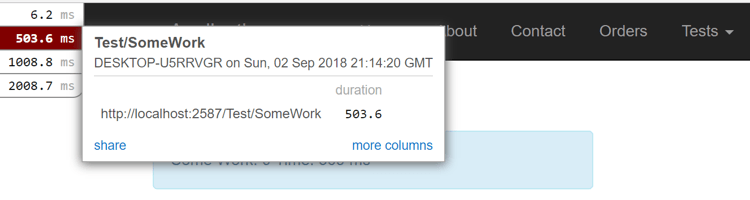
One popular tool is Miniprofiler - created by the fine folks at Stack Exchange to measure performance on sites like Stack Overflow. It comes as a NuGet Package you can simply install in your application. It measures performance and displays the results in a small overlay on your browser. Miniprofiler looks at the whole stack and makes it easy to spot bottlenecks, duplicate SQL queries, and excessive requests. Here’s a glimpse of Miniprofiler in action:

Miniprofiler

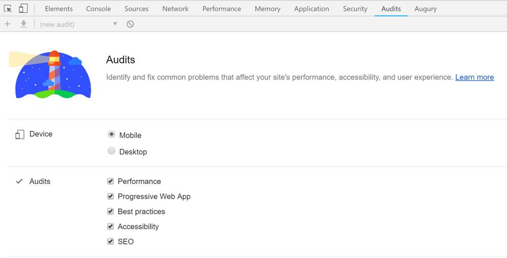
Chrome DevTools are also popular to examine individual requests in web apps. Besides network request monitoring, Chrome DevTools also come with several built-in performance profilers and audit tools. One of the newer audit tools is on the Audits panel in Chrome DevTools. You can run a battery of different performance tests against your site and Google will give you helpful hints on how you can improve performance.

Audits in Chrome DevTools

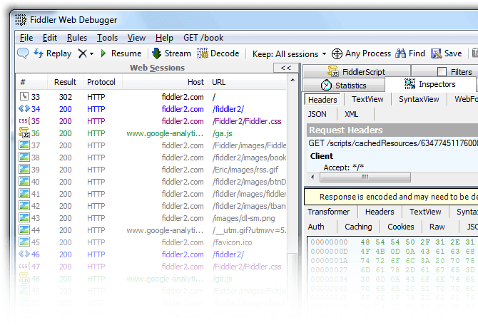
And of course, there is Fiddler - the de-facto tool to monitor your web app’s network layer. In addition to monitoring network traffic, Fiddler will generate statistics that help you find bottlenecks in your application. It also allows for web session manipulation, HTTP/HTTPS traffic recording and web content debugging from any device. Bottom line: Fiddler is here to help, why not use it?

Telerik Fiddler

While measuring individual performance is important, you also need to measure aggregate performance. There are classes of performance issues that only appear while the application is under load. The best way to get data about how your whole application running is to use an Application Performance Monitoring (APM) tool. There are many different APM tools on the market - popular ones include New Relic and Application Insights. Application Insights, being a Microsoft product integrated in the stack, is especially useful for ASP.NET applications.

Because you can always make your applications faster, there is a risk of getting sucked into a rabbit hole with performance tuning. Performance needs to be balanced with other development goals and app features. A good goal for any application is to never make the user wait for more than a second for any action. Optimizations of less than a second seem imperceptible to users, while anything over ten seconds should be immediately remediated. If you can’t get a specific action under a second, one thing to consider is making it asynchronous - give the user back control of the app and notify them when the task is finished.

Performance Tips

Bundling and Minification

In modern web apps, the amount of CSS and JavaScript required to make a webpage functional can be astounding. An easy way to reduce that burden is to minify and bundle all CSS/JavaScript/other static assets. Minification works on normal human readable code files to remove all whitespace and shorten variable names - thus resulting in a much smaller file size. Bundling combines several files into a single resource - thus reducing the overhead of simultaneous connections between server-browser to send lots of files over the wire. Combined, these two tactics vastly enhance client-server communications and speed up web apps. Modern well-architected UI frameworks like Telerik UI for ASP.NET MVC or Telerik UI for ASP.NET Core, powered by Kendo UI, will do many of these performance optimizations automatically.

In ASP.NET web applications, client-side architectures tend to come in two flavors. The first involves doing more server-side and pushing Razor views to the client. You may be using some libraries to provide client-side validations or some Ajax functionality, but JavaScript is the icing on the cake - not the main driver. The second approach is where you use a SPA framework like React, Angular, or Vue to do much more computing on the client side. ASP.NET is happy to step back and allow Web API to serve up data from the server side - you let the SPA frameworks do the heavy lifting with JavaScript in the client browser.

Both of these architectural styles are valid and there are different tools for handling each of them. If you are using a SPA framework or have lots of files to deliver client-side, you should be looking to use a client-side bundling tool like Webpack to package your CSS and JavaScript.

Webpack is a tool that takes a variety of different static assets and bundles them for you. Webpack has many loaders that can process different types of files, and also has advanced features that can help you optimize your assets. One example is tree shaking - Webpack can look through your JavaScript files and remove functions that you aren’t using in your code, resulting in a much smaller bundle.

While Webpack is an amazing tool, it can be a bit of a pain to setup. Each type of client-side asset requires a specific loader and there’s usually several similar looking ones to choose from. To shorten your path to success, using a CLI tool or template may be recommended. Most modern JavaScript frameworks come with CLI tools that can scaffold a basic template - which either abstracts away your Webpack setup (like Angular CLI) or does it for you (like the newly updated Create React App). Regardless, you’ll have a working app with proper bundling in a short amount of time, that includes the best practices for your particular framework.

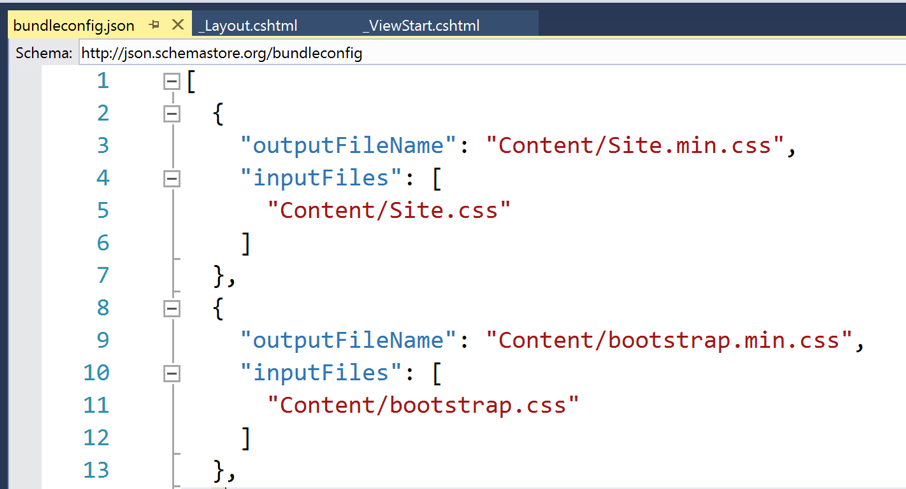
Microsoft also has some fantastic SPA templates you can use for a simple applications. If you aren’t building a SPA and only have a few JavaScript files, your best bet is to use the BuildBundlerMinifier tool. This tool is a NuGet package you can install and it will bundle your assets at build time. It’s relatively easy to setup - you create a json config file that points to your asset folders and you define the output destination for those assets. Here’s what a sample bundle config file may look like:

Sample configuration in Visual Studio

CSS Preprocessing

CSS is what styles your web apps. While plain CSS can be powerful, you should consider using a preprocessor like LESS or SASS - it does give you superpowers, while maintaining compatibility. And once you start using a bundling tool, you can use it to make your own custom bundles of CSS. In addition to making it easier to build larger stylesheets, you can use these preprocessors to reduce your CSS package size. Most serious CSS developers end up using a frontend library like Bootstrap, Foundation, or Material Design. You are, however, likely not using all the features and controls in those libraries. If you’re using a preprocessor, you can build your own custom distribution and comment out all the stuff you aren’t using. This reduces your bundle size while allowing you to easily include those controls if you want to use them later.

Compression

While minifying your JavaScript and CSS files will reduce the amount of data going over the wire, that’s not the only place you can save time. Most browsers support GZIP compression, which lets you compress your files before transporting them between server and client. ASP.NET Core will automatically compress certain file types, but not everything - for example, the content of JSON results isn’t compressed. If you’re building a SPA web application, use the Response Compression middleware to get additional compression to save on significant bandwidth.

Caching

Regardless of how small individual network requests get, nothing is faster than not using the network at all and grabbing content out of the cache. Caching is an essential part of the performance enhancement for most web apps, and done well, can lead to a wonderfully optimized user experience. ASP.NET has several different types of caching, depending on what part of the stack you’re trying to optimize and how you want to store your data.

Caching in ASP.NET Core can be divided into two categories. The first category is data caching - mostly used for backend processing. This is where we cache data in memory or a distributed cache, like a Redis or SQL Server instance. This type of caching is appropriate for saving the results of frequently accessed database queries or storing complex calculations.

The second type of cache is the response cache - mostly used client side. Response caching controls the way HTTP network requests are cached by the client’s browser. This type of caching is useful for files that don’t regularly change like JavaScript, images, and CSS. ASP.NET includes middleware and Controller Action attributes that allow you to customize the response cache headers. While response caching can help with certain files, you don’t want to use it everywhere. Requests that require fresh data and requests that rely on user identity are not good candidates for response caching.

Another way to employ response caching is to use a Content Delivery Network (CDN). Powered by cloud infrastructure providers, CDNs specialize in fast delivery of static assets - through distributed nodes across the world. You are essentially delivering content from as close to the user as possible, thus cutting down on network latency.

Many web apps built with ASP.NET rely on third party libraries - and turns out, most of these libraries are already available from popular CDNs. There’s a high likelihood that your user has already downloaded that library from a nearby CDN for another site they’ve visited - why not reuse? This is especially true for common libraries like jQuery or Bootstrap, or Node module dependencies for SPA frameworks. When using a CDN version of third party libraries, you should, however, keep a fallback version in case the CDN location no longer works or you need a fresh copy. You can do this using the script TagHelper in ASP.NET Core - here are some example script tags for common JavaScript libraries:

<script src="https://ajax.aspnetcdn.com/ajax/jquery/jquery-2.2.0.min.js"
        asp-fallback-src="~/lib/jquery/dist/jquery.min.js"
        asp-fallback-test="window.jQuery"
        crossorigin="anonymous"
        integrity="sha384-K+ctZQ+LL8q6tP7I94W+qzQs... />
</script>
<script src="https://ajax.aspnetcdn.com/ajax/bootstrap/3.3.7/bootstrap.min.js"
        asp-fallback-src="~/lib/bootstrap/dist/js/bootstrap.min.js"
        asp-fallback-test="window.jQuery && window.jQuery.fn && window.jQuery.fn.modal"
        crossorigin="anonymous"
        integrity="sha384-TcIQib027qvyjSMfHjOMaLkf... />
</script>
<script src="~/js/site.min.js" asp-append-version="true"></script>

You can also host your own CDNs. Microsoft Azure, for example, has CDN service that is easy to set up - one you can pair with your web application or Azure storage bucket. AWS and other cloud providers have similar CDN services as well. Bottom line, use CDNs to reduce network latencies and meet the user closer to their geographic locations, thus speeding up your web apps.

Make Your Apps Faster Today

Performance can be a complex beast - modern web applications have dozens of moving parts that can create performance bottlenecks. ASP.NET Core has many tools to help you though. From measurement tools like Miniprofiler to middleware and helpful TagHelpers, there’s no shortage of tricks you can use to make your applications go faster.

If you don’t know where to start, begin with measurement. Get Miniprofiler or Application Insights running on your application and start hunting for bottlenecks. From there, let the data guide you. Find the biggest bottleneck you can fix and get to work. Cheers to faster web apps that delight users.

Telerik Reporting and PDF/A: The Favorite Document Format of Future Archaeologists

$
0
0

Telerik Reporting now supports PDF/A-3, the latest version of the advanced archival file format, to make it easier for you to safely archive all your reports.

The current archaeologist must bother with palm leaves, papyruses, parchments, clay tablets and of course everyone’s favorite, stone tablets. Up until recently our civilization generated huge piles of paper documents, microfilms and microfiches for archival purposes. All those documents must then be classified, managed and stored by trained personnel in storage facilities with climate-control for undetermined periods of time.

It seems like we’re finally moving away from that archival craziness to more planet-friendly, convenient and cost-effective digital archival formats. Initially this was TIFF raster image format, and now the more advanced PDF/A.

The PDF/A ISO standard started development in 2002 by a committee of industry associations, public authorities, library specialists and businesses around the world. The result is a self-containing document format for electronic documents in a manner that keeps their visual appearance and viewer compatibility over long periods of time (centuries).

The first version PDF/A-1, was introduced on October 2005, with the (lengthy) official designation of "ISO 19005-1:2005. Document management – Electronic document file format for longterm preservation – Part 1: Use of PDF 1.4 (PDF/A-1)." In the years that followed two new PDF/A formats were introduced: PDF/A-2 in 2011 and PDF/A-3 in 2012.

What makes PDF/A better then plain old PDF for document archival purposes? In general PDF/A forbids PDF functions that impede effective long-term archiving. Here is a list of some of the prohibited PDF features:

  • Document encryption with passwords
  • Embedded video and audio
  • JavaScript and some actions that may alter the documents

In addition, the format adds some requirements to guarantee reliable reproduction:

  • All required fonts or at least the glyphs must be embedded in the document
  • The color information must be in a platform-independent format with ICC color profiles
  • XMP metadata

Given its usefulness and growing popularity, we added PDF/A support to the Telerik Reporting PDF rendering extension in the R3 2018 release. Telerik Reporting now supports PDF/A-1b, PDF/A-2b and PDF/A-3b. The archival format is enabled with a single device setting called ComplianceLevel that accepts the desired format as string value. This is shown in the following application configuration example:

Telerik Reporting ComplianceLevel Configuration

It’s that easy to start rendering the Telerik Reporting PDF documents with PDF/A compliance level. Thus, future generations can marvel at our tax declarations.

Try it Out and Share Feedback

We want to know what you think—you can download a free trial of Telerik Reporting or Telerik Report Server today and share your thoughts in our Feedback Portal, or right in the comments below.

Start your trial today: Reporting TrialReport Server Trial

Tried DevCraft?

You can get Reporting and Report Server with Telerik DevCraft. Make sure you’ve downloaded a trial or learn more about DevCraft bundles. DevCraft gives you access to all our toolsets, allowing you to say “no” to ugly apps for the desktop, web, or mobile.

Microsoft Joins the Open Innovation Network: What You Need to Know

$
0
0

Microsoft announced this week it is joining the Open Invention Network (OIN), a community dedicated to protecting Linux and other open source software programs from patent risks. The company will be bringing more than 60,000 issued patents to OIN. But what does that mean to you as a developer?

Before the announcement, I wasn’t aware of OIN, which is not surprising given my roots in the Microsoft space. Launched in 2005, OIN is a “shared defensive patent pool with the mission to protect Linux.” It boasts more than 2,650 members including Google, IBM, NEC, Philips, Red Hat, Sony, Toyota, SpaceX and more and it owns more than 1,300 global patents and applications. The OIN patent license and member cross-licenses are available royalty-free to any party that joins the OIN community.

While Microsoft itself says the move might be surprising to some, if you were reading the proverbial tea leaves (in this case, their Azure offerings and .NET Core) you might not be all that shocked.

In the corporate blog post announcing the move, Microsoft said it believes that developers do not want a binary choice between Windows and Linux or .NET and Java. They believe that developers want a cloud platform (in this case, Azure) that supports all technologies. .NET Core, an open source development platform maintained by Microsoft and the .NET community on GitHub, is the cross-platform framework that developers can use to build for Windows, macOS and Linux and deploy to devices, the cloud or embedded/IoT scenarios. Put the two together and it makes sense that Microsoft would want to be part of a group that practices patent non-aggression in core open source technologies by cross-licensing Linux System patents to one another on a royalty-free basis.

My understanding is that Microsoft’s 60,000+ patents - many of which are centered around the Android ecosystem - will fall under the member cross-license utilization agreement. What this means is that Microsoft is forgoing potentially massive amounts of revenue in royalties. An example that Jason Evangelho used in his article with Forbes is Samsung. Currently Samsung pays a royalty to Microsoft for every phone it ships (think about that for a second) in exchange for using Microsoft’s exFAT file system. That’s just one example, extrapolate from here and imagine the potential money involved.

As a developer, if you are creating or want to create applications to run on Linux, you suddenly have a massive amount of IP that is at your disposal, royalty-free and with an unrestricted license.

Microsoft has said it (and I’ve quoted this before) – “it’s definitely not your grandpa/grandma’s Microsoft”. They are backing up that assertion time and time again with their commitment to open source not just in words but with actions.

What are your thoughts? Was this a good move? How do you see it impacting the developer space? Share your thoughts in the comments below. And if you want to learn more about our own open source offerings, don't forget you can check them out right here.

Navigating Easily in PDF Documents with New Bookmarks Support in RadPdfViewer for WPF

$
0
0
Our Telerik UI for WPF suite now supports visualization of PDF bookmarks. Learn more about PDF bookmarks and how the end-users of your applications will benefit by quickly identifying the desired content and navigating with ease in PDF documents.

With the R3 2018 release we are happy to announce the support of PDF bookmarks in RadPdfViewer, part of the Telerik UI for WPF suite. Bookmarks are represented as a visual table-of-contents and are visualized on document load when there are any present in the document. Bookmarks provide a much better user experience navigating large PDF documents by pointing to a targeted destination on click. Also, you can use the “Find current bookmark” functionality which conveniently selects the bookmark that is currently in the view. An example can be seen below:
 
RadPdfViewer-Bookmars

 
Bookmarks UI Components

PDF bookmarks are visualized in RadPdfViewer using the RadPdfViewerNavigationPane. This is a control representing an area which can display different panels, including bookmarks. It is designed to be extended in the future and contain other document-level navigation features, such as thumbnails or attachments. The RadPdfViewerNavigationPane exposes the PaneWidth property which sets the initial value of the pane’s width. The end-users can resize the pane’s width by dragging the splitter resided on the right side of the control. 

<Grid>
    <Grid.ColumnDefinitions>
        <ColumnDefinitionWidth="Auto"/>
        <ColumnDefinition/>
    </Grid.ColumnDefinitions>
    <telerik:RadPdfViewerNavigationPaneRadPdfViewer="{Binding ElementName=pdfViewer, Mode=OneTime}"PaneWidth="300"/>
    <telerik:RadPdfViewerGrid.Column="1"x:Name="pdfViewer"DataContext="{Binding ElementName=pdfViewer, Path=CommandDescriptors}"/>
</Grid>

Commands

The following commands are available in the RadPdfViewer.CommandDescriptors property. They are executed when the end-users interact with the bookmarks panel:

  • ActivateBookmarkItemCommand – It’s executed when an end-user clicks on a bookmark item. As a result the RadPdfViewer “jumps” to the destination in the PDF document or invokes a link pointing to a web resource. 
  • SyncCurrentBookmarkItemCommand – Finds the bookmark item related to the RadPdfViewer’s current page and marks it as selected in the UI. We are proud with our sync-to-current bookmark implementation, since it resembles the behavior of one of the big vendors of the market for PDF viewers but performs more than 20 times faster for large documents. For example, documents containing 5000 bookmarks are synced with RadPdfViewer for approximately half of a second. The RadTreeView control integrated in the bookmarks panel plays a key role in the improved performance. Moreover, our sync selects the most nested bookmark item related to the current page. This nuance in the behavior is very useful when navigating in documents with deeply nested bookmark hierarchies and is not implemented by all PDF Viewers supporting the functionality, especially with this exceptional performance.

The commands can be invoked from code as follows: 

this.pdfViewer.CommandDescriptors.SyncCurrentBookmarkItemCommandDescriptor.Command.Execute(null);

PDF Document Preferences

The PDF model defines certain document preferences which determine how the bookmarks should be displayed. These preferences are included in the document, when it is created or modified, and apply each time it is rendered in the viewer. For example, a preference for the bookmarks panel can be set to be initially expanded or collapsed after the document is loaded, or a preference defining the styling of the bookmarks item text can be defined. With the support of PDF bookmarks in Telerik UI for WPF the following properties are added:

Document Page Mode

This property of the RadFixedDocument class specifies how the document should be initially displayed when opened:

  • UseNone – Specifies that the bookmarks panel should be collapsed by default.
  • UseBookmarks – Specifies that the bookmarks panel should be expanded by default.

Bookmark Text Style 

This property of the BookmarkItem class specifies the style characteristics for displaying the bookmark text. The available options are:

  • Normal 
  • Italic 
  • Bold

Bookmarks text style

Themes

The bookmarks panel is integrated with all themes provided by the Telerik UI for WPF suite. This includes the newly introduced Crystal theme which brings the Mac OS look and feel to your WPF apps. As with our other recent WPF themes, you can easily customize the theme colors to suit your taste with the Color Theme Generator for WPF.

What’s Coming Next 

We are working hard to deliver the support for bookmarks in Telerik UI for Winforms suite for the next R1 2019 release, expected at the beginning of the next year. You can find more information about what is coming in 2019 in the Telerik UI for WPF Roadmap and Telerik UI for Winforms Roadmap

If you are new to Telerik UI for WPF, or this is the first time you are hearing about the suite, you can check out the webpages for WPF, download a trial to try them out for yourself and visit the documentation to get a hang of how they work.

Introducing the Crystal Theme for WPF and WinForms—Get Started in Minutes

$
0
0

Are you a “die-hard” Apple macOS Sierra fan? Have you ever wondered if you can build a WPF or WinForms application that has a similar look and feel? Now you can build a Mac-like user interface in minutes.

Our Mac-Inspired theme is now available as a part of the latest release of Telerik UI for WPF and WinForms. This post will walk you through how easy it is to use it in your applications, plus you'll get a sneak peek at the numerous customization opportunities that come with it.

Building WPF Applications with the Crystal Theme

As a UI components vendor, it is our goal to continuously bring you new ways to modernize the look and feel of our your applications. Therefore, I’m excited to announce that it is finally here—the new, fully Mac-Inspired, Crystal theme.

ScheduleView

This clean and simple, yet popular and trendy design is now offered to you on only one condition—using our awesome controls :). You will not only find out that our interpretation of the theme is cut from the same cloth as the original, but that it also offers a large list of customization capabilities!

Like the previously announced themes for WPF, Crystal theme comes with options to change the default palette colors, depending on your needs—the easiest (and super handy) approach is to use our well-known Color Theme Generator.

Color Theme Generator for XAML

With this theme exposing all the properties of the MaterialAssist class, it’s a piece of cake to visually modify a control without needing to modifying its control template. I believe that there is no need to mention the support of custom CornerRadius, FocusThickness, ShadowDepth and much more. But what I certainly do need to mention is the WindowButtonsAlignment property. Yes, this one is a key feature to the theme’s design—you just write one line of code and the minimize, maximize, restore and close buttons of your windows are moved to the right:

CrystalPalette.Palette.WindowButtonsAlignment = ButtonsAlignment.Right;

Let’s move on to the real part—how to add this awesome theme to your WPF application?

If you are a fan of using implicit styles (like me), you only need to open an application and click on any Telerik Control in Design View. Then click on the Theme element and choose the "Crystal" theme from the available choices.

Theme selector NoXaml apps

Voilà! Now you have yourself a brand new modern WPF app, that uses the brand new Crystal theme!

RadBusyIndicator

And if StyleManager is your thing! It’s a breeze do use it, as well:

publicMainWindow()
{
    StyleManager.ApplicationTheme = newCrystalTheme();
    InitializeComponent();
}


If I've managed to endear Crystal theme to your hearts, feel free to dig deeper into its features by checking out the documentation here. In the meantime, you can check out how some of the most popular controls in WPF look in "Crystal" form:

GridView with Sticky Groups

RadRibbonView

RadImageEditor

Building WinForms Applications with the Crystal Theme

As I mentioned earlier, staying fresh and modern is important, so a new theme is a logical addition to the WinForms suite as well.

You can see the full brilliance of Crystal theme in the Theme Viewer tool or inside the WinForms demo application.

Theme viewer

To apply the Crystal theme to an existing WinForms application, just add a single line of code:

ThemeResolutionService.ApplicationThemeName = "Crystal";

If you decide to customize the theme the best way is to use the Visual Style Builder. This tool allows you to modify any setting of an existing theme.

Visual Style Builder

What makes this theme so different? As an addition to it, we have integrated Font Awesome. Yes, as part of our controls, you will now have access to more than 1300 free font glyphs, ready to be used just right out-of-the-box, no matter which theme you choose to use in your apps! There are three font variations included in the free version of font awesome: Solid, Regular and Brand. The following code shows how you can use Glyphs with RadLabel in your app:

this.radLabel1.LabelElement.CustomFont = "Font Awesome 5 Free Regular";
this.radLabel2.LabelElement.CustomFont = "Font Awesome 5 Free Solid";
this.radLabel3.LabelElement.CustomFont = "Font Awesome 5 Brands Regular";


The code snippet below consists of Unicode glyphs which can be copied from the Font Awesome's website:

this.radLabel1.Text = "\uF017 \uF4AD \uF0A4";
this.radLabel2.Text = "\uF1EB \uF0AD \uF19C";
this.radLabel3.Text = "\uF26B \uF293 \uF3B8";

Glyph icons

Try it Out Yourself and Share Your Feedback

Make sure to get the latest version and try out the new Crystal theme in Telerik UI for WPF and WinForms, and don’t be shy—share your feedback! You can use the comments section below or any of the Feedback Portals (WPF and WinForms).

Download a trial today: WPF WinForms

We are more than excited to hear what you think, so if you have any comments or suggestions, we are always here to answer all your questions :).

Check Out What's New: Telerik UI for WPF, WinForms and UWP R3 2018 SP

$
0
0

The R3 2018 Service Pack is now live, bringing you a wide range of improvements and cool features in the Telerik desktop product line – Telerik UI for WPF, WinForms and UWP.

To dive into the various improvements we made, feel free to start by checking out the release notes of the products:

Below, I wanted to introduce you to some of the highlights in this release.

Crystal Theme for WPF: Dark Variation

With the R3 2018 release of Telerik UI for WPF, just a month ago, we introduced a new, sleek looking, Mac OS inspired theme which we named Crystal (make sure to review this blog post all about the new theme for more info). Since the theme looks so awesome, today, we are adding dark variation of it so you have even more options to style your app. All you need to do is apply the theme and load the dark colors is just a single line of code:

//dark color variation
CrystalPalette.LoadPreset(CrystalPalette.ColorVariation.Dark);

Check out the look of some of the controls below:

Telerik Controls Dark Crystal Theme 1

Telerik Controls Dark Crystal Theme 2

Telerik Controls Dark Crystal Theme 3

We have included the new variation in the ColorThemeGenerator (as a reminder this is the tool we provide for viewing, creating and editing themes) for WPF as well, so you can check all other controls there and play around with the colors.

HeatMap for WPF: Custom Map Source

This new feature will allow you to customize the data fetching mechanism of the control in order significantly improve the performance when dealing with a huge amount of data (for example when you need to render millions of items). This can be achieved by overriding some newly exposed methods and implementing an interface. The following image demonstrates a HeatMap with 2000 rows and 2000 columns (4 million items) rendered. For more info check this help article.

Heatmap for Telerik UI for WPF

PdfViewer for WinForms: Bookmarks

Now, let’s switch gears to Telerik UI for WinForms. After introducing Bookmarks support in PdfViewer for WPF last month, it was only natural for us to make it available in RadPdfViewer for WinForms as well. Bookmarks or Outlines are a tree-structured hierarchy that the control presents as a visual table of contents separated from the actual content as a side panel. The Bookmark items allow users, by interacting with them, to navigate through parts of the document and/or invoke different actions. The control also exposes a convenient API for navigating and manipulating the bookmarks, detailed information is available in our documentation.

PdfViewer for Telerik UI for WinForms

UI for UWP

What I am very excited about when it comes to Telerik UI for UWP is the fact that we have made the necessary improvements to make it fully compatible with Windows 10 version 1809.

Share Your Feedback

Make sure to download and try the latest versions of Telerik UI for WPF, Winforms, UWP and explore all the new features and themes. They are already available for download in your account.

Or download a trial right here:

UI for WPFUI for Silverlight
UI for WinformsUI for UWP

We would love to hear what you think, so please drop a comment below sharing your thoughts. You can also visit our Feedback Portals about UI for WPF and Winforms and let us know if you have any suggestions or if you need any particular features/controls. As for the open source Telerik UI for UWP - feel free to check out the source code in our GitHub repo and make a contribution! :)

In case you missed our latest official release (R3 2018), you can find some of the major updates for WPF in my blog post, for UWP here and for Winforms in this blog post.

Null Values in Chart and Entry Selection in Telerik UI for Xamarin R3 2018 SP1

$
0
0

Check out all the latest updates in this Service Pack update to Telerik UI for Xamarin—null values in charts, selection in Entry and lots of improvements are here for Calendar, ListView and more.

Last month we published R3 2018 release of our Telerik UI for Xamarin suite with tons of goodies like scheduling capabilities in RadCalendar, financial and donut charts, expander, accordion, border, checkbox and new autocomplete control. Now, a month later the Service Pack is out featuring null values support in RadChart, selection in RadEntry and a ton of improvements across the suite.

Chart Null Value Support

With this service release, we have added null values support to our charting control. Now if the data source contains entries with null values, the chart will respect this and will not render anything, allowing the series to continue once valid values are available:

RadChart with null values

RadEntry Gets Selection Capabilities

We have also added an API to pre-select text within RadEntry. Use the CursorPosition and SelectionLength properties to control this.

this.radEntry1.CursorPosition = 13;
this.radEntry1.SelectionLenght = 8;

RadEntrySelection

These same APIs, can be conveniently utilized when you want to understand what the current selection is in the control.

In addition, based on your feedback we have made plenty of improvements to controls across the suite like Calendar, Chart, AutoCompleteView, DataGrid, DataForm, ListView, TreeView, MaskedInput, BusyIndicator.

Watch the R3 2018 Release Webinar

Did you watch the R3 2018 Release Webinar? Make sure not to miss all the updates, presented by our developer advocates Sam Basu (@samidip) and Ed Charbeneau (@EdCharbeneau).

Share Your Feedback

If you have not downloaded the release yet head our to your Telerik account or download a free trial to grab the bits and give them a try.

Start My Trial

We'd love to hear how this all works for you, so please let us know your thoughts by visiting our Feedback portal or by leaving a comment below.

New Crystal WPF Report Viewer Theme in Telerik Reporting and Report Server R3 2018 SP1

$
0
0

The Service Pack updates for the 2018 R3 release of Telerik Reporting and Telerik Report Server are live. They deliver the shiny new Crystal theme to the WPF report viewer, important design-time improvements and more.

WPF Report Viewer

After the Crystal theme was recently released by our friends on the Telerik UI for WPF team, we are catching up by introducing it in the Telerik Reporting product as well. As with the other UI themes, it is easy to apply it and modify it as desired. To be clear, we're currently introducing the light flavor of the Crystal them - the dark one is yet to come, as it only debuted this week with the SP release of the WPF suite.

Crystal Theme

Report Designer & DPI

Report Designer, either standalone or integrated into Visual Studio, is the tool you use most of the time while shaping your reports. Hi-res monitors are the devices of choice for more and more developers and designers, so we focused on improving the experience with high resolution devices.

The most valuable difference is apparent when using a pixel as a unit of measure for a report item and for the design-time grid and ruler. These pixel units are correctly interpreted as device-independent pixels (DIPs) later, when the reports get generated, just like web browsers treat them, but was incorrectly represented as physical pixels on the designer surface. The effect of the incorrect design behavior can be easily demoed instead of explained with the following screenshots:

Before (on 144 DPI)
Before DPI improvement

Now (on the same 144 DPI)
After the DPI improvement

To overcome this, we had to apply significant changes to the Unit structure, and while we were there we also refined the API reference so that it is clear which conversion and factory methods work with DIPs vs. physical (or device-dependent) pixels.

Other improvements on hi-res monitors arose from this change. The Table row and column handles got appropriate sizing, as did the Graph inner handles. Item overlapping detection got more precise because of the report generation precision, which is 0.01 mm. While on the Unit improvements, we changed its serialization, so that it does not emit too many digits after the decimal point. These excessive digits were not meaningful anyway, having in mind the runtime precision mentioned above.

Another designer improvement is a more suitable user warning and experience when searching for report types in the Visual Studio Report Designer and in the new report viewers item template wizards, so that users don’t get confused:

Build needed warning

Angular Report Viewer

We applied an important fix in the Angular report viewer dependencies. Because of the functionality introduced in R3 2018 of direct email for the end-user, we had to depend on the whole Kendo UI suite, which led to a big download footprint when utilizing the Angular viewer. Now, (thanks Kendo UI team!), the viewer has a significantly smaller subset of Kendo UI code as a dependency it carries.

Report Server

Revamped Scheduled Documents and Data Alerts were introduced in R3 2018 along with a new version of the REST APIs for managing the Report Server assets programmatically. The SP release further evolves the APIs, introducing endpoints for managing the report documents that the Scheduled Tasks & Data Alerts generate, so that, for example, you can delete older unnecessary ones.

Fixes

Multiple issues got addressed as well. For the full list of all these, please visit the respective release notes for Telerik Reporting and Telerik Report Server.

Try it Out and Share Feedback

We want to know what you think—you can download a free trial of Telerik Reporting or Telerik Report Server today and share your thoughts in our Feedback Portal, or right in the comments below.

Start your trial today: Reporting Trial Report Server Trial

Tried DevCraft?

You can get Reporting and Report Server with Telerik DevCraft. Make sure you’ve downloaded a trial or learn more about DevCraft bundles. DevCraft gives you access to all our toolsets, allowing you to say “no” to ugly apps for the desktop, web or mobile.

5 Data Reporting Pains Solved - Webinar Recap

$
0
0

Why should you consider a Reporting solution, and then how can you select the best one? We answered these questions and more in our latest Telerik Reporting webinar. Check out a recap and catch the recording below.

Whether you participated in, or missed, our recent Progress Telerik Reporting webinar, we hope that you will find this blog post helpful. We’ve provided a brief recap of the highlights along with on demand access to the recording below.

Senior Sales Engineer Richard Zaslaw hosted the 5 Data Reporting Pains Solved with Telerik Report Serverwebinar with a live Q & A session at the end. You can watch it below, and we’ve also posted the recording on the our YouTube channel, so you can watch it at your convenience.

Presentation Highlights

  • Why Consider a Reporting Solution?
    • Reporting as an economical alternative to BI platforms
  • Criteria for Choosing a Reporting Solution
  • Build Versus Buy: Developer Pain Points involved with implementing a custom solution
    • Developing a Report Designer to enable richly-styled, fully interactive report authoring
    • Empowering non-technical users to add/edit and publish reports with minimal developer intervention
    • Storing and managing reports and providing carefully controlled viewing access
    • Implementing a scheduling and delivery service for reports in requested export formats
    • Monitoring data changes and re-sending current, updated reports to concerned subscribers
  • Progress Telerik Reporting Solution
    • Telerik Reporting (Developer SDK)
    • Telerik Report Server

    See our related blog post: Telerik DevCraft Ultimate: A Flexible Solution for Reporting

  • Designing Telerik Reports
  • Accessing Telerik Reports
  • Telerik Report Server as a customizable, turn-key solution to solve key Developer Pain Points
  • Comprehensive 20+ minute functional demo of Report Server configuration and features
  • Telerik Report Server licensing model

Webinar Questions and Answers

We hosted a live Q & A during the final segment of the webinar. Here is a brief recap of some key questions that were covered:

Q: Does Report Server support multi-tenancy?
A: Multi-tenancy is on our long-term roadmap for inclusion in the Report Server. We can’t commit to an availability date at this time, but we’re working hard to bring this feature to you as soon as we can.

Q: How is testing and staging handled with the Report Server?
A: The Report Server license allows you to define your own staging needs. While the license includes only a single production deployment, you may setup development, QA, and pre-deployment instances, as needed, using that license.

Q: Do I need a Client Access License (CAL) for each user that views a Report?
A: You’ll need CAL for each user accessing the Report Server’s interface directly to view or edit Reports. If you also license Telerik Reporting (Developer SDK) and implement a ReportViewer in your integrated application that is connected to the Report Server as a back-end, those viewing reports within your app are considered anonymous users will not need a CAL.

Q: Is it faster to store Report Server data on the file system or in a database?
A: Due to baked-in optimization and indexing, storing the Report Server data in a database is usually faster.

Q: Do you have a roadmap for new features in Report Server?
A: Telerik Report Server - Roadmap

If you have an additional question that was not covered, feel free to tweet us using the hashtag, #HeyTelerik.

Thank You

As always, THANK YOU to everyone who joined us for the webinar, in person or via the recording.

Try it Out and Share Feedback

We want to know what you think. You can download a free trial of Telerik Reporting or Telerik Report Server today and share your thoughts in our Feedback Portal, or directly in the comments area below.

Start your trial today: Reporting TrialReport Server Trial

Tried DevCraft?

You can get Reporting and Report Server with Telerik DevCraft. Make sure you’ve downloaded a trial, or feel free to learn more about DevCraft bundles. DevCraft gives you access to all our toolsets, allowing you to say “no” to ugly apps for the desktop, web, or mobile.

Introducing MultiColumnComboBox in Telerik UI for WPF

$
0
0

I'd like to introduce you to the new MultiColumnComboBox in Telerik UI for WPF. This powerful control helps you show your users more information and can easily be sorted and filtered.

The newest addition to Telerik UI for WPF, the MultiColumnComboBox is a combination of the RadComboBox and RadGridView. It was designed to let you display more information to your users than a standard ComboBox, and comes with out-of-the-box filtering and sorting so that users can easily select the desired items.

Let’s say, for example, that you want to choose the best employee to handle a certain order that must be processed. You can easily bind the control to any IEnumerable by providing it with an implementation of the abstract ItemsSourceProvider class.

MultiColumnComboBox Overview

User-defined Columns

By using the GridViewItemsSourceProvider in addition to specifying the Columns collection, you can also apply a number of customizations such as enabling footers and defining custom styles for the grid’s rows.

<telerik:RadMultiColumnComboBoxDisplayMemberPath="LastName"
                                NullText="Select employee to handle the order..."
                                Width="300"
                                DropDownWidth="530"
                                DropDownHeight="255">
    <telerik:RadMultiColumnComboBox.ItemsSourceProvider>
        <telerik:GridViewItemsSourceProviderAutoGenerateColumns="False"ItemsSource="{Binding Employees}">
            <telerik:GridViewItemsSourceProvider.Columns>
                <telerik:GridViewDataColumnHeader="First Name"DataMemberBinding="{Binding FirstName}"/>
                <telerik:GridViewDataColumnHeader="Last Name"DataMemberBinding="{Binding LastName}"/>
                <telerik:GridViewDataColumnDataMemberBinding="{Binding City}"/>
                <telerik:GridViewDataColumnHeader="Hire Date"DataMemberBinding="{Binding HireDate}"/>
                <telerik:GridViewDataColumnHeader="Orders Count"DataMemberBinding="{Binding Orders.Count}"/>
            </telerik:GridViewItemsSourceProvider.Columns>
        </telerik:GridViewItemsSourceProvider>
    </telerik:RadMultiColumnComboBox.ItemsSourceProvider>
</telerik:RadMultiColumnComboBox>

The following figure illustrates the result from the code snippet above.

User-defined columns

You can use any of the column types you would use in an ordinary RadGridView control as well as define custom cell templates for them. This makes the number of possibilities for displaying your data practically infinite.

Just as with the other controls in our Telerik UI for WPF suite, the RadMultiColumnComboBox is highly customizable. It offers options for setting its watermark text, choosing which property of the bound objects should be displayed when items are selected, as well as the possibility of sizing its dropdown, to name a few.

Filtering

Now that you’ve displayed the data that is relevant for your users, they will also have the ability to filter the items based on their custom criteria. For the purpose of this blog post, let’s assume you want to display only the employees who have marked London as their city of residence. RadGridView’s familiar filtering control makes this filtering as easy as clicking on a checkbox.

Filtering the MultiColumnComboBox

Sorting

What if you want to choose the London employee who has the least amount of current orders to handle the order? A simple click on the “Orders Count” column sorts the RadGridView by the underlying integer property so that you can do just that.

Sorting the MultiColumnComboBox

Multiple Selection

And what happens if the order that needs to be handled requires multiple employees to work in collaboration? Luckily, the RadMultiColumnComboBox supports multiple selection. You only need to set its SelectionMode to Multiple.

Multiple Selection in the MultiColumnComboBox

Autocomplete

Last but not least, the control comes with 4 different autocomplete modes so that your users can easily find the data they’re looking for. Even if there are thousands of employees in your database, with only a few keystrokes you can find just the one you’re looking for.

Autocomplete in the MultiColumnComboBox

The image above demonstrates the default SuggestAppend mode. With it, when typing in a value the RadGridView will be filtered to display only items containing the searched value in one of the columns. The comparison is made using the StartsWith operator. In addition, if there is only one matching item, the text in the input box will be autocompleted to the matching value.

The Suggest and Append modes, in turn, offer only filtering of the items or autocompletion, respectively.

The Search mode, on the other hand, filters and highlights the data. There are two differences between this mode and the SuggestAppend mode. The first one is that the matched text is not appended to the input. Additionally, the Contains operator is used for the comparison of string properties while the IsEqualTo operator is used for comparing all other types as opposed to the StartsWith operator used in all other three autocomplete modes.

Search autocomplete mode in the MultiColumnComboBox

Share Your Feedback

To sum up, the RadMultiColumnComboBox makes selecting items from a large data source an easy task. Even though the control is in a beta version, you can already start using it to improve your users’ experience. If you have any questions or suggestions, don’t hesitate to contact us. You can post on our forum, propose improvements in our feedback portal, or just reach out in the comments below.

Feel free to check out our documentation to learn more about what the control can do. If you're new to Telerik UI for WPF, you can check out the suite here or jump right into a free 30 day trial today.

New Financial and Donut Series in Xamarin.Forms Charts

$
0
0

We have just added a number of new series to the charts available to you with Telerik UI for Xamarin, making it even easier to present financial and other data visually.

In this blog post I will introduce you to the recently released Donut and Financial series for the Pie and Cartesian Charts in Xamarin.Forms. Those of you who were impatient for the features to be included in the Xamarin.Forms offering are probably aware that up until the recent release you could have added such series directly in the native controls. However, each platform had its specific implementation details and unifying the API in Forms was a natural step in expanding the reach of Telerik UI for Xamarin.

Donut Series

First, let’s have a look at the Donut series and how they can be included in the Pie chart. They're actually pretty similar to the already available Pie Series, with the only difference being the element used for the visualization. The Donut series basically add an additional empty space inside the chart which can be controlled through the InnerRadiusFactor property. The image below shows the two series side by side for better comparison:

donut_pie_comparison

There is nothing new in the way you include the series to the Pie Chart as well – simply add them to the dedicated collection of the control:

<telerikChart:RadPieChart>
    <telerikChart:RadPieChart.BindingContext>
        <local:ViewModel/>
    </telerikChart:RadPieChart.BindingContext>
    <telerikChart:RadPieChart.Series>
        <telerikChart:DonutSeriesShowLabels="True"
                      InnerRadiusFactor="0.4"
                      ValueBinding="Value"
                      ItemsSource="{Binding Data}"/>
    </telerikChart:RadPieChart.Series>
</telerikChart:RadPieChart>

Based on your demand, we have included a couple of new series types within the Telerik UI for Xamarin Cartesian Chart as well – Candlestick and OHLC series. Furthermore, we have added some of the most popular financial indicators which you can use separately or in combination with the financial series. Below you can find some more information on the functionality these new elements grant you.

Financial Series

The financial series are specifically designed to provide information regarding a particular financial instrument such as stocks and the open, high, low and close values that it has at a specific time. Thus, the OHLC and Candlestick series require a collection of data points which have such values. Like any categorical series, both financial series need a category binding as well. The series are mainly used in a scenario with a numerical vertical axis and a horizontal date time axis in order to show the different values of the stock at a specific time.

As the saying goes “a picture is worth a thousand words” and in the financial world probably more than that :). Let’s visualize a scenario – suppose you would like to add information regarding the movement of Apple’s stock over a period of time - in this case we are going to show the data for less than a month. We are going to need a collection of points with the respective data for the different days:

publicclassOhlcDataPoint
{
publicdoubleOpen { get; set; }
publicdoubleHigh { get; set; }
publicdoubleLow { get; set; }
publicdoubleClose{ get; set; }
publicDateTime Category{ get; set; }
}

You can eventually create the collection which will hold the points and add the needed values. For example:

this.SeriesData = newObservableCollection<OhlcDataPoint>();
this.SeriesData.Add(newOhlcDataPoint() { High = 10, Open = 5, Low = 2, Close = 8, Category = newDateTime(1990,1,1)});
. . .

Add as many points as you want.

Here is how the CartesianChart is created:

<telerikChart:RadCartesianChartPaletteName="Light"
                  SelectionPaletteName="LightSelected"
                  BackgroundColor="White">
     <telerikChart:RadCartesianChart.BindingContext>
         <local:ViewModel/>
     </telerikChart:RadCartesianChart.BindingContext>
     <telerikChart:RadCartesianChart.HorizontalAxis>
         <telerikChart:DateTimeContinuousAxisLineColor="#A9A9A9"
                              LabelFitMode="Rotate"
                              LabelFormat="dd/MM"
                              PlotMode="BetweenTicks"
                              MajorStep="2"
                              MajorStepUnit="Day"/>
     </telerikChart:RadCartesianChart.HorizontalAxis>
     <telerikChart:RadCartesianChart.VerticalAxis>
         <telerikChart:NumericalAxisLineColor="#A9A9A9"
                         Minimum="320"
                         Maximum="350"
                         MajorTickBackgroundColor="#A9A9A9"/>
     </telerikChart:RadCartesianChart.VerticalAxis>
     <telerikChart:RadCartesianChart.Series>
         <telerikChart:OhlcSeriesCategoryBinding="Category"
                       DisplayName="AppleStocks-OHLC"
                       OpenBinding="Open"
                       HighBinding="High"
                       LowBinding="Low"
                       CloseBinding="Close"
                       ItemsSource="{Binding SeriesData}"/>
     </telerikChart:RadCartesianChart.Series>
</telerikChart:RadCartesianChart>

Those of you who have used the CartesianChart will notice that there is nothing special about the setup – just the type of series and data it uses is different.

And finally, the promised picture. Actually, let’s make it two – the first one shows the candlestick series on Android and the second shows the OHLC series on iOS.

ohlc_candlestick_blog
Let’s dissect the different visual elements:

financial_blog_2

On Android, the candlestick unit will be filled if the close value is higher than the open value - that is, if the stock went up. In iOS, the red color indicates that the stock went down.

Financial Indicators

The financial (or stock) indicators are mainly used for keeping track of stock prices and patterns of price changes over time. You can find more information about what indicators there are and what they are used for at this link.

In terms of using the indicators in RadCartesianChart, you will need to add them as you would add any other Cartesian series. Every indicator has a related formula by which it calculates the expected result. All you have to do is provide the needed data. Here is a snippet that shows a scenario of OHLC series and a couple of Exponential Moving Average indicators:

<telerikChart:RadCartesianChart.Series>
<telerikChart:OhlcSeries  CategoryBinding="Category"
                DisplayName="AppleStocks-OHLC"
                OpenBinding="Open"
                HighBinding="High"
                LowBinding="Low"
                CloseBinding="Close"
                ItemsSource="{Binding SeriesData}"/>
 
<telerikChart:ExponentialMovingAverageIndicator 
                              
CategoryBinding="Category"
       DisplayName="EMA 7days"
       ValueBinding="Close"
       Period="7"
       StrokeThickness="1"
       Stroke="DarkGreen"
       ItemsSource="{Binding SeriesData}"/>
 
<telerikChart:ExponentialMovingAverageIndicator
                          
CategoryBinding="Category"
   DisplayName="EMA 14days"
   
ValueBinding="Close"
   Period="14"
   StrokeThickness="1"
   Stroke="DarkOrange"
   ItemsSource="{Binding SeriesData}"/>
 
</telerikChart:RadCartesianChart.Series>

There are two types of indicators in terms of setting their properties and getting them ready for displaying your stock data:

Indicators that have a category and a value (usually the close one) bindings as well as one or more periods. Here are the available indicators:

  • OscillatorIndicator
  • RateOfChangeIndicator
  • RelativeStrengthIndexIndicator
  • TrixIndicator
  • WeightedMovingAverageIndicator
  • ExponentialMovingAverageIndicator
  • AdaptiveMovingAverageKaufmanIndicator
  • BollingerBandsIndicator
  • RelativeMomentumIndexIndicator
  • MacdIndicator

Indicators that have a category and high/low/close value bindings as well as one or more periods:

  • AverageTrueRangeIndicator
  • CommodityChannelIndexIndicator
  • StochasticFastIndicator
  • StochasticSlowIndicator
  • TrueRangeIndicator
  • UltimateOscillatorIndicator

The image below shows a simple scenario where a couple of Exponential Moving Average (EMA) indicators with different periods are added.

financial_series_blog

Have we caught your interest? Check out the available examples in the SDK Samples Browser and QSF applications where you can find various demos of the series and the financial indicators. 

Well, the above information should be sufficient to get you started with the financial and donut series. Of course, the world of finance and data visualization is quite a vast topic, so any feedback on the new additions is highly appreciated. If you would like us to add other indicators, expose behaviors which you believe will be helpful or have any other ideas, do not hesitate to share this information with us on our Telerik UI for Xamarin Feedback Portal.

Lastly, if you're new to Telerik UI for Xamarin, you can learn more about it here or dive right into a free 30 day trial today.

Blazor Q&A with Microsoft's Daniel Roth

$
0
0

Want to know more about the past, present and future of Blazor? We sat down with Microsoft's Daniel Roth to learn his thoughts. 

The Progress Telerik team has been really excited about Blazor since it was announced as an experimental project. Ed Charbeneau has written a number of blog posts about it (you can find them here) and our product and engineering teams have been experimenting with it.

We are hearing from all of you that you are interested as well, so we thought we'd sit down (virtually) with Daniel Roth, the Senior Program Manager at Microsoft responsible for Blazor, to learn more about the past, present and future of the project.

Here is a recap of our conversation.

Sara (SF): We're really excited to hear about Blazor and to have you share your thoughts with developers. Thanks for taking the time. Why don't we start at the beginning. Tell us a little about how Blazor came to be.

Daniel Roth (DR): Of course. Thanks for the opportunity. 

There has been a long-standing desire on the .NET team to improve the client-side experience for .NET web developers, but since browsers have historically only supported JavaScript there wasn’t really anything that we could do other than add another JavaScript framework into the already crowded ecosystem. That all changed when the WebAssembly community group announced that they had achieved cross-browser consensus, which opened the door to let other platforms run in the browser. Even then, no one was really sure if it made sense to try to support .NET on WebAssembly until Steve Sanderson built the first Blazor prototype as a demo for his NDC Oslo 2017 presentation on new browser capabilities. The experience Steve showed of building client-side web apps all in .NET was so slick that it opened a lot of people’s eyes to what is now possible.

SF: Very cool. I didn't realize it had been at NDC Oslo where he showed the demo. I'll have to go back and watch that. On the topic of WebAssembly, what do you think it provides that JavaScript or TypeScript doesn’t?

DR: For most application types (mobile, desktop, server, devices, etc.) you have a rich ecosystem of languages, frameworks, and tools that you can use as a developer. The big exception is the browser. Historically, browsers only supported running JavaScript. WebAssembly really changes that to make a much broader developer ecosystem available to web developers. If you can compile your code to WebAssembly then it can run in any modern browser and at native speed.

SF: That makes a lot of sense. Who wouldn't want that kind of performance and speed? So why is it that Blazor is considered “experimental?" 

DR: Blazor started as an experimental project because we weren’t sure how well it was going to work out to run .NET in the browser on WebAssembly and we didn’t know how compelling the user experience would be. We’ve learned a lot since the start of the experiment and Blazor now supports an enthusiastic community. There are still some technical challenges to work through, like performance, debugging, and download size, but we feel confident that they can all be addressed. We’ve already decided to move forward with productizing the Blazor UI component model in .NET Core 3.0 so that it can be run server-side with ASP.NET Core. The WebAssembly support though will need a bit more time to bake.

SF: Can you explain a little more about productizing the Blazor UI component model in .NET Core 3.0? Does that move make Blazor no longer "experimental?"

DR: Blazor is really made up of two parts: a component based UI framework and a WebAssembly based .NET runtime. Running Blazor on the server means that the components execute on the server on .NET Core while the UI is managed over a SignalR connection. You get to write your code using .NET and you still get the rich interactive feel of a browser-based application. Since the server-side Blazor model has no WebAssembly dependency we’ve decided to go ahead and productize the UI framework part of Blazor in of .NET Core 3.0. We are integrating the Blazor component model into ASP.NET Core, which is what we are now calling Razor Components. At the same time, we are continuing work on the client-side WebAssembly support, which will remain experimental for a while longer. The key thing is that we are keeping the component model the same whether you’re running on the server or the in the browser. The same components can be used on the server or in the browser assuming they were implemented with the appropriate abstractions.

SF: Nice. OK. So Razor Components are stateful UI components for the web that support a flexible hosting model?

DR: Exactly. You can host Razor Components in an ASP.NET Core app (for example, as a routable page or used from a Razor Page or MVC View) or you can host them directly in the browser via WebAssembly. Again, they are the productization of the Blazor component model in ASP.NET Core.

SF: Are existing (pre-Blazor) .NET assemblies compatible with Blazor?

DR: With Blazor you run ordinary .NET assemblies in the browser. Blazor supports .NET Standard, which is a standardize API surface area for all the different flavors of .NET (desktop, core, mobile). There are some limitations to the .NET Standard support in Blazor due to the browser sandbox. For example, you can’t open arbitrary files on the file system or make arbitrary network connections, just like you can’t from JavaScript. But for the most part .NET Standard libraries should “just work.”

SF: Since Blazor runs .NET in the browser, can Edge/Chrome developer tools be used to break/debug client-side code?

DR: We have some very early support today for debugging Blazor apps directly in the browser in Chrome. The way it works is we provide a debugging proxy service that augments the Chrome debugging protocol with .NET specific context. You can then use the browser dev tools to remotely connect to the browser instance you want to debug through the debugging proxy. This requires a couple of manual steps to setup today, but in the future, we plan to provide a tooling experience that enables browser debugging for you, like when you hit F5 in Visual Studio. We haven’t implemented debugging in Edge yet, but it would be a similar setup. The nice thing about this setup is that in addition to debugging your .NET code you can also step into any JavaScript code that you might be using through JavaScript interop. There’s still quite a bit of work to be done though to make the experience really feel like a normal .NET debugging experience, but it’s something we’re working on.

Alternatively, you can host your Blazor app server-side and then normal .NET debugging works like it would for any existing .NET application. Many Blazor users tell us that they use the server-side model during development so that they can debug with the intent to later run the app client-side on WebAssembly. It’s another good example of the benefits of having a flexible hosting model.

SF: Can the Blazor framework be used to build desktop apps?

DR: Our primary focus with Blazor is building web apps, but we have tried out using Blazor with Electron to build cross-platform desktop apps. We prototyped using Blazor in a .NET Core process to drive the UI of an Electron app over an IPC channel, and it worked well. You can find a sample using this model on our Blazor community page. It’s still just a prototype though and we don’t know at this point if it’s a direction that we will pursue.

SF:  You've mentioned the Blazor community several times now. Talk to me a little more about that.

DR: The Blazor community is one of my favorite parts of working on the Blazor project. They are a passionate and helpful bunch! Lots of community projects have sprung up around Blazor to provide component libraries, helper libraries, JavaScript interop libraries, tools, and a bunch of fun sample apps. We try our best to share these projects on the Blazor community page. The Blazor Gitter chat room is also a great place to hang out if you have a Blazor related question or you just want to chat about the future of web development with .NET.

SF: What kinds of projects and apps have they created? Are there any that really stick out?

DR: The Blazor community has been enthusiastically building out a variety of fun sample apps using Blazor. They’ve built Markdown editors, to-do lists, calculators, Twitter clones, chat apps, and a whole bunch of simple games, like Asteroids, Tetris, etc. You can find these apps listed on our Blazor community page.

We also regularly get pinged by customers both internal and external to Microsoft that are experimenting with Blazor for potential production scenarios. One interesting scenario is the Try.NET site. Try.NET lets you write some .NET code in browser and then run it. Currently Try.NET compiles and executes your code on the server, but they are investigating if they can use Blazor to instead build and run your code directly in the browser.

SF: Now for a few more personal questions :-). What is your favorite thing about Blazor?

DR: My favorite thing about Blazor is that I get to write web apps using my “native” language for writing code. I get to use the tools, languages, and libraries that I am familiar with, which makes me more productive. It’s not that I don’t like JavaScript; the JavaScript community has done some phenomenal stuff. But working with .NET and C# is what I’m most comfortable and productive with. I also really like how developing with one platform lets me share and reuse code; no need to reimplement stuff twice in a completely different platform.

At the same time, I think Blazor has a lot to offer even if you’re not already familiar with .NET. Blazor gives you a simple and intuitive UI component model with great tooling all built on .NET, which is a stable and mature platform. I really like how Blazor helps me get started fast and lets me focus on building my app. When you combine Blazor with a fast and secure ASP.NET Core backend I think you’ve got a winning solution.

SF: It's really hard to argue with that. One last question... Looking into the Magic 8 Ball, what is the future of Blazor?

DR: “Outlook good”. In the relative short-term the Blazor component model, or Razor Components, will become an integral part of how you write web UI with ASP.NET Core, enabling you to write rich interactive web apps without having to write a lot of JavaScript. Further in the future I expect that .NET will join a rich developer ecosystem of languages and tools that can be used for client-side web development, making building web apps easier and more productive than it has ever been before.

SF: Thank you so much for your time and insight, Daniel. We can't wait to see what the future holds!

Telerik UI for WinForms Demo App Revamped with Fluent Design & High DPI Support

$
0
0

The Demo App for Telerik UI for WinForms has just received a major update, and now features the modern Fluent design and support for high DPI. Check out the demo and try it out.

Back in May 2017 at Build, Microsoft announced the Fluent Design System. The promise was to bring a more intuitive and easy-to-use interface to be the successor of Microsoft’s Metro design, and it focuses on light, motion, material and scale elements to make interactions more coherent with the user interface. After we officially introduced the Fluent theme for the Telerik UI for WinForms suite back in R1 2018, the next logical step was to modernize our existing Demo Application. In R3 2018 we devoted a lot of effort to this, and have completely redesigned the shell of the well-known Demo App.

Metro-inspired vs. Fluent-inspired Demo App
OldvsNew

The app now has an awesome new design naturally inspired by the latest design threads around Fluent. It also supports high DPI to enable automatic resizing of the containers and their hosted controls when the application is run on higher than 100% DPI scaling. The new Demo App offers a cool “hamburger” menu for easier navigation and a dark mode as well for the fans of the “dark side.”

dark

Apart from bringing in the latest UI and UX paradigms, the Demo App can also serve the purpose of an example for achieving an auto-sizing layout. This is extremely important when your application scales under higher DPI.

DemoFluent

On the right side there is a themes panel which allows you to completely change the design of the currently opened example by applying the selected theme to it. You will probably notice the new Crystal theme at the top, which is a Mac OS-inspired theme, delivering that well-known look and feel to your application.  It is the latest addition to our themes pack. One of our commitments as a UI components vendor is to always bring new beautiful theming options for your desktop applications.  Go ahead and test it by downloading the all-new Demo Application now or inside the ThemeViewer tool.

Try It Out and Share Your Feedback

You can learn more about the Telerik UI for WinForms suite via the product page. It comes with a 30-day free trial, giving you some time to explore the toolkit and consider using it for your current or upcoming WinForms development.

Lastly, we would love to hear what you think, so should you have any questions and/or comments, please share them to our Feedback Portal or in the comment section below.

Why XAML? Why Now?

$
0
0

XAML is dead. No wait - Long live XAML. XAML (Extensible Application Markup Language) started life as a simple thin UI markup layer, but has had a surprisingly eventful history. Developers on Microsoft's technology stack have been witnesses to XAML’s phenomenal rise as well as its teetering on the edge of life support.

Turns out, XAML may be much loved or much hated, but has clearly stood the test of time. Over years, no one team at Microsoft owned XAML - it was meant to be a descriptive markup UI language to define visual trees for apps. So, several technologies adopted XAML and gave it character and unique dialects. Today, XAML stands strong powering various app platforms, sports rich tooling support and potentially has a very bright future. This article explores what XAML can power today with an eye out for what the future holds in store.

Desktop

Windows Presentation Foundation (WPF)

The holy grail of Desktop development on Windows today is still WPF - which is where XAML started life. Over the years, XAML has always been the UI layer for WPF apps and has enjoyed rich tooling support. One might argue that much of XAML’s feature richness and ease of use stems from WPF. Both Microsoft and the developer community stepped up to make XAML/C# development a wonderful experience for developers. With code intellisense and design tools like Blend, the UI definition layer for WPF apps continues to be the gold standard for XAML development.

Universal Windows Platform

Starting from Windows 8 and after several iterations, Microsoft finally landed on UWP - the de facto way of building forward-looking apps for Windows. And sure enough, the UI layer is powered by XAML, albeit a slightly different dialect than WPF uses. XAML powering UWP apps is a big deal for developers comfortable with the markup language - primarily because of UWP’s reach. UWP can power apps on every modern Windows device, from tablets, laptops and desktops to XBoxes, Surface Hubs and the HoloLens. Developers get to define their UI in XAML and it simply works across all form factors.

While this sounds magical, the reality takes a bit of work to adjust layouts with a fluid UI for various device sizes - but it is all XAML under the covers. And UWP’s device flexibility means XAML sports rich features like responsive layouts, advanced touch support and inking capabilities.

Mobile

Xamarin.Forms

Being able to reach all Windows devices with XAML was nice, but no one lives in a platform silo. For mobile form factors, iOS/Android rule - .NET developers needed a bridge to carry their skills cross platform. Enter Xamarin.Forms. With a shared abstracted UI layer, developers can share not only business logic but UI definition as well - all towards building truly native cross-platform apps. And the choice for abstracted UI definition? Yep, XAML - a special dialect of it catered for mobile app development.

Xamarin.Forms XAML did something wonderful - relieving .NET developers from having to learn the intricacies of native platform UI. Developers get to define the UI visual tree in XAML and the runtime turns around to render corresponding native UI components on each platform. Modern Xamarin.Forms development provides rich tooling for XAML development - like Forms Previewer, Inspector and Profiler.

Uno

Is Xamarin.Forms XAML not quite your cup of tea? Turns out, a few smart folks from Montreal Canada are with you - and they love UWP XAML. Enter Uno - now an open source UI abstraction library that creates bridges to iOS and Android from XAML. Uno’s application runtime is powered by Mono and Xamarin - developers simply get to use UWP XAML, instead of the Xamarin.Forms head. This was no small effort since the corresponding native UI is being rendered on each platform. It's all worth it just for the love of UWP XAML.

NativeScript

A lot of enterprises that have traditionally had a full .NET technology stack, now power their web app frontends with SPA frameworks - like Angular, React or Vue. Most modern .NET developers aren’t shy about writing JavaScript, CSS and HTML. And if web technologies are what’s powering your apps, then JavaScript Native apps are rather enticing as a mobile strategy. Developers get to reuse web technologies to power truly native cross-platform mobile apps - and potentially share code between web and mobile.

NativeScript is an open source framework for building JS Native mobile apps. Developers get to write straight up JavaScript or TypeScript with Angular for the app’s business logic. And the abstracted UI layer is defined in XML - a JS bridge renders corresponding native UI at runtime. While officially XML, let’s take a look at standard UI definitions in NativeScript - look familiar? Yup, that’s almost XAML, and .NET developers with any XAML experience will be perfectly at home here.

Web

Microsoft Silverlight

XAML powering apps on the web browser has had a checkered past. Understandably, .NET developers who did Silverlight are still hurt - it is never a good situation when technologies die and take down investments. The web has simply moved away from the Plugins model and Silverlight saw the writing on the wall. Folks who did Silverlight development though were actually quite fond of the developer experience - XAML/C# was beautiful in the browser and the rich tooling helped. There may be some longingness to see XAML back on the web - but done with better architecture.

WebAssembly

WebAssembly

Enter WebAssembly - a low level instruction format that modern evergreen browsers can execute natively, just like JavaScript engines execute JS code. Being an open web standard, WebAssembly is enjoying support from big browser vendors, with promises of security and native execution speeds. The biggest draw of WebAssembly is the promise of compiling code written in higher level languages into stack-based instructions that browsers run natively - this opens a lot of doors.

Mono

mono

Mono has been around since the early days of the .NET Framework, as a popular port of .NET APIs to platforms outside of Windows. Over the years, Mono has matured to provide a large API surface area and .NET API mappings on other platforms like Mac/Linux, thus enabling .NET apps to step outside of Windows. Mono continues to power all of Xamarin - it is clearly the easiest way to take .NET code and run it on iOS/Android.

Turns out, folks at Mono are plenty smart and work is underway to bring Mono to the WebAssembly platform. This has the wonderful potential of compiling C# code down to WebAssembly that the browsers can execute natively, Hallelujah! This is exactly what’s powering Blazor - the experimental ASP.NET web framework promising to bring C# to the browser with Razor syntax. While the present Mono support for WebAssembly may be through Mono IL interpreter to run managed code at runtime, support for full static Ahead Of Time (AOT) compilation isn’t far away. This should lead to excellent performance of C# code on the browser.

With C# coming to browser natively, it didn’t take long for XAML afficianados to demand the UI abstraction layer back - this time, done through WebAssembly instead of using a Plugin. While experimental, it turns out both Xamarin.Forms and UWP XAML can already power web apps in the browser through WebAssembly.

Meet Ooui - a small cross-platform UI library that brings the simplicity of native UI development to the web. Ooui.Forms provides Xamarin.Forms renderers for the web with a shadow DOM powering the front-end app - it can be hosted by itself or as a part of ASP.NET Core. There are several online samples to play around with and see the fun of having XAML back in the browser. Also, Ooui.Wasm allows for packaging Xamarin.Forms apps with XAML UI markup into a WebAssembly runtime. It is nice to see a Xamarin.Forms apps, compiled statically and hosted on Amazon S3, running purely as WebAssembly on the browser.

Not to be left behind, UWP XAML also finds its way back in the browser - thanks to Uno. The experimental WebAssembly support looks polished, especially when trying things out in Uno’s WebAssembly Playground. Write, edit and see XAML running in browser natively - how magical.

Looking Ahead

MVVM Frameworks

A big part of why .NET developers are fond of XAML development is the rich tooling and ease of maintaining large codebases. Model-View-ViewModel (MVVM) is a design pattern that works really well for XAML/C# development and there is plenty of help on this front. There are rich MVVM frameworks that have evolved over the years to support WPF/UWP platform development and now they have been customized to work for Xamarin.Forms as well. The open source .NET developer community really shines through with these MVVM frameworks - a lot of effort has gone into building feature richness and Visual Studio templates for each of the frameworks. Popular ones are MVVM Light, Prism and MVVM Cross.

Xamarin.Forms Heads

An interesting set of developments for XAML developers is the increasing number of heads/backends for Xamarin.Forms - this simply increases the number of platforms supported and takes your code places. Xamarin.Forms is open source and the developer community is smart. The result is new Xamarin.Forms heads like MacOS, GTK Linux, WPF, Tizen and even the web - Xamarin.Forms apps are now starting to power so many platforms outside of just mobile. And the abstracted UI layer is your beloved XAML.

Marzipan

Apple has been having an app gap problem - most developers build for iOS, but not much for the Mac AppStore. Their remedy is an internal project codenamed ‘Marzipan’ - aimed for fruition some time in 2019. The goal is get iOS apps running on the Mac desktop through a mashup of UIKit and AppleKit - and there are several demos Apple has shown off already. Now this obviously has to be done carefully - there are implications when we take touch apps back to the desktop with mouse/keyboard.

So why should .NET/XAML developers care about Marzipan? Turns out, we’re talking iOS apps running on Mac desktop with minimal changes. And the iOS apps can be written in Xamarin.Forms or Uno - this means XAML can officially power desktop apps on the Mac. Given XAML’s richness to handle responsive layouts, one can argue that XAML developers should be able to port their iOS apps fairly easily to the Mac.

Polished UI

Another reason for loving XAML/C# development is the rich ecosystem. Most professional apps need complex performant UI and developers need not reinvent the wheel - there is a lot of help. Enter Progress Telerik - your beloved .NET tooling across web, desktop and mobile.

Telerik offers multiple UI suites catering to different platforms for XAML developers. What’s common are feature-rich UI controls, full MVVM support, consistent APIs and professional themes for styling. The engineering efforts behind each UI component shows in performance and pixel-perfect rendering - developers love complex UI that they can just drop in to light up apps. Popular controls include Grids, ListViews, various Charts/Graphs, Calendars, SideDrawers and myriads of other UI that is difficult to create by hand.

While Telerik UI for WPF provides powerful UI for desktop apps, Telerik UI for Xamarin powers mobile apps across all platforms - and yes, all with XAML as the UI stack.

While the modern web may have moved away from Plugins model, many enterprise Silverlight apps still power line of business workflows. To that end, Telerik UI for Silverlight is there to help and sees continued feature investments. Building for Windows devices? Telerik UI for UWP is there to help with polished performant UI - and entirely free and open source.

XAML Standard

As discussed, we have a few flavors of XAML now - WPF, UWP and Xamarin.Forms each talk slightly different dialects. This leads to a bit of fragmentation and some frustration for developers, mostly over annoying little differences and varying XAML namespaces. Wouldn’t it be nice if all platforms spoke the same XAML?

That’s exactly what XAML Standard aims to do - unify all XAML dialects into a common language across WPF, UWP and Xamarin.Forms. The specifications for XAML Standard are being chalked up out in the open with developer community feedback and initial efforts aim to create aliases to smooth out XAML differences across platforms. However, XAML Standard has taken on a particularly difficult problem - the XAML across various platforms is often too focused on platform specifics. The road ahead is rough for XAML Standard, to say the least.

Unified UI Stack

So clearly, XAML as the UI layer is much loved and has stood the test of time. XAML today powers several app platforms across desktop and mobile, and the experimental efforts are underway to bring XAML back to the web browser. Developers enjoy rich tooling for XAML development and a thriving community provides support.

However, one can also argue that there are mixed messages around XAML. There are multiple ways of building the XAML UI stack for mobile/desktop and true cross-platform solutions require a lot of work. Could there be a silver lining in the horizon?

Turns out, .NET Core updates have come in waves. .NET Core 1.x was all about taking the CLR cross-platform - so .NET apps could step outside of Windows. .NET Core 2.x stabilized the ship - most missing APIs were reinstated and web development tooling came of age. .NET Core 3 would be all about taking the benefits of .NET Core back to the desktop for WPF/WinForms apps. Could the .NET Core 4.0 wave see the cross-platform UI story be addressed?

Wouldn’t it be nice if there was a uniform UI layer that was consistent and worked cross-platform for web/desktop/mobile? We can conjecture about the future, but XAML is likely the most obvious candidate to pull off the heist. Fingers crossed and cheers to the future!


Does a Hamburger Menu Belong in a WinForms App?

$
0
0

The hamburger menu is now available in your WinForms apps through the Telerik UI for WinForms NavigationView mode. You can have a modern looking WinForms app built so quickly you'll hardly believe it.

User interfaces are constantly evolving in a bid to make every user of an application a power user. We build applications with lots of great features and capabilities and we want these to be readily available and easily accessible to the end user.

Is it Familiar or Intuitive?

When I use a piece of software there are usually three different kinds of UI I encounter. First are the interactions I am already familiar with from other apps, such as a menu at the top, or a ribbon bar, or a multiple document interface. Second come the new things that are very intuitive as to how they are supposed to be used. This is what we usually refer to as awesome UI/UX - it's something I’m not familiar with but at the same time something that I seem to know how to use. Once such thing for me was radial menus. Although they have not gained much traction, I immediately felt comfortable using one right from the word go. The third kind are things hidden somewhere in the application that are sometimes impossible to find without external help, e.g. a functionality that has a shortcut but no other way of accessing it.

If you ask me, today’s topic, the so-called “hamburger menu” or “navigation drawer/view” as it's known in the UWP world, does fall into either the first or second group. It is more and more adopted in a variety on Windows 10 apps, and in Window 10 itself – see Settings, the Groove app and many more. The symbol with the three horizontal lines “≡” has become synonymous with a shortcut for a menu.

The main idea of this UI paradigm is to have the menu as the top-level navigation within your app and have all the content arranged in separate tabs. You can see this method of organizing an app all the way from phones to tablets to desktop to web apps. The reason for that is the built-in adaptability of the component. On small screens it can be just a button that when clicked displays the menu as an overlay over the content and goes away when not needed. On slightly bigger screens it can be a sliver on the side that can be expanded when needed. And on big screens or when lots of changing back and forth between tabs is needed it can stay expanded all the time.

Now you can incorporate this Windows 10 navigation paradigm into your WinForms application with Telerik UI for WinForms, using the NavigationView mode of RadPageView. And complimenting your app with the recently introduced Fluent theme, you will have a modern Windows Forms application. Let’s take a closer look at the actual control and how to make the most out of it.

Meet NavigationView

If you have experience with our controls suite this will be something you have probably done before. Still, if you are just joining the family, first welcome, and second don’t be intimidated by all the names I throw around here, using the component is a breeze. I bet you will feel as if it is something you know, quite well, how to do.

Drop a RadPageView on your form and add several pages through the smart tag or the Visual Studio Properties pane. Change the text of the pages and/or add images to them to make them prettier. Set the ViewMode property of the page view to NavigationView and you are all set. To let you in on a little secret, you can change the ViewMode first and then add pages, it works either way. And that’s it! You are ready to explore the different display modes the navigation view offers. To help with that allow me to navigate you through them.

First let’s look at the Minimal display mode. Here we are looking for maximum working area and having the menu only when we need it. Also, if your users will be spending most of their time on one tab and will rarely venture to other ones, this will give them the cleanest working area UI-wise.

Minimal Collapsed     Minimal Expanded

Second is the Compact display mode where we can eat up just a little bit of the screen real estate. This will give the user a quicker way to navigate within the application but will still give the content center stage. Once the users are familiar with the tabs and their respective icons they will not need to expand the menu as often and the shortcuts on the edge of the app will be very handy.

CompactCollapsed     CompactExpanded 

The third mode is for big screens where real estate is not a scarcity and we can keep the menu open for maximum clarity. You can see that the menu doesn't overlap the chart when expanded like the other modes, and instead pushes it out so that it can remain open.

ExpandedCollapsed     ExpandedExpanded

I mentioned adaptability earlier. You can have the navigation view adapt automatically to the space the control is given. This means that you can have your application running on different screen sizes and the navigation view will choose the best display mode depending on the amount of screen size it is given.

If you’re like me and love to explore new user interface options, then go ahead and download the latest version of Telerik UI for WinForms and start tinkering with the component. We would also love to hear from you, so please feel free to leave a comment below or in our feedback portal and share your thoughts.

DevReach for .NET Developers

$
0
0

.NET is evolving, and the DevReach conference offers .NET developers a unique look into the present and future. Join us to hear expert speakers present future-facing content and sharing the .NET love.

.NET. It's the beloved development ecosystem for millions of developers worldwide and the platform of choice for many enterprises to run their mission-critical business applications. Of late, .NET has been enjoying a renaissance - key innovations seem to set up the framework for the next decade of success. Developer excitement is palpable.

We'll be covering the latest in .NET developments at our DevReach conference next week. This post dives into what .NET developers can look forward to from DevReach, which takes place in Sofia, BG from November 13th-14th.

.NET Everywhere

One of the key changes in modern .NET has been flexibility - .NET isn't the monolithic Windows-only framework any more. .NET today powers all kinds of apps for web/desktop/mobile across various platforms, and boasts of a healthy ecosystem with rich tooling everywhere. While AR/VR and AI make .NET future-facing, modern day tooling keep developers productive.

If you are a .NET developer attending DevReach, we have a cornucopia of .NET content delivered by some of the best speakers from around the world. DevReach has a long history of delivering the best .NET sessions, and 2018, the 10 year anniversary, promises to be an event to remember. Here's a quick look at what's in store at DevReach for .NET developers:

Future of .NET

A lot is changing in .NET land - come discover the today & tomorrow from our speakers:

Future 

Sessions:

Everyday .NET

While the future may be exciting, we cannot get there unless we understand present day .NET technologies & tooling. The following speakers can help:

Everyday
 

Sessions:

.NET Ecosystem

Today's .NET powers apps in the Cloud and can be containerized for easy hosting. The open source ecosystem invites collaboration, but demands understanding of legal & etiquette nuances. Here are some speakers who can help break down the barriers:

Ecosystem
 

Sessions:

  • (Hitch) Hiker’s Guide to the Cosmos (DB) | Jeremy Likness
  • Code First in the Cloud: Serverless .NET with Azure | Jeremy Likness
  • Works on my macine – Docker for .NET Developers | Chris Klug
  • What You Need to Know About Open Source – Trust Me, I’m a Lawyer | Jeff Strauss

AR/VR with .NET

AR/VR looks poised to become the next iteration of human-computer interactions. And .NET together with Unity can power your AR/VR apps. These experts can show us the future:

ARVR
 

Sessions:

UX Considerations for AR/VR

While AR/VR may be cool, it demands a complete rethinking about UX - the best apps will fall flat if this next generation of user experience isn't well thought through. These two speakers can help:

UXinARVR
 

Sessions:

.NET on Mobile/Desktop

.NET can effortlessly power iOS and Android apps through Xamarin, with a variety of other platforms already supported. And .NET desktop apps can benefit from modernization and code sharing. Meet two of our speakers who actually build the very tools that most .NET developers use:

MobileDesktop
 

Sessions:

  • Get the Most Out of Visual Studio and Xamarin for Mobile Developers | David Ortinau
  • Enhancing WPF/WinForms applications with UWP features | Atanas Popatanasov

.NET Productivity

Developers are most productive when they understand all that their chosen framework offers under the covers. And developer sanity can be gained with testing coverage, knowing security features and using latest tools on top of .NET. Our expert speakers can shine light:

Productivity
 

Sessions:

  • The whirlwind tour of Authentication & Authorization with ASP.NET Core | Chris Klug
  • More Better Quality Coverage | Jim Holmes
  • Building and Deploying Full-Featured Reports with Telerik Reporting | Richard Zaslaw
  • Make your Web with Sitefinity Headless | Martin Gebov

See You There

We have lined up some of the best speakers for DevReach and locked in logistics. All said, .NET developers will be presented with an amazing array of content - struggling to choose sessions to go to is a good problem to have. See you in Sofia for DevReach. Cheers!

New AutoCompleteView for Xamarin.Forms

$
0
0
It’s been a while since our R3 2018 release of Telerik UI for Xamarin, which makes it the perfect time to draw your attention to a new component that many of you may just fall in love with.


RadAutoComplete is quite the popular control for various mobile applications and use cases—even more than we initially anticipated. We have been getting a lot of feature requests for the control, so we went on a journey to see how to accommodate all of our customer needs. After carefully reviewing the various feedback we got and considering the current usage of the control, we have decided that it would be best if we came up with a brand new control.

So, without further ado, meet AutoCompleteView. This new component is easier to use, more intuitive and more feature rich. In this blog post, I will introduce you to the AutoCompleteView control for Xamarin.Forms. You will also learn about the new features coming with it and how to use them.

Let's begin with how to start using the control. The snippet below shows how to add the new control to your XAML files in your project.

<telerikInput:RadAutoCompleteViewx:Name="autoCompleteView" 
                                  Watermark="Search here..."/>


Features

Some of the main features of the AutoCompleteView are:

The Remote Search and Show / Hide Suggestions were some of the most requested scenarios from our customers and are now available in the new control’s feature set. Let me guide you through those features and how to get started with them. For the rest of the features, just use the links above to get more details.

Remote Search Functionality

The Remote Search functionality of the RadAutoCompleteView control allows you to easily take the user input, trigger searching algorithm and assign the results to the ItemsSource of the control.

The control now exposes a new event that occurs when the text is changed: TextChanged event. This event receives a TextChangedEventArgs argument containing data related to the event. This is the place where your searching algorithm can be implemented to achieve the Remote Search functionality.

The image below shows the control in Remote Search state:

remote search functionality


Show / Hide Suggestions

The ShowSuggestions and HideSuggestions methods are another feature provided in the new AutoCompleteView control. Using those methods, you can easily show / hide all suggestions immediately as the user focuses on the input field. This functionality allows you to use the AutoCompleteView control as a ComboBox control.

The following example demonstrates how to use ShowSuggestions() method.
To show all suggestions, assign a handler to the focused event. For example:

this.autoCompleteView.Focused += this.AutoCompleteView_Focused;

... and call the ShowSuggestions() method inside AutoCompleteView_Focused:

privatevoidAutoCompleteView_Focused(objectsender, FocusEventArgs e)
{
     this.autoCompleteView.ShowSuggestions();
}

For more information about the show / hide suggestions, you can check our Methods article.

Creating Custom Templates

If the default templates of the control do not suit your needs, you can easily define a custom template. The available templates for customization are:

  • SuggestionItem Template
  • ShowMore Template (for Tokens Support)
  • NoResult Template
  • Loading Template (for Remote Search Functionality)

Let’s create a simple example using the ShowMore Template and NoResult Template.
For our example, we will create a business object from type City with Name property:

publicclassCity
{
    publicstringName { get; set; }
 
    publicCity(stringname)
    {
        this.Name = name;
    }
}

In our ViewModel, we can create the collection, which will hold the cities and add cities name:

publicclassViewModel
{
    publicList<City> Source { get; set; }
 
    publicViewModel()
    {
        this.Source = newObservableCollection<City>();
        this.Source.Add(newCity() { Name = "London"});
        this.Source.Add(newCity() { Name = "Madrid"});
        this.Source.Add(newCity() { Name = "Paris"});
        this.Source.Add(newCity() { Name = "Tokyo"});
        this.Source.Add(newCity() { Name = "New York"});
        this.Source.Add(newCity() { Name = "Sofia"});
        this.Source.Add(newCity() { Name = "Toronto"});
        this.Source.Add(newCity() { Name = "Budapest"});
        this.Source.Add(newCity() { Name = "Barcelona"});
        this.Source.Add(newCity() { Name = "Rome"});
    }
}

You can add as many cities as you want!

As a final step, we can add the AutoCompleteView control and the templates in our XAML file:

<telerik:RadAutoCompleteViewDisplayMode="Tokens"
                    ItemsSource="{Binding Source}"
                    TextSearchPath="Name"
                    Watermark="Search Here..."
                    BackgroundColor="White">
      <telerik:RadAutoCompleteView.BindingContext>
          <local:TokensViewModel/>
      </telerik:RadAutoCompleteView.BindingContext>
      <telerik:RadAutoCompleteView.ShowMoreTemplate>
          <DataTemplate>
              <LabelText="{Binding Path=., StringFormat='+{0} more'}"
                   VerticalTextAlignment="Center"/>
          </DataTemplate>
      </telerik:RadAutoCompleteView.ShowMoreTemplate>
      <telerik:RadAutoCompleteView.NoResultsTemplate>
          <DataTemplate>
              <LabelText="No match was found for the specific search. Please try again."/>
           </DataTemplate>
      </telerik:RadAutoCompleteView.NoResultsTemplate>
</telerik:RadAutoCompleteView>

The image below shows how the ShowMore Template looks:

AutoCompleteView ShowMore Template

... and the NoResult Template:

AutoCompleteView NoResultTemplate

In case you want to customize the SuggestionItem Template, check our help article.

Have we caught your interest with the new AutoCompleteView control and its features? You can find various demos of the new control in our SDK Samples Browser and the Telerik UI for Xamarin Demo application.

I hope that this information will get you started with the new control—any feedback on it is highly appreciated, as always. If you have any ideas for features to add to the control’s features set, do not hesitate to share this information with us on our Telerik UI for Xamarin Feedback Portal.

If this is the first time you're hearing about Telerik UI for Xamarin, you can find more information about it on our website or dive right into a free 30-day trial today.

Happy coding with our controls!

One Fiddler to Rule Them All

$
0
0

Built from scratch to run on all major platforms, with beautiful UI and a flawless user experience. And yes, it’s free. Meet Fiddler Everywhere – the future of Fiddler.

Have you tried again and again to setup Fiddler to run on Mac or Linux, only to get another error?

Do you feel frustrated that there is no good alternative out there?

Through the years, porting Fiddler to Mac and Linux has been one of the most popular feature requests. At the end of 2016, we introduced beta versions that use Mono, but the problems and limitations with this approach seemed to outweigh the benefits. We’ve tried, we’ve learned.

We're happy to introduce the next Fiddler – Fiddler Everywhere. Fiddler Everywhere is built from scratch to run on all major platforms – Windows, Mac and Linux. It’s everything you’ve asked about, and more:

  1. Cross-platform support: Built on Angular and .NET Core, it provides Mac and Linux users with the same experience and productivity as their Windows counterparts.
  2. Sleek UI: Best practices in UI have evolved significantly since Fiddler's interface was last modified. We want to bring the latest UI and UX improvements to the Fiddler community. And isn't it great that our colleagues from the Kendo UI for Angular team have our backs?
  3. Flawless user experience: Using Fiddler should be a piece of cake, no matter whether you’re building your API services or administrating your organization’s traffic.

And most importantly, it’s free.
Linux Windows Mac

The first build we ship will come with limited functionality, but we will be iteratively adding more based on the usage and the feedback you provide.

That’s great, but what about the old Fiddler – Fiddler for Windows?

We will continue to develop this version at least until the new Fiddler has feature parity with it, and probably long after that. For two major reasons. It works. And everyone loves it.

How can I try Fiddler Everywhere?

You can download Fiddler from our website. Please share your impressions about it below as a comment, in our forums or use the feedback portal to submit, discuss and vote for the things to include in the next release.

This is a new stage in the life of Fiddler – the web debugging tool that everyone on Windows loves. It’s time to go beyond. It’s time for a new beginning. And we invite YOU to be part of it.

Learn more about Fiddler Everywhere or try it out today by downloading it at the link below, and let us know what you think.

Try Fiddler Everywhere Now

Announcing the Report Server API v2 and .NET Client

$
0
0

Telerik Report Server has a new REST API version, which provides many new improvements to your workflow and your code. Read on to see what's new.

Report Server API Version 2

The Telerik Report Server REST API version 2 is now available as part of the R3 2018 release. The aim of version 2 is to improve the current models and error handling, add new endpoints, implement best practices, and make the code cleaner and easier to maintain.

New Endpoints

With the addition of a brand new execution controller it is now possible to queue a scheduled task or data alert for execution via an API call. With the power of executing all tasks and alerts through the API comes the responsibility of cleaning up. Let’s say the execution history of a task becomes too large and takes up a lot of server storage - you can perform a cleanup of all created documents for this task and free up space with a single API call.

API docs

Improved Responses

Error handling has been improved dramatically through required fields and error messages, which contain enough information about the problem and how to resolve it. As a result, you will see fewer internal server errors and 500 status codes.

bad request

Each POST request which creates a new resource will now a return 201 Created response with the created object and its location in the form of a location header. Each PUT request will also return the created object, which should minimize the need to make additional API calls in order to get the up-to-date state of a resource.

created

Revamped Scheduled Tasks and Data Alerts

The R3 2018 release came with an option to deliver a batch of reports in a single scheduled task/data alert execution. Besides the new sleek UI for this feature, we also had to introduce an API approach to add or modify a batch of reports which would be delivered to the subscribers upon execution.

Backward Compatibility

When the version is not specified explicitly the API will continue to work with the v1 behavior. This decision was made in order to prevent any breaking changes in existing applications when upgrading to a new version of Report Server. To turn on the new features add v2 to the API base URL:

https://demos.telerik.com/report-server/api/reportserver/v2

Report Server API Client

Together with the recently introduced API versioning, we are officially announcing the release of the Report Server API Client. The client is a .NET library written in C#. It comes in handy when developing .NET applications which would query the Report Server API. To gain access to the client and its methods follow the Report Server API Client.

The fast setup and reduction of redundant code in the application make the client a practical tool in the C# developer arsenal:

var settings = newSettings() { BaseAddress = "https://demos.telerik.com/report-server"};
 
using(var rsClient = newReportServerClient(settings))
{
    rsClient.Login("demouser", "demopass");
}

Some may have noticed that the version number cannot be seen anywhere in the settings, and that is because the client is configured to always use the latest and greatest Report Server API version. Once the client is configured, getting a resource from the report server is as simple as:

var category = rsClient.GetCategory("categoryId");

A full list of the client methods is available here.

api client code

New SDK Examples

Don't have enough API client examples? We’ve got you covered! The R3 2018 SP1 release comes with new Report Server SDK sample applications. The HTTP client sample app features a common Report Server API scenario of logging into the server, working with resources, and cleaning up.

report server api sdk

Try it Out and Share Feedback

We want to know what you think - you can download a free trial of Telerik Reporting or Telerik Report Server today and share your thoughts in our Feedback Portal, or right in the comments below.

Start your trial today: Reporting TrialReport Server Trial

Tried DevCraft?

You can get Reporting and Report Server with Telerik DevCraft. Make sure you’ve downloaded a trial or learn more about DevCraft bundles. DevCraft gives you access to all the toolsets, allowing you to say “no” to ugly apps for the desktop, web, or mobile.

Viewing all 1954 articles
Browse latest View live