Quantcast
Channel: Telerik Blogs | .NET
Viewing all 1954 articles
Browse latest View live

Troubleshooting an ASP.NET Core App Running in Docker

$
0
0

My friend and colleague, Paul Ballard, shared Andrew Lock's recent article about an issue he had with a "missing connection string" error in a new ASP.NET Core application running in Docker. Andrew, the author of the new book ASP.NET Core in Action, has graciously allowed us to repost his article. In the article, not only does he cover basic background of environments in ASP.NET Core, he also describes how you would use environment-specific configuration. He describes the bug and provides his solution.

Andrew Lock us a full-time developer, working predominantly in full stack ASP.NET development in Devon, UK.

Hope you enjoy!


Why isn't my ASP.NET Core Environment-Specific Configuration Loading?

By Andrew Lock

I was recently standing up a new ASP.NET Core application running in Docker, and I was seeing some very strange behaviour. The application would start up without any problems when running locally on my Windows machine. But when I pushed it to the build server, the application would immediately fail, citing a "missing connection string" or something similar. I spent a good half an hour trying to figure out the issue, so this post is just in case someone else runs into the same problem!

In this post, I'll cover the basic background of environments in ASP.NET Core, and describe how you would typically use environment-specific configuration. Finally, I'll describe the bug that I ran into and why it was an issue.

tl;dr;IHostingEnvironment ignores the case of the current environment when you use the IsDevelopment() extension methods etc. However, if you are using environment-specific configuration files, appsettings.Development.json for example, then you must pay attention to case. Setting the enviroment to development instead of Development will result in your configuration files not loading on a case-sensitive OS like Linux.

ASP.NET Core Environments

ASP.NET Core has the concept of environments, which represent the different locations your code might be running. You can determine the current environment at runtime, and use the value to change the behaviour of your app somehow. For example, in Startup.Configure(), it's common to configure your middleware pipeline differently if you're running in Development as opposed to Production:

public void Configure(IApplicationBuilder app, IHostingEnvironment env)
{
  // only added when running in Development
  if (env.IsDevelopment())
  {
    app.UseDeveloperExceptionPage();
  }

  // only added when running in Production
  if (env.IsProduction())
  {
    app.UseExceptionHandler("/Error");
  }

  app.UseStaticFiles();
  app.UseMvc();
}

You can use IHostingEnvironment anywhere in your application where you want to check the current environment, and behave differently based on the value.

ASP.NET Core has knowledge of three environments by default, and provides extension methods for working with them:

  • Development: identified using IHostingEnvironment.IsDevelopment()
  • Staging: identified using IHostingEnvironment.IsStaging()
  • Production: identified using IHostingEnvironment.IsProduction()

You can also see the value of the current environment by reading IHostingEnvironment.EnvironmentName directly, but it's highly recommended you use one of the extension methods. The extension methods take care to make a case-insensitive comparison between the EnvironmentName and the expected string (i.e. Development).

While you can litter your code with imperative checks of the environment, a generally cleaner approach is to use environment-specific configuration, which I'll describe shortly.

ASP.NET Core Configuration Primer

The configuration system in ASP.NET Core is built up of layers of configuration values, compiled from multiple sources. You can load values from JSON files, XML files, environment variables, or you can create a custom provider to load values from pretty much anywhere.

You can build a configuration object by adding providers to an IConfigurationBuilder object. This typically happens in Program.cs, using the IWebHostBuilder.ConfigureAppConfiguration method. WebHost.CreateDefaultBuilder() calls this method behind the scenes in a typical ASP.NET Core 2.x app. Each provider added to the IConfigurationBuilder adds another layer of configuration. For example, the following code adds a JSON file (appsettings.json) and environment variables to the final configuration object:

IHostingEnvironment env;
var builder = new ConfigurationBuilder()
  .SetBasePath(env.ContentRootPath) // the path where the JSON file should be loaded from
  .AddEnvironmentVariables();

The order of the configuration providers is important here; if any environment variable has the same name as a setting in the JSON file, it will overwrite the JSON setting. The final configuration will be a "flattened" view of the settings in all of the configuration sources.

I think of the flattening of configuration providers as similar to the flattening of layers in a Photoshop image; each layer overwrites the values from the previous layers, except where it is transparent (i.e. where the layer doesn't have values).

For example, imagine you have the following appsettings.json configuration file:

{
  "Logging": {
    "LogLevel": {
      "Default": "Debug",
      "System": "Information",
      "Microsoft": "Information"
    }
  }
}

On its own, that would generate the following settings:

"Logging:LogLevel:Default" = "Debug";
"Logging:LogLevel:System" = "Information";
"Logging:LogLevel:Microsoft" = "Information";

However, if you also had an environment variable:

Logging__LogLevel__Default=Warning

And loaded it after your JSON file, the final configuration would be the following (note the change in value for the first setting):

"Logging:LogLevel:Default" = "Warning";
"Logging:LogLevel:System" = "Information";
"Logging:LogLevel:Microsoft" = "Information";

Environment-Specific Configuration

The "flattening" of configuration providers is what allows you to have environment-specific configuration. Take the common case where you want to use a different setting in local development compared to production. There are a number of ways you could achieve this, for example:

  • Overwrite default values e.g. only set an environment variable for the setting in Production.
  • Use different configuration provider settings e.g. Load settings from Azure Key Vault in production, and User Secrets for local development.
  • Load additional configuration providers e.g. load an additional environment-specific JSON file

Those last two points are essentially the same thing, but I wanted to call them out as different because they're typically used for two slightly different things, secrets vs. settings.

Secrets, such as API keys and connection strings shouldn't be stored inside your repository. For local development, sensitive values should be stored in User Secrets. In production, secrets should be retrieved from a provider such as Azure Key Vault.

In contrast, settings are not sensitive values, they just represent something you might want to configure differently between environments. For example, maybe you want to use more caching in production, or write log files to different locations.

Configuration Loading 9

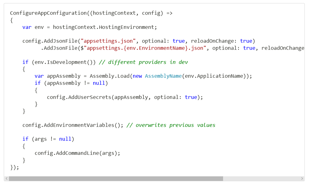
The typical WebHost.CreateDefaultBuilder() method uses all three approaches: overwriting, different providers, and additional providers. The configuration method for the default builder is shown below:
Configuration Loading 10

The default builder configures up to 5 configuration providers by default:

  • A JSON file called appsettings.json
  • An environment-specific JSON file called appsettings.ENVIRONMENT.json where ENVIRONMENT is the name of the current environment
  • User Secrets, if in the Development environment
  • Environment variables
  • Command line arguments (if any arguments were passed)

For the rest of this post I'm going to focus on the environment-specific JSON file, as that's what caused the issue I encountered.

The Problem: Environment-Specific Configuration not Loading

As part of a new .NET Core app I was building, I was running a "smoke test" on the Docker container produced, as described in my last post. This involves running the Docker container on the build server, and checking that the container starts up correctly. The idea is to double check that the initial configuration that occurs on app start up is correct. One such check is that any strongly typed settings validation runs successfully.

Configuration Loading 11

When I ran the smoke test for the first time in a new app, the settings validation for a third-party API URL failed. This was very odd, as I had tested the application locally. When running smoke tests, I typically set the Hosting Environment of the app to Development, (or sometimes a testing-specific environment, Testing). Inside the appsettings.Development.json file, I could see the offending configuration value:

Configuration Loading 12

But for some reason, when the application was running in Docker for the smoke tests, the value wasn't being bound correctly. In the next section, I'll briefly describe some of the things I thought of and looked into.

Troubleshooting

I tried debugging locally, adding and removing the file, and changing the setting value. I was trying to confirm that the file was definitely being loaded correctly, and the setting wasn't coming from somewhere else when running locally. Everything was correct.

I checked that there were no unexpected environment variables overwriting the value when the app was running in Docker for the smoke test. There weren't.

I looked inside the Docker container itself, and double checked that the appsettings.Development.json file existed, and was in the right place. Everything looked OK.

Finally, I checked that I was actually running in the environment I expected - Development. Looking at the logs from the container when the smoke test ran I could see that the Hosting environment was correct according to the app:

Configuration Loading 13

At this point, I was somewhat stumped, I had run out of ideas. I made a coffee.

When I sat down and opened the smoke test script file, the answer hit me immediately…

Linux File-System Case-Sensitivity

The smoke test script I was using is very similar to the script from my last post. The command I was using to run my new app for the smoke test is shown below:

Configuration Loading 14

The problem is the statement where I set the environment variable to define the hosting environment using

Configuration Loading 15

This sets the environment to development which is not the same as Development. ASP.NET Core itself is careful to not differentiate between environments based on case - the IHostingEnvironment extension methods like IsDevelopment() are all case insensitive. As long as you use these extension methods and don't use IHostingEnvironment.EnvironmentName directly, you'll be fine.

However, the one place where it's very common to use EnvironmentName directly is in your app configuration. Earlier I described the common approach to environment-specific configuration: adding an extra appsettings.json file:

Configuration Loading 16

As you can see, we're directly using EnvironmentName to calculate the environment-specific JSON configuration file. In my smoke test script, EnvironmentName="development", so the app was looking for the appsettings.development.json file. The file was actually called appsettings.Development.json.

On Windows, this case difference doesn't matter - ASP.NET Core respects the conventions of the host OS, so it loads the file. Even if you set the environment to DeVelOpMeNt, you'd be fine. Linux, however, is case sensitive, so it won't find the file.

The simple fix was to set the environment with the standard title-casing:

Configuration Loading 17

With that small change, the app was able to start, and the smoke test succeeded.

Summary

Always be consistent with your environment names. The case may not matter if you're running on Windows, but it definitely will if your app is ever run on Linux. The ASP.NET Core framework itself is careful to ignore case when determining the current environment, but you can't trust the underlying operating system to do the same!

Editor's Note: Thanks again to Andrew Lock for allowing us to share this fix with you by republishing this post.


Machine Learning With ML.NET

$
0
0

This time on the Eat Sleep Code podcast, we talk to Microsoft's John Alexander about exciting new Machine Learning libraries for .NET.

On this episode of Eat Sleep Code, Sr. Content Developer at Microsoft John Alexander talks about ML.NET, a set of new Machine Learning libraries for .NET. John explains the purpose of ML.NET and how it enables .NET developers to incorporate machine learning into their .NET (C# & F#) applications. ML.NET basics, extensiblity, and road maps are all discussed.

You can listen to the entire show and catch past episodes on SoundCloud. Or just click below.

John Alexander

John Alexander, Sr. Content Developer at Microsoft
John Alexander is a client-centric, UX-focused software architecture and development thought leader, and noted Microsoft Regional Director, consultant, trainer, published author and speaker.

Show Notes

Transcript

Coming soon...

Why Choose the Telerik WPF DataGrid for Your Next Project

$
0
0

This blog post will walk you through some of the most popular features of the Telerik WPF DataGrid and why it’s a great option to consider for your current or future projects.

DataGrids, Grids, GridViews. They can be found in just about every application that presents data. And for a good reason. Data displayed in a table with rows and columns is both easy to read and meaningful. People are so used to working with Excel-like spreadsheets that they expect to find the same functionalities in everything that resembles one, which holds true to most desktop applications and line-of-business ones in particular. Precisely, for that reason, presenting data in grids can be challenging for any application and the developer behind it.

Let’s examine one scenario. Let’s say you are building a desktop application for the finance or healthcare industry. You or your dev team has created the perfect architecture for your WPF app. You are using DI, MVVM, IoC. You get the data from a web service, from the cloud or from a database, local or remote and process it in a testable and maintainable way. That’s what your developers are good at and have done many times.

But here comes the hard part: presenting that data to the user in a meaningful way, while also providing a great UI and user experience. This can be challenging and even the best can struggle. In the end, the end users of your application, honestly, don’t care what architecture you have used as long as the app can get the job done - you just need to present the data in a clear, visual and easy to understand way. So, if you are in a situation where you want to display your data in a grid, read along - you’ve come to the right place. 

The DataGrid in Progress Telerik UI for WPF is a powerful and easy-to-use grid. We're going to cover a lot of ground in this post - feel free to read from the top or to skim to the feature that captures your interest.

Table of Contents

Creating Columns

For the basis of a WPF datagrid we need rows and columns. Rows are obvious - they represent the objects in your data source. Columns on the other hand represent the properties of those objects. Most datagrids support automatic column generation. This feature allows you to show your data with minimal to no configuration. It is great for simple scenarios, or for situations in which the shape of data that will be presented is determined at runtime. Controlling the generated columns can be done using either the familiar Display attribute or the RadGridView AutoGeneratingColumn event. The latter gives you complete control over the generated columns and the generation process itself.

If you need more control over what and how your columns get presented, you can define them manually. With the Telerik WPF DataGrid solution you have several different kinds of columns at your disposal: data, expression, checkbox, combobox, image, masked input, hyperlink. You can do quite a lot using those. And if you need something more, you can always define your own cell template. You have control over the column header and footer as well, so you can put things like images in the column header or add some text to the column footer. One feature that is very useful is column aggregates. With that feature you can add aggregate functions like min, max, sum, avg to the contents of your column and display the results in the column footer.

GridViewColumns

Grouping Your Data

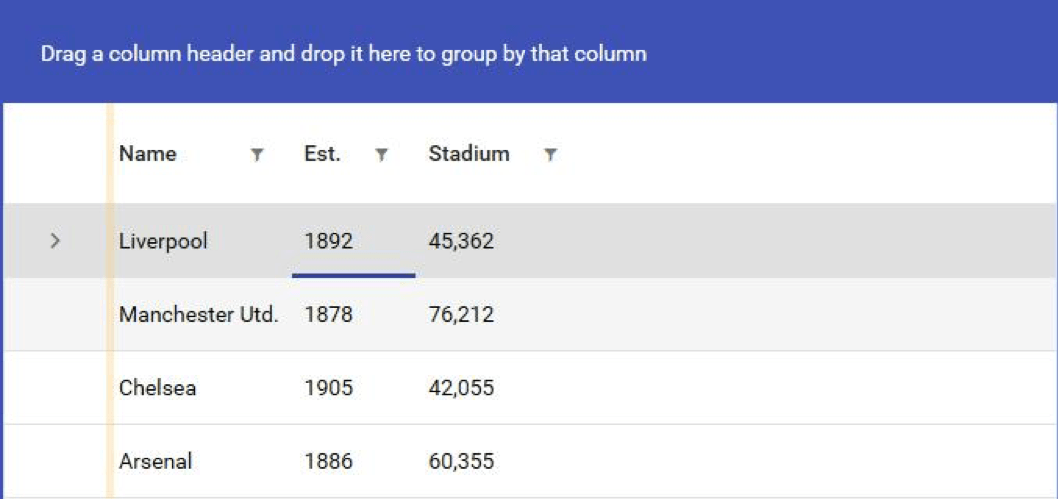
Grouping your data is a very powerful and useful feature. Making it easy and user friendly is one of the key features of the Telerik WPF DataGrid. Your users can easily group the data by simply dragging the desired column to the group panel. Multiple grouping is supported as well.

GridViewGrouping

Remember column aggregates? Well, when the data gets grouped, the aggregate functions work as well, giving you aggregate information about each group. This is built-in behavior and all you need to do to enable it is add aggregate functions to your columns and group your data.

GridViewGroupingAggregates

One more thing. Because of the complexity, grouping a large data set on more than one level can lead to some performance issues. The Telerik DataGrid knows that and has a special kind of rendering for these kinds of situations. It is called flat group rendering mode and it is controlled by the GroupRenderMode property. It simply renders rows one below the other instead of nesting them on many levels.

Let’s Not Forget Sorting

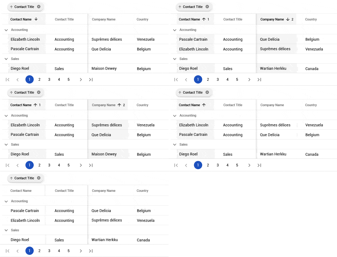
This is pretty intuitive for any scenario. Customers are used to clicking on the column header and expect to find the familiar sort direction arrow, and they take it for granted that every datagrid should do it, whether for web, desktop or mobile. Of course, Telerik grids support column sorting and it works in the usual way. But there is more. When your data is grouped you can change the sort direction of each group individually, and in addition, you can sort the data in each group by another column. This is indicated by the arrows shown in the group buttons appearing in the group panel and in the column headers, as can be seen in the screenshots I have added above. Sorting by more than one column is supported as well, so you can get that much more insight into your data.

The All-Mighty Filtering

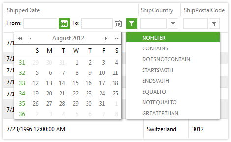
One of my favourite built-in features is the column filtering (even though, I must admit, I am a bit biased ). The user can filter the presented data by their own criteria and this is especially useful in large and complex data sets. By default, all data bound columns have filtering enabled on them. You can opt-out of this behaviour by disabling it if you feel that filtering on this column is not necessary. The filter window itself closely resembles what can be found in pretty much any spreadsheet processing tool.

GridViewFiltering

The filter for a given column picks up all the distinct values that are present in your data set for that particular column. The user can filter by simply selecting a specific value or values using the checkboxes. Advanced filter expressions are also supported. You can do filter expressions that check if the values in your columns start with a specific string value, or is greater, equal, lesser than or between given values. The possibilities are endless here and it is all done automatically for you and out of the box. The consumer of your data, when it is presented in a Telerik datagrid, has all the filtering power they need.

Paging for Larger Datasets

Sometimes you just have too much data for the user to grasp at once. One popular solution is to use paging. Telerik UI for WPF has you covered with a special component made specifically for this purpose - the RadDataPager. It works in close cooperation with the DataGrid and it is a breeze to setup and configure, as you can see in this code snippet.

GridViewPages

Controlling the appearance and paging options starts with the DisplayMode property. It is of type PagerDisplayModes flag enumeration, and its members control what is displayed by the pager. You can also control the size of the page, which is the number of items displayed at once on the screen.

One nice thing about separating the component that does the paging from the DataGrid is that you can use the data pager with other components, like ListView, ComboBox or even charts. This can be helpful when building a dashboard, for example.

Row Details

When you have a lot of information and you can’t display it all using just columns, then maybe you can show that information in a row detail. Each WPF datagrid row is capable of presenting additional information if the form of a row detail. The advantage of this approach is that it can be configured to be displayed only when the row gets selected. This can reduce the number of columns and give your data grid a neater and more compact layout, while still providing all the information the user needs. You can also show the row details at all times, regardless if the row is selected or not, if you prefer.

GridViewRowDetails

Configuring the row detail is done through the row details template. You have complete freedom with regard to what you put in there. You can display text, put in charts or even other datagrids. The possibilities are endless.

Exporting to Various Formats

One of the benefits of using the Telerik UI for WPF toolkit is that you are stepping on the shoulders of giants. There is already an excellent document processing library that has been developed for Telerik tools, and of course it is well integrated into the Telerik WPF DataGrid. The data that is presented by the grid can be exported to many different formats for different applications, including Microsoft Excel (both xlsx and xls format are supported), and exporting to PDF and HTML is also possible. It all comes straight out of the box. You can customize it too.

One other way of exporting data is using the clipboard. The RadGridView supports both copying and pasting data from and to the clipboard and is very flexible in doing so. You have the option to copy the cells with or without the headers, footers, empty rows and columns.

Hierarchical Grid

Sometimes your data can be hierarchical with a parent - child relationship. Extending our current sample data, we can display the employees our managers are managing. The RadGridView can display such data using a nested datagrid.

GridViewNested

Note that the nested grid is a full blown RadGridView. The hierarchical support for the DataGrid handles self-referencing data sets as well. So, if your data has a ParentID relationship for example, your data is good to go. If not all of your data is forming a hierarchy you can hide or show the row expander icons by binding it directly to your data.

This feature can be useful in situations in which your data is truly hierarchical in nature and drilling down makes sense. This can also reduce the cluttering and data overflow in large data sets. When combined with lazy loading it can lead to performance improvements as well, because you will be fetching only the data you are actually showing on the screen.

Managing Data

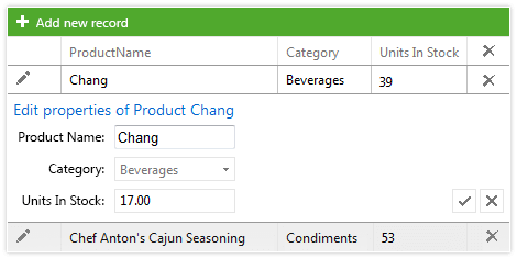
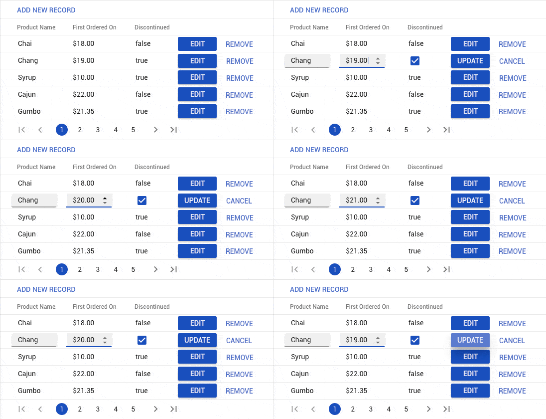
Displaying data is great, but the Telerik grid also allows you to modify the data it is presenting. You can do insert, update and delete with validation and everything. In order to enable it you need to flip a few switches and you are good to go. Make sure to be sure your collection is not read-only and that the type of objects in your data set have a public default constructor.

GridViewEditing

This feature can be useful in some scenarios when your data set is not too complex. Another use case can be when you want to allow the user to edit values of particular cells without the hustle of opening up other views and filling up lengthy forms.

Theming

Last but definitely not least, your data is just a bunch of numbers without a beautiful and modern looking UI. There are plenty of readily available themes you can apply to the RadGridView and any Telerik component for that matter. These are two of my favorite themes, the Material and Fluent themes. In the screenshots above you can see the Windows 8 theme, another great one.

GridViewTheme1

GridViewTheme2

Applying a theme is a breeze. Just reference the theme that you desire and merge its resources in your App.xaml file. Why the merge? Because Telerik NoXaml assemblies, which are the recommended ones, have no Xaml files inside of them. In order to give your WPF DataGrid appearance, you have to reference a theme and merge the resources in your application. This separation allows for the packing of theme dependent resources in different assemblies and reduces the overall size of dependencies and your application, because you are only referencing what you actually need.

Another benefit of the NoXaml assemblies is that you can customize the built-in themes very easily. You can change absolutely anything, starting from a color to completely retemplating the whole component. When you just need to give a specific component some style you will be pleased to know that there are many different APIs for doing that. There will be a dedicated blog post on styling and theming coming soon.

Summary

DataGrids are widely popular and are often part of a project's requirements. Should you face such a decision consider the DataGrid in Telerik UI for WPF, as I have personally tested it extensively and can assure you that it is a very powerful and versatile component for visualizing data in a table-like fashion. It is a great tool for displaying your data and making decisions based on your data. Above I have outlined some of the key features that customers love and seek when they work with DataGrids. I hope you find this useful and decide for yourself whether the Telerik DataGrid is suitable for your scenario.

This is the first blog post in our new series dedicated to the DataGrid in the Telerik WPF library. Next time I am going to show you how to load your grid with data, since grids are all about data. And of course, we are going to do that in MVVM way. So, stay tuned. Also, let me know in the comments what topic about grid view you want to see. Until next time, happy coding!

Join us in Vegas: DEVintersection, #CodeParty and More

$
0
0

If you don’t have plans the first week of December, Vegas should be top on your list. Join us there for some great .NET and JavaScript events.

In early December we’ll be out in Las Vegas for DEVintersection, Microsoft Connect(); and #CodeParty – and we would love to meet up with you to talk about everything going on in the .NET and JavaScript worlds right now. Here’s a little more about where you can find us:

DEVintersection

DEVintersection takes place December 3 – 6 at the MGM Grand in Las Vegas. In its fifth year, the conference boasts an impressive lineup of speakers including Scott Guthrie, Scott Hanselman, Kathleen Dollard, Michele Bustamante, Juval Lowy and our very own Todd Anglin. Over the course of event, you have an opportunity to learn about topics like Blazor, .NET Core 3.0, ASP.NET Core, Azure, AI, Angular, React, Vue and more. We will have a booth which means you have chance to walk away with some cool swag – and maybe even win an Xbox One. Stop by for a demo, a chat and some goodies.


Microsoft Connect();

If you can’t be in Las Vegas, you don’t have to miss out. Microsoft Connect(); is an online event taking place on Tuesday, December 4. While part of the event will be streamed live from DEVintersection, you can still be part of the action by tuning in to learn the latest updates on Azure, Visual Studio, and more.


#CodeParty

#CodeParty is the post-Connect(); party that will also be streamed live from Vegas but is open to anyone. Tune in either at twitch.tv/codeparty or twitch.tv/visualstudio on Tuesday, December 4th from 5:30 – 6:30 p.m. There you’ll find Richard Campbell, Jeff Fritz, Dee Dee Walsh, me and a handful of other folks talking about all we’ve seen in Vegas that day (all that we’ve seen at the event, of course), testing your knowledge with some cool trivia and giving away prizes like a Surface Go, Amazon gift cards, an Xbox and more.

The #CodeParty events are produced by a group of geeks who love the developer community. We are proud to share the sponsorship role with some great companies including these fine folks:

Don't Make Your Users "That Guy" when Playing Videos in Web Apps

$
0
0

You know "that guy," the one who is always blasting noise from videos on their device. But it's not their fault! Chances are, the web app playing those videos didn't use Telerik media player. Learn how you can easily build a beautiful media experience for your users.

You’ve probably had to find a way to let your employees watch the latest company broadcast without interrupting their daily routine, or, if your web app has anything to do with media, show your visitors several videos at once. Pretty straightforward once you put a Teleik media player for ASP.NET AJAX on the page and you can easily throw it in a popup.

Now comes the part where you must not ruin the UX, or your users will curse you.

“But how, it’s just a video”, you ask.
“It’s easy”, I say – just let your users have the video play somewhere they can’t see it, but they will hear it.

Yeah, there’s the mute button on the tab in Chrome and Firefox, but what about mobile? Also, what it if doesn’t work (it doesn’t always work for embedded YouTube videos, at least for me).

So, don’t be that guy whose page blasts noise through the speakers on the adjacent desk or from some phone in the subway.

All you need to do is to make sure that:

  • If the popup is not visible, the video is not playing.
  • The user can’t move the popup somewhere they can’t dismiss it easily.

To do that easily, you need some rich API from the controls we use, like what you can get from RadWindow and RadMediaPlayer.

Let’s have a walkthrough of the generic approach:

  1. First, pick a video. Here’s a basic way to show one:
    <telerik:RadMediaPlayerrunat="server"ID="RadMediaPlayer1"StartTime="8"AutoPlay="false"Width="600px"Height="350px"Source="https://www.youtube.com/watch?v=UlzBZBWEXN4"Title="Kendo R3 2018 Webinar">
    </telerik:RadMediaPlayer>
  2. Now, put it in a dialog. Roughly like that:
    <telerik:RadWindowrunat="server"ID="RadWindow1"Title="Kendo UI R3 2018 Webinar"VisibleOnPageLoad="true"AutoSize="true">
        <ContentTemplate>
            <telerik:RadMediaPlayerrunat="server"ID="RadMediaPlayer1"StartTime="8"AutoPlay="false"Width="600px"Height="350px"Source="https://www.youtube.com/watch?v=UlzBZBWEXN4"Title="Kendo R3 2018 Webinar">
            </telerik:RadMediaPlayer>
        </ContentTemplate>
    </telerik:RadWindow>
  3. Here comes the part where you have to hook some events and tie those two pieces together depending on their API (full code listing with annotations is available below):
    • Use the OnClientShow event to make sure the video resumes.
    • Use the OnClientClose event to pause the video so it doesn’t play, and the user can resume where they left off.
    • Set up a few properties on the dialog so the user can’t drag it out of the viewport, for example.
    • Then there’s a bit of initialization logic and helper methods due to the control specifics that I wrote for you.

It’s easy when the controls give you all the methods and events you need. You can build on this further. For example, have the RadWindow always stay in one spot in the viewport by pinning it and removing the Pin behavior for your users to they can’t un-pin it themselves.

Most of the code here are annotations, don't look at the scrollbar:
<asp:Button Text="show me the webinar"OnClientClick="showWebinar(); return false;"ID="Button1"runat="server"/>
<telerik:RadWindow runat="server"ID="RadWindow1"Title="Kendo UI R3 2018 Webinar"Behaviors="Move, Close, Pin"
    OnClientShow="startPlayer"
    OnClientClose="pausePlayer"
    OnClientBeforeShow="raiseFlag"
    VisibleOnPageLoad="true"Left="-9999px">
    <ContentTemplate>
        <telerik:RadMediaPlayer runat="server"ID="RadMediaPlayer1"StartTime="8"AutoPlay="false"Width="600px"Height="350px"OnClientReady="OnClientReady"Source="https://www.youtube.com/watch?v=UlzBZBWEXN4"Title="Kendo R3 2018 Webinar">
        </telerik:RadMediaPlayer>
    </ContentTemplate>
</telerik:RadWindow>
 
<script>
    functionstartPlayer(sender, args) {
        //just use the control's API
        //the flag is used to provide initialization
        if(!sender.__initializationShowing) {
            getPlayer(sender.get_contentElement()).play();
        }
    }
 
    functionpausePlayer(sender, args) {
        //just like when we started the player automatically
        //we're going to pause it so the user can continue
        //where they left off, should they choose to
        //the flag is used to provide initialization
        if(!sender.__initializationShowing) {
            getPlayer(sender.get_contentElement()).pause();
        }
    }
 
    functionshowWebinar() {
        varpopup = getPopup();
        popup.show();
        popup.center();
        //for the sake of the demo, we will make it so that the RadWindow closes after a few seconds
        //as if the user closed it, either accidentally, or on purpose, hoping to get rid of the video
        //remove the .pause() call above and you'll see that nasty behavior with phantom audio
        setTimeout(function() {
            popup.close();
            console.log("now the tab is neatly quiet, as it should be");
        }, 2000);
    }
 
    functionraiseFlag(sender, args) {
        //the media player needs to be visible in order to initialize properly,
        //hence the VisibleOnPageLoad=true property, similar to audio initialization on mobile devices
        //so we're going to have the RadWindow show up when the page loads for a brief instant
        //we'll put a flag in the dialog object to ensure the rest of the logic does not fire
        //we will lower it when the media player is ready to work
        sender.__initializationShowing = true;
    }
 
    functionOnClientReady(sender, args) {
        varpopup = getPopup();
        popup.close();
        //ensures we don't raise the flag all the time, but only once
        popup.remove_beforeShow(raiseFlag);
        //have the control start autosizing to fit the player
        //if it autosizes during preloading, it will be visible
        //in the viewport, instead of at Left=-9999px
        //there are plenty more methods to configure everything in the API:
        popup.set_autoSize(true);
        popup.set_keepInScreenBounds(true);
        //lower the flag to let the play/pause work
        popup.__initializationShowing = null;
    }
 
    functiongetPlayer(container) {
        //read more on getting a reference to a control object on the client-side here:
        //here we're going to use a DOM traversal to get a reference to the media player in the popup
        //so I can show you that it can be really helpful when working with templates and nested controls
        return$telerik.$(container).find(".RadMediaPlayer").first().get(0).control;
    }
 
    functiongetPopup() {
        return$find("<%=RadWindow1.ClientID%>");
    }
</script>
 

You can apply the same approach to any other similar situation, be that playing audio, having multiple videos playing at once (just loop the dialogs and pause all of the old ones).

If you have other tips for your fellow devs so they aren’t “that guy,” post them in the comments down below.

HTTPS Decryption, Content Decoding and More in Fiddler Everywhere v0.2

$
0
0

The second release of Fiddler Everywhere is now live, and we've added the most critical and highest requested features.

November is shaping up to be a strong month for Fiddler Everywhere. Just over two weeks after the initial release, we’re releasing a new group of the most requested features. Check what’s new:

  • HTTPS decryption – allows you to capture HTTPS traffic
  • Content decoding – allows you to read encoded requests and responses
  • Allow remote connections – allows you to capture traffic from another machine/device
  • Fiddler Everywhere Documentation – read more about how to use and configure Fiddler in our new docs
  • Fixes – we fixed some of the issues reported by you

HTTPS Decryption

Fiddler now supports HTTPS decryption. Let’s be honest – today most traffic is encrypted. In fact, we had trouble finding non-encrypted websites to test Fiddler with. That’s why this feature had the highest priority in our backlog, and is the most voted in our feedback portal, too. You can find out how to enable HTTPS decryption in this help article.

capture https traffic

Content Decoding

You can now see the content of encoded requests and responses. Just click on the Decode button and Fiddler will automatically decode the sessions.

content decoding

Remote Connections

Now you can capture traffic from another machine/device. To enable this feature, go to Settings / Connections and check the box next to Allow remote computers to connect.

remote connections

Fiddler Everywhere Documentation

Fiddler version 0.2 brings you our brand new documentation website. There you can read more about how to use the tool. Check it out, and don’t forget to leave a thumbs up if you find it helpful.

Fixes

There was an issue where Fiddler wasn't working on Ubuntu 18.10, which we have addressed.

Conclusion

Since we first released Fiddler Everywhere, we’ve been working hard to deliver the things you need most. Now, the second release is here, with the most important and requested features. We’re trying to set the pace high, so stay tuned for new goodies in the upcoming weeks. In the meantime, don’t forget to vote or share your ideas in our feedback portal.

Integrating Telerik Reporting into any Frontend Framework

$
0
0

We know there are a lot of JavaScript frameworks out there, which is why the HTML5 Report Viewer in Telerik Reporting can be implemented in Angular, React and Vue.

Let’s play a game. Think of a word and Google it. If the result contains a JavaScript framework with that name then you win, otherwise you lose and drink.

Winning is easier than you might think in this game because the JavaScript world is a rich environment with dozens of tools, libraries, and frameworks. For most developers, it’s challenging to make a choice about which JavaScript application framework to work with, especially when they need to build single-page applications.

Front-end technologies

After the framework wars of the last decade, ‘The Big Three,’ as some call them, are leading the way to a more stable and defined future. React, Vue and Angular are by far the most prominent frameworks and libraries of JavaScript used today.

Which Framework Should You Choose for Displaying Reports?

I want to tell you a secret. It is completely up to you. In this article, I will demonstrate how the HTML5 Report Viewer in Telerik Reporting can be implemented in Angular, React and Vue applications.

Angular, Vue, React

Angular

Angular is built by the Angular Team at Google and used by YouTube, PayPal, Upwork, Lego, and more. Angular has been a top choice for enterprise implementations. That’s why Telerik Reporting provides out-of-the-box integration for Angular applications. Our Angular Report Viewer component can be used in Angular apps with both WebPack and SystemJS module loaders. Using our beautiful Kendo UI for jQuery components for its default template, the Angular component wraps the pure HTML5/JavaScript/CSS3 jQuery-based Report Viewer widget, which is our most popular report viewer for web applications. Complete step-by-step tutorials how to add and configure Angular report viewer are explained in these excellent articles:

React

Built by the Facebook team, React is a favorite among developers for building and maintaining products, whether a quick POC or large enterprise software. It’s currently used by many leading companies like Instagram, Netflix, Yahoo!, WhatsApp and many more. We have an excellent how-to knowledge base article which explains how the HTML5 Report Viewer can be used inside a React application:

Vue

Created by Evan You and adopted by organizations like Alibaba, Vue is becoming a fast favorite among those who discover it. Other top companies that have trusted Vue.js include Adobe, WizzAir, Xiaomi, Grammarly and many more. A knowledge base article which also illustrates how the HTML5 Report Viewer can be used inside a Vue.js application can be found at:

front-end technologies

Before we wrap up, I need to mention that we don’t have built-in support for React and Vue.js, but our development plans are based on users' demand. Currently, we provide wrappers for MVC, WebForms and Angular applications. But you can like/comment with your feedback in the already logged feature requests in our Feedback & Ideas portal:

Try it Out and Share Feedback

We want to know what you think—you can download a free trial of Telerik Reporting or Telerik Report Server today and share your thoughts in our Feedback Portal, or right in the comments below.

Start your trial today: Reporting TrialReport Server Trial

Tried DevCraft?

You can get Reporting and Report Server with Telerik DevCraft. Make sure you’ve downloaded a trial or learn more about DevCraft bundles. DevCraft gives you access to all the toolsets, allowing you to say “no” to ugly apps for the desktop, web, or mobile.

Is That UWP, WPF or WinForms: Bring Your Desktop App to the New Millennium with XAML Islands

$
0
0

XAML Islands, announced in May at MS Build, has spurred a lot of interest and discussion in the .NET community. Read on to learn about our experience with XAML Islands, starting with an overview of its functionality and features, all the way to its practical implications for .NET application development.

XAML Islands is one of the hot topics .NET developers have been exploring following the keynote announcement of Kevin Gallo at Build 2018. Microsoft has reported that over 2.4M developers are currently building desktop apps in Visual Studio EVERY month, with a 50% increase in the last 20 months. 

XAML Islands - .NET Developers - Visual Studio Image
SourceWindows Developer Slideshare

In this series of blogs, I will cover everything you need to know about XAML Islands, starting from what it actually is and what it provides to .NET developers, all the way to how you can use it in your applications and breathe new “life” and an improved UX to your current Windows Presentation Foundation (WPF) or Windows Forms applications.

Let's start off by covering how XAML Islands was born, and what you can do with them today.

How was XAML Islands Born?

To be a .NET desktop developer nowadays is super exciting. You have a wide variety of technologies from which you can choose to build your application. In addition to already established technologies like Windows Forms and WPF, in 2015 Microsoft announced the Universal Windows Platform (UWP). UWP is not just for desktops, but is rather a cross-platform technology for building applications that could run on desktop, Xbox, IoT, Surface Hub and Hololens.

So, what does UWP actually give us that Windows Forms and WPF don't? 

UWP_Features

The first thing that comes to our mind is the modern look and feel UWP provides. That look and feel is consistent with the OS. The Fluent design that is incorporated into Windows 10 and its features are also supported and built into UWP – it comes out of the box for the UWP developed applications.

Next, the framework also provides some features that are part of Windows 10 itself out of the box as well – like Tiles and Notifications

Finally, you have improved servicing. This takes into account the Windows Store. UWP applications can easily be packaged into .appx and deployed into the store. The store provides great variety of services that you can integrate – using them you have multiple ways to deliver, manage and even make money from your app.

The question that likely pops up in your mind here is, “Is it possible to enhance my WPF/WinForms application with all the features UWP provides?” The answer is “Yes.”

What is XAML Islands and how can it Enhance My Application?

Your existing app can call and use almost every Windows 10 API.  Some of the APIs require a simple contract to be added in order to be able to use them.

Using Desktop Bridge you can easily package your existing Win32 app into an .appx. The packing also gives a notion of identity to your app and that brings some of the benefits of calling additional Windows 10 APIs that need that identity.

Enhancement Path

Achieving a look and feel consistent with the OS, however, was mission impossible until now. At Build 2018 Kevin Gallo announced a functionality called “XAML Islands.” Using the islands you can modernize your application with UWP UI and still use your current implementation as much as possible. It has officially been released with the latest version of Windows (1809).

Now let’s dive deep into XAML Islands and see how it works and how to use it.

How do XAML Islands Work?

XAML Islands Overview WPF UWP Image

Source: Windows Developer Slideshare

XAML Islands are the perfect solution for every WPF/WinForms developer that wants to improve the look and feel of their application without migrating them to UWP. All UWP controls could directly be invoked and used from within WPF/WinForms. 

The easiest way to work with XAML Islands is to use the NuGet packages provided by the Windows Community Toolkit. The toolkit contains two control implementations. These controls (one for WPF and one for Windows Forms) wrap the WindowsXamlManager and the DesktopWindowXamlSource:

  • The WindowsXamlManager’s job is to initialize the UWP Framework inside the thread of your WPF/WinForms application. This will allow you to create UWP UI in WPF/WinForms.
  • The DesktopWindowXamlSource’s purpose is to hold the instance of your Island content. It hosts any control that derives from UWP’s Windows.UI.Xaml.UIElement in a UI element that is associated with a window handle (HWND) – it renders to and gets its input from HWND. Using it you can also get and set the focus to that element.
host-controlsNOTE: In order to be able to use these APIs, the latest version of Windows (1809) is required.

Of course you can use the WindowsXamlManager and the DesktopWindowXamlSource’s to implement your host from scratch, but my suggestion is to use the wrappers that are already provided by the toolkit. You have the following packages:

  • Microsoft.Toolkit.Wpf.UI.XamlHost– contains the wrapper of the WindowsXamlManager and the DesktopWindowXamlSource for WPF - the WindowsXamlHost.
  • Microsoft.Toolkit.Wpf.UI.Controls– contains wrappers for the InkCanvas, InkToolbar, MapControl, and MediaPlayerElement controls that can directly be used in WPF.
  • Microsoft.Toolkit.Forms.UI.XamlHost – contains the wrapper of the WindowsXamlManager and the DesktopWindowXamlSource for Windows Forms - the WindowsXamlHost.
  • Microsoft.Toolkit.Forms.UI.Controls– contains wrappers for the InkCanvas, InkToolbar, MapControl, and MediaPlayerElement controls that can directly be used in Windows Forms.

If you are a WPF or Windows Forms developer you need to simply add one of the mentioned packages and you can use all wrapper controls or the WindowsXamlHost to host any UWP control.

What can You do with XAML Islands Today?

Currently, only a few UWP controls are wrapped and ready to use out of the box - they are part of the Microst.Toolkit.Forms/WPF.UI.Controls package:

  • WebView– UWP control used to show web content using the Microsoft Edge engine. Yeah, we finally got a modern version of the WebBrowser control in our WinForms and WPF apps!
  • WebViewCompatible– a version of the WebView that could be used with other operating systems (not only Windows 10). If it is used on Windows 10 version 1803 machine the Edge engine is used. For earlier versions the Internet Explorer engine is used.
  • InkCanvas/InkToolbar– a surface for Windows Ink-base interaction.
  • MediaPlayerElement– UWP view that streams and renders media content.

What Does the Future Hold for XAML Islands?

As the XAML Islands were released only a few months ago, they are still in a development stage and are constantly improving. In the near future more and more UWP controls are expected to be wrapped and a mechanics for wrapping third party controls is expected to be provided as well. 

In our next blog post about XAML Islands we will go deep into the usage of the wrappers and how to create UWP bindings for them inside your WPF/WinForms application. In the meantime, when you have a chance go and check out XAML Islands. Happy playing with it.

And while you're here, feel free to take a look at our UI suites for WPF, WinForms and UWP applications if you're interested in developing apps on those technologies with a beautiful UI quickly.

Progress Announces Support for Visual Studio 2019, .NET Core 3.0, the .NET Foundation and More

$
0
0

Microsoft just announced some exciting changes, and we're ready with our support for Visual Studio 2019, .NET Core 3.0, the .NET Foundation and more.

A lot of great information was shared during Microsoft Connect();. Whether you are a Visual Studio user (and if you aren’t, you should remedy that), interested in desktop development, a friend of .NET, interested in Azure or eager to see how .NET Core 3.0 will change your life, there was something for you in today’s announcements.

As the Telerik team at Progress works closely with our friends at Microsoft, we have some news to share around their announcements as well. Read on to learn more about our commitment to the .NET Foundation, Zero-Day support for Visual Studio 2019 and .NET Core 3.0, and one of the first pull requests made by us to the newly open-sourced WinForms project.

Progress Named .NET Foundation Corporate Sponsor

The .NET Foundation is an independent, non-profit organization, created in 2014 to foster open development and collaboration around the growing collection of open source technologies for .NET. It serves as a forum for commercial and community developers alike to strengthen the future of the .NET ecosystem by promoting openness, community participation and rapid innovation.

Microsoft announced on December 4 that the .NET Foundation will operate under an open membership model. This means that any contributor to .NET is eligible to become a member and participate and vote in the annual Board of Directors elections. Furthermore, the .NET Foundation is expanding its Technical Steering Group to a Corporate Sponsor Program. 

The Telerik team at Progress is proud to be among the first corporate sponsors of the .NET Foundation and looks forward to helping to shape the future of .NET through its participation as a technical advisor.

.NET Core 3.0 Support

Also released on December 4 was .NET Core 3.0 Preview which brings in support for WinForms and WPF applications, and in keeping with our commitment to support the developer ecosystem, the Telerik team at Progress announced 0-day support for the new framework. All Telerik UI for WinForms and WPF controls are compatible with the preview version and will be fully compatible when .NET Core 3.0 is released for general availability. Feel free to head to your Telerik accounts and download the .NET Core version of the products!

According to Scott Hunter, .NET Core 3.0 addresses three scenarios .NET Framework developers have requested including side-by-side versions of .NET that support WinForms and WPF; the ability to embed .NET directly into an application; and it allows desktop developers to truly benefit from the better high-DPI support, among other benefits .NET Core affords. To learn more about what was announced with the .NET Core 3.0 preview, visit the Microsoft .NET blog.

Telerik and Kendo UI Controls Compatible with the Latest Visual Studio 2019 Preview

Visual Studio 2019 Preview is now available and Progress is again at the forefront of the latest cutting-edge technology announcements – our major UI suites support the latest .NET and JavaScript advancements, making you even more productive in the latest version of the best IDE around.

You can use Visual Studio 2019 Preview and the Telerik .NET and Kendo UI JavaScript controls.

Download the Telerik and Kendo UI Visual Studio extensions from the marketplace: 

Telerik UI for ASP.NET Core, Telerik UI for ASP.NET MVC, Telerik Reporting, and JustMock extensions will be available with our next major release (January 2019).

Each of the toolkits provides access to more than 70 ready-to-use UI controls (some toolkits have double that amount). Grid, Dropdown and Menu, and advanced line-of-business controls such as Charts, Gantt, Diagram, Scheduler, PivotGrid and Maps are just a few of the modern controls that come standard in each suite.

Telerik Team Makes One of the First Pull Request to WinForms Repo on GitHub

Microsoft officially open sourced the Windows Forms and WPF frameworks on Tuesday, December 4 and the Telerik team at Progress executed one of the first pull request on the new repository with its contribution of a very neat functionality called NullText. The feature allows the developer to show a string watermark when the text of a control is null. Such a functionality has been a standard in UI for various platforms, as it provides great user experience, by informing the end user what is expected from them to input e.g. “Enter your name.” 

If you had asked me ten years ago if i thought Microsoft would open source anything, I would have simply laughed - it is amazing to see them go as far as open sourcing Windows Forms and Windows Presentation Foundation. This clearly shows Microsoft's dedication to open source and community driven products.

2019 is looking to be an exciting year in the Microsoft developer space. As you move to the latest version of Visual Studio or begin to build on .NET Core 3.0, we will be compatible and ready for you with the best UI controls on the market.

Microsoft’s Latest Open Source Announcements: Why Should You Care?

$
0
0

It's a new, open world for Microsoft developers. With the announcements that Microsoft has made WinForms and WPF open source, and the changes to the .NET Foundation, there is a lot of change in the air. Here's why should you care and what lies ahead.

During the Microsoft Connect(); event, Scott Hansleman announced that Progress and the Telerik team is among the first corporate sponsors of the .NET Foundation. As a developer, you may have tuned out when you heard the word “corporate” but if you did that, you might have missed something really important. Microsoft not only announced the new corporate sponsors who would have a seat on the technical advisory board, but it announced that it has adopted an entirely new open membership model. This is an important point that should not be overlooked. 

Those who have been in the Microsoft world for any length of time will remember the days when “Open Source” was a bad phrase. After Satya Nadella took the reins at Microsoft, all of that began to change. And we think it was change for the better.

Opening membership to the .NET Foundation means that the community truly will have a larger say in the direction of .NET. It also further demonstrates Microsoft's commitment to open source as this announcement comes on the heels of some similar ones – the open sourcing of Xamarin, open sourcing its patents, open sourcing Visual Studio Code, and, most recently, open sourcing WinForms and WPF.

Our commitment to the .NET Foundation underlies our commitment to the developer community as a whole. We have open sourced our UWP controls, JustAssembly and the engine of JustDecompile are open source, and we are the creators of NativeScript. By participating on a larger scale in the .NET Foundation, we will help to ensure there is a healthy open source community with resources to help ensure the worldwide .NET open source and developer base grow to their full potential. The corporate sponsorship funds contributed to the .NET Foundation will be used to provide speaker grants to the global network of Meetups and User Groups; fund in-person conferences and hackathons; and more.

In addition to the sponsorship, the Telerik team at Progress will be donating its time and expertise by serving as technical advisers to help shape the future of .NET by advocating for the needs of the .NET open source developer community.

We believe that the announcements today – the open sourcing of WinForms and WPF and the adoption of an open membership model with corporate sponsors – are just the latest stop on Microsoft’s open source journey. And while they are dedicated to open source, there are a few things left that they haven’t really talked about.

ASP.NET AJAX. Microsoft did not open source Web Forms back in 2012 because it was part of the System.Web.dll that parts of the Windows Server platform have a dependency on. We don’t think this will change, so we are betting Microsoft will leave this one as is.

Windows. A few years ago if you asked me if I thought they would open source Windows I would have just laughed. But they did open source PowerShell… so maybe there is more they could share. The biggest concern would most certainly have to be around security.

I guess time will tell. What are we missing? What do you think will be the next open source announcement that Microsoft makes?

And while you are here, check out the rest of the news we have - including our new support for Visual Studio 2019 and .NET Core 3.0.

Telerik and Kendo UI Controls Compatible with the Latest Visual Studio 2019 Preview

$
0
0

Microsoft unveiled the brand new Visual Studio 2019 today, and we've ensured our Telerik and Kendo UI development tools are already compatible.

Progress has a long-standing tradition in ensuring its Telerik development tools are able to provide zero-day support for any and all new .NET advancements. So it should come as no surprise that the moment Microsoft announced the availability of the latest Visual Studio 2019 Preview on stage at the Microsoft Connect(); event that Progress simultaneously announced the availability of its Visual Studio 2019 compatible controls for all Telerik tools.

Magically (or through the power of technology, as the case may be), when the Visual Studio 2019 Preview went live, the compatible tools became available. You can download the extensions from the Marketplace:

Telerik UI for ASP.NET CoreTelerik UI for ASP.NET MVCTelerik Reporting, and JustMock extensions will be available with our next major release (January 2019).

Each of the toolkits provides access to more than 70 ready-to-use UI controls (some toolkits have double that amount). Grid, Dropdown and Menu, and advanced line-of-business controls such as Charts, Gantt, Diagram, Scheduler, PivotGrid and Maps are just a few of the modern controls that come standard in each suite.

For those not familiar with what’s in the Visual Studio 2019 Preview, we think you’ll be impressed. Here are a few of the highlights:

Visual Studio InitelliCode Custom Repos (Public Preview). Visual Studio IntelliCode is previewing a new capability – AI-enhanced IntelliSense recommendations based on your code. You can now train IntelliCode on your own C# repos, further enhancing recommendations  based on your own patterns and your code’s specific libraries.

Visual Studio Live Share. Visual Studio Live Share is integrated in Visual Studio 2019, meaning every Visual Studio developer can take advantage of Live Share’s real-time collaboration features.

And if that’s not enough, here are a few more highlights:

  • Improved search accuracy for menus, commands, options, and installable components
  • Updated menu and title bar to increase space for code
  • One-click code cleanup command for documents, projects and solutions
  • Improved debugging
  • The ability to submit Pull Requests in the IDE
  • New project template overview
  • The ability to authenticate with GitHub
  • IntelliCode model-sharing and C++ Support
  • More refactoring options
  • Smarter debugging
  • And more…

As with most things Microsoft these days, they are extremely transparent with their roadmap. Make sure you spend some time looking around. While you are there, you can also find links to the Visual Studio release rhythm to give you a better understanding of when to expect updates; the Previews downloads page; and the Developer Community website where you can log your suggestions.

And speaking for logging your suggestions, as you start to play with Visual Studio 2019 and our compatible tools, make sure you share your feedback, thoughts, and needs with our engineering teams. The more feedback we get from you, the more likely we are to meet and exceed your needs and expectations.

Happy coding!

Bring Your WPF and WinForms Apps to .NET Core 3 with Telerik UI for WPF and WinForms

$
0
0

Do you want to update existing WPF and WinForms apps to take advantage of all the features of .NET Core 3.0? Learn how to prepare your app today with Telerik UI for WPF and WinForms.

Today at the Connect(); 2018 conference Microsoft released the .NET Core 3.0 Preview version, which now supports our favorite desktop technologies - WinForms and WPF. This will allow Windows desktop apps to benefit from .NET Core features such as performance improvements, side-by-side deployment and UWP functionality. You can read more about how to enhance your existing desktop app with UWP features here.

However, the greatest thing for existing desktop apps is that, if they are converted to a .NET Core application, they can now be extended with everything new that .NET will include in the future.

What's more, I am super excited to announce that the Telerik UI for WinForms and Telerik UI for WPF controls are .NET Core 3.0 compatible!

So, are you excited about it? Do you want your app to be ready for this? Together, let’s prepare an existing Desktop app for this new adventure!

Updating an Existing Desktop App to .NET Core 3.0

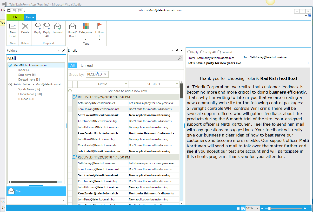
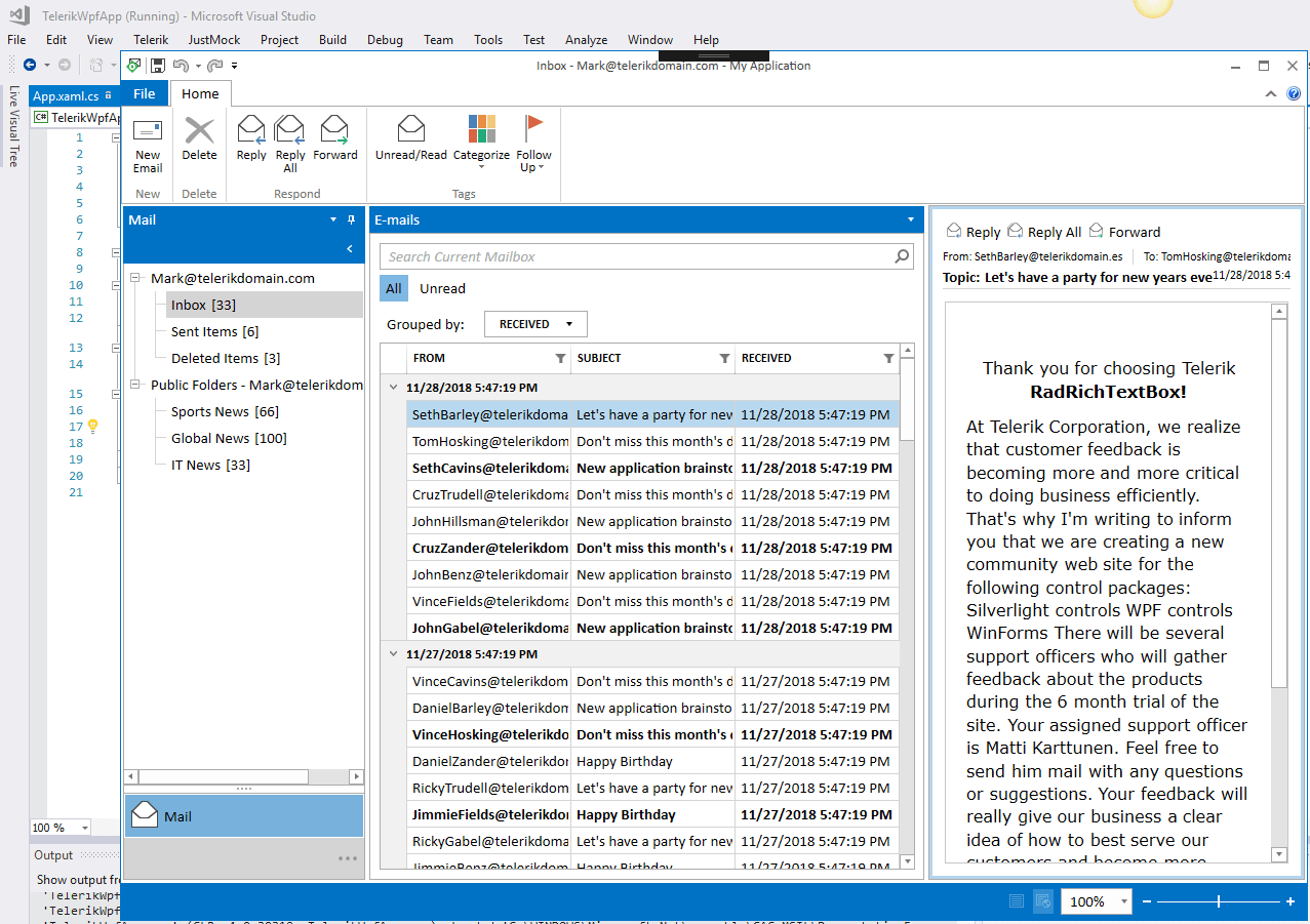
For the purpose of this post I’ll use an existing WPF app – Mail Application  – created with the Telerik WPF Extensions wizard. The application includes separated view, ViewModels and Custom Styles built with Telerik UI for WPF. I will also do the same exercise with a version of this app built with Telerik UI for WinForms.

The Visual Studio extensions are fully compatible with Visual Studio 2019 so if you are excited about everything new – you can install and use them with VS 2019 right now.

WinForms

Winforms app

WPF

mailWpf

Download the Telerik Visual Studio extensions from the marketplace: 

Ready to start? Go!

Step 0: Prepare Your Environment

Of course, first we need to Install the latest .NET Core 3.0 SDK daily build.
Note that you also should Install Visual Studio 2017 Update 15.8 or higher from .https://visualstudio.microsoft.com/downloads/, and select the .NET desktop development workload with the following options: .NET Framework 4.7.2 development tools and .NET Core 2.1 development tools.

Step 1: Check to See if the App is Compatible

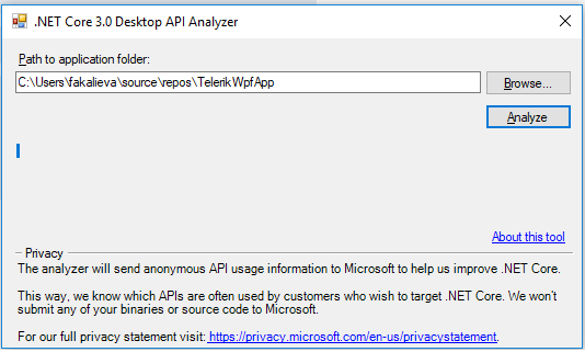
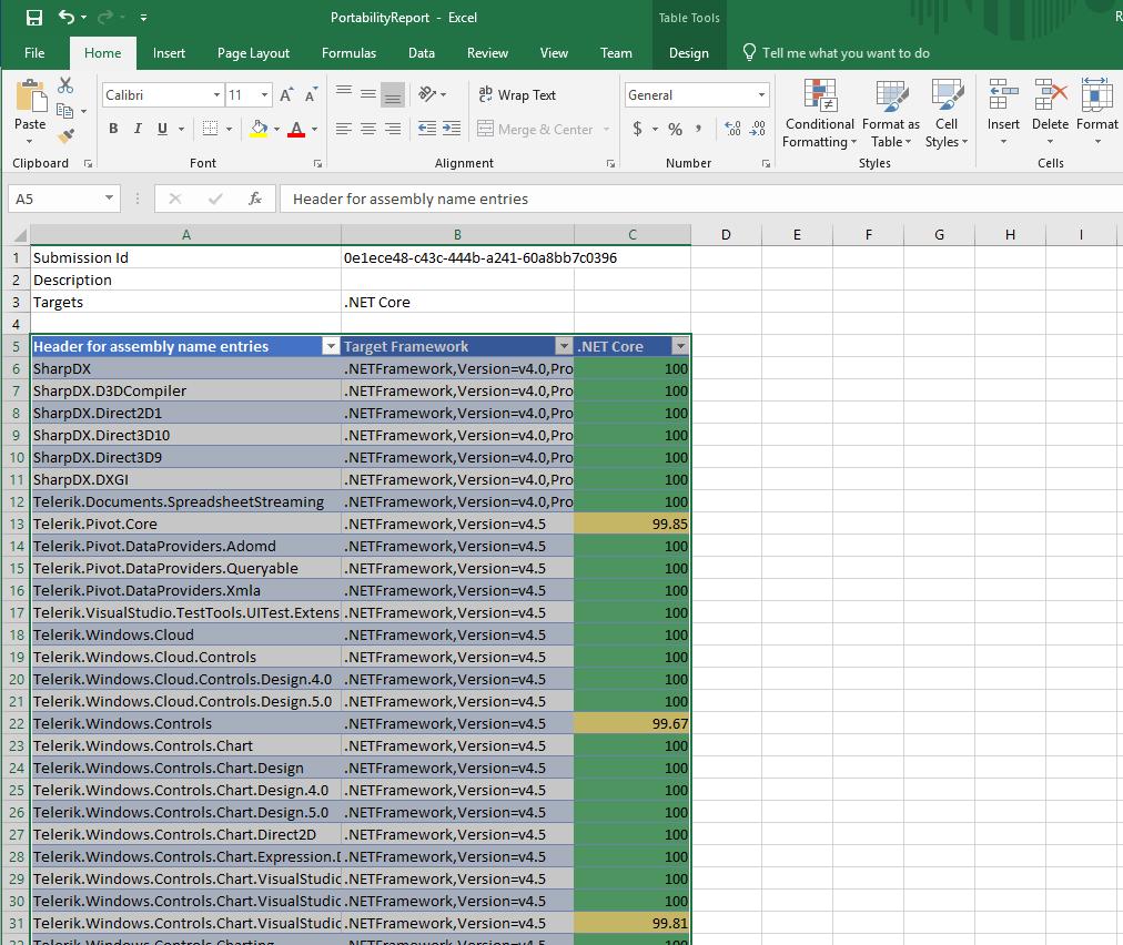
To do this we will run the NET Portability tool using the instructions provided by Microsoft here.

analyzeapp

report

The output shows that we are almost 100% compatible, but there are some more steps we need to do!

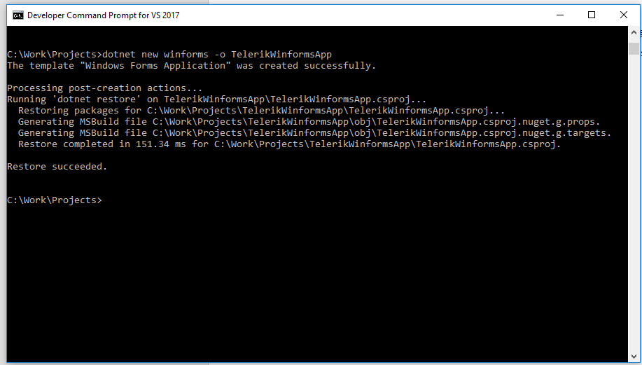
Step 2: Create a New .NET Core 3.0 Application with the VS Command Prompt

At the moment there is no tool or built-in option in Visual Studio that allows you to simply convert the app. The project structure is now different, so we will need to create a new one project file from scratch. How?

It’s time to create a completely new .NET Core 3.0 app project using Command Tool of Visual Studio 2017 :)

Use the command below for WPF:

dotnet new wpf -o MyWPFApp
cd MyWPFApp
dotnet run

And use this one for WinForms:

dotnet new winforms -o MyTelerikWinformsApp
cd MyTelerikWinformsApp
dotnet run

winforms

This command will create a new project in the current directory to the path that you have pointed. To check that everything is OK simply open it to the in Visual Studio and run it.

This will also create the needed solution file.

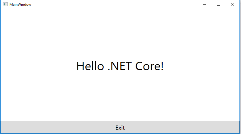
Below is what a WPF app built against .NET Core looks like!

wpf core

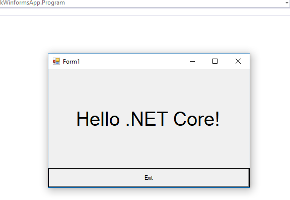
winforms

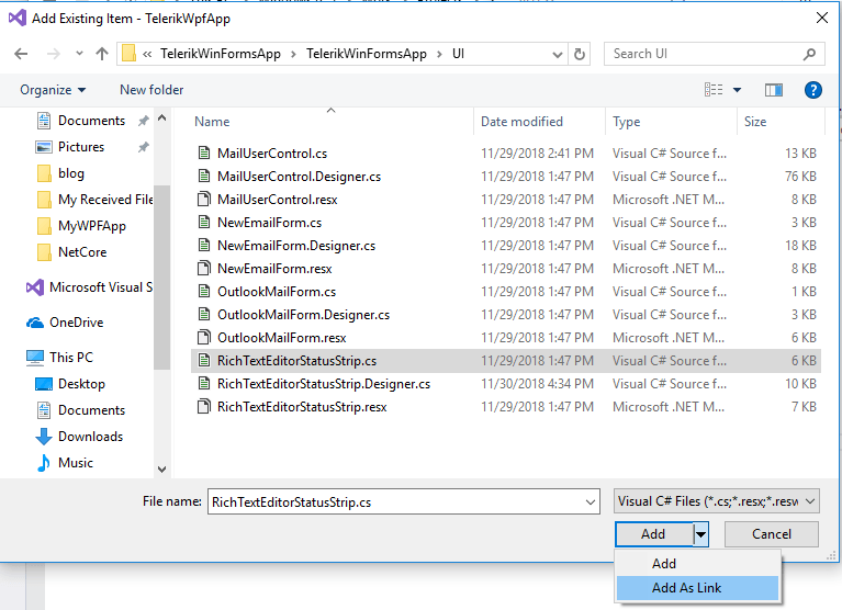
Step 3: Add Existing Files from Original Project as Linked Files

Link Files

After you have done this, there are some interesting things you should consider/do:

  • If you have used images with the build action Resources, change it to Embeded resource or Content

  • If you add your AssemblyInfo or App.Manifest file, be sure to add this manually to the project file - the new project style uses a different approach and generates the same assembly attributes as part of the build process

  • If you have referred to some references which are still not available in .NET Core as Windows.Composition, you should Include the Windows.Compatibility Pack

  • There is no design time support at this time, however, Microsoft is working on it and we should expect it in near future

Step 4: Change the Telerik Binaries with the Version Built Against .NET Core 3

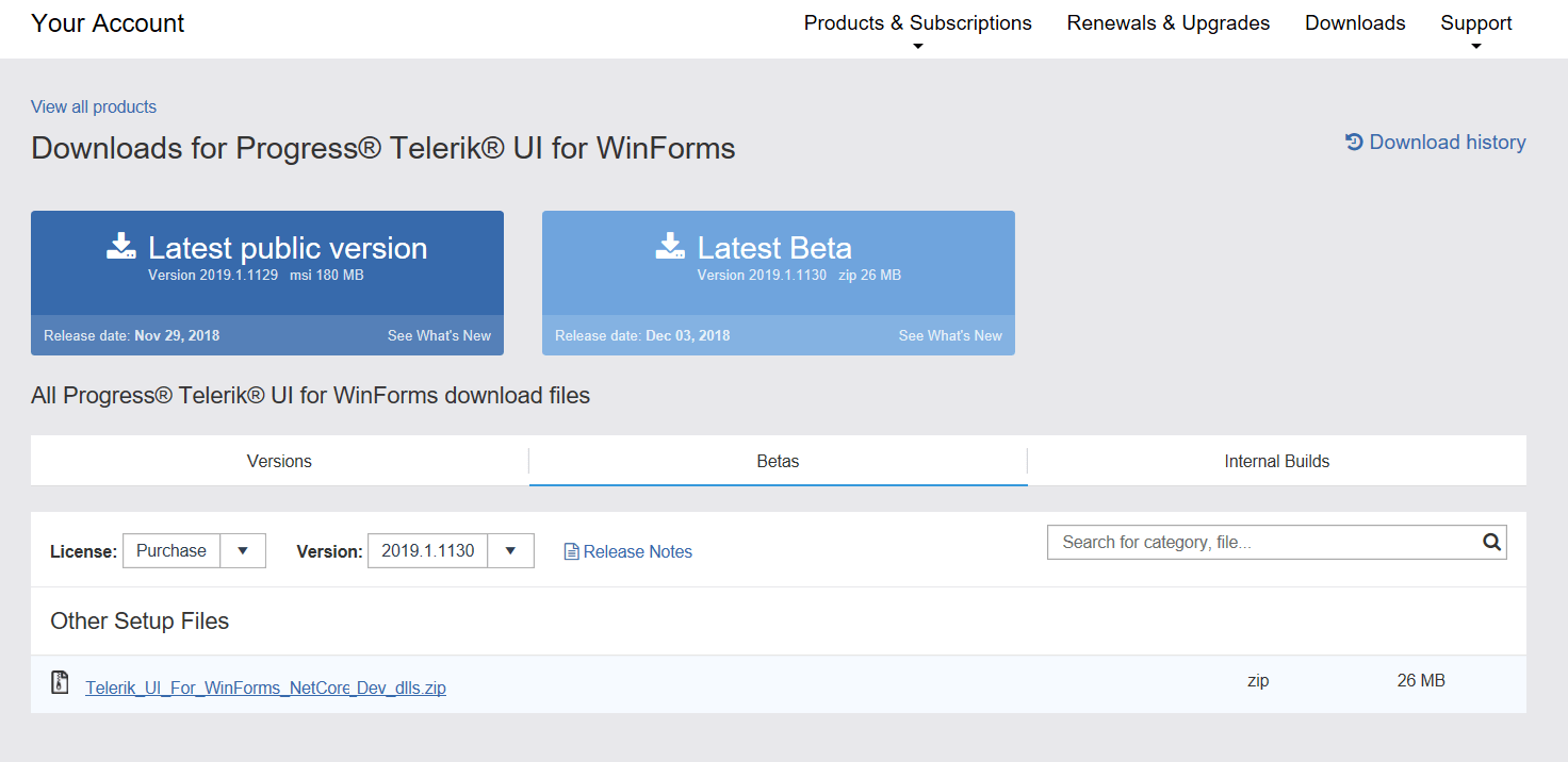
To do this, login to your account, go to the Downloads section of the latest release and download the .zip for WPF and .zip for WinForms containing the Preview of the .NET Core 3 controls for Telerik UI for WinForms or WPF.

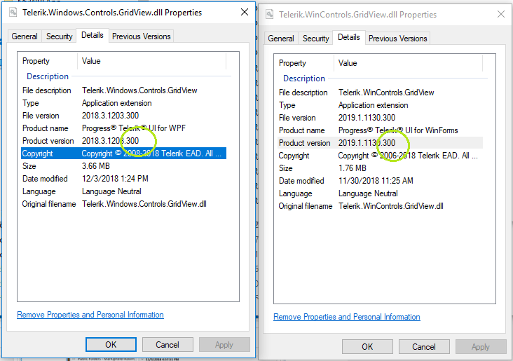
Now, add references to the .NET Core 3.0 alternative of the same Telerik binaries you previously used. The libraries have the same names and differ only in their versioning, They contain the 300 postfix in their versioning info.

your account

binaries

Note for WPF applications, if you use RadRichTextBox for WPF, there is one additional step. The current implementation uses MEF to load additional UI and components (like dialogs and document format providers depends), which in turn by default uses Assembly.ReflectionOnlyLoadFrom(*) method to inspect the assemblies for possible suitable parts. The method is currently not implemented for .NET Core, so as a workaround you can provide a pre-defined type catalog at the beginning of your application:

RadCompositionInitializer.Catalog = new TypeCatalog(
                // format providers
                typeof(XamlFormatProvider),
                typeof(RtfFormatProvider),
                typeof(DocxFormatProvider),
                typeof(PdfFormatProvider),
                typeof(HtmlFormatProvider),
                typeof(TxtFormatProvider),

                // mini toolbars
                typeof(SelectionMiniToolBar),
                typeof(ImageMiniToolBar),

                // context menu
                typeof(Telerik.Windows.Controls.RichTextBoxUI.ContextMenu),

                // the default English spell checking dictionary
                typeof(RadEn_USDictionary),

                // dialogs
                typeof(AddNewBibliographicSourceDialog),
                typeof(ChangeEditingPermissionsDialog),
                typeof(EditCustomDictionaryDialog),
                typeof(FindReplaceDialog),
                typeof(FloatingBlockPropertiesDialog),
                typeof(FontPropertiesDialog),
                typeof(ImageEditorDialog),
                typeof(InsertCaptionDialog),
                typeof(InsertCrossReferenceWindow),
                typeof(InsertDateTimeDialog),
                typeof(InsertTableDialog),
                typeof(InsertTableOfContentsDialog),
                typeof(ManageBibliographicSourcesDialog),
                typeof(ManageBookmarksDialog),
                typeof(ManageStylesDialog),
                typeof(NotesDialog),
                typeof(ProtectDocumentDialog),
                typeof(RadInsertHyperlinkDialog),
                typeof(RadInsertSymbolDialog),
                typeof(RadParagraphPropertiesDialog),
                typeof(SetNumberingValueDialog),
                typeof(SpellCheckingDialog),
                typeof(StyleFormattingPropertiesDialog),
                typeof(TableBordersDialog),
                typeof(TablePropertiesDialog),
                typeof(TabStopsPropertiesDialog),
                typeof(UnprotectDocumentDialog),
                typeof(WatermarkSettingsDialog)
                );

And voila -  run the project and see your new Desktop .Net Core 3 app with Telerik UI.
You can see that visually .NET Core 3.0 app (left) is the same as the original app(Right):

Now the apps are ready and you can continue to work with them. In the meantime, you can check out what else is cooking in our Telerik kitchen!. Stay tuned for the next major release of Telerik UI for Winforms and Telerik UI for WPF in early 2019.

Welcome to new era of .NET Core 3 apps and happy coding!

Getting Started with XAML Islands: Hosting a UWP Control in WPF and WinForms Apps

$
0
0

No, XAML Islands is not an exotic vacation spot, but in some ways it's even more exciting. This new functionality for .NET desktop developers from Microsoft aims to modernize classic WPF, WinForms and Win32 apps. Let's dive in.

In this blog series, we will walk you through what XAML Islands is, what it’s good for and how can you use it in your applications. In the previous article, we briefly talked about the history behind the implementation of the XAML islands, what it is, key functionalities & API, what's available for use now, as well as what you can expect in the near future.

Today's focus will be on: Hosting a UWP WebView, InkCanvas, MapControl and establishing native UWP Bindings in a WPF and Windows Forms application. Let's dive in and take a in-depth look into the available wrappers (WebView, InkCanvas and the WindowsXamlHost) and how native UWP bindings could be created from within the WPF and WinForms worlds.

WebView, InkCanvas and WindowsXamlHost Wrappers

Building a custom wrapper for a specific UWP control could be a time-consuming job. For that reason some of the most used UWP controls are wrapped for you and can be used out of the box. The currently wrapped controls are WebView, InkCanvas, InkToolBar, MediaPlayerElement and the MapControl.

NOTE: You need to have the latest version of Windows (1809) installed in order to be able to use XAML Islands.

In order to use these controls first you need to add a reference to the Microsoft.Toolkit.Wpf.UI.Controls Nuget package for WPF and to the Microsoft.Toolkit.Forms.UI.Controls for Windows Forms.

XAML_Islands_nuget

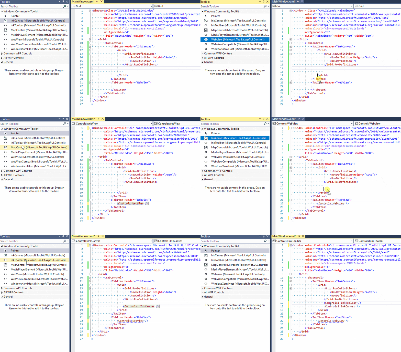
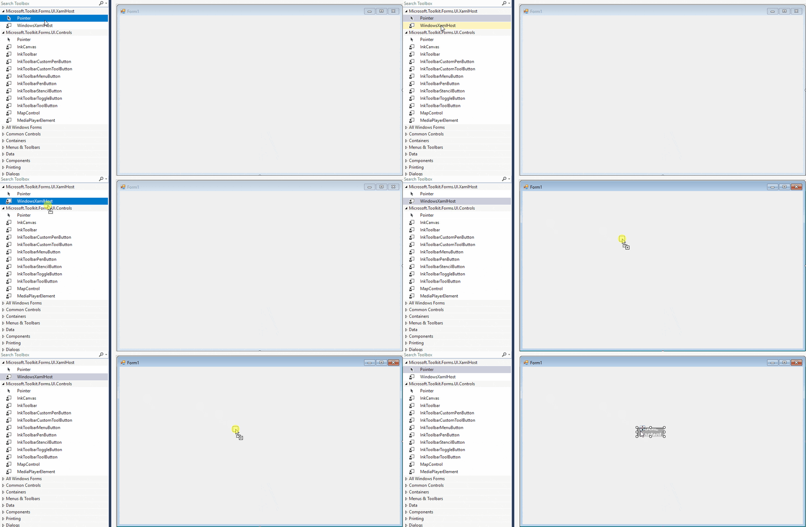
After the package is added you can head out and open the Visual Studio toolbox – the wrapped controls should be visualized there. You can simply drag and drop them inside your application and use them as any other WPF/WinForms control.

For example we can add InkCanvas and WebView:

WebView_InkCanvas_Toolbox

The properties and methods of the WebView and the InkCanvas are exposed as well and can be used directly:

<TabControl>
    <TabItem Header="InkCanvas">
        <Grid>
            <Grid.RowDefinitions>
                <RowDefinition Height="Auto"/>
                <RowDefinition Height="*"/>
            </Grid.RowDefinitions>
            <Controls1:InkToolbar TargetInkCanvas="{x:Reference Name=inkCanvas}"/>
            <Controls1:InkCanvas Grid.Row="1" x:Name="inkCanvas" />
        </Grid>
    </TabItem>
    <TabItem Header="WebView">
        <Controls:WebView Source="https://www.telerik.com"/>
    </TabItem>
</TabControl>


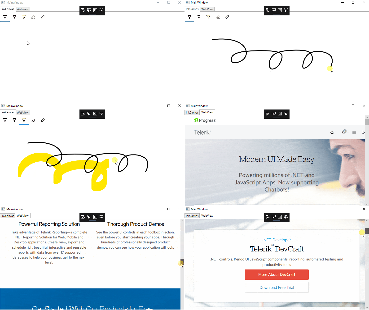
And the result should look like this:

WebVIew and InkCanvas

How to Wrap Other UWP Controls?

For every other control that is not wrapped out of the box, you can use the WindowsXamlHost and visualize it in WPF. 

First you need to add the following namespace in XAML in order to be able to use the WindowsXamlHost:

xmlns:XamlHost="clr-namespace:Microsoft.Toolkit.Wpf.UI.XamlHost;assembly=Microsoft.Toolkit.Wpf.UI.XamlHost"

After the namespace is added the WindowsXamlHost can be declared. Using the InitialTypeName of the host you need to specify the exact type of the control you want to initialize. For example, here is how you can show a pure native UWP Button:
<XamlHost:WindowsXamlHost InitialTypeName="Windows.UI.Xaml.Controls.Button" />
NOTE: In order to be able to reference the Windows 10 APIs in your WPF/WinForms application please, make sure you have added the needed references.

Using ChildChanged you can access the Button in code behind and play with it. The ChildChanged event guarantees the Button is completely loaded:

<XamlHost:WindowsXamlHost x:Name="xamlHost" InitialTypeName="Windows.UI.Xaml.Controls.Button" ChildChanged="WindowsXamlHost_ChildChanged"/>

And in the code-behind:

private void WindowsXamlHost_ChildChanged(object sender, System.EventArgs e)
{
    var host = (WindowsXamlHost)sender;
    var button = host.Child as Windows.UI.Xaml.Controls.Button;
    button.Content = "I am UWP Button";
}

This is just a simple example of initializing a UWP Button in WPF using the host. You can declare even more complex UI and assign them as a Child to the WindowsXamlHost:

...
global::Windows.UI.Xaml.Hosting.WindowsXamlManager.InitializeForCurrentThread();
 
var uwpGrid = new Grid();
uwpGrid.Margin = new Windows.UI.Xaml.Thickness(12, 20, 12, 14);
uwpGrid.RowDefinitions.Add(new RowDefinition());
uwpGrid.RowDefinitions.Add(new RowDefinition() { Height = Windows.UI.Xaml.GridLength.Auto });
 
var map = new MapControl();
 
var sliderGrid = new Grid();
Grid.SetRow(sliderGrid, 1);
sliderGrid.Margin = new Windows.UI.Xaml.Thickness(12);
 
var sliderPanel = new StackPanel();
vqr zoomSlider = new Slider();
zoomSlider.Minimum = 1;
zoomSlider.Maximum = 20;
zoomSlider.Header = "Zoom Level";
zoomSlider.Value = 17.5;
sliderPanel.Children.Add(zoomSlider);
 
var headingSlider = new Slider();
headingSlider.Minimum = 0;
headingSlider.Maximum = 360;
headingSlider.Header = "Heading";
headingSlider.Value = 0;
sliderPanel.Children.Add(headingSlider);
 
var desiredPitchSlider = new Slider();
desiredPitchSlider.Minimum = 0;
desiredPitchSlider.Maximum = 64;
desiredPitchSlider.Header = "Desired Pitch";
desiredPitchSlider.Value = 32;
sliderPanel.Children.Add(desiredPitchSlider);
sliderGrid.Children.Add(sliderPanel);
 
uwpGrid.Children.Add(this.map);
uwpGrid.Children.Add(sliderGrid);
this.xamlHost.Child = uwpGrid;
...

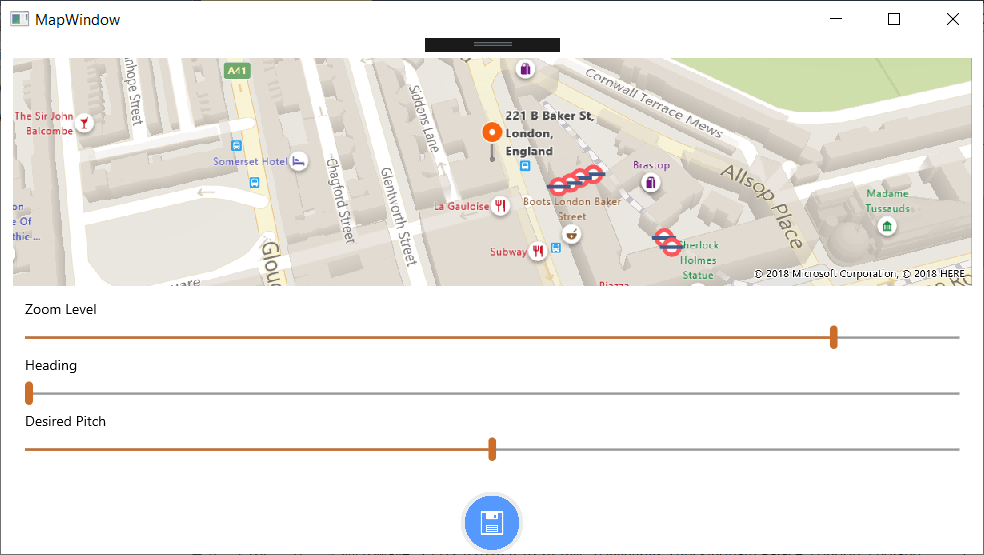
And the final result should be:

UWPMap

Host UWP Controls in Windows Forms

Similarly to WPF, you can wrap any native UWP control and visualize it in Windows Forms.

First you need to add the Microsoft.Toolkit.Forms.UI.Controls Nuget package. Like in WPF, you should be able to see the wrapped UWP controls in your Toolbox.

With a simple drag and drop the desired control can be placed and used in your application.

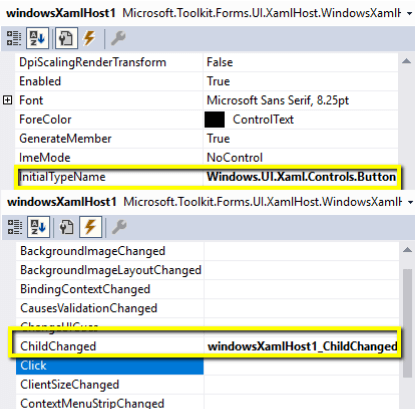
For example here is how a UWP Button can be created in the WinForms world:

WinForms_XamlIslands

And in code behind using the ChildChanged event you can set the desired properties to the Button:

XAMLIslands_WinForms
private void windowsXamlHost1_ChildChanged(object sender, EventArgs e)
{
    var host = (WindowsXamlHost)sender;
    var button = host.Child as Windows.UI.Xaml.Controls.Button;
    button.Content = "I am UWP Button called from Windows Forms :)";
}

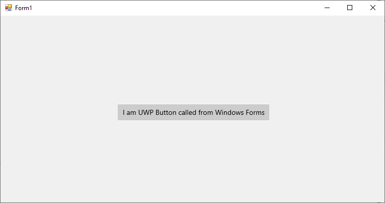
The final result should look like this:

WinForms_XAMLIslands

Using Bindings with the XAML Islands

One of the most useful features of XAML is Bindings. Because the Child of the WindowsXamlHost is running on the same process and on the exact same thread, just like with WPF and Windows Forms, you can establish bindings for your native UWP control without any concerns.

For example, lets create a simple ViewModel class:

public class ViewModel : INotifyPropertyChanged
{
    private string uwpBtnContent;
 
    public ViewModel()
    {
        this.UwpBtnContent = "I am set from the ViewModel";
    }
 
    public string UwpBtnContent
    {
        get
        {
            return this.uwpBtnContent;
        }
        set
        {
            if (this.uwpBtnContent != value)
            {
                this.uwpBtnContent = value;
                this.NotifyPropertyChanged(nameof(UwpBtnContent));
            }
        }
    }
 
    public event PropertyChangedEventHandler PropertyChanged;
 
    private void NotifyPropertyChanged([CallerMemberName] string propertyName = "")
    {
        PropertyChanged?.Invoke(this, new PropertyChangedEventArgs(propertyName));
    }
}

After that inside the ChildChanged event we can create the following binding for the Content property of the Button:

private void WindowsXamlHost_ChildChanged(object sender, System.EventArgs e)
{
    var host = (WindowsXamlHost)sender;
    var button = host.Child as Windows.UI.Xaml.Controls.Button;
    button.SetBinding(
        Windows.UI.Xaml.Controls.Button.ContentProperty,
        new Windows.UI.Xaml.Data.Binding()
        {
            Path = new Windows.UI.Xaml.PropertyPath("UwpBtnContent"),
            Source = new ViewModel()
        });
}

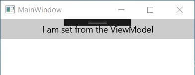
The result should look like this:

Binding

Limitations

As the XAML Islands is still in preview it has a few limitations. Here are some of them:

  • The Wrapped controls are not properly responding to changes in DPI and scale
  • Accessibility tools do not work seamlessly across the application and hosted controls

You can find a complete list with more information about the other limitations of XAML Islands here.

Closing Words

Being a desktop developer has never been so exciting. Bringing a native look and feel to your WPF and WinForms application using XAML Islands is another great functionality introduced by Microsoft. I am excited to see how XAML Islands develops, and for all the new functionalities that I believe are coming to us as developers in the future.

Do not hesitate and give XAML Islands a try right now. Believe me you won't regret it. You might also be interested in checking out our WPF, WinForms and UWP suites, which are in lock step with everything new from XAML Islands to .NET Core 3.0.

Thanks and Happy coding.

P.S. In the 3rd and final blog of the series, we are going to focus on styling and customizations and in particular, how to create Fluent Design-inspired WPF and WinForms applications.

Recommended Articles:

Plan Your Time with Telerik Calendar & Scheduling for Xamarin

$
0
0

The Calendar in our UI for Xamarin suite is now enhanced with new Scheduling capabilities, allowing you to create a detailed view of a schedule for a specific number of days.

The key to productive meetings is to plan them well beforehand. Having the proper tool to quickly display and manage appointments is an important part of the planning process. Taking this into account, we have recently enhanced the Calendar component in our Telerik UI for Xamarin suite with Scheduling capabilities, and I am eager to tell you all the details regarding the new functionality.

CalendarAll

With R3 2018 release of Telerik UI for Xamarin, RadCalendar comes with a new MultiDay view mode which enables you to create a detailed view of the schedule for a specific day or a couple of days. Even more, you will have full control over the way the appointments are visualized through various configuration options. Let’s check it out right away.

Setting up RadCalendar with MultiDay ViewMode

Currently, the ViewMode of RadCalendar can be changed only after the native Calendar control is rendered, which is why we’d need to hook to the NativeControlLoaded event and switch the view mode inside its handler:

<telerikInput:RadCalendar x:Name="calendar"NativeControlLoaded="CalendarLoaded" />

and here is the event handler:

private void CalendarLoaded(object sender, EventArgs e)
{
    (sender as RadCalendar).TrySetViewMode(CalendarViewMode.MultiDay);
}

We’re planning to improve the way this works and allow you to directly set/bind the ViewMode property of the control. So, expect more news on this in the upcoming R1 2019 release.

Adjusting the Timeline per Your Preferences

As the main function of the MultiDay view is to help users manage their appointments in a quick and intuitive way, we’ve made sure to provide a few useful configuration settings such as:

  • Day Start and End times
  • Option to show only the work week
  • Time indicator marking the current time
  • Custom time intervals inside the timeline

All of these can be easily applied through MultiDayViewSettings property of RadCalendar.

In addition, you can play with a variety of options for customizing the look & feel of the Multiday view, so that it matches the rest of your app. You can apply different background and text colors to the AllDay area, all-day appointments, regular appointments, timeline, and more. For a full list of the available settings I recommend checking out the MultiDayView topic from Calendar & Scheduling documentation.

The next snippet demonstrates how you can utilize some of the provided configuration options. Note that the styling settings are applied through the MultiDayViewStyle property of the control:

<telerikInput:RadCalendar x:Name="calendar"
                NativeControlLoaded="CalendarLoaded">
    <telerikInput:RadCalendar.MultiDayViewSettings>
        <telerikInput:MultiDayViewSettings VisibleDays="5"
                DayStartTime="9:00:00"
                DayEndTime="18:00:00"
                TimelineInterval="1:00"
                IsWeekendVisible="false"
                IsCurrentTimeIndicatorVisible="true" />
    </telerikInput:RadCalendar.MultiDayViewSettings>
    <telerikInput:RadCalendar.MultiDayViewStyle>
        <telerikInput:MultiDayViewStyle
                AllDayAreaBackgroundColor="Beige"
                AllDayAppointmentBackgroundColor="CornflowerBlue"
                AllDayAppointmentTextColor="White"
                CurrentTimeIndicatorColor="Blue"
                AppointmentFontSize="11"
                AllDayAppointmentFontSize="11" />
    </telerikInput:RadCalendar.MultiDayViewStyle>
</telerikInput:RadCalendar>

The screenshot below shows RadCalendar with the above settings applied on an iOS simulator:

XamarinCalendarTimeline

Displaying Meetings

After configuring the MultiDay view mode timeline, we are ready to add our appointments to the Calendar.

RadCalendar works with IAppointment objects, so we'll need to create an Appointment class that implements the IAppointment interface:

public class Appointment : IAppointment
{
    public DateTime StartDate { get; set; }
    public Color Color { get; set; }
    public DateTime EndDate { get; set; }
    public string Title { get; set; }
    public bool IsAllDay { get; set; }
    public string Detail { get; set; }
}

Then, we’ll create and add appointments to a collection of Appointment objects that should be assigned to the AppointmentsSource of the Calendar. Here are a few sample appointments:

var date = DateTime.Today;
calendar.AppointmentsSource = new ObservableItemCollection<Appointment>{
    new Appointment {
        Title = "Meeting with Tom",
        StartDate = date.AddHours(11),
        EndDate = date.AddHours(12),
        Color = Color.Tomato
    },
    new Appointment {
        Title = "Lunch with Sara",
        Detail = "Eddy's",
        StartDate = date.AddHours(12).AddMinutes(30),
        EndDate = date.AddHours(13).AddMinutes(30),
        Color = Color.DarkTurquoise
    },
    new Appointment {
        Title = "Birthday",
        StartDate = date.AddDays(2).AddHours(2).AddMinutes(30),
        EndDate = date.AddDays(2).AddHours(3),
        IsAllDay = true    
    }
};

And now you can see all the appointments visualized in the timeline:

XamarinCalendarAppointments

Scheduling Meetings

Most likely you will not only need to display meetings, but also provide users with the ability to schedule meetings. This can be accomplished by hooking to the TimeSlotTapped event of the Calendar and pushing a new page for adding a new appointment.  

The following XAML code example shows a basic form with a few input controls for scheduling a meeting:

<StackLayout Padding="10, 20, 10, 0" HorizontalOptions="FillAndExpand">
    <Grid Padding="10, 0, 10, 0" Margin="0, 10, 0, 0">
        <Label Text="New Event" FontSize="18"
                        HorizontalOptions="Center"
                        VerticalOptions="Center" />
        <Label Text="Save" FontSize="16"
                        HorizontalOptions="End"
                        VerticalOptions="Center">
            <Label.GestureRecognizers>
                <TapGestureRecognizer Command="{Binding AddCommand}" />
            </Label.GestureRecognizers>
        </Label>
    </Grid>
    <StackLayout Padding="10, 20, 10, 0">
        <telerikInput:RadEntry Text="{Binding AppointmentTitle}"
                        WatermarkText="Enter title"
                        Margin="0, 0, 0, 15"  />
        <telerikPrimitives:RadBorder BorderColor="#C8C7CC" BorderThickness="0, 0, 0, 1">
            <Grid Margin="0, 0, 0, 10" HeightRequest="40">
                <Label Text="All-day" FontSize="17" VerticalOptions="Center" />
                <Switch IsToggled="{Binding IsAllDay}" HorizontalOptions="End" />
            </Grid>
        </telerikPrimitives:RadBorder>
 
        <telerikPrimitives:RadBorder BorderColor="#C8C7CC" BorderThickness="0, 0, 0, 1">
            <Grid Margin="0, 0, 0, 10" HeightRequest="40">
                <Label Text="Starts" FontSize="17" VerticalOptions="Center" />
                <TimePicker Time="{Binding StartTime}"
                        HorizontalOptions="End" VerticalOptions="Center" />
            </Grid>
        </telerikPrimitives:RadBorder>
 
        <telerikPrimitives:RadBorder BorderColor="#C8C7CC" BorderThickness="0, 0, 0, 1">
            <Grid Margin="0, 0, 0, 10" HeightRequest="40">
                <Label Text="Ends" FontSize="17"  VerticalOptions="Center" />
                <TimePicker Time="{Binding EndTime}"
                        HorizontalOptions="End" 
                        VerticalOptions="Center" />
            </Grid>
        </telerikPrimitives:RadBorder>
    </StackLayout>
</StackLayout>

We’ll have to create a ViewModel class containing all the bound values and define that ViewModel as BindingContext of the page with the above form. Here is a sample AddAppointmentViewModel class:

public class AddAppointmentViewModel
{  
    private ICollection<Appointment> appointments;
    public AddAppointmentViewModel(ICollection<Appointment> appointments, DateTime startDate, DateTime endDate)
    {
        this.AddCommand = new Command(this.Add);
 
        this.appointments = appointments;
        this.StartTime = startDate.TimeOfDay;
        this.EndTime = endDate.TimeOfDay;
        this.StartDate = startDate;
        this.EndDate = endDate;
    }
    public ICommand AddCommand { get; }
    public string AppointmentTitle { get; set; }
    public bool IsAllDay { get; set; }
    public DateTime StartDate { get; set; }
    public DateTime EndDate { get; set; }
    public TimeSpan StartTime { get; set; }
    public TimeSpan EndTime { get; set; }
 
    private void Add()
    {
        var newAppointment = new Appointment
        {
            Title = this.AppointmentTitle,
            StartDate = this.StartDate.Date.AddTicks(this.StartTime.Ticks),
            EndDate = this.EndDate.Date.AddTicks(this.EndTime.Ticks),
            IsAllDay = this.IsAllDay,
            Color = Color.Green
        };
        this.appointments.Add(newAppointment);  
        App.Current.MainPage.Navigation.PopAsync();
    }
}

All that is left is to call the page containing the AddAppointment form on Calendar TimeSlot tapped action:

calendar.TimeSlotTapped += CalendarTimeSlotTapped;
 
private void CalendarTimeSlotTapped(object sender, TimeSlotTapEventArgs e)
{
    var appointments = (sender as RadCalendar).AppointmentsSource as ObservableItemCollection<Appointment>;
    var addAppointmentViewModel = new AddAppointmentViewModel(appointments, e.StartTime, e.EndTime);
    this.Navigation.PushAsync(new AddAppointmentPage(addAppointmentViewModel));
}

Once your code is complete, you can run the app and schedule new meetings.

XamarinCalendarAddMeeting

You can also find various demos showing the scheduling features of RadCalendar in the Telerik UI for Xamarin Samples Application.

What's Next

For the upcoming R1 2019 release of Telerik UI for Xamarin we’re planning to add more features to the scheduling functionality of RadCalendar such as:

  • Recurrent events support
  • Built-in UI for creating and editing appointments

As always, we'd love to hear your feedback. If you find anything missing that you'd like to see in a future version of the Calendar & Scheduling component, feel free to submit your feedback to our public feedback portal.

If this is the first time you're hearing about Telerik UI for Xamarin, you can find more information about it on our website or dive right into a free 30-day trial today.

Thanks and happy coding!

A Quick Intro to the Telerik ASP.NET DataGrids – AJAX, MVC and Core

$
0
0

With more than 100 built-in functionalities available in each of the Telerik ASP.NET DataGrids, you get a powerful component which provides a variety of options for how to present and perform operations over the underlying data.

As you know, ASP.NET comes in three distinct flavors. One is not better than another, however which one you use will depend primarily on your ultimate application goals. If you plan on building a cloud-based application that could run on Windows, macOS, or Linux, you would go with ASP.NET Core. If you are interested in something lightweight and highly testable, you may go with ASP.NET MVC. Or, if you come from a desktop background and prefer a declarative and control-based programming method, ASP.NET Web Forms would likely be your framework of choice.

And with any web app, you may find yourself in need of components or controls to provide a modern UI. Because we build components, we have some insight into which ones developers are using the most in their applications. Without a doubt, across all frameworks the most popular is the DataGrid.

It makes sense. DataGrids are a ubiquitous way to represent and manipulate data.

Essential DataGrid Elements

Any developer who has tried to build one will tell you that a grid is not static. A functional grid is interactive; it has structure and often requires more than you might think at first glance.

The datagrid depicted below is a fairly common one. It includes some of the most requested features such as paging, filtering, grouping, editing, nesting tables, and more.

ASP.NET DataGrid Essential Elements

The grid is part of the Telerik UI for ASP.NET AJAX, Telerik UI for ASP.NET MVC, and Telerik UI for ASP.NET Core toolsets. Telerik UI for ASP.NET AJAX can be purchased as a standalone product or part of the Telerik DevCraft bundle. The others can be purchased as server-side add-ons to Kendo UI or in Telerik DevCraft.

With more than 100 built-in functionalities available in each of the Telerik ASP.NET DataGrids, you get a powerful component which provides a variety of options for how to present and perform operations over the underlying data. In addition to basic and expected features such as sorting, filtering, grouping, editing, and exporting, more advanced functionalities are supported as well – detail rows, reordering of rows, scroll modes, multi row or cell selection, responsive design and more. In terms of data binding, the data source you choose and how you implement may vary from framework to framework, but if you use Telerik ASP.NET DataGrid controls, you often have multiple data binding options.   

Because each framework is somewhat different, let’s explore the ASP.NET AJAX, MVC and Core DataGrids built by the Telerik team at Progress.

ASP.NET Web Forms (aka AJAX) DataGrid

The ASP.NET AJAX DataGrid is one of the most mature and advanced controls in the Telerik ASP.NET AJAX suite, featuring a rich arsenal of functionalities like data binding to various data sources, editing, filtering, sorting, CRUD operations, mobile supportgrouping and more. And each of these features is richer than a single word might suggest.

For example, with the Telerik UI for ASP.NET AJAX DataGrid you can use any declarative data source control (AccessDataSource, SqlDataSource, LinqDataSource, EntityDataSource, ObjectDataSource, XmlDataSource, OpenAccessDataSource) or bind the grid to your custom objects. We also support server events, which are executed only when the grid needs to get fresh data from the server. Declarative and programmatic client-side binding to ASP.NET Web Services, WCF, ADO.NET, OData services and Page Methods are also supported.
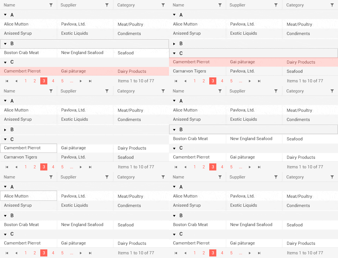
Telerik ASP.NET AJAX GridView - Data Binding

When bound to a DataSource control, the editing feature of the ASP.NET AJAX Grid allows you to enable automatic data editing. You can also use the extensive API to handle the CRUD operations in a custom manner. You can display the edit form inline, as a regular form or in a popup and choose between the built-in edit forms, your own template or a user control. You can also enable batch editing to allow users to edit multiple items and save them all by hitting the Save button just once.

Telerik ASP.NET AJAX GridView - Editing

Filtering is another functionality providing you with plenty of options for displaying data. With the Telerik ASP.NET DataGrids you can filter any type of data - string, decimal, Boolean, date and time. Depending on the column filtered your users can select any filtering function from the contextual menu, including “Equal,” “Contains,” “Greater than” and “Less than.” You can use the different grid columns to provide suitable filter inputs like date pickers, numeric textboxes, and drop down lists. The client and server-side APIs allow you to define your own filter template while still utilizing the built-in filtering mechanism.

Telerik ASP.NET AJAX GridView - Filtering

And those examples are just the beginning. To find out more about the functionalities of the Telerik ASP.NET AJAX DataGrid make sure you explore our resources about grid hierarchy with templates, grid virtualization, excel-like filtering, mobile-friendly grids, as well as getting started with Telerik UI for ASP.NET AJAX tips.

As you start to see the depth of the DataGrid and the richness of each feature, you will realize how much you can do with your DataGrid with the right control. You also won’t be surprised to find out that major organizations and institutions such as American Express, Bank of America and the University of North Carolina all have used the Telerik UI for ASP.NET AJAX controls.

Trial | Web Mail Sample App | Demos | Documentation

ASP.NET MVC DataGrid

The Telerik UI for ASP.NET MVC Grid enables highly sophisticated interactions with your data.

As an example, SanDisk, one of the world’s largest manufacturers of flash memory products, used the Telerik UI for ASP.NET MVC controls in an application designed to help their employees plan and forecast production and sales numbers for all the different markets they serve without maintaining spreadsheets. Analysts can maintain various versions of their forecasts and merge them into the final published version developed by the planning managers or VPs. The reports are published at the end of every quarter using BI tools such as Tableau, and released to a larger audience, including the CEO and other decision makers in the company. 

The end application featured the Grid, and was built using HTML5 and jQuery-based Kendo UI controls, Telerik UI for ASP.NET MVC, a web API and a service layer that uses a custom Data Access Layer specifically developed for SAP HANA. You can learn more about the application and project from our case study.

Much like the ASP.NET Web Forms/AJAX Grid, the Telerik UI for ASP.NET MVC DataGrid offers the essential Grid features like paging, sorting, filtering and grouping your data using a very intuitive interface. You have the ability to re-size and reorder your columns and even easily hide or display them individually. You can freeze columns with the change of a single property, or allow the user to lock and unlock columns interactively, or even easily create a hierarchy for your parent and child records. With the template feature of the Grid component you have full control over complex formatting. You can choose between a Toolbar template, Column header template, Row template, Detail template and others.

Telerik ASP.NET MVC DataGrid - Essential Features

And, as we mentioned in the section about Web Forms, each of the features has a depth and richness that enables you to create an outstanding user experience.

Take editing as an example. Editing can easily be wired to a RESTful API, or work with local data. Edit forms can be presented in-line, or in a pop-up. You can even do batch updates to allow many changes to be done before preserving them in the data. This allows your users to create, update or even delete data from your underlying data source.

Telerik ASP.NET MVC DataGrid - Editing

And since we’ve mentioned data source, with the MVC DataGrid, you can easily configure remote data binding with the Kendo UI DataSource utility which works with any RESTful API. You can connect to any local data source or remotely communicate through JSON/JSONP, OData, or XML formats.

Telerik ASP.NET MVC Grid - Data Sources

Again – we’ve just explored the tip of the iceberg with these examples, so make sure you check out our demos as well as the .NET DevChat: Responsive Web Apps with ASP.NET MVC and Bootstrap 4 and Refactoring Data Grids with C# Extension Methods articles.

Trial | Kendo UI® ♥ Bootstrap Sample App | Demos | Documentation

ASP.NET Core DataGrid

ASP.NET Core is an open-source, cross-platform framework that was first released by Microsoft in June 2016. That fall, Progress announced its Telerik UI for ASP.NET Core toolset.

In the two short years the product has been available, the ASP.NET Core DataGrid has quickly become a favorite component in the toolset. As with the other ASP.NET DataGrids, it is a responsive and adaptive HTML5 Grid that provides more than 100 features from filtering to sorting data, to more advanced features like pagination and hierarchical data grouping.

In addition to the traditional HTMLHelpers, one of which is the Grid HtmlHelper, Telerik UI for ASP.NET Core comes with the industry’s first compete packaged-set of Tag Helpers as well. The Grid Tag Helper helps you configure the Kendo UI grid component within your ASP.NET Core applications.

With the exception of the Tag Helpers, which are unique to ASP.NET Core, the ASP.NET Core and ASP.NET MVC DataGrids share the same features and functionalities. We’ve talked a little about editing and data sources, but did you know that the Telerik UI for ASP.NET Core Grid offers virtualization and endless scrolling functionalities, allowing users to scroll smoothly through records? This affords you the opportunity to achieve exceptional performance regardless of the size of your database or the grid configuration.

Telerik ASP.NET Core DataGrid Performance

From a usability perspective, our DataGrid meets accessibility requirements as well as multiple interaction opportunities. The Telerik UI for ASP.NET Core DataGrid component is Section 508, WAI-ARIA and WCAG 2.1 compliant, ensuring individuals with disabilities can interact with it. And it provides keyboard navigation that enables you to create an application that allows users to use mouse clicks, keyboard strokes or both.

Telerik ASP.NET Core DataGrid - Keyboard Navigation

With more than 100 features of the Grid alone, it’s definitely worth checking out some of our articles, particularly Working with ASP.NET Core and Data Grids, Prototyping ASP.NET Core Data Grids and Getting Started with Telerik UI for ASP.NET Core and Bootstrap 4.

As you might expect, we have an arsenal of demo pages including an Insert, Update and Delete from Data Source demo, Export to PDF & Excel demo, Freeze Grid Columns demo, Hierarchical Grid demo and Column Interaction demo.

TrialKendo UI® ♥ Bootstrap Sample App | Demos |  HTML Helpers Documentation | Tag Helpers Documentation

Additional Resources for ASP.NET AJAX, MVC, and Core DataGrids 

The DataGrids for our ASP.NET tools are feature-rich, highly performant, and beautifully designed. But don’t just take our word for it. Definitely download a free 30-day trial and take them for a spin.

And check out a few of the other Grid resources and information we have available that span across our toolsets.

  • Article:Top 17 Tips for Effective Grids in Web Apps
  • Themes: All grids have three Sass-based themes – Default, Bootstrap and Material. Have we mentioned there are Less-based themes as well? The Theme Builder application, which enables you to create new or customize the existing themes of each framework, is also available.
  • Unlimited Product Support: We’re proud to provide a support service that our customers love. Progress offers unlimited support delivered by the engineers of the product with a 24-hour guaranteed response time, Monday through Friday.
  • StackOverflow: We’re big fans of StackOverflow at Progress. If you want to learn from the larger Telerik user community, we encourage you to visit stackoverflow.com and use the tag “telerik-grid.”

Happy coding!


Razor Components for a JavaScript-Free FrontEnd in 2019

$
0
0

Could a server application architecture that promises to provide an alternative to JavaScript be the next big thing for .NET developers in 2019? In this article we'll discuss Razor Components, a new framework that promises JavaScript free web development backed by .NET technologies like C#, .NET Standard, and SignalR.

Could a server application architecture that promises to provide an alternative to JavaScript be the next big thing for .NET developers in 2019? In this article we'll discuss Razor Components, a new framework that promises JavaScript free web development backed by .NET technologies like C#, .NET Standard, and SignalR. This new technology is on the road-map for .NET Core 3.0 and it's showing a lot of potential.

Razor Components, is what originally started as Blazor Server-Side in early 2018. Blazor is a .NET single page web application framework that is generally associated with .NET running on Web Assembly. However, Blazor is capable of running under multiple scenarios including server-side as a .NET Standard application, a.k.a. Razor Components. Blazor and Razor Components are essentially the same, except for where they execute. Blazor runs on the browser using web assembly, while Razor Components runs on the server. Razor Components treats the browser as a “thin-client” where the web browser handles just the user interface (UI) and the server receives events and responds with UI updates remotely. To the user, the application is indistinguishable from any other web application.

Author's note: In my opinion, the current name choice of “Razor Components” leads to confusion. To clarify what we're discussing:

  • Razor is a template markup syntax for .NET
  • Blazor is a .NET based web framework which can run on the client using WebAssembly or as:
    • Razor Components - Blazor framework running on the server

On the surface the concept of Razor Components brings up more questions that it answers, so let's dig deeper into the architecture.

Server - Client Architecture

Razor Components has a unique architecture that allows a .NET application to run server-side while the user interface runs out of process in a remote browser. The combination of .NET Core and SignalR allows us to write web applications without JavaScript.

At the “Core”

Razor Components is the combination of several .NET Core technologies. First and foremost a Razor Components application utilizes .NET Standard 2.0. Building with .NET Standard means Razor Components has a large .NET API surface to work with as it is compatible with other .NET Standard libraries. In addition, Razor Components is a .NET Core application, so it can be built and deployed using any operating system. A quick look inside a Razor Components .csproj shows we're in familiar .NET territory. The application type is even an EXE, which tells us this is an executable. > In .NET Core the actual output is an executable .dll, not a literal .exe.

<PropertyGroup>
  <TargetFramework>netstandard2.0</TargetFramework>
  <OutputType>Exe</OutputType>
  <LangVersion>7.3</LangVersion>
  <!-- ... -->
</PropertyGroup>

So what do we do with this executable and how does it translate into a magical thin-client enabled web application? To understand this we'll need to take a look at the server & client relationship.

Now Serving Razor Components

On the server the application is hosted by ASP.NET Core. This is again a typical ASP.NET Core application, the base on which other ASP.NET Core apps are hosted including: MVC, WebAPI, and Razor Pages. In a Razor Components application the host uses services and middleware to register the application in the HTTP pipeline. Looking into the Startup.cs of the server application we can see the services and middleware configurations.

At the time of writing, Razor Components is still called ServerSideBlazor in the related APIs.

public void ConfigureServices(IServiceCollection services)
{
  // ...

  // adds the Server-Side Blazor services, and those registered
  // by the app project's startup
  services.AddServerSideBlazor<App.Startup>();

  // ...
}

// This method gets called by the runtime. Use this method to
// configure the HTTP request pipeline.
public void Configure(IApplicationBuilder app,
                      IHostingEnvironment env)
{
  // ...

  // Use component registrations and static files from the
  // app project.
  app.UseServerSideBlazor<App.Startup>();

  // ...
}

Once the server application is ready we can make an initial web request request, this leads us to setting up the browser as a “thin-client”.

SignalR the Thin-Client

Upon making a request to the server, we receive back static files for the application. As with most typical web applications we receive HTML. With Razor Components the first file received by the client is the Index.html file which kicks off the client-side application. The client application is a single JavaScript file included with the framework, blazor.server.js. This application is a special SignalR client with a responsibility to receive/process DOM changes from the server, send events to the server, and most importantly establish a WebSocket connection with the server.

The communication between the client and server is done through SignalR as binary data. The packets of data contain just the necessary DOM changes and not the entire rendered DOM. There's NO Viewstate a la ASP.NET WebForms to worry about with Razor Components.

With the client - server relationship understood, now we can focus on the UI portion of the framework.

Writing Web UIs Razor and C#

Since Razor Components runs server side as a .NET Standard app, logic is written using .NET technologies. This is possible due to the Blazor framework which employs the RenderTree, a DOM abstraction similar to virtual DOMs used in popular JavaScript frameworks like Angular and React. Let's look at UI side of the framework to understand how components are written.

Component Basics

Razor is the popular template markup syntax that was introduced in ASP.NET MVC 3.0. Razor gained popularity through its simplicity in that it requires an @ symbol to begin a code-block without an explicit closing tag. Unlike the MVC framework, where Razor is used to explicitly write HTML, Razor Components emits a RenderTree. In Razor Components every .cshtml file is as a component which can be used as an element, ex: Widget.cs becomes <Widget>. Carrying on the tradition of simplicity can be seen in the following image as much of the concept of a component can be understood from some basic annotations.

The header of a component defines special characteristics or features of a component such as: routing, layout, and dependency injection. In the image, we can see that this component has a route specified by @page "/counter". The component acts as a page when visiting the route /component, additionally the component can be used in other components as the element <Counter>.

All markup inside the component becomes part of the RenderTree. This shares some similarity to the way .jsx is used in React. Given the example <h1>Counter</h1> the framework will create the following code behind the scenes when building the RenderTree builder.AddMarkupContent(0, "<h1>Counter</h1>\n\n");. With the RenderTree abstracted away, developers can focus on writing components with Razor and HTML.

Component logic is written as C# within a @funcitons block. Fields, properties, and events are bound using Razor syntax. Referencing an event or value from the code block within the component's markup is as simple as using @propertyName.

Component Parameters

The concept of components goes beyond encapsulating markup. In order to create reusable components we need to be able to communicate with components. Components support the use parameters to bind data and events. Using the [Parameter] attribute in a component exposes properties for consumption. In the following Counter component, the [Parameter] attribute is added to allow consumers to specify the amount to increment the count by.

<p>Current count: @currentCount</p>
<button class="btn btn-primary" onclick="@IncrementCount">
  Click me
</button>

@functions {
  int currentCount = 0;

  [Parameter] protected int CountBy { get; set; } = 1;

  void IncrementCount()
  {
    currentCount += CountBy;
  }
}

In another file we can now set the CountBy value on the component element.

<Counter CountBy="5"></Counter>

The parameter CountBy can also be bound to other components on the page allowing the value to be set dynamically by the user. For example, we can place an input on the page and bind its value to the CountBy property. Now the counter's behavior can change at run-time by changing the value of the input.

<Counter CountBy="@countBy"></Counter>
<input bind="@countBy" type="number" />

@functions {
  int countBy = 5;
}

The component model is easy to learn but provides a robust base to build complex UIs. Additional libraries can also be used to support the application logic and UI experience.

A Broad Range of Options: Including JavaScript

Because Razor Components leverages .NET and the browser, the architecture allows for some interesting integration points.

.NET Standard and Beyond

Since Razor Components is a .NET Core application, it works with .NET Standard libraries, this means existing NuGet packages and SDKs may be compatible. This includes most .NET Standard libraries provided they do not interact with or depend on technologies that are tightly coupled to a platform. For example, a library like MarkDig which is used to parse Markdown into HTML is compatiable because it has no dependencies beyond .NET Standard 2.0. At the time of writing, even the advanced .NET based Machine Learning SDK - ML.NET is compatible when used as a service within a Razor Components application.

JavaScript Interoperability

Additionally a Razor Components app can use dependencies the JavaScript ecosystems and through an interoperability layer the app can communicate bidirectionally with both .NET and JavaScript dependencies. This is helpful for situations where the Razor Components does not support a necessary browser/DOM API or an existing JavaScript library is useful.

While the component model in Razor Components an solve most UI needs, some DOM APIs are still needed. For example, getting the users geo location information is not supported directly through Razor Components. To access this feature as a DOM API, Razor Components can call upon the JavaScript implementation in the browser through the JavaScript interop layer.

The following example shows an example of how a C# abstraction can be written to interface with the browser's geo location APIs, specifically the getCurrentPosition method. From .NET, the JSRuntime.Current.InvokeAsync method is used to invoke a JavaScript moduleinteropGeolocation.js.

// GeoLocation.cs (.NET)
public class Geolocation
{
  // ...

  public async Task GetCurrentPosition(
    Action<Position> onSuccess,
    Action<PositionError> onError,
    PositionOptions options = null)
  {
    OnGetPosition = onSuccess;
    OnGetPositionError = onError;
    await JSRuntime.Current.InvokeAsync<bool>(
      "interopGeolocation.getCurrentPosition",
      new DotNetObjectRef(this),
      options);
  }

  // ...
}

Through invokeMethodAsync the JavaScript module is able to call back into .NET returning the results.

// interopGeolocation.js (Browser)

window.interopGeolocation = {
  getCurrentPosition: function (geolocationRef, options) {
    const success = (result) => {
      geolocationRef.invokeMethodAsync(
        'RaiseOnGetPosition',
        interopGeolocation.toSerializeable(result));
    };
    const error = (er) =>
    geolocationRef.invokeMethodAsync(
      'RaiseOnGetPositionError',
      er.code);
    navigator.geolocation.getCurrentPosition(
      success,
      error,
      options);
},

// ...

The abstraction is then used within the application as normal C# code. This interop can written as a .NET library that can be shared among many projects.

// Index.cshtml (Application usage)

// Component initialized
protected override async Task OnInitAsync()
{
  var g = new Geolocation();
  await g.WatchPosition(Handler, HandleError);
}

void Handler(Position p)
{
  Lat = p.Coords.Latitude;
  Long = p.Coords.Longitude;
}

Ideally, once an interop is created for an API, it shouldn't have to be created again.

ASP.NET Core 3.0 Timeline

Razor Components was first announced during DotNET Conf. It is expected that Razor Components will ship with ASP.NET Core 3.0 mid-2019. The following quote from Daniel Roth explains what the goal of Blazor and Razor Components will be over the near term.

Our primary goal remains to ship support for running Blazor client-side in the browser. Work on running Blazor client-side on WebAssembly will continue in parallel with the Razor Components work, although it will remain experimental for a while longer while we work through the issues of running .NET on WebAssembly. We will however keep the component model the same regardless of whether you are running on the server or the client. You can switch your Blazor app to run on the client or the server by changing a single line of code. See the Blazor .NET Conf talk to see this in action and to learn more about our plans for Razor Components:

Getting Started

If you're the type of developer who likes to test things early, you can try Blazor Components today. At the time of writing, Razor Components is still being branded as Server-Side Blazor which can be found at Blazor.NET. Follow the instructions under getting and be sure to choose the “Blazor (Server-Side in ASP.NET Core)” project type.

Pros & Cons

Since only a small amount of JavaScript is required to bootstrap the client and no .NET assemblies are transferred to the client. Even during operation network traffic is light because communication between the browser “thin-client” and the server is a small binary packet. However, because web sockets are used, the client and server must always be connected. This means that Razor Components apps cannot work in offline mode. If offline mode is a must for your application, then the WebAssembly equivalent Blazor application may be a better choice. With that said, Blazor has yet to receive an official release date or promise of support from Microsoft.

Scale with Azure

One last point of concern to some may be the question of “how will Razor Components scale.” Since Razor Components is built with SignalR, it has the advantage of Azure. Azure SignalR Service is a fully managed service infrastructure that works seamlessly with ASP.NET Core SignalR. Integrating SignalR Service requires very little code modification to add automatic capacity provisioning, scaling, or persistent connections.

Wrapping up

Razor Components, the server-side implementation of the Blazor framework is a new take on web development. By utilizing the web browser as a thin-client Razor Components offers a new alternative to JavaScript frameworks. Its component model is simple enough that it maintains a short learning curve, yet is robust enough to be extremely productive. Even though Razor Components is new, its ability to use existing .NET libraries, tooling and optionally JavaScript's ecosystem as well makes it a strong candidate for front end web development.

This post is part of the Second Annual C# Advent. Check out the advent calendar for other great posts!

Building Faster Backends in ASP.NET Core

$
0
0

Web application performance is often ignored until it's too late. If developers are not careful, small inefficiencies can pile up leading to a slow clunky web app. To avoid this fate, the key is consistency - and always staying cognizant of performance bottlenecks. Many small improvements over time are cheaper and easier than trying to cram them in at the end of the project.

We recently looked at how to build faster frontends in ASP.NET Core. Now let's take a look at the other half of the equation - the web server backend. Optimizing your backend performance is different than optimizing your frontend web app. Most frontend performance improvements focus on the size of requests going over the wire. Backend performance, on the other hand, is more focused on getting data efficiently and controlling responses. This article takes a deep dive into backend performance tuning - we take a look at some tools of the trade and common techniques that can help.

Measuring Speed

If you want to improve the performance of your web application, you must first measure it. Measuring performance can be tricky business. Variations caused by other processes in the pipeline can make exact performance numbers hard to obtain. Developers need to know never to trust a single performance number. If you run the same operation under the same conditions a few times, you'll get a range that's good enough to optimize. Additionally, there are certain performance issues that you can only catch while running the application under user load.

To measure performance, developers would likely want to use two different types of tools. First would be a profiling tool to measure individual performance. There are many tools that can do this, but one of the most popular ones is MiniProfiler. MiniProfiler is simply a NuGet package you can pull in to your web application project. It measures the performance of different processes and displays the information while you run your application. Times are stored unobtrusively on the top right corner. You can expand them to get a detailed analysis of the time it takes for different processes to run on your machine. Here's an example of the output from MiniProfiler:

MiniProfiler will also profile SQL queries from Entity Framework - this makes it easy to find long running queries. MiniProfiler will also flag duplicate SQL queries. Here's an example:

You can also add custom profiling steps to your web application. If you have a long running process, you can break it down into steps and track how long each one takes. In the code below, we're adding a custom profiling step to the method:

MiniProfiler is a great tool for testing the performance of an application while you're using it, but it lacks the ability to get aggregate performance data. For this, you'll likely need an application performance monitoring (APM) tool. Application Insights and New Relic are popular, but there are lots of options. These tools will measure the overall performance of your web app, determining the average response time and flagging down slow responses for you.

Once you have your measurement tools in place, you can move onto fixing problems. When fixing performance issues, developers should take measurements before and after each intervention. Also, it is advisable to change only one thing at a time - if you change several factors and re-test, you won't know which (if any) of those interventions worked. Improving application performance is all about running different experiments. Measuring performance will tell you which experiments worked.

Another handy utility for measuring performance is Telerik Test Studio– a test automation solution liked by developers & QAs. While the primary goal is automating UI tests for web/desktop/mobile, Test Studio is also quite helpful in load and performance testing. Developers can capture HTTP(S) traffic and customize requests to gauge impact on performance, and recorded Test Studio web tests can be reused for load testing. The bottom line is, developers should use all available tools at their disposal to measure speed and see how performance tuning can help.

Performance Tips

There are a lot of performance tuning techniques - the best ones are based on real production applications. Performance tips cannot be applied blindly though - developers need to measure the interventions and make sure they work for the given app. Just because something worked in one app, it doesn't mean it'll be good for another application. Let's do a quick run down of some common performance tuning techniques for your backend app server.

Dealing with Databases

Data is pivotal for any app, but databases can also be the most common performance bottleneck. Your database queries need to be efficient - period. Using your favorite profiler, find the offending slow-running query and try running it directly against the database. Developers can also use SQL Server Management Studio and check out the execution plan, if using SQL Server as a database. If using relational databases, you should make sure that the fields you are searching on are hitting the appropriate indexes - if need be, one can add any necessary indexes and try again. If your database query is complex, you can try simplifying it or splitting it up into pieces.

If optimizing SQL queries is not your forte, there's a shortcut. In SQL Server Management studio, go to Tools > Database Tuning Engine Advisor. Run your query through the tool and it'll give you suggestions on how to make it run faster.

Get the Right Stuff

What your web app shows on a given screen should have an exact correlation to what you fetch from your data tier - one should not grab any unnecessary data. Developers need to be wary of reusing expensive item retrievals to grab whole graphs of related objects for small grids.

Another thing to consider is that your users probably aren't going to read 10,000 items you pushed out to client side - at least, not at the same time. Developers must consider fetching data in batches and using pagination to limit the size of datasets retrieved. Modern interface for web apps like Kendo UI or Telerik UI for ASP.NET MVC/Core already have smart UI controls that work seamlessly with chunks of data through pagination - developers don't need to reinvent the wheel.

Cache Slow Calculations

The best way to get data more quickly is to not get it at all. Smart use of caching can radically improve your web application's performance. In ASP.NET Core, data caching comes in two flavors - in-memory caching and distributed caching.

In-memory caching stores cached data on the server. While this is the easiest cache to use, it's also limited to a single server. If you are running multiple servers, each will have a different cache.

Distributed cache uses a data store to keep the cached data. You can run as many servers as you want and they'll all hit the same data cache. The two most common data stores for distributed caching are SQL server and REDIS - both fairly easy to set up.

Because it's so effective, some developers will want to cache everything - this can be counterproductive. Caching adds complexity to your app and the performance boost isn't always worth it. Developers should limit caching to things that are hard to calculate or slow to change. Another technique is to try keeping all data caching logic in a single layer in your app - throwing cache commands all over the place can make it hard to track down potential errors.

Crush it with Response Compression

When improving the performance of your web applications, it's important to minimize the amount of data over the wire. This is especially true for folks using your web app from their phones. One way to send fewer bits is to enable response compression. By default, ASP.NET Core will GZIP several different types of requests. However, it will not GZIP commonly used responses, including CSS, JavaScript, and JSON. Before ASP.NET Core, you used to have to write custom middleware to compress those types of responses. In ASP.NET Core, the middleware is built in... all you need to do is add it to your Startup.cs file, like so:

Don't Create a Logjam

While most logging frameworks keep their performance cost to a minimum, logging still has a cost. Excessive logging can slow down your application during high load times. When in Production, developers should be logging only what's necessary to support monitoring and routine troubleshooting. You should save verbose logging for lower environments where you can afford the performance cost. Also, logging levels are best kept configurable - if you need to temporarily turn up your logging to gather data for an issue, you should be able make that happen without needing to recompile your app.

Ace Your Async Requests

Making use of asynchronous programming with C# Async/Await is a fantastic way to improve the performance of your application, but you need to be aware that these keywords will not run commands in parallel. Await stops the execution of your code - so if you have multiple async requests that are awaiting, your individual performance will be the same as if you ran those requests consecutively.

This doesn't mean you shouldn't async what you can, however. Async still improves the performance of your application, but only under load. By reducing the number of threads waiting around, async/await increases the throughput of your application.

If you want to improve individual performance, you need to make use of the Task Parallel Library (TPL). By managing your own tasks, you can execute things in parallel. If you have several slow calls to make for a method, like calling an external service, you should consider running them in parallel instead of using async/await.

The following example illustrates the two methods. The top method uses the standard async/await flow and the bottom method uses task objects. Running the tasks in parallel uses more code, but running several slow requests in parallel will save time.

Make Your Apps Faster Today

Building performant web applications is a tough job, but ASP.NET Core has lots of tools and features that will help. Developers should begin by measuring performance with tools like MiniProfiler and Application Insights. Then, as you find bottlenecks, go through the checklist to see which interventions help your app. Performance tuning takes patience and experimentation - hopefully, with frontend and backend processes streamlined, you can turn the right knobs to see performance improvements. Performant web apps mean delighted users and elevated engagement - cheers to that.

From Responsive to Progressive: Making TripXpert a Progressive Web App

$
0
0

PWAs enable you to take an existing web app and offer it as a native mobile experience. In this blog, we showcase how to do so using our sample travel app, TripXpert.

It's hard to escape all the hype around Progressive Web Apps (PWAs). Everyone involved with the web is excited about the prospect of being able to take their existing web applications and offer them in a more native way on mobile devices. While many of you may have taken a look at what they are and have a good idea of what the characteristics of a PWA might be, what you may not know is that we have a couple of PWA examples using Kendo UI components.

Today, I wanted to dive into one of these applications, TripXpert, which we have showcased as a responsive web app for quite some time. Why bring this up in a PWA conversation? Well, recently the team took time to make TripXpert a full-blown PWA and I wanted to highlight just how we went about adding in this extra functionality.

Wait a Second, What is a PWA?

In case you haven't yet heard about Progressive Web Apps I'll get you caught up in just a paragraph or two.

The quick and dirty around PWAs is that they are responsive web applications that can take advantage of mobile devices' native features. You might initially say that this is close to Cordova and hybrid applications of old, but the main difference is that there is no need to run the application in a shell, or offer plugins or wrappers for native functionality. A PWA is a regular web app that we browse to with our desktop and mobile devices today. We just sprinkle in some extra capabilities on mobile devices when a user opts to add them to the home screen, which is done through the browser rather than the various app stores.

I should mention that beyond just adding native mobile functionality to an app, a PWA is also an optimized application that is reliable and can load instantly even under slow or no internet connections. It is also fast and can provide a native-like experience (responds quickly to interactions, has smooth animations and is devoid of "jank"). Finally, a PWA should also be engaging, which means that it should feel like a natural app on the mobile device—including all of the UX that comes with that mindset. So, it's not quite as easy as just adding in a new setting and getting a PWA, you have to make sure that you're properly optimized to be a PWA. The end result is good for you either way though, as not only are you getting further engagement in your application thanks to mobile users, you also end up having a faster application, which is very important for today's web apps.

Google has a great PWA page that covers everything at a high level, and also provides in-depth links and more resources to explore. It covers what I mentioned above and way more, plus has tools like Lighthouse to help with building and optimizing your PWA, so definitely check it out!

Actually, What is "TripXpert"?

Let me also introduce the application that we'll be talking about throughout this article: TripXpert. Essentially, TripXpert is built to mimic a tourism website that allows you to book complete vacation packages to various locations across the globe. What I like about this scenario is that it gives us a lot of real-world examples to deal with, like displaying a list of packages, creating an enticing layout for each package, providing a detail view that can incorporate our data visualization components and maps, and a few other things. Additionally, from a mobile perspective, users could be looking at potential trips while on the go, making this a great scenario to start taking advantage of device features and create a great PWA.


tripxpert-in-action

TripXpert was built with ASP.NET MVC and the Telerik UI for ASP.NET MVC components. The great thing about these components is that they are built on top of the jQuery edition of the Kendo UI components, so anything I mention in this article can be applied to jQuery, ASP.NET MVC, and ASP.NET Core (also based on our jQuery widgets)!

Here's a full list of the components we used:

  • DropDownList
  • MaskedTextBox
  • Window
  • Button
  • Map
  • Dialog
  • Menu
  • ListView
  • Calendar
  • TabStrip
  • ComboBox
  • ResponsivePanel
  • Kendo UI Validator

At first, this application was meant to showcase the great-looking UI components that we have (just a straight up brag, I know, but I'm biased :wink:), along with putting them together in a larger sample, but it also took on a vital role of showcasing how to build a responsive web app using our UI components. The Kendo UI components are all responsive out of the box, which means that outside of some design choices we've made for the look-and-feel of the app itself, any kind of responsive design approaches will fully work with our components.

Now, to make this a PWA, there are a couple of things that we need to do on top of the responsive features, but I'll get to that a little bit later. First, let's cover what we did around responsiveness.

Making Things Responsive

To make sure that we follow patterns that you might be using today, we started off with adding in Bootstrap v4.1.1. While we do not use it 100% across all of our responsive features (some of that is driven by custom CSS we implemented or classes available in the Kendo UI themes) you'll see plenty of inclusions of the Boostrap spacing utilities sprinkled throughout the HTML. This helps us ensure that things appear in the right places depending on the viewport that we have available, which is very important as the real estate of the application changes—we don't want elements to either appear squished next to each other or weirdly stacked when we resize the browser (especially when we use a mobile device).

Bootstrap isn't the only thing we used though. There's also some work done coming from the Kendo UI jQuery components and our integration with Bootstrap that we can take advantage of to make things truly responsive.

While I can't go through exactly every piece of responsiveness (that would be an article in its own), I can provide a couple of highlights.

Looking over the search area, we can see that we have different views of search depending on our view port.

Desktop


tripxpert-search-desktop

Mobile


tripxpert-search-mobile

As we can see, we drop a lot of extra "fluff" around searches when we get down to a smaller screen size. You can still select the filters that we have in the beginning based on interactions with the search input, but from a real estate perspective, we cut down quite a bit.

This is all handled by working with Bootstrap to set up some rules around when to display a certain element, having worked with the Bootstrap Display Utilities to decide at what size we should hide these inputs. Then, from a Kendo UI component perspective, we simply define that we want the element to have width:100% like we do here:


@(Html.Kendo().DropDownList()
    .Name("OfferType")
    .OptionLabel("Offer type")
    .DataTextField("Text")
    .DataValueField("Value")
    .BindTo(new List<SelectListItem>() {
        new SelectListItem() { Text = "All types", Value = "All" },
        new SelectListItem() { Text = "Special offers", Value = "Special" },
        new SelectListItem() { Text = "Regular offers", Value = "Regular" }
    })
    .HtmlAttributes(new { style = "width:100%;", @class = "tx-offertype" })
    .Height(150)
    .Events(x=> x.Change("onOfferTypeChange"))
)

Notice the .HtmlAttributes configuration option above—this is more or less all we need for Kendo UI to adhere to whatever rules we set up with Bootstrap!

The above is just an extract of what we've done to add responsiveness to TripXpert. There's plenty of more responsive features built in (check out how the ListView goes from multiple columns down to a single column on mobile devices) but I want to jump over to what has been done

Let's Make a PWA!

Now, just making a website responsive is really just the first step. How do we take something like TripXpert and make it a full-blown PWA? Well, there are a few things that we have to do on a technical level to "PWA-ify" our application. From a UI perspective (the app has to follow UX guidelines for PWAs afterall), we're luckily covered due to a few reasons, one being the usage of the Kendo UI CSS classes that we can pull out from our themes. Having built-in responsiveness from the Kendo UI components helps out quite a bit as well of course!

Let's take a look at the two things that immediately stick out to take this application from responsive to progressive.

Adding the manifest.json


The manifest.json file describes what your application is and how it should behave when a user installs the application to their home screen. Browsers can read this file and get a quick rundown of what to expect from your app. This file is required in order tor browsers like Chrome to provide the "Add to Home Screen" option for your application (which we will see in action later). For a more thorough explanation of what the manifest.json file is, please refer to Google's Web Fundamentals guide around The Web App Manifest.

For reference, here's what we specifically did for TripXpert and its manifest.json file:


{
  "name": "TripXpert",
  "short_name": "TripXpert",
  "theme_color": "#858585",
  "background_color": "#858585",
  "display": "standalone",
  "Scope": "./",
  "lang": "en",
  "description": "The ultimate trip planning app!",
  "start_url": "./",
  "icons": [
    {
      "src": "/Images/App/Icons/HomeScreen/homescreen-icons_144X144.png",
      "sizes": "144x144",
      "type": "image/png"
    },
    {
      "src": "/Images/App/Icons/HomeScreen/homescreen-icons_180X180.png",
      "sizes": "180x180",
      "type": "image/png"
    },
    {
      "src": "/Images/App/Icons/HomeScreen/homescreen-icons_192X192.png",
      "sizes": "192x192",
      "type": "image/png"
    },
    {
      "src": "/Images/App/Icons/HomeScreen/homescreen-icons_512X512.png",
      "sizes": "512x512",
      "type": "image/png"
    }
  ],
  "splash_pages": null,
  "screenshots": [
    {
      "src": "/Images/Gallery/France/Eiffel-Tower_Attraction.jpg",
      "sizes": "320x320",
      "type": "image/jpeg"
    },
    {
      "src": "/Images/Gallery/Italy/Roman-Colosseum_Lilia-Karakoleva.jpg",
      "sizes": "320x320",
      "type": "image/jpeg"
    }
  ]
}


What we see here is the name of the application, TripXpert, along with the icons that we would like to have associated with the application depending on the size that the device offers. We also set up things like ensuring that the application always starts on ./, even if the user saved the application to their desktop when navigating a particular vacation package, and we also define that it should run as a standalone application so it runs in its own window, rather than in the standard browser UI. This helps us make the user experience feel even closer to a native app.

Hard Labor with Service Workers


Beyond just describing how our application should behave when installed, we want to take advantage of some actual native functionality. This includes potentially working with the application offline, syncing data in the background, push notifications and much more! The key to this is service workers and they are what make PWAs bridge the gap between web and native functionality.

For the scope of this article, a service worker is written in JavaScript and the browser runs it in the background, separate from your web application. It cannot access the DOM directly, so you have to handle communication between the service worker and your business logic. A service worker also terminates itself when its not used, and starts up again when it is used, so you can't use service workers themselves to maintain state and data.

For more information on service workers (there's a ton to look in to!), I recommend Google's Service Workers: an Introduction article, which does a great job of diving in to what service workers are and how to start using them in your applications.

The service worker file for TripXpert is a bit long, so rather than pasting it here, I'll link directly to service-worker.js right here.

What you'll notice initially is a variable that we set up to hold files that we want to be cached:

var cachedFiles = [
    path,
    path + "bundles/css?v=9bf_1hN1hPPO3xXNTcN-zh4IFDRFrfVrnaYTdddcBHQ1",
    path + "bundles/js?v=3NJpYh6kMRRulVfyFMXyChUMveyhk6-RqaWX_5pxkQY1",
    path + 'Images/App/TripXpert_logo.svg',
    path + 'Home/GetDestinations',
    path + 'Home/GetSpecialDestinations',
    path + 'Destinations/Destinations_First',
    path + 'Images/Gallery/Barcelona-and-Tenerife/Arc-de-Triomf,-Barcelona,-Spain_Liliya-Karakoleva.JPG?width=320&height=320',
    [...]


This part, especially the first couple of lines, is important to ensure that we keep all of the functionality of our application intact when we install our application to a mobile device. This variable provides all of the paths to JavaScript files that we need to use in our application, and then transitions into pages, images and other files that we need to have in our application.

We use this when the install event of the service worker triggers (when we actually install the application to a device) to actually cache all of the files provided in the cachedFiles array.


self.addEventListener('install', function (e) {
    e.waitUntil(
        caches.open(cacheName).then(function (cache) {
            Promise.all(
                cachedFiles.map(function (url) { cache.add(url) })
            );
        })
    );
});


Now, once we've installed and set up our cached files, we will actually have to handle what happens when requests are made within the application. A service worker will start receiving fetch events when a user navigates to a different page or refreshes a particular page. This is our chance to check if we have something available in the cache, or if we need to retrieve something outside of the application. If it is a resource that we have available locally, let's not waste time and bandwidth by trying to retrieve it from a server somewhere!

I won't go in to a full rundown of what each line means here, but for reference the way we handle this in TripXpert is the following.

self.addEventListener('fetch', function (e) {
    if ((e.request.url.indexOf("kendo") === -1 && e.request.url.indexOf("TripXpert") === -1) ||
        e.request.url.indexOf("t.eloqua") !== -1 ||
        e.request.url.indexOf("d.company") !== -1 ||
        e.request.url.indexOf("facebook") !== -1 ||
        e.request.url.indexOf("google") !== -1 ||
        e.request.url.indexOf("outbrain") !== -1 ||
        e.request.url.indexOf("twitter") !== -1 ||
        e.request.url.indexOf("linkedin") !== -1 ||
        e.request.url.indexOf("Destination") !== -1
    ) {
        return;
    }
 
    e.respondWith(
        caches.match(e.request.url).then(function (resp) {
            return resp || fetch(e.request.url).then(function (response) {
                var clonedResponse = response.clone();
                 
                if (response.redirected) {
                    return new Response(response.body);
                }
 
                caches.open(cacheName).then(function (cache) {
                    cache.put(e.request.url, clonedResponse);
                });
                return response;
            });
        }).catch(function () {
            return caches.match('/');
        })
    );
});


With all of the above, we have the fundamentals of a PWA. Our application can now be installed, it will look like a native application (no browser UI getting in the way), have its own set of icons on various home screens and will work offline without any missing functionality! We aren't adding push notifications or anything like that in this iteration, but this gives us a good baseline for an initial PWA that we can of course expand upon to make even more native-like!

The Proof is in the Pudding

Let's see what this looks like on my mobile device!


tripxpert-mobile-gif

As we can see, on this Android device, Chrome offers me the ability to save this app to my phone's home screen. Now, you'll notice that I get a generic icon rather than this beautiful icon which seems to be due to my custom launcher. For any of you trying this on your own devices, you should be able to see the TripXpert icon instead.

Once I open up the application, we can see that there really isn't a way to tell that this is not a regular mobile application. There is no browser UI bar at the bottom, or any kind of search bar at the top, so from a user's perspective, we've created something that looks great on their device and they access it just like they would any other installed app they picked up from the App Store or Google Play.

The Most Important Bit: Source Code

I've been linking to the actual TripXpert application so far, but what about the source code? It is found right here on GitHub and will give you even further insight on how we set things up (server-side code included)! This is a great way to gain more insight in to just how we created this lovely little application.

Pssst—We Have Other PWAs!

By the way, TripXpert is not the only sample that we have that covers how to build a Progressive Web Application! If you're interested in seeing how this can be done in Angular or React, then I have some great news for you: we have sample PWAs built for these frameworks as well! Check them our right here:

Final Notes

While this blog post didn't take you step-by-step through building TripXpert, it hopefully gave you some ideas and guidance around how you can potentially take your own applications and make them into a PWA. There might be a few steps here, including making your app actually responsive, but once you've got a great layout and user experience for mobile devices, it is only natural to start adding in some more features to make the experience that much better for mobile users! Go forth and PWA!

New PDF Viewer Coming in Telerik UI for Xamarin R1 2019

$
0
0

Viewing and manipulating PDFs is an increasingly common task, but still a cumbersome one - especially on mobile devices. That's where the new PDF Viewer for Telerik UI for Xamarin comes in.

With the first release of the year (R1 2019), the Telerik UI for Xamarin UI library expands with a new PDF Viewer Control enabling the end-users of your mobile application to view PDF documents without relying on third-party applications.

Nowadays, we deal with PDF documents almost daily, ranging from bank statements to invoices and formal documents and business memos. As mobile devices become more and more powerful and commonly used as an extension (or replacement) of a desktop application, we turn to reviewing PDFs on our handhelds as well. However, in order to view these files, we rely on a separate application to review them, which often requires us to switch back and forth between applications.

In the case of mobile devices, this process is quite cumbersome and does not provide the best user experience. This claim was further backed up by you, our customers and we've received numerous requests from you to provide the option for reviewing PDF files inside the mobile app itself - we heard you loud and clear!

We are happy to announce that as of the next release of Telerik UI for Xamarin, a brand new control is coming to life - the PDF Viewer. This allows you and the end-users of your application to review PDF files straight from inside the mobile app, without needing to install a third-party app.

Telerik UI for Xamarin - PDF Viewer - Overview Image

But we didn't stop there, and we've also added a number of extra features to provide you with an even better user experience. Here is a list of the features that will ship together with the release:

  • PDF Document Visualization: Display PDF documents with text, images, shapes, colors, lists, bullets and more
  • Single Page and Continuous Scrolling Support: Easily scroll the document in the viewer with a fluent experience
  • Commands Support: Be it Zooming, Navigating from page to page, FitToWidth or Toggling the Layout mode, you got it
  • Toolbar Support: With the built-in toolbar, all commands and actions are already set in place

We are still actively working on the control, so expect a few extra features too :). The R1 2019 release will take place on January 16th (yes, it's close!), at which point you will be able to download the latest version of the Telerik UI for Xamarin toolkit and explore the control for yourself and try it out in your application.

As we previously mentioned, the PDF Viewer came to life based on your continuous feedback and support, and we couldn't be more thankful. Please, continue sharing your thoughts, as this is one of the key factors we take into account in building our roadmap.

Last, but not least, you can get a detailed overview of everything new in R1 2019, across all our products, together with our developer experts, so make sure to sign up for the Telerik R1 2019 Webinar on January 18th.

Save My Seat for the Release Webinar

We look forward to sharing more with you after the release. Hope you are as excited as we are!

The NavigationView (Hamburger Menu) Arrives in Telerik UI for WPF R1 2019

$
0
0

Another powerful navigation control is coming to Telerik UI for WPF with the Telerik R1 2019 Release - the NavigationView. Also known as the Hamburger Menu, it provides a modern and intuitive user experience in your WPF applications.

As I am writing this blog post, reality hit me hard - it's already 2019, a year which in my childhood was used to signify the future, where people rode flying cars and buildings rose as high as the clouds. Despite that being far from the truth, we've seen tremendous change in our everyday lives, due to major technology advancements across multiple industries. As users we are interacting with more software products and platforms than ever before and as we rely on them for both work and leisure, we praise and demand intuitive and modern UI across the board.

One prominent example of a great navigational UI is NavigationView, often called the Hamburger Menu. You can find it in a variety of UWP / Windows 10 applications, as well as the Windows 10 Start Menu itself.

We are happy to announce that it's part of our Telerik R1 2019 release of Telerik UI for WPF

Telerik_UI_for_WPF_-_NavigationView_-_Overview Image

The NavigationView organizes the content into separate tabs, all visible on the side as drawers. It's an easy way to allow the end-user to navigate to the different views of the application. Through it's adaptive nature it provides a great UX across various devices, making it the go-to choice for many developers. With the initial release of the control, it will support the following features:

  • Adaptive Display Mode: The control will dynamically adopt the layout to the size of the window, while keeping the content well-arranged and visible on the screen
  • Data Binding: The control can be easily bind to different sources such as Objects and Collections
  • Flexible Header and Footer: Both the Headers and Footers can be easily customized to accommodate the needs of your application
  • UI Automation Support: The NavigationView provides built-in support for Microsoft UI Automation
  • Enhanced Routed Events Framework: With the events system of the control your code will become elegant and concise
  • Keyboard support: Perform navigation, selection and other actions through the keyboard alone

The Telerik R1 2019 Release goes live on January 16, when you will be able to get your hands on the latest version of Telerik UI for WPF and try out the NavigationView in your application.

In addition to the Hamburger Menu, the release will bring full support for Visual Studio 2019 and the .NET Core 3.0 Preview (huzzah!), as well as a bunch of other new controls and feature enhancements. These include the official MultiColumnComboBox control, the ability to add the MultiColumnComboBox column to the GridView component, a new RibbonUI to pair with the Diagram component and a Hyperlink button to name a few.

For a detailed overview of everything new in R1 2019, make sure to sign up for the Telerik R1'19 Webinar. 

Save My Seat for the Release Webinar

Thank you for your continuous support and feedback - keep the feedback coming, as this is a critical part of how we set our product roadmap. Stay tuned for more info after the release, and see you at the webinar!
Viewing all 1954 articles
Browse latest View live