Quantcast
Channel: Telerik Blogs | .NET
Viewing all 1954 articles
Browse latest View live

ASP.NET Core Tag Helpers Video Tutorial: Getting Started with Telerik Tag Helpers

$
0
0

In this series of videos, get introduced to ASP.NET Core Tag Helpers and learn how you can use them to build better real-world applications with the help of Telerik UI for ASP.NET Core.

This instructional video series is a hands-on demo of ASP.NET Core Tag Helpers with the help of Telerik UI for ASP.NET Core. Learn the basics of working with Tag Helpers by building a fully functional app using multiple UI components (grid, chart, date picker and more). The course is guided by industry pros: Scott Addie, Sr. Content Developer for Microsoft, and Ed Charbeneau, three-time Microsoft MVP.

What are ASP.NET Core Tag Helpers

To really understand how ASP.NET Core Tag Helpers can make you more productive we’ll begin with an introduction to the basics of Tag Helpers. In this video we’ll learn why Tag Helpers were added in ASP.NET Core and how they improve the readability of our markup through better IntelliSense and easier context switching.

Let’s Build an App

In the Tag Helper video series we’ll learn how to build the Team Efficiency Dashboard, a single page, responsive web application. The application uses date picker, responsive panel, chart, grid and tree view Tag Helpers to create an interactive reporting experience. In this video we’ll take a look at the completed app we’ll be building.

Introducing Telerik UI for ASP.NET Core: Tag Helpers

ASP.NET Core comes with a handful of Tag Helpers, just a fraction of what is needed to build a real-world application. For a complete toolbox of components the Telerik UI for ASP.NET Core features over 60 Tag Helpers. In this video we discuss the features of Telerik UI for ASP.NET Core and how to install, where to find documentation and get a free trial.

Let’s Start with a Prototype

In this video we discuss the prototype application which we will transform over the course of the video series into a fully functional application. The prototype application is a simple bootstrap layout with placeholder elements which will be replaced with Telerik UI for ASP.NET Core Tag Helpers.

Form Basics: Label and Date Picker Tag Helpers

Scott Addie introduces us to the ASP.NET Core Label Tag Helper and the Telerik Date Picker Tag Helper. This introduction shows how to write markup using Tag Helpers and discusses the advantages of the generated UI.

Using the Tree View Tag Helper to Master Hierarchical Data

Microsoft MVP Ed Charbeneau shows us how to use the Telerik ASP.NET Core Tree View Tag Helper. The Tree View Tag Helper is a UI component that can be data bound naturally to hierarchical data sources.

Refactoring with the ASP.NET Core 2.1 Partial Tag Helper

In this video we learn how to refactor application view code with the Partial Tag Helper. The Partial Tag Helper is a new feature in ASP.NET Core 2.1 used to encapsulate markup.

Responsive Panel

In this video we see how to create a mobile responsive panel with the Responsive Panel Tag Helper. This Tag Helper creates a drawer that collapses off screen when a device has a small screen size.

Tackling Data Sets with the Telerik Data Grid Tag Helper

In this video we learn how to use the Telerik Data Grid Tag Helper. Data binding, sorting, filtering, and server side functionality are discussed.

Handling Client Side Events and User Interactions

In this video we learn how to use Telerik UI for ASP.NET Core’s client side API. Using client side events we can easily add interactivity and bind to events using ASP.NET Core Tag Helpers.

Using Chart Tag Helpers for Interactive Data Visualizations

In this view we learn how to use the Telerik Chart Tag Helper for ASP.NET Core. Client side events are used to complete the demo application.

I hope this video series helps you get started with ASP.NET Core Tag Helpers and shows how Telerik UI for ASP.NET Core can help you build your real-world applications. You can start a free trial of Telerik UI for ASP.NET Core here and try it out for yourself. Happy coding!


Telerik Team Contributes to the Newly Open Sourced WinForms

$
0
0

When Microsoft announced it would be making WinForms and WPF open source, our Telerik team jumped at the opportunity to be among the first contributors.

Microsoft recently announced WinForms and WPF are now open source. It is a natural progression of the company’s open source efforts and further delivers on its promise to the developer community.

Working alongside Microsoft, our team - led by Stefan Stefanov - submitted one of the first pull requests to be merged in the WinForms repo on GitHub: support for PlaceholderText in the TextBox control.

The concept behind the feature is simple - it has a single property called PlaceholderText. When set, the control allows developers to show a watermark with a description if the text of a control is set to null.

Prior to this feature being merged, in order to provide guidance for the users as to what input is expected in a text field, the only option was to have a label next to the TextBox control. However, there are cases where labels are not appropriate, and it is much more user friendly to have a placeholder text in the TextBox itself to provide users with prescriptive guidance for input expectations. A prime use case for this would be the user name and password fields.

How it Works

A single public property called PlaceholderText is introduced, with no default value. When the property is set AND the TextBox.Text is null or string.Empty, the string from the PlaceholderText will be drawn in the TextBox control when it has no focus, using the SystemColors.GrayText.

Once the property value is changed the new text will be drawn, if currently visible. When the user focuses on the control, the text disappears. Different text alignments and RightToLeft are taken into consideration when the PlaceholderText is being drawn. It supports Multiline mode as well.

In addition, AccessibilityObject has been implemented to return the PlaceholderText when the Text is empty, so screen readers read the PlaceholderText value and guide the users as to what is expected from them as input.

On the bottom left side of the image you can see a TextBox with PlaceholderText drawn.

PlaceholderText

We are excited about the future of desktop development with WinForms and WPF and were thrilled to be a part of the group of developers making Microsoft’s desktop libraries even stronger. What’s more, with the frameworks now open source, we can access the code at a deeper level and address issues in a self-serve model. This will enable us to deliver better products faster to you and address issues that in the past may have required more detailed and lengthy interactions with Microsoft. If you don't have a license of Telerik UI for WinForms or Telerik UI for WPF, make sure you download a trial.

What are your thoughts on WinForms and WPF being open sourced? Is it a good thing for you as a desktop developer? What do you hope to see from the frameworks in the future and do you plan to contribute? Share your thoughts with us.

Report Rendering Run Time on Linux and More in Telerik Reporting and Report Server R1 2019

$
0
0

We've added great features to Telerik Reporting and Telerik Report Server in our first release of 2019, including improved Linux support. Read on to get a preview.

For the R1 2019 release of Telerik Reporting and Telerik Report Server, we have been busy implementing a whole set of new features. These have come directly from your requests on our feedback portal, so thank you and keep them coming! 

In the next release, which will arrive on January 16th, we will include report rendering run time on Linux (.NET Core), declarative report definitions localization, scalability of the report scheduling service and much more.

In this blog post, I want to focus on what to expect regarding one of these features in particular – Report rendering run time on Linux (.NET Core) in Telerik Reporting.

New Feature Preview: Report Rendering Run Time on Linux (.NET Core) in Telerik Reporting

With Telerik Reporting you can deploy your created reports to any business application. Currently, we support the following technologies:

  • ASP.NET MVC
  • ASP.NET Ajax (Web Forms)
  • WPF
  • Windows Forms
  • HTML5
  • Angular
  • Azure Cloud

With R1 2019, we will enable our report rendering engine, along with the reports web service, to be available for deployment on console and web applications targeting .NET Core framework, versions 2.0 and higher. The deployment target can be both Windows and Linux OS. With this valuable addition Telerik Reporting becomes available to a wider developer audience by targeting yet another operating system. 

Try it Out and Learn More at the Webinar

If you are new to our tools or have only tried some, make sure you download the trial and take them for a spin. You can either download just the Reporting and Report Server tools, or download a trial of our entire set of .NET and JavaScript tools with the DevCraft bundle.

Watch the Webinars

And don't forget to register for our R1 2019 release webinar on January 18th, where our technical experts will provide a deep dive into all our new features and functionalities.

Save My Seat

R1 2019 Sneak Peek: Telerik Tools for ASP.NET AJAX, MVC and Core

$
0
0

Get a sneak peek at some of the new controls and features that will be available in Telerik UI for ASP.NET AJAX, Telerik UI for ASP.NET MVC and Telerik UI for ASP.NET Core.

Happy 2019! If you hadn’t heard, next week is the first major release of the year for the Telerik and Kendo UI product lines. And while you will have to wait a few more days before you can get your hands on the latest bits, I thought I’d share the highlight reel of what will be included.

Make sure you download the latest bits or a trial on January 16 – and don’t forget to sign up for the Telerik R1 2019 release webinar where Sam Basu and Ed Charbeneau will go over all of the new additions and improvements to our web, mobile and desktop tools.

Telerik UI for ASP.NET MVC and Telerik UI for ASP.NET Core

New Date Range Selection Components: MultiViewCalendar and DateRangePicker Date Range selection is a popular request. Because of this, we are adding two new controls in R1 2019 - MultiViewCalendar and DateRangePicker. The MultiViewCalendar component enables developers to easily display two calendars side by side, while the DateRangePicker component provides the ability to pick a start and end date all within a single drop down menu.


TreeView Performance Boost
With R1 2019 we have taken significant steps to improve rendering and interaction time with the TreeView, which is most noticeable in data intensive scenarios. But don’t worry, there won’t be a need to work with any new configuration; all improvements are under the hood!

Scaffolding and Support for Razor Pages in ASP.NET Core
With R1 2019 Telerik UI for ASP.NET Core will receive several scaffold templates that can easily be added in to any project to help speed up development. On top of this, as of R1 2019 we will also fully support Razor Pages to help cover more scenarios when developing with ASP.NET Core.

Telerik UI for AJAX

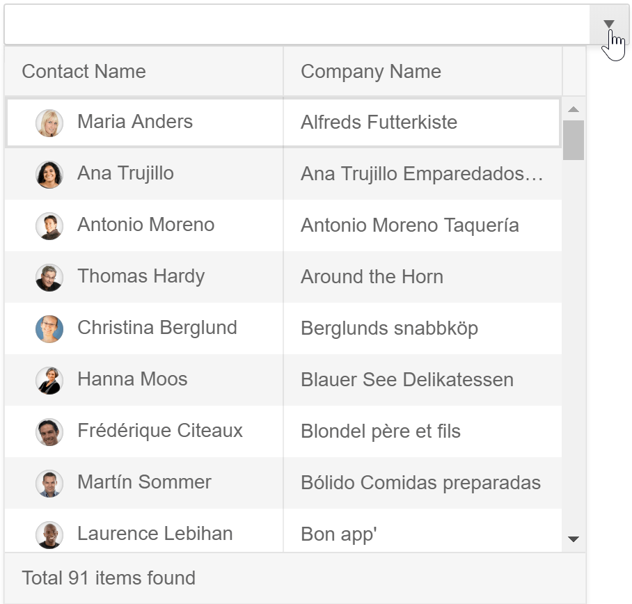
New Control: MultiColumnComboBox I know what you are probably thinking – “a new control for Telerik UI for ASP.NET AJAX? Sweet!” (I couldn’t agree more). In R1 2019, Telerik UI for ASP.NET AJAX users will have the ability to display tabular data within a drop down with the new MultiColumnComboBox. This new control provides the power of a displaying and filtering items in the table all within a drop down, giving users more context around the data items they are looking to select.


The Toolbar Feature Gets Added to RadChat
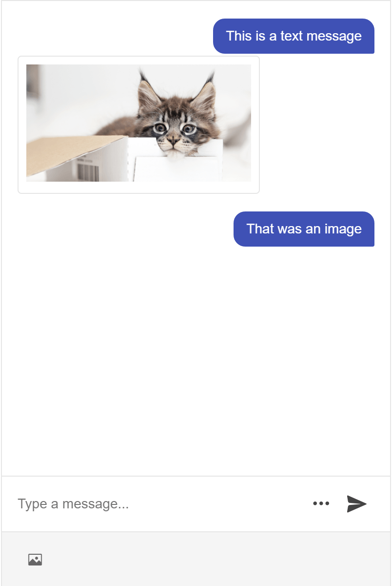
We’re also adding features to RadChat (our Conversational UI control). With the new toolbar feature the RadChat component can now have additional forms of input in any chat, including the ability to attach images, sound files, and any other type of file that may be needed. This toolbar can be customized to ensure that the component only offers the required inputs.

Try it Out and Learn More at the Webinar

As I mentioned above, you'll be able to download the latest bits or trial on January 16 – try it out and let us know what you think. Be sure to sign up for the Telerik R1 2019 release webinar on January 18th as well for a deeper look at all the new features in the release.

Save My Seat for the Release Webinar

New WinForms TabbedForm Control Coming in Telerik R1 2019

$
0
0

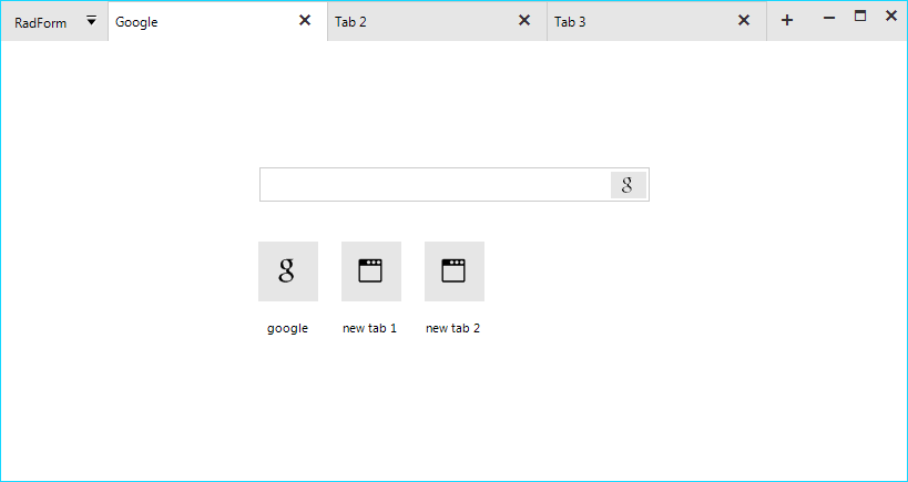
Whether you are a fan of multitasking or not, you can't deny the usefulness of having multiple tabs in both web browsers and applications to easily switch between different views at content with ease. With the R1 2019 Release of Telerik UI for WinForms, we are introducing a new TabbedForm Control to help you achieve the same user experience in your desktop applications.

Ever heard the name Adam Stiles? Most probably not, but he is the man who pioneered the concept of tabbing in a browser, which we now use daily in Chrome, Firefox, Microsoft Edge, Safari and a lot of consumer and business apps. Back in 1997, Adam was working on a side project in his spare time called SimulBrowse (later called NetCaptor), which upon launch awed it's users by having a few extra selectable boxes on the bottom of the screen each navigating to a different webpage. And that's how tabbing we know today was born and later adopted by Mozilla in Firefox.

original-30226-1399578148-23

Image source: Buzzfeednews

Nowadays, users are so used to being able to easily switch between tabs to get our hands on on different types of content in a dedicated window, that developers can't just easily overlook it. However, as with almost anything in programming, enabling such functionality in an desktop application requires writing a lot of lines of code and thorough unit and user testing, not to mention the number of man hours. Here is where Progress Telerik steps in.

Based on popular demand and multiple requests through our feedback portal, we are happy to say that as of the next release (R1 2019) of Telerik UI for WinForms, the new TabbedForm control will be yours for the taking to use as you please in your WinForms based desktop applications.

Telerik UI for WinForms - Tabbed Form (new) image

The TabbedForm control enables you to display tabs in the title bar of the form, which can contain anything from text to buttons, as well as other elements. The control comes with a variety of features to satisfy an abundance of user-scenarios. Here are some of the key features:

  • Tab Reordering via drag and drop
  • Displaying tabs in separate windows
  • Support for text, icons, shapes, buttons and more
  • Context Menu
  • Pinned Items
  • Adjustable Caption height

That's far from everything coming to the Telerik UI for WinForms suite, but we don't want to spill the beans ahead of time - that would ruin the surprise, yet you can be certain of one thing - it's going to be HUGE!

The Telerik R1 2019 Release is going live on January 16th, when you will be able to download the latest version and try out all the newest controls and features coming to the suite. Just 2 days after the release (on Jan 18th), we will be holding the Telerik R1 2019 Release webinar, where our dev experts (Sam Basu and Ed Charbeneau) will take you for a 60-minute ride around the latest and greatest innovations across the Telerik web, mobile and desktop suites, so make sure to sign up!

Save My Seat for the Release Webinar

See you there!

Help Us Shape the Future of Telerik and Kendo UI

$
0
0

Introducing a new and improved experience for gathering your product feedback and ideas. Vote with the community and submit new feature requests or bug reports to our developers. 

Building beautiful software that fits your users’ needs perfectly is hard. You know it, and we know it.  

On the Telerik and Kendo UI teams we have been creating the UI components of your choice for years. I’ll tell you a little secret – the way we do that is by listening to your needs. 

That is why I’m thrilled to announce a new, improved experience for gathering your product thoughts and ideas and ensuring each of them is heard across the Telerik and Kendo UI product families. 

If you’re too excited to reach the end of this post, go check them out now at https://feedback.telerik.com/

Why New Portals?

Over the years, we’ve experimented with different systems and tools for gathering product suggestions. While all of those were doing the job sufficiently well, there were always little pieces that could be improved - be it integration of the portal with your Telerik account so you can see everything in one place or the ability to track both feature requests and bug reports in the same place. 

Additionally, we wanted deeper integration with our internal systems to better track votes, comments and new suggestions, and ultimately ensure everyone’s voice is being heard. 

Feedback Reaches Our Developers Directly

We take great pride in the fact that support for Telerik and Kendo UI is provided by the very same engineers who built the products. We’ve now made sure this happens for your suggestions and bug reports as well. 

Portals also integrate with our development backlogs, so every vote is in there from the moment you cast it.

How to Use the New Portals 

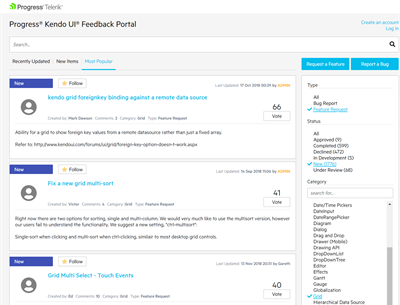
Head out to one of the portals, for example the one for Kendo UI for jQuery (https://feedback.telerik.com/kendo-jquery-ui) and log in with your Telerik account.   

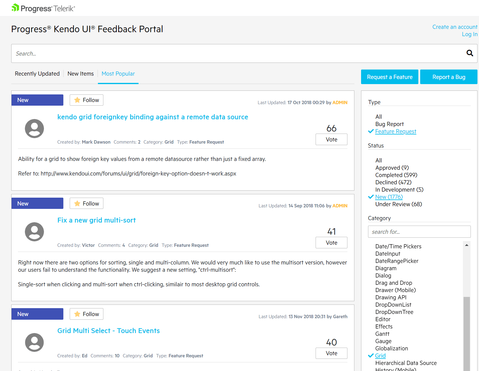
Browse the new and popular ideas, or filter by a specific component.

Kendo UI for jQuery Feedback Portal

We have transferred over all ideas from the tools we previously used along with their comments and votes, so don’t worry – nothing’s lost. 

Found what you were looking for? Cast your vote or subscribe to the item to receive email notifications about status changes and comments. 

If you can’t find the feature you need, or if you feel there might be a bug, go ahead and submit that to us for review by clicking the buttons in the upper right-hand side. 

Request a Feature and Report a Bug buttons

We will get back to you within a few days. You can expect guidance on how you can work around bugs or suggestions for how to approach a missing feature. 

What Do You Think? 

Fine, I’ll tell you another secret. At Progress, we absolutely love eating our own dog food which is why this solution is built in-house and utilizes our Kendo UI components. This allows us to listen to your feedback and tweak the portals as needed. 

Love it? Hate it? Have an idea for improvement? Let us know in the comments, submit a support ticket or, why not, post on one of the feedback portals.  

Most importantly, I urge you to find the portal for the product you use the most at https://feedback.telerik.com/ and let us know how YOU think we should shape the future of Telerik and Kendo UI. 

DevReach for .NET Developers

$
0
0

The .NET ecosystem is evolving fast, and the DevReach conference offered .NET developers a unique look into the present & future. Relive DevReach as international experts share .NET love.

.NET. It's the beloved development ecosystem for millions of developers worldwide and the platform of choice for many enterprises to run their mission-critical business applications. Of late, .NET has been enjoying a renaissance - key innovations seem to set up the framework for the next decade of success. Developer excitement is palpable.

DevReach is Central & Eastern Europe's premier developer conference, and took place November 13th-14th in beautiful Sofia BG. An awesome lineup of international experts/speakers shared their vision for .NET - what's in it today & what's to look forward tomorrow. This post dives into what DevReach offered for the latest in .NET development. You can now relive each of the breakout sessions recorded in full HD. Enjoy! 

.NET Everywhere

One of the key changes in modern .NET has been flexibility - .NET isn't the monolithic Windows-only framework any more. .NET today powers all kinds of apps for web/desktop/mobile across various platforms, and boasts of a healthy ecosystem with rich tooling everywhere. While AR/VR and AI make .NET future-facing, modern day tooling keep developers productive.

If you were a .NET developer attending DevReach, we had a cornucopia of .NET content delivered by some of the best speakers from around the world. DevReach has a long history of delivering the best .NET sessions, and 2018, the 10 year DevReach anniversary, did not disappoint. Here's a quick look at what DevReach offered for .NET developers:

Future of .NET

A lot is changing in .NET land - come discover the today & tomorrow from our speakers:

Future  

Sessions:

Everyday .NET

While the future may be exciting, we cannot get there unless we understand present day .NET technologies & tooling. The following speakers can help:

Everyday
 

Sessions:

.NET Ecosystem

Today's .NET powers apps in the Cloud and can be containerized for easy hosting. The open source ecosystem invites collaboration, but demands understanding of legal & etiquette nuances. Here are some speakers who can help break down the barriers:

Ecosystem
 

Sessions:

AR/VR with .NET

AR/VR looks poised to become the next iteration of human-computer interactions. And .NET together with Unity can power your AR/VR apps. These experts can show us the future:

ARVR
 

Sessions:

UX Considerations for AR/VR

While AR/VR may be cool, it demands a complete rethinking about UX - the best apps will fall flat if this next generation of user experience isn't well thought through. These two speakers can help:

UXinARVR
 

Sessions:

.NET on Mobile/Desktop

.NET can effortlessly power iOS and Android apps through Xamarin, with a variety of other platforms already supported. And .NET desktop apps can benefit from modernization and code sharing. Meet two of our speakers who actually build the very tools that most .NET developers use:

MobileDesktop
 

Sessions:

.NET Productivity

Developers are most productive when they understand all that their chosen framework offers under the covers. And developer sanity can be gained with testing coverage, knowing security features and using latest tools on top of .NET. Our expert speakers can shine light:

Productivity
 

Sessions:

Cherish the Memories

If you attended the anniversary edition of DevReach, first up - thank you. Above anything, we can all be proud of the developer community we've built over the past decade around DevReach. If you were a .NET developer attending DevReach, we hope you enjoyed the amazing array of content from our speakers. With session recordings up, we can all look back at what we needed to remember from sessions or just sit back to relive the memories. 

Thank you & see you next year!

Introducing the Next Level of the Documentation Experience for Telerik and Kendo UI

$
0
0

We've updated the look and feel of our documentation to help you achieve your goals and better respond to your feedback. Check out what's new.

Redesign Again? Why? 

Nobody loves changes - this is in our core human nature and we know it. However, UX standards are evolving at a high speed these days. It's similar to the speed with which new JS libraries and frameworks are popping up. Over the years we have redesigned our documentation sites a few times, as we always try to deliver the best experience not only in our products, but in our resources as well. They are part of the product offering too and you as developers are spending some time there, right?

The New Way 

In the latest version of our documentation, which you can see today, we built a whole new infrastructure. This enables us to easily write and publish more and more new resources, release new features and, importantly, address gathered feedback from you and fix potential issues. And last, but not least – to make your whole journey better and help you achieve your goals easily. 

We decided to execute the project lean, and released the new documentation site product by product. Those of you who were on that journey from the very beginning know that we gathered feedback about the new design. And now is the time to say THANK YOU! Thank you to all of you who gave your time to share your ideas, suggestions of what we can improve and do better, bug reports and votes.  

Kendo UI for jQuery Documentation

Here are some of the features we have enabled for all of our documentation: 

  • Filter search results by resource type – API reference articles; knowledge base articles; documentation article 
  • Request technical support directly from the documentation site – you can now address your issues or request a missing feature directly from the documentation by contacting some of our Technical Support Engineers 
  • Easy way to contribute – you can now fix a typo, wrong hyperlink or even write content by editing the article directly 
  • Easy way to navigate inside an article aided by table of contents

At the End… 

There is no end – we are always working hard to deliver more than expected so if you have any comments, ideas or just want to give us a thumb up – do it . 


How to: Capture Android Traffic with Fiddler

$
0
0

In this step by step tutorial, learn how to setup your Аndroid device to use Fiddler as a proxy and capture web traffic from your phone.

Debugging web applications on Windows is fairly easy. Every browser has its own developer tools, and most importantly you can use Fiddler. However, this is not the case if you’re mobile developer that want to debug an application or website from Android device. Luckily, you can still use Fiddler to do it.

Prerequisites

First you have to have Fiddler installed on your desktop machine. The PC and the Android device should be discoverable on the same network. This was the tricky part for me, as even when I have them on the same network, they couldn’t communicate with each other. I had to use the mobile hotspot on my machine to make them discoverable.

Just ping the device IP from your machine to be sure they can communicate.

Setting up Fiddler

First, you should enable the Allow remote computers to connect setting in Fiddler

  1. Open Fiddler and select Tools -> Options
  2. Choose the Connections tab
  3. Select the Allow remote computers to connect checkbox to enable the setting
  4. Restart Fiddler in order the changes to take effect

Fiddler is now listening on port 8888 (this is the default port, you can change it from the setting above).

Allow remote computers to connect

Setting up the Android Device

Once Fiddler is listening, we should use it as a proxy in Android.

  1. Open the WiFi menu.
  2. Tap and hold on your current network to show the network details
  3. Choose the Manage network settings option
  4. Check Show advanced options checkbox
  5. Choose Manual from the Proxy dropdown list
  6. Type your IP address in the Proxy host name field
    NOTE: You can check your IP address by hovering over the Network Connection icon in the Fiddler toolbar.
  7. Type the Fiddler listening port (8888 by default) in the Proxy port field
  8. Click Save to apply changes

WiFi settings

Your device’s traffic should be visible in Fiddler.

Capture HTTPS Traffic

With the current setup you should be able to capture HTTP traffic. However, if you try to open any HTTPS website, you’ll get the This site’s security certificate is not trusted! error. To fix this, you should trust the Fiddler root certificate.

NOTE: By default, Fiddler-generated certificate is valid for 5 years. However, this can cause ERR_CERT_VALIDITY_TOO_LONG error in Chrome on Android. To fix this:

  1. Run about:config in Fiddler QuickExec.
  2. Create new variable fiddler.certmaker.ValidDays with value 820

Then, you can proceed with installing the Fiddler Root certificate as follow:

  1. In your browser, navigate to http://ipv4.fiddler:8888
  2. Download the Fiddler root certificate.
  3. Install the certificate on your device.

Now you should be able to capture HTTPS traffic too.

Cleaning Up

Once you’re done debugging, don’t forget to remove the WiFi proxy from your device.

This is all you need to know about capturing web traffic from Android devices with Fiddler. If you have any questions or problems, just leave a comment below.

We always love hearing feedback, so feel free to share your thoughts on what you'd like to see with us over on our Feedback Portal. And if you're new to Fiddler, you can get started today - download Fiddler for free right here

When Will JustMock Support .NET Core? Right Now!

$
0
0

Let me guide you through the new features and improvements that are coming with R1 2019.

.Net Core 2.0 support

If you follow the news around the .Net world you couldn’t miss how trendy .Net Core became and how much attention it gains from developers around the world. We felt it too through your requests and questions on when JustMock will support .Net Core. Therefore, after thorough research we implemented it in JustMock and now you are empowered to unleash the quality .Net Core applications you desire with the help of JustMock.

In case you are wondering, there are no differences with older versions on how the tests are written. 

JustMock Console

JustMock Console is designed to handle command line and installation free scenarios. The installation free scenario is the scenario where you don't need to install JustMock in order to execute tests that are using JustMock. There are four main cases where this tool will be useful when using command line.

  • Running JustMock tests for both .Net Framework and .Net Core when JustMock is installed on the machine.
  • Running JustMock tests for .Net Framework in installation free scenario
  • Running JustMock tests for .Net Core in installation free scenario.
  • Running JustMock tests for both .Net Framework and .Net Core in installation free scenario.

If you would like to learn more about this tool you could check our documentation article: JustMock Console.

Debug Trace for JustMock Profiler

We've created a built-in debug trace capabilities in the JustMock Profiler and now it is a bit easier to understand what is happening inside the profiler. The debug trace can be enabled by setting the environment variable JUSTMOCK_LOG_LEVEL to one of the following values: TRACE, DEBUG, INFO, WARN, ERROR, CRITICAL and OFF. All traces are redirected to the system debug. For a better convenience we recommend the system debug to be visualized with the DebugView tool. Keep in mind that the tool captures the output from the whole system, so for convenience the traces could be filtered by the keyword "JustMockProfiler".

Visual Studio 2019 compatibility

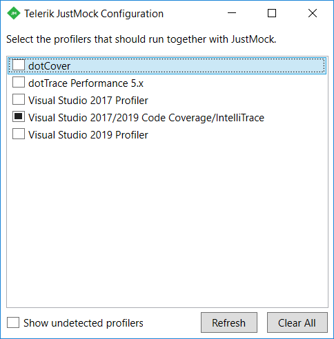
You may already know that with the unveiling of Visual Studio 2019 preview by Microsoft (Dec 2018) we announced zero-day compatibility and support of all the Telerik tools. This includes integration with the VS 2019 profiler, intelitrace and code coverage.

Visual Studio 2019 integration

New documentation design

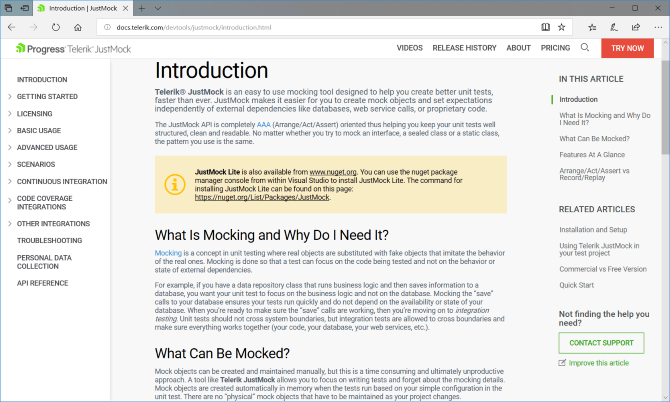
With the new new documentation design you should be able to better navigate around the content. Also, you could easily suggest a content modification if something doesn't feel right. Be sure to check it, I believe you will like it: JustMock documentation.

JustMock documentation

Revamped feedback portals

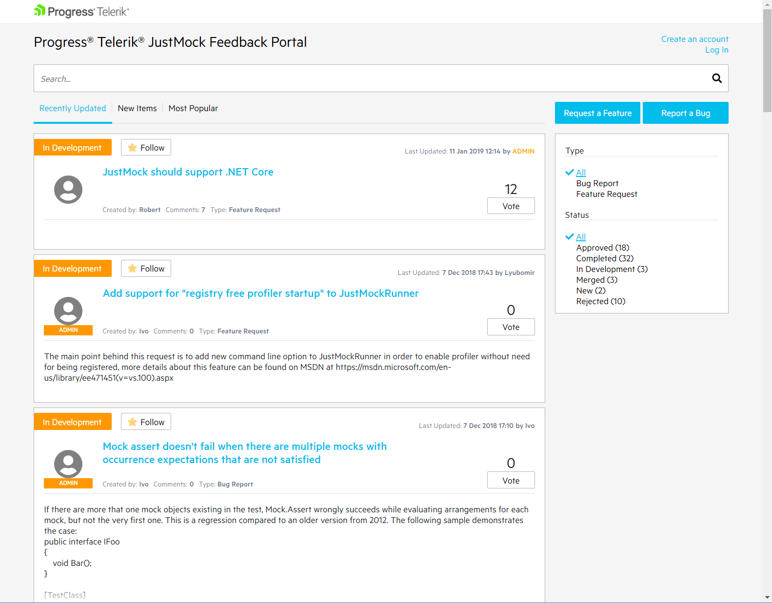
And that’s not all. We also revamped our feedback portals to provide improved experience for gathering your product thoughts and ideas and ensuring each of them is heard across the Telerik and Kendo UI families of products. To read more about it, check out this blog post.
 Revamped feedback portals

Silverlight support

With the introduction of .Net Core 2.0 support we decided that it is time to say goodbye to the old technologies and starting with R1 2019 Silverlight won't be supported by JustMock. If you still need JustMock to write tests for Silverlight, you can still download the R3 2018 version from your account. Furthermore, if any critical issues emerge we will provide fixes but with a separate release. In any case, if you have any questions regarding Silverlight you can contact us through our support system.

Sign Up for the Webinar

To see the new release in action, please join us on the Telerik R1 2019 webinar, on Friday, January 18th @ 11:00 am - 12 pm EST.

Save My Seat

Share Your Feedback

Feel free to drop us a comment below sharing your thoughts. Or visit our revamped Feedback portal and let us know if you have any suggestions or if you need any particular features/controls.

Try out the latest:

JustMock

In case you missed it, here are some of the updates from our previous release.

What's New in Telerik UI for ASP.NET AJAX in R1 2019

$
0
0

The first major release of Telerik UI for ASP.NET AJAX is available and comes complete with a new MultiColumnComboBox control, a new feature for RadChat and more.

New year - new you! Or, in this case: new year - new release for Telerik UI for ASP.NET AJAX! I know, maybe it doesn’t sound as catchy, but it doesn’t take away from the fact that as of today the R1 2019 release for Telerik UI for ASP.NET AJAX is here! Let’s jump straight in to what we were able to deliver for this release

Introducing the RadMultiColumnComboBox

Have you been laying awake at night, restless for hours, trying to figure out how to have a drop down widget where each item has several columns to display multiple fields for each data item? Well, we just delivered the cure for your insomnia with the RadMultiColumnComboBox. It’s quite a mouthful to say, but the name kind of gives it away: it’s a ComboBox that supports multiple columns.

ajax-multicolumncombobox

As you can see from the image above not only can we display each data item with multiple fields but we have all of the great ComboBox features like typing to filter (aka search), virtualization, and all other goodies you’re used to! There are a ton of features to check out with this new component and I recommend checking out the online demos for more details!

Toolbar Comes to RadChat

One of the most important pieces of any modern messaging system or chat bot, beyond being able to send text-based messages back and forth, is to add additional input types like attaching images, upload other files, maybe even record voice. Previously this hasn’t been possible with the RadChat component, but with the R1 2019 release we introduced the toolbar feature for RadChat that allows you to define additional items that you can add in to your chat interface.

ajax-radchat-toolbar

To see this in action beyond just an image, the RadChat toolbar demo will provide you with some hands-on interaction!

Miscellaneous Improvements

Some other various items that we took care of this release that I wanted to mention as people have reached out to us quite a bit about some of these, include:

  • The ComboBox component now has a get_textWithoutEmpthyMessage() method to return the text of the EmptyMessage property
  • PlotBands in the HtmlChart can take DateTime objects for the start and end of the PlotBand range
  • The Bar-type HtmlChart can now have multiple series overlap by setting negative values to the Gap and Spacing properties
  • The RadEditor has improved the stripping of DOM attributes when switching from HTML to Design mode in IE
  • Speaking of, the StripDomEventAttributes filter captures more DOM attributes!

Beyond this we have of course addressed a ton of various bugs across the entire suite of UI controls.

Security Enhancements

Beyond the improvements above we’ve also taken extra steps to improve the security of UI for ASP.NET AJAX! We have always taken security very seriously but with this release we took some additional steps to make this the most robust and secure release to date!

Want to See More? Webinar Coming Soon!

Hopefully you’re just as excited as I am about this new release! While I’ve linked to various resources and demos so far the best way to actually try this out is to either download a new trial, or if you are an active license holder you can just grab the latest and greatest from the Your Account page! You can also see a more detailed list of the of the features and fixes in this release by visiting the release history page.

If you want to check out these new features, and what else is coming for our various .NET UI control sets, you should sign up for the R1 2019 webinar! This is happening on January 17th at 11 AM ET and for more information you can refer to this webinar page! Seats are limited so to make sure that you get to see the latest and greatest you should sign up today!

A New Year, a New Splendid Release for Telerik UI for WinForms

$
0
0

Check out everything that's new in Telerik UI for WinForms with the R1 2019 release.

The beginning of the new 2019 year brings to your attention the R1 2019 release of Telerik UI for WinForms. It offers a multifarious set of new controls, .NET Core 3 & Visual Studio 2019 support and enhancements that will improve the customers’ experience. Google Chrome-like forms, text-box with embedded buttons, font selection control, crystal dark design is just a small part of the packed new features that tickles your eagerness to continue reading.

Let’s go over what is coming with R1 2019:

.NET Core 3 & Visual Studio 2019 support

We are super excited to announce that the Telerik UI for WinForms controls are .NET Core 3.0 Preview compatible! We introduced a new set of binaries built against .NET Core 3.0 so you can benefit from all the introduced features in the framework. We will continue shipping them in the future releases together with the other binaries.

The Visual Studio Extensions and our installers are fully compatible with Visual Studio 2019 so if you are excited about everything new – you can install and use them with Visual Studio 2019 right now.

RadTimeSpanPicker

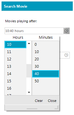
RadTimeSpanPicker is a UI component that provides a full control over selecting a specific time span and duration within certain ranges using the built-in components for days, hours, minutes, seconds and milliseconds. It comes with negative values support, data binding, localization and right to left functionality out of the box. GridTimeSpanPickerEditor wraps the RadTimeSpanPicker control in the new column that RadGridView offers. Thus, you can achieve TimeSpan values mapping out of the box.

img1

RadFontDropDownList

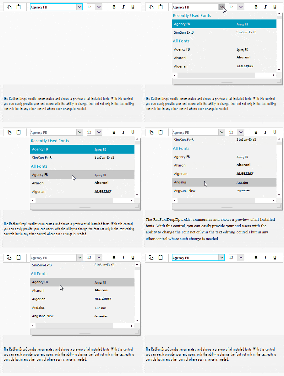
RadFontDropDownList represents a drop-down list with built-in fonts that are installed on the system. Once you drag and drop the control onto the form, it is populated with all fonts installed on the machine and it is not necessary to do it programmatically. It saves our users’ development time. Recently used fonts are displayed along with a full list of all fonts. The select on hover functionality is quite eye-candy and allows to change the font easily in the associated text control.

img2

RadTabbedForm

Modern browsers inspired form is here. RadTabbedForm displays tabs in the title bar just like in most modern Web browsers. It allows customizing the tabs like adding buttons or other elements in front or after the tabs. You can pin the tabs or reorder them via drag and drop. Each tab can be opened as a standalone window.

img3

RadButtonTextBox

Embedding button elements inside RadTextBox has been a highly demanded feature for quite some time. Although we always offered to our customers appropriate solutions for their scenarios thanks for the highly customizible Telerik Presentation Framework, we are thrilled to announce the new RadButtonTextBox control. Now, you can very easily insert button (and other) elements on the left or right side of the editable part.

img4

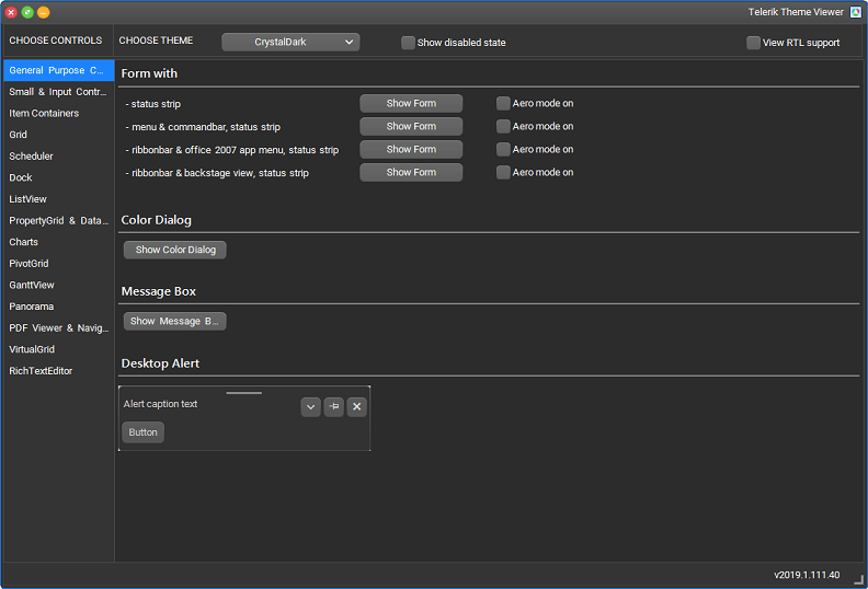
CrystalDark Theme

The CrystalDark theme is the latest addition to our themes pack as we are aware of our customers’ inclination to use dark themes in their applications. Go ahead and give it a try in the ThemeViewer tool.

img5

Crystal Themes Blending

As a continuation of the Material and Fluent themes blending, the Crystal themes are also designed to work with a predefined set of colors. Thus, using Visual Style Builder you can generate different color variations of the Crystal and CrystalDark themes. A completely new theme can be created for a couple of minutes.

Next generation of documentation experience

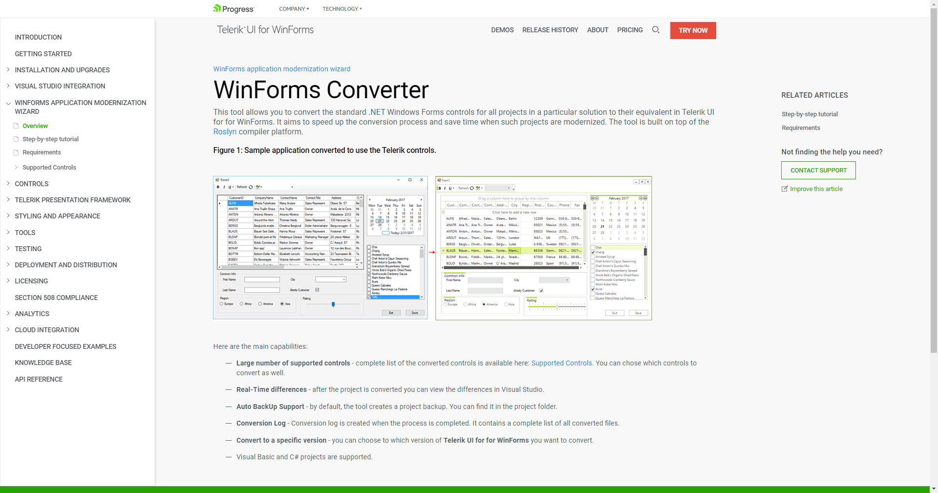
I am thrilled to also share that R1 2019 brings a brand-new UI and UX to our documentation websites for all Telerik and Kendo UI products, combining latest UI and UX trends with your feedback. Simply head out to docs.telerik.com, select the desired product and enjoy the new experience. To read more about, head out to this announcement blog.

 winforms_docs_001

Revamped feedback portals

And that’s not all. We also revamped our feedback portals to provide improved experience for gathering your product thoughts and ideas and ensuring each of them is heard across the Telerik and Kendo UI families of products. To read more about it, check out this blog post.

Feedback portal

Try It Out and Share Your Feedback

You can learn more about the Telerik UI for WinForms suite via the product page. It comes with a 30-day free trial, giving you some time to explore the toolkit and consider using it for your current or upcoming WinForms development.

We would love to hear what you think, so should you have any questions and/or comments, please share them to our Feedback Portal or in the comment section below.

Last, but not least, make sure to sign-up for the Telerik R1 2019 release webinar to get a deep dive review of all the latest and greatest features across the .NET and JavaScript UI libraries.

What's New in Telerik Reporting and Telerik Report Server R1 2019

$
0
0

Check out everything that's new with the first release of the year for Telerik Reporting and Report Server.

The biggest developer contentment for his work is customers gratification. That’s why we highly appreciate and continuously listen to your feedback so we can make products that support all top of the line trends and perfectly fit into your real-world scenarios. All the new features are requested by our customers and are hugely demanded in our improved feedback portal.

In this release, you will find the highly anticipated Telerik Reporting runtime targeting .NET Core 2.1+, Scalability of the Report Server Scheduling service, TRDP report definitions localization support in the Standalone Report Designer, continuous paging for the supported web viewers and for the Telerik Report Server Preview.   

Let's now deep dive in all this goodness shipped with R1 2019. 

Report Rendering Runtime Targeting .NET Core 2.1+ both for Windows and Linux  

In this release, we’ve enabled our report rendering engine along with the report web service on web and console applications targeting the popular .NET Core framework. The required assemblies are built with .NET Standard 2.0 and the web reports service targets .NET Core 2.1+. The applications using the Telerik Reporting runtime for .NET Standard can be deployed both to Windows and Linux OS. With this valuable addition, Telerik Reporting targets the most popular server operating systems.

Telerik Reporting ASP.NET Core on Linux


Scalability of the Report Server Scheduling Service

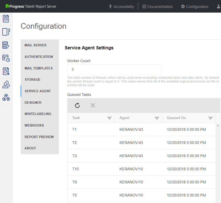
Report scheduling is one of the most appreciated features of Telerik Report Server. With R1 2019, we’ve enabled multiple report scheduling instances, to load balance on multiple servers the pending scheduled tasks. This can decrease the time required for report documents delivery and allow the full use of the available compute resources. 

Telerik Report Server R1 2019 Load Balancing


TRDP Reports Localization

Previously reports created with Standalone Report Designer required custom user functions to localize the reports. Now, we’ve enhanced the declarative report definitions (TRDP) to support localization like the typed report definitions, so that one report definition can serve multilingual end users. Besides the labels, one can localize report items’ position and size, allowing fine-tuned report documents for different languages.

TRDP Reports Localization

Improved Web Viewers User Experience

We’ve improved the report pages’ navigation by introducing continuous scroll through pages. This results in effortless and fluent page navigation where the user doesn’t need to press toolbar buttons and wait for a page refresh. All the required page content is loaded on-demand and dynamically appended into the page area. 

scrolling Telerik Reporting web viewer

Additionally, we added viewer options controlling the parameters’ inputs enabling search in the list of available parameter values while saving display real estate.

Telerik Report Viewer SingleSelectComboTelerik Reporting MultiSelectCombo


More information on the new features is available in our next generation of documentation experience

I am thrilled to also share that R1 2019 brings a brand-new UI and UX to our documentation websites for all Telerik and Kendo UI products, combining latest UI and UX trends with your feedback. Simply head out to docs.telerik.com, select the desired product and enjoy the new experience. To read more about, head out to this announcement blog.

Documentation

Revamped Feedback Portals

And that’s not all. We also revamped our feedback portals to provide improved experience for gathering your product thoughts and ideas and ensuring each of them is heard across the Telerik and Kendo UI families of products. To read more about it, check out this blog post.

Feedback

Try it Out and Learn More at the Webinar

If you are new to our tools or have only tried some, make sure you download the trial and take them for a spin. You can either download just the Reporting and Report Server tools, or download a trial of our entire set of .NET and JavaScript tools with the DevCraft bundle.

Watch the Webinar

And don't forget to register for our R1 2019 release webinar on January 18th, where our technical experts will provide a deep dive into all our new features and functionalities.

New Controls, VS 2019 and .NET Core Support in Telerik UI for WPF in R1 2019

$
0
0

Happy New Year and Happy new release of Telerik UI for WPF and Telerik UI for Silverlight. Enjoy this very first and very solid release for this year which brings new NavigationView, DiagramRibbon and HyperlinkButton controls, Charts for RadSpreadsheet and RadSpreadProcessing,.NET Core 3 and Visual Studio 2019 support as well as tons of useful new features. 

Let me guide you through the new controls and features of the release.

NavigationView (aka HamburgerMenu)

NavigationView 

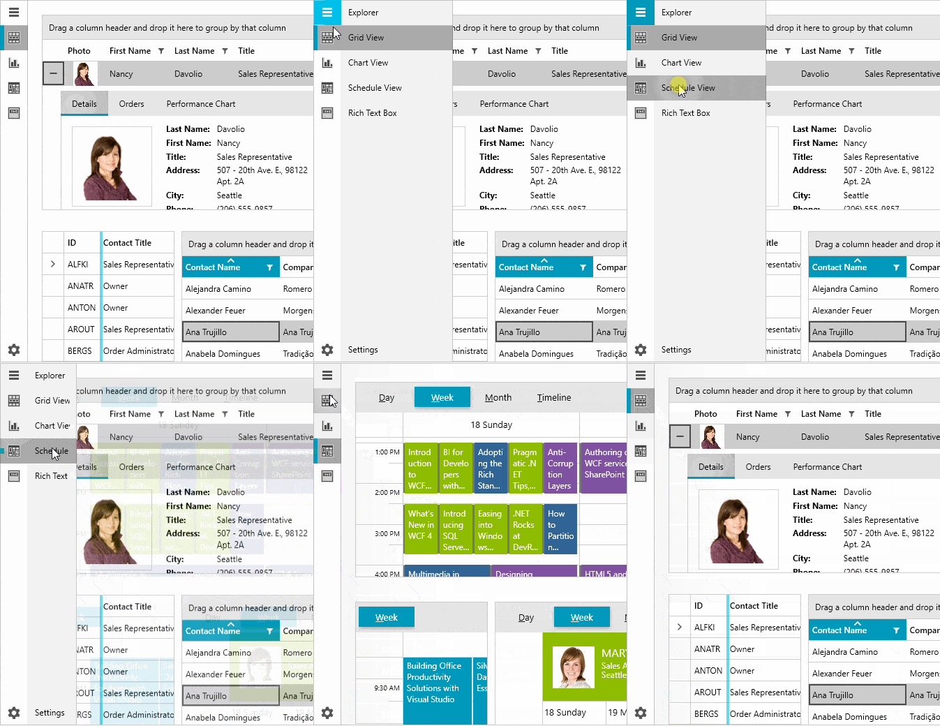
I'm happy to announce the release of the newest addition of Telerik UI for WPF - RadNavigationView. This hamburger menu like control will allow you to add even more Windows 10 experience in your WPF application and build a modern navigation experience. RadNavigationView automatically adjusts its display mode based on available screen space, which will improve the overall user experience of your application. Here are the key features of the initial version of the control:
  • Adaptive Display Mode: The control will dynamically adopt the layout to the available size, while keeping the content well-arranged and visible on the screen.
  • Data Binding: The control can be easily bound to different sources such as Objects and Collections.
  • Flexible Header and Footer: Both the Headers and Footers can be easily customized to accommodate the needs of your application.
  • UI Automation Support: The NavigationView provides built-in support for Microsoft UI Automation.
  • Enhanced Routed Events Framework: With the events system of the control your code will become elegant and concise.
  • Keyboard support: Perform navigation, selection and other actions through the keyboard alone.
  • Built-in Animations: NavigationView provides predefined and customizable open/close animations of the navigation pane.
Make sure the check the control examples in our demos app here and the online help documentation here.

I hope you would enjoy the control and that it will enable you to achieve even more modern look and richer user experience.

Charts for RadSpreadsheet and RadSpreadProcessing

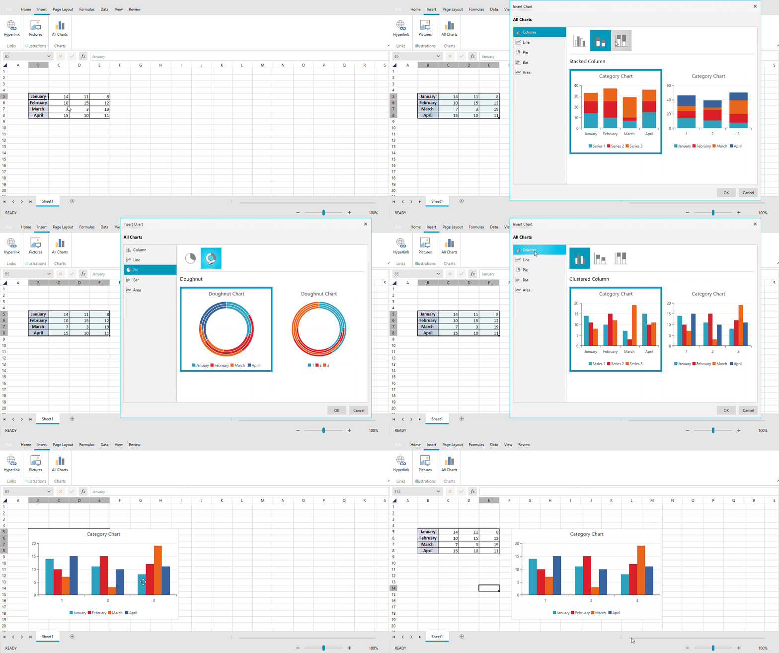
This release we are introducing one of our most eagerly awaited features, Charts for RadSpreadsheet and RadSpreadprocessing. As usual, the processing component offers a versatile API that can be used to edit or create a chart from scratch and for the UI we are leveraging the abilities of the powerful RadChartView. You can see the feature in action below:

Charts in Spreadsheet

Naturally, the charts are supported by the format providers. The import / export functionality will work automatically for all formats, except for the PDF format in RadSpreadProcessing scenario, which needs a few additional references. We’ve prepared a handy example showing how to set it up.

For this release the following types of series will be supported:

  • Bar / Column
  • Line
  • Area
  • Pie
  • Doughnut

Implementing the rest is in our immediate plans, so stay tuned!

HyperlinkButton

Introducing new button that extends RadButton with hyperlink capabilities. The button provides customizable appearance, Telerik UI for WPF theming support and UI automation support. For more information check this help article.

DiagramRibbon


With this release instead of building your own ribbon UI for RadDiagram you could simply drag and drop the new RadDiagramRibbon control from the VisualStudio ToolBox. RadDiagramRibbon is predefined, fully customizable and ready-to-use RibbonView providing UI for the most common features and settings of RadDiagram. The control can be easily configured and wired to RadDiagram using a design time wizard. For more details please check this article from our help documentation.

GridView & MultiColumnComboBox 

  
  • RadMultiColumnComboBox is now official! We polished the control and added more customization options like Styles and Templates for the selection boxes, footer area in the drop down, improved layout, Coded UI levels 2-3 and much more. Make sure to check it out!
  • MultiColumnComboBoxColumn - we are adding a new GridView column as well. Using it you can easily benefit from the MultiColumnComboBox features inside of RadGridView. For more details check the documentation of the new column – I hope it will allow you to achieve even more.


  • SpreadsheetStreamingExport - new binary for rapid async export to Excel, based on our RadSpreadStreamProcessinglibrary. It provides flawless export of GridView with millions of rows to .csv and .xlsx format. For more info check this article.
  • Added customization properties for the GridViewLoadingIndicator. (link)
  • Add support for controlling the visibility of the ScrollPositionIndicator.
  • Add support for controlling the visibility of the SearchPanel's close button. (link)

Diagram – Avoid Overlapping Connections

We made improvements in the AStarRouter algorithm implementation of RadDiagram that allow improving in complicated layouts by avoiding the overlapping connections. The router previously had AvoidShapes option turned on by default and now we added AvoidConnectionOverlap. This setting enables the routing to find a path for a polyline connection which minimizes the overlapping segments with the rest of the connections. In addition, we added powerful options for controlling the algorithm (ShapeCrossPenalty, SegmentOverlapPenalty and SegmentOverlapDistance), that will allow you to make your specific layout even better and achieve the desired appearance. The settings configure the importance of avoiding shapes and connections as well as the desired distance between collinear segments. Below you can see how setting the AvoidConnectionOverlap property makes a huge difference:

this.diagram.RoutingService.Router = newAStarRouter(this.diagram)
{
    SegmentOverlapPenalty = 2,
    SegmentOverlapDistance = 9,
    AvoidConnectionOverlap = true
};

And here is the result - see before (on the left) and after (on the right) below:

Neat uh?!

For more details about the Routing article from the RadDiagram documentation.

ExpressionEditor Enhancements


For this release we managed to implement all logged features (including the most voted feature for custom functions) and fix all known issues of RadExpressionEditor for WPF and Silverlight! Here is summary of all the new staff you will be able to benefit from:

  • Possibility to implement your custom functions/categories and include them in the list of available functions. (link)
  • Possibility to modify the list of the available functions as desired. (link)
  • Option to display all the nested properties of complex objects (drill-down). (link)
  • Added Text functions for string manipulations. (link)

Support for .Net Core 3


With the release of the preview version of .Net Core 3 we introduced new set of binaries built against .Net Core 3 in order to allow you to benefit from all features that newest version of the framework will provide. Along with the other binaries we will be shipping .Net Core 3 version as well from now on. The new binaries can be also found inside of the Telerik UI for WPF NuGet packages, allowing you to easily start migrating your existing WPF projects built with Telerik UI for WPF.

Visual Studio 2019 compatibility and Coded UI support

As you already know with the unveiling of Visual Studio 2019 preview by Microsoft (Dec 2018) we announced zero-day compatibility and support of all the Telerik tools. With this release we are adding Coded UI support for Visual Studio 2019 preview – we are distributing new binary built against the newest studio that can be found in the TestTools folder within the installation folder of Telerik UI for WPF.

Other New Features

  • FileDialogs: Added support for environment variables. (link)
  • PivotGrid: Added support for resizing columns at run-time. (link)
  • ChartView: Allowed showing information for two or more data points from the same series to be shown in the track ball. (link)
  • DropDownButton: Added DropDownMinWidth and DropDownMinHeight properties. (link)
  • AutoCompleteBox: Exposed TemplateSelector for the DropDownItem. (link)
  • ImageEditor: Introduced Bold, Italic, Underline and FontFamily settings in the DrawTextTool.
  • PdfProcessing: Implemented Import and Export for "W*" clipping operator and import for "b" geometry operator.
  • PdfProcessing: Added support for CropBox element in PDF page.
  • PdfProcessing: Implemented ImageSource.GetBitmapSource method to work with all color spaces and filters.

Revamped Feedback Portals

And that’s not all. We also revamped our feedback portals to provide improved experience for gathering your product thoughts and ideas and ensuring each of them is heard across the Telerik and Kendo UI families of products. Check out the new WPF, Silverlight and Document Processing portals.


Sign Up for the Webinar

To see the new release in action, please join us on the Telerik UI R1 2019 webinar, on Friday, January 18th @ 11:00 am - 12 pm EST.

Save My Seat

Share Your Feedback

Feel free to drop us a comment below sharing your thoughts. Or visit our Feedback portals about UI for WPF, Silverlight and Document Processing Libraries and let us know if you have any suggestions or if you need any particular features/controls.

Try out the latest:

UI for WPF  UI for Silverlight

In case you missed it, here are some of the updates from our last release.

What's New in the Telerik Toolsets for ASP.NET MVC and Core in R1 2019

$
0
0

New controls, new features, new themes and more. Check out what's inside the latest releases of Telerik UI for ASP.NET MVC and Telerik UI for ASP.NET Core.

You’ve probably heard it by now, but just in case I’ll mention it here as well: the R1 2019 release is here! I wanted to take the time to take y’all through the latest and greatest in Telerik UI for ASP.NET MVC and ASP.NET Core!

Brand New Components

DateRangePicker

jquery-mvc-core-daterangepicker-material

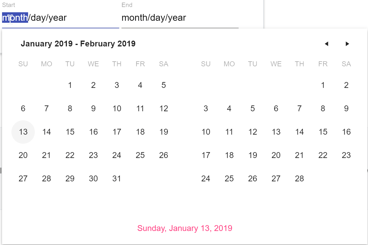
The DateRangePicker gives end-users an easy way to select a range of dates through a drop down. The popup displayed will contain two calendars to make it easy to select an appropriate range of dates.

MultiViewCalendar

jquery-mvc-core-multiviewcalendar-material

The MultiViewCalendar is similar to the DateRangePicker in the sense that it offers a way for users to interact with two calendars at the same time. Of course, this component takes up a little more real estate than the DateRangePicker (since we don’t use a popup for this component) but it’s still a great component to use for many applications.

Ripple

jquery-ripple-effect

In case you’re not aware, the Material Design guidelines call for a “ripple” effect for animations and various interactions. You see this quite often when interacting with a button or a checkbox. This is a bit tricky to add on your own, so we released our own Ripple component to help you add this animation to any of your own HTML elements.

Hybrid UI Components Migrated

ScrollView

jquery-mvc-core-scrollview-material

You probably instantly recognized the ScrollView by the image above. The dots at the bottom and the left and right navigation elements kind of give it away. This traditionally was just available in our hybrid UI tool set, but with R1 2019 we’ve now added this as a standalone widget to be used in ASP.NET MVC or ASP.NET Core applications.

Switch

jquery-mvc-core-switch-material

The Switch component was also available in the hybrid UI library, and we also wanted to make sure that desktop or responsive web applications (even PWAs) built with MVC or Core could utilize this component. Now it has never been easier to have a quick toggle button added to your application.

Material Theme lands in the ThemeBuilder

Thanks to The ThemeBuilder, customizing any Kendo UI theme is as easy as selecting a color through a color picker or plugging in your own HEX values. All of our UI components are rendered on the page and any changes that you make will automatically update all of the components right before your eyes.

With the latest release of the ThemeBuilder we have included support for the Material theme to make sure you can select from a wide range of predefined color swatches or create your own from scratch!

Scaffolding & Razor Pages

Another feature that we added to the ASP.NET Core suite specifically is the new scaffolding templates. These templates can be used to cut down on development time and automatically use some of our UI components and CSS primitives for certain types within the fields on your models. To start taking advantage you simply have to install the scaffolding templates in to your Visual Studio instance and follow the guidelines that we provide in this documentation article.

These templates can be used in both MVC and Razor Views by the way.

Since I brought up Razor Views I also wanted to mention that as of R1 2019 we officially support Razor pages with all UI for ASP.NET Core components.

TreeView Performance Boost

One of the biggest improvements that we did to an existing component came to the TreeView component. We took a good look in to the code behind the widget and realized there were optimizations that could be made. Thanks to this we have improved the performance across not just the rendering of the TreeView, but also during many of the interactions that you might do with the component (filtering, expanding, etc.). For more information you can refer to this blog post which goes in to the juicy details!

Upcoming Webinar

We covered quite a bit here, but there’s always more to see! Not only in the MVC and Core products, but also in all of the other .NET-based products that we offer. That’s why I wanted to end this blog post by mentioning that you should join the R1 2019 Telerik release webinar, taking place on January 18th at 11 AM ET. For more information head on over to the webinar page and sign up today! Keep in mind that seats are limited so make sure you snag that seat as quickly as possible!


Telerik UI For Xamarin R1 2019: Recurring Appointments, Visual Studio 2019 Support and More

$
0
0

Telerik UI for Xamarin R1 2019 is packed with new features, like built-in recurring appointments, UI for editing appointments, PDF Viewer, Localization & Globalization and Visual Studio 2019 support.

With the Telerik UI for Xamarin R1 2019 release we continue to fulfill the suite with components and features, making it your primary development tool for the platform. With this release, we have added a PDF Viewer component, built-in screens for add/edit appointments in our calendar, recurring appointments, new popup control, header & footer in listview, as well as items reorder in grouped scenario, dock layout, localization and globalization, and support for Visual Studio 2019.

PDF Viewer

It is here! RadPdfViewer Beta for Xamarin Forms. PDF documents have been around for quite some time and they promise to stay. Now there is no need to open external apps to view PDF documents. They are shown right in your app, and the viewer can be configured as per developer’s preferences. RadPdfViewer comes with: 

  • PDF Document Visualization: Display PDF documents with text, images, shapes, colors, lists, bullets and more 
  • Single Page and Continuous Scrolling Support: Choose your preferred presentation 
  • Commands Support: Be it Zooming, Navigating from page to page, FitToWidth or Toggling the Layout mode, you have it 
  • Toolbar Support: With the built-in toolbar, all commands and actions are already set in place: 
  •     NavigateToPreviousPage 
  •     NavigateToPage 
  •     NavigateToNextPage 
  •     ZoomIn 
  •     ZoomOut 
  •     FitToWidth 
  •     ToggleLayout

You only need to decide which ones you need in the application. 

PdfViewer

The control is still in beta and we are actively working on adding new features and improving the performance. So give it a try and let us know what’s good and what could be better. 

Calendar & Scheduling: Recurring Appointments and Add/Edit Appointment views 

With this release, we introduce recurring appointments and built-in views for adding/editing/deleting appointments in RadCalendar. You can now add appointments with recurrence rule. The control exposes powerful APIs for creating various recurring patterns – from every working day to every third Monday of the month. And then there’s more –  with the new built-in views all you need is to set a single property to enable adding and editing the appointments including the recurring ones. You can choose whether to edit a single occurrence or the entire series.

EditAppointment RepeatAppointment CustomRecurrence

Popup 

Ever needed to display a popup with more complex content than just a string and a button? Meet RadPopup. It allows you to display arbitrary content and place it at a location of your choice – be it a point on the screen or relative to an existing view. Need a context menu for your listview, treeview or another navigation control? RadPopup saves the day. You can choose whether you want the popup dismissed when tapping outside it or you need the user to perform certain action within the popup. Setting a single property ensures there’s a background added to the whole screen, so the user is focused on the popup.  

Popup3
 

RadListView: Header & Footer and Reorder in Grouped Scenario 

You asked, we listened. RadListView now features scrollable header and footer. Easily configured through HeaderTemplate and FooterTemplate properties, you can now add custom content in the top and in the bottom of your listviews. In addition, we added support for reordering items when the control is grouped.
ListView Header And Footer 

Dock Layout 

Xamarin Forms application layout made easy! Arrange several views, so that each one is docked to a screen edge or to another docked view with ease. Let the last one fill the remaining space -- super quick with  RadDockLayout

Dock
 

Localization & Globalization 

With this release we’ve reviewed and improved the localization and globalization support in our controls. We’ve added a number of keys, so that you can provide culture-specific values for the strings found in the suite. On the other hand, controls respect the device language and show date, time, numeric, currency etc. values accordingly. 
DataForm

Visual Studio 2019 Support

Last but not least, Telerik UI for Xamarin R1 2019 comes with support for Visual Studio 2019. All you need to do is download the suite and give it a try. 

The Next Level of the Documentation Experience

I am thrilled to also share that R1 2019 brings a brand-new UI and UX to our documentation websites for all Telerik and Kendo UI products, combining latest UI and UX trends with your feedback. Simply head out to docs.telerik.com, select the desired product and enjoy the new experience. To read more about, head out to this announcement blog.


Telerik UI for Xamarin documentation

Revamped Feedback Portals

And that’s not all. We also revamped our feedback portals to provide an improved experience for gathering your product thoughts and ideas and ensuring each of them is heard across the Telerik and Kendo UI families of products. To read more about it, check out this blog post.

Feedback portal

Sign Up for the Webinar

To see the new release in action, please join us on the Telerik UI R1 2019 webinar, on Friday, January 18th @ 11:00 am - 12 pm EST.

Save My Seat

Share Your Feedback

Feel free to drop us a comment below sharing your thoughts. Or visit our revamped  Feedback portal about UI for Xamarin and let us know if you have any suggestions or if you need any particular features/controls. 

Telerik and Kendo UI R1 2019 Release is Here!

$
0
0

The first Telerik and Kendo UI release of the year has arrived! Check out everything that's new, including new components, hundreds of improvements and the all-new Telerik UI for Blazor.

At Progress, we pride ourselves on the day zero support our Telerik and Kendo UI products provide for new development frameworks and tooling. As engineers ourselves, we like to tinker with newest technologies – both at work and at home. Transferring what we’ve discovered into articles and easy to use products is what drives every one of us – ultimately seeing you productive and successful in creating sleek and modern user interfaces.

The R1 2019 release builds on that drive and promise to you to be the first to market, and today we maybe go even one step further – throwing our support behind the still experimental Blazor framework from Microsoft. And of course, bringing you over 50 new components and 300+ improvements across all frameworks and platforms. Read on for more details, and for those of you who just want to get the bits right away, you can get them here.

Telerik UI for Blazor – Early Preview

If you haven’t heard of Blazor, you should really check it out. Built by Daniel Rorth and Steve Sanderson as an experimental .NET web framework embracing WebAssembly to target web applications using C# and HTML. You read that right, your C# compiles to WebAssembly so no need for JavaScript! While the Blazor website itself provides a lot of information, I particularly liked the session Microsoft’s John Galloway gave at our annual DevReach conference which really explains Blazor very well in less than 40 minutes - Blazor – A New Framework for Browser-based .NET Apps (DevReach 2018).

By being the one of the first teams to throw our support behind a what is currently an experimental framework, we want to help Blazor mature faster and ensure the ecosystem around it is ready for all of you who are as passionate about it as we are.

So, what’s in the early preview of Telerik UI for Blazor? Today we are releasing our own Data Grid for Blazor with some essential first functionality like data binding, sorting, paging, theming etc. In addition to the Blazor Grid, we are also releasing two more components – the Blazor Button and TabStrip! As this is a preview our resources are a bit limited, but you can sign up and get ahold of a copy of the bits via our NuGet repository by following this link.

We will follow-up this announcement with more blogs, including how to get started, over the next couple of days so keep an eye out for more information on how to start using these components!

With this being a preview, we are looking forward to working with a few of you on advancing our Blazor suite further. Give it a try and email Carl Bergenhem, Product Manager for Blazor (and a few other web products ) with your impressions on how it is working and what you’d like to see next.

Telerik Line of Products – Summary

December is usually a slow month for developer news but Microsoft changed that with several major announcements made at the Connect() conference. In case you missed it, there were a few previews announced and thanks to our tight connection with Microsoft, we were able to release support for Visual Studio preview and .NET Core 3.0 on December 4.

The R1 2019 release formalizes our support for Visual Studio 2019 and .NET Core 3.0 Preview in all our installers and brings a bunch of new controls for your web, mobile and desktop applications. While not a comprehensive list, below are our Telerik release highlights. Make sure you check out the release notes for each product to learn about everything that is included.

Web – Telerik UI for ASP.NET Core, MVC and AJAX

  • New MultiViewCalendar and DateRangePicker components, new grid features for ASP.NET MVC, ASP.NET Core
  • New MultiColumnComboBox for ASP.NET AJAX

Mobile – Telerik UI for Xamarin

  • New PDFViewer, Popup, and DockPanel controls
  • New scheduling features, including add/edit and recurring appointments
  • Header and footer support in ListView
  • Localization and globalization support

Desktop – Telerik UI for WPF and WinForms

  • New NavigationView (AKA Hamburger), Diagram Ribbon UI and HyperlinkButton controls for WPF
  • Charts support in RadSpreadsheet and RadSpreadProcessing and Expression Editor support for custom functions in WPF
  • New TabbedForm, FontDropDownList, ButtonTextBox and TimeSpanPicker controls for WinForms
  • New grid features, including TimeSpan editor and TimeSpan column for WinForms; new MultiColumnComboBox column and support for high-performance asynchronous exporting for WPF
  • New CrystalDark theme for WinForms

Reporting, Testing, and Productivity Tools

  • Improved Web Viewers User Experience and Report Definitions Localization for Telerik Reporting
  • Scalability of the Report Scheduling Service, Improved Report Preview User Experience and Report Definitions Localization for Telerik Report Server
  • Deploy report rendering engine along with the reports web service on .NET Core – both on Windows and Linux

Kendo UI Line of Products – Summary

The R1 2019 release is adding a slew of new Kendo UI controls, numerous grid improvements, and native support for Vue, rounding out Kendo UI’s native support for three of the most popular JavaScript frameworks (Angular, React, and Vue).

  • For Vue developers, we have the most exciting news: the initial, jQuery-free, native suite of components for Vue is here! This suite is being introduced with the new Vue Grid. For the existing Vue.js component library, we also introduced the MultiViewCalendar, DateRangePicker, Ripple, ScrollView, and Switch components.
  • For React developers, we continue down the path of providing jQuery-free, native to React widgets, which now include new controls: TreeView, Splitter, Window, Upload, MaskedTextBox, DropDownButton, SplitButton, and Toolbar. Also, the team added several enhancements to the Grid that improve its performance and extensibility.
  • Our Angular components have been improved in many ways. For example, we now provide expanded editing options with the RichTextEditor component. We have also enhanced the Scheduler to support resources and custom data models binding, along with a few other features.
  • And on, for many, the beloved jQuery front, we enhance an already strong suite of 70+ jQuery components with new MultiViewCalendar, DateRangePicker, ScrollView, and Switch components, as well as a Material Theme support in the ThemeBuilder.

More on all this is at the Kendo UI blog.

R1 2019 Release Blog Posts

While this blog post provides a high-level overview, you will want to check out these in-depth blog posts which cover all new features in detail.

Telerik UI for ASP.NET AJAXTelerik UI for ASP.NET MVC Telerik UI for ASP.NET Core
Telerik UI for Blazor (Preview)Telerik UI for WinFormsTelerik UI for WPF
Telerik UI for Xamarin 
Telerik ReportingTelerik Report Server
Telerik JustMock 
Kendo UI for jQueryKendo UI for AngularKendo UI for React
Kendo UI for Vue


Feedback Portal and Documentation is Now Supercharged

But wait, there is more! We have also released a new experience for gathering your feedback about all our products. We’d especially appreciate you pulling our new release today, and sharing your feedback at https://feedback.telerik.com to help us shape the future of our Kendo UI and Telerik line of products.

In addition, we completed the revamp of our documentation portal. With the new portal you now have all-in-one portal with easy way to locate reference articles, and request help right from documentation, as well as contribute to documentation in case you see an improvement that can be made.

Sign Up for Release Webinars

Seeing is believing, so register to see all the new features – WEBINARS ARE COMING UP FAST! It will help you to follow along easily if you download the latest release here.

Telerik

Date/Time: Friday, January 18th @ 11:00 am - 12 pm EST Register Now

Kendo UI

Date/Time: Tuesday, Jan 22, 11:00 AM ET - 12:00 PM ET Register Now

Introducing the Telerik UI for Blazor Early Preview

$
0
0

Introducing the Telerik UI for Blazor Early Preview, .NET UI components for the Blazor framework without JavaScript dependencies. 

Progress Software and the Telerik brand has a long history of supporting the .NET community with products like Telerik UI for ASP.NET AJAX, UI for ASP.NET, and UI for ASP.NET Core. This is why we’re proud to announce the early preview release of Telerik UI for Blazor!

  1. What is Blazor
  2. What is Razor Components
  3. Blazor Recommended Reading
  4. Built from the Ground-Up - 100% Native .NET
  5. Experiment With Us
  6. Telerik UI for Blazor Early Preview

What is Blazor

Blazor is a new framework by the Microsoft ASP.NET team that introduces a next generation component model that allows developers to write Single Page Applications (SPA) without JavaScript. If Blazor sounds new to you that’s because it has only been in development less than a year, and as an experimental project. Initially the Blazor framework targeted the Mono WebAssembly runtime (the .NET runtime compiled to wasm), thus allowing .NET to run on the client’s browser inspiring the name “Blazor” (Browser + Razor).

In this configuration the application’s resources including .dll files are delivered to the client and executed the Mono WebAssembly runtime. While the WebAssembly deployment of Blazor is sill in active development a server-side deployment option was introduced called Razor Components.

Blazor Component Model

The Blazor component model is refreshingly simple in its design. Components can contain markup (HTML) and logic (C#) in a single Razor (cshtml) file. The component is capable of handling data binding, events, and dependency injection all without JavaScript.

The Counter Component below demonstrates the basic composition of a Blazor component.

The counter component uses a basic HTML button to increment a counter field which is displayed within a paragraph tag. Because Blazor operates as a single page application all of the interactions in the component happen on the client. Updates to the browser’s Document Object Model (DOM) are handled by the Blazor framework though data binding.

What is Razor Components

Recently Microsoft has announced plans to support the framework when running server-side in a mode called Razor Components. Even more recently, an announcement was made that the same component model will be backwards compatible with ASP.NET Core (MVC) and Razor Pages. All of these cutting edge news and bits dropping around Blazor has our team at Telerik excited for the future of ASP.NET development. Much like Blazor running on WebAssembly, Razor Components allows developers to write Single Page Applications (SPA) without JavaScript.

The key difference between Blazor and Razor Components is the way the application is deployed. Instead of Blazor running via WebAssembly on the client, the Blazor framework runs on the server as an executable. In this mode, ASP.NET Core hosts the application and provides a communication channel using SignalR technology. Using SignalR the application sends UI updates and receives changes and events as binary packets of data over a web socket connection. Since only the changes are sent over the connection, the payload is small and efficient.

Since Razor Components utilizes the Blazor framework, components can be used in both deployment types.

If all of this is new to you, and it’s most likely that it is, then we have some blog posts to catch you up on all things Blazor. The following articles should bring you up to speed, or if you’re biting your nails to check out what’s below, we’ve included the TLDR as well.

TLDR

Razor Components, is what originally started as Blazor Server-Side in early 2018. Blazor is a .NET (SPA) framework that is generally associated with .NET running on Web Assembly. However, Blazor is capable of running under multiple scenarios including server-side as Razor Components.

  • Razor is a popular template markup syntax for .NET
  • (Browser + Razor) Blazor is a .NET based web framework which can run on the client using WebAssembly or as:
    • Razor Components: The Blazor framework running on the server via SignalR
    • Razor Components via “circuits” - Razor Components running in ASP.NET Core / Razor Pages
  • All Blazor hosting models, both client and server-side, utilize C# APIs instead of JavaScript
  • Razor Components is expected to ship in ASP.NET Core 3.0

Built from the Ground-Up - 100% Native .NET

Telerik UI for Blazor will not wrap existing jQuery/JavaScript products in C# and pretend it’s something new. With Telerik UI for Blazor we are starting from scratch and writing components with .NET whenever possible. Alternatively we could have decided to wrap existing jQuery components, as short-term path, however we feel that the wrapper programming model is a leaky abstraction that would “bleed back” into the .NET API layer. In addition, we feel that a native .NET approach is a long term investment that will fetch larger gains in the long run. Consider this a modern day tortoise vs. hare story.

We can’t express enough how important both the JavaScript and .NET ecosystems are to us. We have UI libraries for developers of all skill types, however a segment of .NET community has expressed the need for front-end web tooling that does not require JavaScript and we’re happy to have the opportunity to serve this community through Blazor.

Experiment With Us

Blazor is an exciting prospect for .NET developers because it allows us to create full-stack .NET web application. We have received countless feedback items asking for our support this next generation platform.

Initially we’re offering Telerik UI For Blazor as an early preview release. This development model closely resembles the effort being made by Microsoft with Blazor as we aim to release small sets of functionality in hopes to gain feedback and knowledge about how our customers use the product. During the experimental phase Telerik UI for Blazor will be a free trial for all and we hope that you will continue sharing with us your use cases, experience, road-blocks, and bugs.

After downloading Telerik UI for Blazor you will receive an email with instructions on how to share your feedback, wishes and Blazor experiments with us.

Telerik UI for Blazor Early Preview

The initial offering will be small with just a few popular UI components including the Data Grid, Tab Set, and Buttons. Through customer feedback we plan to expand the number of components and rage of APIs. We believe that building to our customers needs and recommendations is the path to success.

Prerequisites

  1. Install the Blazor SDK by following the steps outlined on the Blazor website

  2. Download the Telerik UI for Blazor NuGet package directly

  3. (optional) Use the Telerik NuGet feed as a package source

Your First Blazor Project

We recommend starting with the “Blazor (Server-side in ASP.NET Core)” project type when using the New Project dialog. This project type is also known as “Razor Components” and will eventually ship with ASP.NET Core 3.0. However, Telerik UI for Blazor will work on all Blazor project types.

With the new project created, we’ll need to install our Telerik UI for Blazor NuGet dependency. Before adding the package, be sure to navigate to the project that contains the application’s UI. This will be either <project>.App or <project>.Client depending of the template you chose.

  1. Install the Telerik.UI.for.Blazor NuGet package. This will add the component library to your application.

  2. Register the components in the application. In the root of the application, locate the _ViewImports.cshtml file and add the following code.

@using Kendo.Blazor

@addTagHelper *,Kendo.Blazor
  1. We’ll also need to reference the style sheet needed for the components. Locate the index.html file in the /wwwroot folder and add the following line.
<link href="//kendo.cdn.telerik.com/2019.1.115/styles/kendo.material-v2.min.css" rel="stylesheet">

Notice we’re not referencing any JavaScript files, that’s because there aren’t any JavaScript dependencies. You’re now ready to start testing Telerik UI for Blazor.

Blazor Data Grid

The Telerik UI for Blazor Data Grid has quite a few features in this preview. The data grid in this release is capable of: data binding, sorting, paging, themes, templates, and in-cell editing, which only supports int, string and DateTime fields.

Let’s see these features in action by replacing the hand coded table in the Fetch Data example with the Telerik Data Grid. First take a moment to run and explore the Fetch Data example at localhost/fetchdata.

Locate the code for Fetch Data under the /Pages folder. Replace the entire table element with a KendoGrid component. Telerik UI for Blazor components use the Kendo namespace as it is a familiar reference to our existing front-end libraries and shares CSS code with those libraries.

else
{
  <KendoGrid Data=@forecasts Pageable=true PageSize=5 Sortable=true>
    <KendoGridColumn Field=@nameof(WeatherForecast.Date)>
      <Template>
        @($"{(context as WeatherForecast).Date:d}")
      </Template>
    </KendoGridColumn>
    <KendoGridColumn Field=@nameof(WeatherForecast.TemperatureC) />
    <KendoGridColumn Field=@nameof(WeatherForecast.TemperatureF) />
    <KendoGridColumn Field=@nameof(WeatherForecast.Summary) />
  </KendoGrid>
}

The KendoGrid component binds the Data property to forecasts which is an array of the WeatherForecast object. The grid also has the Pageable, PageSize, and Sortable properties enabled. Inside of the KendoGrid component, we define child components for each field we would like displayed in the grid. Because this is all C# code, we can set the Field property with C#'s nameof operator giving us type safety. In addition, templates can be used to display custom formats, images, and even other UI components. Here a template is used to format the Date field.

Blazor Tab Set

The other major component included in this release is the KendoTabSet. The KendoTabSet supports multiple tab positions: Top (default), Bottom, Left, and Right. We can use Blazor’s bind attribute to demonstrate the tab positions at run-time. Locate the index.cshtml page under the /pages folder. Replace the page’s content with the following code.

@using Kendo.Blazor.Components.TabStrip

<h1>Hello, world!</h1>
<select bind=@tabPosition>
  <option value=@KendoTabPosition.Top>Top</option>
  <option value=@KendoTabPosition.Left>Left</option>
  <option value=@KendoTabPosition.Right>Right</option>
  <option value=@KendoTabPosition.Bottom>Bottom</option>
</select>

<KendoTabStrip TabPosition=@tabPosition>
  <KendoTab Title="Sofia">
    <h2>22<span>ºC</span></h2>
    <p>Sunny weather in Sofia</p>
  </KendoTab>
  <KendoTab Title="New York">
    <h2>24<span>ºC</span></h2>
    <p>Partly Cloudy weather in New York</p>
  </KendoTab>
  <KendoTab Title="Paris">
    <h2>21<span>ºC</span></h2>
    <p>Rainy weather in Paris</p>
  </KendoTab>
</KendoTabStrip>

@functions {
  KendoTabPosition tabPosition = KendoTabPosition.Top;
}

In this example we start by creating a simple select list element with all of the KendoTabStrip position values, KendoTabPosition.<value>. Most importantly, KendoTabPosition is a standard C# enum type so we get strongly typed values and intellisense here. Next a KendoTabStrip component is created with several KendoTab components that display some weather forecast data. The TapPosition property is bound to both the select element and KendoTabStrip through the a simple backing field tabPosition declared in @function.

Because select is using the bind attribute, it automatically updates the tabPosition value when the option is changed, this allows us to modify the position at run-time.

Summary

We’re excited to be part of the next generation of ASP.NET applications by supporting Blazor. Telerik UI for Blazor Early Preview is available for free today. The package currently includes Data Grid, Tab Set, and Button components written from the gound up to take advantage of Blazor without JavaScript dependencies (there’s no jQuery this time folks). Throughout the year Microsoft will be working on Blazor (aka Razor Components) as part of ASP.NET Core 3.0. We plan on keeping Telerik UI for Blazor up to date as the project progresses and look forward to hearing your feedback, see what you’ve built, and know what components you need for your next app.

Sign Up for Release Webinars

Seeing is believing, so register to see all the new features – WEBINARS ARE COMING UP FAST! It will help you to follow along easily if you download the latest release here.

Telerik

Date/Time: Friday, January 18th @ 11:00 am - 12 pm EST Register Now

Kendo UI

Date/Time: Tuesday, Jan 22, 11:00 AM ET - 12:00 PM ET Register Now

Developer Event Lineup. Escape Winter. Come to a Conference.

$
0
0

Happy 2019, developer friends. With the holidays behind us and the new year in full swing, I thought it would a good time to provide a brief update on a few places we can meet up between now and the end of March. There will be others, of course, but hopefully one or more of the events below is on your calendar too!

NDC London
Jan 28 – Feb 1 | London, UK
NDC London, one of Europe’s largest conferences for .NET and Agile development, will be held Jan 28 – Feb 1 in Westminster, London. Covering a wide range of topics from .NET to 3D Modeling, Gaming and IoT, UX and Web and everything in between, NDC London has an impressive lineup of speakers and topics. Progress will have a booth, so make sure you stop by and talk to Sam Basu, Ed Charbeneau, and Carl Bergenhem about our Telerik and Kendo UI tools.

Vuejs Amsterdam& Frontend Developer Love
Feb 13 – 15 | Amsterdam
Two conferences in one! What more could you ask for? Frontend Developer Love kicks off on February 13 and runs through the 15th at the Theatre Amsterdam. Vuejs Amsterdam will be, the largest Vuejs conference on the planet (and I’m not exaggerating), will be collocated with Frontend Love. Our very own Jen Looper and Elena Gancheva will both be speaking and I will be manning the booth. Make sure you don’t miss their sessions and stop by the booth to learn more about NativeScript and our Kendo UI offerings.  

BASTA!
Feb 24 - March 1 | Frankfurt, Germany 
One of the largest conferences in Germany for .NET, Windows and open innovation, you’ll find Progress at BASTA! Spring in Frankfurt. Not only are we a gold sponsor but we will be delivering a keynote and regular session (more on this to come). Make sure to stop by our booth for a demo of our latest .NET and JavaScript tools and get your hands on some of our awesome swag and prizes!

Microsoft Ignite Tour
Feb 26 - 27 | London, UK
If you didn’t get a chance to go to Microsoft Ignite in Orlando, never fear. Microsoft is taking the show on the road with stops all over the world. These two-day events are free to attend and provide developers with an opportunity to dive deep on topics like cloud, security, DevOps and more. Progress will have a presence there – make sure you stop by and see first hand what's new in our toolsets.

Microsoft MVP Summit
March 17 | Bellevue, WA
For those of you going to the Microsoft MVP Summit, keep your eyes open for details about our party. And – for those of you who aren’t going, we will be hosting a #CodeParty on Twitch so you can be part of the party whether you are an MVP or not! More details will follow in a future blog post.

NDC Copenhagen
March 27 - 29 | Copenhagen, Denmark
We like the idea of NDC so much we thought we’d do another one – this time in Denmark. A slightly shorter event (this one offers two days of workshops and one day of general conference sessions), NDC Copenhagen has an equally impressive speaker lineup. Make sure you stop by the Progress booth to learn about our latest Telerik and Kendo UI tools and walk away with swag and maybe even some prizes.

Why You Should Learn TypeScript

$
0
0

This time on the Eat Sleep Code podcast, we learn why it's important for developers to learn TypeScript.

On this episode, David Pine (Microsoft MVP) shares his experience with TypeScript. David talks about why TypeScript is a valuable tool for improving your experience with applications that normally are written using JavaScript. We discuss how to compile TypeScript, what are its strengths and how to get started.

You can listen to the entire show and catch past episodes on SoundCloud. Or just click below.

David Pine

David Pine is a Technical Evangelist, Microsoft MVP and Google Developer Expert working at Centare in Wisconsin. David loves knowledge sharing with the technical community and speaks internationally at meetups, user groups, and technical conferences. David is passionate about sharing his thoughts through writing as well and actively maintains a blog at davidpine.net. David's posts have been featured on ASP.NET, MSDN Web-Dev, MSDN .NET and Dot Net Curry. David loves contributing to open-source projects and stackoverflow.com as another means of giving back to the community. David sat on the technical board and served as one of the primary organizers of Cream City Code for going on four years. When David isn’t interacting with a keyboard, you can find him spending time with his wife and their three sons, Lyric, Londyn and Lennyx. Follow David on Twitter at @davidpine7.

Show Notes

Transcript

Coming soon!

Viewing all 1954 articles
Browse latest View live