Quantcast
Channel: Telerik Blogs | .NET
Viewing all 1954 articles
Browse latest View live

Build a Countries List with Telerik UI for WinForms DomainUpDown

$
0
0

In this blog post, you will learn more about the DomainUpDown control in Telerik UI for WinForms and how to use it to build a selection list for countries.

RadDomainUpDown in Telerik UI for WinForms is a combination of a text-box and a pair of moving up and down buttons to navigate through a limited selection of options. This control may save you some screen space since it occupies the space needed for a standard text-box. However, in addition, it allows the end user to select one of a variety of several items.

A common use-case is to build an input form for filling personal information. One of the required fields is the nationality. RadDomainUpDown is suitable for introducing the countries options if you don’t want to allocate  a lot of space on the form.

DomainUpDown_Animated

Adding Countries to the DomainUpDown Control

You can add the country items either at design time or at run time.

Adding Items at Design Time

The RadListDataItem Collection Editor allows you to do that. You can access it through the Smart tag >> Edit Items option:

DUD_01

Adding Items at Run Time

For each country option, add a RadListDataItem to the Items collection that RadDomainUpDown offers:

RadListDataItem item1 = newRadListDataItem("Bulgaria");
RadListDataItem item2 = newRadListDataItem("France");
RadListDataItem item3 = newRadListDataItem("Italy");
this.radDomainUpDown1.Items.AddRange(newList<RadListDataItem>()
 
{
    item1,
    item2,
    item3
});

Adding Flags to the Countries

Open the project’s Resources and add the flags for the countries that you have added:

DUD_02

DUD_03

Adding Country Flags at Design Time

Open the RadListDataItem Collection Editor again and assign an image to each RadListDataItem:

DUD_04

Adding Country Flags at Run Time

Set the Image property for each RadListDataItem:

item1.Image = Properties.Resources.BUL;
item2.Image = Properties.Resources.FR;
item3.Image = Properties.Resources.ITA;

The last thing to do is to set the ReadOnly property to true. Thus, the item’s image will be shown next to the text after making a selection:

DUD_05

Wrapping Items

Set the Wrap property to true if you need the selected item to revert to the first item after reaching the last item and vice versa.

DomainUpDownWrap 

Data Validating

The SelectedIndexChanging event allows you to control whether the newly selected item is valid according to the other fields’ input, e.g. selected town. If the selection is not valid simply set the Cancel argument to true:

privatevoidradDomainUpDown1_SelectedIndexChanging(objectsender,
    Telerik.WinControls.UI.Data.PositionChangingCancelEventArgs e)
{
    if(e.Position>-1 && this.radDomainUpDown1.Items[e.Position].Text=="Italy")
    {
        e.Cancel = true;
    }
}

Try It Out and Share Your Feedback

You can learn more about the Telerik UI for WinForms suite via the product page. It comes with a 30-day free trial, giving you some time to explore the toolkit and consider using it for your current or upcoming WinForms development.

Start My Trial

We would love to hear what you think, so should you have any questions and/or comments, please share them to our Feedback Portal.


Header and Footer in Telerik UI for Xamarin ListView

$
0
0

The Telerik UI for Xamarin ListView control now features Header and Footer support, giving you new opportunities to customize the experience for your users.

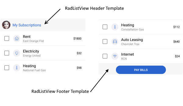
With Telerik UI for Xamarin, you can now add custom content to the top and bottom of your list view using the HeaderTemplate and the FooterTemplate properties of the ListView. You can use them in your mobile app to display descriptive information about the content (list view items). In this blog post I will show you how both templates can be added to the RadListView control

ListView Header and Footer

HeaderTemplate

The HeaderTemplate can be used for adding custom content to the top of the items container. It could be used in different cases, for example to add text which gives an overview for the list view content. The snippet below shows how to add the HeaderTemplate:

<telerikDataControls:RadListView.HeaderTemplate>
    <DataTemplate>
        <LabelText="All mail"/>
    </DataTemplate>
</telerikDataControls:RadListView.HeaderTemplate>

FooterTemplate

The RadListView FooterTemplate is displayed at the bottom of the list view items. Here's a sample use-case scenario: say the items in the list view are messages and you want to execute some operation to all/some of them - in the footer template you can add a button that, when clicked, deletes all/the selected messages, or marks them "as read." Here is how a sample Footer Template could be defined:

<telerikDataControls:RadListView.FooterTemplate>
    <DataTemplate>
        <ButtonText="Delete all"Clicked="Button_Clicked"/>
    </DataTemplate>
</telerikDataControls:RadListView.FooterTemplate>

Please note that both templates are scrollable along the items in the ListView. For more details check our help article here.

Using Header and Footer in the Xamarin ListView

Let’s create a sample app using the HeaderTemplate and the FooterTemplate. For the demo we are going to use the RadDockLayout control. RadDockLayout provides a mechanism for child elements to be docked to the left, right, top or the bottom edge of the screen or to occupy the center area of the layout. You can easily arrange the views in order to achieve a fully featured layout of a page.

Let's create a view model and a business object that will be the source of the list view: 

publicclassViewModel
{
    publicViewModel()
    {
        this.Source = newObservableCollection<News>()
        {
            newNews("As a Front-End Developer, you will be responsible for the look, feel and navigation of complex enterprise ecommerce solutions."),
            newNews("We’re looking for a UX Architect for our UX/UI team who tells cohesive, well-thought and user tested stories through mind maps, user flows and ultimately, prototypes. "),
            newNews("Define consistent UI style guides and page layouts. "),
            newNews("You will be speaking to customers, using data to inform your designs, and, since we believe in design as a team effort, have an open work process with regular design critiques and peer feedback.")
        };
    }
    publicObservableCollection<News> Source { get; set; }
}
 
publicclassNews
{
    publicNews(stringdescription)
    {
        this.Description = description;
    }
 
    publicstringDescription { get; set; }
}

Finally, lets declare the RadDockLayout and dock the RadListView control to occupy the remaining space of the screen:

<ScrollViewBackgroundColor="White">
    <telerikCommon:RadDockLayout>
        <GridtelerikCommon:RadDockLayout.Dock="Top"
            BackgroundColor="#009688"
            HeightRequest="50">
            <LabelText="Job Descriptions"VerticalTextAlignment="Center"/>
        </Grid>
        <GridtelerikCommon:RadDockLayout.Dock="Bottom"
            HeightRequest="50"
            BackgroundColor="#659BFC">
            <LabelText="Navigation"VerticalTextAlignment="Center"/>
        </Grid>
        <Grid>
            <telerikDataControls:RadListViewItemsSource="{Binding Source}">
                <telerikDataControls:RadListView.BindingContext>
                    <local:ViewModel/>
                </telerikDataControls:RadListView.BindingContext>
                <telerikDataControls:RadListView.HeaderTemplate>
                    <DataTemplate>
                            <telerikPrimitives:RadBorderPadding="5">
                                <StackLayoutOrientation="Horizontal"BackgroundColor="#F7F7F7">
                                    <telerikPrimitives:RadBorderCornerRadius="30"
                                                        HorizontalOptions="Start"
                                                        WidthRequest="60"
                                                        HeightRequest="60"
                                                        Margin="10">
                                        <ImageSource="Avatar.png"Aspect="AspectFill"/>
                                    </telerikPrimitives:RadBorder>
                                    <StackLayoutOrientation="Vertical"Spacing="0"VerticalOptions="Center"HorizontalOptions="StartAndExpand">
                                        <LabelText="Jane"FontAttributes="Bold"TextColor="Black"Margin="0"/>
                                        <LabelText="@jane"TextColor="#919191"Margin="0"/>
                                    </StackLayout>
                                    <telerikInput:RadButtonText="Add news"
                                                    BackgroundColor="Transparent" 
                                                    BorderColor="#007AFF"
                                                    BorderRadius="30"
                                                    BorderWidth="2"
                                                    Margin="5"
                                                    WidthRequest="100"
                                                    HeightRequest="40"
                                                    Padding="12,3,12,3"
                                                    HorizontalOptions="End"
                                                    VerticalOptions="Center"
                                                    TextColor="#007AFF"/>
                                </StackLayout>
                        </telerikPrimitives:RadBorder>
                    </DataTemplate>
                </telerikDataControls:RadListView.HeaderTemplate>
                <telerikDataControls:RadListView.FooterTemplate>
                    <DataTemplate>
                        <telerikPrimitives:RadBorderPadding="5"BackgroundColor="#F7F7F7">
                            <telerikInput:RadButtonText="Share news"
                                            TextColor="White"
                                            WidthRequest="200"
                                            HeightRequest="40"
                                            VerticalOptions="Center"
                                            HorizontalOptions="Center"
                                            CornerRadius="25"
                                            Margin="0, 5, 0, 5"
                                            Padding="15,5,15,5"
                                            BackgroundColor="#007AFF"/>
                        </telerikPrimitives:RadBorder>
                    </DataTemplate>
                </telerikDataControls:RadListView.FooterTemplate>
                <telerikDataControls:RadListView.ItemTemplate>
                    <DataTemplate>
                        <telerikListView:ListViewTemplateCell>
                            <telerikListView:ListViewTemplateCell.View>
                                <StackLayoutOrientation="Vertical"Margin="10, 10, 10, 10"BackgroundColor="White">
                                    <LabelText="{Binding Description}"FontSize="15"Margin="3"TextColor="Black"/>
                                </StackLayout>
                            </telerikListView:ListViewTemplateCell.View>
                        </telerikListView:ListViewTemplateCell>
                    </DataTemplate>
                </telerikDataControls:RadListView.ItemTemplate>
            </telerikDataControls:RadListView>
        </Grid>
    </telerikCommon:RadDockLayout>
</ScrollView>

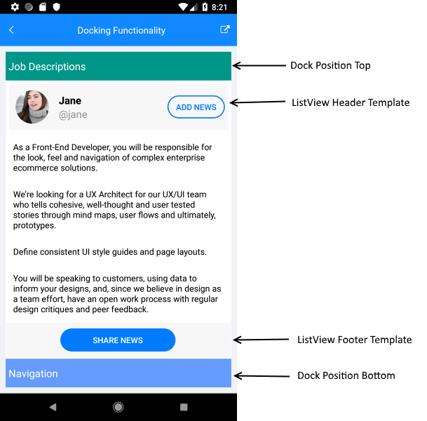
The image below shows the final result:

Demo App

That's all, now you have your list view with header and footer. 

Tell Us What You Think

Have we caught your interest with the RadListView new features and the RadDockLayout control? We would love to hear what you think about them. If you have any ideas for features to add, do not hesitate to share this information with us on our Telerik UI for Xamarin Feedback portal.

Don’t forget to check out the various demos of the controls in our SDK Sample Browser and the Telerik UI for Xamarin Demos application.

If you have not yet tried the Telerik UI for Xamarin suite, take it out for a spin with a 30-day free trial, offering all the functionalities and controls at your disposal at zero cost.

Start My Trial

Happy coding with our controls!

The Uno Platform And WebAssembly

$
0
0

On this episode of Eat Sleep Code, we talk about using Uno to create cross platform .NET apps, and what WebAssembly means for deploying .NET to the web.

Join us as we talk with Jérôme Laban, Uno Platform CTO, about the prospects of using Uno to create cross platform .NET applications. Jérôme also discusses the use of WebAssembly by Uno and what WebAssembly means for deploying .NET to the web.

You can listen to the entire show and catch past episodes on SoundCloud. Or just click below.

Jérôme Laban

jerome.laban

Jerome Laban has been programming since 1998, mainly involved in .NET and C# development as teacher, trainer, consultant in France. He is the CTO of Uno Platform in Montreal, a framework aiming at improving the development cycle of cross-platform apps using Windows, iOS, Android and WebAssembly using Mono and Xamarin. Uno Platform

Show Notes

Building Fiddler Importers

$
0
0

Learn how to build your own Fiddler importers with this simple guide.

This is a guest post from Eric Lawrence, written in collaboration with the Fiddler team. Would you like to write about Fiddler for our blog? Let us know in the comments below.

When reproducing a bug on a website or web service, traffic captures are invaluable because they allow developers and testers to easily see exactly what’s going on at the network level, even without having access to the reproduction environment. Over the years, Fiddler’s Session Archive Zip (SAZ) file format has become the gold standard for such captures because SAZ files are easily captured (with Fiddler, Fiddler Everywhere, FiddlerCap, or a Fiddlercore-based tool) and are easily reviewed with the powerful Fiddler desktop client.

However, in some cases, you may wish to debug network traffic that was originally captured using another tool and exported in a format like a Wireshark PCAP or the browser-standard HTTP Archive Format (HAR). Fiddler already includes importers for those formats, but what if you want to support a different format that Fiddler doesn’t yet support?

Fortunately, Fiddler is extremely extensible, and this extends to the import/export system. We’ve previously published an example exporter, and today I’d like to talk about how you can build an importer.

I’m now an engineer on the Microsoft Edge browser team, and our preview builds are now being tested by users around the world. When those users encounter problems, sometimes the best path for debugging starts with capturing a network traffic log. For some of our more technical users, that might involve collecting a SAZ file using one of the existing Fiddler-* products. But for other users (especially our upcoming MacOS users), collecting a SAZ file involves more overhead. In obscure cases, collecting a SAZ file might cause a repro to disappear.

Fortunately, the new Microsoft Edge browser is built atop the Chromium open-source browser engine, and Chromium includes a built-in network logging feature. To collect a network log in Edge, simply navigate a tab to edge://net-export (in Google Chrome, you’d visit chrome://net-export instead).

Configure the options using the radio buttons and click Start Logging to Disk. Open a new tab and reproduce the problem. After you’ve completed the repro, click Stop Logging. At the end, you’ll have a NetLog .json file containing all of the network events. The output JSON file can be viewed using a web-based viewer:

However, in many cases, it would be more desirable to view the file using Fiddler. Unlike the web based viewer (which tends to show content as a base64-encoded string of goo), Fiddler includes built-in formatters for common web formats (e.g. images, JSON, etc), and it makes it easier to export response bodies as files, resend captured requests using the Composer, and replay captured responses using the AutoResponder.

Fiddler does not include a NetLog importer by default, so let’s build one.

First, we start by looking at the Chromium documentation for the relatively straightforward file format. NetLog files are JSON-serialized streams of network events. The low-level events (tracking DNS lookups, TCP/IP connections, HTTPS certificate verifications, etc) are associated to a request identifier, which represents one or more network requests (what Fiddler calls a “Web Session”). So, the task of our importer is to:

  1. Parse the JSON file into a list of events
  2. Bucket the events by the request identifiers
  3. Generate one or more Fiddler Web Sessions from each bucket

The C# sourcecode for the FiddlerImportNetlog extension is available on Github. Beyond all of the typical project files, the extension itself consists of just two files, Importer.cs, FiddlerInterface.cs, and Properties\AssemblyInfo.cs.

The AssemblyInfo.cs contains just one line of interest:

[assembly: Fiddler.RequiredVersion("4.6.0.0")]

Fiddler requires this attribute to load the assembly as an extension; it specifies the minimal version of Fiddler you’ve tested the extension to run in.

The FiddlerInterface.cs file contains a simple class which implements the ISessionImporter interface. The ProfferFormat attribute on the class specifies the format type and a descriptive string to show in the import dialog:

The importer interface exposes a single method, ImportSessions, which accepts a string specifying the selected format, a dictionary of options, and an optional event handler to call back with import progress events. The function returns an array of Sessions created from the imported data.

The bulk of the extension’s logic is found in Importer.cs. The caller provides a StreamReader from which the imported file’s text is read and then parsed using the JSON.JsonDecode method made available by the using Fiddler.WebFormats statement at the top of the file. WebFormats.JSON is a fast, simple parser that reads the JSON into Hashtables (for JS objects), ArrayLists (for JS arrays), and primitive types (booleans, doubles, strings, etc).

After parsing, the importer looks up the mappings from named event types (e.g. URL_REQUEST_START_JOB) to the integer identifiers recorded inside the event entries, then parses the list of event entries, bucketizing those with a source of URL_REQUEST by the request id. Then, the ParseSessionsFromBucket method loops over each URL_REQUEST’s events to collect the data (e.g. request headers, response headers, response bodies) needed to generate a Fiddler Web Session. Two notable details:

  1. The NetLog format may have multiple request/response pairs in a single URL_REQUEST (e.g. if the request resulted in a redirect or an automatic authentication challenge/response)
  2. The NetLog format does not presently store (anywhere) the request body content for POST requests. In contrast, response body bytes may or may not be present based on the options chosen by the user when starting the logging process

After generating the list of extracted Web Sessions, the importer generates a few “mock” Sessions that allow the user to peruse the raw data captured in the file (e.g. the browser configuration, list of enabled extensions, etc).

After an hour of quick-and-dirty coding, Fiddler can now import NetLog json files:

If you’re just interested in using this importer without building it yourself, you can install it from my website. If you find any bugs, please file them!

Hopefully, you’ve found this to be a useful introduction to how easy it is to build importers to get your data into Fiddler!

How to Achieve Chrome-like Tabs with Tabbed Form in WinForms applications

$
0
0

This post will introduce you to the Tabbed Form control and its features, and we'll see how to achieve tabbed navigation in your WinForms application.

We introduced the Telerik UI for WinForms RadTabbedForm in the R1 2019 version of the controls. I hope that by now you have played with it and seen how handy it can be in so many scenarios. In this blog post I will try to explain some of the scenarios the control handles and later go over the features in more depth.

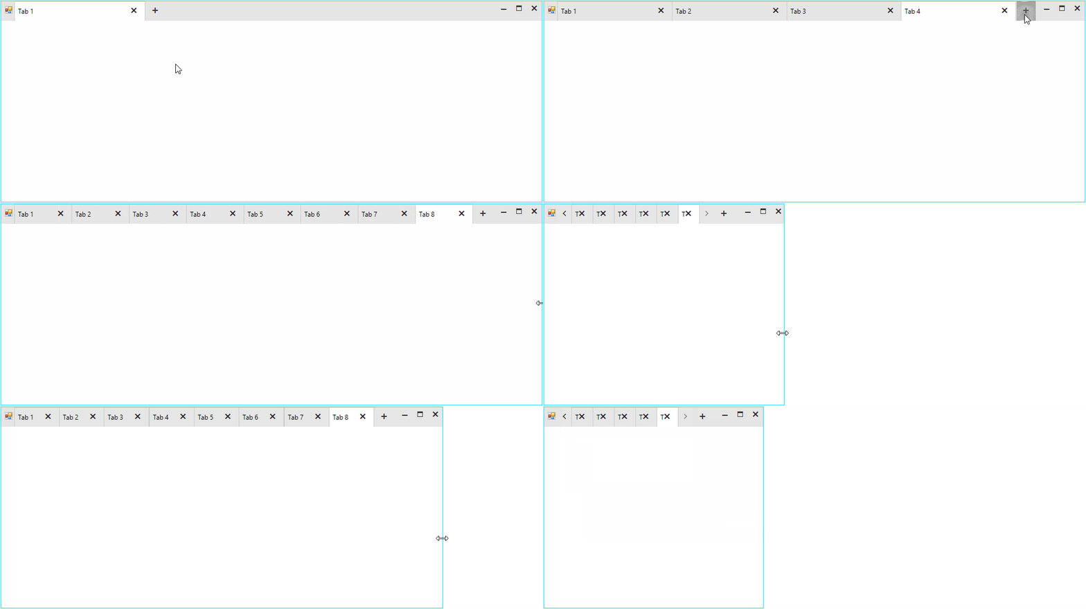
tabbed-form-01

Where to Use Tabbed Form?

The idea to organize the different views of an application in separate tabs is not new. The Microsoft TabControl and our own RadPageView have been around for quite some time. Although powerful, these controls serve a more limited purpose. Imagine, that you want to implement a tabbed UI which will serve as a top-level container of the entire application. The page view and MS tab control are not suitable for this as they are bound to the form they were added to and the pages or tabs cannot be dragged and dropped. Actually, a dock control can better serve you, yet if you want to achieve an end-user experience like what people are seeing in the modern browsers, it is still not good enough.

The RadTabbedForm is specifically built to handle this scenario. The application content can be organized and separated in different tabs where each tab is responsible for a different part of the application. The tabs are located inside the form's title bar just like in browsers (Chrome, Edge etc.) and they can be reordered or moved away to a separate window. This is extremely useful in big applications visualizing data. Instead of switching from one tab to another, the end user could simply drag the tab out thus creating a new form. The tabs would then be in two separate windows and the user could easily view both contents simultaneously. RadTabbedForm offers great flexibility and freedom which will be appreciated by the people using your application.

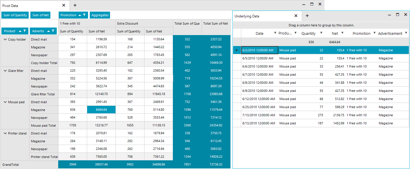
The screenshot below shows two tabs with the second tab being detached in a separate form. The first tab displays a RadPivotGrid and the second one shows a breakdown of the grouped and aggregated data behind the selected cell in the pivot from the first tab.

tabbed-form-011

Architecture and Features

The RadTabbedForm represents a form host of the RadTabbedFormControl. The form control is responsible for creating and manipulating the tabs in the title bar, the panels associated with each tab holding their content and the drag-drop service. Basically, most of the functionality and API is defined inside the RadTabbedFormControl, which is exposed by the form's TabbedFormControl property. The control is packed with many features and its look can be completely customized by simply setting a couple of properties. The form is built on top of TPF consisting of many light-weight visual elements. The Structure article in the documentation provides information on the more important building blocks of the control.

Full Design Time support

Tabs can be added in the designer of Visual Studio. Each tab will create a panel where all the other controls can be added.

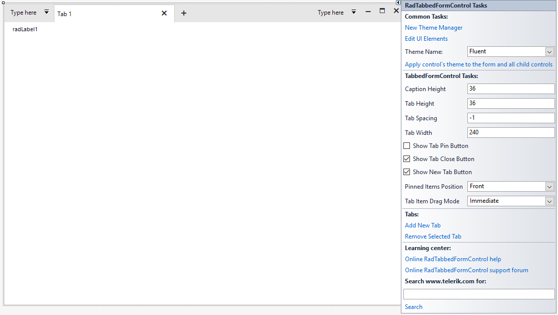
RadTabbedForm with the Fluent Theme in the Visual Studio Designer

tabbed-form-02

Title Bar Support

It was really challenging to implement all the features inside the form's non-client area. I am happy to say that we managed to achieve everything which was planned.

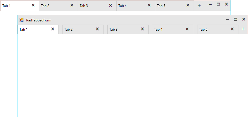
  • Settings: The title bar’s height is not fixed, and it can be adjusted via the CaptionHeight property. The tabs height and the space between them is also adjustable. We have decided to leave no space between the tabs, however, if your end users would need such you can increase the tab spacing. For example, with the following settings you can increase the height of the entire title bar and have the tabs displayed under the top-part where the form`s icon and system buttons are located. This way you will have a bigger part of the non-client area empty which will allow the users to move the form easily.

    this.ShowIcon = true;
    this.TabbedFormControl.ShowText = true;
    this.TabbedFormControl.CaptionHeight = 65;
    this.TabbedFormControl.TabHeight = 32;
    this.TabbedFormControl.TabWidth = 180;
    this.TabbedFormControl.TabSpacing = 12;
Default and Customized Tabbed Forms

tabbed-form-03

  • Standard Windows Title Bar Style: What does it mean? Basically, it means that we can paint the tabs inside the default Windows title bar as it is painted by the operating system. This will vary from one Windows version to another and it will also depend on the chosen Windows theme. This behavior is controlled by the AllowAero property of the form. Setting the property to false would force our themes and the control will adjust the title bar to match the theme of the tabbed control. In some situations, it might be necessary to match the standard Windows look so the AllowAero property has you covered:

    this.AllowAero = true;

Standard Windows 10 Title Bar Style

tabbed-form-04

Drag and Drop

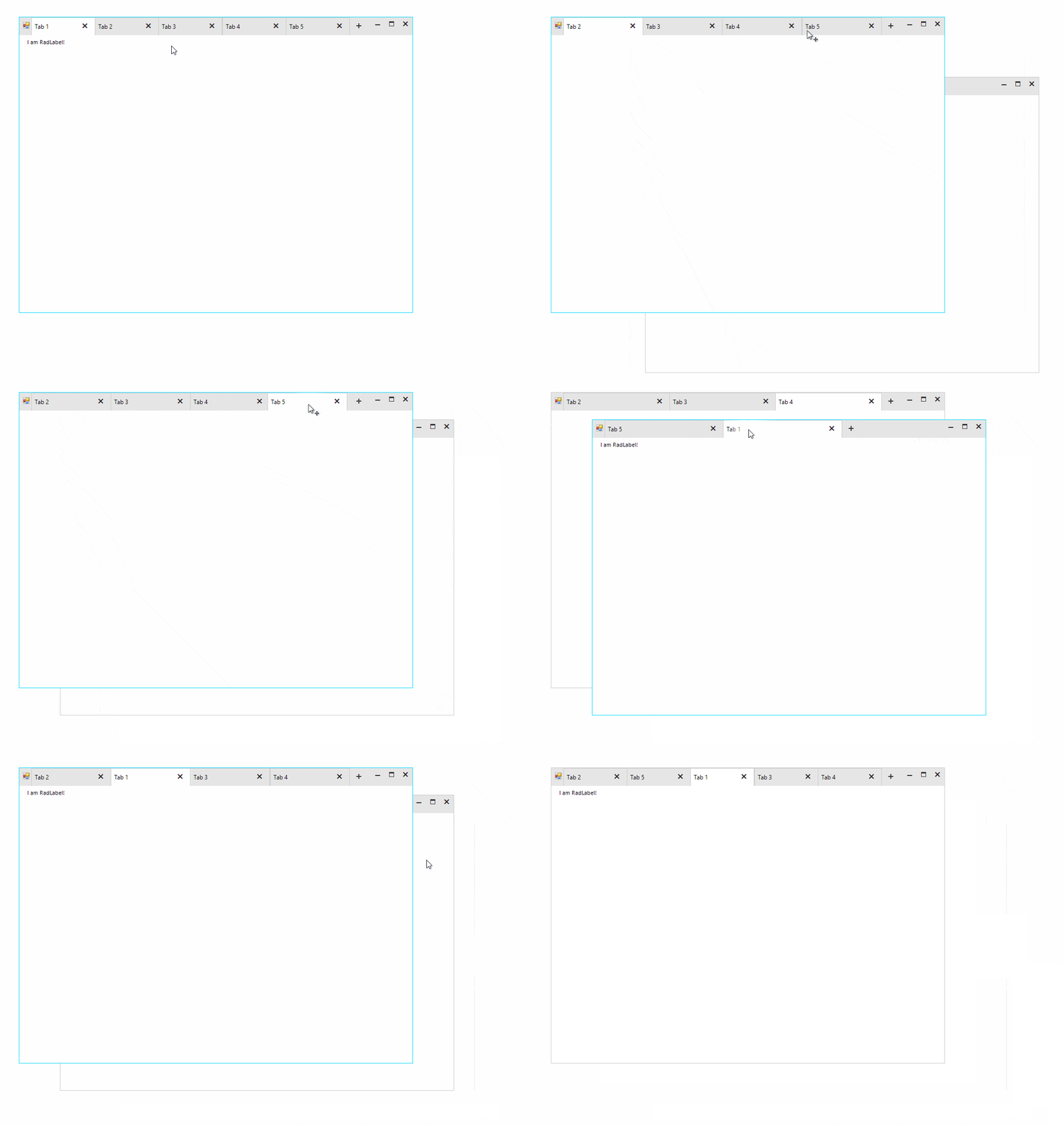
The tabs can be reordered inside the title bar. It is also possible to drag them out to create a separate form. The tab content including all the added controls will be moved to the new form. This operation can be repeated numerous times over and the tab be moved from one form to another.

tabbed-form-drag-drop

Quick Actions

Various elements like buttons, check boxes, drop-down buttons etc. can be added before and/or after the tabs.

this.TabbedFormControl.LeftItems.Add(newRadButtonElement { Text = "button1"}); //adds items before the tabs
this.TabbedFormControl.RightItems.Add(newRadButtonElement { Text = "button2"}); //adds items after the tabs

These elements can be also added in the Visual Studio designer.

tabbed-form-05

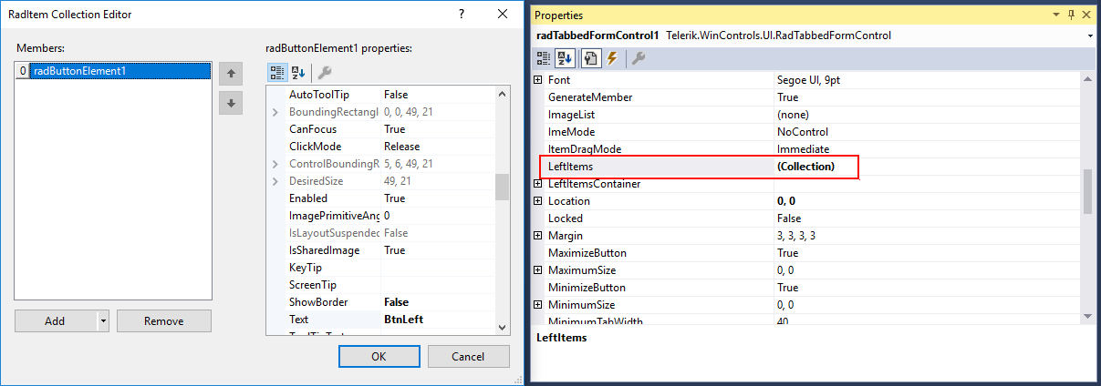
The LeftItems and RightItems collections are also exposed in the property grid of the designer and the elements can be edited in the collection editor.

tabbed-form-06

Navigation

The tabbed control also has a built-in navigation. The navigation buttons will appear automatically, whenever the tabs cannot fit entirely in the available width. The tabs always have an equal width and it can be controlled with the TabWidth and MinimumTabWidth properties. The layout is smart enough and if the tabs count is increased to a point that they cannot fit in the title bar with their specified width, the widths of all tabs will be decreased equally. The layout will decrease the widths of the tabs until it reaches the specified MinimumTabWidth value. At that moment the navigation buttons will become visible.

tabbed-form-navigation

Pinned Items

Tabs can be pinned to the left or right side of the title bar. When unpinned, the tab will return to its last position.

this.TabbedFormControl.Tabs[0].Item.IsPinned = true;

tabbed-form-07

Context Menu

The tabbed control also has a built-in context menu which is fully localizable.  

tabbed-form-08

The items displayed in the menu can be customized in the RadTabbeFormControl.ContextMenuOpening event.

privatevoidTabbedFormControl_ContextMenuOpening(objectsender, RadTabbedFormControlItemConextMenuOpeningEventArgs e)
{
    if(e.TabItem.Text == "Tab 1")
    {
        //remove first item
        e.ContextMenu.Items[0].Visibility = ElementVisibility.Collapsed;
    }
    elseif(e.TabItem.Text == "Tab 2")
    {
        //disable the context menu
        e.Cancel = true;
    }
}

Getting Started

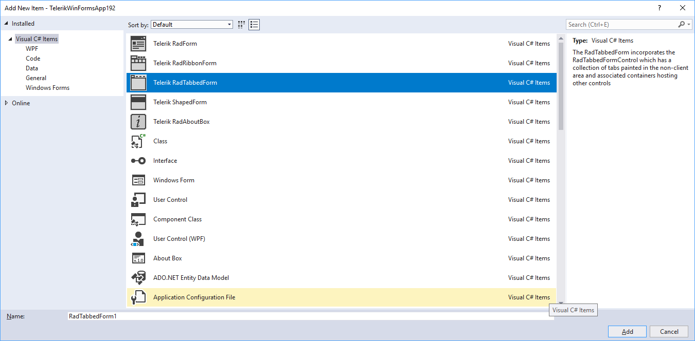
There are two ways to add a RadTabbedForm to your Visual Studio project:

  • VSX extensions: Assuming that you have our Visual Studio extensions installed, you can create a new tabbed form by simply adding a new item to the project.

tabbed-form-09

  • RadFormConverter: Simply drag and drop the component from the Visual Studio tool box and convert the current form to a RadTabbedForm.

Once you have the form added to the project you can start building the UI. Tabs can be added via the RadTabbedFormControl's smart tag. The smart tag also exposes the most important properties of the control. You can also check our Demo application and the two RadTabbedForm examples. Please also don't miss the documentation as it provides detailed information on the features and API of the control.

Try It Out and Share Your Feedback

We'd love to hear what your thoughts are on the new control. Please leave a comment below or write in the forums. If you have an idea for the next great feature you can also submit it on our feedback portal.

You can learn more about the Telerik UI for WinForms suite via the product page. It comes with a 30-day free trial, giving you some time to explore the toolkit and consider how it can help you with your current or upcoming WinForms development.

Create Accessible PDF Documents with Telerik Reporting

$
0
0

Our latest addition to the accessibility story is enabling the PDF rendering extension to produce PDF files that comply with the PDF/UA standard. 

Whether we are writing code, authoring an article or composing a poem, we usually want to get our message delivered to as many people as possible. Sharing our work with others is getting much easier with the advantages that modern technology gives us. This task gets even more important when the shared information represents business data that needs to be accessed by a broader audience.  

A key factor here is to choose a suitable medium, and Adobe’s PDF file is arguably the best way to spread the message. PDF stands for Portable Document Format and indeed it is a well-established standard for creating and distributing documents, which can be read on virtually any current platform and device. But the PDF standard has one more very important feature – it can produce documents in a way that allows users with disabilities to be able to perceive the shared information. This feature is called accessibility and is defined by the PDF/UA standard which is aimed at production companies of software and assistive technologies. 

Accessible PDF Documents

We on the Telerik Reporting team introduced accessibility support in R3 2017 and have since continued evolving further in this direction. Our latest addition to the accessibility story is enabling the PDF rendering extension to produce PDF files that comply with the PDF/UA standard. The most important characteristics of these files are listed below:
  • Tagged contents - all textual items in the report will have a corresponding accessibility entry in the PDF structure. This entry contains the text recognized by the screen readers and other assistive technologies. The rules to generate the text in tagged contents are the same used to generate the metadata in rendered report contents and can be checked here
  • Description for non-textual items - the PictureBox, Graph and Map items should provide meaningful accessible descriptions as well. This description is persisted in a tagged element with configured actual and alternate text. Other graphical primitives like borders will be treated as non-informational elements and will be added in the PDF document structure as artifacts. 
  • Annotations - all the links in the document have a respective link annotation object in the PDF structure. The purpose of the link annotation objects is to provide additional information about the currently selected navigational link. 
  • Document Title - the title is obtained from the PDF device information settings that can be set via code or through the configuration file. When unavailable, the DocumentName property of the report will be used instead. 
  • Document Natural Language– like the document’s title, the document language should be set in the PDF device information settings. If unavailable, the value of the Culture.Name property of the report will be used instead. 

Configuration 

The setting that determines whether the reporting engine would add the accessibility information to the PDF document is named enableAccessiblity and is passed through the PDF device information settings. The settings can be also controlled from the report viewer’s EnableAccessibility property, providing a consistent behavior between viewed content and exported documents. Since the report viewer setting has a broader scope, it has lower priority than the settings explicitly set in device information object. The accessibility feature can also be enabled in code, for example, when the PDF file is produced from the ReportProcessor class:

var rs = newTypeReportSource() { TypeName = typeof(Dashboard).AssemblyQualifiedName };
var deviceInfo = newHashtable()
{
    { "EnableAccessibility", true}
};
var result = newReportProcessor().RenderReport("PDF", rs, deviceInfo);
File.WriteAllBytes("AccessibleDashboard.pdf", result.DocumentBytes);

Results Assessment

The most complete document that describes the checks that a PDF file needs to pass to satisfy PDF/UA standard, is the Matterhorn Protocol. It specifies which of the failure conditions can be tested with dedicated software and which need to be examined manually. Based on this protocol, many tools can evaluate the produced PDF document and determine if it complies to the accessibility standards established with PDF/UA.

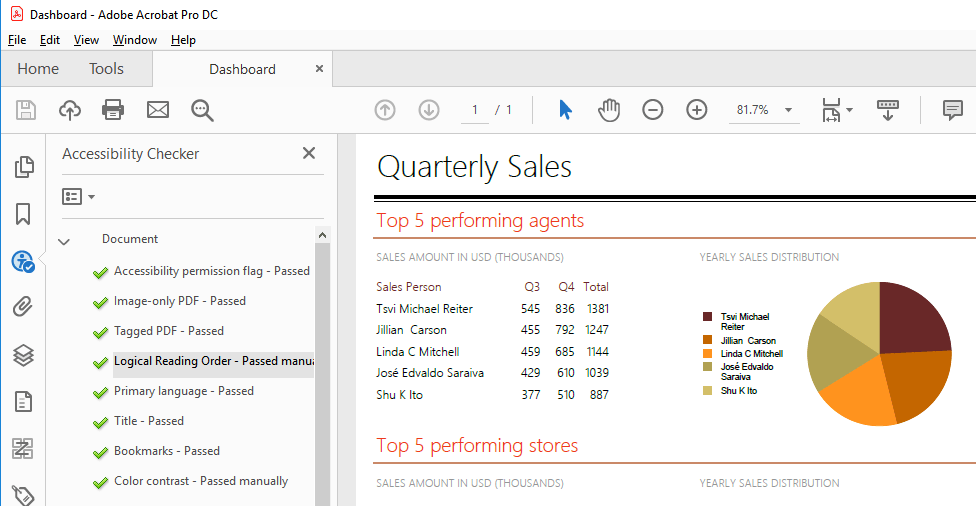
For example, Adobe Acrobat provides a thorough test that traverses the PDF structure and its metadata and outputs a detailed report as shown below:

PDF accessibility check on Adobe Acrobat

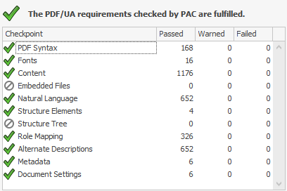
Another comprehensive and free testing tool is PAC - PDF Accessibility Checker. PAC is built in accordance with the Matterhorn protocol and evaluates all the failure conditions that can be tested with a software product. It also includes a screen reader preview that helps to determine how the document will be interpreted by screen-reading applications like NVDA and JAWS, utilized by the visually impaired users. The report that PAC tool displays when checking a PDF/UA compliant file looks like this:

PDF Accessibility Check by PAC

Want to Learn More?

If you are new to our tools or have only tried some, make sure you download the trial and take them for a spin. You can either download just the Reporting and Report Server tools, or download a trial of our entire set of .NET and JavaScript tools with the DevCraft bundle.

We're eager to hear what you think, so please don't forget to share your feedback and help us make Telerik Reporting even better.

Throwing .NET Exceptions: ArgumentException and InvalidOperationException

$
0
0

Exceptions can be thrown either by the runtime or the application code. This can be caused by bad code, while, other times, the problem is caused by bad user input that has not been accounted for in the application's code. When any of these errors occur, the system catches the error and raises an exception.

The process of generating and signaling the error is referred to as throwing an exception. This is done using the throw keyword followed by a new instance of a class derived from System.Exception. There are standard exception types provided by the .NET framework that you can use rather than creating a custom exception.

In this post, I'll show you why and how to use the ArgumentException and InvalidOperationException types which, are part of the standard exceptions in .NET.

Note: Interested in learning about the ArgumentNullException and ArgumentOutOfRangeException? Check out my post on those exceptions here.

Working with InvalidOperationException Exception

The InvalidOperationException exception type is thrown when a method call is invalid for the object's current state. This can be caused by changing a collection while iterating it, or casting a Nullable<T> that is null to its underlying type. We can also throw this exception type in cases where we want to signal to our application that the requested operation through a method call can't be performed because the object is in an invalid state. Let's look at an example:

class Account
{
  public Account(string firstName, string lastName, int balance)
  {
    FirstName = firstName;
    LastName = lastName;
    Balance = balance;
  }

  public string FirstName { get; private set; }
  public string LastName { get; private set; }
  public int Balance { get; private set; }

  public void Withdraw(int amount)
  {
    if (amount > Balance)
      throw new InvalidOperationException("Insufficient fund");

    Balance = Balance - amount;
  }
}

The code above shows an Account class with properties to hold the account owner's names and account balance. The Withdraw method deducts the withdrawal amount from the balance, and if the withdrawal amount is higher than the balance, it throws an exception — the InvalidOperationException. When the exception is raised, it cancels the withdraw transaction and signals to the application that the account can't be debited of that amount because of insufficient funds.

Working with ArgumentException Exception

The ArgumentException type inherits from the System.SystemException class and should be thrown when a method argument receives an invalid argument value. Carrying on from the Account class example from the previous section, let's guard the Withdraw method not to allow a number less than one, or an empty string as values for the names.

class Account
{
  public Account(string firstName, string lastName, int balance)
  {
    if (string.IsNullOrEmpty(firstName))
      throw new ArgumentException("FirstName is invalid");
    if (string.IsNullOrEmpty(lastName))
      throw new ArgumentException("LastName is invalid");

    FirstName = firstName;
    LastName = lastName;
    Balance = balance;
  }

  public string FirstName { get; private set; }
  public string LastName { get; private set; }
  public int Balance { get; private set; }

  public void Withdraw(int amount)
  {
    if (amount < 1)
      throw new ArgumentException("Amount can't be less than 1",
                                  nameof(amount));
    if (amount > Balance)
      throw new InvalidOperationException("Insufficient fund");

    Balance = Balance - amount;
  }
}

In the code above, we used the ArgumentException exception in the constructor to prevent initializing an account object with invalid values. We also throw the ArgumentException exception if the Withdraw method is called with an amount less than one. We used the constructor that accepts an exception message and a second parameter to indicate the parameter that caused the exception.

That's A Wrap

We looked at throwing exceptions in C#, specifically, throwing the ArgumentException and InvalidOperationException that are part of the standard exceptions in .NET.

The ArgumentException is thrown when a method argument receives an invalid argument value. The InvalidOperationException exception is thrown in cases where the failure to invoke a method is caused by reasons other than invalid arguments. Because the InvalidOperationException exception can be thrown in a wide variety of circumstances, it is important to read the exception message returned by the Message property. How you handle the exception depends on the specific situation. Most commonly, however, the exception results from developer error and it can be anticipated and avoided.

Localization and Globalization for Xamarin.Forms Applications Using Telerik UI for Xamarin

$
0
0

This blog will introduce you to the built-in mechanism for globalization and localization of the Telerik UI for Xamarin suite, and help you understand the difference between the two terms.

I have the feeling that these two terms - globalization and localization - are often misunderstood. Therefore I would like to start with more general questions and then will dive into some specifics. 

What is Globalization? 

According to W3, “Globalization is the process of design and development of a product, application or document content that enables easy localization for target audiences that vary in culture, region, or language. Some people use other terms, such as "internationalization” to refer to the same concept.” 

What about Localization? 

The process of adaptation of a product, application or document content to meet the language, cultural and other requirements of a specific target market (a locale). Often thought of only as a synonym for “translation of the user interface and documentation,” localization is a substantially more complex issue. It can include customization related to:

  1. Numeric, date and time formats
  2. Use of currency
  3. Keyboard usage
  4. Collation and sorting
  5. Symbols, icons and colors
  6. Text and graphics containing references to objects, actions or ideas which, in a given culture, may be subject to misinterpretation or viewed as insensitive
  7. Varying legal requirements

This list is just a start - localization can apply to many more things as well.

How Do These Relate to Application Development?

When it comes to the user interface of an application, these terms boil down to applying correct strings and various formats depending on the language settings of the respective device. This task sounds simple and straightforward, but it can become hard for execution, especially in cases where third party UI components are used.

We understand this, and therefore Telerik UI for Xamarin provides an easy to use mechanism which can change the predefined strings in our components. Examples of such strings can be found in several of our controls including RadDataGrid, RadCalendar & Scheduling UI, RadAutoCompleteView, RadNumerInput and more.

It is worth mentioning that not all the components take advantage of this mechanism simply because there are no predefined strings in every single one. For those which need any predefined string(s) the TelerikLocalizationManager is used to resolve the exact characters to display. Internally those components work with keys instead of specific string values. At runtime, the localization manager is expected to resolve those keys to concrete strings.

What is TelerikLocalizationManager? 

This is a class which uses one of two available approaches to map the predefined keys of all components of the Telerik UI for Xamarin suite with exact strings which will be visualized. 

The first method requires extending the default manager by overriding a single function which does the actual mapping. It returns a string for a given key (a.k.a. key-value pair). Here is an example: 

publicclassCustomTelerikLocalizationManager : TelerikLocalizationManager
{
    publicoverridestringGetString(stringkey)
    {
        if(key == "And")
        {
            return"И";
        }
        if(key == "Or")
        {
            return"Или";
        }
        if(key == "ResetText")
        {
            return"Изчисти";
        }
        if(key == "FilterText")
        {
            return"Филтрирай";
        }
        if(key == "FilterUISectionText")
        {
            return"Филтрирай по:";
        }
        returnbase.GetString(key);
    }
}

Once the mapping is done, an instance of the customized localization manager should be assigned to the static TelerikLocalizationManager.Manager property before the UI is initialized and rendered. In a XamarinForms application a good place to do this is just before the InitializeComponent() function of a page. 

publicMainPage()
{
    TelerikLocalizationManager.Manager = newCustomTelerikLocalizationManager();
    this.InitializeComponent();
}

However, if your application initializes any resources at earlier stage, you should consider instantiating the extended manger on an earlier stage as well. 

Using TelerikLocalizationManager to Localize a Xamarin.Forms Application

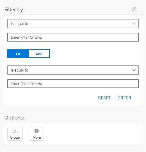
This example translates part of the filtering UI of the RadDataGrid component to Bulgarian. You can recreate the exact scenario by following the Getting Started article in our documentation. Here is how the filtering UI looks like by default.

RadDataGrid FilteringUI

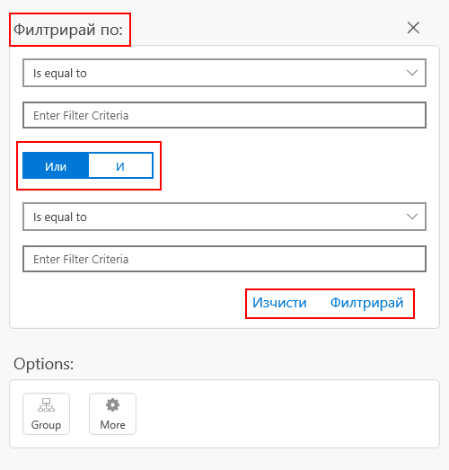
After applying the customized localization manager, the visualized strings change like this: 

RadDataGrid Bulgarian FilteringUI

If you are going to translate an application, most likely you will have to translate it to many languages. This can be done by creating many customized localization managers – one for each supported language. In addition to this, the developer should decide which manager is to be used when instantiating one. Here is one way to do it:

publicpartialclassMainPage : ContentPage
{
    publicMainPage()
    {
        ILocalizationManager manager = null;
        if(CultureInfo.CurrentUICulture.Name == "bg-BG")
        {
            manager = newCustomTelerikLocalizationManager();
        }
        elseif(CultureInfo.CurrentUICulture.Name == "fr-FR")
        {
            // new up your French manager
        }
        elseif(CultureInfo.CurrentUICulture.Name == "de-DE")
        {
            // new up your German manager
        }
        ...
        TelerikLocalizationManager.Manager = manager;
        InitializeComponent();
        ...
    }
}


Localizing Xamarin Application with Resouces

On the other hand, the second available approach for providing key-value pairs eliminates the need of choosing between multiple managers. It makes use of the well-known .resx files. You just need to create one (or several), update them to match a convention and embed them into your application. Because of the convention the TelerikLocalizationManager will automatically pick and read the correct file depending on the language settings of the device. 

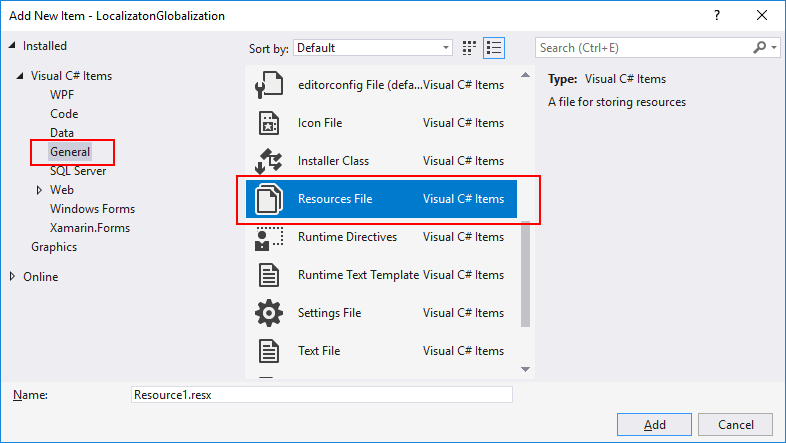
Speaking about creating such files, here are the steps that can be followed to do so. Usually Visual Studio provides a convenient item template for .resx files. It can be used by right-clicking on the portable project and navigating to Add > New Item… in the newly opened dialog navigate to Visual C# Items > General > Resources File.  

ResourcesFile item template

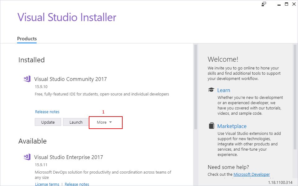
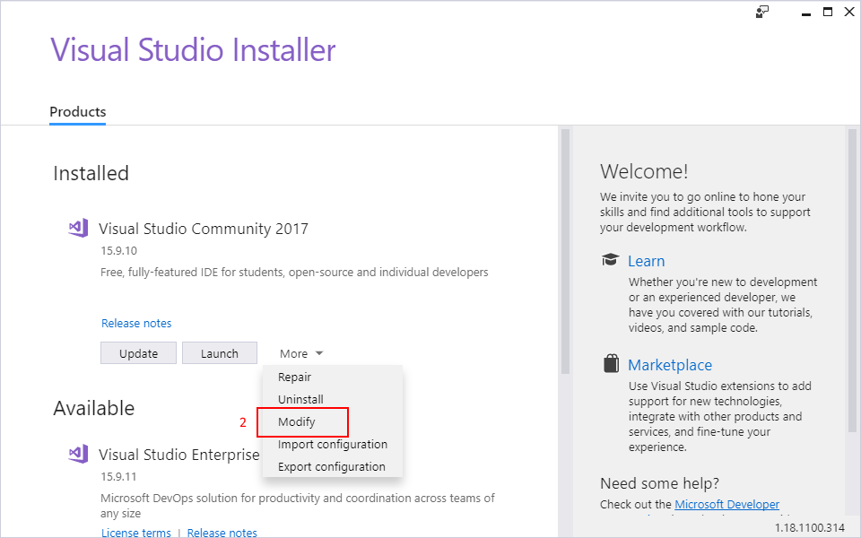
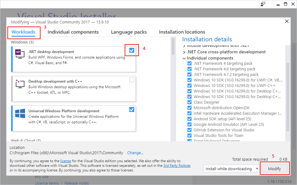
However, as a mobile developer it is a common pitfall to install only the “Mobile development with .NET” workload when installing Visual Studio. It gives you everything you need to get started with XamarinForms, but unfortunately, by default, this workload does not provide the resources file item template. You will have to install another workload to get it. This can be done by opening the Visual Studio Installer, going to More > Modify under Workloads, checking “.NET desktop development” and pressing Modify

Visual Studio Installer

Visual Studio Installer

Visual Studio Installer

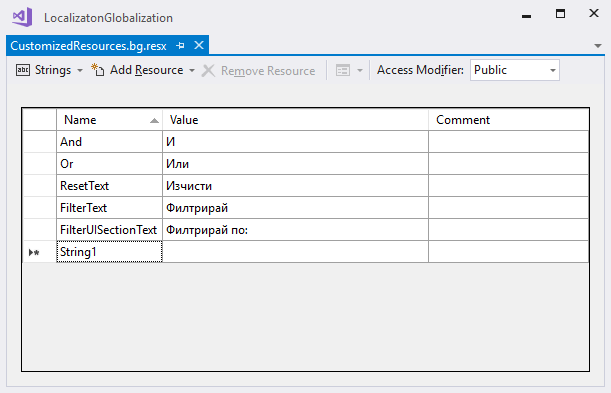
Let the installer do its job and then you will be able to create a .resx file from the Add New Item dialog. Visual Studio also provides a convenient editor for these files. In the editor, the key-value pairs can easily be provided in a tabular form. This makes reading, adding and editing entries much easier. 

ResourcesFile editor

Once the resource file is ready, it is time to comply to the earlier mentioned convention. There are two aspects that need to be covered.  

First is the name of the file. It should be structured like this [filename].[culture].resx. In this demonstration the file is named “CustomizedResources.bg.resx”. If I need to translate the app in German, the file containing the German key-value pairs would be named “CustomizedResources.de.resx”.  

The second aspect is to provide a resources file for the neutral culture as well. This is achieved by creating an empty .resx which does not specify any culture in its name. In this example it should be named “CustomizedResources.resx”. This file is not required to provide any key-value pairs since leaving it empty none of the default strings will be overridden and the controls will visualize their default strings representation. 

The final step is to provide a new resource manager to the default TelerikLocalizationManager. This once again should be done before the controls are visualized. 

namespaceLocalizatonGlobalization
{
    publicpartialclassMainPage : ContentPage
    {
        publicMainPage()
        {
            stringresourceId = "LocalizatonGlobalization.CustomizedResources";
            TelerikLocalizationManager.Manager.ResourceManager = newSystem.Resources.ResourceManager(resourceId, typeof(MainPage).GetTypeInfo().Assembly);
            InitializeComponent();
        }
    }
}

Please note how the resourceId variable is constructed. It includes the fully qualified namespace name and the filename without the culture specific extension of the resource file. This allows the ResourceManager to pick and use the correct resources file. 

Where Can I Find the Keys Used by the Components?

No matter which of the two approaches you choose to use, you will need to know the exact keys that the components internally use. In our xamarin-forms-sdk repository you can find the DefaultResources.resx file. It contains every key that is used by all components along with the default string values. 

Basically, this is the type and volume of the resources file that is required if you are to translate all the components part of the Telerik UI for Xamarin suite. 

Wrapping Up 

If you are in a hurry and are looking for a fast and easy way to translate your application, you may find it useful to create a custom ResourcesManager and some .resx files. However, if you need more control over the translation process, you may like extending the default TelerikLocalizationManager and taking control in code. 

Don't forget to install the newest version of Telerik UI for Xamarin from your Telerik account, check the available examples in the Demo Application as well as the SDK Samples Browser applications. As always, your feedback would be greatly appreciated. 

Thanks for reading and I hope you find the globalization and localization a bit clearer and valuable to your projects.


Fasten Your Seatbelts! RadTabbedWindow Lands on XAML Islands

$
0
0

Telerik UI for WPF in R2 2019 is here and I am happy to announce that it can help you take the navigation in your WPF application to the next level. Say hi to the latest addition to our collection of WPF navigation controls – the brand new RadTabbedWindow.

Introducing RadTabbedWindow

It may sound like a hybrid WPF control, born from the equation RadTabControl + RadWindow = RadTabbedWindow. Don’t worry, RadTabbedWindow is not like hybrid cars – this control is the best of both worlds and there are no two ways about it.

Any application deserves an efficient navigation system. Luckily, tabbed navigation is one good such system. Tabbed navigation can absolutely be described as a “good conversation” with your clients. If implemented properly, it clearly and precisely tells the users exactly:

  • where they are
  • what's available to them
  • how can they access what's available

Therefore, a good navigation system needs to meaningfully separate content into different sections, clearly show what content is available and interactively present that content.

Want to bring the productivity of tabbed window management to your WPF application? Let me guide you through its key features.

Key Features & Events

The control has a rich API that greatly facilitates the customization of its functionality and appearance. Some of the tabbed window's key features include:

  • DragDrop support:
    • Reorder tabs in a single window
    • Drag out tabs to create new window
    • Drag drop tabs from one window to another
  • Pin/unpin/close functionality (through the UI or programmatically)
  • Adding tabs runtime (through the UI or programmatically)
  • Data Binding
  • Out-of-the-box touch support

Oh, let’s not forget to mention that the RadTabbedWindow control also exposes a number of events that greatly contribute to the easy customization of the control’s behavior:

  • TabbedWindowCreating (new one created via drag and drop)
  • AddingNewTab
  • PreviewTabPinned & TabPinned
  • PreviewTabUnpinned & TabUnpinned
  • PreviewTabClosed & TabClosed
  • PreviewSelectionChanged & SelectionChanged

More detailed information can be found in the great documentation article for the control.

P.S. The tabbed window comes with the built-in variety of our Telerik UI for WPF Themes Suite (this means even easier look and feel enhancements). Also, do not hesitate to benefit from the flawless color customization and rapid palette creation using the Color Theme Generator. Now let’s move on to the interesting part! The next sections will guide you through embedding UWP’s WebView control inside RadTabbedWindow.

Hosting WebView in RadTabbedWindow

Do you remember XAML Islands? They are like little containers inside WPF apps - ones that can hold little pieces of XAML to render UWP controls. This way, we can now bring an even richer app experience with the modern UWP WebView control within our tabbed window.

With the newer Windows 10 versions, you can host UWP controls in non-UWP desktop applications using this feature. More information on this can be found here.

Have you already tried them? Shame on me, I haven’t.

What better time than now to test the waters of XAML Islands? :)

Requirements for Hosting WebView

There are some requirements that you need to be sure are met before we proceed:

Once we have check marks next to all the above bullets, we are ready to drag the WebView control from Visual Studio’s Toolbox!

Step-by-Step Guide

In this guide, I am using the tabbed window with NoXaml version and the Fluent theme.

  1. Create an empty WPF application, add references to the following assemblies and merge the corresponding ResourceDictionaries in App.xaml:
    • Telerik.Windows.Controls
    • Telerik.Windows.Controls.Navigation
    • Telerik.Windows.Controls.Data

    Add an empty Style targeting the main window which is based on RadTabbedWindowStyle. Your App.xaml should look like:

    <Application.Resources>
        <ResourceDictionary>
            <ResourceDictionary.MergedDictionaries>
                <ResourceDictionarySource="/Telerik.Windows.Themes.Fluent;component/Themes/System.Windows.xaml"/>
                <ResourceDictionarySource="/Telerik.Windows.Themes.Fluent;component/Themes/Telerik.Windows.Controls.xaml"/>
                <ResourceDictionarySource="/Telerik.Windows.Themes.Fluent;component/Themes/Telerik.Windows.Controls.Navigation.xaml"/>
            </ResourceDictionary.MergedDictionaries>
            <StyleTargetType="local:MainWindow"BasedOn="{StaticResource RadTabbedWindowStyle}"/>
        </ResourceDictionary>
    </Application.Resources>
  2. Add xmlns:telerik="http://schemas.telerik.com/2008/xaml/presentation," replace Window with telerik:RadTabbedWindow and remove the empty Grid. Your MainWindow.xaml should look like the following:
    <telerik:RadTabbedWindowx:Class="WpfApplication1.MainWindow"
            xmlns:local="clr-namespace:WpfApplication1"
            mc:Ignorable="d"
            Header="MainWindow"Height="800"Width="1300">
    </telerik:RadTabbedWindow>

    To be able to show WebView as RadTabbedWindow’s Content you need to add the following namespace and set AllowTransparency property to false. This property is true by default because of the underlying shadow, present in all themes. 

    xmlns:navigation="clr-namespace:Telerik.Windows.Controls.Navigation;assembly=Telerik.Windows.Controls.Navigation"
    navigation:RadWindowInteropHelper.AllowTransparency="False"

    In MainWindow.xaml.cs, you should inherit from RadTabbedWindow instead of Window:

    publicpartialclassMainWindow : RadTabbedWindow
    {
        publicMainWindow()
        {
            InitializeComponent();
        }
    }
  3. If you want the tabbed window to be the main window, you need to remove the StartupUri from the App.xaml file and modify App.xaml.cs to contain the following: 
    protectedoverridevoidOnStartup(StartupEventArgs e)
    {
        newMainWindow().Show();
        base.OnStartup(e);
    }

    Otherwise - you can create it as a separate window by adding a new Window to your project and changing the TargetType of the empty style from step 1 accordingly.

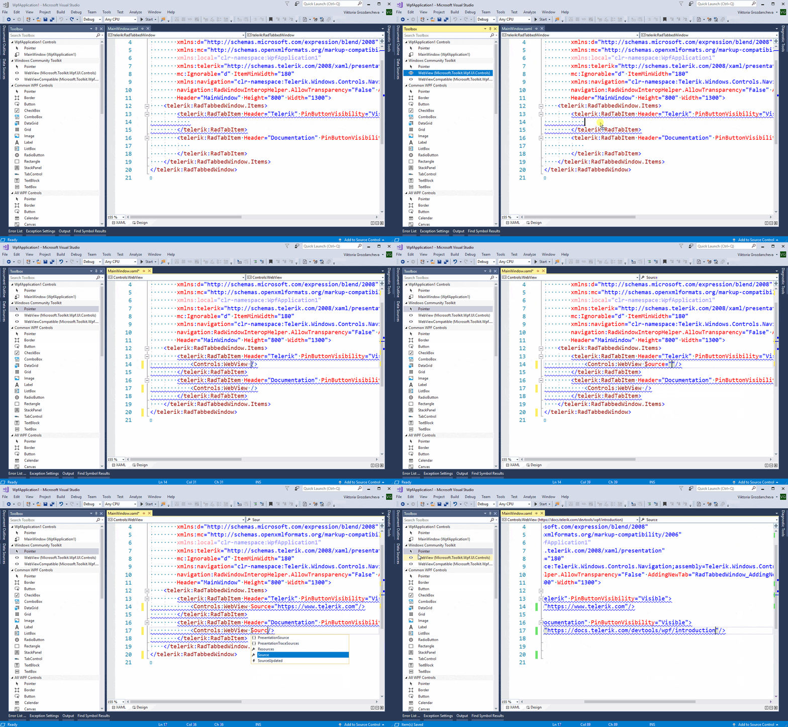
  4. Add new item to tabbed window, drag WebView from Visual Studio’s Toolbox as its content and make the desired configurations:

    Drag WebView as RadTabItem Content from Toolbox

  5. Run the application and enjoy!
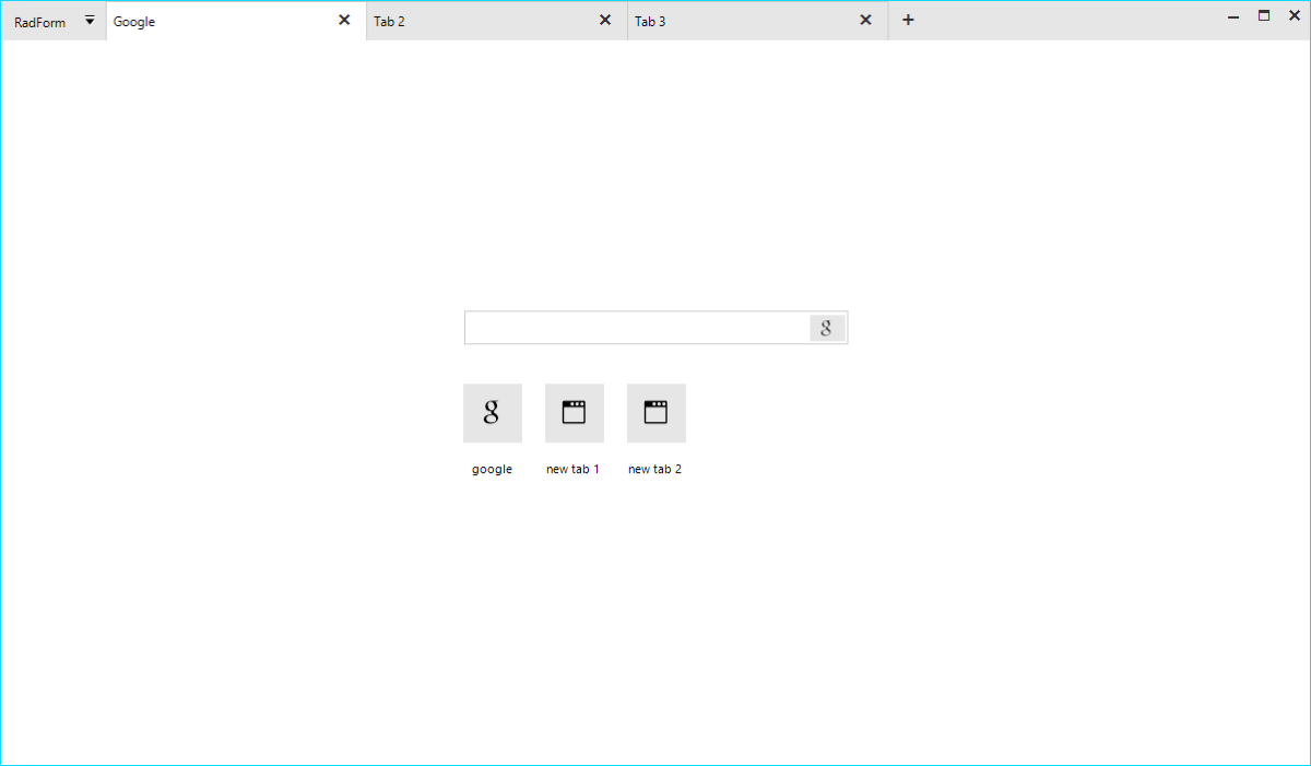
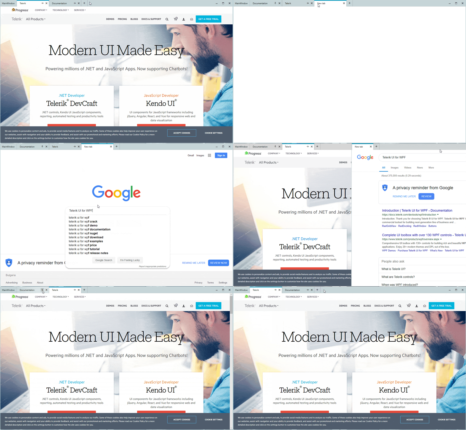
The following GIF is a sample representation of the above guide with the only difference that it creates new WebView as the Content of the new tab form AddingNewTab event. Code snippet of AddingNewTab follows as well.

RadTabbedWindow in action
private void RadTabbedWindow_AddingNewTab(object sender, Telerik.Windows.Controls.TabbedWindow.AddingNewTabEventArgs e)
{
    var wv = new WebView();
    wv.Source = new Uri("https://google.com");
    RadTabItem newTab = e.Item as RadTabItem;
    if (newTab != null)
    {
        newTab.Header = "New tab";
        newTab.Content = wv;
    }

It didn’t hurt, and it actually looks pretty cool, doesn’t it? As the Telerik R2 2019 Release is already live, do not hesitate to give RadTabbedWindow a try right away and feel more than welcome to share your thoughts in the comments section below.

Try It Out

If by some chance this is the first time you've heard about Telerik UI for WPF, then you can explore the great variety of key features, controls and themes ready for the taking on our product page.

Azure Cosmos DB and Grid in Web Forms

$
0
0

In this guide, learn how to use Azure Cosmos DB with Web Forms to create a powerful grid for your web apps.

Azure Cosmos DB and Grid in Web Forms - is this combination really possible?

Yes, absolutely. Azure Cosmos DB is the new kid in the block while Web Forms is the old veteran, but still the favorite web development technology of many people.

So, let’s start with building this grid.

This is a list of the content sections, so you can navigate easier:

  1. Create an Azure Cosmos DB Collection
  2. Partition Key
  3. Create a New Web Forms Project
  4. Add a Grid Control to the Page
  5. Read the Data from the Database
  6. Bind the Data to the Grid
  7. Inserting
  8. Deleting
  9. Updating
  10. Download and Run the Ready Project

Before we begin, here's a short summary defining Cosmos DB:

Today’s applications are required to be highly responsive and always online. To achieve low latency and high availability, instances of these applications need to be deployed in datacenters that are close to their users.

...

Azure Cosmos DB is a globally distributed database service that's designed to provide low latency, elastic scalability of throughput, well-defined semantics for data consistency, and high availability. In short, if your application needs guaranteed fast response time anywhere in the world, if it's required to be always online, and needs unlimited and elastic scalability of throughput and storage, consider building applications by using Azure Cosmos DB.

MSDN: Global data distribution with Azure Cosmos DB - overview

1. Create an Azure Cosmos DB Collection

In this sample I will use a nice option to configure an Azure Cosmos DB – its dedicated Emulator. You can use your existing collection from your Azure account or download the Emulator, which does not require an account.

Next step is to create the Container (Collection) and add some items. One of the fields you need to fill is called Partition Key and this setting is explained in more detail in the next section.

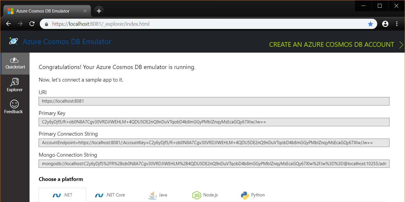
Once this is complete, your database emulator will now look like this:

Azure Cosmos DB Emulator

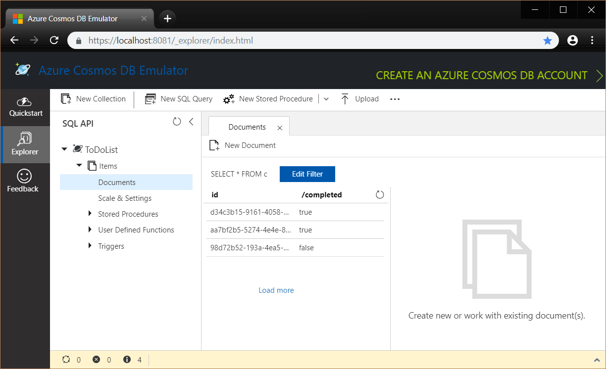
In the Explorer tab you can now see any records you might have:

Azure Cosmos DB Emulator - Explorer Tab

2. Partition Key

  1. What is this?

    Are you familiar with the concept of Grouping data? Partitioning is similar where it uses the same values of a field to distribute the data into divisions.

    It is useful for load balancing, performance, scalability, manageability, availability and similar abilities.

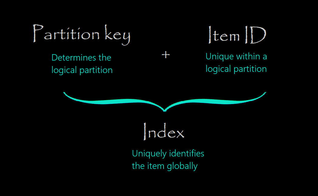
  2. Partitioning
  3. Some juicy details

    Let’s divide this in 2 sections (Reference):

  • Logical partitions:

    By using partitioning, the items in a container are divided into distinct subsets, called logical partitions.

    Example 1: If UserID serves as the partition key for the items in a container, and there are 1000 unique UserID values, 1000 logical partitions will be created for the container.

    Example 2: If all the items contain a City property, then you can use City as the partition key for the container and specific values for the City such as, "London", "Paris", "NYC" etc. will form a distinct logical partition.

  • Physical partitions:

    You don’t need to worry about these since Cosmos DB automatically manages the placement of logical partitions onto physical partitions (server infrastructure) depending on the load. Also, you can't control their size, placement, the count, or the mapping. What you can do, however, is to control the number of logical partitions and the distribution of data and throughput by choosing the right partition key using the suggestions from the next step.

  • How to choose it?

    Choosing a partition key is an important decision that will affect your application’s performance. You can consider the following best practices and details when choosing a partition key:

    • Have a wide range partition key with many distinct values such as hundreds or thousands.
    • Avoid “hot” partition key value (check the image below). If the requests for a specific value exceed the allocated throughput, the requests will be rate-limited.
    • By default, a single logical partition is allowed an upper limit of 10 GB of storage.
    • Candidates for partition keys may include the properties that appear frequently as a filter in your queries.
    • Think about not only having general even storage distribution, but also even distribution when your data is getting hit. Choose a partition key that spreads workload evenly across all partitions and evenly over time.
    • If such a property doesn’t exist in your data, a synthetic partition key can be constructed.

      Click the image below to expand and see a possible case with hot partition:

      Possible Hot Partition

      Pro Tip: You can choose this key only initially - changing some properties of a collection like the ID or the partition key are not supported. Reference

  • Videos

    I highly suggest that you check these videos before choosing the key:

  • 3. Create a New Web Forms Project

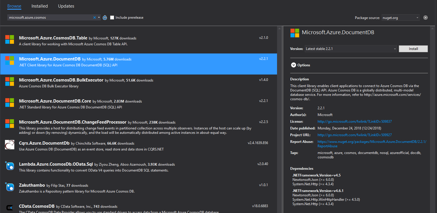
    I choose to use a Template Web Application provided by the Progress Telerik UI for ASP.NET AJAX Toolset. It is very similar to a standard ASP.NET Web Application Project so you are perfectly fine if you decide to use that instead. The next step would be to open the NuGet Manager and add the Microsoft Azure Cosmos DB Client Library.

    Pro Tip: Make sure that you are using a corresponding version of the Azure Cosmos DB Library and the Emulator. A long-time discrepancy between these can lead to issues. To avoid this, you can use their latest version.

    New Web Forms Project

    4. Add a Grid Control to the Page

    Now we will display our data in a grid control and make it visually appealing to the user’s eye. This can be achieved by using a standard asp:GridView or any other server-side grid control you prefer. I will be using the RadGrid– the most capable player in the Telerik AJAX league:

    <telerik:RadGrid ID="RadGrid1" runat="server" AllowPaging="True" Width="800px"

        OnNeedDataSource="RadGrid1_NeedDataSource" OnColumnCreated="RadGrid1_ColumnCreated"

        AutoGenerateEditColumn="true" OnUpdateCommand="RadGrid1_UpdateCommand"

        AutoGenerateDeleteColumn="true" OnDeleteCommand="RadGrid1_DeleteCommand"

        OnInsertCommand="RadGrid1_InsertCommand">

        <MasterTableView DataKeyNames="Id,Completed" CommandItemDisplay="Top">

        </MasterTableView>

    </telerik:RadGrid>

    And this is the entire definition. The columns are generated automatically based on the DataType of the field. Complex functionalities like paging, filtering, grouping, sorting, aggregates and many more are also provided with a single property and without any additional coding on the developer’s part.

    Yes, it is charming.

    On the outside, it will look like the image below. If Bootstrap is not your thing, you can also choose from around 20 other built-in skins or create your custom one:

    Grid

    You can find the required assemblies to run this grid in the Download section.

    5. Access the Database

    To set up a valid connection to your database, you will need to use some key identifiers. I prefer to have them directly in the web.config:

    <appSettings>

         ...

        <add key="endpoint" value="https://localhost:8081/" />

        <add key="authKey" value="C2y6yDjf5/R+ob0N8A7Cgv30VRDJIWEHLM+4QDU5DE2nQ9nDuVTqobD4b8mGGyPMbIZnqyMsEcaGQy67XIw/Jw==" />

        <add key="database" value="ToDoList" />

        <add key="collection" value="Items" />

    </appSettings>

    Now, we can get a reference to the database in the code-behind:

    private static readonly string DatabaseId = ConfigurationManager.AppSettings["database"];

    private static readonly string CollectionId = ConfigurationManager.AppSettings["collection"];


    private static DocumentClient client

    {

        get

        {

            return new DocumentClient(

                new Uri(ConfigurationManager.AppSettings["endpoint"]),

                ConfigurationManager.AppSettings["authKey"]);

        }

    }

    For implementing additional methods like CreateDatabaseIfNotExistsAsync and CreateCollectionIfNotExistsAsync, you can check the DocumentDBRepository.cs file and its GitHub code.

    6. Bind the Data to the Grid

    Once you have a valid connection and access to the database, you can now extract the records from the Collection and bind the grid. Usually, grids can be bound using their DataSource property and the DataBind() method. Since we are using RadGrid in this case, we can make avail of the ultimate NeedDataSource event handler of the grid:

        protected void RadGrid1_NeedDataSource(object sender, GridNeedDataSourceEventArgs e)

        {

            IQueryable<Item> source = client.CreateDocumentQuery<Item>(

                UriFactory.CreateDocumentCollectionUri(DatabaseId, CollectionId));


            RadGrid1.DataSource = source;

        }

    The amazing thing about it is that you don’t have to worry about actions like paging, filtering, sorting, grouping, their corresponding events, and when to rebind the grid. The NeedDataSource event does everything automatically under the hood and all that is left for you is to lean back and enjoy the functionality.

    7. Inserting

    Inserting is the most straightforward operation to modify the database. The process simply includes extracting the new values and adding a new record (Document) to the data source:

       protected void RadGrid1_InsertCommand(object sender, GridCommandEventArgs e)

        {

            GridEditableItem item = e.Item as GridEditableItem;

            Hashtable newValues = new Hashtable();

            item.ExtractValues(newValues);


            Item newItem = new Item()

            {

                Name = (string)newValues["Name"],

                Description = (string)newValues["Description"],

                Completed = (bool)newValues["Completed"]

            };


            client.CreateDocumentAsync(UriFactory.CreateDocumentCollectionUri(

                DatabaseId, CollectionId), newItem).Wait();

        }

    For create and update operations on documents, the partition key is optional. When absent, the client library will extract the partition key from the document before sending the request to the server. Reference

    8. Deleting

    Usually deleting a record (Document) requires only its unique data key value to remove it from the database. In this case the partition key part is also required so the Azure Cosmos DB knows in which bucket the item is located:

        protected void RadGrid1_DeleteCommand(object sender, GridCommandEventArgs e)

        {

            GridDataItem item = (GridDataItem)e.Item;

            string dataKeyID = item.GetDataKeyValue("Id").ToString();

            bool partitionKeyID = (bool)item.GetDataKeyValue("Completed");


            RequestOptions requestOptions = new RequestOptions()

            {

                PartitionKey = new PartitionKey(partitionKeyID)

            };


            client.DeleteDocumentAsync(UriFactory.CreateDocumentUri(

                DatabaseId, CollectionId, dataKeyID), requestOptions).Wait();

        }

    9. Updating

    Now for updating, I will separate the section into 2 parts:

    1. When there is no need to change the partition key of the record. In this case you can use the replace method and find and modify the record directly.
    2. When you want to change the partition key, too. Changing the partition key of an item (Document) is not supported and you need to first delete it and then re-create it in another partition/bucket.

        protected void RadGrid1_UpdateCommand(object sender, GridCommandEventArgs e)

        {

            GridEditableItem item = (GridEditableItem)e.Item;

            string dataKeyID = item.GetDataKeyValue("Id").ToString();

            bool partitionKeyID = (bool)item.GetDataKeyValue("Completed");

            bool newPartitionKeyID = ((CheckBox)item["Completed"].Controls[0]).Checked;


            Hashtable newValues = new Hashtable();

            item.ExtractValues(newValues);


            Item updatedItem = new Item()

            {

                Name = (string)newValues["Name"],

                Description = (string)newValues["Description"],

                Completed = (bool)newValues["Completed"]

            };


            if (partitionKeyID != newPartitionKeyID)

            {

                RequestOptions requestOptions = new RequestOptions()

                {

                    PartitionKey = new PartitionKey(partitionKeyID)

                };

                client.DeleteDocumentAsync(UriFactory.CreateDocumentUri(DatabaseId, CollectionId, dataKeyID), requestOptions).Wait();

                client.CreateDocumentAsync(UriFactory.CreateDocumentCollectionUri(DatabaseId, CollectionId), updatedItem).Wait();

            }

            else

            {

                updatedItem.Id = dataKeyID;

                client.ReplaceDocumentAsync(UriFactory.CreateDocumentUri(

               DatabaseId, CollectionId, dataKeyID), updatedItem).Wait();

            }

        }

    10. Download and Run the Ready Project

    Now comes the sweet part – you have the sample ready to download and run. All you need to change is the configuration of your own Azure keys as demonstrated in the Access the Database step. If you want to play some more with the Telerik tools, you can use the assemblies in the Bin folder of the project or get the installer from the Telerik Download page.

    Less Screen Space with the New Simplified Mode of RibbonView

    $
    0
    0

    Check out the latest feature of RadRibbonView - changing the default layout mode to a simplified one. Designed for all fans of keeping things neat and organized!

    There are some things that we use every (or almost every) single day of our lives. If there is something we can all agree on, it is that we all strive for all these things to be well-organized and balanced. This was one of the main goals for Telerik UI for WPF’s R2 2019 Release as well.

    That's why we make it easier to simplify the new Ribbon in our latest release. I believe that if you are fan of keeping things neat and organized, you’ll love it!

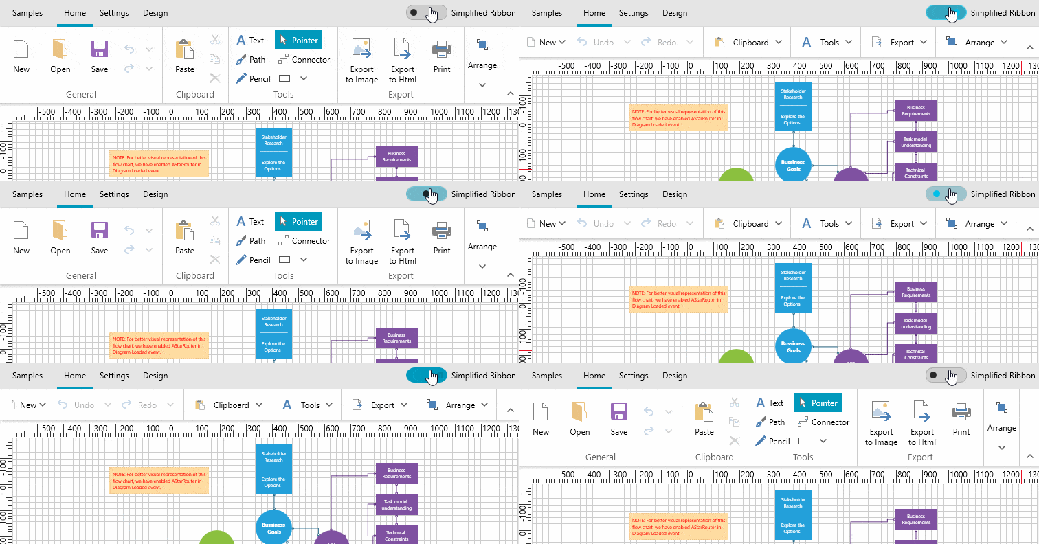
    This smaller, more compact ribbon is designed to show you the most commonly used ribbon elements in a streamlined single line interface. It replaces the bulkier design that has dominated Microsoft Office for years. According to Microsoft's announcement of this new ribbon UI, the change is "designed to help users focus on their work and collaborate naturally with others".

    How is this change achieved? By reducing vertical space and using a smaller number of highly used commands.

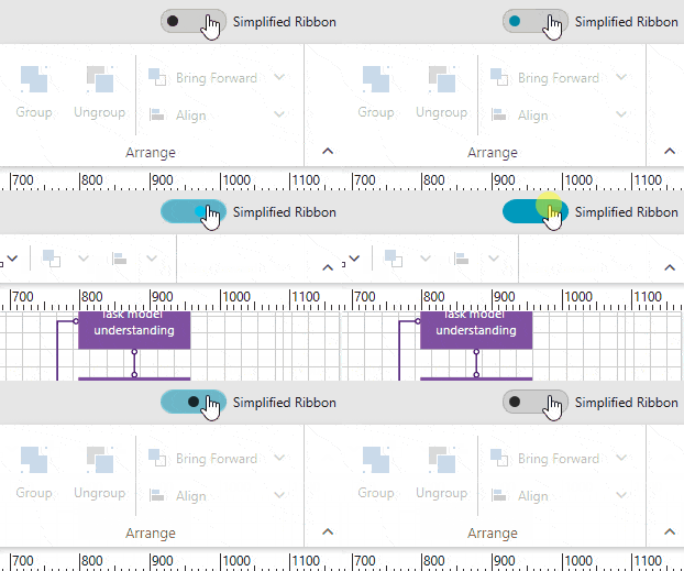
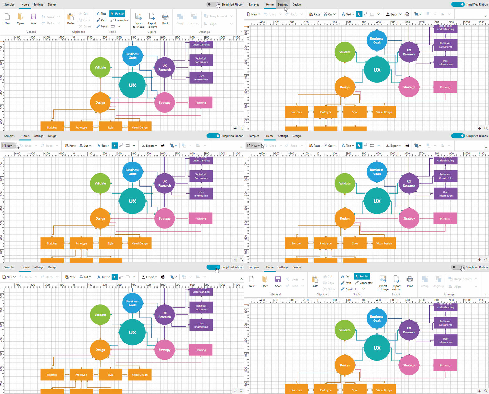
    What is the main advantage? Boosted end user productivity, while still providing the ability to go back to the traditional ribbon view in a single toggle.

    Let's dive into RadRibbonView’s new feature - changing the default layout mode to simplified. 

    Setting Up Simplified Content

    RadRibbonView’s new LayoutMode is designed to be fully customizable. What do I mean?

    YOU are the author of the whole simplified content that will be shown when switching to the new mode. So, make the most of your power and use it wisely.

    Some secret weapons to properly carry out this task include:

    • The SimplifiedItems property of the RadRibbonTab
    • The SimplifiedContentHeight property of the RadRibbonView
    • Last but not least - this awesome help article

    The SimplifiedItems property gives you full control over what is displayed, when the layout mode of the RadRibbonView is simplified. The idea of the simplified ribbon is to save vertical screen space; however, it comes at the cost of horizontal space. You may find the upcoming tips on how to adapt the default layout accordingly useful:

    • Remove elements (buttons, groups) that are not an integral part of your application. They can always be reached by switching to the default mode.
    • Combine multiple elements inside a dropdown. For example, if you have "Cut", "Copy" and "Paste" buttons in the default layout, you can combine them in a single RadRibbonSplitButton in the simplified layout.
    • If you do not want a particular RadRibbonGroup to be collapsed when the LayoutMode is Simplified, you can utilize the Variants property of the RadRibbonGroup.

    To see them in action, shall we begin our journey to perfection? In the following example, I use RadDiagram’s ribbon + the handy tips a bit higher up. Oh, and the popular Fluent theme (yes, the new LayoutMode undoubtedly comes with built-in support for all available themes!).

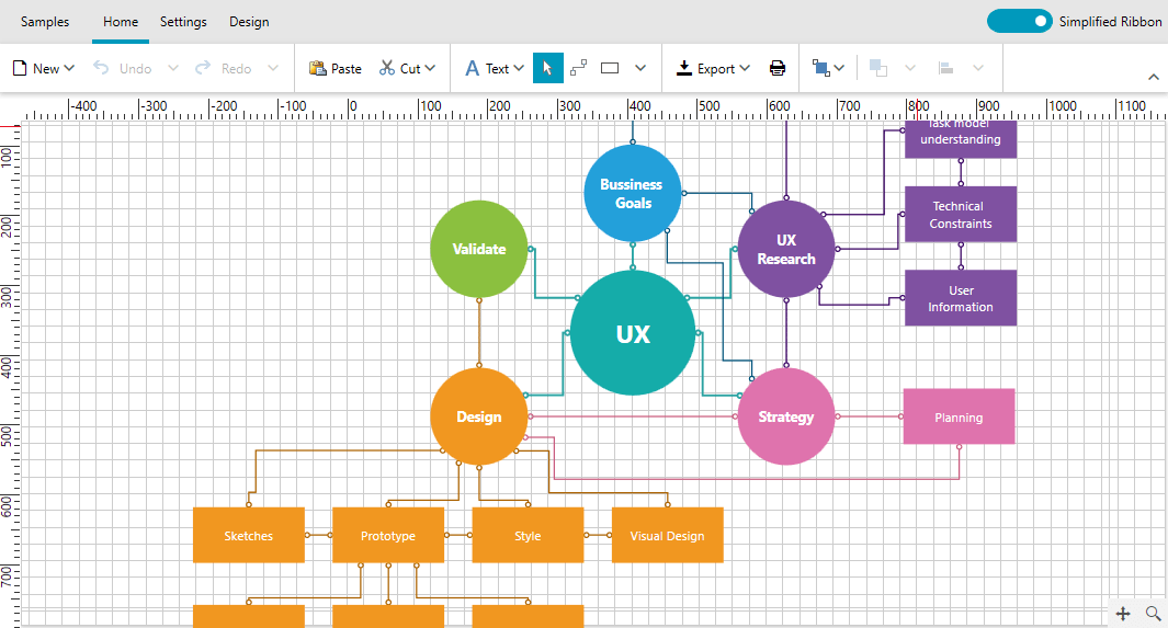
    DiagramRibbon Default Mode

    This is the default mode of the DiagramRibbon with Home tab currently selected. The first RadRibbonGroup – the General one – currently looks like:
    <telerikRibbon:RadRibbonGroupHeader="{telerik:LocalizableResource Key=DiagramRibbon_General}"x:Name="generalGroup"
        telerik:ScreenTip.Description="{telerik:LocalizableResource Key=DiagramRibbon_GeneralDescription}"
        telerik:ScreenTip.Title="{telerik:LocalizableResource Key=DiagramRibbon_General}"
        Icon="{telerik:IconResource IconRelativePath=16/CollapsedGroupIcons/home_general.png, IconSources={StaticResource IconPaths}}">
        <telerikRibbon:RadRibbonButtonx:Name="NewButton"Command="diagram:DiagramCommands.Clear"ribbonPrimitives:KeyTipService.AccessText="N"
            CommandTarget="{TemplateBinding Diagram}"
            LargeImage="{telerik:IconResource IconRelativePath=new.png, IconSources={StaticResource IconPaths}}"Size="Large"Text="{telerik:LocalizableResource Key=DiagramRibbon_New}"/>
        <telerikRibbon:RadRibbonButtonx:Name="OpenButton"Command="diagram:DiagramCommands.Open"ribbonPrimitives:KeyTipService.AccessText="O"
            CommandTarget="{Binding RelativeSource={RelativeSource TemplatedParent}}"
            LargeImage="{telerik:IconResource IconRelativePath=open.png, IconSources={StaticResource IconPaths}}"Size="Large"Text="{telerik:LocalizableResource Key=DiagramRibbon_Open}"/>
        <telerikRibbon:RadRibbonButtonx:Name="SaveButton"Command="diagram:DiagramCommands.Save"ribbonPrimitives:KeyTipService.AccessText="S"
            CommandTarget="{Binding RelativeSource={RelativeSource TemplatedParent}}"
            LargeImage="{telerik:IconResource IconRelativePath=save.png, IconSources={StaticResource IconPaths}}"Size="Large"Text="{telerik:LocalizableResource Key=DiagramRibbon_Save}"/>
        <telerik:RadCollapsiblePanelx:Name="undoRedoPanel">
            <telerikRibbon:RadRibbonSplitButton  telerik:StyleManager.Theme="{StaticResource Theme}"Command="diagram:DiagramCommands.Undo"x:Name="UndoButton"ribbonPrimitives:KeyTipService.AccessText="U"
                CommandTarget="{TemplateBinding Diagram}"CollapseToSmall="WhenGroupIsSmall"
                LargeImage="{telerik:IconResource IconRelativePath=Undo.png, IconSources={StaticResource IconPaths}}"Size="Medium"Text="{telerik:LocalizableResource Key=DiagramRibbon_Undo}">
                <telerikRibbon:RadRibbonSplitButton.DropDownContent>
                    <telerik:RadListBoxtelerik:StyleManager.Theme="{StaticResource Theme}"MaxHeight="500"BorderThickness="0"ItemsSource="{Binding Diagram.UndoRedoService.UndoStack, RelativeSource={RelativeSource TemplatedParent}}"ItemTemplate="{StaticResource UndoItemTemplate}"x:Name="UndoStackListBox"/>
                </telerikRibbon:RadRibbonSplitButton.DropDownContent>
            </telerikRibbon:RadRibbonSplitButton>
            <telerikRibbon:RadRibbonSplitButtontelerik:StyleManager.Theme="{StaticResource Theme}"Command="diagram:DiagramCommands.Redo"x:Name="RedoButton"ribbonPrimitives:KeyTipService.AccessText="R"
                CommandTarget="{TemplateBinding Diagram}"CollapseToSmall="WhenGroupIsSmall"
                LargeImage="{telerik:IconResource IconRelativePath=Redo.png, IconSources={StaticResource IconPaths}}"Size="Medium"Text="{telerik:LocalizableResource Key=DiagramRibbon_Redo}">
                <telerikRibbon:RadRibbonSplitButton.DropDownContent>
                    <telerik:RadListBoxtelerik:StyleManager.Theme="{StaticResource Theme}"MaxHeight="500"BorderThickness="0"ItemsSource="{Binding Diagram.UndoRedoService.RedoStack, RelativeSource={RelativeSource TemplatedParent}}"ItemTemplate="{StaticResource UndoItemTemplate}"x:Name="RedoStackListBox"/>
                </telerikRibbon:RadRibbonSplitButton.DropDownContent>
            </telerikRibbon:RadRibbonSplitButton>
        </telerik:RadCollapsiblePanel>
    </telerikRibbon:RadRibbonGroup>

    Now, let’s define its SimplifiedItems.

    <telerikRibbon:RadRibbonTab.SimplifiedItems>
        <telerikRibbon:RadRibbonGroupHeader="{telerik:LocalizableResource Key=DiagramRibbon_General}"
            telerik:ScreenTip.Description="{telerik:LocalizableResource Key=DiagramRibbon_GeneralDescription}"
            telerik:ScreenTip.Title="{telerik:LocalizableResource Key=DiagramRibbon_General}"
            Icon="{telerik:IconResource IconRelativePath=16/CollapsedGroupIcons/home_general.png, IconSources={StaticResource IconPaths}}">
            <telerikRibbon:RadRibbonDropDownButtonText="{telerik:LocalizableResource Key=DiagramRibbon_New}"VerticalAlignment="Center"SmallImage="{telerik:RadGlyph Glyph=}">
                <telerikRibbon:RadRibbonDropDownButton.DropDownContent>
                    <StackPanel>
                        <telerikRibbon:RadRibbonButtonCommand="diagram:DiagramCommands.Clear"ribbonPrimitives:KeyTipService.AccessText="N"
                            CommandTarget="{TemplateBinding Diagram}"Margin="0 5 0 0"
                            LargeImage="{telerik:IconResource IconRelativePath=new.png, IconSources={StaticResource IconPaths}}"Size="Medium"Text="{telerik:LocalizableResource Key=DiagramRibbon_New}"/>
                        <telerikRibbon:RadRibbonButtonCommand="diagram:DiagramCommands.Open"ribbonPrimitives:KeyTipService.AccessText="O"
                            CommandTarget="{Binding RelativeSource={RelativeSource TemplatedParent}}"
                            LargeImage="{telerik:IconResource IconRelativePath=open.png, IconSources={StaticResource IconPaths}}"Size="Medium"Text="{telerik:LocalizableResource Key=DiagramRibbon_Open}"/>
                        <telerikRibbon:RadRibbonButtonCommand="diagram:DiagramCommands.Save"ribbonPrimitives:KeyTipService.AccessText="S"
                            CommandTarget="{Binding RelativeSource={RelativeSource TemplatedParent}}"Margin="0 0 0 5"
                            LargeImage="{telerik:IconResource IconRelativePath=save.png, IconSources={StaticResource IconPaths}}"Size="Medium"Text="{telerik:LocalizableResource Key=DiagramRibbon_Save}"/>
                    </StackPanel>
                </telerikRibbon:RadRibbonDropDownButton.DropDownContent>
            </telerikRibbon:RadRibbonDropDownButton>
            <telerik:RadCollapsiblePanel>
                <telerikRibbon:RadRibbonSplitButtontelerik:StyleManager.Theme="{StaticResource Theme}"Command="diagram:DiagramCommands.Undo"ribbonPrimitives:KeyTipService.AccessText="U"LargeImage="{telerik:IconResource IconRelativePath=Undo.png, IconSources={StaticResource IconPaths}}"CommandTarget="{TemplateBinding Diagram}"Size="Medium"Text="{telerik:LocalizableResource Key=DiagramRibbon_Undo}">
                    <telerikRibbon:RadRibbonSplitButton.DropDownContent>
                        <telerik:RadListBoxtelerik:StyleManager.Theme="{StaticResource Theme}"MaxHeight="500"BorderThickness="0"ItemsSource="{Binding Diagram.UndoRedoService.UndoStack, RelativeSource={RelativeSource TemplatedParent}}"ItemTemplate="{StaticResource UndoItemTemplate}"/>
                    </telerikRibbon:RadRibbonSplitButton.DropDownContent>
                </telerikRibbon:RadRibbonSplitButton>
                <telerikRibbon:RadRibbonSplitButtontelerik:StyleManager.Theme="{StaticResource Theme}"Command="diagram:DiagramCommands.Redo"ribbonPrimitives:KeyTipService.AccessText="R"LargeImage="{telerik:IconResource IconRelativePath=Redo.png, IconSources={StaticResource IconPaths}}"CommandTarget="{TemplateBinding Diagram}"Size="Medium"Text="{telerik:LocalizableResource Key=DiagramRibbon_Redo}">
                    <telerikRibbon:RadRibbonSplitButton.DropDownContent>
                        <telerik:RadListBoxtelerik:StyleManager.Theme="{StaticResource Theme}"MaxHeight="500"BorderThickness="0"ItemsSource="{Binding Diagram.UndoRedoService.RedoStack, RelativeSource={RelativeSource TemplatedParent}}"ItemTemplate="{StaticResource UndoItemTemplate}"/>
                    </telerikRibbon:RadRibbonSplitButton.DropDownContent>
                </telerikRibbon:RadRibbonSplitButton>
            </telerik:RadCollapsiblePanel>
        </telerikRibbon:RadRibbonGroup>
    <!-- Other groups here -->
    </telerikRibbon:RadRibbonTab.SimplifiedItems>

    And this is what the simplified mode looks like:

    DiagramRibbon Simplified Mode

    Switching to the Simplified Ribbon

    Switching the layout of the ribbon can either be completed using the UI, or programmatically.

    To be able to switch to Simplified Mode, you just set the ShowLayoutModeButton property of the control to True. The content of this button is also fully customizable through the LayoutModeButtonContent property.

    And yes - using this button allows you to toggle back and forth between the simplified  and the traditional ribbon UI.

    <telerik:RadRibbonViewShowLayoutModeButton="True"LayoutModeButtonContent="Simplified Ribbon">
            <!--
                RadRibbonTabs
            -->
    </telerik:RadRibbonView>

    LayoutMode SwitchToggleButton

    Choosing to change the layout in code, you can:

    this.ribbonView.LayoutMode = RibbonLayout.Simplified;
     
    // or
      
    RibbonCommands.ToggleLayoutModeCommand.Execute(null, this.ribbonView);

    Just look what we did! Tiny, tidy, totally tubular! 

    LayoutMode - Simplified

    Try It Out and Share Your Feedback

    Didn’t that fire you with enthusiasm to immediately give the new RadRibbonView’s simplified layout mode a try? I know it did. Do not wait another minute and get the latest version of:

    Telerik UI for WPF

    If you have any difficulties, feel free to reach out to us – we are always there for you. And don’t forget to drop a line in the comments section or share your feedback to help us build the future of Telerik UI for WPF together.

    Happy coding all!

    Writing Azure Functions with Telerik Document Processing

    $
    0
    0

    Over the past year, we've been bringing .NET Core support to the Telerik Document Processing Libraries. We’ve recently added PdfProcessing to that list. Let's try it in an Azure Function with a quick and powerful demo walkthrough.

    The Telerik Document Processing Libraries are a set of components that allow you to create, import, modify and export Excel, Word and PDF documents without external dependencies. Until recently, these libraries only worked in a .NET Framework environment.

    Over the past year, we’ve been putting in a lot of work into making the libraries cross-platform by porting the APIs to work in .NET Core and Mono environments via .NET Standard 2.0 support. We started with the release of the RadSpreadStreamProcessing and RadZipLibrary. In the last release, 2019 R2, we’ve added RadPdfProcessing to that list.

    In this article, I will demonstrate the ability to run RadPdfProcessing in an Azure Function that can create a 10,000-page PDF document in 8 seconds! Let’s get started.

    Setup

    Before moving forward, double check that you have the prerequisites installed. You’ll need: 

    • Visual Studio 2019 installed with the Azure development workload
    • Have the Azure Functions tools installed.
    • An Azure account is optional, but recommended (you can test functions locally without it)

    To get started, open Visual Studio 2019 and create a new C# Azure Functions project (Fig.1).

    Fig.1 (click to enlarge any figure)

    Create a new Azure Functions project

    Next, name it "DocumentProcessingFunctions" and click the Create button (Fig.2).

    Fig.2

    Set Project Name

    The last part of project wizard is to configure the function settings. To keep this demo simple, let's choose HttpTrigger and set access rights to Anonymous (Fig.3).

    Fig.3

    Functions settings

    When Visual Studio finishes generating the project, do a project Rebuild to restore the NuGet packages and compile.

    There's one last thing to do before we start writing code. At the time of writing this article, the project's Microsoft.NET.Sdk.Functions package is a version behind. Let's update that now (Fig.4).

    Fig.4

    Update NuGet Packages

    Adding PdfProcessing References

    Now that the project is primed, it's time to add the Telerik Document Processing assembly references. There are two ways to do this; via NuGet package or assembly reference.

    Although the .NET Framework versions have NuGet packages, at this time the .NET Standard versions are only shipped via NuGet inside the Telerik.UI.for.Xamarin package. However, installing the Telerik UI for Xamarin NuGet package pulls in a bunch of unnecessary dependencies (e.g. Xamarin.Forms). Therefore, the best option is to reference the assemblies directly.

    You can find the Document Processing assemblies in the Telerik UI for Xamarin installation folder. This folder location depends on which operating system you're using.

    - MacUser\Documents\Progress\Telerik UI for Xamarin [2019 R2 or later]\Binaries\Portable
    - PCC:\Program Files (x86)\Progress\Telerik UI for Xamarin [2019 R2 or later]\Binaries\Portable (Fig.5). 

    Fig.5

    Assemblies Folder

    Note: If you do not already have UI for Xamarin installed, you have two options for a quick fix. Option 1: If you have a license, download it from the Telerik UI for Xamarin downloads page. Option 2: If you don't have a license, starting a trial on the Telerik UI for Xamarin page will download the installer.

    Let's now add the three required Telerik references for RadPdfProcessing to the project (Fig.6).

    Fig.6

    Telerik Project References

    Now that the references are added, we're ready to start writing the function.

    Writing the Function

    The project gets generated with a generic Function1 class. We don't want to use this because the function's class name is typically used for the FunctionName, which becomes part of URL for the HttpTrigger. Yes, you can rename the Function to be different than the class, but we'll stick to the defaults for this tutorial.

    Let's delete Function1.cs and add a new function to the project. You can do this with the same way you add a class, except you want to choose the "Azure function" template (Fig.7).

    Fig.7

    Add a new Function class

    This will open a new window in which you select the function's settings. As we did earlier, choose HttpTrigger and set the access rights to Anonymous (Fig.8).

    Fig.8

    Function Settings

    Your project should now look like this (Fig.9):

    Fig.9

    GeneratePdf Function Start

    Walking through how Azure functions work, or instructions on how to use RadPdfProcessing itself, is outside the scope of this tutorial. However, I still didn't want to drop a big code block on you without explanation, so I've left code comments to explain what each section does.

    At a high level, here are the stages:

    1. The function is triggered when a GET/POST is requested at the function's URL. There may or may not be a pageCount parameter passed in the query string (default is 10,000 pages).
    2. A sample BarChart.pdf file is downloaded from a blob using HttpClient to be used as the original source.
    3. RadPdfProcessing comes in and creates a working document. A for-loop, using the pageCount, is used to insert a page into that document (that page is a full copy of the sample PDF).
    4. The final PDF file created by RadPdfProcessing is returned to the client using FileResult.

    Here's the code, you can replace the entire contents of your GeneratePdf class with it:

    usingSystem;
    usingSystem.IO;
    usingSystem.Linq;
    usingSystem.Net.Http;
    usingSystem.Threading.Tasks;
    usingSystem.Web.Http;
    usingMicrosoft.AspNetCore.Mvc;
    usingMicrosoft.Azure.WebJobs;
    usingMicrosoft.Azure.WebJobs.Extensions.Http;
    usingMicrosoft.AspNetCore.Http;
    usingMicrosoft.Extensions.Logging;
    usingTelerik.Windows.Documents.Fixed.FormatProviders.Pdf.Export;
    usingTelerik.Windows.Documents.Fixed.FormatProviders.Pdf.Streaming;
     
    namespaceDocumentProcessingFunctions
    {
        publicstaticclassGeneratePdf
        {
            [FunctionName("GeneratePdf")]
            publicstaticasync Task<IActionResult> Run(
                [HttpTrigger(AuthorizationLevel.Anonymous, "get", "post", Route = null)]
                HttpRequest req,
                ILogger log,
                ExecutionContext executionContext)
            {
                log.LogInformation("START PROCESSING");
     
                // Check to see if there was a preferred page count, passed as a querystring parameter.
                stringpageCountParam = req.Query["pageCount"];
     
                // Parse the page count, or use a default count of 10,000 pages.
                var pageCount = int.TryParse(pageCountParam, outintcount) ? count : 10000;
     
                log.LogInformation($"PageCount Defined: {pageCount}, starting document processing...");
     
                // Create the temporary file path the final file will be saved to.
                var finalFilePath = executionContext.FunctionAppDirectory + "\\FileResultFile.pdf";
     
                // Remove any previous temporary file.
                if(File.Exists(finalFilePath))
                {
                    File.Delete(finalFilePath);
                }
     
                // Create a PdfStreamWriter.
                using(var fileWriter = newPdfStreamWriter(File.Create(finalFilePath)))
                {
                    fileWriter.Settings.ImageQuality = ImageQuality.High;
                    fileWriter.Settings.DocumentInfo.Author = "Progress Software";
                    fileWriter.Settings.DocumentInfo.Title = "Azure Function Test";
                    fileWriter.Settings.DocumentInfo.Description =
                        "Generated in a C# Azure Function, this large document was generated with PdfStreamWriter class with minimal memory footprint and optimized result file size.";
     
                    // Load the original file
                    // NOTE: In this test, we're only using a single test PDF download from public azure blob.
                    byte[] sourcePdfBytes = null;
     
                    using(var client = newHttpClient())
                    {
                        sourcePdfBytes = await client.GetByteArrayAsync("https://progressdevsupport.blob.core.windows.net/sampledocs/BarChart.pdf");
                        log.LogInformation($"Source File Downloaded...");
                    }
     
                    if(sourcePdfBytes == null)
                    {
                        returnnewExceptionResult(newException("Original file source could not be downloaded"), true);
                    }
     
                    // Because HttpClient result stream is not seekable, I switch to using the byte[] and a new MemoryStream for the Telerik PdfFileSource
                    using(var sourcePdfStream = newMemoryStream(sourcePdfBytes))
                    using(var fileSource = newPdfFileSource(sourcePdfStream))
                    {
                        log.LogInformation($"PdfFileSource loaded, beginning merge loop...");
     
                        // IMPORTANT NOTE:
                        // This is iterating over the test "page count" number and merging the same source page (fileSource.Pages[0]) for each loop
                        // For more information on how to use PdfProcessing, see https://docs.telerik.com/devtools/document-processing/libraries/radpdfprocessing/getting-started
                        for(var i = 0; i < pageCount; i++)
                        {
                            fileWriter.WritePage(fileSource.Pages.FirstOrDefault());
                        }
     
                        // Now that we're done merging everything, prepare to return the file as a result of the completed function
                        log.LogInformation($"END PROCESSING");
     
                        returnnewPhysicalFileResult(finalFilePath, "application/pdf") {FileDownloadName = $"Merged_{pageCount}_Pages.pdf"};
     
                    }
                }
            }
        }
    }

    Build the project, it's time to run it!

    Function Time

    Microsoft has a great tutorials on both how to test the function locally (via localhost) or publish it to Azure. I recommend stopping here to visit one of the options:

    I personally love the built-in support Visual Studio has for publishing projects. In just a few clicks, the App Service was spun up and my Functions project was published (Fig10).

    Fig.10

    Publish To Azure Dialog

    Now it's time to test the function! For the default 10,000 page PDF, use the URL without any parameters:

    - https://yourseviceurl.azurewebsites.net/api/GeneratePdf/

    Less than 10 seconds later, you'll get the file result (Fig.11).

    Fig.11

    10k Page File Result

    If you want to change the number of pages, say to test one hundred thousand pages, you can pass a pageCount parameter.

    https://yourseviceurl.azurewebsites.net/api/GeneratePdf/?pageCount=100000

    About 40 seconds later, yes 40 seconds for 100,000 pages, you'll get the file result (Fig.12)

    Fig.12

    100k Page Result

    Of course the time it takes will depend on the processing work you're doing in the document. In this demonstration, I illustrate the power and optimization that PdfProcessing has. The original BarChart.pdf document contains both text and images, it's no slouch.

    Wrapping Up

    I hope this was a fun and enlightening tutorial, and you can find the demo's full source code in this GitHub repo. The main takeaway today is that RadPdfProcessing now works anywhere .NET Standard 2.0 will. .NET Core on Linux? Check. Xamarin.Forms? Check. Azure Functions? Check.

    If you have any questions for the Document Processing Team, feel free to open a Support Ticket or post in the Forums. The same folks who build the components also answer support tickets and forum posts.

    Happy Coding! 

    What's New in the Telerik UI for WinForms R2 2019 Service Pack

    $
    0
    0

    Check out the latest features and fixes just released in the service pack for Telerik UI for WinForms, including improved dialogs and searching.

    Along with several new features, we've introduced 40 important bug fixes to improve our customer’s experience when using Telerik UI for WinForms. This includes better memory consumption in RadGridView and an improved collapsing experience in RadRibbonBar.

    Drag and Drop Functionality in File Dialogs

    The drag and drop feature of the file dialogs allows you to grab items (file and folders) and move them to a different location. The feature supports copy and move operations and it is enabled by default. 

    FileDialogsR22019SP

    Deferred Search in RadGridView

    Now, the filtering behavior through the search text box can be performed dynamically. The new DeferredSearch property of the GridViewSearchRowInfo indicates whether the grid control will wait until the Enter key is pressed before a new search operation is started. Its default value is false

    Custom Fonts in RadFontDropDownList

    Load your favorite custom fonts in RadFontDropDownList. You can already load custom fonts using the ThemeResolutionService class. Now, you can use the custom font loaded in memory by the ThemeResolutionService and add it to the font drop-down. RadFontDropDownList offers the AddFont and RemoveFonts methods accepting a FontFamily as an input parameter.

    Try It Out and Share Your Feedback

    R2 2019 SP is already available for download in customers’ accounts. If you are new to Telerik UI for WinForms, you can learn more about it via the product page. It comes with a 30-day free trial, giving you some time to explore the toolkit and consider using it for your current or upcoming WinForms development.

    We would love to hear what you think, so should you have any questions and/or comments, please share them to our Feedback Portal.

    You can also check our Release History page for a complete list of the included improvements.

    Improved DesktopAlert, Map & More in Telerik UI for WPF R2 2019 SP

    $
    0
    0

    The R2 2019 Service Pack is live today and brings new features in the DesktopAlert, Map and DiagramRibbon controls, in the VisualStudio2013 theme, as well as many improvements in our major controls. Let's see what's new in Telerik UI for WPF and Telerik UI for Silverlight with the latest Service Pack.

    DesktopAlert: Display Alerts with Auto Height and Hide Alerts from the Task Switcher

    One of my favorite controls is RadDesktopAlert and I'm happy to share that the control gains two desired features this service pack:

    • Auto height– it is possible now to display alerts with auto height by simply setting the height of the control to double.NaN.
    • Hide from task switcher– by setting the ShowInTaskSwitcher property to false. The alert will not be visible in the Alt + Tab menu of Windows. (read more in the docs)

    Make sure to check them out! 

    Map: Add Request/Response Headers to the WebClient

    If you are implementing a custom map provider you may find this useful. We have added a WebHeaders property of the MultiScaleTileSource, that will allow you to add request/response headers to the WebClient of the provider. For example now you can easily set a User-Agent/Referrer header. For more details please refer to this help article from our documentation.

    DiagramRibbon: Simplified Ribbon Mode

    In R2 we added new simplified layout mode to RadRibbonView (check this blog post out in case you have missed it), now with the service pack the feature is available for RadDiagramRibbon as well. You can now enjoy the new modern simplified ribbon layout available out of the box with RadDiagramRibbon – see it below in action:

    Simplified DiagramRibbon

    For more details check this article from our online help documentation.

    TabControl: Close Tabs by Clicking the Middle Mouse Button

    We added an ability to close the Tabs using the middle button. The option is disabled by default. In order to enable it, just set the CloseTabsOnMouseMiddleButtonDown property to true. You can see it in action in the WPF demos here– check the PinAndClose example from the TabControl demos.

    TabbedWindow: Many Improvements

    As you may know, in R2 we released brand new RadTabbedWindow control, that allows creating browser-like user interface within WPF application. For this Service Pack we polished it in order to make it better - so if haven't tried it, please do so!

    One significant change that you should know about if you are using the control is that we changed the Items property type - from ObservableCollection<RadTabItem> to IList.

    Please let us know if you have any feedback and make sure to check out this blog explaining how to use XAML islands in RadTabbedWindow (it is pretty )! 

    VisualStudio2013 Theme: Customize the ReadOnly Appearance of the Controls

    We added three new properties to the VisualStudio2013 palette that will allow you to easily modify the appearance of the controls that have a ReadOnly state. The new properties are:

    • ReadOnlyBackgroundBrush: Used as a background of elements that are in a read-only state.
    • ReadOnlyBorderBrush: Used in borders inside elements that are in a read-only state.
    • ReadOnlyOpacity: Used for text in inputs when they are in a read-only state.

    For more info about the Theme please check the VisualStudio2013 Theme article. You can see them in action in the Color Theme Generator for WPF application.

    Check Out the Detailed Release Notes

    We have a lot more! To get an overview of all the latest features and improvements we’ve made, check out the release notes for the products below:

    Share Your Feedback.

    Feel free to drop us a comment below sharing your thoughts. Or visit our Feedback portals about Telerik UI for WPFSilverlight and Document Processing Libraries and let us know if you have any suggestions or if you need any particular features/controls.

    And if you haven’t already had a chance to try our UI toolkits, simply download a trial from the links below:

    UI for WPF  UI for Silverlight

    In case you missed it, here are some of the updates from our last release.

    Telerik UI for Xamarin R2 2019 SP Brings Hardware Acceleration for RadPdfViewer & More

    $
    0
    0

    The R2 2019 Service Pack is live today and brings new features in the PdfViewer, Calendar, TabView, and AutoCompleteView controls, and more improvements across the Telerik UI for Xamarin suite as well as some news in Telerik UI for UWP.

    With last month's R2 release of Telerik UI for Xamarin, RadPdfViewer went from beta to official. Now, with the service pack release, we have added two new significant improvements - hardware acceleration and improved scrolling performance.

    We have introduced a simple boolean property: EnableHardwareAcceleration. Just set it to true and RadPdfViewer will use the device's graphics adapters capabilities to render the document. In addition, we have invested a lot of effort in improving the scrolling performance - we have applied various optimizations, so now the scrolling is significantly smoother, with no stutter or delay.

    In other news, in this release we have added a Completed event to RadAutoCompleteView - something you have been asking for. With it, you will be notified when the user is done entering the text query and have confirmed that with the return key. 

    RadCalendar now features an API for serializing and deserializing recurrence patterns to/from iCalendar format:

    var pattern = newRecurrencePattern()
    {
        Frequency = RecurrenceFrequency.Daily,
        DaysOfWeekMask = RecurrenceDays.WeekDays,
        Interval = 3,
        MaxOccurrences = 10
    };
    stringserializedPattern = RecurrencePatternHelper.RecurrencePatternToString(pattern);

    and

    stringpattern = "FREQ = WEEKLY; UNTIL = 20191024T000000Z; INTERVAL = 3; BYDAY = MO,TU,TH,FR";
    RecurrencePatternHelper.TryParseRecurrencePattern(pattern, outresult);

    By popular demand, we have introduced a property in RadTabViewIsContentPreserved. Yes, you guessed it right, it lets you control if the tab content will be kept when switching between tabs, thus allowing for keeping the controls and their state intact when returning to certain tab.

    The release also includes a number of fixes in RadCalendar, RadChat, RadDataGrid, RadListView, RadSideDrawer and RadTreeView.

    What's New Telerik UI for UWP 2019 R2 SP

    We have added a support for toolbox for Visual Studio 2019 so you can use the suite in the latest version of Visual Studion. In addition, we have added new property in RadAutoCompleteBox: SelectAllOnKeyboardFocus which allows suspending of the selection of the whole text when there is a keyboard focus. 

    Check Out the Detailed Release Notes

    We have a lot more! To get an overview of all the latest features and improvements we’ve made, check out the release notes for Telerik UI for Xamarin.

    Share Your Feedback

    Feel free to drop us a comment below sharing your thoughts. Or visit our Feedback portals about Telerik UI for Xamarin and UWP and let us know if you have any suggestions or if you need any particular features/controls.

    And if you haven’t already had a chance to try our UI toolkits, simply download a trial from the links below:

    UI for Xamarin  UI for UWP

    In case you missed it, here are some of the updates from our last release.


    Support for ASP.NET Preview 6 and More in UI for Blazor 1.2.0

    $
    0
    0

    Telerik UI for Blazor 1.2.0 is here, and it brings official support for ASP.NET Core 3.0 Preview 6!

    Seems like nowadays we can confidently say “another day, another Blazor release!” While maybe not that bad, last week we did see updates come through with ASP.NET Core 3.0 Preview 6 dropping. If you’re interested in what’s new for ASP.NET Core Preview 6 head on over to Daniel Roth’s blog post covering the Preview 6 update.

    As for this blog post, we will be focusing on the latest and greatest within Telerik UI for Blazor 1.2.0 which dropped today!

    Preview 6 Support and Changes

    While there are a lot of changes happening with Blazor itself, which the previously linked blog from Microsoft covers in detail, I wanted to highlight some of the items that have a direct impact on Telerik UI for Blazor. These are just copied straight from said blog post:

    • New Razor features: @attribute, @code, @key, @namespace, markup in @functions
    • Blazor directive attributes
    • Authentication & authorization support for Blazor apps
    • Static assets in Razor class libraries

    There’s obviously more to this update, but the above has a direct impact around working with our UI components. For example, rather than using @function to define the code within our pages the new approach is to use @code within markup.

    Another change is that Blazor-specific syntax uses more of the @directive attribute, which means that code that looked like:

    <TelerikDateInput @ref="theDateInput" bind-Value="@dateInputValue"></TelerikDateInput>

    is now:

    <TelerikDateInput @ref="theDateInput" @bind-Value="dateInputValue"></TelerikDateInput>

    In case you didn’t notice the small difference, the new approach uses @bind-Value versus the old way of bind-Value.

    As mentioned, there are plenty of other updates but I just wanted to note some of the highlights here. Of course, with our support for Preview 6, UI for Blazor 1.2.0 officially supports working with these new features!

    Telerik UI for Blazor Demos and Docs

    While we’re on the topic, something to mention is that we have gone through all of our demos and documentation articles to cover these changes. This means that any code snippet or piece of information related to the previously mentioned changes will be reflected in our samples (@function is @code etc.).

    This is a part of our ongoing commitment to stay on top of the latest and greatest within Blazor. The Telerik UI for Blazor team wants to ensure that any accompanying resource that we have, not just our actual UI components, continues to stay up-to-date and follow along with whatever changes happen within the Blazor framework. It’s a rapidly evolving world but we’re here to make sure you can follow along!

    Some Updates to Our UI Components

    An improvement with UI for Blazor 1.2.0 is that telerik-blazor.js, the one JavaScript file that we included with some interop items for Telerik UI for Blazor, is now included within the actual NuGet package of the product. This opens up the ability to rely on what is included with the NuGet package rather than rely on a CDN, which has been the approach so far. So, with Telerik UI for Blazor 1.2.0 you get a choice for how to include this JavaScript file: either through the CDN (which has been a frequently used method so far) or just pull in the file from the NuGet package you have referenced in your Blazor project already. Exactly what you need to keep in mind is covered in this documentation article.

    Beyond this we have also introduced the ability to work with the EditorTemplate in popup editing for the data grid component, as well as binding DateInput and DatePicker to nullable values - two highly requested features from developers working with these two components. Both of these features are based on feedback that existing Telerik UI for Blazor users have sent over. We want to you, the developer, to know that your feedback is being addressed so continue to send over notes through our Telerik UI for Blazor Feedback Portal, or our support ticketing system, to ensure that we address items that you need!

    More to Come!

    The story of Telerik UI for Blazor certainly does not stop here, and we’ll be back in the near future with another update with new components and new features. Yes, 1.2.0 mainly focused on the changes coming from ASP.NET Preview 6, but that doesn’t mean we haven’t been busy expanding the features and capability of our UI components! Keep a look out for updates both here to keep up to date on the latest and greatest!

    Check Out the Latest Fixes in Telerik JustMock R2 2019 Service Pack 2

    $
    0
    0

    Check out the latest service pack release for Telerik JustMock that includes fixes for Visual Studio code coverage, dotCover, different behavior of different Arrange overloads and not respected arrangements.

    Integration with Visual Studio Code Coverage

    With the previous release of JustMock we had introduced a bug in the integration between JustMock and Visual Studio code coverage functionality. I am happy to share that the problem is already fixed.

    Integration with dotCover

    We have discovered that there is an unpleasant issue with the approach we had on initializing the JustMock profiler that had an impact over the integration between JustMock and dotCover. The issue is fixed and there are no other known issues with other third party profilers.

    Different Behavior for Different Arrange Overloads

    We have received some inquiries about a different and unexpected behavior when a mock of a LINQ query was made with the Arrange overload that accepts a function as a parameter. The issue was that the query was recognized as a different action. The reason for this is that this overload was not designed to handle a LINQ queries. This is why we have implemented a mechanism that will recognize such scenarios and will throw an exception. The exception will contain a message with suggestion about the correct Arrange overload that has an expression as a parameter and which should be used in such scenarios.

    A Static Constructor Disrespects Arrangements when Triggered by the PrivateAccessor Class

    As the heading suggests, there was a problem where a static constructor triggers a type initialization which disrespected the previously made arrangement. All of this was happening only when the static constructor was triggered by a call made from the Telerik.JustMock.PrivateAccessor class. You can enjoy the fix with the JustMock R2 2019 Service Pack.

    JustMock Templates for .NET Framework

    For better test discovery by Visual Studio 2017/2019 we have updated the version of the NuGet packages that the JustMock C# .NET Framework template is using. Those packages are MSTest.TestAdapter and MSTest.TestFramework.

    Try It Out and Share Your Feedback

    The R2 2019 Service Pack is already available for download in customers’ accounts. If you are new to Telerik JustMock, you can learn more about it via the product page. It comes with a 30-day free trial, giving you some time to explore the capabilities of JustMock.

    We would love to hear what you think, so should you have any questions and/or comments, please share them in our Feedback Portal.

    You can also check our Release History page for a complete list of the included improvements.

    C# 8: Nullable References

    $
    0
    0

    The next major version release of the C# language comes with exciting new features. One of them is nullable reference type, which helps prevent the unhandled null reference exceptions that have ruined our apps at some point. Read along while I introduce you to this new feature.

    C# 8 is the next major version release of the C# programming language. This has got people in the C# community excited because it comes with exciting new features, and I'm excited to share some of them with you. The plan is to release C# 8 at the same time as .NET Core 3.0, which is still in preview. I'll be publishing a couple of posts on C# 8 where I'll briefly introduce you to some of the features I'm excited about, so as to get you excited about them too.

    In this article, I'll be writing about nullable reference types.

    Installing .NET Core 3

    .NET Core 3 is still in preview and didn't come with the release of Visual Studio 2019 on April 2. In order to create .NET Core 3.0 projects with VS2019, you should do the following:

    • Download .NET Core 3.0
    • Open Visual Studio
    • Click Tools> Options in the top menu
    • Expand Projects and Solutions | .NET Core
    • Select the Use previews of the .NET Core SDK checkbox and click OK to save.

    With this setting, when you create a new project, you can select .NET Core 3.0 as the targeted framework. If you're using macOS or Linux, running dotnet new [project type] starts you off with .NET Core 3.0 as the targeted framework, which you can change from the project file if you want. To be sure that C# 8.0 preview features are available, you can set the <LangVersion /> property explicitly for your project. This setting is buried deep inside the Advanced settings within your project's Build tab. In order to update that, follow the instructions below:

    • Right-click your project in Solution Explorer.
    • Select Properties to view your project properties.
    • Click the Build tab within your project properties
    • Click the Advanced button on the lower right
    • Select C# 8.0 (beta) as the language version

    This can also be set by editing the .csproj file and adding 8.0 as the value for <LangVersion> element.

    <Project Sdk="Microsoft.NET.Sdk">
      <PropertyGroup>
        <OutputType>Exe</OutputType>
        <TargetFramework>netcoreapp3.0</TargetFramework>
        <LangVersion>8.0</LangVersion>
      </PropertyGroup>
    </Project>
    

    Nullable Reference Types

    In C#, one of the differences between value types and reference types is that value types are not nullable while reference types are nullable. This means that the statement int amount = null will result in a build error whereas Account savingsAccount = null is a valid syntax and the compiler compiles happily for you. It's possible to allow null for value types if you really need to. All you need to do is to adorn the type with ? or use the Nullable<T> type. So, int? amount = null becomes valid code and your app can compile without errors.

    If you have been programming for a while, you might have experienced unhandled NullReferenceException exceptions a couple of times. This might happen for various reasons, and you have to put some kind of guards or checks to avoid encountering this exception. The nullable reference type that comes with C# 8 is designed to help avoid accidental null reference exceptions. The feature is designed to allow variable type definitions to specify whether they can have null assigned to them or not. So, by default, reference types are non-nullable and you have to use ? with the type to specify that it can accept null as a value. While this makes reference types non-nullable and stops you from assigning null as value to the variable, it does so with a warning which you see at compile time and not with errors that could fail the build.

    Let's look at an example:

    static void Main(string[] args)
    {
      string firstName = "Jake ";
      string middleName = null; //warning CS8600: Converting null literal or possible null value to non-nullable type
      string lastName = " Archibald";
    
      PrintFullName(firstName, middleName, lastName); //warning CS8604: Possible null reference argument for parameter 'middle' in 'void Program.PrintFullName(string first, string middle, string last)'
    }
    
    static void PrintFullName(string first, string middle, string last)
    {
    }

    The code snippet above will result in two warnings related to nullable reference, and the warnings are placed as comments in the example. The warnings point to middleName, which is assigned a value of null and passed as a parameter to PrintFullName method. What if the middle name is optional for the application? You can mark the variable type as nullable using the T? syntax.

    static void Main(string[] args)
    {
      string firstName = "Jake ";
      string? middleName = null;
      string lastName = " Archibald";
      PrintFullName(firstName, middleName, lastName);
    }
    
    static void PrintFullName(string first, string? middle, string last)
    {
      Console.WriteLine(middle?.Length);
      Console.WriteLine(first + middle + last);
    }

    In the code above we used string? to mark the variable and parameter type as nullable, and running the application there won't be any warning. While T? syntax is used to denote nullable reference types, there isn't a long form for this. You might be thinking you can use Nullable<T> but it won't work, and only supports using the T? syntax.

    Enable Nullable Reference Types

    You can opt in to use this feature. It can be set at the project level or in a source file using #nullable and #pragma warning pre-processor directives. The nullable annotation context and nullable warning context determines whether nullable annotations have effect, and whether nullability warnings are given.

    To enable this feature project-wide, you should add the <NullableContextOptions></NullableContextOptions> element to the first PropertyGroup element of the project file.

    <Project Sdk="Microsoft.NET.Sdk">
      <PropertyGroup>
        <OutputType>Exe</OutputType>
        <TargetFramework>netcoreapp3.0</TargetFramework>
        <NullableContextOptions>enable</NullableContextOptions>
      </PropertyGroup>
    </Project>

    If there is no project level setting, the default is for this feature to be disabled (i.e. for both nullable contexts to be disabled). The #nullable directive controls both the annotation and warning contexts, while the #pragma warning ... nullable directives control only the warning context, leaving the annotation context unchanged.

    static void Main(string[] args)
    {
      #nullable enable
      string firstName = "Jake ";
      string middleName = null; // warning CS8600: Converting null literal or possible null value to non-nullable type.
      string lastName = " Archibald";
      #nullable restore
    
      PrintFullName(firstName, middleName, lastName);
    }
    
    static void PrintFullName(string first, string? middle, string last) // warning CS8632: The annotation for nullable reference types should only be used in code within a '#nullable' context
    {
    }

    In the code above, the nullable context is enabled for a few lines of code (assuming that it's disabled in the project setting), and the setting is restored to its previous context before we enabled it. If we had used #nullable disable it would have disabled it for the code that follows, which might not be what you want. Therefore, it's better to use restore and not disable. You should notice the warning it gives at the line the PrintFullName method was declared. This is because we used the syntax to create a nullable variable type while the feature is disabled.

    For more info on nullable context and pre-processor directives, check out the feature specification.

    That's A Wrap

    C# 8 is the next major version release of the C# language, and it comes with exciting new features. I'll be sharing a couple more of them with you in some upcoming blog posts — I've talked about the nullable reference type in this post. The idea behind it is to allow developers to specify if a variable or parameter type definition should accept null. You can opt in to this feature and enable it in the project setting, or in a source file using some pre-processor directives.

    What is Accessibility for Web Apps and Why Do I Care?

    $
    0
    0

    As the web has grown in usage, old ways of doing things have fallen behind. But what technology makes difficult, it also can make easy. As long as we follow a few simple guidelines, we can make the web available to pretty much everyone. 

    Every year more and more of our life is conducted on the web, from shopping and sharing to banking and business. What was done in person or on paper or on the telephone a few years ago all takes place on the web today. We all now have access to a dizzying amount of information and activities online. But as the web has grown in usage, the old ways of doing things have fallen behind.

    Paper letters, telephone conversations, in-person shopping... these belong to a museum now, and in many cases there are things that now can only be done on the web, and no longer in person. Bank branches and even ATMs have been replaced with online banking. Blockbuster and Borders Books are a distant memory, and Sears filed for bankruptcy after shuttering many stores. Now we have Amazon.

    This is great for most of us, and a time saver for many, but what if you are not able to use the web? What if the store you used to shop at went out of business from online competition, but the online store is not something that you can use easily? This is where accessibility comes in. And just like ramps on the sidewalk and braille on the elevator buttons have made physical movement easier for those with disabilities, so too has accessibility efforts made the web usable for those who are not able to surf the web in the same way that the rest of us are used to.

    It might even surprise some of you that people with disabilities are even able to surf the web. But what technology makes difficult, it also can make easy, and there are a number of tools and processes that actually make the web available to pretty much everyone. At least, as long as we follow a few simple guidelines.

    This is not an issue that only affects a small segment of the population, either. According to the US Census Bureau, nearly 1 in 5 Americans – 57 Million people - have a disability of some sort. These disabilities make life difficult in the world today. Many of these come with age which adds further burden to a group that already has to deal with reduced earning power, less technical familiarity, and other limitations. The likelihood of having a severe disability in the 65-69 year age group is one in four, where it is only one in 20 for the 15 to 24 year old group.

    With widespread disability comes the need for accessibility for this group. Accessibility is often abbreviated “A11Y” because it starts with an “a”, then has 11 letters, then ends with a “y”. And that itself is really a matter of accessibility because if you struggle to enter characters, then a four-letter word is much better than a 13 letter word. Accessibility is not just one thing either, it’s a collection of things. It’s a little bit user experience, it’s a little bit design, it’s a little bit coding, and it’s a little bit testing. But put it all together and you have a pleasant web experience for everyone.

    Let’s stop a minute and think about why we really care about all this. So what if a handful of people have trouble accessing the web. Do we really need to worry about one more thing when we are trying to get our app done? Well, yes, we do. For three main reasons.

    3 Good Reasons to Care about Accessibility

    First of all, let’s start with not being a jerk. It’s hard navigating life with a disability, and if you can make people’s life a bit easier with a few changes on your part, then you should do it. Let’s assume we all agree on that. Disabilities take a toll on people’s life in many ways, including reducing access to employment. Of the age group 21-64, people reporting a disability only experience 41% employment, compared to 79% employment in this same age group who had no disability. Among people 15 to 64 with severe disabilities, 11% experience persistent poverty.

    Secondly, and selfishly, it’s usually in your best interest. There are over 56 million people in the US alone with some amount of disability. That’s a pretty big market. Do you really want to ignore that many potential customers when all you have to do is have a little more care when you build your apps?

    Thirdly, even if you don’t care about the first two reasons (which is hopefully not the case) then you need to do it because it’s the law. Web site accessibility – whether internal or external – falls under the Americans with Disabilities Act (or ADA). And sooner or later, it will catch up to you. In 2017 over 800 federal lawsuits were filed in the US against websites for accessibility violations, 14 times as many as in 2015. Companies keep trying to argue that the ADA doesn’t apply to their website, and almost without exception the judges keep ruling that it does. Do it now, or wind up in court later.

    And there is actually a fourth reason too (yes, I know I said three, this is a bonus). If you look at the things that you need to do to make a website or app accessible, most of it is just a bunch of good design practices for everyone. Sure, a deaf person might not be able to hear the soundtrack to your explainer video, but someone in a crowded open office might also just not be able to play it loudly enough to hear it. So put in captions – for the deaf user, sure, or just for the user who can’t play loud soundtracks. That’s just one example of a case where accessibility doesn’t just mean being accessible to people with disabilities.

    Another factor to take into account (but not a fifth reason) is that while people often think that making an app accessible is a lot of extra work, it really isn’t. Most of it is simply following good design practices from the start. If you build your app right to begin with, you won’t have much extra work at all.

    Types of Disabilities to Consider

    What are the kind of things we need to worry about? Let’s start off with five types of disabilities to consider. These are:

    • Physical – poor or no motor function
    • Visual – low-vision, blind, color blind
    • Hearing – deaf or hard of hearing
    • Cognitive – dyslexia, autism, ADHD, etc.
    • Speech – unable to speak or have speech impediment

    In addition, we need to consider combinations of disabilities where possible as well as single disabilities. This can present particular challenges for the user. For example, if your solution to impaired vision is to use a screen reader and the user is also hard of hearing, they have a problem.

    For each of these, we need to think about how that affects the functionality of the app. We need to consider non-standard means of interaction: Does my site work without a mouse? Without visual cues? Without sound? It can be very interesting to try to disconnect the individual I/O devices from your computer and see how well your app works. Turn off the monitor, put away the mouse, turn off the speakers… what happens when you do?

    To really test out an app, however, we need to test it in the situation that a disabled user will typically be in. Users with vision impairments will usually be using a screen reader so while they might not be able to see the screen, they will be having it read to them. So we also need to consider the use of common assistive tech that people with disabilities might be using: Does my site work with various assistive technologies (AT) like readers, magnification, special keyboards, etc. ? Understanding the environments that will be used helps create apps that will work well with these devices and also set the stage for effective testing.

    Disabilities that are not Disabilities

    We have been considering people with typical disabilities that we are largely familiar with, but there is another class of users that we should include in this grouping: people with transient or situational disabilities.

    First of all, we need to include people who might not have a very good handle on technology. This is largely older users who grew up without computers or the internet. Many of them simply are not comfortable or particularly familiar with the use of technology. Add to this age-related issues like reduced eyesight, hearing, or mobility, and simply not understanding what a user interface is asking for can have the same effect as an actual cognitive impairment.

    Next we should consider the environment that the user is working in. What if they are surfing the web in a noisy Starbucks, left their earbuds at home, and just can’t hear the nifty explainer video you posted? What if they are in a sunny park with their laptop and the bright sun is washing out their screen and making it hard to see? Or what if they are in a location with very slow wifi (horrors!) and each page is loading very slowly?

    In addition to location, consider equipment. What if they are on a mobile phone, or an old computer, or on a computer with an old version of a browser?

    And finally, what about temporary health issues? You would not expect someone to be buying rock climbing gear if they did not have the use of their hands, so maybe you don’t do much about physical disabilities on your rock climbing store site. But what if they simply broke their hands on their recent rock climbing excursion and, because they are slow learners, want to buy some more equipment so they are ready when the cast comes off?

    These are situations where it is dangerous to assume that you know your users and are certain that they will not be operating with specific disabilities.

    Hitting 100% Accessible

    One short but important point to make is that the reality is that you will likely never be 100% accessible to everyone. Accessibility isn’t binary, and it isn’t measured in “yes” or “no.” There are limitations to any approach to providing alternate forms of access. Combinations of disabilities can be extremely challenging. And finally, some techniques to help one type of disability can actually make it harder for other types of disabilities.  Accessibility is all about providing the most good for the most people without making your app hard to use for people without disabilities. Fortunately you don’t have to figure this out and there are standards and guidelines to follow to reach this state.

    So how do we prioritize? What are the disabilities we need to worry about the most? If we look at data from the US census, we see the following:

    Of the 57 million people in the US with a disability:

    • 8.1 million have some level of vision impairment
    • 2 million are blind
    • 7.6 million have hearing impairment
    • 1.1 million have severe hearing loss
    • 5.6 million use a hearing aid

    Beauty vs. Accessibility

    Another short but important point to make is that making your app accessible absolutely does not mean you have to make it ugly, or clunky, or violate your company’s brand standards. A large number of the accessibility guidelines will actually make your app more usable for everyone and will provide a better all-around user experience. You do not need to compromise to be accessible. 

    The Next Step

    Having taken a quick look at how disabilities impact a user’s access to content and services on the web, the next step is to take a look at the laws and guidelines that apply to web access. This will primarily be the WCAG 2.1 specification in the United States, and the governing law is the ADA. Most countries have their own laws in place to provide online accessibility, but this is a good place to start for most people and if you plan on operating in the US, then you need to be at least compliant with the WCAG 2.1 standards. In the rest of this blog series on accessibility we will go into more detail on the laws that apply to online accessibility and the standards that are used to guide implementation. We’ll take a deeper dive into exactly what that means for your app development, and then show actual examples of how to code popular design elements to guarantee accessibility. Stay tuned!

    3 Ways to Deploy a WinForms or WPF .NET Core Application

    $
    0
    0

    This post will help you deploy and bring your finished app to your users. NET Core 3 gives us three ways to deploy an app, and each has its benefits.

    I know that the real fun is while an app is being developed, and we as developers are focused mainly on this part of creating an application. However, the real purpose of every app is to get to its end users. 

    To achieve it, deployment is very important part of this process. In a previous post I have talked about the benefits of .NET Core apps and how to convert an existing WinForms and WPF app to .NET Core.

    Now, no matter whether the app is converted or completely new - it is time to continue with guidance on how to deploy it and bring the completed app to its users. .NET Core 3 gives us three ways to deploy an app – and each has its benefits:

    Framework-Dependent Deployment (FDD) & Framework-Dependent Executables (FDE)

    These two approaches have one major thing in common - they depend on the installed  .NET Core outside the application. This leads us to common advantages and disadvantages:

    What are the Benefits of These Two Approaches?

    Benefits include a smaller size, and that multiple apps use the same .NET Core installation, which reduces both disk space and memory usage on host systems. 

    What are the Disadvantages?

    As .NET Core is not part of the package, your app may not work or change its behavior based on the installed version of .NET Core on the host machine.

    NOTE! What are the main differences between FDD and FDE approach?
    • The first one outputs *.dll files, the second one *.exe files.
    • The first one can be used for multiple platforms, you don't have to define the target operating systems as your .NET Core app will run on in advance, while the second should be published separately for each target platform. 
    • With the FDE approach your app can be run by calling the published executable without invoking the dotnet utility directly. 

    Now let's talk more about the third approach:

    Self-Contained Deployment (SCD)

    This is the new approach coming with .NET Core that opens up some great possibilities, and we will focus more on it in this post. With this approach your app includes .NET Core inside it. SCDs include an executable (such as app.exe on Windows platforms for an application named app), which is a renamed version of the platform-specific .NET Core host, and a .dll file (such as app.dll), which is the actual application.   

    What are the Benefits?

    You have control of the version of .NET Core that is deployed with your app. Other apps or updates cannot break the behavior of your app!  

    What are the Disadvantages?

    • You must select the target platforms for which you build deployment packages in advance.
    • The size of your deployment package is relatively large, since you have to include .NET Core as well as your app and its third-party dependencies
      However with .NET Core 3 Preview 6 it is possible to use Assembly Linker and significantly decrease the size of the app. 
      IL linker scans the IL of your application to detect which code is actually required, and then trims unused framework libraries. This can significantly reduce the size of some apps. Just set PublishTrimmed=true in your project. Typically, small tool-like console apps benefit the most as they tend to use fairly small subsets of the framework and are usually more amenable to trimming. If your app uses reflection be careful and read how to handle the case here.

    Now, as I said, we will focus on the third approach and take a deep dive into how we can use it. There two ways to create deployment files for such an app – with the Command Prompt or with Visual Studio

    As usual, I’ll use Telerik Visual Studio templates to build an app for demo purposes. However, this time I’ll use the brand new .NET Core templates released with R2 2019 Release.  After you install Telerik components for WPF or WinForms they will appear in your Visual Studio like this:

    template telerik

    vsx

    With several clicks I have prepared a functional desktop application for  .NET Core - WPF Calendar app.

    calendar

    Now, let's deploy it.  

    Deploying with Visual Studio

    This is my preferred way! I <3 Visual Studio and its benefits.  

    Note that there is difference in the approach depending on the version of Visual Studio. I’ll use the VS 2019 official version (version above 15.7) and describe the steps in details. However, if you're using an earlier version please refer to this article from Microsoft.

    Again, I remind you that with SCD  approach of deploying we need to create a profile for every platform, so you need to repeat the steps below for every platform you need to target!

    Step 1. Right-click on the project (not the solution) in Solution Explorer and select Publish. 

    publish1

    ...and the "Pick a publish target" dialog box opens: 

    publish dialog

    Step 2. Choose a deployment location.

    Step 3. After that click on Configuration settings and choose self-contained deployment mode and choose target runtime.

    configure profile

    Step 4. Save the configuration and run the Publish button. 

    Now, let’s see what’s in the output folder:

    output

    A bunch of dll files – all needed .NET Core assemblies and assemblies of your app including the Telerik ones.  

    Note that there are some files in the location folder that are not mandatory for publishing, but I recommend to save it *.pdb - save them to use it to debug the deployed app if needed.

    After we have the output files you can deploy them in any way to the target machine – zip them, simply use the copy command or... with the new MSIX format.

    What is MSIX?

    It is a new app packaging format for Windows applications that supports Win32, WPF, and WinForm apps

    What are the Benefits?

    • Works with any Win32, WPF, or WinForms apps (regardless of whether it is .NET Core 3)
    • Enables seamless distribution to the Microsoft Store
    • Enables Side-Loading with Easy Download & Install Page
    • Automatic App Updates
    • Easily integrates with Continuous Integration
    • Lights up some Windows 10 features like URI launching

    What are the Disadvantages?

    • Only supports Windows 10 for "seamless install mode"
    • Requires special tools on Windows 7/8 (MSIX Installer)
    • Requires side-loaded app to be signed with cert (pretty standard, but not ideal for indie dev).
    • Sandboxes app like a UWP app

    To learn more about how to package the app, please refer to this post.

    And now let's see an alternative way without using the studio.

    Deploying with Command Prompt

    Guess what? It is very easy. Just call dotnet publish --self-contained true in your working directory and you are almost done. 

    To configure the deployment use the following params:

    -c Specify the Configuration
    -f
    Use for the framework
    -r
    Target Runtime Platform

    In my case the command will be: 

    dotnet publish  -c Release -f netcoreapp3.0 -r win10-x64 --self-contained true 

    More to Read

    I hope you are as excited about all of the benefits of .NET Core 3 as we - the people working on Telerik UI components - are! That is why we will love to hear more about whether you are going to convert your existing applications. Do you have any problems with that? Is there anything you would like the .NET Core version of Telerik UI for WPF and WinForms to include? Please share your feedback!

    Let us know in the comments below or in our portals for WinForms and WPF.

    In this post I tried to cover the base scenario, however for more details you can refer to these Microsoft articles:

    Happy deploying!

    Viewing all 1954 articles
    Browse latest View live