What developers really want is to use the Telerik UI for Blazor components in a Blazor SPA that’s integrated into Views (or Razor Pages) in existing ASP.NET Core projects. Here’s everything you need to make that happen.
Real-world web applications integrate multiple technologies. Here's how to integrate ASP.NET MVC, HTML, CSS, Blazor, and the Telerik UI for Blazor components. Hey! At least you don't need JavaScript.
As I said in an earlier blog post, the real power of using controls like Telerik UI for Blazor is how those controls work together and how they work with ASP.NET Core. Before you start assembling your UI, you're going to need to assemble a project that lets you combine ASP.NET Net Views and Razor Pages, which is what this post is about.
In this column, I'm going to integrate a Server-Side Blazor (SSB) component into an existing ASP.NET Core project. With SSB, the component's code executes on the server based on information from the browser. As a result, reporting on the status of the server-browser connection must also be integrated into the solution.
Integrating Blazor and ASP.NET Core with Views or Pages
Adding SSB to an existing ASP.NET Core project requires some changes to the project. Those steps are:
- Add the latest version of the NuGet package,
Microsoft.AspNetCore.Blazorto your project - Add two folders to your project: (1)
Componentsto the project's root, and (2)Pagesto theComponentsfolder Startup.cs: In theConfigureServices()method, add this line at the start of the method:
services.AddServerSideBlazor();In the Configure() method, add this line at the end of the body of the lambda expression passed to the call to the app.UseEndpoints() method:
endpoints.MapBlazorHub();While I'll eventually be creating a View that hosts a Blazor component that forms my SPA, some things don't change. A ControllerAction() method that, for example, retrieves a collection of Customer objects and passes them to the View that will host my SPA, looks very familiar:
public IActionResult Index()
{
  IEnumerable<Customer> custs;
  custs = CustomerRepo.GetAll();
  return View(custs);
}
Integrating a View or Page
One critical caveat: While I'll talk exclusively about views in this section, everything discussed here would work equally well in a Razor Page. I just got tired of typing View or Page.
A View that works with Blazor requires some special support (in addition to doing the typical thing of a accepting the Customer collection created in the Controller's Action() method). First, I need the JavaScript library that supports my Blazor component communicating with my code on the server. To support the Telerik components, I also need that JavaScript library:
@model IEnumerable<BlazorFromMVC.Models.Customer>
<script src="~/_framework/blazor.server.js"></script>
<script src="https://kendo.cdn.telerik.com/blazor/1.1.0/telerik-blazor.min.js" defer></script>
To ensure that my grid displays correctly, I also need a Telerik cascading stylesheet (the funny syntax below is required to handle the @ symbol in the middle of the Telerik URL). I've also included a stylesheet with styles that I'll use when displaying HTML that notifies the user when the connection to the server is lost:
<link rel="stylesheet" href="https://unpkg.com/@("@")progress/kendo-theme-default@latest/dist/all.css" />
<link href="~/css/BlazorConnection.css" rel="stylesheet" />
All of these link and script elements could, of course, be put in the site's Layout View rather than repeated in each View or Razor Page.
To handle notifying the user about the connection status, I need an element with an id of “components-reconnect-model.” Blazor assigns a CSS class to this element when the SignalR connection to the server is lost. If the connection can't be re-established, Blazor assigns a different style. The Blazor JavaScript library includes a reconnect method that you can call to try and re-establish connection if Blazor is unable to reconnect, which I want to take advantage of. Here's some simple HTML and a script to handle all of that:
<div id="components-reconnect-modal" class="reconnect-block">
  <div class="reconnect-wait">
    Connection lost -- please wait, attempting to reconnect
  </div>
  <div class="reconnect-button">
    Unable to reconnect. Click to attempt to reconnect:
    <input type="button" value="Reconnect" onclick="Reconnect()" />
  </div>
</div>
<script>
function Reconnect() {
window.Blazor.reconnect();
}
</script>This is the BlazorConnection.css stylesheet I created to work with Blazor to display status messages about the connection status. It defines the styles used by Blazor (components-reconnect-hide, components-reconnect-show, components-reconnect-failed), along with rules for displaying/hiding the div elements in my View:
.components-reconnect-hide {
  display: none;
}

.components-reconnect-show {
  display: block;
}

.components-reconnect-failed {
  display: block;
}

.components-reconnect-show .reconnect-wait {
  display: block;
}

.components-reconnect-failed .reconnect-wait {
  display: none;
}

.components-reconnect-show .reconnect-button {
  display: none;
}

.components-reconnect-failed .reconnect-button {
  display: block;
}
I realize this displays my almost complete ignorance of CSS.
Within the View, you're ready to call a Blazor component (Customers.razor), passing the data the component needs (in my code below, I pass the Model property of the View). While the code must be included inside some element, the name of the element is irrelevant:
<custs>
  @(await Html.RenderComponentAsync<TelerikUi.Components.Pages.Customers>(new { custs = Model }))
</custs>
Integrating the Telerik Components
Finally, it's time to create the component. To add a component, right click on the Pages folder you added earlier and select Razor View (currently there is no template for a Razor component). Enter the name of your component file (which will also be the name of your component) and give it a file extension of .razor (Customers.razor).
Your component doesn't need a page directive because it's being called from a View. The component does, however, need a property whose name matches the parameter used in the RenderComponentAsync() call to pass data to the component (cust in my case). That parameter also needs to be decorated with the Parameter attribute as in this example:
@using BlazorFromMVC.Models

@functions
{
  [Parameter]
  private IEnumerable<BlazorFromMVC.Models.Customer> custs { get; set; }
}
Within the component, the simplest way to display the collection of customers is to use a TelerikGrid. To use that, you'll need to download the Telerik UI for Blazor installation package. Once that's downloaded and installed, you'll need to follow these instructions to add the Telerik NuGet feed to your NuGet Manager. After that, you can use NuGet manager to add the Telerik.UI.for.Blazor package to your project.
Within your project, to add the necessary Telerik classes to your project's dependency injection container, you'll need this line of code in Startup.csConfigureServices() method:
services.AddTelerikBlazor();The last step before adding the Telerik is to return to your component's Razor file and add a using directive for the grid's namespace:
@using Telerik.Blazor.Components.GridWith that in place, you can add your grid to your Blazor component. To get the grid to display your collection, you need to:
- Set the grid's
Dataattribute to the property holding the collection - Define a column for each property of the objects in the collection that you want to display
I covered this in detail in an another post.
Here's an example for my Customers collection:
<TelerikGrid Data="@custs">
  <TelerikGridColumns>
    <TelerikGridColumn Field="Id" Title="Customer Id"></TelerikGridColumn>
    <TelerikGridColumn Field="FirstName" Title="First Name"></TelerikGridColumn>
    <TelerikGridColumn Field="LastName" Title="Last Name"></TelerikGridColumn>
  </TelerikGridColumns>
</TelerikGrid>
But, of course, as powerful as the TelerikGrid is, it's just the simplest possible user interface for displaying a collection. Creating a truly useful UI requires combining several components, as I'll demonstrate in my next posts. Stay tuned.


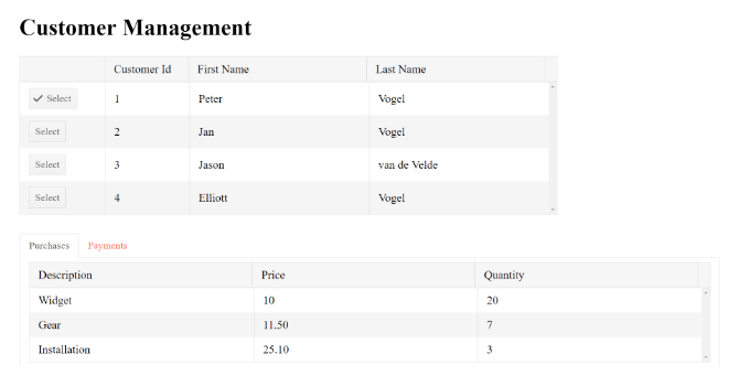


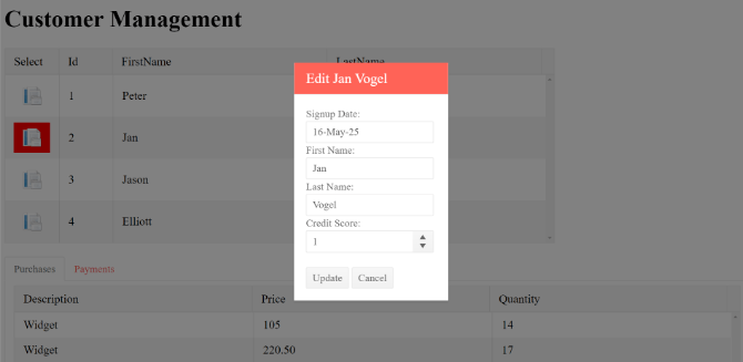


 Figure 2 Telerik UI for Blazor Native TreeView Animation