Quantcast
Channel: Telerik Blogs | .NET
Viewing all 1954 articles
Browse latest View live

Auditory Disabilities and What You Need for Accessibility

$
0
0

The web increasingly provides both a rich visual and audio experience. In this article, we'll define auditory disabilities and talk about web development strategies for improving accessibility for users with hearing impairment.

The internet has done more than transform the way people with auditory disabilities access information. It has enabled them to take part in a system of global communication. However, developers often don’t consider individuals who are deaf; these individuals still encounter barriers when trying to access information on the web. Developers often regard web accessibility as nothing more than adhering to guidelines that ensure sites work with screen readers for the blind. This failing is understandable given how many of us think of the web as a visual medium, but is it?

The web consists of information presented as graphics, video, audio, animation, or text. While our most common experience with web content is visual, increasingly content on the web is a rich visual and audio experience.

Perhaps the most compelling reason to make your site accessible to those with hearing disabilities is that there are negative social implications for those with different types of hearing loss. For example, those with high-tone hearing loss have a more difficult time understanding women’s voices, and the same is true with men’s voices for those with low-tone hearing loss. Likewise, hearing loss has a tremendous social impact on aging individuals. It is thus important to mitigate these social ramifications by making your web content as accessible as possible to these individuals.

Developers should consider accessibility in the context of all disabilities. This article explores useful strategies that help improve accessibility in apps and products to those with hearing loss. Catering to this broad demographic shows respect through inclusion, but it’s also a smart business strategy. Despite the wealth of available assistive technologies, a web application that’s short on accessibility features still presents frustrating problems for users with impairments.

Understanding Auditory Disabilities

Before we look at strategies to improve the internet for individuals with auditory disabilities, let’s first examine the disabilities themselves: specifically, the degrees and classifications of hearing loss. Although deafness is often considered an all-or-nothing condition, many individuals have degrees of functional hearing loss, classified as mild, moderate, severe, and profound. Those who identify as deaf usually have either acute or profound hearing loss, where people with lesser degrees of hearing loss are commonly referred to as hard-of-hearing.

Degrees of Hearing Loss

Mild hearing loss refers to the inability to hear sounds below about 30 decibels. Speech for these individuals can be difficult to understand, especially in the presence of background noise. Those with moderate hearing loss are unable to hear sounds below about 50 decibels; to compensate, they may require a hearing aid. Severe hearing loss is the inability to hear sounds below approximately 80 decibels, and while hearing aids can help some of these individuals, they may be insufficient. The complete inability to hear, or an inability to hear sounds below about 95 decibels, is referred to as profound hearing loss. Along with those who have severe hearing loss, many individuals with profound hearing loss communicate principally through sign language; others rely on lip-reading.

Classifications of Hearing Loss

Just as hearing loss has its different degrees, there are also classifications of auditory impairment. Conductive hearing loss is the result of damage to or blockage of the moving parts of the ear which leads to the inability of the inner ear bones to vibrate correctly, preventing the proper detection of auditory information. Neural hearing loss (nerve deafness) occurs when the hair cells of the inner ear are damaged, which prevents the associated nerves from properly transmitting auditory information to the brain for processing.

High-tone hearing loss, as its name implies, refers to the inability to hear high frequencies, just as low-tone hearing loss means that low frequencies are inaudible. Deaf-blindness is the condition of being both deaf and blind; those who are deaf-blind often communicate by sign language, but they feel the signs the other speaker is making. And when accessing web content, they generally use refreshable braille displays that allow access to all the web page’s textual content, including alternative text for images.

Making Multimedia Content Accessible to Persons with Hearing Disabilities

Improving accessibility to the hearing impaired in your applications begins by examining how these users navigate the web. The strategies people with auditory disabilities use vary according to the type and extent of their disability and the individual’s preferences, but at minimum, provide transcripts for audio-only content, and provide both captions and transcripts for multimedia content, i.e., video content with audio.

Transcripts for Audio and Video Content

Providing transcripts is a good idea in itself: text content is easy to skim, not to mention highlight, and it also offers SEO advantages for your site or app. Additionally, those who like to take notes have an easier time doing so with text content available.

YouTube offers automated transcriptions and captions for all videos. Third-party transcription services include Trint and Sonix.

Captions and Subtitles for Video

With video content, the most effective way to make multimedia content accessible to persons with hearing disabilities is including captions and subtitles.

Like transcripts for audio-only content, captions and subtitles benefit the public at large. Many viewers of your video content are likely to be watching on their phones in a public place, and so have the sound muted. This is true for popular platforms like Facebook and Instagram, and it’s likely to become the norm in the future.

For reference, here’s a list of the source repositories for a few subtitle-capable JavaScript video player libraries:

Sign Language Feeds for Your Videos

Offering sign language is secondary to the other methods of content accessibility, but it remains a valid consideration. It may not be possible for those who communicate primarily in sign language to read and understand text at the rate it is presented in captions.

Providing sign language presentation of audio information is a way to make content accessible to these individuals. One universally compatible way of doing this is to embed a video of the sign language interpreter in the video stream.

However, this has a few disadvantages. One is technical: including sign languages leads to a lower resolution image that cannot be enlarged without enlarging the entire image. A deeper issue is a linguistic one: American Sign Language (ASL) differs from British Sign Language (BSL) and Australian Sign Language (Auslan), and is different from the sign languages in Europe and Asia.

Different sign languages are in use around the world, and while that presents problems more related to internationalization than accessibility, the fact that those who can read the same spoken language (e.g., English) sometimes use and understand profoundly different sign languages presents a problem of disability access. Still, including sign language feeds is an option to consider.

Making Other Website Functionality Accessible to Users with Hearing Disabilities

Besides transcripts and captions for those with hearing impairment, there are more accessibility considerations to keep in mind as a web developer.

First, don’t rely on sounds alone to get the user’s attention; instead, use a combination of sound and visual elements. Though this principle applies to alerts and notifications, it also naturally extends to providing support over email or text chat, as opposed to forcing customers to call a phone number (even if you offer support over TTY/TDD).

Next, make two-factor authentication friendly and fully accessible to those with auditory disabilities by not requiring a phone for initial setup, reset or validation.

Third, increase the distinguishability of your content by excluding background sounds, making it easier for those who are hard of hearing to discern your content. If this is not an option, include background sounds that a user can turn off, or background sounds that are at least 20 decibels lower than the foreground speech content. For those who are completely deaf or cannot audibly discern your content, making your content visually distinguishable by, for example, increasing contrast and enlarging text, is an important consideration.

Options for making your application or site accessible to users with auditory impairments don’t end with these best practices. We encourage you to delve into the full potential of true accessibility when developing web apps. Reading the Web Content Accessibility Guidelines (WCAG) 2.0 at the World Wide Web Consortium (W3C) website is a great place to start.

Conclusion

Most of the work required to make your website accessible to persons with hearing disabilities consists of providing text-based alternatives for video and audio content. However, you may discover other, smaller details in your website or product experience that also present difficulties to those who can’t hear or hear well. Developers committed to making their content more accessible should take this goal into account as early as possible when planning a project. Although you can apply small changes after development is complete, you can’t address everything required for accessibility by a technical change.

It’s, therefore, crucial to educate your team about all types of disabilities your users might have so that they can design and build software with accessibility in mind. That, in turn, is an essential step in helping the web become a friendlier and more welcoming place for those with auditory disabilities. Along with providing resources like transcripts and captions, clarity in your content can make a profound difference for users with auditory disabilities.


Learn More about Accessibility

We have created a comprehensive whitepaper on accessibility for developers that covers everything from laws to coding to testing.

Download the whitepaper:Accessibility for Developers

Adding Accessibility to Your Apps

One easy way to make sure that you are creating accessible web apps is to start with components from the Kendo UI libraries. Our components are all WCAG complaint and give you great functionality from grids and charts to schedulers and pickers. Get a head start on your app's UI and a head start on accessibility compliance at the same time.

Learn more about: Kendo UI


Easily Edit Your Images with an ImageEditor for Xamarin.Forms

$
0
0

The RadImageEditor in Telerik UI for Xamarin allows you and the end users of your mobile application to easily view and edit images in different file formats.

If you use our Telerik UI for Xamarin suite, you can have all editing tools in one place with the RadImageEditorToolbar control. The Toolbar control is designed to enhance further the capabilities of the editor by introducing a set of tools for editing images. It also provides the ability to be customized with just the tools for your needs.

In this blog post I will bring two components to your attention - RadImageEditor and RadImageEditorToolbar. You will get familiar with the features they provide and how to use them. We will learn more about the customization process of the Toolbar and how to apply styles to it.

image editor features

Xamarin.Forms Image Editor Features

  • Import and export images in different formats such as JPEG and PNGGIF and BMP can be imported only for viewing purposes for the time being
  • Various image source options: Images can be loaded from a stream, a file (as embedded resource, or image located on the device) and a URI
  • Rich image editing feature set– including transformations and effects
  • Undo/Redo support
  • Pan and Zoom support
  • Custom Commands
  • Toolbar with customization capabilities

Image Editor Toolbar

The RadImageEditor control comes with various editing capabilities, and with the help of the ImageEditorToolbar you can provide your users easy and quick way to edit their images. Whether it is for the creation of a full fledged Image Gallery, or simply to add an avatar to their profile, the Image Editor component for Xamarin Forms has got you covered. 

The default Toolbar includes items for all the available image editing options, and additionally you can customize the displayed editing options according to your needs.

The editing capabilities can be separated into three main categories:

  • Image transformations which includes operations such as Crop, Rotate, Resize,etc.
  • Applying Effects such as Hue, Saturation, Brightness, Contrast and many more.
  • Reversing and Re-Applying actions such asUndo, Redo, Reset.

Getting Started with the Image Editor 

Now let's create a sample demo app using the editing capabilities of the ImageEditor control.

Add the ImageEditor and ImageEditor Toolbar in your page. Note that we need to attach the ImageEditor control to the Toolbar control. This can be achieved through the Toolbar ImageEditor property. We need this because all Toolbar items execute their actions against the specified image editor.

<Grid>
    <Grid.RowDefinitions>
        <RowDefinition/>
        <RowDefinitionHeight="Auto"/>
    </Grid.RowDefinitions>
    <telerikImageEditor:RadImageEditorx:Name="imageEditor">
        <telerikImageEditor:RadImageEditor.Source>
            <OnPlatformx:TypeArguments="ImageSource"Default="image.jpeg">
                <OnPlatform="UWP">Assets\image.jpeg</On>
            </OnPlatform>
        </telerikImageEditor:RadImageEditor.Source>
    </telerikImageEditor:RadImageEditor>
    <telerikImageEditor:RadImageEditorToolbarGrid.Row="1"ImageEditor="{x:Reference imageEditor}"/>
</Grid>

and add the following namespace:

xmlns:telerikImageEditor="clr-namespace:Telerik.XamarinForms.ImageEditor;assembly=Telerik.XamarinForms.ImageEditor"

Note that for the demo, the .jpeg file is loaded from platform resources. Here is how the default Toolbar looks:

On Android

ImageEditor Toolbar on Android

On iOS

ImageEditor Toolbar on iOS

Customizing The Image Editor Toolbar

The RadImageEditorToolbar can be easily customized. By default, all ImageEditorToolbar Items are auto-populated. This can be changed by setting the RadImageEditorToolbar AutoGenerateItems property to False.

Let's include in our Demo app the following editing tools: Crop, Undo, Redo and Brightness. When AutoGenerateItems is false we will need to manually add the Crop, Undo, Redo and Brightness as Toolbar Items:

<Grid>
    <Grid.RowDefinitions>
        <RowDefinition/>
        <RowDefinitionHeight="Auto"/>
    </Grid.RowDefinitions>
    <telerikImageEditor:RadImageEditorx:Name="imageEditor">
        <telerikImageEditor:RadImageEditor.Source>
            <OnPlatformx:TypeArguments="ImageSource"Default="image.jpeg">
                <OnPlatform="UWP">Assets\image.jpeg</On>
            </OnPlatform>
        </telerikImageEditor:RadImageEditor.Source>
    </telerikImageEditor:RadImageEditor>
    <telerikImageEditor:RadImageEditorToolbarGrid.Row="1"ImageEditor="{x:Reference imageEditor}"AutoGenerateItems="False">
        <telerikImageEditor:BrightnessToolbarItem/>
        <telerikImageEditor:CropToolbarItem/>
        <telerikImageEditor:UndoToolbarItem/>
        <telerikImageEditor:RedoToolbarItem/>
    </telerikImageEditor:RadImageEditorToolbar>
</Grid>

We can extend the snippet above by customizing the Toolbar Item (Brightness). Each Toolbar item from Effects and ImageTransformations can be further customized through the ApplyToolbarItem, CancelToolbarItem and TemplateToolbarItem properties:

<Grid>
    <Grid.RowDefinitions>
        <RowDefinition/>
        <RowDefinitionHeight="Auto"/>
    </Grid.RowDefinitions>
    <telerikImageEditor:RadImageEditorx:Name="imageEditor">
        <telerikImageEditor:RadImageEditor.Source>
            <OnPlatformx:TypeArguments="ImageSource"Default="image.jpeg">
                <OnPlatform="UWP">Assets\image.jpeg</On>
            </OnPlatform>
        </telerikImageEditor:RadImageEditor.Source>
    </telerikImageEditor:RadImageEditor>
    <telerikImageEditor:RadImageEditorToolbarGrid.Row="1"ImageEditor="{x:Reference imageEditor}"AutoGenerateItems="False">
        <telerikImageEditor:BrightnessToolbarItemAutoGenerateItems="False">
            <telerikImageEditor:CancelToolbarItemHorizontalOptions="Start"/>
            <telerikImageEditor:TemplateToolbarItem>
                <telerikImageEditor:TemplateToolbarItem.Template>
                    <DataTemplate>
                        <SliderMaximum="2"Minimum="-1"Value="{Binding Value}"/>
                    </DataTemplate>
                </telerikImageEditor:TemplateToolbarItem.Template>
            </telerikImageEditor:TemplateToolbarItem>
            <telerikImageEditor:ApplyToolbarItemHorizontalOptions="End"/>
        </telerikImageEditor:BrightnessToolbarItem>
        <telerikImageEditor:CropToolbarItem/>
        <telerikImageEditor:UndoToolbarItem/>
        <telerikImageEditor:RedoToolbarItem/>
    </telerikImageEditor:RadImageEditorToolbar>
</Grid>

Custom ImageEditor Toolbar

Check here for more details about Toolbar customization.

Styling the Image Editor Control 

The Default ImageEditorToolbar can be styled through the Style property. You will need to declare the Style in the ResourceDictionary of the page and set its TargetType property to be of type telerikImageEditor:ImageEditorToolbarItem. For more on how to do that, check out this Toolbar Styling article.

If you use a custom Toolbar you can easily apply style on each Toolbar item. For more on this, check here.

Tell Us What You Think

Have we caught your interest with the RadImageEditor and its features? We would love to hear what you think about it. If you have any ideas for features to add, do not hesitate to share this information with us on our Telerik UI for Xamarin Feedback portal.

Don’t forget to check out the various demos of the controls in our SDK Sample Browser and the Telerik UI for Xamarin Demos application.

If you have not yet tried the Telerik UI for Xamarin suite, take it out for a spin with a 30-day free trial, offering all the functionalities and controls at your disposal at zero cost. 

Happy coding with our controls!

Azure DevOps and Telerik NuGet Packages

$
0
0

Learn how to use the Telerik NuGet server, or NuGet packages with Azure Artifacts, in an Azure DevOps build pipeline.

As a Support Engineer, I frequently come across questions on how to use the Telerik NuGet server in Azure DevOps build pipelines. Since our NuGet server is a private feed that requires credentials, this can be confusing to set up the first time.

Let me help demystify this today by showing you two options you can use to restore Telerik NuGet packages in your build definitions.

  • A Service Connection
  • Azure Artifacts

Let's start with the more traditional approach and use the Service Connection and a nuget.config file to connect to the Telerik NuGet server to restore packages. Then, I'll explain how you host your own Telerik NuGet package(s) in an Azure Artifacts feed and restore packages from there instead.

Package Sources

In Visual Studio, you would add a private NuGet feed by going into the Tools > Options > NuGet > Package Sources and add a Package Source.

Visual Studio Package Sources

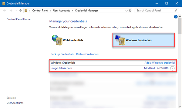
Visual Studio will prompt you for your Telerik credentials the first time the feed is accessed. These credentials can be subsequently accessed via the Windows Credentials Manager (e.g. to update password).

Credentials Manager interface with Windows credentials selected and Telerik list item visible.

However, what if your project is being built in an Azure DevOps build pipeline? How does the pipeline restore a package that is only in a private feed? This is where a NuGet config file comes into play. It allows you to set package sources as well as where to get the credentials.

Below is an example of a nuget.config file. Notice that it defines the Telerik NuGet server URL as well as two environment variables for the credentials.

<?xmlversion="1.0"encoding="utf-8"?>
<configuration>
  <packageRestore>
    <addkey="enabled"value="True"/>
    <addkey="automatic"value="True"/>
  </packageRestore>
  <activePackageSource>
    <addkey="All"value="(Aggregate source)"/>
  </activePackageSource>
  <packageSources>
    <addkey="NuGet"value="https://api.nuget.org/v3/index.json"/>
    <addkey="Telerik"value="https://nuget.telerik.com/nuget"/>
  </packageSources>
  <packageSourceCredentials>
    <Telerik>
      <addkey="Username"value="%TELERIK_USERNAME%"/>
      <addkey="ClearTextPassword"value="%TELERIK_PASSWORD%"/>
    </Telerik>
  </packageSourceCredentials>
</configuration>

However, this could be a security issue in a CI/CD environment where another user might be able to read the values of environment variables. This is where the Service Connection comes in handy.

The Azure DevOps Service Connection lets you enter credentials in a secure manner without unnecessarily exposing account details and that Service Connection can now be used by multiple pipelines to authenticate private NuGet feeds (and other services that need authentication).

Service Connection Walkthrough

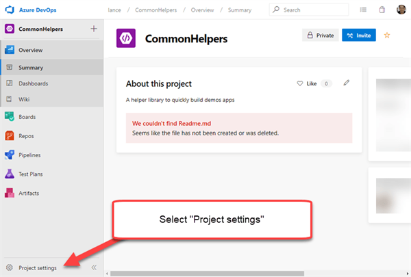
Let's walk through adding a Service Connection to the Telerik NuGet server. To start, go to the Project Settings in your DevOps project portal.

Project Setting

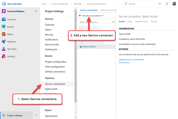
On the Project Settings page, select the Service Connections menu item under Pipelines and then open the New Service Connection drop down.

New Service Connection drop down

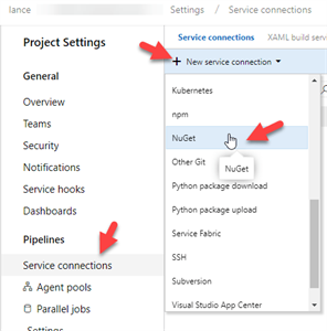
Select NuGet from the drop down list.

NuGet Service Selection

You'll be presented with a dialog that lets you enter the URL and authentication credentials. For the Telerik NuGet server, you'll want to select Basic Authentication.  Once that selection is made, you can enter the Telerik server URL and use your Telerik account credentials.

Add NuGet service connection information

Once that is saved, your build pipelines can now fetch packages from the Telerik NuGet feed. Next, let's take a look at how a build pipeline uses the nuget.config and the Service Connection together to fetch the Telerik packages.

Using Telerik Service Connection

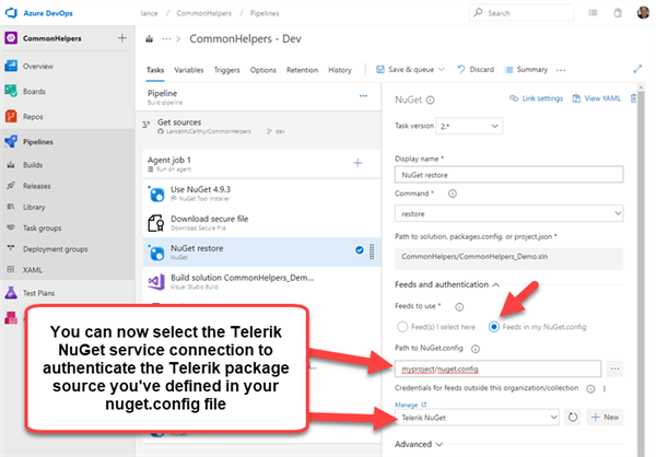
In your build pipeline, there's a NuGet Restore step. Select that step and look to the properties panel. Change the Feeds to Use selection to Feeds in my NuGet.config. A new dropdown will appear titled "Credentials for feeds outside this organization/collection." Open it and select the new Telerik NuGet Service Connection available.

Using Service Connection

That's it! When you queue and run the pipeline, the Telerik NuGet packages will be restored.

Azure Artifacts

Using a Service Connection means that any package available to that account holder could be fetched and used. If you do not want pipelines to have unfettered access to the Telerik account holder's downloads, you can host your own feed right in the DevOps project with the Azure Artifacts feature.

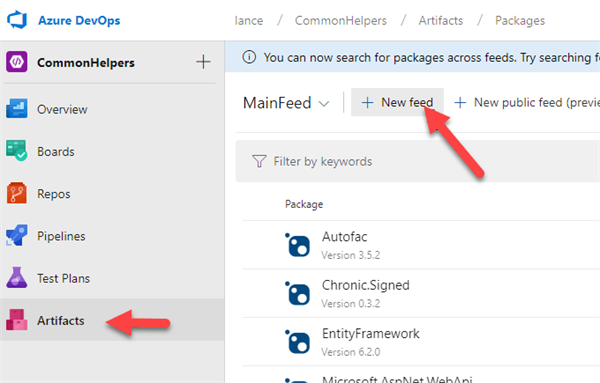
In the project's main menu, select Artifacts and then click the New Feed button at the top.

Artifacts Tab

Give the feed a name (e.g. something like TelerikPackages), select the "Only use packages published to this feed" option, then click the Create button. You will now have your own feed that you can push nupkg files to and it will handle the heavy lifting of the server duties.

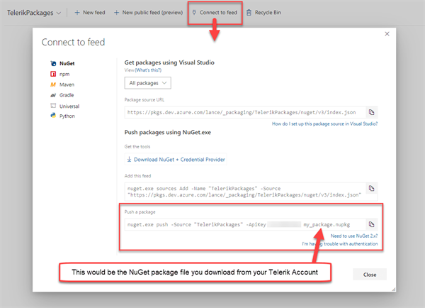
To see how to push packages to this feed, click the "Connect to feed" option at the top. A dialog will appear with helpful information on how you can push packages to that specific feed.

Connect to Azure Artifacts Feed

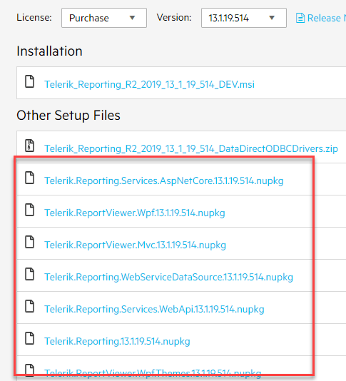
You can get the NuGet package file (nupkg) for any Telerik product you're using by going to the downloads page for that product. You can start at the My Account - All Products page.

Underneath the installer for the product, you'll see an Other Setup Files section where the nupkg files will be. For example, here's what it looks like for the Telerik Reporting packages.

Telerik Reporting NuGet package files

The last piece of this puzzle is to go to the build pipeline and select that feed for a NuGet Restore step.

Using an Artifact Feed

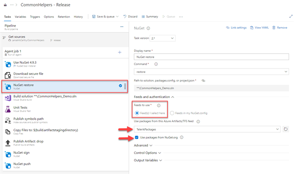
Just like we did above for the Service Connection, go to the build pipeline and select the NuGet Restore step. Except this time, you'd choose Feed(s) I select here and choose the TelerikFeed from the Use packages from this Azure Artifacts/TFS feed dropdown list.

Using the Artifact feed in a pipeline

Important: If you have nuget.org packages to restore in addition to the Telerik packages, leave the "Use packages form NuGet.org" option selected.

Wrapping Up

I hope this information helps show how you can use Telerik NuGet packages in your Azure DevOps pipelines. you can take Service Connection route or go with a more controlled Azure Artifact option.

You can find more information on using Azure DevOps or Azure Artifacts in the following documentation:

If you have any questions, don't hesitate to reach out. I'm available on Twitter @lancewmccarthy. If you're having problems with, or have questions about, the Telerik packages, you can talk directly to the engineers for that product by opening a Support Ticket.

Thanks for stopping by and have a great day!

Motor Disabilities and What You Need for Accessibility

$
0
0

Designing for accessibility can make your website better for everyone. In this article, we'll define motor disabilities and talk about web development strategies for improving accessibility for users with a motor disability.

For people with disabilities, the internet can be a lifeline that connects them to the world. Motor disabilities, in particular, can limit a person’s independence, especially in a society that routinely designs physical structures without regard to the concerns of people with disabilities. But on the internet, individual creators and developers can make their products more accessible to all their users, irrespective of physical ability.

What is a Motor Disability?

The term “motor disability” applies to any condition that impedes sensation, movement, or coordination. Motor disabilities can result from several possible causes, including congenital conditions, illnesses, and physical trauma, but these disabilities tend to present similar challenges for users when they navigate the web.

Diseases and Conditions

  • Cerebral palsy describes a brain injury or abnormality, resulting in a loss of muscle control. The condition usually appears during pregnancy or early infancy and can cause spasms or tightness in the muscles, involuntary movements, and speech impairment.
  • Muscular dystrophy (MD) is a genetic disorder that affects the genes governing muscle protein production. The progressive muscular degeneration caused by MD impacts a broad range of individuals but is most common in children.
  • Multiple sclerosis (MS) occurs when the protective myelin layer around an individual’s nerve cells erodes, causing misfiring or non-communication between the brain and the skeletal muscles. The symptoms of MS vary widely and tend to change over time, including tremors, weakness, numbness, unstable walking, spasticity, slurred speech, muscle stiffness, impaired memory, and partial or complete paralysis.
  • Spina bifida is a congenital condition in which a fetus’s spine fails to close fully around the spinal cord during the earliest stages of pregnancy, causing a bulge in a person’s back where the spinal membrane has protruded beyond the spine. Spina bifida can cause motor difficulties and paralysis, as well as, in some cases, language disability due to fluid in the brain.
  • Amyotrophic lateral sclerosis (ALS, or Lou Gehrig’s Disease) is a degenerative disease that inhibits communication between the skeletal muscles and the brain. ALS can cause slowness in movement and speech as well as partial paralysis.
  • Arthritis is most common among the elderly but can also occur in young people. Joint pain caused by advanced arthritis can lead to fatigue when manipulating a mouse or keyboard and may prompt a user to switch to alternative controls or spend less time on a computer altogether.
  • Parkinson’s disease is a central nervous system disorder that can cause both muscle rigidity and muscle tremors. People with advanced cases may be unable to use a computer mouse, keyboard, or voice interface, having to rely on complex assistive technologies to navigate the web.
  • Essential tremor is a nerve disorder that causes uncontrollable tremors and can interfere with the use of arms, hands, head, and larynx.

Trauma

  • Spinal cord injuries interrupt the communication between the brain and the skeletal muscles and can cause partial or complete paralysis in the legs and lower body (paraplegia) or the arms, legs, and torso (quadriplegia).
  • Limb loss and damage may impact an individual’s ability to operate a computer when the injury has occurred to the arm or hand. Some types of traumatic limb damage, such as damage to the nerves, may affect the functionality of the limb without altering its appearance.

Assistive Technologies

Building an accessible web product for users with motor disabilities requires an understanding of the tools and strategies that these individuals are likely to employ when they navigate the web. People with motor disabilities may choose from a variety of assistive technologies, most of which either work with or emulate a keyboard interface. Despite the wide variety of motor disabilities, assistive technologies are often designed with broad purposes that can apply to multiple types of disabled individuals.

Common assistive technologies include:

  • Head wands and mouth sticks are devices that fit over the head or into the mouth and extend toward a control interface. Once in place, the user can manipulate the wand or stick with their neck and jaw muscles to control an adaptive computer mouse, keyboard, or other assistive technology.
  • A single switch is a device - often a large button or touch-sensitive pad - that is placed near a body part to be clicked. Special software is often necessary to translate single-switch activity into computer commands.
  • A sip-and-puff switch has the same functionality as a single switch but is operated by blowing and sucking air into a mouthpiece. This type of switch is helpful for users who retain muscle function in the head but may not be able to rely on muscles from the neck down.
  • An oversized trackball mouse is a trackball whose larger dimensions make it easier to operate with assistive devices such as a head wand.
  • An adaptive keyboard may feature word-completion technology as well as raised gaps between keys that allow users to rest their hands in place when not typing and during muscle spasms.
  • People with limited or no hand control sometimes prefer eye-tracking devices, which register the user’s eye movements and use them to navigate the web.
  • While it can be costly, voice recognition software offers some users the option to navigate the web via direct voice commands smoothly. But others with motor disabilities find that their throat muscles are also affected - for example, by cerebral palsy - to such an extent that typical voice recognition software cannot consistently interpret their speech.

Assistive technologies by themselves are not enough to make the web accessible to users with disabilities, and, in the next section, we cover three ways to make your website more accessible to users with motor disabilities.

Support Effective Keyboard Navigation

Despite the availability of oversized and adaptable models, people with motor disabilities often find it impossible to use a mouse. Most assistive technologies that people with motor disabilities use emulate a keyboard in some way. By making your website effectively usable with a keyboard, you open up access to the users of these assistive technologies.

Start by following WAI-ARIA guidelines to make all elements on your web pages accessible via keyboards and keyboard emulators. Specifically, make sure that the keyboard focus elements are visible on your page with CSS elements.

Reduce Actions that Require Too Many Keypresses

Most motor-assistive technologies make use of isolated and small muscle groups. For example, those using a head wand engage their neck muscles for every action they make on a webpage or a keyboard. The mouth stick users select keys on a keyboard emulator with a movement of the mouth.

With small muscle groups used for every action, fatigue can become an issue when performing a task on your site like navigating to the end of a long list requires a lot of clicks or key presses.

To help people using assistive technologies, provide practical ways to navigate your site with only a few clicks. For example, by adding a way to skip to the end of long pages and long lists with a single click with a skip-to-content button at the top of your navigation bar.

Another way to reduce the keyboard clicks needed for navigation on your website is to structure your navigation menus as a multi-level tree. Instead of scrolling through an entire list of available pages, your users can jump to the section of the navigation that they are looking for with only a few clicks.

Add a Search Field to Your Website

Some users with motor disabilities use a voice recognition system. While those systems make it easier to navigate a webpage, it’s easier to type a phrase into a text field via speech recognition than it is to click specific elements on the webpage via voice control.

Search functionality is generally already present on most websites, and everyone can use it, not just those with motor disabilities. To take full advantage of this strategy, you also need to make sure that your pages are indexed, and that the sorting of the search results is helpful.

Conclusion

Making your webpage usable by those with motor disabilities often boils down to designing each element so that it’s effectively usable with a keyboard. Accessibility-oriented developers should also avoid functionality that relies exclusively on mouse control as well as build in shortcuts, like skip-to-content functions and focus elements, that help alleviate fatigue in users with motor disabilities.

Most importantly, educate your creative team about the nature and challenges associated with motor disabilities, and be sure to design and build projects with accessibility in mind from the earliest development stages.


Learn More about Accessibility

We have created a comprehensive whitepaper on accessibility for developers that covers everything from laws to coding to testing.

Download the whitepaper:Accessibility for Developers

Adding Accessibility to Your Apps

One easy way to make sure that you are creating accessible web apps is to start with components from the Kendo UI libraries. Our components are all WCAG complaint and give you great functionality from grids and charts to schedulers and pickers. Get a head start on your app's UI and a head start on accessibility compliance at the same time.

Learn more about: Kendo UI

Using a Code-Behind Approach to Blazor Components

$
0
0

In this article we'll look into when it's helpful to use a code-behind in your Blazor development, how we benefit and what to expect when re-factoring existing components.

When working with Blazor the default component architecture is to have all of the markup and logic mixed within a single file (.razor). When components are simple this approach works well, however as the complexity becomes greater managing the entirety of a component as a whole becomes difficult. Using a "code-behind" approach allows for markup and logic to be separated into their own files. In this article we'll look into when it's helpful to use a code-behind, how we benefit and what to expect when re-factoring existing components.

Single File Approach

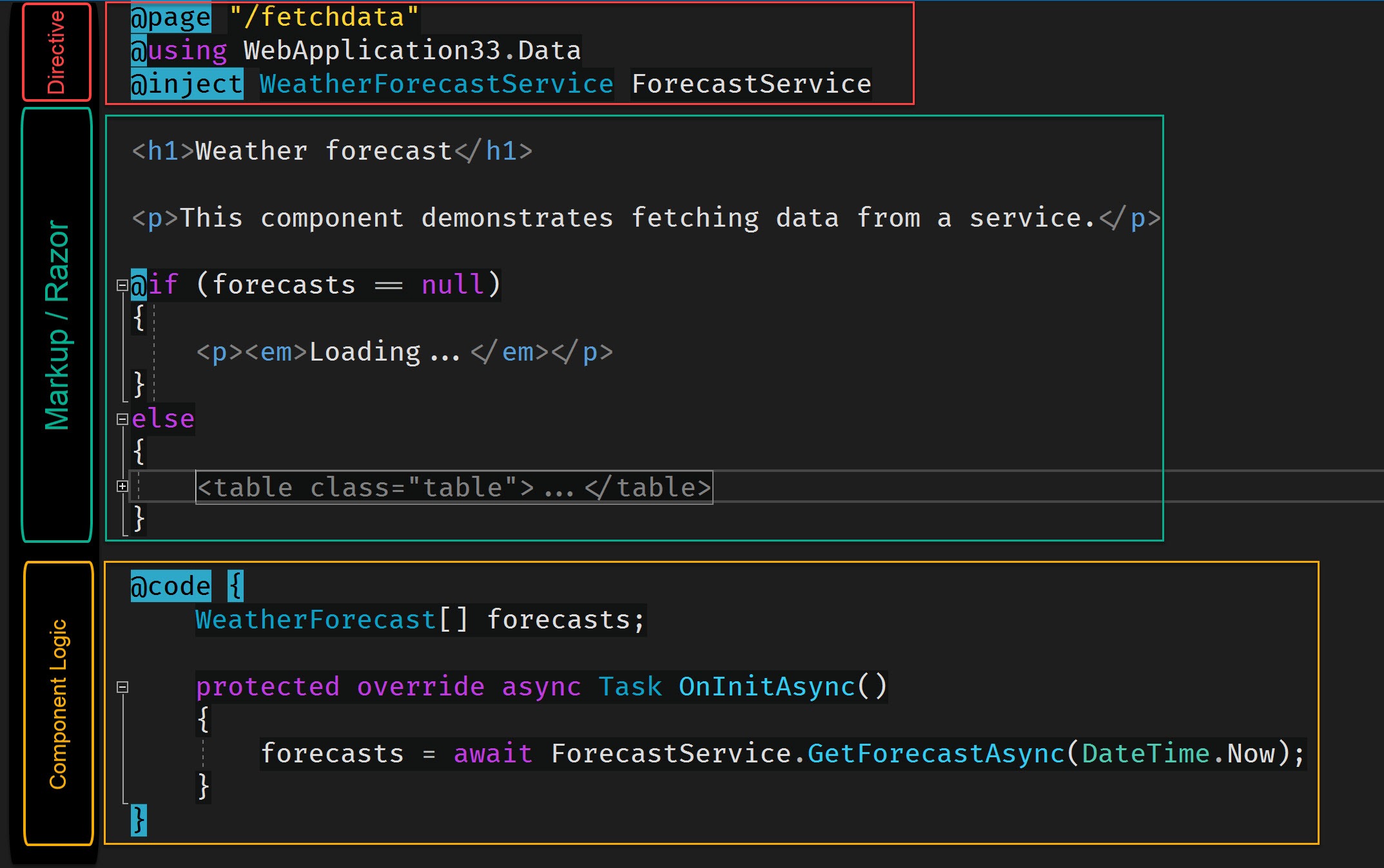
Let's begin with a quick review of the single file approach. We'll use ASP.NET's default template's FetchData component as an example. The FetchData component displays an HTML table of weather forecast data by looping over data provided by a service. The component uses directives, HTML/Razor, and a @code block; these are all typical items that make up a component.

component-anatomy

The markup for the component is quite verbose. Weighing in at 30+ lines the markup itself extends the length of the file, causing us to scroll down to find the components logic represented by a @code block.

scroll-needed

Keep in mind that this component is still actually quite simple. As the complexity becomes greater each section will grow. This means we will eventually have more directives, using statements, markup, and logic in our code block. While it may be convenient to have an all inclusive file, it will eventually become tedious to maintain due to constant scrolling between between markup and logic.

Let's re-factor the FetchData component by using a code-behind file see how it improves the overall developer experience.

Code-Behind Approach

Code-behind is a common term for the technique of using a separate code file to that represents all of the logic for a corresponding page, view, or component. Creating a code-behind in Blazor requires a few steps, but thankfully it's supported by the framework so setup is quite simple. To complete our code-behind we'll need to create a class and then link the code-behind to our markup. Once we have the structure in place, we can move over our existing logic.

Creating and Linking a Code-Behind

First we'll need a class file that will represent our code-behind. This is a standard .NET class, however naming is very important. When we create our code-behind file we need to consider both the file name and class name as they can greatly effect our developer experience.

Let's start with the file name. When we add the file name we should follow a common convention of [componentName]Base.razor.cs. The .razor.cs extension is understood by Visual Studio and will be properly nested within the file explorer window. Since the component already occupies a class name we'll need to add the suffix Base to our class name giving it a unique class name. The final code-behind file should be FetchData.razor.cs with a class name of FetchDataBase.

file-nesting

Next, we'll need to link the markup portion of the component (.razor) to the code-behind (.razor.cs). In the code-behind file, we'll inherit from ComponentBase. When inheriting from ComponentBase, in Visual Studio the shortcut ctrl+. will add the using statement using Microsoft.AspNetCore.Components; which is the namespace for ComponentBase. At the time of writing the ctrl+. shortcut is unavailable in Razor as are many re-factoring tools for Visual Studio. Access to these shortcuts emphasizes the importance of code-behind files in Blazor.

using Microsoft.AspNetCore.Components;

namespace MyApp.Pages
{
    public class FetchDataBase : ComponentBase
    {
    }
}

We'll use a similar process in our markup file to complete the link between both files. At the top of the component's markup we'll inherit from our code-behind using the @inherits directive. Inheriting from FetchDataBase forms a complete component and we no longer need to use the @code block to define our component's logic.

@inherits FetchDataBase
@page "/fetchdata"
@using WebApplication33.Data
@inject WeatherForecastService ForecastService

...markup

@code { ... }

We can now migrate all of the code from the @code block to our code-behind, and a few directives as well.

Migrating @code to Code-Behind

Most of the logic from our @code block can be copied directly as-is to the code-behind without change, however there are some small updates that will need to be made. The @code block is scoped to the component's class, while the code-behind's scope is the component's base class. Anything we would like to reference in the base class via markup needs to be marked protected. In the case of FetchData, the variable forecasts is used in the components markup so it must be protected or public to be visible to the FetchData class. In the code-behind WeatherForecast[] forecasts; becomes protected WeatherForecast[] forecasts;.

    public class FetchDataBase : ComponentBase
    {
        protected WeatherForecast[] forecasts;

        ...
    }

As we move code to our code-behind, additional using statements will be required as the code-behind doesn't take advantage of global values in _Imports.razor. Once again this is where standard tooling comes in handy with ctrl+. making short work of any missing namespaces.

ctrl+period

using Microsoft.AspNetCore.Components;
using System.Threading.Tasks; // Added by ctrl + .
using MyApp.Data; // Added by ctrl + .

namespace MyApp.Pages
{
    public class FetchDataBase : ComponentBase
    {
        protected WeatherForecast[] forecasts;

        protected override async Task OnInitAsync()
        {
            forecasts = await ForecastService.GetForecastAsync(DateTime.Now);
        }
    }
}

With all of the code migrated, we still need to tackle one final step, dependency injection (DI).

Dependency Injection in Blazor Code-Behind

Dependency Injection in Razor markup is handled by the @inject directive. While the directive is available in code-behind classes, it is written much differently and at first glance may not be obvious. To use dependency injection in a code-behind file we'll use the [Inject] attribute and apply it to a property of the type we would like to inject, ex: [Inject] MyType MyProp { get; set; }.

using Microsoft.AspNetCore.Components;
using System;
using System.Threading.Tasks;
using MyApp.Data;

namespace MyApp.Pages
{
    public class FetchDataBase : ComponentBase
    {
        [Inject] WeatherForecastService ForecastService { get; set; }

        protected WeatherForecast[] forecasts;      

        protected override async Task OnInitAsync()
        {
            forecasts = await ForecastService.GetForecastAsync(DateTime.Now);
        }
    }
}

With the [Inject] attribute added the component can now resolve the service and we no longer need the directive in the Razor markup. We can proceed with cleaning up our markup by removing the @inject and @using directives as well as the @code block.

Code-Behind Final Thoughts

When we started the component's directives, markup and logic were all contained in a single file. While a single file approach provides benefits in its simplicity, and is great for small components, it simply doesn't scale well. Once our component requires complex markup or logic it's easy to get lost in the large file and/or confused by two different ways of expressing code. In addition, we lose access to some of Visual Studio's most valuable productivity tooling.

The process of converting an existing component to use a code-behind is quite easy. A few code changes are required with regards to using statements, protection levels, and dependency injection. For the most part Visual Studio even guides us through making the proper corrections to achieve a successful compilation.

side-by-side

When the transition is complete we benefit from clearly defined roles for markup and logic with a lot less scrolling. If we need to see the component in its entirety we can now snap the two windows side-by-side and focus on the task at hand.

New to Blazor?

If you're new to Blazor and want to start learning quickly, see the free Blazor Quick Start video series. In this instructional video series we learn about ASP.NET Core Blazor. Learn the basics of working with Blazor concepts like: components, events, data binding, and more. The course is guided by me, Ed Charbeneau, an industry pro and four-time Microsoft MVP.

Simplifying Equals Modernizing in the Telerik UI for WinForms RibbonBar

$
0
0

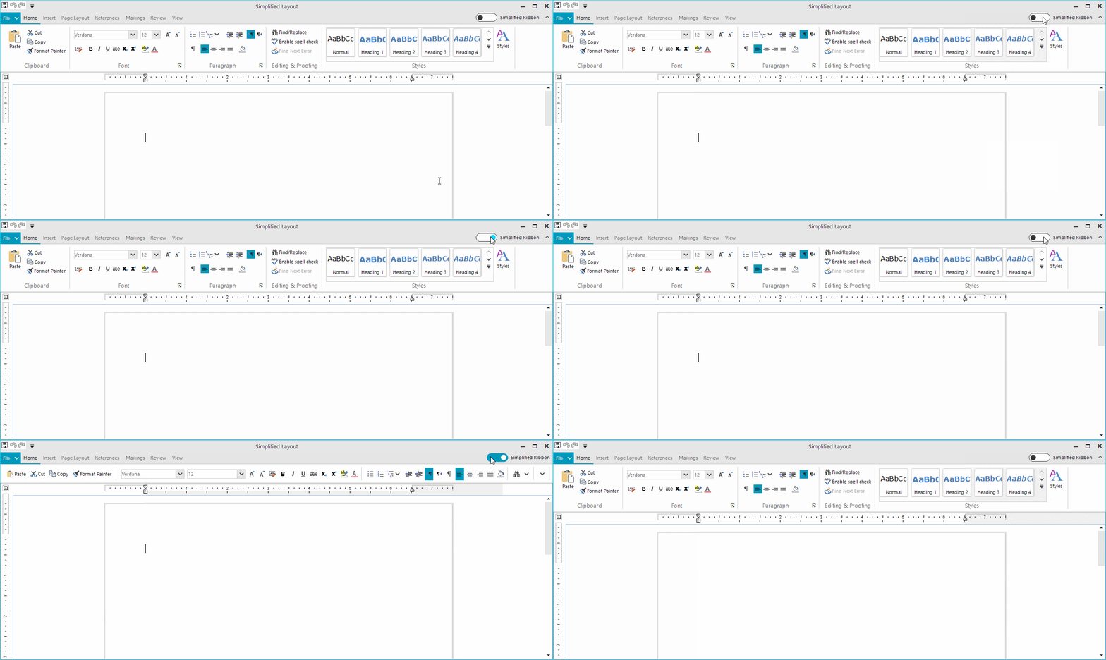
We introduced the new Simplified mode in RadRibbonBar in the Telerik UI for WinForms R2 2019 release. This powerful feature allows modernizing new or existing ribbon controls to incorporate a more compact UI and save valuable screen space.

simplified-ribbon01

Concept of Simplified Ribbon

The RadRibbonBar control has been around for quite some time. The control has served its purpose well, which is to provide the end user with a convenient UI allowing them to easily and intuitively invoke commands. UI Design and UX in general have also evolved through the years and now some people may say that the traditional layout of the ribbon control is bulky and not following the latest design trends. To be honest, that seems to be fair. Recently Microsoft introduced a new Simplified mode in their online Office suite. Hopefully, we will soon see this in the desktop versions of the same products. The Simplified mode of the ribbon bar is cool and sleek, moreover it is compact.

Such UI is invaluable when the screen space is limited, not to mention it is more user friendly as it puts only the most important commands at focus, and I personally enjoy it when working with Word in Office 365. This inspired us to implement a new layout mode in RadRibbonBar so that the control catches up to the modern UI trends.

How the Simplified Ribbon Bar Works

We wanted to provide a solution which would work equally well with ribbon controls already part of existing applications as it would with ribbons in new projects. It was imperative that the new feature did not impose limitations on the existing APIs in the control. We wanted the developers to keep on using the ribbon the way they were already doing it and to have the new option for switching the layout available at run-time. I should also say that the new feature is not built for a specific theme and it is supported equally well by all of our 27 themes.

Layout Mode

RadRibbonBar now has a LayoutMode property which is an enumeration with the available layouts. Currently the possible ones are Default and Simplified:

this.radRibbonBar1.LayoutMode = RibbonLayout.Simplified;

Simplified Ribbon Height

A single property controls the height of the entire ribbon control when it is in Simplified mode. This allowed us to have different heights depending on the applied theme. This property also gives freedom to change the height depending on their actual scenario.

this.radRibbonBar1.SimplifiedHeight = 105;

Layout Toggle Button

This button is responsible for switching the layout. It is located in the top right corner of the control. By default, the button is not visible, yet it can be easily displayed by setting a single property:

this.radRibbonBar1.ShowLayoutModeButton = true;

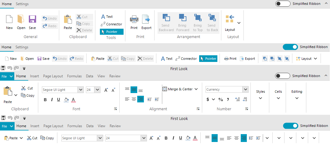
We decided to set the ShowLayoutModeButton property to true, in our own RadRibbonBar implementations part of the RadRichTextEditor, RadSpeadsheet, and RadDiagram controls. The animation at the beginning of the blog shows the default and simplified layouts in RadRichTextRibbonBar. Here is a screenshot showing the ribbon in the diagram and spread controls.

simplified-ribbon02

Run-time support

The Simplified layout mode is available only at run-time. The Developer still needs to set up the UI building groups and sub groups in the traditional layout mode. Then at run-time they can switch the layout and have the new modern look. This approach allowed us to support ribbon controls which were already shipped. For the developer, this meant that they could provide their end users with a new cool feature without having to do anything on their side.

Simplified Layout

The main idea in the Simplified layout mode is to have all the items building the various groups in RadRibbonBar arranged in a single row. This posed several challenges while implementing the feature.

  • Infinite Nesting: The traditional layout can be really complex, and groups can be nested in each other. The first thing we did is to flatten the structure and reparent all of the elements to be direct children of the main ribbon group. This can be seen clearly in the Clipboard and Font groups of the screenshot above. It was also a challenge to implement the transition from Simplified to the Default mode and restore the original arrangement.
  • Element Properties: We did our best to handle as many scenarios as possible so that the control looks good when switched to the Simplified mode. In order to achieve this, we had to change some of the element properties so that they look good in a single row. For example, the Paste drop-down button in the Clipboard group originally had the TextImageRelation property set to ImageAboveText and this looks perfect in the default layout. Such text-image relation, however, did not make sense in the Simplified mode, so we changed the element to display the image before the text. We also changed some other properties as well as the images in order to decrease the height of the various elements and fit them in a single row. We have a documentation article listing them.
  • Customization: As many element properties were being changed while switching the layout mode, we had to provide the developers an API to control this process. The ItemStyleChanging event is firing for each of the changed properties and it can be subscribed via the main element of the control: RadRibbonBar.RibbonBarEelement. The event is cancellable as in certain scenarios the developer might decide that that a particular property for a particular element should not be changed. The arguments provide information about the element, the group where it is located, the property, the old and new property values as well as the context in which the change operation is being executed. For example, we have decided that the gallery items in the Simplified mode will display only text, however, in certain cases one may need to use a different display mode. If that is working well in a client's application, the event's NewValue argument can be changed. We have a nice documentation article on Customizing the Simplified Ribbon demonstrating this with the RichTextEditorRibbonBar:
privatevoidRibbonBarElement_ItemStyleChanging(objectsender, Telerik.WinControls.UI.ItemStyleChangingEventArgs args)
{
    if(args.Context == ItemStyleContext.DefaultToSimplified)
    {
        if(args.Element isRadGalleryItem && args.Property == RadButtonItem.DisplayStyleProperty)
        {
            args.NewValue = DisplayStyle.Image;
        }
    }
}

Try it Out

Make sure to download and try the latest version of Telerik UI for WinForms to explore all the new features and themes. It is available jn your Telerik Account, or if you are new to Telerik UI for WinForms, you can get a fully featured 30 day free trial here.  

We'd love to hear how this all works for you, so please let us know your thoughts by visiting our Feedback portal or by leaving a comment below.

Accessibility Regulations You Need to Follow: Section 508

$
0
0

What is Section 508 of the Rehabilitation Act of 1973, and why should you adhere to it when developing your product or services? Learn what you need to know in this article.

Accessibility means ensuring access to information or products for individuals who have a disability. On a webpage, this includes all text, images, sounds, code, and markup. The Web Content Accessibility Guidelines, or WCAG, represent the foundation used worldwide for assessing a website’s accessibility.

This article covers Section 508 of the Rehabilitation Act of 1973 and why it’s important to adhere to for your visitors and your business. The act regulates physical, sensory, or cognitive accessibility for federal hardware and software products in the United States.

Software Applications

Section 508 has relevant up-front requirements for all software applications. First, the software must not interfere with the accessibility features of the operating system it runs on, nor may it disable any of the operating system's activated accessibility features developed and documented in compliance with industry standards.

We strongly recommend learning about your operating system’s documented accessibility features (here are descriptions for macOS and Windows) and testing them with your software as part of your development workflow.

If you’re able to use existing features that conform to the regulations, a big part of the work may already be complete.

Second, all visual content must have a text alternative. If you use an image as a program element, the information that image contains must also be available in text form. Try creating titles and descriptions for all images and visual content in your software. After a while, you may find it becomes an effortless part of your workflow.

Third, use other techniques in addition to color-coding to convey information, not color alone. When displaying a graphic or asking the viewer to make a choice, use other elements to distinguish the different options. Experiment with text on the controls, varying shapes or placement for best results.

Finally, all essential application functionality must be executable using a keyboard. Here you can take advantage of the many shortcuts keyboards offer and map them to essential functions in your application.

Websites and Web-based Applications

In the previous section, we looked at the four main technical standards that apply to software applications and operating systems. Now let’s examine the requirements for a website or a web-based application.

The major milestones for software applications mentioned above also apply here: The website must provide text alternatives to visual content, must avoid exclusively using color-coding as a way to differentiate controls, and must be entirely usable with a keyboard alone. To test compliance with these regulations, you can simplify your layout, add text to every visual element, and try navigating your web content with only a keyboard.

In addition to these, a website must also adhere to the WCAG standards mentioned at the beginning of this article. Section 508 is built on the foundations of the WCAG. When building a webpage, consult the W3C website to gain a better understanding of how these accessibility guidelines apply to your website or web-based application.

Telecommunications Products

Finally, let’s consider telecommunications products. This class of products, which includes telephones and other products that allow voice communication, are regulated by Section 508 and also fall under the Section 255 accessibility guidelines of the Telecommunications Act. As with the other product classes, the goal for telecommunications products is to ensure that any individual, regardless of disability, can have full use of the product or service.

In regulating telecommunications products, Sections 508 and 255 require that the device is operable without vision, with low vision, with little or no color perception, without hearing, without speech, and more. Many telecommunications products meet these standards by providing TTY (“teletypewriter”) functionality, which refers to interactive text-based communications using coded signal transmission. This functionality allows all audio commands and inputs to be translated into text and back again for individuals with disabilities.

Navigating accessibility in these three different avenues is important in ensuring that your content can reach the widest audience possible. An inaccessible interface is a quick way to ensure your audience searches elsewhere for their content.

Conclusion

At the beginning of this article, we asked why it’s worth spending time on accessibility when working with technology products.

If you’re a government agency, compliance with these regulations is compulsory, and you’re breaking the law if you don’t. Next, it’s worth noting that making your software and web applications accessible to everyone significantly increases your market. More individuals who can use your web application means more business.

Think about accessibility early in the development process, because after your product is complete, addressing accessibility issues is more costly and time-consuming. Even if you’re a government agency, meeting the regulations set forth by Sections 508 and 255 from the beginning allow your applications to be procured by government agencies without having to jump through more hoops.

Adherence to accessibility standards is good for business and good for all web users. The more individuals who can access information and web content, the closer we get to a well-informed and connected society, and we can all agree that’s a goal worth working toward.


Learn More about Accessibility

We have created a comprehensive whitepaper on accessibility for developers that covers everything from laws to coding to testing.

Download the whitepaper:Accessibility for Developers

Adding Accessibility to Your Apps

One easy way to make sure that you are creating accessible web apps is to start with components from the Kendo UI libraries. Our components are all WCAG complaint and give you great functionality from grids and charts to schedulers and pickers. Get a head start on your app's UI and a head start on accessibility compliance at the same time.

Learn more about: Kendo UI
Getting Started with Telerik Map Control for Xamarin.Forms

$
0
0

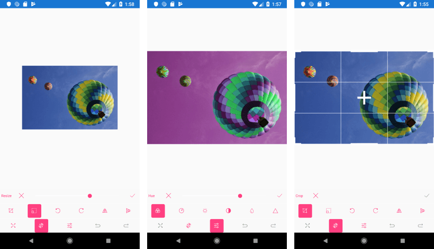
Have you ever had to display a map representing geographical data inside your mobile application? Or to provide seat selection options to your users for an event or airplane boarding? If so, the latest addition to the Telerik UI for Xamarin suite - the Map component - will come in handy. 

In short, RadMap for Telerik UI for Xamarin is a data visualization control used to render shapes consisting of points, lines and polygons (areas). The shapes are read from ESRI shape files. The shape file format is now a common format for storing geometric location along with associated attribute data of spatial features. If you’d like to learn more about the shape file format, you can go through its specification here.

In this post I am going to briefly introduce you to the Map control and its main features, such as support for multiple layers, selection, pan and zoom as well as conditional styling.

Set up the Xamarin Map Control

As I mentioned in the introduction, RadMap works with shape files. Shape files usually represent maps, but they can be used in other scenarios as well. For example, they can store information for various types of schemes – like theater seats, airplane seats distribution or floor plans, just to name a few.

You can download ready-to-use shape files or create your own (if you’d like to visualize a specific scheme) with any of the GIS software available on the market.

A good collection of free and ready-to-use shape files presenting the world map can be found on the Natural Earth website.

In the example we're going to create in this post we will use the Countries shape file from the resource referred to above. Keep in mind that although its name indicates a singular file, a shape file is actually a collection of at least three basic files: .shp, .shx and .dbf. For our purposes we would need only the .shp and the .dbf files.

So, let’s stop talking and start coding. 

First, we will need to include the .shp and .dbf files to our Xamarin.Forms project and set their Build Action to “Embedded resource.” Setting the build action is an important step as otherwise the files can't be read.

Then, the Countries shape file should be assigned to the Map through a ShapefileLayer instance. Check below the Map XAML definition with the ShapefileLayer added:

<telerikMap:RadMapx:Name="map">
    <telerikMap:RadMap.Layers>
        <telerikMap:ShapefileLayer>
            <telerikMap:ShapefileLayer.Reader>
                <telerikMap:MapShapeReaderx:Name="countriesReader"/>
            </telerikMap:ShapefileLayer.Reader>
        </telerikMap:ShapefileLayer>
    </telerikMap:RadMap.Layers>
</telerikMap:RadMap>

You would also need to add the telerikMap namespace:

xmlns:telerikMap="clr-namespace:Telerik.XamarinForms.Map;assembly=Telerik.XamarinForms.Map"

And here is how the .shp file and the corresponding data file (.dbf) are loaded through the reader:

var source = MapSource.FromResource("XamarinApp.ne_10m_admin_0_countries.shp");
this.countriesReader.Source = source;
 
var dataSource = MapSource.FromResource("XamarinApp.ne_10m_admin_0_countries.dbf");
this.countriesReader.DataSource = dataSource;

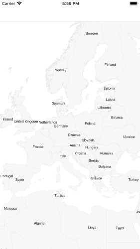
At this point, if we run the app on iOS emulator, we see this:

Map First Look

Display Labels in a Xamarin Map Control

The dbf file that we just loaded through the DataSource of the map reader contains additional information for each shape in the form of attributes. We could show shapes labels, for example, or apply different styling to the shapes according to some criteria taken from the attribute’s details.

You could check all the loaded shapes and their attributes by looking into the Shapes property of the MapShapeReader instance:

var countries = countriesReader.Shapes;

In our case, there is an attribute with key “NAME” which holds the name of the country represented by each shape. So, we can easily display labels and customize their appearance through the LabelAttributeName and ShapeLabelStyle properties, respectively, like this:

<telerikMap:RadMapx:Name="map">
    <telerikMap:RadMap.Layers>
        <telerikMap:ShapefileLayerLabelAttributeName="NAME">
            <telerikMap:ShapefileLayer.Reader>
                <telerikMap:MapShapeReaderx:Name="countriesReader"/>
            </telerikMap:ShapefileLayer.Reader>
            <telerikMap:ShapefileLayer.ShapeLabelStyle>
                <telerikMap:MapShapeLabelStyleTextColor="#1E1E1E"                                            
                                           FontSize="10"/>
            </telerikMap:ShapefileLayer.ShapeLabelStyle>
        </telerikMap:ShapefileLayer>
    </telerikMap:RadMap.Layers>
</telerikMap:RadMap>

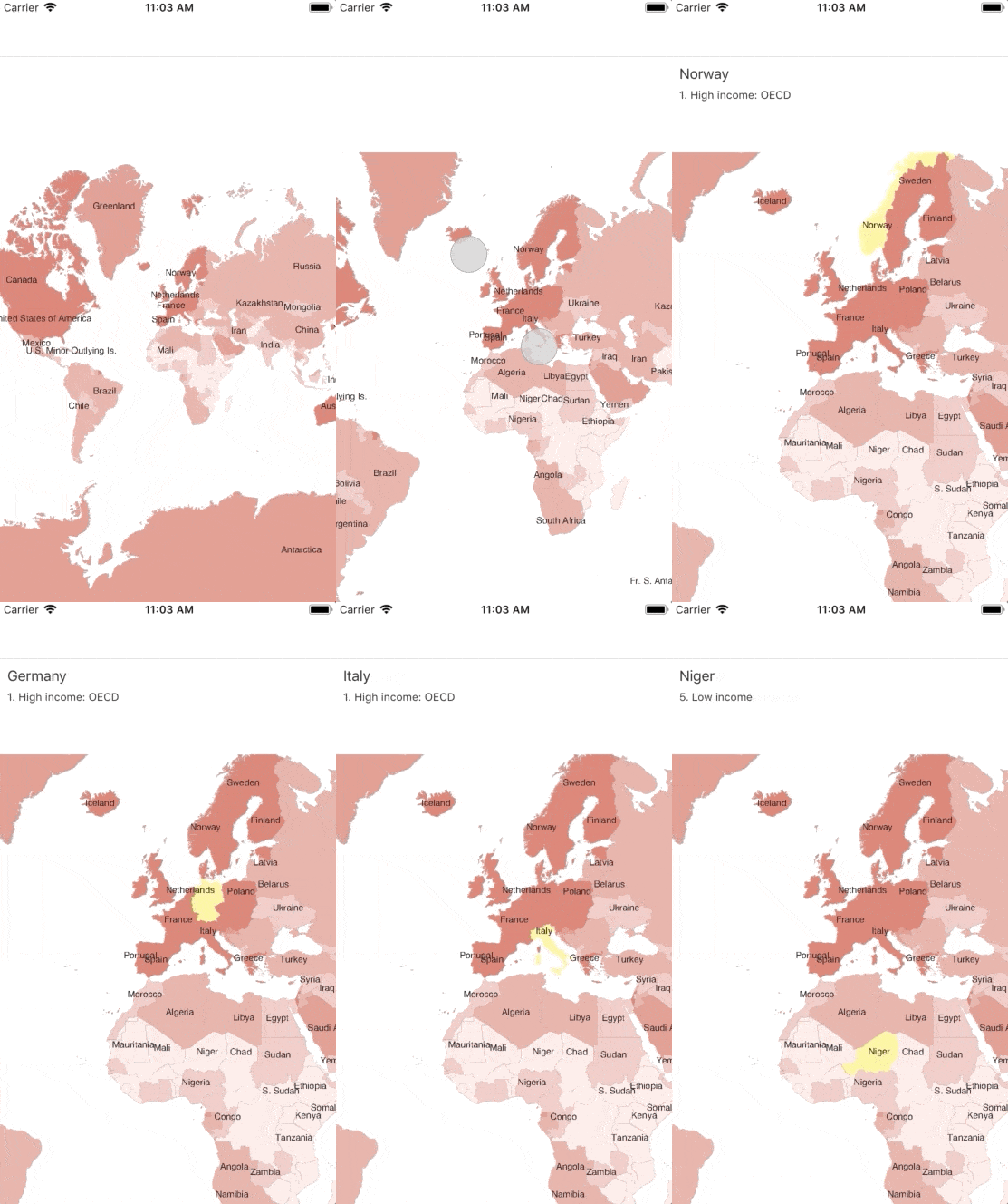
When viewed in the iOS device simulator, the map should look something like this:

Map with Labels

Apply Different Styles

The appearance of the rendered shapes can be customized through the ShapeStyle property, which provides the means for defining FillColor, StrokeColor and StrokeWidth for each shape. In addition, different styles could be applied to distinguish different areas through the ShapeStyleSelector.

In our example we will use the “INCOME_GRP” attribute which holds information about each country’s income to set separate colors to the countries according to the income value.

First, let's create the custom style selector that should inherit from MapShapeStyleSelector class:

publicclassIncomeShapeStyleSelector : MapShapeStyleSelector
{
    publicMapShapeStyle HighIncomeShapeStyle { get; set; }
    publicMapShapeStyle LowerHighIncomeShapeStyle { get; set; }
    publicMapShapeStyle MiddleIncomeShapeStyle { get; set; }
    publicMapShapeStyle LowerMiddleIncomeShapeStyle { get; set; }
    publicMapShapeStyle LowIncomeShapeStyle { get; set; }
 
    publicoverrideMapShapeStyle SelectStyle(objectshape, BindableObject container)
    {
        var attributesShape = shape asIShape;
        if(attributesShape != null)
        {
            var scaleRank = Double.Parse(attributesShape.GetAttribute("INCOME_GRP").ToString().Substring(0, 1));
 
            switch(scaleRank)
            {
                case1: returnthis.HighIncomeShapeStyle;
                case2: returnthis.LowerHighIncomeShapeStyle;
                case3: returnthis.MiddleIncomeShapeStyle;
                case4: returnthis.LowerMiddleIncomeShapeStyle;
                default: returnthis.LowIncomeShapeStyle;
            }         
        }
        returnnull;
    }
}

Then, we would need to define It in XAML as a resource:

<ResourceDictionary>
    <local:IncomeShapeStyleSelectorx:Key="IncomeShapeStyleSelector">
        <local:IncomeShapeStyleSelector.HighIncomeShapeStyle>
            <telerikMap:MapShapeStyleFillColor="#DE796C"StrokeColor="#BC9896"/>
        </local:IncomeShapeStyleSelector.HighIncomeShapeStyle>
        <local:IncomeShapeStyleSelector.LowerHighIncomeShapeStyle>
            <telerikMap:MapShapeStyleFillColor="#E49388"StrokeColor="#BC9896"/>
        </local:IncomeShapeStyleSelector.LowerHighIncomeShapeStyle>
        <local:IncomeShapeStyleSelector.MiddleIncomeShapeStyle>
            <telerikMap:MapShapeStyleFillColor="#E9ACA4"StrokeColor="#BC9896"/>
        </local:IncomeShapeStyleSelector.MiddleIncomeShapeStyle>
        <local:IncomeShapeStyleSelector.LowerMiddleIncomeShapeStyle>
            <telerikMap:MapShapeStyleFillColor="#EFC7C1"StrokeColor="#BC9896"/>
        </local:IncomeShapeStyleSelector.LowerMiddleIncomeShapeStyle>
        <local:IncomeShapeStyleSelector.LowIncomeShapeStyle>
            <telerikMap:MapShapeStyleFillColor="#FBE9E7"StrokeColor="#BC9896"/>
        </local:IncomeShapeStyleSelector.LowIncomeShapeStyle>
    </local:IncomeShapeStyleSelector>
</ResourceDictionary>

And lastly, apply it to the ShapefileLayer instance:

<telerikMap:RadMapx:Name="map">
    <telerikMap:RadMap.Layers>
        <telerikMap:ShapefileLayerLabelAttributeName="NAME"
                         ShapeStyleSelector="{StaticResource IncomeShapeStyleSelector}">
            <telerikMap:ShapefileLayer.Reader>
                <telerikMap:MapShapeReaderx:Name="countriesReader"/>
            </telerikMap:ShapefileLayer.Reader>
            <telerikMap:ShapefileLayer.ShapeLabelStyle>
                <telerikMap:MapShapeLabelStyleTextColor="#1E1E1E"                                            
   FontSize="10"/>
            </telerikMap:ShapefileLayer.ShapeLabelStyle>
        </telerikMap:ShapefileLayer>
    </telerikMap:RadMap.Layers>
</telerikMap:RadMap>

Running the application after the latest changes should look like this:

Map Shapes Styling

Select Shapes

RadMap supports single and multiple selection of shapes to help draw users’ attention on specific areas. By default, the selection is turned off, so we would need to enable it by setting the SelectionMode property of the ShapefileLayer instance to either “Single” or “Multiple” per our preferences.

In addition, we can access the selected elements through SelectedShape / SelectedShapes properties according to the chosen selection mode.  

Check the needed changes below:

<telerikMap:RadMapx:Name="map"Grid.Row="1">
    <telerikMap:RadMap.Layers>
        <telerikMap:ShapefileLayerLabelAttributeName="NAME"
                        ShapeStyleSelector="{StaticResource IncomeShapeStyleSelector}"
                        SelectionMode="Single"
                        SelectedShape="{Binding SelectedShape, Mode=TwoWay}">
            <telerikMap:ShapefileLayer.Reader>
                <telerikMap:MapShapeReaderx:Name="countriesReader"/>
            </telerikMap:ShapefileLayer.Reader>
            <telerikMap:ShapefileLayer.ShapeLabelStyle>
                <telerikMap:MapShapeLabelStyleTextColor="#1E1E1E"                                            
           FontSize="10"/>
            </telerikMap:ShapefileLayer.ShapeLabelStyle>
            <telerikMap:ShapefileLayer.SelectedShapeStyle>
                <telerikMap:MapShapeStyleFillColor="#FFF399"
                               StrokeColor="#FFFBAE"/>
            </telerikMap:ShapefileLayer.SelectedShapeStyle>
        </telerikMap:ShapefileLayer>    
    </telerikMap:RadMap.Layers>
</telerikMap:RadMap>

Where SelectedShape property is defined like this;

privateIShape selectedShape;
 
publicIShape SelectedShape
{
    get
    {
        returnthis.selectedShape;
    }
    set
    {
        if(this.selectedShape != value)
        {
            this.selectedShape = value;
            if(this.selectedShape != null)
            {
                this.CountryName = this.selectedShape.GetAttribute("NAME").ToString();
                this.CountryIncome = this.selectedShape.GetAttribute("INCOME_GRP").ToString();                      
            }
            this.OnPropertyChanged();
        }
    }
}

Here is the result after running the updated code on iOS:

Map Shapes Selection

Xamarin Map Layers Support 

RadMap has a multi-layered architecture, so we could add more layers displaying different types of elements on the same map.  Let’s explore this option by adding, for example, the Roads shape file (from the Natural Earth collection) in our example.  

<telerikMap:RadMapx:Name="map">
    <telerikMap:RadMap.Layers>
        <!-- countries layer -->
        <telerikMap:ShapefileLayer>
            <telerikMap:ShapefileLayer.Reader>
                <telerikMap:MapShapeReaderx:Name="roadsReader"/>
            </telerikMap:ShapefileLayer.Reader>
        </telerikMap:ShapefileLayer>
    </telerikMap:RadMap.Layers>
</telerikMap:RadMap>

Add the shp file to the roadsReader:

var roadsSource = MapSource.FromResource("XamarinApp.ne_10m_roads.shp");
this.roadsReader.Source = roadsSource;

And we will have the roads visualized on the map:

Map with multiple layers

Configure Pan and Zoom

Last but not least, I would like to mention the interaction feature of the Map – the control provides pan and zoom functionality that will help the end users of your app interact with the view and inspect it in more details. 

You can choose between a few interaction modes to provide the needed user experience. The available options are only Pan, only Zoom, PanAndZoom (which is the default value) as well as None. The selected one is applied through the InteractionMode property of the Map.

In addition, you can configure the minimum and maximum allowed zoom levels. Please check the Key Features documentation topic for more details on this.

Try it out and Share your Feedback

I hope I have managed to give you an overview on the basic features of the Map control in Telerik UI for Xamarin. Don’t forget to check out the various demos of the controls in our Sample Browser and the Telerik UI for Xamarin Demos application.

As always, we would love to hear your feedback about the Map control and how we can improve it. If you have any ideas for features to add, do not hesitate to share this information with us on our Telerik UI for Xamarin Feedback portal.

Still haven't tried Telerik UI for Xamarin? The free trial is right here waiting for you to give it a try and explore all the components provided in the suite.


Solving the Accessibility Puzzle

$
0
0

Staying on top of your needs, running regular accessibility scans and working with or training accessibility experts can ensure you deliver the best, and most compliant, user experience possible.

Following accessibility guidelines is tough, especially if a lawyer is breathing down your neck. But you can do it, and without sacrificing overall UX.

Businesses in many industries get more than their fair share of emails from legal types threatening lawsuits if the organization’s site or app doesn’t work well for those with disabilities. They typically cite lack of compliance with WCAG AA accessibility guidelines, the accepted standard.

Accessibility is a worthy goal and good business. Naturally, organizations want to avoid lawsuits and serve their customers. But improved accessibility can seem like a massive effort. How do you even begin?

Get a Good Site Scanner

Law firms use site scanners to flag non-accessible sites. More aggressive law firms may flag you for items that aren’t actually accessibility violations. Don’t just rely on a letter from an overzealous attorney. You’ll want to get your own scanner and check for yourself.

Find an accessibility scanner that will check your entire site, do a comprehensive job, and provide thorough reporting. At truematter we use Powermapper Accessibility Checker and Validator. It is excellent and the fees are modest.

Ask For Advice

You need someone with legitimate accessibility experience to interpret the gray areas in the WCAG guidelines. This is not an exact science. Larger banks with internal web teams may have an accessibility expert on staff. Regional banks tend to work with external web consultants of some kind.

Either way, the bulk of your accessibility effort will be interpreting your scanner’s findings and determining the best way to fix any issues. It will take user experience know-how to decide how to fix these problems without negatively impacting your site visitors. Experts can also help you document your unique solutions to gray-area problems for future reference.

Of course, the aforementioned law firms will likely suggest their partners as help for hire. You may or may not wish to put your trust in these recommendations.

Determine the Extent of the Problem

Run an initial scan to assess the problem yourself. Get your accessibility expert to interpret it. Together, take stock of the situation. Yes, you may be looking at significant changes to your code and content, especially if your site is more than three years old. If you are in the middle of a redesign, stop and ensure you are building accessibility into your new site.

Build In-House Accessibility Expertise

Your team can learn a great deal about accessibility for themselves. It will take some research and reading to understand how to interpret your scanner’s findings and the WCAG 2.0 AA guidelines. Assign a team member to become strongly familiar with accessibility. Have your newly minted guru teach the rest of the team at a lunch and learn, or during the course of fixes.

Keep in mind that if your accessibility point person is not a developer, you will still need an internal or external expert to help with code-based accessibility changes.

Keep Up With Your Scans

Run scans monthly and after every major site change. This way, you’ll stay on top of the situation.

Don’t Panic

A letter or suit from an aggressive law firm can be a day ruiner. Employ accessibility and UX experts, fix existing problems, watch for future issues, and document your solutions diligently. You’ll not only protect your legal backside, you’ll be serving your customers better than ever before.


Learn More about Accessibility

We have created a comprehensive whitepaper on accessibility for developers that covers everything from laws to coding to testing.

Download the whitepaper:Accessibility for Developers

Adding Accessibility to Your Apps

One easy way to make sure that you are creating accessible web apps is to start with components from the Kendo UI libraries. Our components are all WCAG complaint and give you great functionality from grids and charts to schedulers and pickers. Get a head start on your app's UI and a head start on accessibility compliance at the same time.

Learn more about: Kendo UI
Web Accessibility vs. Usability

$
0
0

Web accessibility and usability are closely related, but the terms are quite different. Learn the differences between them and how to optimize for each.

Web accessibility and usability are closely related, but the two terms are quite different. Although they’re commonly used interchangeably, it’s important to understand the differences between the two terms. In order to do so, we must establish the link between web accessibility and usability while outlining what makes each term unique. Let’s start off with looking at web accessibility and what it means.

What is Web Accessibility?

The World Wide Web Consortium (W3C) defines web accessibility as a way of ensuring people with disabilities are still able to understand, perceive, navigate, and interact with or contribute to the web. Essentially, web accessibility refers to the ability for people with any sort of disability, including auditory, visual, speech, cognitive, and neurological disabilities, to be able to access the web.

Web accessibility is also vital for those who don’t have disabilities. The concepts behind web accessibility are beneficial for those who:

  • Use mobile devices, smart TVs, smart watches, and other devices that have smaller screens.
  • Have temporary disabilities, such as a broken arm or ear infection resulting in loss of hearing.
  • Use a slow internet connection that results in lagging when it comes to specific types of media.
  • Have limitations based on situations, such as sitting in a noisy environment or bright sunlight.

This is where the Web Accessibility Initiative (WAI) comes into play. The World Wide Web Consortium created the WAI, which includes the Web Content Accessibility Guidelines (WCAG). It is a set of guidelines that should be followed to ensure web accessibility for all individuals.

Web Content Accessibility Guidelines

The Web Content Accessibility Guidelines are a set of recommendations to make web content of all types more accessible, especially for those who have disabilities of any type. Although the recommendations are designed with people with disabilities in mind, they are beneficial for all users. The Web Content Accessibility Guidelines are internationally recognized and widely adopted standards that should be considered during the development of all web content.

Similar to many sets of guidelines, the Web Content Accessibility Guidelines have evolved over the years. The first incarnation, the Web Content Accessibility Guidelines 1.0, was developed in 1999. At the time, the guidelines made a significant impact in terms of web accessibility—outlining 14 separate guidelines divided into three main priority levels, including:

  • Priority 1: the most basic, bare minimum level of web accessibility—web developers must satisfy or meet these requirements.
  • Priority 2: a more advanced level to address large barriers for users with disabilities—website developers must satisfy or meet these requirements.
  • Priority 3: a level that aims to significantly improve web accessibility—web developers need to meet these requirements.

In 2008, the Web Content Accessibility Guidelines 2.0 were published, consisting of 12 guidelines organized under four principles: robust, understandable, operable, and perceivable. Each of the four principles is related to one or more guidelines. If those guidelines are followed, they will lead to more accessible web content for all individuals, including those with disabilities. For example:

  • Principle 1 (perceivable): All user interface components or perceivable information must be presented to users in ways they’re able to perceive.
    • Guideline 1.1 text alternatives: Text alternatives must be provided for any non-text content, in order to ensure it’s able to be altered into forms, such as large print, symbols, etc.
  • Principle 2 (operable): All user interface components or operable navigation must be operable for all individuals.
    • Guideline 2.1 keyboard accessible: Functionality on any given website should be available via a keyboard for those who require it.
  • Principle 3 (understandable): Information and user interface operation must be understandable for all individuals.
    • Guideline 3.1 readable: Text content must be readable and understandable for all individuals.
  • Principle 4 (robust): All content must be robust enough so it is understandable for all users, and that includes assistive technologies.
    • Guideline 4.1 compatible: Compatibility should be maximized with current and future user agents in mind, including assistive technologies.

For a complete list of guidelines, see the W3C website here. Every individual guideline has specific criteria for success that can be tested to ensure the guideline is met. Web developers and other persons working on the website can use the criteria to ensure their design meets the specifications necessary. In addition, the WCAG 2.0 offers instructions on how to code for accessibility for each guideline and success criteria listed.

WCAG 2.0 introduced an important concept wherein it has three levels of conformance that must be considered, including:

  • Level A: Some or all of the web content is completely inaccessible to some segment of the population.
  • Level AA: Some or all of the content will be difficult for some segment of the population to use.
  • Level AAA: The content is as accessible as possible given the current state of web content and/or technology.

For an organization to claim compliance at any given level, all of the relevant requirements for that specific level and all lower levels must be met. For web developers, meeting the requirements should be quite simple from a technical standpoint. More often than not, web developers run into issues when they don’t understand how people with disabilities use the web.

The Benefits of Having an Accessible Website

Technology, and more specifically the internet, is an incredibly important resource that we rely on in our day-to-day lives. In fact, we use the internet for everything—from education to commerce to employment to recreation. There are so many opportunities available to us through the web. For those with disabilities, the web offers the ability to remain active in terms of participation in society.

People with disabilities use a wide range of assistive technologies to help them navigate the web. But if websites aren’t built properly, they’re not able to use those assistive technologies. Ultimately, if websites aren’t built properly, people with a disability aren’t able to benefit from the internet the same way those who don’t have a disability are able to benefit.

Aside from being inclusive to those with disabilities, there are many benefits of having an accessible website, including but not limited to:

  • Avoid legal complications: Depending on your business model, you may be bound by legal requirements relating to web accessibility. Although most entities aren’t deliberately discriminating against people with disabilities, it’s important to understand and implement the guidelines to ensure you’re avoiding legal action.
  • Rank higher on search engines: Most search engines will be able to crawl your website more easily if you’re incorporating various accessibility features, such as alt text for images. If you make sure your website is accessible for persons with disabilities, it’s likely also going to be accessible for search engines.
  • Improve your reputation in the marketplace: An accessible website shows a level of corporate social responsibility that is important for ensuring your reputation stays positive. Once your website is accessible, the word will get out, and you’ll have more positive public relations.
  • Boost usability for all visitors: Features that make your website accessible for users with disabilities also make your website easier to navigate for those without disabilities. Consider those who are older and experiencing fewer motor skills as a result of aging. An accessible website makes a world of difference for everyone.

There are many benefits when it comes to having an accessible website. First and foremost, you’re able to rest assured knowing you’re not sending a considerable portion of the population over to a competitor because they’re unable to access your information.

Accessibility Testing

There are various software programs and online services that can be used to ensure your website is accessible. Click here to view a list of tools wherein you’re able to filter to find the specific tool that matches your unique needs. Web developers who are developing or redesigning a website should evaluate accessibility early in the process, as well as throughout the process. This is to identify and resolve problems immediately.

Making Your Website Accessible

It all starts with being familiar with the WCAG 2.0 guidelines. Most of the basics are quite simple to implement, but make sure you give yourself extra time to work around common issues. If you’re a web developer at the beginning stages of a website, it’ll be much more efficient to incorporate accessibility as you go.

What is Usability?

Usability is similar to accessibility in terms of focus on the website and how it operates. When we speak about usability, we’re focusing on how easy user interfaces are to navigate and use for the end user. There are five quality components to focus on when you’re looking to ensure usability:

  • Efficiency: Does the website allow users to perform tasks quickly once they’ve learned the design?
  • Learnability: Does the website allow users to accomplish basic tasks the first time they’re using the design?
  • Memorability: Does the website ensure users are able to reestablish proficiency after not using the design for a period of time?
  • Errors: Does the website lead the user to make frequent errors, and, if so, how easily can the user recover from these errors?
  • Satisfaction: Does the website offer a pleasant, easy-to-use design that users enjoy?

Usability is an important factor to consider in any given website design or redesign. In fact, if a website is difficult to use, visitors won’t stay on the website long. That will minimize the chance of return, as well as impact search engine optimization as the bounce rate will be high.

Usability Guidelines

The U.S. Department of Health & Human Services released research-based web design and usability guidelines that are intended to provide best practices relating to various web design and digital communication issues. These web design and usability guidelines are separated into 18 chapters—each containing various sections. The 18 chapters are as follows:

  • Chapter 1: Design Process and Evaluation
  • Chapter 2: Optimizing the User Experience
  • Chapter 3: Accessibility
  • Chapter 4: Hardware and Software
  • Chapter 5: The Home Page
  • Chapter 6: Page Layout
  • Chapter 7: Navigation
  • Chapter 8: Scrolling and Paging
  • Chapter 9: Headings, Titles, and Labels
  • Chapter 10: Links
  • Chapter 11: Text Appearance
  • Chapter 12: Lists
  • Chapter 13: Screen-Based Controls (Widgets)
  • Chapter 14: Graphics, Images, and Multimedia
  • Chapter 15: Writing Web Content
  • Chapter 16: Content Organization
  • Chapter 17: Search
  • Chapter 18: Usability Testing

The guidelines found in the 18 chapters listed above are all created to help ensure proper usability for all individuals using any given website or application. Some of the guidelines include:

  • Provide content that is useful and engaging: All content provided on any website should be useful. Consider your audience and make sure content is suitable for them.
  • Take advantage of parallel design: Use multiple designers to propose solutions for design issues and use the best elements from each designer. Avoid relying on a single designer who may miss important factors.
  • Use background images as sparingly as possible: Be careful when using background images to ensure foreground text is still readable. If background images are unavoidable, use simple images and keep the resolution low.
  • Keep all links meaningful and easy to follow: Any links should be labeled in a way that’s understandable and easy to distinguish for all users. Users should be able to know where they’re being led when they see the link.
  • Avoid cluttered or confusing pages: All pages on any website should be clutter-free. Try to keep important content and/or links clearly available and minimize displays that are confusing.
  • Make all major options present on the homepage: The homepage of any website should offer all major options. Users should not have to navigate to the second or third level to find options that are unavailable on the homepage.

The research-based web design and usability guidelines are designed to help improve the usability of any given website. It’s vital to familiarize yourself with the complete list of guidelines, including all 18 chapters and their relevant sections, to ensure your website functions optimally.

The guidelines listed above will be a great start, but the key is testing your website throughout the design phases to ensure usability.

Usability Testing

Usability testing goes a long way towards ensuring your website is easy to use. You will want to perform usability testing with actual users or customers instead of web developers or project managers. This will remove any bias and keep testing professional and to the point. Naturally, the aim of usability testing is to ensure potential issues are found and fixed before the final launch date.

How to Improve Website Usability

After you’ve performed usability testing and fixed any major issues, there are quite a few minor things you can do to improve website usability. These tips can be used to make your website more user-friendly—ensuring consistency and simplicity for all users:

  • Reduce page loading times as much as possible. Start by optimizing images by reducing the file size before uploading them to your site. Next, optimize browser caching and CSS files to help the page load faster.
  • Improve consistency throughout all pages. Keep a similar layout with the same fonts and colors throughout the website. This will help users gain a better understanding of the website the first time they use it.
  • Use headings and subheadings in your content. This will help with SEO, but also make your content easier to read for those who are skimming through the page. This will also give customers the information they need right away.

The Difference Between Web Accessibility and Usability

When it comes to web accessibility vs. usability, it’s important to remember the key difference: web accessibility is focused on the actual ability to access information, whereas usability is focused on the end user’s experience.

In conclusion, both are important if you want a website that gets a healthy amount of traffic. 


Learn More about Accessibility

We have created a comprehensive whitepaper on accessibility for developers that covers everything from laws to coding to testing.

Download the whitepaper:Accessibility for Developers

Adding Accessibility to Your Apps

One easy way to make sure that you are creating accessible web apps is to start with components from the Kendo UI libraries. Our components are all WCAG complaint and give you great functionality from grids and charts to schedulers and pickers. Get a head start on your app's UI and a head start on accessibility compliance at the same time.

Learn more about: Kendo UI
Selecting One Date or More with the Telerik Calendar for Blazor

$
0
0

The Calendar component for Telerik UI for Blazor gives your users an intuitive way to select a single date, but it also supports the standard UI conventions for selecting multiple dates. Here’s how to handle all of those scenarios, including those times you want to exclude some dates.

In a previous column, I showed how to add the Telerik UI for Blazor Calendar component to a page and support the user navigating from month-to-month. But I didn’t spend much time describing how to grab the date the user selects. That’s the point of this post: The options you have for letting the user select both a single date and multiple dates.

Version caveats: For this column, I’m using Telerik UI for Blazor 1.4.1, Visual Studio 2019 Preview (version 16.3), and ASP.NET Core v3.0.0-preview7. I had to install the NuGet package for Microsoft.CodeAnalysis (and update some related packages) before I could install the NuGet package containing Telerik UI for Blazor. I also had to upgrade to the latest version of the JavaScript file that supports its components:

<script src="https://kendo.cdn.telerik.com/blazor/1.4.1/telerik-blazor.min.js" defer></script>

Retrieving a Single Date

The Calendar component provides you with three ways to retrieve a single date. If you don’t need to work with the date immediately, the simplest solution is to simply bind the calendar’s value to a property or field in your application using the @bind-Value attribute. Binding the <TelerikCalendar> element to a field might look like this:

<TelerikCalendar @bind-Value="startDate"></TelerikCalendar>
@code {
  private DateTime startDate;
  // ...
}

With this solution, every time the user selects a date, the startDate field will automatically be updated with the user’s selected date.

While there’s nothing wrong with using a field, rewriting the code as a fully implemented property and putting some code in the property’s setter allows you to take some action when the user selects a date. Replacing this field with a fully-implemented startDate property lets me put the selected date somewhere safe (in the following code, I just store the value in a backing field).

Here’s the code that lets me hang onto the user’s last selected value no matter what happens in my component’s UI (notice that I don’t have to rewrite the @bind-Value attribute on the <TelerikCalendar> element to work with this code because the calendar doesn’t care if I’m binding to a field or a property):

private DateTime _startDate;
private DateTime startDate
{
  get { return _startDate; }
  set { _startDate = value; }
}

Another option for having some code to run as soon as the user selects a date is to bind a method of your own to the calendar’s ValueChanged() event. The method bound to the event will be passed a DateTime object representing the user’s selected date whenever the user clicks on a date.

Here’s the code that does that (and also just stashes the date in a field):

<TelerikCalendar ValueChanged="@getDate"></TelerikCalendar>
@code {
  private DateTime _startDate;
  private void getDate(DateTime startDate)
  {
    _startDate = startDate;
  }
}

These two options are mutually exclusive: You can’t use both @bind-Value and ValueChanged() on the same <TelerikCalendar> element.

Your third option is to bind the calendar as a whole to a field in your component. Then, in any method in your component, you just have check the calendar’s Value property to retrieve the user’s selected date. This code, for example, grabs the user’s date in a method bound to a button’s onclick() event:

<TelerikCalendar @ref="calendar"></TelerikCalendar>
<br />
<TelerikButton ButtonType="ButtonType.Button"
               @onclick="sendData">
  Update
</TelerikButton>
@code {
  TelerikCalendar calendar;
  public void sendData()
  {
    _startDate = calendar.Value;
    // perform other actions...
  }
}

This option can be combined with either @bind-Value or ValueChanged attributes.

Retrieving Multiple Dates

There are occasions when you will want to let the user select multiple dates. A typical scenario is when the user must specify a range of dates by specifying a start and end date. However, there are also scenarios where you want the user to select multiple, random dates ("Please indicate which dates there will be someone home to accept delivery").

The Calendar component supports both scenarios – you just turn on multiple date selection for the calendar by setting its SelectionMode attribute to CalendarSelectionMode.Multiple:

<TelerikCalendar SelectionMode="@CalendarSelectionMode.Multiple">
</TelerikCalendar>

There is a UI trick here, though: As with dropdown lists or listboxes, the user must press the Ctrl key (to select multiple dates) or the Shift key (to select a range of dates) when selecting a date.

If you use the calendar’s ValueChanged attribute to bind to a method, your method will be called each time the user selects a date and the method will be passed the date the user clicked. If you use the @bind-Value attribute, your property or field will also be set to the date the user clicked on each time the user selects a date. You could use these two options to validate dates as the user selects them.

When it comes to retrieving all the selected dates, however, the simplest solution is to add a reference to the calendar component and access all the selected dates using the SelectedDates property:

<TelerikCalendar @ref="calendar"
                 SelectionMode="@CalendarSelectionMode.Multiple">
</TelerikCalendar>
<br />
<TelerikButton ButtonType="ButtonType.Button" @onclick="sendData">
  Update
</TelerikButton>
@code {
  TelerikCalendar calendar;
  private void sendData()
  {
    foreach (DateTime dt in calendar.SelectedDates)
    {
      // work with each of the selected dates...
    }
  }
}

If the user has the Ctrl key pressed while selecting dates, the SelectedDates collection will hold all of the dates the user clicked on. If the user has the Shift key pressed while selecting dates, then the SelectedDates collection will hold all of the dates between the two selected dates.

Working with Disabled Dates and Date Ranges

Be aware, though: If you’re also using the DisabledDates property and the user uses the Shift key to select a range of dates, some special handling is required.

The DisabledDates property allows you to specify a collection of dates that the user is not allowed to select. Here’s a naïve implementation that adds the weekends in July 2019 to a collection:

private List<DateTime> weekends = new List<DateTime>() {
  new DateTime(2019, 7, 6),
  new DateTime(2019, 7, 7),
  /* other weekend dates */
};

The weekends collection could then be tied to a <TelerikCalendar> element using the DisabledDates attribute to prevent the user from clicking on weekend dates:

<TelerikCalendar @ref="calendar"
                 SelectionMode="@CalendarSelectionMode.Multiple"
                 DisabledDates="@weekends">
</TelerikCalendar>

However, when the user uses the Shift key to select a range of dates, they may never even try to click on any of the disabled dates – a user might, for example, click on the Friday before the weekend (July 5th) and the Monday following (July 8th). The calendar’s UI will do its bit, highlighting the full range (from the 5th to the 8th inclusive), while using a duller color for the disabled dates. The SelectedDates collection will, however, include all the dates in the range, including the disabled dates (i.e. July 5th, 6th, 7th, and 8th).

Fortunately, removing disabled dates is easy: Just apply the Except() method to the SelectedDates property, passing the collection of disabled dates (the weekends collection, in my case). The Except() method will return a new collection consisting of the dates from SelectedDates that don’t appear in the disabled dates collection. If you want, instead, to get a list of the disabled dates in SelectedDates– to notify the user about which dates in the range weren’t selected – you would use the Intersect() method instead of the Except() method (though, as I say, the UI does a pretty good job of flagging the disabled dates).

Revising my sendData() method to automatically remove any disabled dates gives me this:

public void sendData()
{
  var validDates = calendar.SelectedDates.Except(weekends);
  foreach (DateTime dt in validDates)
  {
    // ...
  }
}

You can now give your users the ability to select the date (or dates) they want while preventing them from selecting the date (or dates) you don’t want them to use.

To learn more about these Telerik UI for Blazor components and what they can do, check out this Blazor demo page or download a trial to start developing right away!

Loading the Treeview for Telerik UI for Blazor with LINQ and Entity Framework: Simplifying Complexity

$
0
0

Setting required properties of the TreeView to ensure that you get the display you want requires some clever LINQ queries. Here's how to load a TreeView from a table in a database in five (5) statements.

Tree views are an immensely powerful UI concept for organizing hierarchical data while giving the user control over how much of the hierarchy they want exposed. Its configuration, on the other hand, can be a nightmare, especially if you're pulling data from a non-hierarchical source such as a relational database. You end up having to write a lot of code to either ensure that you retrieve your data in the right order for the hierarchy or you have to repetitively navigate through the nodes on the tree view to add the right nodes in the right place.

The TreeView component in Telerik UI for Blazor simplifies all of that configuration; you simply pass a collection of objects that you've defined. Based on the data in the objects, the TreeView sorts out the relationships and builds the hierarchy for you. This post is about how to pass a set of entity objects retrieved through LINQ and Entity Framework.

Version caveats: For this column, I'm using Telerik UI for Blazor 1.4.1, Visual Studio 2019 Preview (version 16.3), and ASP.NET Core v3.0.0-preview7. I had to install the NuGet package for Microsoft.CodeAnalysis (and update some related packages) before I could install the NuGet package containing Telerik UI for Blazor. I also had to upgrade to the latest version of the JavaScript file that supports its components:

<script src="https://kendo.cdn.telerik.com/blazor/1.4.1/telerik-blazor.min.js" defer></script>

If Everything Worked Out

In the TreeView, each node represents an object in a collection that's bound to the Data property. If this collection is constructed perfectly, the code to bind it is simple:

<TelerikTreeView Data="@orgChart"></TelerikTreeView>
@code {
  public IEnumerable<OrgUnit> orgChart { get; set; }
}

In real life, entity objects you retrieve from your database probably aren't following conventions (in fact, your entity objects are probably missing several properties that the TreeView requires). Fortunately, it's very easy to both to override these conventions and to incorporate the additional properties required by the TreeView.

The Relational Perspective

For this article, let's assume the following hierarchical problem: a TreeView that shows the hierarchical relationship in a company's organizational units (divisions and departments). Here, divisions belong to the company and departments belong to divisions.

In this fictional company, there is a database with a table that lists all those organizational units. The relationship between these organizational units is an example of the classical Bill of Materials problem in relational database theory. A table implements the typical solution for this problem: it has a foreign/primary key relationship with itself that allows each department/division to link to the department/division it belongs to.

For that solution, each row has these three columns (plus, probably, many others):

  • OrdId: a primary key that holds the organizational unit's identifier
  • Name: the organizational unit's name
  • Owner: a foreign key that points to another row in the table (the department or division this unit belongs to)

For my example, one row in this table represents the organization. The company row is easily identifiable because the company has no parent department, so its foreign key is set to null (in fact, the TreeView requires that you have one object with no parent to use as the topmost node). This table also has rows for each of the organization's three divisions: East, West, and Central (their foreign keys point back to the company row). The table also has rows for each division's departments (each department's foreign key points back to the row for the division it's part of).

The code to retrieve this data and load it into the collection that drives a TreeView consists of these two lines of code:

CompanyEntities db = new CompanyEntities();
List<OrgUnit> OrgUnits = db.OrganizationalUnits.ToList();

Designing the Classes

To hold that data, there is an OrgUnit entity class:

public class OrgUnit
{
  public int OrgId { get; set; }
  public string Name { get; set; }
  public int? Owner { get; set; }
  // other properties...
}

The TreeView will use the foreign/primary key relationship between the Owner and OrgId properties to nest child objects under their parents. In fact, it's that ability to resolve foreign/primary key relationships and figure out which children belong to which parents that lets the TreeView work with any set of related tables.

But, for any object to work with the TreeView, I must add three (3) additional properties to my OrgUnit class:

  • HasChildren: a Boolean that must be set to true for any parent that has children in the collection passed to the TreeView. If you don't set this property to true on parent nodes, users will be unable to expand a node to see its children.
  • Expanded: a Boolean that you can use to control which nodes display their children. In my cases, I want to set this to true for the top node in the TreeView that represents my company so that the TreeView initially displays with the three (3) divisions showing.
  • Icon or ImageURL: a string with the name of a custom font icon or the URL for an image to display with the node. Optionally, you can add an IconClass property to hold a CSS class name to use with the image.

You're not obligated to use these names as your property names – the TreeView allows you to give your properties whatever names you want and configure the component to use them. In fact, I've already taken advantage of that with my initial three properties of OrgId, Name, and Owner.

By default, the TreeView looks for properties called Id, Text, and ParentId rather than the names I used in my class (OrgId, Name, and Owner). To configure the TreeView to use the property names driven by my table's columns, I use the IdField, ParentIdField, and TextField attributes on the <TelerikTreeViewBinding> element to tie the TreeView to my entity's properties.

That means that my <TelerikTreeView> element ends up looking like this to bind the default names to the property names on my entity class:

<TelerikTreeView Data="@OrgChart">
  <TelerikTreeViewBindings>
    <TelerikTreeViewBinding IdField="OrgId"
                            ParentIdField="Owner"
                            TextField="Name">
    </TelerikTreeViewBinding>
  </TelerikTreeViewBindings>
</TelerikTreeView>

I could do the same thing for the three (3) “required” properties that aren't represented in the database (HasChildren, Expanded, and Icon). However, it's easier just to use the names that the TreeView is looking for.

Here's the full version of my entity class, using the [Notmapped] attribute to tell Entity Framework not to try to bind the required properties to my table:

public class OrgUnit
{
  public int Id { get; set; }
  public string Name { get; set; }
  public int? Owner { get; set; }

  [NotMapped]
  public bool HasChildren { get; set; }
  [NotMapped]
  public string Icon { get; set; }
  [NotMapped]
  public bool Expanded { get; set; }
}

Setting the Required Properties

I'm not quite ready to pass my collection to the TreeView: I still have to set those “required” properties (HasChildren, Icon, and Expanded) so that the TreeView display will do the right thing.

Setting the Expanded property is easy because, for my initial display, I only want the top node (the company node) to be expanded. I can do that with this line of code that finds the entity that has no parent and sets its Expanded property to true:

orgUnits.Where(o => o.Owner == null).First().Expanded = true;

Setting the HasChildren property is slightly more complicated: I want to set it to true for any object that has a child. Or, to put it another way, any object whose OrgId appears in some other object's Owner property. That's what this statement does (if you're keeping count, this is the fourth statement):

orgUnits.Where(p => orgUnits.Any(c => c.Owner == p.Id))
        .ToList()
        .Select(p => { p.HasChildren = true; return p; });

I could just leave the Icon field empty, but that makes for a boring display. Alternatively, if I wanted to put different icons on different OrgUnit instances, I could use a variation on my last statement to selectively set the Icon property based on properties in each OrgUnit. But, for this demo, I'll just set the Icon property to "folder" for all the org units in my fifth, and last, statement:

orgUnits.ToList()
        .Select(p => { p.Icon = "folder"; return p; });

OK, I lied: I have one more statement. I need to set the collection used by the TreeView to the collection I've carefully built. Here's that last line:

orgChart = orgUnits;

And there you have it: Very little fuss or muss and I've loaded a treeview-ready collection from my database in just five LINQ statements. Hard to do better than that (but I bet a comment will show up, eventually, that does it in fewer lines).

To learn more about these Telerik UI for Blazor components and what they can do, check out this Blazor demo page or download a trial to start developing right away!

Designing for Accessibility

$
0
0

Designing with web accessibility in mind will deliver inclusive access to information and functionality for all users. Learn how to do it and why it's important.

Web accessibility is the process of ensuring people with disabilities don’t experience any sort of barriers when it comes to interacting with or accessing websites on the internet. When websites are designed with web accessibility in mind, they are developed and edited to work for all users, regardless of ability, in order to ensure inclusive access to information and functionality. Although the term ‘web accessibility’ tends to focus on people with disabilities, it’s also beneficial for those experiencing temporary or situational limitations, such as an individual with a broken arm or an individual who has a slow internet connection.

Why is Web Accessibility Important?

The internet is a vital resource for all sorts of people of all ages. In fact, we depend on the internet in our day-to-day lives for everything from recreation to commerce to education to employment. The internet provides us with information and resources we might otherwise have a difficult time finding. For many with disabilities, the internet provides the ability to remain an active part of society.

Web accessibility is vital to ensure equal access for all users, including people with disabilities or temporary/situational limitations. Let’s consider an individual with a disability that makes it difficult to physically go to the store or shopping center. The internet enables them to still make purchases that would otherwise be difficult for them to make.

Aside from assisting persons with disabilities to live easier, more inclusive lives, web accessibility is important when it comes to legal liability. Organizations must keep in mind that various laws and policies require web accessibility. If you haven’t already, look into relevant laws and policies in your state and industry to ensure you’re complying as needed.

Principles of Web Accessibility

The World Wide Web Consortium created the Web Accessibility Initiative (WAI), which consist of the Web Content Accessibility Guidelines (WCAG). The Web Content Accessibility Guidelines should be followed to ensure web accessibility for people with disabilities. The first incarnation, the Web Content Accessibility Guidelines 1.0, was created in 1999. In 2008, the second incarnation, the Web Content Accessibility Guidelines 2.0, came out—offering 12 guidelines organized under four principles. In 2018, another version, 2.1, was published. It addresses 17 additional success criteria.

These four principles: robust, operable, understandable, and perceivable, will lead to more accessible web content. Each of the four principles is related to one or more guidelines. These guidelines and relevant success criteria help address these principles to ensure web accessibility is achieved.

1. Perceivable: All information and user interface components on any given website must be available in ways all individuals can perceive.
2. Operable: All navigation and user interface components on any given website must be operable for all individuals.
3. Robust: All content on any given website must be robust enough that user agents, including assistive technologies, can interpret it.
4. Understandable: All information and user interface operation must be clearly understandable for all users.

As mentioned, each of the four principles includes a list of guidelines to ensure that principle is accomplished. A list of guidelines can be found in the WCAG 2.0 and 2.1 table of contents here and here.

Assistive Technology

Assistive technology is defined as a piece of equipment or a type of product designed to improve or maintain the functional capabilities of people with disabilities. Assistive technologies can make a world of difference for those with disabilities—helping them lead comfortable, productive lives wherein they’re able to take part in various activities that would otherwise be difficult. There are various assistive technologies available:

  • Tools, such as adapted pencil grips or automatic page turners, designed to improve the outcome of educational tasks.
  • Cognitive aids, such as electrical assistive devices, created to help challenge memory skills.
  • Mobility aids, such as wheelchairs or scooters, designed to help improve the individual’s ability to move.

In terms of web accessibility, assistive technologies can be used to help ensure the individual is able to leverage the internet and any web-related content. Some examples include:

  • A mouth stick: A simple device that is placed in the mouth so the user can manipulate as needed for typing or using a mouse.
  • A head wand: A simple device strapped to the user’s head, in order to enable them to type, navigate, and have control over web services.
  • Oversized trackball mouse: A device that lets users move their cursor easily, despite any fine motor movement limitations.
  • Adaptive keyboard: A popular technology featuring raised areas in between keys to help slide the finger into the correct key.
  • Voice recognition software: Software that enables users to control web services with simple commands.

Assistive technologies are helpful for people with disabilities who have trouble clicking small areas, typing out sentences, and overall, completing tasks to leverage the web with success.

Color and Contrast

When it comes to web accessibility, colors with good contrast are essential to ensure those with low contrast sensitivity or colorblindness can distinguish between colors. In order to achieve colors with good contrast, colors must have sufficient contrast between text and background. This is technically referred to as “luminosity contrast radio” and must be considered for text on images, buttons, and icons.

If you’re using colors to convey information via maps, diagrams, and other types of images, you must also ensure colors with good contrast are used. This helps those with low contrast sensitivity or colorblindness, but it’s also vital to keep content viewable in different lighting conditions. Web content created with colors with good contrast will be easily viewed by all users.

There are various tools available to help select color combinations that work for all individuals, including people with disabilities. Ideally, web developers should use the tools available to them during the early design stage.

Writing for Accessibility

When it comes to writing content, accessibility should be considered. In fact, most recommendations that make website content more accessible to people with disabilities make website content simpler to read for all individuals. Some helpful tips for writing content to ensure accessibility include:

  • Provide informative page titles that describe the content found on each individual page.
  • Use headings and subheadings whenever possible to provide clear structure and meaning throughout the content.
  • Write link text that directly and clearly describes the content found after clicking on the link.
  • Offer meaningful text alternatives for all images, in order to provide information or context as needed.
  • Create transcripts and/or captions for multimedia, such as podcasts or videos, to ensure optimal understanding.
  • Provide clear instructions and/or guidance when it comes to error messages, forms, and other tasks.
  • Use concise and clear content that includes short paragraphs, easy-to-understand words, and bullet points for greater readability.

Sound and Motion

Animated content that includes sound and motion can be distracting for individuals with or without disabilities. If content moves, blinks or scrolls automatically, it creates a barrier for individuals with visual disorders, as well as those with seizure disorders. In fact, visual content that flashes more than three times per second could trigger seizures. When creating web content and/or services, web developers should:

  • Provide a mechanism that’s keyboard accessible for users to stop, pause or hide any animated content.
  • Keep flashing visual content from flashing more than three times per second at all times.
  • Offer the ability to restart content after pausing or stopping from the same point it was stopped.

Meeting Web Accessibility Guidelines

The Web Content Accessibility Guidelines 2.0, published in 2008, consist of 12 guidelines organized under four separate principles: understandable, robust, operable, and perceivable. For a complete list of guidelines, see the W3C website here. The WCAG 2.0 offers instructions for each guideline, as well as success criteria to ensure accessibility.

Who Needs to Comply?

The law states that private or non-profit organizations with 50+ employees, as well as public-sector organizations, must meet the accessibility requirements. January 1, 2014 was the deadline for new public websites, refreshed websites, and any web content posted after January 1, 2012 to meet the guidelines in a Level A manner.

January 1, 2021 is the deadline for new public websites, refreshed websites, and any web content posted after January 1, 2012 to meet the guidelines in a Level AA manner. By January 1, 2021, meeting the guidelines in a Level AA manner must be accomplished aside from criteria 1.2.4 (live captions) and 1.2.5 (pre-recorded audio descriptions).

WCAG

The first incarnation, the Web Content Accessibility Guidelines 1.0, was released in 1999—creating a huge impact on the world of web accessibility. WCAG 2.0, released in 2008, introduced an important concept wherein there are three levels of conformance, including:

  • Level A: Some segment of the population will find some or all of the web content to be completely inaccessible.
  • Level AA: Some segment of the population will find some or all of the content to be difficult to use.
  • Level AAA: The content is as accessible as reasonably possible with the current state of web content and/or technology.

At this time, meeting Level AAA is not expected or required. For an organization to claim compliance at any specific level, they must meet all of the requirements for that level and all levels below it.

In 2018, the most recent version of WCAG—2.1—was released. All requirements from 2.0 are included in 2.1; however, it contains an additional 17 success criteria that address mobile accessibility, individuals with learning and cognitive and disabilities, and people with low vision. Conforming to WCAG 2.1 standards when developing or updating website content is the recommended course of action.

Section 508

The Rehabilitation Act of 1973, a federal anti-discrimination law, was the first legislative effort created to ensure people with disabilities were included and considered. The act focuses on individuals with physical and cognitive disabilities. In 1998, the act was amended to include Section 508—expanding on the law to encompass information pertaining to equal access in terms of electronic and information technology.

Section 508 states that the government must not procure any sort of electronic and information technology services and/or goods that don’t meet accessibility guidelines. Section 508 specifically mentions the internet—outlining that web design must be made accessible to all individuals with disabilities.

This means systems must be able to be used without relying on any single ability or sense. If they’re not able to be used, alternative forms of content must be provided to individuals with disabilities. Section 508 standards relating to web accessibility can be found online.

Testing for Accessibility

Accessibility testing is defined as a form of testing to ensure an application or website is usable for people with disabilities. There are various programs available to ensure you’re creating content that is accessible for all users. Click here to view a list of tools that allows you to filter and find the right tool for your unique needs.

When developing or redesigning a website or application, perform testing for accessibility early in the process. This will allow you to resolve issues immediately.

Why test for accessibility? Aside from the legal complications that come with not ensuring accessibility, you also want to make sure you’re catering to the entire population. Approximately 20% of the population has some type of disability. A surprising 1 in 2 people over 65 have reduced capabilities to some degree. If you’re not testing to ensure accessibility, you’re missing a large part of the market.

Implementing Accessibility

The first step to implementing accessibility is understanding disabilities and how they impact end users. If you’re a web developer looking to create or design a website or application, it’s important to understand the barriers people with disabilities face. Most of the basics in the WCAG 2.0 guidelines are easy to implement, but you might find yourself struggling if you don’t understand disabilities.

It helps to start with a content management system that supports accessibility. There are many options to choose from. Once you’ve selected a content management system, choose a theme or template that’s accessible. There should be documentation for the theme—outlining notes on accessibility for that particular layout.

When selecting plugins, widgets, and modules, keep accessibility in mind. Most elements, such as video players or editing toolbars, will support the creation of accessible content.

Conclusion

There are many benefits to ensuring an accessible website. First and foremost, you’re able to avoid legal liability. You’re also able to rest assured knowing you’re catering to the entire population—keeping you from missing out on a good portion of the market.


Learn More about Accessibility

We have created a comprehensive whitepaper on accessibility for developers that covers everything from laws to coding to testing.

Download the whitepaper:Accessibility for Developers

Adding Accessibility to Your Apps

One easy way to make sure that you are creating accessible web apps is to start with components from the Kendo UI libraries. Our components are all WCAG complaint and give you great functionality from grids and charts to schedulers and pickers. Get a head start on your app's UI and a head start on accessibility compliance at the same time.

Learn more about: Kendo UI

Your Monthly Fill of Telerik UI for ASP.NET Core

$
0
0

It’s a high season for the Telerik UI for ASP.NET Core team, and we're working hard to enable our community of developers to create robust and impactful applications with professional UI. Check out what's new in our timeline, rating, grid and more.

As we get closer to the R3 2019 release in September, we want to share some insights and make sure you know what you will soon hold in your hands. All the components discussed here are not available yet, but will be part of our R3 2019 release – slated to come next month!

In this blog post we will try to give everyone an idea of what we’ve been grilling up over the last couple of months of the summer. Based on your feedback and technology trends, the Telerik UI for ASP.NET Core release will include new Timeline, Filter and Rating widgets. In addition to the new components, we are enhancing the Grid with a built-in Search Panel, and are working towards making Telerik Document Processing Library available for your ASP.NET Core applications!

New Components

Timeline

For a more sophisticated, sleek and interactive way to visualize time events in your applications we are working towards releasing a new timeline widget.

Telerik UI for ASP.NET Core Timeline Component 

Figure 1 Telerik UI for ASP.NET Core Timeline Component

The Timeline component will provide options for horizontal or vertical layout orientation, as well as visualization of the events time granularity (year, month, day), expanding and collapsing of the events, and intuitive customizations in terms of content, images, text, colors, and fonts.

Rating

The Rating widget will allow users to intuitively rate items in their applications, with multiple options to customize the rendering and behavior: rating scale (including handling avg. values), custom icons (stars, hearts, circles and more), single and continuous selection of items, keyboard navigation and accessibility.

Telerik UI for ASP.NET Core Rating Component 

Figure 2 Telerik UI for ASP.NET Core Rating Component

Filter

The new Filter component will enable you to provide complex filtering expressions for data bound controls. The visual expression building will provide a user-friendly way to filter and locate data.

Telerik UI for ASP.NET Core Filter Component Figure 3 Telerik UI for ASP.NET Core Filter Component

Document Processing

We are happy to announce that Telerik Document Processing will be soon added to our offering. Telerik Document Processing for ASP.NET Core is a set of UI-independent and cross-platform libraries that enables processing content between different formats, PDF file generation, and archive file management. It will include the following libraries:

  • PDFProcessing
  • ZipLibrary
  • SpreadStreamProcessing

Component Enhancements

Built-In Search Panel in Grid

Grids with large volumes of data require a straightforward way to search and locate records. That’s why in addition to the current grid filtering options, we are working towards adding a built-in search panel that enables users to easily search through the data and filter only relevant records in the Grid. The search panel will add a search text box inside the grid toolbar and will enable you to configure which grid fields will be searchable.

Telerik UI for ASP.NET Core Grid Search Panel

Figure 4 Built-in Search Panel in Telerik UI for ASP.NET Core Grid


Telerik UI for ASP.NET Core is Preview 7 Compatible

All Telerik UI for ASP.NET Core components are compatible with the .NET Core 3.0 Preview 7 version, ensuring developers that are already looking at ASP.NET Core 3.0 can test our components in this preview version and prime us for the official release of ASP.NET Core 3.0.

As a leading provider for UI components we aim to be fully compatible shortly after the official ASP.NET Core version 3.0 release in September 2019, and along the way we will continue to provide preview compatibility on a regular basis.

In addition to all said, there are a few other interesting initiatives that we would like to share with you in one of our next blog posts, so stay tuned.

What's in the Latest Telerik UI for ASP.NET Core Version?

If you are planning your next great application and wonder what cool stuff is coming out soon in R3 2019, check our What’s New Page or the Telerik UI for ASP.NET Core Roadmap page. 

And if you're new to Telerik UI for ASP.NET Core, feel free to take the toolset for a spin with a free 30 day trial.

As Always, We Are Continuously Looking for Your Feedback!

We want to continue to hear your feedback! If there are features you are missing, or components you need, please do not hesitate to reach out! We have the official Telerik UI for ASP.NET Core feedback portal for this exact reason. Submit your ideas for new components and features, or vote and comment on existing feature requests to have a direct impact on our roadmap!

Happy ASP.NET Core coding from the Progress Telerik UI for ASP.NET Core team!

Creating Accessible Grids with Kendo UI

$
0
0

In this blog, we will look at how to implement an accessible grid using the Kendo UI Grid Components. Note that while we are using a Kendo UI for jQuery component for this example, Kendo UI has native components for Angular, React and Vue as well.

Web accessibility means that people with disabilities can use the web, and how a grid is interpreted differs for sighted and non-sighted users. A sighted user can quickly understand the information because they have a visual of the entire grid. A non-sighted user interacts with a grid differently—assistive technology, like a screen reader, will read the grid one cell at a time. Therefore, the grid must be designed so that contextual information is not lost. Up next, we will see how the grid achieves this and conforms to the Web Content Accessibility Guidelines (WCAG) 2.1.

Making Headers Screen Reader Accessible

The WCAG success criterion 1.3.1 states, “Information, structure and relationships conveyed through presentation can be programmatically determined or are available in text.” For a grid, the structure and relationships within the data are primarily identified by its headers. The headers are usually the first row or first column of a grid. Headers may also be distinguished from other cells with bold font or a shaded background. These visual cues cannot be interpreted by a non-sighted user. Furthermore, because the headers are always visible, a sighted user knows which data cell is associated with which header. The following is an example table.


 A data table showing information about people. The table headers are shown on a light grey background to distinguish them from the data beneath them. The five header titles are: Name, Surname, Region, Birthday, Email.


If the grid wasn’t designed to be accessible, the first row after the headers would be read as “Corvin, Câmpineanu, Romania, 02/09/1996, corvin-96@example.com.” In this example, you might be able to decipher what each piece of information means but your data may not be as distinct. If you had a grid of financial data, each cell would be a number and it would be virtually impossible to determine what each number meant. For a non-sighted user, there needs to be a way to associate the header with a data cell.

For a table with a simple layout, using the th element to identify header cells is sufficient for a screen reader. However, for tables with a complex layout, the scope attribute should also be added to table headers. The table headers of the Kendo UI Grid have the scope="col" attribute to associate column headers with the data. With these enhancements, a screen reader will now announce the name of the header with the data when the column changes. Using the previous example, the second row would be read as, “Name, Corvin; Surname; Câmpineanu; Region, Romania; Birthday, 02/09/1996; Email, corvin-96@example.com.”

Making Content Keyboard Accessible

The next accessibility guideline you need to look at is making content keyboard accessible, which is in WCAG Guideline 2.1. There are users who have physical disabilities that prevent them from using a mouse so they rely on the keyboard 100% of the time. Even if a user does not have a physical disability, it can provide greater convenience to have the option to use a keyboard. A Kendo UI Grid can be navigated via keyboard by setting the navigatable attribute to true. This allows you to use the arrow keys to move throughout the grid. This also helps with editing the grid—if you have enabled in-cell editing, instead of clicking the cell to put it in edit mode, the user can press the "enter" key.


 A data table showing information about people. The table headers are shown on a light grey background to distinguish them from the data beneath them. The five header titles are: Name, Surname, Region, Birthday, Email. One of the cells under the heading titled Name is highlighted in blue and the text is shown being edited in-cell.


In the following example, the editing mode for the grid is inline. But now the edit command can be activated by the keyboard.


A data table showing information about people. The table headers are shown on a light grey background to distinguish them from the data beneath them. The five header titles are: Name, Surname, Region, Birthday, Email. Each row has two buttons to Edit or Delete to its left. The top row is selected and data can be edited in-cell. The buttons to the left of the selected row allow users to choose Update or Cancel for the row changes. 


There is also a navigate event handler that can be used when navigatable is enabled. The event can be triggered with either the mouse or keyboard. Event handlers such as onClick that can only be triggered by a mouse limit accessibility.

Help Users Navigate

The last accessibility standard we will explore is WCAG Guideline 2.4, which says you should “provide ways to help users navigate, find content and determine where they are." The grid does this in several ways. When the grid is in edit mode, the input element that is in focus is highlighted. When the selectable attribute is enabled, the selected row is given a contrasting background color. If pageable is enabled, a pager will be added to the footer of the table so you can see your location in the grid. By default, there will be a button for each page, with the button for the current page highlighted. The pager can also include an input element so the user can enter the page number to navigate to. Last, the number of data items on the page along with the total number is updated as you page through.


Pagination below a data table with buttons labeled 1-8. Forward and back arrows allow users to go forward or back one page, or to jump to the beginning or end of the pages. The button labeled "1" is highlighted in blue to show that it is selected. 


Learn More about Accessibility

We have created a comprehensive whitepaper on accessibility for developers that covers everything from laws to coding to testing. Download the whitepaper:

Accessibility for Developers

Adding Accessibility to Your Apps

One easy way to make sure that you are creating accessible web apps is to start with components from the Kendo UI libraries. Our components are all WCAG compliant and give you great functionality from grids and charts to schedulers and pickers. Get a head start on your app's UI and on accessibility compliance at the same time. Learn more:  

Kendo UI


Customize the Display of Your Blazor TreeView with Templates

$
0
0
While functional, the default display for a node in TreeView is just a single line with an icon and some text. In this blog, we show you how to get the display you really want by creating your own custom template.

There's nothing wrong with the default display for a node in a TreeView. But, it is just a single line with an icon and some text. If you want to do more, you can! All you have to do is wrap some markup in an <ItemTemplate> element to get the display you want.

In a previous post, I showed how to load a TreeView with objects pulled from Entity Framework (and with a little bit of LINQ). What I didn't discuss was how to manage what's displayed in each of its nodes.

By default, the TreeView will display whatever you have in the Text property of the object that your TreeView nodes represent. And, also by default, the node will display the icon or image you specify in the node's object along with that text.

But if you want something more (or something different), you can have that, too: you can create your own custom template with the data from the node that you want to display (including different templates for different levels in your TreeView). There's only one caveat: adding a template suppresses the default behavior for displaying a node. If you want to display either the node's text or icon, you'll have to add that to your template.

A Basic Template

Creating a template that applies to every node is simple: inside the <TelerikTreeView> element, add a <TelerikTreeViewBindings> element and, within it, a <TelerikTreeViewBinding> element (you probably already have those in place to handle binding your object's properties to the TreeView node). Creating a template just consists of adding an <ItemTemplate> element within the <TelerikTreeViewBinding> element:

<TelerikTreeView Data="@OrgChart">
  <TelerikTreeViewBindings>
    <TelerikTreeViewBinding IdField="OrgId"
                            ParentIdField="Owner"
                            TextField="Name">
      <ItemTemplate>
        <!-- your template -->
      </ItemTmplate>
    </TelerikTreeViewBinding>
  </TelerikTreeViewBindings>
</TelerikTreeView>

Within the <ItemTemplate> element, you can put whatever combination of markup and text you want to have displayed for the node. You can access the object associated with the node through the context keyword (you'll need to cast the context to the type of the object that the TreeView is displaying at that node).

In the case study I used in my previous post, I displayed an OrgUnit object in each node in my TreeView. I could, therefore, create an item template that grabs the Name property and displays it with some markup:

<ItemTemplate>
  Department: <h3>@((context as OrgUnit).Name)</h3>
</ItemTemplate>

By the way, if you're not happy with using context in your code, you can change that name by using the Context attribute of the <ItemTemplate> element. For this example, I might prefer to use the name of the object that the node is displaying. If so, I could rewrite my example as follows:

<ItemTemplate Context="OrgUnit">
  Department: <h3>@(OrgUnit as OrgUnit).Name</h3>
</ItemTemplate>

Beyond the Basics

You're not limited to a single line of text in your template: you can put in as much text and markup as you want. However, if you are going to use multiple lines, it's a good idea to put them inside a <div> element to ensure that your nodes display well. Here's an example that displays two (2) properties from the OrgUnit object:

<ItemTemplate>
  <div>
    Department: <h3>@((context as OrgUnit).Name)</h3><br />
    Manager: <h3>@((context as OrgUnit).Manager)</h3>
  </div>
</ItemTemplate>

You can even put a code block inside the <ItemTemplate> element that can simplify your code. For example, if I rewrite the previous example to use a code block, I can avoid repeatedly casting my node to a OrgUnit type (and reduce the number of parentheses required):

<ItemTemplate>
  @{
    OrgUnit ou = context as OrgUnit;
    <div>
      Department: <h3>@ou.Name</h3><br />
      Manager: <h3>@ou.Manager</h3>
    </div>
  }
</ItemTemplate>

There's nothing stopping you from tying JavaScript code to any DOM events that these elements fire. You can also use components in Telerik UI for Blazor in the item template – a <TelerikButton> element, for example (though, presently, there's no way to access information about the node that the button is part of).

Different Templates for Different Nodes

By creating an <ItemTemplate> element as I've done here, you've effectively created a "default" template that applies to all nodes. But you may not want to display the same template for all the nodes in the TreeView.

To customize the way each node displays, you can create additional templates and tie them to specific levels within the TreeView by adding the Level attribute to the <ItemTemplate> element. In the TreeView, the topmost node (what the documentation calls the "root node") is at level 0, that node's immediate children are at level 1, their children are at level 2, and so on.

In the "organizational chart" TreeView, the top node represents a company, the nodes under it represent divisions and the nodes under the divisions represent departments. Since there are more departments than any other kind of organizational unit, it makes sense to define a "default template" to support the display for a department (as I've done). But, I can also create additional templates to customize the display for the two higher levels (company and division).

If I do that, a <TelerikTreeViewBindings> element would end up looking something like this (while I've ordered my level-specific templates in this example by level number, that isn't required):

<TelerikTreeViewBindings>
  <TelerikTreeViewBinding IdField="OrgId"
                          ParentIdField="Owner"
                          TextField="Name">
    <ItemTemplate>
      Department: <h3>@((context as OrgUnit).Name)</h3>
    </ItemTemplate>
  </TelerikTreeViewBinding>
  <TelerikTreeViewBinding Level="0">
    <ItemTemplate>
      Company: <h1>@((context as OrgUnit).Name)</h1>
    </ItemTemplate>
  </TelerikTreeViewBinding>
  <TelerikTreeViewBinding Level="1">
    <ItemTemplate>
      Division: <h2>@((context as OrgUnit).Name)</h2>
    </ItemTemplate>
  </TelerikTreeViewBinding>
</TelerikTreeViewBindings>

Really, at this point, you can now have your TreeView display whatever you want.

To learn more about out Telerik UI for Blazor components and what they can do, check out our Blazor demo page or download a trial to start developing right away!

Start Trial

.NET Core Background Services

$
0
0

.NET Core 2.1 introduced the Generic Host, which allows you to launch an app similar to that of ASP.NET Core but for processing non-HTTP requests.

Meaning, the generic host takes all the goodness that ASP.NET Core provides for cross-cutting concerns, such as its built-in dependency injection, logging and configuration, and allows you to build on top of that for non-HTTP scenarios.

The most typical scenario is for a worker service or any type of long-running process. This could be a service that does some work and then sleeps for a period of time before doing more work. An example of this would be a polling service to fetch data from an external web service. Another really common use case would be a service that pulls messages of a queue and processes them.

.NET Core 3 Worker Service Template

With .NET Core 3, there is a new template available that uses the Generic Host and gives you the basic scaffolding of creating a worker service.

If you're using the CLI, you can generate a new service worker easily:

dotnet new worker MyWorkerServiceApp

Microsoft.Extensions.Hosting

The Generic Host library is the Microsoft.Extensions.Hosting NuGet package.

If you open up the .csproj file generated by the template, you will see the package being referenced as well as the Microsoft.NET.Sdk.Worker being referenced:

<Project Sdk="Microsoft.NET.Sdk.Worker">
  <PropertyGroup>
    <TargetFramework>netcoreapp3.0</TargetFramework>
  </PropertyGroup>
  <ItemGroup>
    <PackageReference Include="Microsoft.Extensions.Hosting" />
  </ItemGroup>
</Project>

Program.cs should look familiar if you've worked with ASP.NET Core:

using System;
using System.Collections.Generic;
using System.Linq;
using System.Threading.Tasks;
using Microsoft.Extensions.DependencyInjection;
using Microsoft.Extensions.Hosting;

namespace WorkerServiceDemo
{
  public class Program
  {
    public static void Main(string[] args)
    {
      CreateHostBuilder(args).Build().Run();
    }

    public static IHostBuilder CreateHostBuilder(string[] args) =>
      Host.CreateDefaultBuilder(args)
          .ConfigureServices((hostContext, services) =>
          {
            services.AddHostedService<Worker>();
          });
  }
}

You can configure various services just like you would in ASP.NET Core; Dependency Injection via AddSingleton() or AddTransient(); logging via AddLogging(); or configuration via AddOptions().

The main difference is in ConfigureServices(), where the new extension method, AddHostedService<T> where T : class, IHostedService is called. This comes from the Microsoft.Extensions.Hosting.Abstractions package and is a transitive dependency from Microsoft.Extensions.Hosting.

The new class that was created from the template is called Worker and is used as the type parameter in AddHostedServices.

using System;
using System.Threading;
using System.Threading.Tasks;
using Microsoft.Extensions.Hosting;
using Microsoft.Extensions.Logging;

namespace WorkerServiceDemo
{
  public class Worker : BackgroundService
  {
    readonly ILogger<Worker> _logger;

    public Worker(ILogger<Worker> logger)
    {
      _logger = logger;
    }

    protected override async Task ExecuteAsync(CancellationToken stoppingToken)
    {
      while (!stoppingToken.IsCancellationRequested)
      {
        _logger.LogInformation("Worker running at: {time}", DateTimeOffset.Now);
        await Task.Delay(1000, stoppingToken);
      }
    }
  }
}

The first thing to note is our class extends the abstract class, BackgroundService. This is a new class provided in .NET Core 3. It implements IHostedService, which is required by AddHostedService<T>.

Before we jump into BackgroundService, let's first take a look at IHostedService and what has to get implemented, if you were creating your own implementation.

using System.Threading;
using System.Threading.Tasks;

namespace Microsoft.Extensions.Hosting
{
  /// <summary>
  /// Defines methods for objects that are managed by the host.
  /// </summary>
  public interface IHostedService
  {
    /// <summary>
    /// Triggered when the application host is ready to start the service.
    /// </summary>
    /// <param name="cancellationToken">Indicates that the start process has been aborted.</param>
    Task StartAsync(CancellationToken cancellationToken);

    /// <summary>
    /// Triggered when the application host is performing a graceful shutdown.
    /// </summary>
    /// <param name="cancellationToken">Indicates that the shutdown process should no longer be graceful.</param>
    Task StopAsync(CancellationToken cancellationToken);
  }
}

You simply need to implement the StartAsync() and StopAsync() methods using the CancellationToken for graceful shutdown of your service.

You can probably already start to imagine how having an abstract class would be helpful, since the implementation would likely be similar for most scenarios where you want to create a long-running service.

BackgroundService

BackgroundService is new to .NET Core 3 and provides a simple abstract class for implementing a long-running service.

using System;
using System.Threading;
using System.Threading.Tasks;

namespace Microsoft.Extensions.Hosting
{
  /// <summary>
  /// Base class for implementing a long running Microsoft.Extensions.Hosting.IHostedService.
  /// </summary> 
  public abstract class BackgroundService : IHostedService, IDisposable
  {
    /// <summary>
    /// This method is called when the Microsoft.Extensions.Hosting.IHostedService starts. The implementation should return a task that represents
    /// the lifetime of the long running operation(s) being performed.
    /// </summary>
    /// <param name="stoppingToken">Triggered when Microsoft.Extensions.Hosting.IHostedService.StopAsync(System.Threading.CancellationToken) is called.</param>
    /// <returns>A <see cref="T:System.Threading.Tasks.Task" /> that represents the long running operations.</returns>
    protected abstract Task ExecuteAsync(CancellationToken stoppingToken);
  }
}

You simply need to implement Task ExecuteAsync(CancellationToken stoppingToken) while handling the CancellationToken that is used to determine when to stop your method.

using System;
using System.Threading;
using System.Threading.Tasks;
using Microsoft.Extensions.Hosting;
using Microsoft.Extensions.Logging;

namespace WorkerServiceDemo
{
  public class Worker : BackgroundService
  {
    readonly ILogger<Worker> _logger;

    public Worker(ILogger<Worker> logger)
    {
      _logger = logger;
    }

    protected override async Task ExecuteAsync(CancellationToken stoppingToken)
    {
      while (!stoppingToken.IsCancellationRequested)
      {
        _logger.LogInformation("Worker running at: {time}", DateTimeOffset.Now);
        await Task.Delay(1000, stoppingToken);
      }
    }
  }
}

You'll notice the constructor takes an ILogger<Worker> as a dependency, which is resolved by the built-in dependency injection from the Generic Host. As mentioned, we can define other services to register with DI in the ConfigureServices() method in Program.cs.

Exchange Rate Polling Service

For a simple example, I'm going to create a service that is going to make an HTTP call every hour to an exchange rate web service to get the latest USD to CAD exchange rate.

Packages

I'm adding the latest version of Microsoft.Extensions.Http that provides us the ability to register the IHttpClientFactory and register the Newtonsoft.Json for deserializing the JSON response from the web service.

<Project Sdk="Microsoft.NET.Sdk.Worker">
  <PropertyGroup>
    <TargetFramework>netcoreapp3.0</TargetFramework>
  </PropertyGroup>
  <ItemGroup>
    <PackageReference Include="Microsoft.Extensions.Hosting" Version="3.0.0-preview6.19304.6" />
    <PackageReference Include="Microsoft.Extensions.Http" Version="3.0.0-preview6.19304.6" />
    <PackageReference Include="Newtonsoft.Json" Version="12.0.2" />
  </ItemGroup>
</Project>

Configure Services

As mentioned, I'm calling AddHttpClient() to register the IHttpClientFactory which I can inject into my worker class:

using Microsoft.Extensions.DependencyInjection;
using Microsoft.Extensions.Hosting;

namespace WorkerServiceDemo
{
  public class Program
  {
    public static void Main(string[] args)
    {
      CreateHostBuilder(args).Build().Run();
    }

    public static IHostBuilder CreateHostBuilder(string[] args) =>
      Host.CreateDefaultBuilder(args)
          .ConfigureServices((hostContext, services) =>
          {
            services.AddHttpClient();
            services.AddHostedService<Worker>();
          });
  }
}

Worker

The first thing is the IHttpClientFactory so we can get a new instance of the HttpClient. If you're unfamiliar with the IHttpClientFactory, check out the docs.

In the ExecuteAsync, I'm going to make an HTTP request to the api.exchangeratesapi.io service and get the latest exchange rate from USD to CAD. I'll handle relevant failures and use the logger to output. Likely here I'd be storing this data and persisting it somewhere for my application to use.

using System;
using System.Collections.Generic;
using System.IO;
using System.Net.Http;
using System.Threading;
using System.Threading.Tasks;
using Microsoft.Extensions.Hosting;
using Microsoft.Extensions.Logging;
using Newtonsoft.Json;

namespace WorkerServiceDemo
{
  public class Worker : BackgroundService
  {
    private const string Symbol = "CAD";
    private const int ThreadDelay = 5000;

    private readonly ILogger<Worker> _logger;
    private readonly HttpClient _httpClient;
    private readonly JsonSerializer _serializer;

    public Worker(ILogger<Worker> logger, IHttpClientFactory httpClient)
    {
      _logger = logger;
      _httpClient = httpClient.CreateClient();
      _serializer = new JsonSerializer();
    }

    protected override async Task ExecuteAsync(CancellationToken stoppingToken)
    {
      while (!stoppingToken.IsCancellationRequested)
      {
        _logger.LogInformation("Worker running at: {time}", DateTimeOffset.Now);

        try
        {
          var response = await _httpClient.GetAsync($"https://api.exchangeratesapi.io/latest?base=USD&symbols={Symbol}", stoppingToken);
          if (response.IsSuccessStatusCode == false)
          {
            _logger.LogCritical("Exchange Rate API Failed with HTTP Status Code {statusCode} at: {time}", response.StatusCode, DateTimeOffset.Now);
            continue;
          }

          using var sr = new StreamReader(await response.Content.ReadAsStreamAsync());
          using var jsonTextReader = new JsonTextReader(sr);
          var exchangeRateResult = _serializer.Deserialize<CurrencyExchange>(jsonTextReader);

          if (exchangeRateResult.Rates.TryGetValue(Symbol, out var cadValue))
          {
            _logger.LogInformation($"{Symbol} = {cadValue}");
          }
          else
          {
            _logger.LogCritical($"CAD Exchange rate not returned from API.");
          }
        }
        catch (HttpRequestException ex)
        {
          _logger.LogCritical($"{nameof(HttpRequestException)}: {ex.Message}");
        }

        await Task.Delay(ThreadDelay, stoppingToken);
      }
    }
  }

  public class CurrencyExchange
  {
    public string Base { get; set; }
    public DateTime Date { get; set; }
    public Dictionary<string, decimal> Rates { get; set; }
  }
}

Windows Service

If you're running .NET Core in Windows, you can install this worker service as a Windows Service.

Add the Microsoft.Extensions.Hosting.WindowsServices package to your .csproj file as a PackageReference

<PackageReference
  Include="Microsoft.Extensions.Hosting.WindowsServices"
  Version="3.0.0-preview6.19304.6" />

This adds an extension method called UseWindowsService() to the IHostBuilder.

public static IHostBuilder CreateHostBuilder(string[] args) =>
            Host.CreateDefaultBuilder(args)
                .UseWindowsService()
                .ConfigureServices((hostContext, services) =>
                {
                  services.AddHttpClient();
                  services.AddHostedService<Worker>();
                });

This allows you to run the application still as a console application or debug as you normally would through the CLI, Visual Studio, Visual Studio Code, Rider, etc. However, it also provides the ability to install (and then run it as a windows service).

cs create WorkerServiceDemo binPath=C:\Path\To\WorkerServiceDemo.exe

Summary

The Generic Host and the new BackgroundService in .NET Core 3 provides a convenient way to create long-running processes in .NET. You get all the wonderful features of dependency injection, logging, and configuration that you're used to in ASP.NET Core now for running long-running jobs or services.

RadFileDialogs: Customizable Alternatives to Standard WinForms File Dialogs

$
0
0

Telerik UI for WinForms now features customizable alternatives to the three most commonly used Windows file and folder manipulation dialogs: OpenFileDialog, SaveFileDialog and OpenFolderDialog. Read on to see how you can use them in your applications.

file dialogs

Telerik UI for WinForms recently introduced RadOpenFileDialog, RadSaveFileDialog and RadOpenFolderDialog, all of which are fully themable, which allows you to achieve a consistent look and feel across the entire WinForms application. They come in handy if you are looking for a more appealing UI, enabling you to replace the standard file dialogs that come with .NET with a modern design and user experience. Here are some of their key features:

  • Easy navigation and history: The dialogs allow you to easily browse the Windows file system through the tree-view-like navigation, the breadcrumb and the history navigation pane. A history of the visited folders is kept so that you can seamlessly jump back and forth between the file system hierarchy. 

  • Search: All dialogs feature convenient search functionality that will not only search into file names, but in file contents as well, utilizing the powerful Windows Search Index.
    search

  • Layouts: The dialogs provide the option to switch between different view modes like List, Tiles, Details, Small, Medium, Large and Extra Large Icons
    Layout modes

  • Variety of Themes: All dialogs are shipped with a rich set of themes that enable you to easily build slick interfaces with the look-and-feel of Crystal, Fluent, Material, Windows and Office design, as well as more than 20 other themes.
    File Dialogs Themes

  • Keyboard support and editing: File dialogs deliver built-in keyboard support. Once the dialog is shown, the user can use arrow keys to navigate through items. File/Folder editing options are also in place. The dialogs provide file and folder names editing via the F2 key or mouse click.

  • Windows File System Synchronization: All operations performed with any of the dialogs are automatically synced with the file system, and will detect and reflect any external changes (the dialogs provide instant UI updates when a file or folder is added, deleted, moved to another directory or renamed).
    File System Synchronization

  • Filter: You can specify a filter for the OpenFileDialog and SaveFileDialog dialogs in order to indicate to the user which types of files should be opened or saved. To enable this functionality you can set the Filter and FilterIndex properties.
    this.radOpenFileDialog1.Filter = "Word Documents|*.doc"+
                "|Excel Worksheets|*.xls;*.xlsx"+
                "|PowerPoint Presentations|*.ppt"+
                "|Office Files|*.doc;*.xls;*.xlsx;*.ppt"+
                "|Image Files|*.jpg;*.png"+
                "|Text Files|*.txt;"+
                "|Archives Files|*.zip;*.rar"+
                "|All Files|*.*";
    Filtering
  • Network locations: In cases where you need to open, save or edit files that are not on your local system, you can use the Network Locations functionality in the File Dialogs of Telerik UI for WinForms to see and access any devices available on the network.

  • Hidden files and folders: You have the option to display hidden files and folders in the file dialogs.
    Hidden files

  • Context menu: To make the user experience fluent, the convenient Windows context menu will be shown when files/folders are being right clicked, featuring all the familiar options it exposes. In addition, when clicking on an empty space the "standard" Windows context menu will pop up including all available options.

  • Directory/Drive filtering: Gives the ability to limit users from browsing through the whole file system. The following code snippet illustrates how to show only directories under the D: drive:
    privatevoidOpenFileDialog_DirectoryRequesting(objectsender, DirectoryRequestingEventArgs e)
    {
        if(!e.Directory.FullName.StartsWith(@"D:"))
        {
           e.Cancel = true;
        }
    }

    directory requesting

  • Drag and drop: As of the R2 2019 SP1 release, the file dialogs support drag and drop operations. This feature of the file dialogs allows you to grab items (file and folders) and move them to a different location. It also supports copy and move operations and it is enabled by default. Drag and drop from and to the Windows file explorer is supported out-of-the-box.
    Drag and Drop

What’s Coming

For our upcoming R3 2019 release, which will be here next month, we are planning to release a brand-new navigation bread crumb which will introduce text editing and auto complete in file dialogs. It will also have its own look and feel.

Another cool feature in our roadmap is the custom places (favorites) node in the navigation tree view. It will support the the need fort fast and easy navigation.

For more information please refer to our online documentation and don’t forget to check out the demos in the WinForms Demo application as well. 

As always, please do share your feedback in the comments section below or in our Feedback portal.

Stay Informed about Telerik and Kendo UI Services with Our New Status Page

$
0
0

At Progress, we always strive to listen and act on your feedback. That’s why I am happy to announce a brand new services status page aimed at keeping you informed about our most utilized Telerik and Kendo UI services. Based on all the information we’ve gathered from you during the past year, here are the important highlights.

Keep Track of all Telerik and Kendo UI Services You Use

We keep an eye on each front that may affect you. This includes all important services used for distribution, development and even production purposes—and also, the assets used daily by our clients. Here is the full list:

  • Telerik NuGet feed
  • Kendo UI Bower
  • Kendo UI CDN
  • Kendo UI Dojo
  • Documentation sites
  • Demo sites
  • Product Forums

Be Aware of Issues Before They Impact You or Your Clients

The status page provides the ability to subscribe for notifications about incidents or planned maintenance. The best thing here is that you have several options to do this:

  • email notifications
  • text messages on your phone
  • webhook notifications that can be sent directly in your chat clients
  • Atom or RSS feed

All of these can be accessed under the “Subscribe to Updates” button, at the top-right corner of the status page.

SubscribeToUpdates

For the Ones that Won’t Read this Blog Post

We have you covered as well, as in case of an incident, we will show a notification directly on our support tickets submission page. This way, all affected customers will know what is happening even before they ask.

IncidentNotification

Head Over to the New Status Page

Finally, we all agree that our main efforts must be targeted to not having live service incidents at all and believe me, we have done a lot on that front as well. Should it happen however, we decided to invest in a status page, so that you are informed about everything that can disturb your business or tight development schedule.

Now head over to status.telerik.com and subscribe to receive notifications right in your inbox or phone. Let us know what you think in the comments, too.


Top 5 Resources for Web App Accessibility

$
0
0

Kickstart turning your web pages into accessible web pages. Here are our 5 favorite resources for learning what you need to change and how to implement those changes.

Just in case you haven’t heard it before, accessibility is important. As with most of life, unless we or someone we love is affected by a particular issue, we tend to not think about it. We don’t think about wheelchair accessibility unless we’re trying to leave a subway station without climbing 50 stairs. We don’t care if a number flashes on a screen to call the next person in the waiting room unless we’re visually impaired and can’t read that screen. We don’t think about using transcripts on YouTube unless we’re hearing impaired. Having full access to the internet shouldn’t just be a privilege for the non-disabled. It should be available for all.

There are web accessibility laws and policies in numerous countries including the United States and the European Union. In June 2018, the W3C introduced the Web Content Accessibility Guidelines (WCAG) 2.1, and in September 2018, the European Union adopted them as the digital accessibility standard. Through multiple settlement agreements, the United States Department of Justice endorsed the Web Content Accessibility Guidelines 2.0AA.

As a developer, you’re responsible for making sure screen readers can access your websites and apps, that a user can navigate them by keyboard, can easily adapt to large type, and more. When was the last time you tried to navigate Facebook or Gmail without your mouse? Have you ever tried to fill out a form just by using voice prompts? Have you ever used the accessibility tools on your computer? Below we’ve compiled a list of resources for your journey into accessibility.

1. Understanding Web Accessibility Guidelines - Mozilla

Mozilla compiled a great series of resources explaining exactly how to comply with WCAG 2.0 and 2.1. They break down each of the four principles of accessibility (Perceivable, Operable, Understandable, and Robust) and link to practical resources so that you don’t have to go hunting anywhere else.

The four sections, each covering one aspect of accessibility, are a comprehensive list of things to keep in mind when building quality websites. Mozilla’s compilation covers the basics of providing text alternatives to non-text content, continues to instructions for making that text show up on the page in predictable ways, provides specific guidelines on webpage navigation, and covers everything in between.

Many of the suggestions should be a must-read for everyone building a webpage, for example:

2. Don’t Make Me Think, Revisited: A Common Sense Approach to Web Usability (3rd Edition) - Steve Krug

This is one of the best books on usability available. While usability is about creating an effective and clear website, many of the usability concepts discussed in this book also make your website more accessible to people with disabilities and impairments, for example, those less sensitive to certain colors, or those with poor visual acuity or tunnel vision. This new edition includes a chapter on mobile usability.

In Chapter 1, with the same title as the book itself (Don’t Make Me Think!), Steve Krug points out that making every page seem obvious makes the website experience feel better to the users. “The sites that don’t make us think about unimportant things seem effortless. At the same time puzzling over things that don’t matter saps our energy and our time,” Krug argues.

Chapter 5, Omit Needless Words, becomes ever more important as new content gets added to the web every day. The author provides suggestions on making your writing on the web shorter and more effective.

3. Accessibility Wins

If you’re in need of a little inspiration, scroll through the examples over on Accessibility Wins. The blog features the websites that are making their functionality accessible to all. Know of any great examples of accessible websites? Submit your entry!

One of the things I learned about on Accessibility Wins is Facebook’s accessibility toolbar. A great example of navigation help on a large website that otherwise would be tough to get around without a mouse or a keyboard. Ideally, no website should be as complex as Facebook. But if yours is, this is an effective pattern to try out.

I also loved the explanation of the Google Maps keyboard-only navigation. Pro tip: press Shift+Tab twice to get right into the keyboard-only mode without having to tab through the entire webpage.

4. The A11Y Project

The A11Y Project has a great list of resources including a library of accessible widgets and patterns, a checklist for an accessible website, and a long list of screen readers, courses, and software to check color contrast.

The accessible widgets and patterns are available for free from the Patterns page. There you will find everything from buttons and forms to tables and even to a list of embeddable accessible video players. Many of the elements are written in vanilla JavaScript and don’t require any extra libraries to work.

The Project also organizes accessibility-related conferences and meetups, and you can find the information on those in the events section. There are events of all kinds, from online webinars to in-person events around the globe.

5. Free Course: Web Accessibility by Google

This course goes deeper into how accessible semantics can help with navigating a webpage, how screen readers work, and how to find potential accessibility tweaks on an existing webpage.

The course is part of a nanodegree in Frontend Development and covers areas of accessibility such as the focus and the navigation without a mouse, the web semantics for screenreaders, and the general styling for accessible elements.

The course also shows how to use the developer tools built into the Chrome web browser to audit the accessibility of web pages and understand what changes can be made to improve the usability for all visitors.

Accessibility is Up to You

It is up to designers and developers to adhere to the accessibility guidelines. Most developers don’t choose colors or fonts, but all developers should understand the principles of accessibility and feel empowered to bring up any problems they find for discussion with the team.

In an ideal world, teams would consider the accessibility aspect when planning the project from the beginning so that they could catch potential accessibility issues early. Regardless of when you may enter a project, it’s important to fight for the accessibility of it for all.

Perhaps you want to find some fellow developer or designer friends and go through these resources together. Perhaps you’ll want to talk to your boss or manager about making sure the WCAG guidelines are implemented in every project. Perhaps, you’re a freelancer who can add accessibility as part of your development process. Whatever your role, accessibility is for you and me and your neighbor and your mom and the girl in Indonesia you’ll never know. Now go add some subtitles for your videos!


Learn More about Accessibility

We have created a comprehensive whitepaper on accessibility for developers that covers everything from laws to coding to testing.

Download the whitepaper:Accessibility for Developers

Adding Accessibility to Your Apps

One easy way to make sure that you are creating accessible web apps is to start with components from the Kendo UI libraries. Our components are all WCAG complaint and give you great functionality from grids and charts to schedulers and pickers. Get a head start on your app's UI and a head start on accessibility compliance at the same time.

Learn more about: Kendo UI

Viewing all 1954 articles
Browse latest View live