Quantcast
Channel: Telerik Blogs | .NET
Viewing all 1954 articles
Browse latest View live

What's New in Telerik Reporting and Report Server R3 2019 SP1

$
0
0

Service Pack updates for the 2019 R3 release of Telerik Reporting and Telerik Report Server are live, delivering a new Visual Studio 2019 WPF theme, important stability and security improvements and more.

WPF Report Viewer Beauty

You may have seen the new Visual Studio 2019 theme that was released by our comrades in arms at Telerik UI for WPF, and we're excited to announce we are now introducing it in Reporting. As with any other UI theme, it is straightforward to apply it or modify it.

Visual Studio 2019 Theme for WPF

Web Report Designer Goodness

In our previous release, we brought you a web-based report designer widget that offers report editing functionality to end-users from platform-agnostic web applications. This time we are improving on the UX with the option to create new data source components, close already opened reports, and save them as a file with a different name. Another improvement is the new and shiny overlapping items indicator, which will warn you if the report items are not aligned properly.

Web Report Designer

CSV Rendering Security

Theodore Roosevelt said, “In any moment of decision, the best thing you can do is the right thing, the next best thing is the wrong thing, and the worst thing you can do is nothing.

We take security seriously, and even when the attack vector is not exposed by Reporting itself, we are ready to travel the extra mile and enable our users to block potential vulnerabilities. In this case, we are talking about the simple CSV file format. Nothing dangerous, right? Until you open it with a spreadsheet application, such as Excel, which decides to interpret some text as a formula just because the first character is the equals sign. This opens the door for many malicious formulae to be executed on the end user’s machine if they are not careful, even though the CSV format itself couldn’t be clearer that automatically executing anything that looks like a formula is not an intended usage.

To make sure this worst-case scenario won’t happen to our users, we’ve added a rendering option that prefixes the CSV data and prevents spreadsheet applications from executing formula-like data fields.

REST Service Stability

The Reporting REST service is the link between the reporting engine and the fleet of report viewers compatible with numerous stacks and technologies available out there. Thus, it should be trustworthy and reliable in all circumstances. To meet this goal, first we enhanced the REST service with a cache cleaning performance boost, and then in this service pack, we made sure that it runs smoothly and reliably. To reap the benefits, we encourage you to update to this version, if you haven’t done so already.

PDF Digital Signature Validation

We introduced PDF digital signing a while back, which enables signing and validating PDF documents and provides a means to confirm that the content has originated from the signer and hasn't been tampered with. This release includes an important fix that will stabilize the feature and make it possible to validate signatures across different PDF reader vendors such as Adobe and Foxit.

Fixes

Multiple issues got addressed as well. For the full list, please visit the respective release notes for Telerik Reporting and Telerik Report Server.

Try it Out and Share Feedback

We want to know what you think—you can download a free trial of Telerik Reporting or Telerik Report Server today, and we hope you'll share your thoughts with us in our Feedback Portal, or right in the comments below.

Start your trial today: Reporting Trial Report Server Trial


Creating Customizable Charts with the Telerik Chart Component for Blazor

$
0
0

It’s not just that the Chart component in Telerik UI for Blazor makes it easy to create charts – it’s that the Chart component makes it easy for you to let the user have the chart they want.

You can produce whatever report or chart you want but, if it’s used by more than one person, you can be pretty much guaranteed that your chart won’t be “right” for more than one of them. For all the rest of your users, your chart won’t be in the “right” format, it won’t combine the “right” data, and so on. Even if you have an audience of one that you can tailor your chart for, you’re guaranteed that when that person moves on to a new job, the replacement will want significant changes to the chart.

This is, of course, one of the reasons that dashboards are popular: They allow users to configure the various widgets on the page to meet each user’s particular wants/needs. The Chart component in Telerik UI for Blazor supports that same kind of flexibility through its ability to be dynamically reconfigured at runtime. In other words, you can not only deliver a chart to the user, you can also give users the ability to customize the chart to get the view they want.

In a previous post, Creating Charts with the Telerik Chart Component for Blazor, I showed how the Chart’s Independent Series binding mechanism let me massage an incoming set of data into the data points that the user wanted. The markup and code to make that work looked like this:

<TelerikChart><ChartSeriesItems><ChartSeriesType="@selectedType"Data="@quantitiesSold"></ChartSeries></ChartSeriesItems><ChartCategoryAxes><ChartCategoryAxisCategories="@months"></ChartCategoryAxis></ChartCategoryAxes>*@
</TelerikChart>
@code {
  private IEnumerable<object> quantitiesSold;
  private string[] months;

In this example, I’m using what Telerik calls “Independent Series” binding. Independent Series binding requires two collections: One to hold the “data to be graphed” or Y-axis data (quantitiesSold, in my case), and one to hold the labels for that data or the X-axis data (months, in this code). I built both collections in my component’s OnInitializedAsync method from an initial collection of SalesDTO objects.

Letting the User Customize the Data

But now that I’ve created that initial chart, I can start giving the user the ability to customize it. To begin with, I’ll let the user select the year for the data so the user can look at previous years.

My first step in letting the user pick the year to display is to declare two fields: one to hold the list of years retrieved from my collection of SaleDTOs, and one to hold the year that my user has selected. Those two fields look like this:

@code {
    private List<string> years;
    private string selectedYear;

In my OnInitializedAsync method, after retrieving my data and loading my months field, I’ll load my years field with the available years in the SalesDTO collection using code like this:

years =(from s in graphSales
                 orderby s.Year
                 select s.Year).Distinct().ToList();

Finally, in my markup, I’ll generate a dropdown list with options for each of the years. I’ll bind that dropdown list to my selectedYear field so that the field is automatically updated whenever the user selects a year:

Year: <select@bind="selectedYear"><option>Pick a Year</option>
        @foreach (string year in years)
        {
        <option>@year</option>
        }
    </select>

My last step in letting the user select which data to use is to update the statement that loads the quantitiesSold field that, in turn, drives my chart. Instead of hardcoding in the current year as I did originally, I’ll have the LINQ query that fills the field use my selectedYear field (Blazor will take care of regenerating the collection each time selectedYear changes):

quantitiesSold =(from s in graphSales
                               where s.Year == selectedYear
                               orderby s.MonthOrder
                               select(object)s.QuantitySold);

That works great for my ChartSeries… but is less successful for my ChartAxis. While I can use my selectedYear field in the query that generates my list of month names, that query isn’t regenerated when the user selects a new year.

The solution is relatively simple, though. First, I convert my selectedYear field into a fully written out property. Then I regenerate my months list in the property’s setter, instead of doing it in my OnInitializedAsync method. Here’s the new version of the selectedYear “property that used to be a field” that will refill the months field every time the user selects a new year:

string selectedyear ="Pick a Year";
private string selectedYear
{
   get 
  {return selectedyear;}
  set 
  {
     selectedyear = value;
     months =(from s in graphSales
                        where s.Year == selectedyear
                        orderby s.MonthOrder
                       select s.Month).Distinct().ToArray();}}

You could make a very good case that I should move the code that fills my quantitiesSold field to this setter also. However, the code is working in the OnInitializedAsync method, and Vogel’s first law of programming is, “You don’t screw with working code,” – so I’ll leave it in place.

Letting the User Customize the Chart Type

That’s cool, but it’s considerably sexier to let the user change the chart type. With the Chart component, I can do that, too.

First, I need another field, this time to hold my chart type. I’ll initialize this field to the type I think that the user is most likely to want (if I don’t initialize this field, my Chart will default to Area, which, while not the worst choice in the world, is less likely to be my user’s favorite than, for example, a line chart). Here’s that field:

private ChartSeriesType selectedChartType = ChartSeriesType.Line;

I’ll then provide the user with another dropdown list that lets the user select their chart type. I’ll bind the dropdown list to my selectedChartType field. That dropdown list looks like this:

Type: <select@bind="selectedChartType"><optionvalue="@ChartSeriesType.Line">Line</option><optionvalue="@ChartSeriesType.Bar">Bar</option><optionvalue="@ChartSeriesType.Column">Column</option><optionvalue="@ChartSeriesType.Area">Area</option></select>

The last step is, in the TelerikChart element, to bind the ChartSeries’ Type attribute to my selectedChartType field. That change gives me this:

<ChartSeriesType="@selectedChartType"Data="@quantitiesSold"></ChartSeries>

And now I have the display in Figure 2 below:

Chart-Fig2 (002)

My user may still not have, initially, the display they want. But I’ve given them some options to customize that display to get to what they do want. In other words, I may not be able to make them happy, but I can keep them busy.

Try it Today

To learn more about Telerik UI for Blazor components and what they can do, check out the Blazor demo page or download a trial to start developing right away.

Telerik UI for Blazor 2.3.0 is Here with ComboBox, Grid Column Resizing, 3.1 Preview 2 & More

$
0
0

Check out the latest features and updates in Telerik UI for Blazor, including a new ComboBox, Grid Column Resizing, MultiView Calendar and .NET Core 3.1 Preview 2 Compatibility.

We are continuously evolving the Telerik UI for Blazor suite, and are happy to announce that version 2.3.0 has been just released and is ready for download. We continue to regularly add new components and extend the capabilities of the most used and demanded component - the Grid.

Based on your feedback and requests we added a brand new Blazor ComboBox control, MultiView Calendar and enhanced the Grid with Column Resizing. We have also ensured that Telerik UI for Blazor is compatible with Preview 2 of .NET Core 3.1.

Compatible with ASP.NET Core 3.1 Preview 2 Release

Shortly after Microsoft announced the release of Preview 2 of .NET Core 3.1, we are glad to share that Telerik UI for Blazor 2.3.0 is fully compatible.

NET Core 3.1 is a short release focused on key improvements in the two big additions to .NET Core 3.0. - Blazor and Windows desktop. Microsoft has announced that 3.1 will be a long term support (LTS) release with an expected final ship date of December 2019.

New Blazor ComboBox Component

Whether you need to allow the user to select items from a dropdown list of predefined values, let them enter custom values, or filter the available items - the new Blazor ComboBox component has it all.

Telerik UI for Blazor ComboBox

ComboBox Data Binding

To add the ComboBox to your Blazor app, simply add the <TelerikComboBox> tag and bind it to data like in the example below:

<TelerikComboBoxData="@ComboBoxData"TextField="ComboTextField"ValueField="ComboValueField"@bind-Value="selectedValue">
</TelerikComboBox>

You can bind the ComboBox to primitive types (like int, string, double), or a data model. Further details can be found in the detailed data binding article.

ComboBox Filtering

To ease the search of values for your users, you can able the Filterable option in the <TelerikComboBox>. To encourage user typing of values when filtering, you can set the Placeholder property with a suitable call to action message.

<TelerikComboBoxData="@ComboBoxData"Filterable="true"Placeholder="Find product by typing part of its name"@bind-Value="@SelectedValue"TextField="ProductName"ValueField="ProductId">
</TelerikComboBox>

ComboBox Custom Values

In addition to filtering and selecting values, your application scenario may also require user input with custom values. In this case you have to set the AllowCustom property to true and ensure that the TextField, ValueField and the Value properties are of type string.

Telerik UI for Blazor ComboBox Custom Values

ComboBox Customizations and Templates

The ComboBox allows you to control the data, size, and various appearance options. Using templates, you can change rendering and customize items, header and footer. An example of how to customize your ComboBox using templates can be found below:

<TelerikComboBox@bind-Value=@SelectedValue
Data="@ComboBoxData"
ValueField="ProductId"
TextField="ProductName">
<HeaderTemplate>
<divclass="k-header"style="margin-top: 10px; padding-bottom: 10px">Available Products</div>
</HeaderTemplate>
<ItemTemplate>
<code>@((context as Product).ProductName) - @(String.Format("{0:C2}", (context as Product).UnitPrice))</code>
</ItemTemplate>
<FooterTemplate>
<divclass="k-footer"style="margin-top: 10px">A Total of @ComboBoxData.Count() Products</div>
</FooterTemplate>
</TelerikComboBox>

ComboBox Events

For capturing and handling the selected and inserted values in the ComboBox, or responding to their changes, you have two events which you can utilize:

  • ValueChanged - fires upon every change of the user selection.
  • OnChange - fires only when the user presses Enter, or blurs the input (for example, clicks outside of the combo box). Can be used with two-way binding of the Value.

Blazor Grid Column Resizing

With the Telerik UI for Blazor 2.2.0 release we introduced Grid column reordering, and now with the 2.3.0 release we are adding option to resize the columns of your Grid.

Telerik UI for Blazor Column Resizing

To enable the column resizing, set the Resizable parameter of the grid to true. Resizing is done by users of your applications by simply dragging the borders between their headers.

If for certain columns in the Grid it doesn’t make sense to be resized, set the column parameter Resizable to false. The users will still be able to resize other columns around it.

New Blazor MultiView Calendar

To enable easy browsing through the Calendar dates, we have enabled the option to render multiple instances of the current calendar view next to each other. Using the Views property you can set the desired number of calendars you would like to appear on your page.

<TelerikCalendarViews="3"View="CalendarView.Month"></TelerikCalendar>

Telerik UI for Blazor MultiView Calendar

Download Telerik UI for Blazor 2.3.0

Download the latest version Telerik UI for Blazor Native Components from the Telerik UI for Blazor overview page and share your feedback with us on the official Telerik UI for Blazor feedback portal.

We Value Your Feedback!

We value your ideas, requests and comments, and we are proud to announce that Telerik UI for Blazor 2.3.0 release is heavily based on feedback items submitted by you – our community of Blazor developers. Check out the Resizable Grid Columns& ComboBox Component feedback items to see how seriously we take into consideration your requests.

Keep helping us shape the future of UI for Blazor in 2020 and beyond!

Happy Blazor Coding!

First 5 Tips for Building Secure (Web) Apps

$
0
0

Lately, everybody and their dog has gotten hacked. New vulnerabilities are found every day, and web apps have a very wide surface area that can be targeted by attackers. How do I stay secure? We will give you a starting point in this post.

You can follow people like Troy Hunt or take a look at his Have I Been Pwned site to see how many security breaches occur on a daily basis. Or, take a look at the list of vulnerabilities in Windows 10 (1111 at the time of writing, check with what you see when you read this), and how every Patch Tuesday brings security fixes. A few weeks ago it turned out that sudo was also very easy to exploit. This will give you an idea of how the security landscape moves at a blinding speed, and that security is a very serious matter.

The question is – how do I handle that? Where do I get started with my apps’ security? Here are my top five tips for starting with your application security, in a short little post.

Tip 1 – Start Educating Yourself

The very first thing to go to is the OWASP (short for Open Web Application Security Project™) Top 10 Vulnerabilities project. A direct link to the latest version of the report at the time of writing is here.

If you work for a large company, it’s likely that someone has already thought about security. If nothing else, your own company’s assets should be protected and monitored and there are people who do this. Talk to them. They can point you in the right direction, perhaps offer some policies and best practices, or further courses.

Even if you are a freelancer or work in a small dev shop, there are many online courses you can watch or take. It’s important, and it can even be interesting. In any case, it will broaden your horizons.

Tip 2 – Develop With Security in Mind

When you implement a form or an API/service endpoint, think not only of how you would use it, but also how you could abuse it. Some of the main attack vectors in a web app are where user input comes in – be that as actual input from a <form>, or by making requests for data. Authentication, sanitization and authorization should be the first things that happen to the request before it even touches the database or business logic.

Developing with security in mind also means that you should consider the way the app will handle its security from the get-go. This includes authentication and authorization services, access control, whitelisting, communication between projects in the same solution (or from other solutions/vendors), and so on. Do not leave that for later, it must be clear from early on, so that all elements of your app handle it properly.

Make no mistake, this also applies to intranet apps that are not available to the general public, not just to your online stores.

Tip 3 – Monitor CVE Databases

A quick online search for something like “<Vendor Name> <Product Name> vulnerability” will give you a list and links to those databases, so it won’t take much of your time.

Occasionally, you can peek at vulnerability databases to see if there is anything that affects you. Some even allow you to create feeds and monitor certain categories (for example, nvd.nist.gov and cvedetails.com). Here’s also a vendor list for Telerik products.

Tip 4 – Use the Latest Versions of Packages You Depend on

I mentioned it above, but I will re-iterate – vulnerabilities and issues are found all the time, everywhere. The general way they are fixed is “in the latest version” of the corresponding package/tool.

So, try to keep up to date with the software your app uses. This can be frameworks (if you’re still on .NET 3.5 or 4.0 – I’m looking at you), generic packages (like fetching jQuery or Newtonsoft.Json from NuGet) or other software from vendors like us.

Being updated usually will also provide you with new features, other fixes and improvements, not just better security.

Moreover, the more often you update, the easier it will be. Vendors generally strive to avoid breaking changes (I know we do), and even when they happen, they happen rather rarely. Hitting one change every once in a while is better than hitting 5 at once when you finally update from something written in 2011 when you also may have to consider other paradigm shifts in the frameworks and technologies.

Here’s also our guide on upgrading your Telerik UI for ASP.NET AJAX controls, which also shows how to monitor for changes and the tools we provide for that, so it’s easy for you to keep your Telerik bits updated.

Tip 5 – Ask Your Vendors

This ties in with the previous point, but I wanted to keep it separate for a couple of reasons.

Reason 1: If the vendor does not know, this will at least make them think about the concept. Perhaps they should also adopt some security best practices into their SDLC, who knows. I, for one, don’t know if you would want to keep working with a vendor who does not care about security.

Reason 2: Sometimes it’s just easier to ask than to wade through online resources. The most common answer you’ll get is that “the latest version has no known vulnerabilities,” which should be another incentive for you to update to it.

A key thing in the previous paragraph is the word “known.” They say that what you don’t know can’t hurt you, but with security that’s not really the case. This is also why vulnerabilities are often found in older versions of software products – certain things, approaches or code that were considered OK at the time of their writing, are not good enough anymore, and information about that may be unearthed even years later.

For example, we just updated the information here to reflect new findings even though we fixed the original vulnerability two and a half years ago, and those new findings don’t affect the later versions. To reiterate the original advisory we sent back then (and what I have been saying in this post), the best solution is to upgrade to the latest version (at the time of your reading, not at the time of this writing), which contains even more security improvements.

Reason 3: What if you found a vulnerability in a vendor’s product that’s not listed online? Perhaps you found it while working with the product, or a security audit/penetration testing on your app brought it to light. In any case, you should reach out your vendor privately, because they are the only people who can fix it, but they can’t do that if they don’t know about it.

A common practice for handling such reports by software vendors is called “responsible disclosure” where information about a vulnerability will only be published after the vendor has released a fix for the problem. Usually, this happens in a new version, but that may vary depending on the distribution model of the product – for example, an OS or a massive end-to-end product will often ship patches (often for their latest version only), while smaller products (like NuGet packages or component vendors like us) usually release new versions.

What information becomes public is a matter of your own discretion, and there’s a fine line to walk between giving your fellow developers enough information to protect them, and providing too much so black hats or even script kiddies can exploit issues. My personal belief is that it should be known what the attack vector and its implications are so developers can understand the situation and determine if they are affected, but the exact exploit details should not be public.

What if you found a vulnerability in a Telerik product? Open a support ticket for the affected product with us so we can discuss the situation. If you don’t have an active subscription, open a generic ticket, choose the Products category and add information which component suite this is about. If you’re the penetration tester and don’t have an account with us – you can create one for free. Our ticketing system is private and secure and is suitable for such sensitive communication.

In Summary

Communication about security is a two-way street and by participating you help improve the world for everyone. If you have something to add (even “small” things like online courses or articles you liked), put it in the comments below and help your fellow devs build secure apps.

Telerik Chart Component for Blazor: Simplifying Binding and Supporting Customization

$
0
0

The Chart component in Telerik UI for Blazor gives you two modes for binding data. Both give you the ability to let the user customize the chart at runtime – including choosing which data they want to display.

In an earlier post, Creating Charts with the Telerik Chart Component for Blazor, I showed how to graph data that wasn’t coming from your data source in the format that you wanted. My component was retrieving a set of Data Transfer Objects that I had to filter and transform to get the data that I wanted to graph. Essentially, I had to generate two matching collections: one with the “data to be graphed” (the vertical or Y-axis), and one with the categories for that data (the horizontal labels or X-axis).

However, if the data objects that you want to graph contain both the “data to be graphed” and the category label to use – in other words, if each object provides all the data for a point on the graph – well, suddenly everything gets much easier.

Independent Series vs. Data with Labels

My case study in that previous column used what Telerik calls “Independent Series” binding. For a line graph, it means that the Telerik Chart is bound to two separate collections: one that holds the data to be graphed (the vertical or Y-axis), and another collection that holds the categories (the labels that run along the horizontal X-axis).

With Independent Series binding, I tie the field holding my “data to be graphed” collection (quantitiesSold, a collection of integers) to the ChartSeries element using its Data attribute; I bind the field holding my category labels collection (months, a collection of strings) to the ChartCategoryAxis element using its Categories attribute.

Here’s the markup that leverages Independent Series binding:

<TelerikChartWidth="75%"><ChartSeriesItems><ChartSeriesType="@selectedType"Data="@quantitiesSold"></ChartSeries></ChartSeriesItems><ChartCategoryAxes><ChartCategoryAxisCategories="@months"></ChartCategoryAxis></ChartCategoryAxes></TelerikChart>
@code {
    private IEnumerable<object> quantitiesSold;
    private string[] months;

However, if the collection that you’re retrieving consists of objects that hold both the data to be graphed and the category data… well, in that case, things get simpler: You just pass that collection to the chart to have the results graphed. In Telerik UI for Blazor this is called “Attach Series to Their Categories” binding.

For example, the SalesDTO objects that I want to graph have a QuantitySold property (the data to be graphed) and a Month property (the name of the month for the sales). There’s no reason that I couldn’t use the Month property as the label for the QuantitySold data. In that case, because each SalesDTO object holds both the data and the label for one point on the graph, I can just pass my SalesDTO collection to the Telerik Chart component and everything will work out fine.

With the “Attach Series to Their Categories” binding, inside the TelerikChart element I just need the ChartSeries element. I still bind the ChartSeries’ Data attribute, but, this time, I bind it to a collection of objects rather than values – in this case, a collection of my SalesDTO objects.

I do have to add two more attributes to the ChartSeries element:

  • The Field attribute (which I set to the name of the property on the SalesDTO object that holds the “data to be graphed”)
  • The CategoryField attribute (which I set to the name of the property that holds the category label)

In my case, the data to be graphed is in the QuantitySold property and the label for that data is in the Month property. As a result, I can create a graph of all of my SalesDTO objects with just this markup and the field that holds my SalesDTO objects:

<TelerikChartWidth="75%"><ChartSeriesItems><ChartSeriesData="@graphSales"Field="QuantitySold"CategoryField="Month"> </ChartSeries></ChartSeriesItems></TelerikChart>
@code {
    private IEnumerable<SalesDTO> graphSales;

Supporting Customization

Plainly, Independent Series gives you more flexibility in mixing and matching data and labels. With Independent Series, I can massage my input data in any way I want to create the points on the chart, summarizing or transforming the data as needed. There’s no necessary connection between the incoming data and the points on my chart.

With Attaching Series Data to Their Categories, though, each object in my collection has to have a one-to-one relationship with a point on the chart. On top of that, every object in the collection has to hold both its data and its “official label” – and that label must be something that I’m willing to put in my UI.

With Independent Series, the data and labels can come from completely different sources. In my case study, for example, where I was charting sales numbers against month names, my month names (“January” through “December”) could easily have been hardcoded into my application.

But I don’t lose much else in the way of flexibility when I use Attach Series Data to Their Categories. For example, in another post, Creating Customizable Charts with the Telerik Chart Component for Blazor, I can let the user both select what data to display and the kind of chart they wanted (bar, line, area, etc.). Some customization options actually become easier if I’m using Attach Series Items to Their Categories.

For example, let’s say I want to give the user the ability to choose between seeing the number of units sold and the total amount they were sold for. Those are two different properties on my SalesDTO object: QuantitySold and ValueSold. I can do that with both binding mechanisms.

Regardless of which binding method I choose, I start the same way: By giving the user a tool to choose what data they want. For this, I’ll provide a dropdown list showing the two options that’s bound to a field that will hold the user’s choice:

Data: <select@bind="propertyName"><optionvalue="QuantitySold">Amount</option><optionvalue="ValueSold">Value</option></select>
@code {
    private string propertyName;

Changing the Data with Independent Series

If I’m using Independent Series, I will have already set up a field of IEnumerable to hold the data to be graphed. In my previous post that field looked like this:

private IEnumerable<object> quantitiesSold;

Because the quantitiesSold field is a list of type object, I can load the field with any data I want. That works out well for me because QuantitySold is type int, while ValueSold is type decimal.

Having said that, though, I’m going to either need some “clever” (by which I mean: “unreadable and unmaintainable”) LINQ to switch between the two properties, or I’m going to need two LINQ statements. I prefer the solution with two LINQ statements… which also means that I’ll have to rewrite my propertyName field into a full-fledged property.

As an example of how that would work, this code gives the user the ability to switch between QuantitySold and ValueSold on the fly:

private string propertyname;
    private string propertyName
    {
        get {return propertyname;}
        set
        {
            propertyname = value;switch(propertyname){case"QuantitySold":
                    quantitiesSold = from s in graphSales
                                     where s.Year == selectedYear
                                     orderby s.Month
                                     select(object)s.QuantitySold;break;case"ValueSold":
                    quantitiesSold = from s in graphSales
                                     where s.Year == selectedYear
                                     orderby s.Month
                                     select(object)s.ValueSold;break;}}}

(As a side note, now that my “data to be graphed” field holds two different kinds of data, I should probably rename it to something more neutral than ‘quantitiesSold’ – perhaps ‘dataToBeGraphed’).

Changing the Data with Attach Data Series to Their Labels

With Attach Series Items to Their Categories, the solution is much simpler: It just requires a layer of indirection. Instead of setting the ChartSeries’ Field attribute to the name of a property, I set the attribute to a field that holds the name of the property.

I’ve already bound my dropdown list to a field called propertyName so I’ll use that propertyName field in my ChartSeries’ Field attribute, like this:

<ChartSeries Data="@graphSales" Field="@propertyName"
                                                              CategoryField="Month">

And, because my dropdown list will automatically update my propertyName field, it can go back to being just a field:

private string propertyName;

Now, when the user picks a property name from my dropdown list, my propertyName field will automatically be updated with the name of the property, and the Chart will regenerate itself with the new data.

As you probably expect, every silver lining has a cloud wrapped around it. Attach Items to Their Categories can make generating your chart considerably simpler – even making it easier to provide your user with customization options. If your incoming data doesn’t meet the criteria for Attach Items to Their Categories, it might make sense to massage your incoming data into a format where each object represents a point on the chart holding both the data and label. Where that isn’t possible (or requires too much effort to be worthwhile), Independent Series binding will meet your needs with some loss of flexibility.

Or, as I tell my clients: “You do have a choice: Do you want your arm cut off or ripped off?”

Try it Today

To learn more about Telerik UI for Blazor components and what they can do, check out the Blazor demo page or download a trial to start developing right away.

Missed the Adopting Blazor Webinar? Catch Up with this Recap

$
0
0

Curious about adopting Blazor and how it works? Wondering whether client-side or server-side hosting is the best fit for you? Catch our webinar recap to learn what you need to know.

We covered a lot of ground in our Telerik UI for Blazor webinar and wanted to share a recap of the event. If you missed the live webinar or want to watch it again or share it with a friend or colleague, you can find the recording HERE, or watch it right here.

In this post you’ll learn all about the Blazor framework and architecture, and how we feel Blazor is going to change the ASP.NET development ecosystem.

What is Blazor?

To begin, Blazor is a brand-new framework from Microsoft that aims to allow developers to build SPA applications using existing .NET technologies. And the Blazor framework has features that you would see in popular frameworks like Angular or React, but all of this is being done with .NET. We have features like server-side rendering, forms and validation, routing, client-side routing, unit testing, and especially important for us here on the Telerik team, component packages—all right out of the box.

Telerik UI for Blazor Components Telerik UI for Blazor Components

Let's take a look at the architecture of Blazor and learn a little bit more about how we're able to write full stack .NET applications that run on the client. Blazor itself is independent of the way the application is hosted. And there's actually two ways of hosting a Blazor application right now. We have a client-side hosting model and a server-side hosting model. And I'm going to dive into exactly what each of these are and how they're implemented.

It's important to note that the client-side version of Blazor runs on WebAssembly, which will be released with .NET 5 in May of 2020. In the meantime, the server-side rendering portion of Blazor is fully supported now that .NET Core 3 has launched.

Client-Side Hosting Model

First of all, let's learn how the client-side version of Blazor works. In a typical browser, we have the browser engine that takes in JavaScript, and it sends it through a parser. That JavaScript then gets compiled and turned into byte code. And once we have our application loaded in the browser, it can interact with the DOM and run APIs.


Blazor Client-Side Hosting Model WebAssembly - Client-Side Blazor 

There's a new technology available to us called WebAssembly. WebAssembly is a byte code that browsers can execute and what makes WebAssembly different is that it's parsed and compiled before it's delivered to the browser. Languages other than JavaScript, such as C++ and C#, can be compiled directly to byte code and used by the browser. So, this is what Microsoft has done—they've taken the .NET runtime and compile to WebAssembly to run .NET into the browser.

WebAssembly and the .NET runtime running in the browser is what enables Blazor to run client-side. When Blazor is running in the client, this enables us to use .NET assemblies and run our .NET application code within the browser without any plugins, because it's using all web standard technologies. Essentially, Blazor applications are .NET applications that run on the client.

Server-Side Hosting Model

Now, let’s take a look at the server-side version of Blazor and how its implemented on the server. Unlike the client-side version of Blazor, server-side Blazor runs without WebAssembly. All of your code for your application is hosted on the server and it runs in your server and connects to the client and uses it as a thin client.

Blazor Server-Side Hosting ModelBlazor Server-Side Hosting Model

There's a small JavaScript payload that's sent to your browser. It connects through SignalR and sends information to your application through WebSockets. Once you have that connection established, your browser then can send events and updates to the application running on the server. Blazor then figures out what elements need to change on your screen, and sends only those changes down to the browser to make those changes in the DOM.

One thing that's nice about the client-side architecture is it can be a very vertical slice architecture. There's not a lot of overhead because you have your application running where the data may be stored, enabling you to write applications extremely quickly. There's not a need for an N-tier application in some scenarios.

A Side-by-Side Comparison

If we look at that two side-by-side, we have some benefits of each hosting model. With client-side Blazor, we have little to no server overhead because everything is running on the .NET framework within the client in their browser. It's a RESTful technology just like Angular, React, or an Ajax application. And it's capable of doing offline and PWA type of work as well.

Blazor Hosting Models ComparisonComparing Blazor Hosting Models

Some of the downsides to running on the client include the larger payload size, because we're shipping code to the client. And just as much as RESTful can be a positive it's a disconnected environment, and that's something that we have to be aware of. Support for client-side Blazor is tracking for May of 2020.

Looking at the server-side of things, we have a very small payload size. We're only sending over a JavaScript file and small binary packages that contain updates for the browser. There's potentially less abstraction, because it's a connected environment. It has pre-rendering supported out of the box, great for SEO and it’s supported today. And with Microsoft launching support for ASP.NET Core 3.0, everything you need for server-side Blazor comes with that.

When it comes to server-side, some of the potential downsides are that a constant connection is required for your application to operate because of the WebSocket technology, and you're expending server resources versus sending everything to the client to be processed.

Hopefully that served as a good top-level overview of how the two hosting models square up.

Now, it's important to note that while we're thinking that there's two hosting models here, the code that you write for both is going to be about 99% identical. The only things that change between a client and server app is how you access your data. All the components that you write, and all your UI logic will be 100% identical between these two models.

Blazor Prerequisites

As far as prerequisites for Blazor, you'll need the .NET Core SDK. And in the future for Blazor on the client-side, you may need updated preview bits for the .NET SDK. Same thing goes for Visual Studio, you'll need Visual Studio 2019. For folks that want to use the client-side version of this technology, you should stay on the preview channel of Visual Studio because it gets constant updates from the ASP.NET team. For server-side Blazor, you should be good with .NET Core 3.0 in Visual Studio 2019.

Finally, when it comes to our Telerik UI for Blazor components, what we're finding is that we don't have any special use cases when we're using either client or server technology—they work in both instances.

Learn More About Blazor

If you want to find out more about Blazor and how to get started, I suggest you check out the following resources:


Custom Machine Learning with ML.NET

$
0
0

In this post, we look broadly at the capabilities of ML.NET, Microsoft's open source machine learning framework, compared to Azure Cognitives Services.

ML.NET is Microsoft’s recently released open-source, cross-platform, code-first framework for Machine Learning. Although new to us, the framework has its roots in Microsoft Research, and has been used by many internal teams over the last decade, including those working on products you have almost certainly heard of — Microsoft Windows, Office and Bing, to name a few.

ML.NET makes it possible for .NET developers to easily integrate machine learning into their applications, whether console, desktop or web. It covers the full lifecycle of ML activity, from training and evaluation of models, to use and deployment. Many typical supervised and unsupervised machine learning tasks are supported, including Classification, Regression, Recommenders and Clustering. The framework also integrates with TensorFlow, giving .NET developers the ability to invoke deep learning models (suited for tasks like object detection or speech analysis) from a familiar environment.

Why ML.NET?

These days, we are spoiled for choice when it comes to options for adding machine learning or AI capabilities to our applications. With a NuGet package and just a few lines of code, we can harness the power of Azure Cognitive Services to perform complex tasks like sentiment analysis, object detection and OCR with high levels of accuracy and performance. Microsoft really has done an incredible job at making these tools accessible to developers of all levels of experience.

How then does ML.NET fit in? You can use ML.NET to perform many of the same kinds of machine learning tasks as you can on Azure. However, as a highly configurable and code-based framework, it will certainly take more than a few lines of code. In terms of differentiation, some of the key reasons you might consider ML.NET are:

  • Training a domain-specific model:
    Many Cognitive Service models are trained on broad datasets in order to provide a good experience for a wide range of use cases. This is great for pick-up-and-play use, as well as many real-world needs. However, if you are working on a specialized problem, a general-purpose model may not be as well suited. For example, Cognitive Services will have no trouble telling you whether an image contains a hat or an animal. If you want to detect and distinguish between different kinds of hats (for example, your own hat collection) and don’t care about recognizing animals or other objects, you might benefit from training your own domain-specific model, which ML.NET allows you to do easily.

  • Keeping data within your network or on a user’s machine:
    Many Cognitive Services do allow you to train custom models, or augment the built-in ones, by providing them with your own examples. In some cases your models can also be exported and downloaded, enabling offline usage. However, for regulation or privacy reasons you may not want, or be permitted, to upload training data or send predication inputs to a cloud provider. ML.NET can be used end to end — both for training and for prediction — in an offline manner. If you need training and/or prediction data to remain internal, ML.NET is an attractive option.

  • Dynamic generation of ML models:
    As a code-first framework, ML.NET makes it is quite easy to perform dynamic generation of machine learning models, based on information not known at compile time. If your application supports dynamic content (for example, user defined schemas) and you want to integrate ML capabilities, ML.NET is an option.

  • Modifying or extending the framework:
    As an open-source project, the full source code for ML.NET is available on GitHub, allowing you to quickly investigate implementation details, fix bugs or even add functionality, as needed.

  • Avoiding consumption-based pricing:
    ML.NET is free to use, regardless of the number of operations you perform with it. Of course, running your own systems has a cost too!

Probably the biggest barrier to accessing these differentiating features is the higher requirement of Machine Learning knowledge that ML.NET has when compared Azure Cognitive Services. Using ML.NET requires you to be thinking more about things like data pre-processing, data pipelines, algorithm selection, model validation and performance metrics. While understanding these concepts will give you a solid machine learning grounding, tackling them all at once can be a bit daunting. Fortunately, the ML.NET team has put something together that can help newcomers to get started.

Bridging the Gap — AutoML and Model Builder

If you want to use ML.NET but the idea of building pipelines, selecting trainers and evaluating models has you thinking twice, there is an option for you in the form of AutoML, a companion library for ML.NET. AutoML lowers the barrier to entry for new machine learning developers by automating parts of the lifecycle and attempting to produce an optimal machine learning model for your data. Specifically, it automatically:

  • Loads training data from an SQL or text-based source

  • Performs basic pre-processing of input data, including detection of categorical fields and removal of fields that are not useful for prediction

  • Explores potential algorithms and parameters, iteratively training models and evaluating the effectiveness of each against your input data

  • (When used via the CLI or Model Builder) Generates code to load the trained optimal model, ready to provide new predictions

AutoML can be invoked from code (Install-Package Microsoft.ML.AutoML), a command line interface (dotnet tool install -g mlnet) or via a GUI tool in the form of a Visual Studio Extension, Model Builder.

For the remainder of this post, we’ll run through an example of using Model Builder to automatically train a machine learning model and generate the code to use it.

Walkthrough — Using Model Builder to Automatically Train a Taxi Fare Prediction Model

In this walkthrough, we’ll build a model that predicts a New York taxi fare based on inputs such as time, distance, number of passengers and payment method. We’ll use data from the ML.NET samples repository as our input.

Prerequisites:

If you don’t have Visual Studio 2017 or 2019, install one of those before attempting to install the Model Builder extension.

Step 1: Create a New Project in Visual Studio

ML.NET runs in any x86 or x64 environment that .NET Core runs in, so we could start with many of the built-in templates. In this case, we’ll create a new .NET Core console app.

01-create-netcore (002)

Once you’ve created your project, wait till you see the familiar empty console app project on screen.

Step 2: Add ‘Machine Learning’ to Your Project

With the extension installed, we can invoke Model Builder by right-clicking our project in the Solution Explorer, and selecting Add -> Machine Learning. After doing this, you’ll be greeted by the ML.NET Model Builder scenario screen.

02-right-click-add-ml (002)

Step 3: Configure Model Builder for Your Dataset

Select Scenario

Our interaction with Model Builder starts by picking from one of a few predefined scenarios. Essentially, these are templates tailored for specific machine learning tasks. In our case, we want to predict taxi fares, so the ‘Price Prediction’ is a good choice.

03-select-scenario (002)

Load Training Data

The next task is to specify the data we want to use for training. Price prediction is an example of a supervised learning task, in which a machine learning model is trained to make predictions by being shown examples of historical data. Examples include both the model inputs (in our case, things like time, distance and number of passengers) as well as the output value (the actual fare for a trip). Later, when we want to predict a fare, our model will take the details of our new trip and use them, in conjunction with the relationships it derived from the training data, to predict a fare.

To assess the quality of a machine learning model, we typically exclude part of our historical data from training. This ensures we have some known good input/output combinations (that our model hasn’t seen) against which we can compare our model’s outputs. AutoML witholds a portion of our data automatically for this purpose, so we can provide it with our full dataset. If you completed the optional prerequisite, you should choose your concatenated dataset in the Select a file dialog. Otherwise, you can paste in the URL for the training data. The benefit of using the concatenated dataset is that you will provide a larger body of training data to AutoML.

After loading the file, Model Builder will automatically detect columns and provide a preview of the data. We need to tell Model Builder which field we want to predict; in our case this is the ‘fare_amount’ field.

04-load-data (002)

Step 4: Use Model Builder to Generate an Optimal Model

Train an Optimized Model

Model Builder uses AutoML to iteratively explore options and determine the optimal prediction algorithm and parameters for a given dataset. The upper bound on iteration time is up to us, and should primarily be influenced by the size of the training dataset.

The ML.NET team has some guidelines on iteration durations for various dataset sizes; for our dataset (between 2.5mb and 5mb, depending on whether you concatenated the test and train data), just ten seconds should be adequate. After clicking ‘Train’, Model Builder will begin to iterate on models and display a few details about its progress. Model Builder evaluates each model it trains and uses the model’s R-Square score as the mechanism for comparing them.

05-train-model (002)

Review Model Performance

After performing the optimization, Model Builder provides an overview of the process, including the evaluation metrics of the best five configurations it was able to produce within the iteration time.

06-evaluate-model (002)

Although Model Builder automatically selects the model with the best result, it is worth taking a moment to review the final metrics. If the metrics of the selected model are not good, it is unlikely to perform well on new inputs. In a situation like this, you may need to iterate on the model training process. Options might include:

  • Increasing the exploration time for AutoML (allow it to find a better algorithm or parameters)
  • Increasing the amount of training data (provide more examples that better represent the variability of your domain)
  • Preprocessing training data (expose new features that could increase predictability, or remove those that might not)

In our case above, the best model was produced using the LightGbmRegression trainer and yielded an R-squared score of 0.94, which should perform well.

Step 5: Use the Model

After evaluation, Model Builder will automatically add two new projects to your solution. The first is a library containing the model and input classes that can be referenced by your existing project. The second is a sample console application with code that demonstrates how to load and use the model.

07-generate-sample-code (002)

With these two projects generated, we’re ready to see the model in action. The sample application uses a hard-coded single input from your training dataset to demonstrate model usage. To make it more interactive, you can replace the contents of Program.cs with the below, which will allow you to interactively enter trip details and receive a predicted fare:

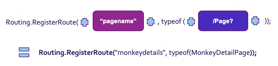
using System;using System.IO;using System.Linq;using Microsoft.ML;using PredictTaxiFareML.Model.DataModels;usingstatic System.Console;usingstatic System.Environment;namespace PredictTaxiFareML.ConsoleApp
{classProgram{privateconststring Quit ="quit";privateconststring ModelPath =@"MLModel.zip";staticvoidMain(string[] args){var context =newMLContext().Model;var model = context.Load(GetPath(ModelPath),out _);var engine = context.CreatePredictionEngine<ModelInput, ModelOutput>(model);WriteLine("== AutoML Interactive Taxi Fare Predictor == ");while(GetInput(outvar input))WriteLine($"{NewLine}Predicted fare: "+
                 $"{engine.Predict(input).Score:C}{NewLine}");}privatestaticboolGetInput(out ModelInput input){WriteLine($"{NewLine}Enter trip details:{NewLine}");

            input =newModelInput{
                Passenger_count =ReadF("Passenger count",1),
                Trip_time_in_secs =ReadF("Trip time (mins)",1)*60,
                Trip_distance =ReadF("Distance (mi)",0),
                Vendor_id =ReadCat("Vendor","VTS","CMD"),
                Rate_code =ReadF("Rate code (0 - 6)",0,6),
                Payment_type =ReadCat("Payment type","CRD","CSH"),};returntrue;}privatestaticfloatReadF(string title,float min =float.MinValue,float max =float.MaxValue){while(true){try{returnClamp(float.Parse(Prompt(title)), min, max);}catch(Exception ex){WriteLine(ex.Message);}}}privatestaticstringReadCat(string title,paramsstring[] values){
            title = $"{title} [{String.Join(",", values)}]";var ret ="";while(!values.Contains(ret))
                ret =Prompt(title);return ret;}privatestaticstringPrompt(string title){Write($"  - {title}: ");returnReadLine().Trim().ToUpper();}privatestaticfloatClamp(float input,float min,float max){var ret = Math.Max(Math.Min(input, max), min);if(Math.Abs(ret - input)>0.1)WriteLine($"Clamping to {ret}");return ret;}privatestaticstringGetPath(string relativePath){var root =newFileInfo(typeof(Program).Assembly.Location);var asmPath = root.Directory.FullName;return Path.Combine(asmPath, relativePath);}}}

That code in action looks like this:

08-interactive-prediction

Wrapping Up

And that’s it! We’ve successfully used Model Builder to automatically generate an optimized model for prediction from our taxi fare dataset. AutoML handled some of the thornier steps for us automatically, letting us benefit from some of the unique features of ML.NET without needing to be a machine learning expert. Hopefully this walkthrough helps to demystify ML.NET a little, and gives you the inspiration to try creating custom models on some of your own data too.

Passing Arguments in Xamarin Forms

$
0
0

Sometimes, we need to find a way to pass some parameters from the XAML to our code behind it, but we just don’t know how to do it. So that’s why in this article we will be learning how easy it is to pass arguments to our controls in XAML. We’ll explore different ways, such as: Passing arguments to non-default constructors, calling factory methods and generic arguments.

The topics we will explain include:

  • Passing arguments
    • Constructor arguments
    • Factory methods
    • Generic methods
  • Data types allowed

Learning to Pass Arguments

Constructor Arguments

Yes! Constructor arguments can be passed from the XAML. Xamarin.Forms allows us to pass these types or arguments through the XAML page.

Let’s see the structure we need to use!

<YourUIControl>
    <UIControl.Property>
    <Property>
    <x:Arguments>
    <x:ArgumentTtype>Your vaule </x:ArgumentType>
    <!--Add all the argument that you need-->
    <x:Arguments>
    </Property>
    </UIControl.Property>
    <YourUIControl>

Imagine that you have to fill the Color’s constructor for a BoxView’s Color property. There are various constructors within the class Color, and one of them gets four values which are Double type. With the structure explained above we just have to do something like this:

<BoxView HeightRequest="150" WidthRequest="150" HorizontalOptions="Center">  
           <BoxView.Color>  
               <Color>  
               <x:Arguments>   
                   <x:Double>0.25</x:Double> 
                   <x:Double>0.50</x:Double> 
                   <x:Double>0.9</x:Double> 
                   <x:Double>0.10</x:Double>  
               </x:Arguments>  
       </Color>  
         </BoxView.Color>  
    </BoxView>

Factory Methods

And if the previous was not enough, with this way of passing arguments, we can also access the factory methods! But first… What are Factory methods? A factory method is a public and static method that returns objects of the same type of parent class. To use it, you just have to add the x:FactoryMethod attribute to the same structure explained in the constructor argument. Right next to the property control UI tags, as I show below:

<Color x:FactoryMethod="FromHex">

An example to use:

<BoxView HeightRequest="150" WidthRequest="150" HorizontalOptions="Center">
      <BoxView.Color>
        <Color x:FactoryMethod="FromHex">
          <x:Arguments>
            <x:String>#FF048B9A</x:String>
          </x:Arguments>
        </Color>
      </BoxView.Color>
</BoxView>


Generic Type Arguments

Finally, we can pass the argument of a generic type. We just have to use the x:TypeArguments attribute, and use the structure as in the following example:
<StackLayout>
    <StackLayout.Margin>
      <OnPlatform x:TypeArguments="Thickness">
        <On Platform="iOS" Value="0,20,0,0" />
        <On Platform="Android" Value="5, 10" />
        <On Platform="UWP" Value="10" />
      </OnPlatform>
    </StackLayout.Margin>
  </StackLayout>

Data Types Allowed

This is a great way to pass arguments from the XAML, but it’s important to know that we have some limitations of the data types that the arguments support. The following table contains all the types that are supported:

Object  Boolean  Byte  Single Array 
 Int16 Int32  Int64 Double DateTime
 Decimal Char String TimeSpan 


Note: When using any of these data types in an argument, you must use the “x:” namespace and the value of the argument must have the following structure:

<x:DataType>YourValue</x:DataType>

Reference

- https://docs.microsoft.com/en-us/xamarin/xamarin-forms/xaml/passing-arguments

Telerik UI for Blazor 2.4.0 – Localization, Grid Scroll and 3.1 Preview 3 Compatibility

$
0
0

Our November 2019 Telerik UI for Blazor releases continue, and we are happy to announce the latest version, 2.4.0, of Telerik UI for Blazor is available for download. It includes Blazor Components Localization, Grid Scrolling and Compatibility with .NET Core 3.1 Preview 3.

Just two weeks after we released Telerik UI for Blazor 2.3.0, which included new BlazorComboBox and Grid Column Resizing, in 2.4.0 we included something big - you can now translate the messages of UI components in Blazor apps. And because we know how important it is for you to continuously enhance the Blazor Grid in this release we worked on enabling you to set the Width property in addition to setting the Grid Height. Last, but not least, in 2.4.0 we have also ensured that Telerik UI for Blazor is compatible with Preview 3 of .NET Core 3.1. Read ahead to find out more.

New Localization in UI for Blazor Components 

Globalization is the process of implementing an application that works in multiple cultures and one of its important aspects is Localization, i.e. being able to customize an app for a given language.

Because we know that Localization is crucial for applications that need to run on markets in different countries, in this release we set the stage for Globalization by implementing Localization. Now you can translate texts and messages related to Blazor UI components.

More details on how to enable Localization in your Blazor app and how Localization works in Telerik UI for Blazor can be found in the official documentation article.

Telerik UI for Blazor Localization

Example of Grid Localization - translated user interface including logical operators

We will continue our efforts to extend your Blazor app Globalization capabilities, and in the upcoming releases you will be able to adapt the components to different cultures and have right-to-left support. 

Blazor Grid Enhancement Column Width and Scroll

You can now control the Grid Width behavior and,depending on the settings you apply, you can have different distribution and potentially Grid Scroll

In the basic case when no column widths are set, the available Grid width is distributed evenly between all Grid columns. In case all column widths are explicitly set and the cumulative column width is greater than the available Grid width, a horizontal scrollbar appears and all set column widths are respected.

Telerik UI for Blazor Grid Scroll

For details on the various scenarios of styling the Telerik UI for Blazor Grid using Width, Height and CSS settings, check out the following articles: Grid Column Width and Grid Styling

Telerik UI for Blazor is Compatible with the .NET Core 3.1 Preview 3 Release

Just days after Microsoft announced the release of Preview 3 of .NET Core 3.1, we happy to state that Telerik UI for Blazor 2.4.0 is fully compatible.

.NET Core 3.1 is a short release focused on key improvements in the two big additions to .NET Core 3.0. - Blazor and Windows desktop. Microsoft has announced that 3.1 will be a long-term support (LTS) release with an expected final ship date of December 2019.

Download Telerik UI for Blazor 2.4.0

Download the latest version of Telerik UI for Blazor Native Components from the Telerik UI for Blazor page and help us shape the future of UI for Blazor by sharing your ideas, features requests and comments with us on the official Telerik UI for Blazor feedback portal

Happy Blazor Coding! 


Discovering the Power of the Expander Control for Xamarin Forms

$
0
0

Learn how to use this handy control to save time when you're developing your next Xamarin app.

As developers, it’s normal for us to find applications that require more complex controls than the more common ones. In these moments we have to choose between building them from scratch or looking for whether the controls we need already exist. If we choose to build them ourselves, we can penalize the development time of the project. So in this post, making use of Telerik UI for Xamarin, in a few steps we will learn how to use one of those uncommon but very, very useful controls for our applications: the Expander.

But … What is the Expander?

The Expander, also called the RadExpander, is a control that allows us to group a set of information (graphic controls), allowing it to collapse and expand, so we can have all the information we need on the screen but save space on the screen design.

RadExpanderBanner


First of All… What Do I Need?

⚠ Important: Telerik UI for Xamarin has a free trial that allows us to explore all the great components they offer for use in our apps.

Let’s Start!

1. Add the following namespace to your app

   xmlns:telerikPrimitives="clr-namespace:Telerik.XamarinForms.Primitives;assembly=Telerik.XamarinForms.Primitives"

2. Learning RadExpander Structure

To add this control, you must use the following structure:

<telerikPrimitives:RadExpander HeaderText="Settings">            
                 <telerikPrimitives:RadExpander.Content>

                        <!-- Here you can add whatever layout that you need-->  
                 </telerikPrimitives:RadExpander.Content>
    </telerikPrimitives:RadExpander>    

As we saw above, we need to enclose our code between these two tags and then just close it. It’s important to know that inside the tags, we can add whatever layout that we need, such as: StackLayout, GridLayout, among others. These are some of my favorite properties.

  • HeaderText:(Obligatory field) This is the name that will be displayed in the header of the expander.

    Telerik UI for Xamarin Expander - Header

  • HeaderLocation: Allows us to set the location that will get the header bar. Values accepted are:
  • Top (Default value)

    Telerik UI for Xamarin Expander - TopBar

  • Bottom

    Telerik UI for Xamarin Expander - BottomBar

  • BorderColor: This is the color that the border of the entire RadExpander will have, including the header bar.

    Telerik UI for Xamarin Expander - Border Color

Now, Let’s See an Example!

<telerikPrimitives:RadExpander x:Name="SettingExpander" HeaderText="Settings" HeaderLocation="Top" BorderColor="#F7AEF0">            
                 <telerikPrimitives:RadExpander.Content>
                    <Grid Margin="20">
                        <Grid.RowDefinitions>
                            <RowDefinition Height="Auto"/>
                            <RowDefinition Height="Auto"/>
                            <RowDefinition Height="Auto"/>
                        </Grid.RowDefinitions>
                        <Grid.ColumnDefinitions>
                            <ColumnDefinition Width="Auto"/>
                            <ColumnDefinition Width="Auto"/>
                        </Grid.ColumnDefinitions>

                        <telerikPrimitives:RadCheckBox Grid.Row="0" Grid.Column="0" />
                        <Label Grid.Row="0" Grid.Column="1" Text="Turn On WIFI" />

                        <telerikPrimitives:RadCheckBox Grid.Row="1" Grid.Column="0" />
                        <Label Grid.Row="1" Grid.Column="1" Text="Turn On Bluetooth" />

                        <telerikPrimitives:RadCheckBox Grid.Row="2" Grid.Column="0" />
                        <Label Grid.Row="2" Grid.Column="1" Text="Airplane mode"/>
                    </Grid>
                 </telerikPrimitives:RadExpander.Content>
         </telerikPrimitives:RadExpander>

Good look with your implementation! Thanks for reading !

Learn More

Check out the Telerik UI for Xamarin docs to learn more about how this control works.

Reduce Self-Contained App Size with the Latest .NET Core Features

$
0
0

New improvements in .NET Core make it simple to decrease the size of your self-contained apps. Check out this quick tip and see how easy it is to trim things down.

.NET Core allows you to build a self-contained (portable) version of your application. When this approach is used, all the .NET Core and other referenced assemblies are shipped with the application. This significantly increases the application size, and even a simple application can take a significant amount of space. This is not an issue for a development or a workstation machine but can be an issue if you are using Xamarin for example, where you need to redistribute the application to the clients’ phones

.NET Core 3+ ships with an IL Linker which allows you to reduce the size of the self-contained application. It automatically determines which assemblies are needed and copies only them.

I have ported the HotelApp form the Telerik UI for WinForms demo application to .NET Core to test this feature. I have published the application with the standard configuration first.

trimed_core_app001

Then I used the trimmed configuration. In the latest Visual Studio Preview version, you can specify this from the UI, and there is no need to edit the project file manually.  

trimed_core_app002

The following image shows the difference.

trimed_core_app003

This feature just saved 50 megabytes in this case, and I believe it is great amount of space considering that the portable version should include the frameworks assemblies as well.

Try It Out and Share Your Feedback

The R3 2019 SP for Telerik UI for WinForms is already available for download in customers’ accounts. If you are new to Telerik UI for WinForms, you can learn more about it via the product page. It comes with a 30-day free trial, giving you some time to explore the toolkit and consider using it for your current or upcoming WinForms development.


Your Monthly November Fill of Telerik UI for ASP.NET Core

$
0
0

In this November wrapup, we highlight the top developments from the last month and give you a sneak preview of two new components.

As we look back on November, we on the Telerik UI for ASP.NET Core team we want to share updates from the last month, highlight important deliveries and give you more details on what’s coming next in the .NET Core world and UI for ASP.NET Core.

November Updates for Telerik UI for ASP.NET Core

Telerik UI for ASP.NET Core Service Pack R3 2019

At the end of last month we published the R3 2019 service pack of Telerik UI for ASP.NET Core. The release includes cool updates to our Editor components allowing you to merge and split of tables cells, updates to our Date and Time Input and Picker controls, as well as multiple other improvements and enhancements in the UI for ASP.NET Core suite. Check out the full list of the R3 Service Pack Release Contents here.

And in case you missed the Telerik R3 2019 Webinar revealing the new components and features in Telerik UI for ASP.NET Core, you can watch a recording here.

Sneak Preview of What We Are Currently Working On

We are happy to share with you the design of one of our new components that we are going to add to our R1 2020 release: the Badge Button.

Telerik UI for ASP.NET Core Button Badge

The Button Badge Component that will enable you to subtly alert users of your applications for status changes, notifications or short messages.

Soon, you will also be able to take advantage of the new Breadcrumb component and be able to provide a great way to navigate in your apps.

Telerik UI for ASP.NET Core Breadcrumb

Telerik UI for ASP.NET Core using Visual Studio for Mac

Earlier this month, Microsoft announced the release of Visual Studio 2019 for Mac version 8.3 and you can now use Telerik UI for ASP.NET Core controls in your projects VS projects on Mac. We have created special getting started documentation and video resources to enable your project work in Visual Studio for Mac.

Compatibility with Preview Versions of .NET Core 3.1

.NET Core is constantly evolving and NET Core 3.1 is a short release focused on key improvements in the two big additions to .NET Core 3.0. - Blazor and Windows desktop. Microsoft has announced that .NET Core 3.1 will be a long-term support (LTS) release with an expected final ship date in the first week of December 2019.

Throughout December, we will ensure on a regular basis that the Telerik UI for ASP.NET Core component suite is compatible with the latest preview releases by Microsoft.

Looking Into 2020

2020 is going the be big for the .NET Core world! Exciting times are coming with the introduction of client-side Blazor in May and .NET 5 in November.

To jump start your new ASP.NET Core Coding Year of 2020, the Telerik UI for ASP.NET Core team is already working hard to deliver to you in January the following new components and features:

  • New ASP.NET Core Component File Manager
  • New ASP.NET Core Breadcrumbs Component
  • New Badge for Button Component
  • Component Enhancements
  • Accessibility Improvements 
  • Compatibility with .NET Core 3.1

Try Out Our New Components and Let Us Know What You Think

For those if you who already tried out the latest ASP.NET Core components Timeline, Filter,Rating, Card , Diagram, Search Panel in the Grid, DPL - we would love to hear your feedback.

Telerik UI for ASP.NET Core Rating 

Vote and submit ideas for new components and features on the official Telerik UI for ASP.NET Core feedback portal and have direct influence on the 2020 roadmap and beyond.

Download and Install the Latest Telerik UI for ASP.NET Core

To make sure you have access to the latest current Service Pack R3 2019 from our components and feature set, download the latest version from Your Telerik Account or via the Progress Control Panel. If you are planning your next great application and wonder what cool enhancements are coming out soon, check our What’s New Page or the Telerik UI for ASP.NET Core Roadmap page.

Creating a Single EXE Application with .NET Core

$
0
0

Learn how to use one of the new features in .NET Core to easily create a single EXE app that is entirely self-contained.

One of the cool new features in .NET Core 3.0 is that you can easily build a single EXE file that contains the entire application. The merged EXE will contain all .NET Core files, and this means that you do not need to install anything on the client machine. You do not have to know if a specific framework is installed as well (we all know the “application requires one of the following versions of .NET Framework” message). I believe that this is a cool feature for people who need to run their applications on several machines and do not know what is installed. The support staff can benefit from it as well, for example when they need to test a specific version on the client machine.

In this blog, I want to use one of our sample applications to demonstrate this feature. I have ported the HotelApp from the Telerik UI for WinForms demo application to .NET Core 3.

In the latest Visual Studio 2019 Preview there is no need to use a command anymore, and you can do this from the UI. First, right-click on the project and then hit Publish, then select folder and click create.

portable-core-app001

Click the edit button to edit the configuration.

portable-core-app002

In the publish configuration you can check the single EXE option.

portable-core-app003

Once ready, save and click Publish. You can now go to the publish folder and get your app.  I have tested the application on several machines, and it works without issues. The entire package is a large (200MB), but it contains all needed assemblies.

portable-core-app004

Try It Out and Share Your Feedback

The R3 2019 SP of Telerik UI for WinForms is already available for download in customers’ accounts. If you are new to Telerik UI for WinForms, you can learn more about it via the product page. It comes with a 30-day free trial, giving you some time to explore the toolkit and consider using it for your current or upcoming WinForms development.

Create, Modify & Export Documents with WordsProcessing for Xamarin.Forms

$
0
0

Need to generate Docx, HTML, RTF or PDF documents in your Xamarin App? Telerik UI for Xamarin has a solution for you - our new WordsProcessing library.

telerik-ui-for-xamarin-wordsprocessing

It has never been easier to generate, modify and export a document in your mobile application! The RadWordsProcessing library enables you to easily generate and export documents in various formats, including:

  • PDF
  • Docx
  • RTF
  • HTML
  • Plain text

The library comes in handy all cases where document or PDF generation is needed, such as PDF invoice generation for an e-commerce app, or to serve the user with a filled application form in Docx format.

With our document processing library you can quickly access each element in a given document, modify, remove it or add a new one. Additionally, the generated content can be saved as a stream, file, or send to the client browser.

In this blog post, we will familiarize you with the RadWordsProcessing structure and the features it provides.

WordsProcessing Structure

The document model of RadWordsProcessing for Xamarin includes all necessary elements and features of a document, including:

  • Sectionsthat can be customized using the properties exposed by the corresponding class. Headers, footers, and watermarks for a section can be customized as well.
  • Paragraphswhose properties and methods enable you to change its collection of inlines and appearance.
  • Tablesequipped with an API,allowing you to easily insert, edit, and remove from the document. Their rows, cells, appearance, and content are also flexible, with various changes and manipulations possible.
  • Inlines, including Runs, Images, as well as inline and floating images, Fields, Breaks, Bookmarks, Hyperlinks and Tab stops.
  • Styles: the documents processing model includes a repository of Style objects containing sets of character, paragraph or table style properties. Additionally, you can create custom styles and use them throughout the document.

Supported Formats

In addition to the smooth creation, modification, import and export of files, RadWordsProcessing gives you the ability to convert between variety of formats - convert Docx to PDF or HTML to Docx in your Xamarin apps. The currently supported formats are Docx, RTF, HTML, PDF and plain text.

The processing library doesn’t need any external dependencies in order to convert documents from/to the supported formats - the document model is UI-independent and can be used on both server and client-side.

Features

In addition to being able to create, modify, and export a document, RadWordsProcessing has some additional sweet features, including:

  • Inline & floating images: support for inline & floating images for the most popular formats, including support for working with image properties such as Source, Size, Flip, Rotation, AspectRatio, etc.
  • Bookmarks & hyperlinks: enable your users to easily navigate a document with bookmarks and hyperlinks
  • Watermarks: identify document status or mark it as confidential with watermarks
  • Create documents indifferent file formats, for example:

    generate documents

privateRadFlowDocument CreateDocument()
{
RadFlowDocument document = newRadFlowDocument();
RadFlowDocumentEditor editor = newRadFlowDocumentEditor(document);
editor.ParagraphFormatting.TextAlignment.LocalValue = Alignment.Justified;
editor.InsertLine("Dear Telerik User,");
editor.InsertText("We’re happy to introduce the new Telerik RadWordsProcessing component for Xamarin Forms. High performance library that enables you to read, write and manipulate documents in DOCX, RTF and plain text format. The document model is independent from UI and ");
Run run = editor.InsertText("does not require");
run.Underline.Pattern = UnderlinePattern.Single;
editor.InsertLine(" Microsoft Office.");
editor.InsertText("The current community preview version comes with full rich-text capabilities including ");
editor.InsertText("bold, ").FontWeight = FontWeights.Bold;
editor.InsertText("italic, ").FontStyle = FontStyles.Italic;
editor.InsertText("underline,").Underline.Pattern = UnderlinePattern.Single;
editor.InsertText(" font sizes and ").FontSize = 20;
editor.InsertText("colors ").ForegroundColor = GreenColor;
editor.InsertLine("as well as text alignment and indentation. Other options include tables, hyperlinks, inline and floating images. Even more sweetness is added by the built-in styles and themes.");
editor.InsertText("Here at Telerik we strive to provide the best services possible and fulfill all needs you as a customer may have. We would appreciate any feedback you send our way through the ");
editor.InsertHyperlink("public forums", "http://www.telerik.com/forums", false, "Telerik Forums");
editor.InsertLine(" or support ticketing system.");
editor.InsertLine("We hope you’ll enjoy RadWordsProcessing as much as we do. Happy coding!");
editor.InsertParagraph();
editor.InsertText("Kind regards,");
returndocument;
}
  • Easily Find all instances of a string And Replace it with another through the ReplaceText() method of the RadFlowDocumentEditor.
privatevoidReplaceText()
{
if(string.IsNullOrEmpty(this.findWhat))
{
return;
}
RadFlowDocumentEditor editor = newRadFlowDocumentEditor(this.replacedDocument);
if(this.useRegex)
{
Regex oldTextRegex = newRegex(this.findWhat);
editor.ReplaceText(oldTextRegex, this.replaceWith);
}
else
{
editor.ReplaceText(this.findWhat, this.replaceWith, this.matchCase, this.matchWholeWord);
}
}

The full demo project can be found here.

  • Insert Documents at a Specific Position using the InsertDocument() method.
  • Merge two RadFlowDocument instance using the Merge() method.
RadFlowDocument target = newRadFlowDocument();
RadFlowDocument source = newRadFlowDocument();
//...
// target will contain merged content and styles.
target.Merge(source);

Here the document you wish to add content to is called target and the document from which you wish to take the content is called source.

Export documents in different formats:

export documents

Tell Us What You Think

Have we caught your interest with the new RadWordsProcessing library for Xamarin.Forms and its features? You can find various demos of the processing library in our Telerik UI for Xamarin Demo application.

I hope that this information will get you started with the processing library— as always, any feedback on it is highly appreciated. If you have any ideas for features, not hesitate to share this information with us on our Telerik Document Processing Feedback Portal.

If this is the first time you're hearing about Telerik UI for Xamarin, you can find more information about it on our website or dive right into a free 30-day trial today.

Happy coding with our controls!

Localization in Blazor UI​

$
0
0

As of the 2.4.0 release, the Telerik UI for Blazor components let you do that by exposing a service interface that you can implement to return the desired localized texts. If you don’t provide such a service implementation, we quietly fall back to the default English texts. 

telerik blazor grid localization in action

We follow the general .NET Core approach for relying on Dependency Injection (DI) to get work done in an app. There are so many ways you can implement this service, that I won’t even try to guess – databases, static resources (such as resx files), generated static classes, third party services, you name it – the world is your oyster and you can do whatever you need and reuse whatever you already have.

We will take a closer look at one approach that may let you reuse a lot of code/logic, especially if you have created other (Telerik-based) .NET apps. It is .resx files. In UI for Blazor we use the same resources as the UI for ASP.NET MVC suite, so you can carry over translations you’ve already made and use tools you’re already familiar with.

The WASM Flavor

Before I add the links to the code examples, I need to mention the Client-side (WASM) flavor. At the time of writing, there seems to be no standard or recommended way to set the thread culture and to localize such an app.

Don’t despair, it is not yet official, and besides - there are some sample solutions online (such as using JS Interop to get the current browser culture while initializing the app and to set the thread culture) and I will leave the exact architecture choice to you. We just have to wait and see what the future will bring.

What pertains to the examples we prepared is that while in a server-side Blazor app .resx files will work out-of-the-box, this is not the case with a WASM app. So, we prepared an example that lets you reuse .resx files in a client-side (WASM) Blazor app as well.

Finally, Code Time

Here are the links you need:

What’s Next

Localization is only one part of globalizing an app, and using date and number format strings to match the culture of the user is also very important. The user would like to see their own currency marker, the decimal separators they are used to, the date formats, month and day names they know. And they will demand it from your app, so we will provide this for you. We are working on format support as I am writing this post, and it will be available in our next release – 2.5.0. Stay tuned!

Download Telerik UI for Blazor 2.4.0

See how much better your app will look and how much happier your users will be once you enable them to select their preferred language. Download the latest 2.4.0 version of Telerik UI for Blazor Native Components from the Telerik UI for Blazor page.

Happy Blazor Coding!


Globalization in Blazor UI

$
0
0

We are here to help – since 2.4.0 Telerik UI for Blazor components have supported localized translations, and now with 2.5.0 we implemented the other part of the globalization feature – taking the CurrentCulture from the thread and using it to render the appropriate formats for dates and numbers.

For example, if the culture is de-DE, the user will see the Euro symbol from a number formatted as a currency in the NumericTextBox, but if the culture is en-US, they will see a $ sign.

blazor-currency-culture 

This also applies to dates – the default formats, month names, day names and so on are taken from the culture. You can see this all in one place in the DateTimePicker.

Here’s how this compares in the underlying DateInput – this screenshot is from the list of standard format strings from the Supported Formats.

blazor-standard-format-strings-with-culture 

Code Time

Or, rather, codeless time - there isn’t a single line of code you need to write for the Telerik components to support number and date formatting. We simply read the current thread culture that you set in your app.

What’s Next

In addition to adding major components and features, we are also working on general functionality that will affect the entire range. We have RTL support, Keyboard support (navigation) and Accessibility (such as WAI-ARIA and WCAG compliance) on our radar, and we are working on implementing these features as well. As usual, stay tuned!

Telerik UI for Blazor 2.5.0 – Scheduler, Globalization and .NET Core 3.1 GA Compatibility!

$
0
0

As we are approaching the end of an amazing 2019 (21 releases with more than 25 Blazor UI components), we are thrilled to announce the latest release 2.5.0 of Telerik UI for Blazor!

Something exciting that the team has been working over for the last few weeks is now available for download - the Scheduler! In November we announced the release of Localization in UI for Blazor. In 2.5.0 we expanded on Internationalization and included Globalization. Last but not least, in 2.5.0 we have also ensured that Telerik UI for Blazor is compatible with the official release of .NET Core 3.1. Read on to learn more.

New Blazor Scheduler Component

The Blazor UI Scheduler has been one of the most voted requests, so we put a lot of effort to make sure you can plug it in your apps soon - your events, appointments and tasks have a new home called  <TelerikScheduler> !

Blazor Scheduler Overview

The Scheduler is a feature-rich and powerful component that allows you to add, edit and visualize appointments, while also providing options to customize and look and feel by selecting different views.

Telerik UI for Blazor Scheduler

To add it in your application simply add the <TelerikScheduler>  tag and populate its Data property. The cool thing is that if your model uses the default fields names, you only need to define the Scheduler appearance properties and views.

<TelerikSchedulerData="@Appointments"Height="600px"Width="800px">
   <SchedulerViews>
       <SchedulerDayView/>
   </SchedulerViews>
</TelerikScheduler>
 In case you want to adapt the view you can specify in the tag <SchedulerViews>Currently UI for Blazor supports : SchedulerDayView, SchedulerMultiDayView, SchedulerWeekView with plans to add more in our upcoming releases. You can additionally set the start and end dates of the SchedulerViews .

<TelerikSchedulerData="@Appointments"Height="600px"Width="800px">
   <SchedulerViews>
        <SchedulerDayViewStartTime="@DayStart"EndTime="@DayEnd"WorkDayStart="@WorkDayStart"WorkDayEnd="@WorkDayEnd"/>
        <SchedulerWeekViewStartTime="@DayStart"EndTime="@DayEnd"WorkDayStart="@WorkDayStart"WorkDayEnd="@WorkDayEnd"/>
        <SchedulerMultiDayViewStartTime="@DayStart"EndTime="@DayEnd"WorkDayStart="@WorkDayStart"WorkDayEnd="@WorkDayEnd"NumberOfDays="10"/>
    </SchedulerViews>
</TelerikScheduler>

Telerik UI for Blazor Scheduler
 

Scheduler Appointments

For each event/appointment in the Scheduler you can set the following fields:

  • Title – short appointment title that would bring meaning to the user such as “Sprint Demo Meeting”
  • Start - start date and time of the appointment
  • End - start date and time of the appointment
  • Description - detailed description of the appointment
  • IsAllDay – specifies whether the appointment is with a whole day duration or specific time interval
Telerik UI for Blazor Appointment Editing

Need appointment validation? No problem – to make it easier for you, the component has built-in validation for the Title, Start and Date fields.

Scheduler Navigation

The Scheduler provides multiple ways to navigate it – both from an user perspective and as a developer. Users can change the currently shown time range, choose from several available views, and toggling between business and full day hours.

If you need to utilize navigation via code you can refer to the UI for Blazor Navigation article. 

Telerik UI for Blazor Scheduler

 
Scheduler Events

Telerik Scheduler for Blazor has the following events available as of 2.5.0 release:

  • CUD Events– needed for managing appointment editing. The Scheduler exposes OnCreate, OnDelete and OnUpdate events to help you update data in the view model and the underlying database and OnEdit and OnCancel for implementing custom logic
  • DateChanged– fires when the user navigates to another day
  • ViewChanged– fires when the user changes the Scheduler view

And this is just the start. Stay tuned for more cool Scheduler features in our upcoming release.

New in UI for Blazor Globalization

If your Blazor app is going to conquer the world, it needsInternationalization– translation of UI components texts to multiple languages, adapting value formatting based on specific culture, and even right-to-left support. Since 2.4.0 release the Telerik UI for Blazor components have supported localized translations, and in 2.5.0 we implemented Globalization– the ability to read CurrentCulture and render the date formats, currencies and numbers accordingly.

Read more on Globalization in UI for Blazor in the dedicated blog post.

UI for Blazor is Compatible with .NET Core 3.1 Official Release!

.NET Core 3.1 has been officially released by Microsoft and is ready to be used in any business or user scenario, and the good news is that Telerik UI for Blazor 2.5.0 is fully compatible!

.NET Core 3.1 is a small set of fixes and refinements over .NET Core 3.0, which was released in September 2019. It is a long-term supported (LTS) release and will be supported for three years.

Download Telerik UI for Blazor 2.5.0

The 2.5.0 version of Telerik UI for Blazor Native Components is available for download from the Telerik UI for Blazor page!

Thank you for contributing and being part of the amazing UI for Blazor community! Keep sharing your ideas, features requests and comments with us on the official Telerik UI for Blazor feedback portal.

Looking Forward to an Amazing Blazing 2020!

Telerik Blazor Team at Progress

An Introduction to Xamarin Forms Shell

$
0
0

Sometimes we invest too much time building applications with complex navigations, which makes us extend the delivery period of the app and, therefore, the costs to our customers. That’s why in this article we will be learning about Xamarin.Forms Shell.

Xamarin Forms Shell

We will learn the following topics:

➖ What is Xamarin.Forms Shell?

➖ Its main advantages

➖ How to create a page in Shell

➖ Knowing the hierarchy of an App in Shell

➖ Flyout

➖ Navigation

Let's start!

What is Xamarin.Forms Shell?

Xamarin.Forms Shell is a container which aims to improve the navigation complexity of our applications.

Main Advantages of Xamarin.Forms Shell

Among its main advantages we have the following:

Reduces the complexity of mobile application development

Provides a common browsing user experience

Uses a URI-based navigation scheme

Has an integrated search controller

Now Let's Create a Page in Shell! ‍♀

To create our page in Shell, we must perform the following steps:

1. Let's go to the XAML!

We are going to create a page called AppShell.xaml. When you create an XAML, a predefined structure is automatically generated, to which we only have to add the <Shell> tags and you should have a structure like this:

<?xml version="1.0" encoding="UTF-8" ?>
    <Shell
          xmlns="http://xamarin.com/schemas/2014/forms"
          xmlns:x="http://schemas.microsoft.com/winfx/2009/xaml"
          xmlns:views="clr-namespace:ShellNavigationSample.Views"
          x:Class="ShellNavigationSample.AppShell">

    </Shell>

2. Inherited from the Shell Class

When creating the XAML a code-behind of the page was also generated, which, according to our example, should be called AppShell.xaml.cs. Here we must inherit from the class Shell:

    public partial class AppShell : Shell
    {
         public AppShell()
         {
              InitializeComponent();
         }
    }

And with these two simple steps our application is ready to work in Shell.

Now, Let’s Learn about the Hierarchy of an App in Shell

Once the page is created, we need to add the components that will allow us to make the navigation and design of our app. This Shell has given us a structure with which we can work in a very easy and practical way!

Hierarchical Structure

1. FlyoutItem or Tabbar
    2. Tab
        3. ShellContent

FlyoutItem or Tabbar: Represents one or more Items in the Flyout.

Tab: Groups the content into Tabs.

ShellContent: Represents the ContentPage in the App. When more than one is added, they are represented in Tabs.

What Is the Flyout?

Among the components that we need to add to our page, we have the Flyout, which facilitates navigation and design through a menu.

Flyout is a drop-down menu that can be accessed through the hamburger icon or by simply sliding your finger from left to right.

It is composed of the following elements:

Header

Flyout items

Menu Items

Header, Flyout and Menu

Let’s See an Example of How To Do It

<Shell xmlns="http://xamarin.com/schemas/2014/forms"
           xmlns:x="http://schemas.microsoft.com/winfx/2009/xaml"
           xmlns:views="clr-namespace:Xaminals.Views"
           x:Class="Xaminals.AppShell">
        ...
        <FlyoutItem Title="Animals"
                    FlyoutDisplayOptions="AsMultipleItems">
            <Tab Title="Domestic"
                 Icon="paw.png">
                <ShellContent Title="Cats"
                              Icon="cat.png">
                    <views:CatsPage />
                </ShellContent>
                <ShellContent Title="Dogs"
                              Icon="dog.png">
                    <views:DogsPage />
                </ShellContent>
            </Tab>
            <ShellContent Title="Monkeys"
                          Icon="monkey.png">
                <views:MonkeysPage />
            </ShellContent>
            <ShellContent Title="Elephants"
                          Icon="elephant.png">  
                <views:ElephantsPage />
            </ShellContent>
            <ShellContent Title="Bears"
                          Icon="bear.png">
                <views:BearsPage />
            </ShellContent>
        </FlyoutItem>
        ...
    </Shell>

Image and example obtained from official documentation.

Once our pages are built, we need to be able to navigate between them. One of the most interesting parts of Shell is the ease with which it allows us to navigate through routes. Let’s see!

Shell performs navigation by specifying a URI, which can have three components:

Route, Page, Query Parameters - Navigation

Route: Define the path to the content that exists as part of the Shell visual hierarchy.

Page: Pages that do not exist in the Shell visual hierarchy can be inserted into the navigation stack from anywhere within an app.

Query parameters: They are query parameters that can be passed to the landing page while browsing.

URI structure

With the three previous elements, the structure of the route will be as follows:

Route, Page, Query Parameters - URI

// Route + /page? + QueryParameters = //route/page?queryParameters

Registering the Routes

To register a route, we must only add the property Route followed by the name of the route:

<Shell>
       <FlyoutItem Route="animals">
              <Tab Route="domestic">
                  <ShellContent Route="cats" />
                  <ShellContent Route="dogs" />
              </Tab>
            <ShellContent Route="monkeys" />
            <ShellContent Route="elephants" />
            <ShellContent Route="bears" />
        </FlyoutItem>
        <ShellContent Route="about" />
    </Shell>

Viewing the Routes

The routes added above take the hierarchy of the parent elements, so if we want to visualize in a faster way how the indicated structure will look, we will obtain a result like this:

Viewing Routes

Animals
   domestic
     cats
     dogs
 monkeys
 elephants
 bears
about 

Now let's recreate the routes!

In the following examples, some scenarios of access to the different routes of our example were indicated:

I want to go to... dogs ➡ //animals/domestic/dogs
domestic ➡ //animals/domestic
about ➡ //about

Registering the Pages

To register the pages, we just have to add the following line. Below I explain its structure:

Registering Pages

Routing.RegisterRoute( + "pagename" + "typeof(" + "/Page?" + ));= Routing.RegisterRoute("monkeydetails", typeof(MonkeyDetailPage));

Types of Routes

Shell has two types of routes:

Types of Routes - Absolute

Absolute: Browse by specifying a valid absolute URI as an argument for the GoToAsync method.

Example: await Shell.Current.GoToAsync("//animals/monkeys");

Types of Routes - Relative

Relative: Navigation is also done by specifying a valid relative URI as an argument for the GoToAsync method. The system will attempt to search for URIs that match a ShellContent object.

Example: await Shell.Current.GoToAsync("monkeydetails");

Ready!

Our Shell app is ready to start!

Thanks for reading my article!

References:

https://docs.microsoft.com/en-us/xamarin/xamarin-forms/app-fundamentals/shell/introduction

Get Familiar with the Latest Features of Telerik PdfViewer for Xamarin

$
0
0

Text selection and link annotations are now part of the Telerik Xamarin PdfViewer control! Explore the powerful new features of our R3 2019 release.

There are some great new capabilities in the latest release of Telerik UI for Xamarin. The text selection and link annotations features will add more interactivity to your PDF documents, enabling end users to select any text from the document and copy it. Link annotations, on the other hand, will allow navigating to an external hyperlink or to another place within the same document. Let’s take a closer look at these features.

Text Selection

Just tap and hold on any text within the PDF document displayed in RadPdfViewer – the text will be highlighted and the two drag handles will enable you to manipulate the selection. In addition, as soon as the selection is made, PdfViewer displays a customizable SelectionMenu with a default Copy command allowing you to retrieve the selected text. A GIF is worth a thousand words, so let's see this capability in action:

xamarin_pdfviewer_textselection

Additionally, RadPdfViewer provides some useful customization capabilities related to text selection, so you can fine-tune the appearance of the selected text, the handles and the selection menu. All these settings can be applied through the SelectionSettings property of RadPdfViewer.

For example. let's modify the colors used for text selection:

<telerikPdfViewer:RadPdfViewer.SelectionSettings>
    <telerikPdfViewer:SelectionSettings
                SelectionIndicatorColor="{StaticResource MainColor}"
                SelectionFill="{StaticResource MainColorTranslucent}"/>
    </telerikPdfViewer:RadPdfViewer.SelectionSettings>
</telerikPdfViewer:RadPdfViewer>

Where the referenced StaticResources are defined in a MergedDictionary:

<ResourceDictionary>
    <Colorx:Key="MainColor">#FC5173</Color>
    <Colorx:Key="MainColorTranslucent">#4DFD8BA2</Color>
    <StyleTargetType="telerikPdfViewer:SelectionMenu">
        <SetterProperty="Fill"Value="{StaticResource MainColor}"/>
    </Style>         
</ResourceDictionary>

And the result on Android and iOS:

PdfViewer Text Selection

By default, the selection menu includes a Copy command which copies the selected text into the clipboard. This setting is, of course, configurable – you can easily add various commands to the menu through the provided flexible API. The SelectionSettings class exposes MenuItems collection of SelectionMenuItem objects, each of them providing Text and Command properties. To learn more about this, please go to the Text Selection documentation topic where an example is also provided.

Link Annotations

R3 2019 ships support for link annotations as well. There are two types of link annotations: annotations that point to absolute URLs, and those that point to a location within the document.

RadPdfViewer is capable of properly treating them both.

In the case with hyperlinks, tapping on the link will have а browser open, navigated to the respective address. Keep in mind this still depends on the platform - we’re using the Device.OpenUri method to navigate to the corresponding URL. In the second case (annotations pointing to bookmarks within the document), upon tap, the view port will be scrolled to the specified destination. This is a particularly useful capability if you have a table of contents at the beginning of the PDF document.

Check out the GIF below to see how RadPdfViewer handles a link annotation that points to a hyperlink:

xamarin_pdfviewer_linkannotations

An extension point for customizing the URL navigation behavior is also available - RadPdfViewer provides LinkAnnotationTapped event that can be used to plug custom logic related to links in the PDF document. Find out more about this in our documentation topic on Link Annotations.

Tell Us What You Think

As always, we would love to hear your feedback about the PdfViewer component and how we can improve it. If you have any ideas for features to add, do not hesitate to share this information with us on our Telerik UI for Xamarin Feedback portal.

Still haven't tried Telerik UI for Xamarin? The free trial is right here waiting for you to give it a try and explore all the components provided in the suite.

Telerik UI for Blazor & Telerik Reporting Join Forces this January

$
0
0

In the upcoming Telerik R1 2020 release, Telerik UI for Blazor and Telerik Reporting will join together to make it easy to embed reports in your Blazor apps.

Telerik UI for Blazor was the first set of native UI components for Blazor on the market, and our fast-growing component suite enables developers to build the next generation of web applications with less time and effort. 

Telerik Reporting is the most complete yet lightweight reporting solution that can be embedded in any web application seamlessly.

Now, these two will come together in perfect harmony with the Telerik R1 2020 Release.

Telerik Reporting will introduce a new report viewer for Blazor wrapping the flexible HTML5/JS web report viewer that will ensure the easy and fast preview of reports directly into a Blazor application.

With this new addition any web developer will be empowered to:

  • Add reporting functionality to the application built with Blazor
  • Style the viewer using our flexible Kendo UI themes to match the look of the Blazor application

Along with that, we continue improving the newly released Web-Based Report Designer in Telerik Reporting. It enables developers to bring report editing functionality to their end users right from their web applications. It also brings a lot of UX improvements and simplifications compared to classic report designers.

With Telerik UI for Blazor and Telerik Reporting every developer can be perfectly equipped for the new era of web development! Stay tuned!

Learn More at the Webinar

This is just a small preview of what’s to come! For more information you’ll have to wait on the official release on January 15, 2020. If you want to be extra prepared and get an in-depth look at this and everything new in web development, you should register for our live webinar on January 21st.

Tried Telerik DevCraft?

While you’re anxiously awaiting January 15, 2020 so you can start playing with the latest cool features and functionality, make sure you’ve downloaded a trial or purchased DevCraft.

DevCraft is the finest developer tooling collection which includes modern, feature-rich and professionally designed UI components, and reporting and productivity tools from the Telerik and Kendo UI suites. DevCraft will arm you with everything you need to deliver outstanding applications in less time and with less effort. With the backup of our legendary support team, which consists of the developers who actually build the products, you can rest assured that you have a stable partner to rely on along your journey.

Viewing all 1954 articles
Browse latest View live