Quantcast
Channel: Telerik Blogs | .NET
Viewing all 1954 articles
Browse latest View live

Improve Your Application's Navigation with New Breadcrumb in Telerik UI for WinForms

$
0
0

Learn about the improvements in our newly redesigned breadcrumb control in Telerik UI for WinForms, with tips for how to get the most out of it.

Breadcrumbs (or breadcrumb trail) is a secondary navigation system that shows a user’s location in a website or application. The term came from the Hansel and Gretel fairy tale in which the main characters create a trail of breadcrumbs in order to track their way back to the house. Just as described in the fairy tale, users need to know their location within the app, as well as track the navigation history.

The old RadBreadCrumb was composed of StackLayoutPanel that hosts a collection of RadSplitButtonElements. Each RadSplitButtonElement represents a node in the hierarchy to the full path of the selected node. This works correctly, but there were several disadvantages of the current implementation which we wanted to improve. This is why we are happy to announce a brand new RadBreadCrumb control!

RadBreadCrumb Navigation

RadBreadCrumb is a navigation control that allows users to navigate through a tree structure, like the Windows file explorer, the document object model in HTML or the organizational hierarchy structure in a company. It can be used to define the application navigation, or to display more complex hierarchical data.

breadcrumb-navigation

Thanks to its advanced capabilities, RadBreadCrumb will significantly improve the navigation and performance of your application. Here are some of the key features:

TreeView Integration

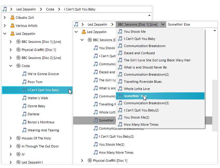
RadBreadCrumb provides an easy way to connect to a RadTreeView control instance, and it will show the path to the currently selected node as a sequence of drop-down buttons. Each button can be used to navigate to a specific node in the tree. Breadcrumbs are most appropriate when your data has a deep hierarchical structure with many levels.

treeview-integration

Data Binding

With its powerful data-binding mechanism, the control lets you display hierarchical structures, such as directories and relational data. It can be bound to any IList or IBindingList data source and it will display the data source hierarchical structure, where the user can navigate it. In addition, unbound mode is also supported if you need to populate the items manually.

Text Editing and Auto-Complete

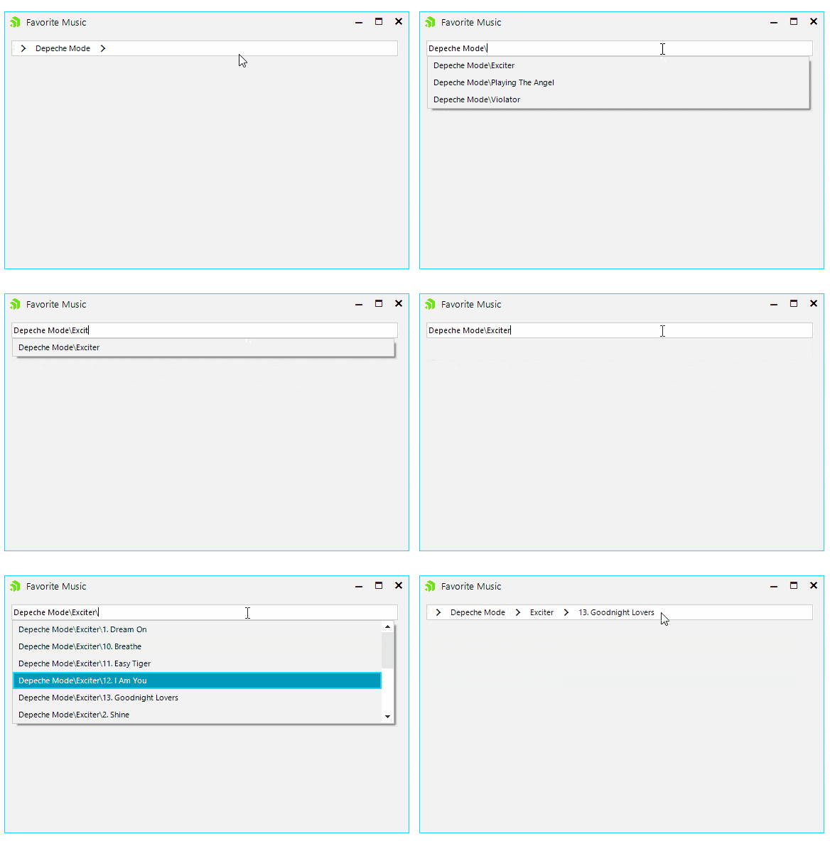
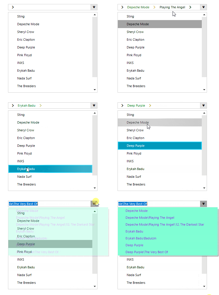
Text editing is very useful feature when the user needs to enter the desired location manually instead of selecting it with the mouse. Complimented by the powerful auto-complete mechanism, it makes this task flawless.

this.radBreadCrumb1.IsTextModeEnabled = true;
this.radBreadCrumb1.IsAutoCompleteEnabled = true;

auto-comlete

History

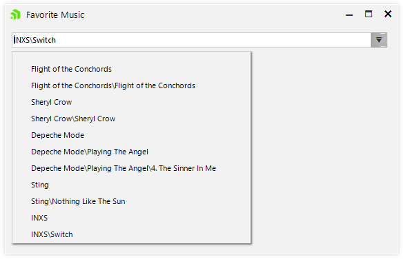
Another key feature is that recently visited places can be saved and displayed in a convenient drop-down so the user can navigate between them easily.

this.radBreadCrumb1.IsHistoryEnabled = true;

history

Auto-Hide Items

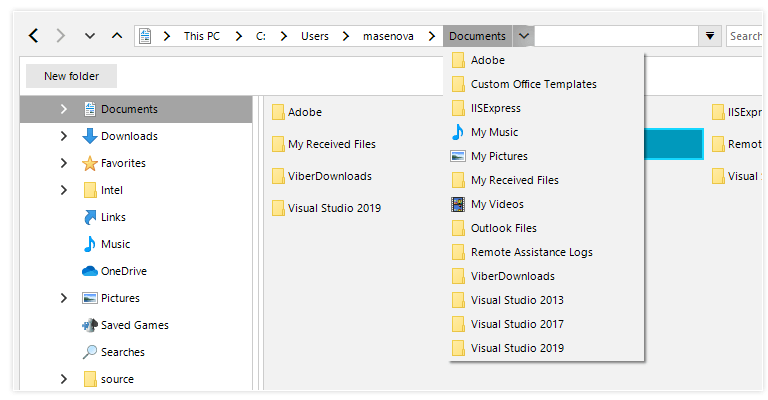
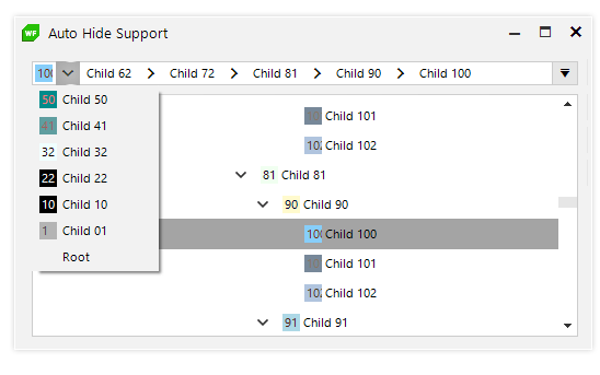
Auto-hide items comes in handy when the hierarchical path is longer than the control length. In this case the RadBreadCrumb control will conveniently display the latter part of the hierarchy, so the user is aware of his selection. All the hidden items will be displayed in a popup menu when click on the header button.

auto-hide

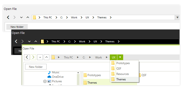
Fully Themable

The RadBreadCrumb control is shipped with a rich set of themes that allow you to easily build slick interfaces with the look and feel of some of the latest Windows and Office versions.

themes

Exposed Events

The rich variety of exposed events that the Telerik Presentation Framework provides allows you to easily achieve more complex scenarios by implementing your own logic and customizing the look and feel of RadBreadCrumb in your application. Here are some of them:

  • AutoCompleteItemsCreated – This event occurs when auto-complete items are created. Here the user can modify the auto-complete items and/or modify the collection (add, remove, move or replace items).
  • SplitButtonCreating – In this event handler the users can replace the button with a custom one, or cancel creating RadSplitButtonElement for the associated RadTreeNode.
  • SplitButtonCreated – For each node in the path hierarchy a SplitButtonElement is created. In this event handler the users can set button properties, modify one or more items of the SplitButton.Items collection or modify the collection (add, remove, replace items).
  • HistoryItemCreated – In this event handler the user can access the AssociatedMenuItem in order to modify it or prevent it from being added to the history.
privatevoidRadBreadCrumb1_HistoryItemCreated(objectsender, Telerik.WinControls.UI.BreadCrumb.AssociatedMenuItemEventArgs e)
        {
            e.MenuItem.FillPrimitive.BackColor = Color.Aquamarine;
            e.MenuItem.ForeColor = Color.BlueViolet;
        }
intcounter = 0;
privatevoidRadBreadCrumb1_SplitButtonCreated(objectsender, Telerik.WinControls.UI.BreadCrumb.SplitButtonCreatedEventArgs e)
        {
            if(counter++ % 2 == 0)
            {
                return;
            }
            e.SplitButtonElement.ActionButton.ForeColor = Color.Green;
            e.SplitButtonElement.ArrowButton.ForeColor = Color.Goldenrod;
        }

events

  • CollapsedItemsCreated – This event occurs when there is not enough space to fit all items and all collapsed items have their corresponding menu items created. In this event handler the user can add, remove, reorder the items in that will appear as collapsed.
  • PathParsing – Handling this event the user can change the path, or cancel the parse operation at all.
  • PathParsed – This event occurs when a path has been evaluated and a RadTreeNode is about to be selected in the RadBreadCrumb. In this event handler the user can change selected RadTreeNode.

More detailed information about this control is available here.

Check Out the Latest Version and Share Your Feedback

Make sure to download a free trial of the latest version of the Telerik UI for WinForms suite, and explore all the new features that came with the Telerik R3 2019 Release.

You can also visit our Feedback portal and drop us a line if you have any suggestions or if there are any particular features/controls you would like to see.


Powerful New Features in Telerik UI for WinForms File Dialogs in R3 2019

$
0
0

Along with the announcement of new controls, the R3 2019 release for Telerik UI for WinForms brings powerful new features for the File Dialogs. Let’s take a look at the new upgrades.

New Features in Telerik UI for WinForms File Dialogs

R3 2019 further enhances the recently released File Dialog controls with the following new features:

New RadBreadCrumb

File Dialogs now comes with a newly designed RadBreadCrumb. It offers you the ability to build complicated navigation systems that allow you to track navigation history. Thanks to its powerful data-binding mechanism, the control lets you display hierarchical structures such as directories and relational data. With the auto-complete functionality, RadBreadCrumb significantly improves the navigation and performance of your application.

new-breadcrumb

Custom Places

File Dialogs now can show favorite links similarly to Windows' Quick Access view. These links are known as “Custom places.” To use them you should just add a list of directories to the control's CustomPlaces collection:

RadSaveFileDialog saveFileDialog = new RadSaveFileDialog();
saveFileDialog.CustomPlaces.Add(@"C:\Program Files\");
saveFileDialog.CustomPlaces.Add(@"C:\Program Files (x86)\Progress");
saveFileDialog.CustomPlaces.Add(@"C:\Windows\System32");
saveFileDialog.CustomPlaces.Add(@"C:\Windows\Microsoft.NET");
saveFileDialog.CustomPlaces.Add(@"C:\Windows\Globalization");
saveFileDialog.CustomPlaces.Add(@"C:\Windows\Help");
saveFileDialog.ShowDialog();

custom-places

It is also possible to add multiple custom places like favorites and libraries nodes. This will give you quick access to the custom defined folders:

List<string> paths = new List<string>()
{
@"C:\Users\”your_user_name”\Desktop",
@"C:\Users\”your_user_name”\Downloads",
@"C:\Users\”your_user_name”\Music",
@"C:\Users\”your_user_name”\Pictures",
@"C:\Users\”your_user_name”\Contacts",
@"C:\Users\”your_user_name”\Links"
};
Image favoritesIcon = Properties.Resources.Favorites;
explorerControl1.AddCustomPlacesNode("Favorites", favoritesIcon, paths);
paths = new List<string>()
{
@"C:\Users\”your_user_name”\Documents",
@"C:\Users\”your_user_name”\Searches",
@"C:\Users\”your_user_name”\Videos"
};
Image folderIcon = Properties.Resources.Folder;
explorerControl1.AddCustomPlacesNode("Libraries", folderIcon, paths);
fav


Environment Variables

File Dialogs provide out of the box support for the most common system environment variables that refer to well-known directories in the Windows file system, as well as to any user defined variables.

variables

Drag and Drop Functionality

As of the R2 2019 SP1 release, the File Dialogs support drag and drop operations. The drag and drop feature allow you to grab items (file and folders) and move them to a different location, just like you can in Windows Explorer. The feature supports copy and move operations. The drag and drop functionality is controlled by a single property:

RadSaveFileDialog saveFileDialog = new RadSaveFileDialog();     
saveFileDialog.SaveFileDialogForm.ExplorerControl.IsDragDropEnabled = true;

drag-and-drop


Other Features

Other cool features like searching, filtering, display hidden files and folders are also available in File Dialogs in Telerik UI for WinForms. Make sure to explore them here.

Try It Out

To try out the new Telerik UI for WinForms File Dialogs control, all you need to do is to download and install the latest bits. Existing users can get them in your account, and if you are new you can get a free 30 day trial here to check it out.

We'd love to hear how this all works for you, so please let us know your thoughts by visiting our Feedback portal or by leaving a comment below.

Telerik and Kendo UI R1 2020 Release is Here!

$
0
0

The Telerik and Kendo UI R1 2020 release has landed. Check out the latest updates and learn what's new!

We work hard to make continuous and steady progress for you every day!

Over 30 years ago, Masaaki Imai sat down to write the groundbreaking book KAIZEN: The Key to Japan’s Competitive Success. Through this book, the term Kaizen was introduced in the world.

"Kaizen means improvement. Moreover, it means continuing improvement in personal life, home life, social life, and working life. When applied to the workplace Kaizen means continuing improvement involving everyone – managers and workers alike." —Masaaki Imai

Kaizen fundamentals are solid, simple and straightforward:

  • Standardize. Come up with a process.
  • Measure. Quantify exactly how good that process is.
  • Compare. Make sure your process is meeting specific needs.
  • Innovate. Find and remove redundancy and waste.
  • Standardize. Come up with a better process based on what you've learned.
  • Repeat. Do it all over again.


Kaizen

Following the Kaizen philosophy, we had 120 days for continuous improvements from our previous release on September 18, 2019 up to now in the Telerik and Kendo UI products. We use every single day to progress forward with steady, stable steps. And now, the new release of Telerik and Kendo UI is here!

With newly released controls, features and improvements you as developers will be perfectly equipped with everything you need to deliver outstanding and visually appealing applications across web, desktop and mobile in less time and with less effort.

Read on for more details, and for those of you who just want to get the bits right away, you can get them here.

Release Highlights by Product

Get an overview of everything that's new across the entire release here, and be sure to dig into the details in the individual product blog posts, which are packed with more information about the latest updates.

Note: All posts will be linked below as they go live over the course of this week.

Telerik UI R1 2020 Release

Telerik UI

Web Development

Telerik UI for Blazor

The Fastest Growing Native Component Suite introduces new controls, viewer for Reporting and much more! 

  • New Grid features: Row Virtualization, Column Reordering and Resizing, Scrolling, Batch Editing 
  • New components: Scheduler, ComboBoxand Autocomplete
  • Globalization and Localization: Accessibility and Keyboard support
  • Official support for .NET Core 3.1
  • Read More: Release Blog Post | Product Page

Telerik UI for ASP.NET Core & Telerik UI for ASP.NET MVC  

  • New Components: FileManager, Breadcrumb and Badge 
  • Enhancements in Grid (Column Virtualization), Scheduler, Editor, Filter and TreeList
  • Telerik UI for ASP.NET Core official support for .NET Core 3.1  
  • Read More: Release Blog Post | Product Page (Core / MVC)

Telerik UI for ASP.NET AJAX  

  • New MultiSelect component and improvements in UI for ASP.NET AJAX
  • Read More: Release Blog Post | Product Page

Desktop Development  

Telerik UI for WPF 

  • New TaskBoard control, Syntax Editor is now RTM, ScheduleView: Agenda View and Splash Screens 
  • Official support for.NET Core 3.1 LTS 
  • Read More: Release Blog Post | Product Page

Telerik UI for WinForms 

  • New Syntax Editor control andTouch keyboard control 
  • Official support for.NET Core 3.1 LTS 
  • Read More: Release Blog Post | Product Page

Mobile Development  

Telerik UI for Xamarin 

  • New Components: ListPicker, Template Pickerand DateTimePicker
  • SpreadProcessing library for .NET Standard
  • New Calendar View - AgendaView
  • All controls support HotReload
  • Read More: Release Blog Post | Product Page

Reporting 

Telerik Reporting 

  • New report viewer control for Telerik UI for Blazor
  • Crystal Report Converter v.2 in Telerik Reporting 
  • SQL DataSource wizard and dedicated editors for complex properties in Web-based report designer in Telerik Reporting 
  • Read More: Release Blog Post | Product Page

Telerik Report Server 

  • Improved Web-based report designer in Telerik Report Server
  • Read More: Release Blog Post | Product Page

Telerik JustMock 

  • Implement support for execution of .NET Core tests by the Azure Pipeline task
  • Implement Visual Studio 2019 as a Test platform option for the Azure Pipeline extension
  • Read More: Release Blog Post | Product Page

Kendo UI R1 Release 2020

Kendo UI

Kendo UI for Angular 

  • New Components: Checkbox, Radio Button, Avatar, Chips, Card, File Select and Floating Label
  • Grid Enhancements: Column Virtualization, Performance Improvements
  • TreeView Enhancements: Drag & Drop Nodes
  • Editor Enhancements: Keyboard Navigation, Accessibility
  • Upload Enhancements: Support for Chunking
  • New Sample App: Financial Dashboard App
  • Read More: Release Blog Post | Product Page

KendoReact 

  • New Components: Form, Drawer, Card, Checkbox, Avatar and Filter
  • DataTools Package Enhancements
  • Scheduler Enhancements: Keyboard Navigation, Custom Rendering, Accessibility Compliance
  • TreeList Enhancements: Column Virtualization, Frozen Columns, Resize Columns, Reorder Columns, Multi-column Headers
  • NumericTextBox Enhancements
  • Read More: Release Blog Post | Product Page

Kendo UI for jQuery 

  • New Components: Breadcrumb, Badge and File Manager
  • Grid Enhancements: Column Virtualization
  • TreeList Enhancements: Search Panel
  • Editor Enhancements: Merge Table Tool, Format Painter Tool
  • Scheduler Enhancements: Auto-sizing of Events
  • FilterEnhancements: Custom Filter Function, Custom Operators per FieldandFormat Expression Preview
  • Timeline Enhancements: Shared DataSource Support
  • New Sample App: Financial Dashboard App
  • Read More: Release Blog Post | Product Page

Kendo UI for Vue  

  • New Components: Input, Numeric TextBox, DropDownList and Dialog
  • Read More: Release Blog Post | Product Page

About DevCraft 

DevCraft is the finest collection of developer tools, and includes modern, feature-rich and professionally designed UI components as well as reporting and productivity tools from the Telerik and Kendo UI suites. DevCraft will arm you with everything you need to deliver outstanding applications in less time and with less effort. With the backup of our legendary support team, which consists of the developers who actually build the products, you can rest assured that you have a stable partner to rely on along your journey. You can learn more about DevCraft here

Sign Up for the Release Webinars

Seeing is believing, so register to see all the new features – the webinars are coming up fast! It will help you to follow along easily if you download the latest release here.

January 21, 2020 @11:00 a.m. – 11:45 a.m. ET  

What’s new in Web Development Solutions

  • Telerik UI for Blazor
  • Telerik UI for ASP.NET Core
  • Telerik UI for ASP.NET MVC
  • Telerik UI for ASP.NET AJAX

Register for the Web Session

January 21, 2020 @11:45 a.m. ET – 12:30 p.m. ET 

What’s new in Desktop, Mobile, Reporting and Mocking solutions 

  • Telerik UI for WPF 
  • Telerik UI for WinForms
  • Telerik UI for Xamarin
  • Telerik Reporting
  • Telerik JustMock

Register for the Desktop Session

January 23, 2020 @11:00 a.m. – 11:30 a.m. ET 

What’s new in Kendo UI for Angular 

Register for the Angular Session 

January 23, 2020 @11:30 a.m. – 12:00 p.m. ET   

What’s new in KendoReact 

Register for the React Session 

January 23, 2020 @12:00 p.m. – 12:30 p.m. ET 

What’s new in Kendo UI for jQuery 

Register for the jQuery Session 

January 23, 2020 @12:30 p.m. – 13:00 p.m. ET 

What’s new in Kendo UI for Vue 

Register for the Vue Session

Telerik UI for Blazor 2.6.0 – Document Processing, Accessibility, AutoComplete and More!

$
0
0

We're thrilled to announce that the latest release of Telerik UI for Blazor is loaded with new features - read on to catch up on everything that's new.

Happy new and blazing 2020, fellow developers! We hope it brings health, inspiration and success to all of you! As we kick off 2020, we're excited to announce that the Telerik UI for Blazor component suite - which counts 30+ native, production-ready components and a growing ecosystem of tooling and libraries - is getting even more goodness in the latest release. Telerik UI for Blazor 2.6 includes new and improved features such as Document Processing Library (DPL), Keyboard Navigation, Accessibility, new AutoComplete Component, Report Viewer for Blazor (thanks to Telerik Reporting Team), Enhanced Scheduler and more.

With the first release for 2020 we are adding some much desired libraries, tooling, components and features to Telerik UI for Blazor which will take your Blazor apps to the next level! Generate various documents like Excel, Word and PDF, convert files from one format to another, manage stream compression and archived files; Keyboard Navigation and Accessibility across the board, Report Viewer for Blazor (as part of Telerik Reporting R1 2020), brand new AutoComplete component, enhancements to the Scheduler with drag-and-drop, resources and more.

Telerik UI for Blazor Supports Both Server-Side and WebAssembly

2020 promises to be really progressive for the application development world with the official release of Blazor WebAssembly in May. Our goal with Telerik UI for Blazor is to continuously deliver Native, Production-Ready UI components and support both Blazor hosting models – Server-Side and WebAssembly.

We will ensure that your server-side apps work with .NET Core 3.1 LTS, and at the same time your client-side apps are continuously compatible with all latest preview versions of Blazor WebAssembly 3.2.  

New in UI for Blazor – Document Processing Libraries

In the 2.6.0 release we added Telerik Document Processing as part of our Blazor offering. Telerik Document Processing is a set of UI-independent and cross-platform libraries that will boost your Blazor applications with the following:

  • PDF Processing– the document processing library enables your application to create, import and export files to and from PDF formats with high performance. The document model allows you to generate sleek documents with differently formatted text, images, shapes and more.
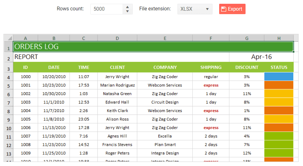
  • SpreadProcessingenables you to manage spreadsheet documents: create new from scratch, modify existing or convert between the most common spreadsheet formats. You can save the generated workbook to a local file, stream, or stream it to the client browser. 

    Telerik UI for Blazor DPL - Generate File

  • SpreadStreamProcessing - create and export a large amount of data with excellent performance. You can also append data to an already existing document stream. The generated document can be exported directly to a file on the file system or to a stream (for example, to send it to the client).

    Telerik UI for Blazor DPL - SpreadStreamProcessing

  • WordsProcessing – manage and export documents to DOCX, rich and plain text format without having to rely on third-party software (such as Microsoft Office). The rich text capabilities include tables, images, built-in styles and themes, various font types, sizes and colors.  
  • ZipLibrary– to load data from existing ZIP archives or create and edit ZIPs with data like images, DOCX or PDF files that can be used by other applications. You can also create ZIP archives in memory or use a stream to get data and add it to a ZIP archive.
  • Telerik UI for Blazor DPL - ZipArchiving

Telerik Reporting – Report Viewer for Blazor

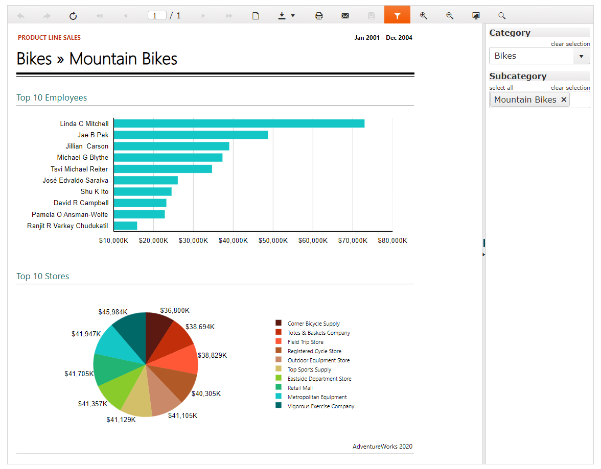
With the R1 2020 release, the Telerik Reporting Team introduced a new Report Viewer for Blazor, wrapping the flexible HTML5/JS web report viewer that will ensure the easy and fast preview of reports directly into your Blazor application.

Check out the official Telerik Reporting page for more details and demos.

Telerik ReportViewer for Blazor

New in Accessibility

Accessibility is a topic of growing importance and we at Progress are continuously working towards built-in accessibility for the components we create.

What does Accessibility mean for your Blazor apps and why you should consider it?

First of all, you show you care about people with disabilities and contribute to making their lives a bit easier. You can now provide full control over your Blazor app features by giving users with disabilities access to app content through assistive technologies or keyboard navigation.

Secondly, your apps will be compliant with current accessibility standards and policies, namely: The WCAG, Section 508 and WAI-ARIA standards.

A third factor is that by making your Blazor app accessible to people with disabilities, you are actually making it more accessible to everyone else too – from people in noisy offices that need captions, to people browsing your apps in a sunny park that need high-contrast themes.

And if the above reasons are not enough, consider the fact that there are more than 50 million people in the U.S. alone with some amount of disability - a pretty big market. So, with a little more care when you build your Blazor apps you can reach out many new potential customers.

New Keyboard Navigation

The Telerik UI for Blazor components have support for Keyboard Navigation! Your app users can directly use their keyboard to navigate through your app components and interact with them - invoke actions such as clicking links, buttons, paging the grid, navigating to form controls and more.

The following article shows the Telerik Blazor components that support specific keyboard combinations and links to live demos where you can see the behavior in action, together with the available keyboard shortcuts.

New AutoComplete Component

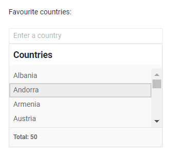
The AutoComplete component concept is well known and almost mandatory for modern app development. Based on a user’s input, the Blazor AutoComplete component provides a list of suggestions.

Telerik UI for Blazor AutoComplete

AutoComplete Data Binding

The AutoComplete component can be bound to a simple collection of string values or data model with just a line of code:

<TelerikAutoComplete Data="@Suggestions" @bind-Value="@TheValue" />

AutoComplete Filtering

For cases with a large number of list values or where there's a need for a faster, simplified search of values, you can use the Filtering option of the component. This way the AutoComplete component will filter the available suggestions according to the current user input.

To enable filtering, set the Filterable parameter to true. The default filter operator is “starts with,” and it ignores casing.

<TelerikAutoComplete Data="@Suggestions" @bind-Value="@TheValue" Filterable="true" />

Additionally, you can use the MinLength property to control when the filter list will appear.

<TelerikAutoComplete Data="@Suggestions" @bind-Value="@TheValue" Filterable="true" MinLength="2" />

You can set different filter operators as shown in the example below:

<TelerikAutoComplete Data="@Suggestions" @bind-Value="@TheValue" Filterable="true" FilterOperator="@StringFilterOperator .Contains" />

AutoComplete Customizations with Templates

You can completely customize the AutoComplete component and its items rendering by using templates. The component gives you options to set the following templates and customize:

  • Item - individual items in the dropdown element of the component
  • Header - the content that you can place above the list of items inside the dropdown element
  • Footer - the content that you can place below the list of items inside the dropdown element.

AutoComplete Events

For capturing and handling changes to the values in the AutoComplete, you have two events which you can utilize: 

  • ValueChanged - fires upon user input keystrokes  
  • OnChange - fires when the user presses Enter, or blurs the input (for example, clicks outside of the component), and can be used with two-way binding of the Value

Scheduler Component Enhancements

Just released in December 2019, the Scheduler Component quickly became a favorite one and we are happy to extend its functionally based on your feedback. In the 2.6.0 release we are adding:

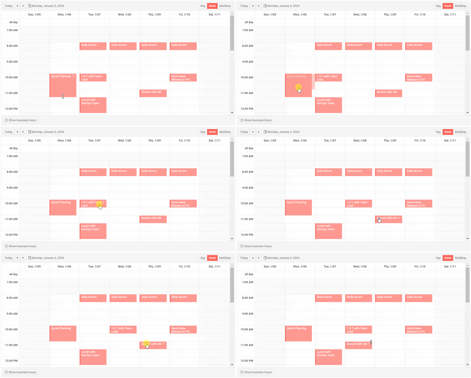
Scheduler Drag & Drop and Resize of Appointments

Change the timing of your appointments with a simple drag-and-drop between different slots, and resize the events to alter their duration. 

Telerik UI for Blazor Scheduler Drag and Drop

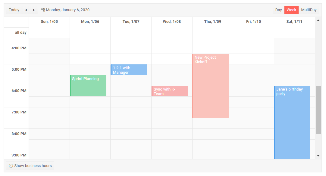
Scheduler Resources

The Scheduler now allows you to assign shared resources to your appointments and mark that with a specific color. A common scenario is when you have meeting rooms, equipment or subject matter experts that you need to share between teams.

Resources are optional so you can have none, single or multiple resources. The color of an appointment will be determined by the first declared resource.

To add resources to a <TelerikScheduler>, add a <ScheduerResource> tag for each and specify its Field, Title and Data fields.

<TelerikScheduler Data="@Appointments" @bind-Date="@StartDate" @bind-View="@CurrView" Height="600px" Width="800px" AllowUpdate="true" AllowCreate="true">
    <SchedulerResources>
        <SchedulerResource Field="RoomId" Title="Meeting Room" Data="@Rooms" />
        <SchedulerResource Field="ManagerName" Title="Manager Name" Data="@Managers" />
    </SchedulerResources>
    <SchedulerViews>
        <SchedulerDayView StartTime="@DayStart" />
        <SchedulerWeekView StartTime="@DayStart" />
        <SchedulerMultiDayView StartTime="@DayStart" NumberOfDays="10" />
    </SchedulerViews>
</TelerikScheduler>

Telerik UI for Blazor Scheduler Resources

Example of Telerik UI for Blazor with Multiple Resources

Download Telerik UI for Blazor 2.6.0

We encourage you to download the 2.6.0 version of Telerik UI for Blazor native components from the Telerik UI for Blazor page. Be sure to let us know what you would like to see next in the suite in our dedicated Blazor feedback portal.

Telerik R1 2020 Release Webinar

As we have packed a lot of great new stuff from all Telerik UI Component suites, be sure to sign up for the Telerik R1 2020 release webinar on Tuesday, January 21st at 11:00 AM ET for a deeper look at all the new features in the release.

Reserve Your Webinar Seat

Thank you for contributing and being part of the amazing UI for Blazor Community! Looking Forward to an Amazing Blazing 2020!

Telerik UI For Xamarin R1 2020 - What's New

$
0
0

Find our what we have in store for you in the first Telerik for Xamarin release of 2020.

Now that we have welcomed 2020, it's time for Telerik UI for Xamarin's first release of the new year (and decade) to emerge on the scene. The highlights of the latest version include a new set of picker controls, as well as an additional view mode for the Calendar control - the Agenda view. We have also included support for the RadSpreadProcessing library which enables you to work with spreadsheet documents.

As always, all the fixes and improvements we introduce in the suite are to help you in your endeavor to bring great cross-platform mobile experiences to your customers.

Picker Controls

We have introduced the following set of picker controls which were specifically designed to cover the most common scenarios:

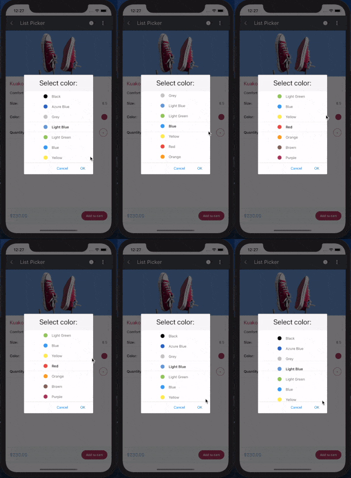
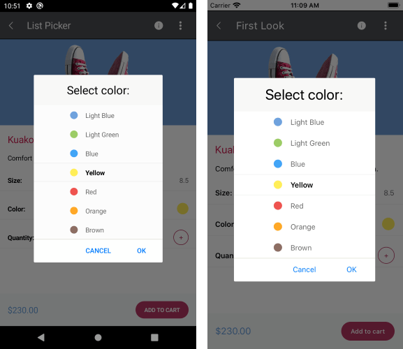
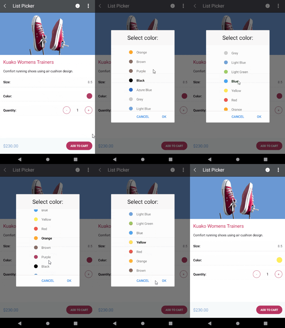
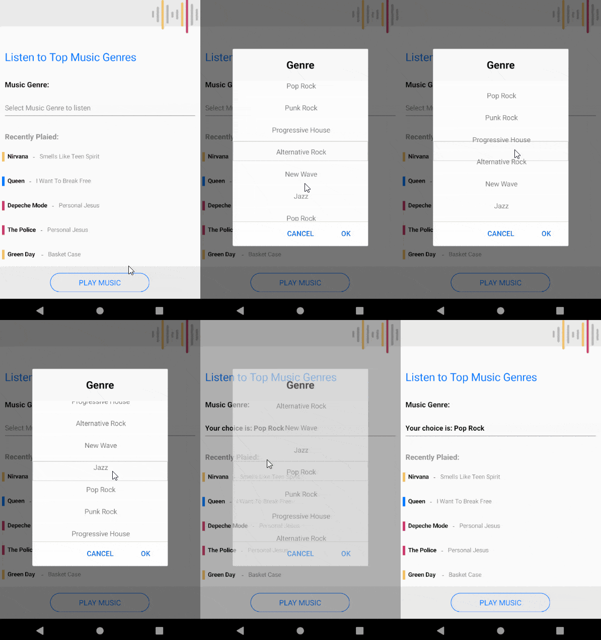
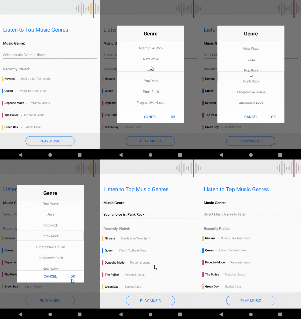
List Picker

The List Picker control allows you to select a single item from a list of items which is visualized inside a popup. The control provides the ability to loop its items infinitely while scrolling. You can also fully customize the dialog appearance, style and define templates for all the items or specifically customize the selected item.

Our List Picker control includes the following features:

  • Looping: loops items infinitely while scrolling
  • Templates: define a template for the list items, as well as the selected one
  • UI Virtualization: visual elements are being reused when scrolling to boost performance
  • Display string format: chose what text to display when an item from the list is picked
  • Flexible styling API: style the items, popup, header and footer of the picker
  • Command support: commands for clearing a selected item, opening and closing the dialog

You can find more information on the List Picker in the documentation - Getting Started with List Picker for Xamarin.

List Picker

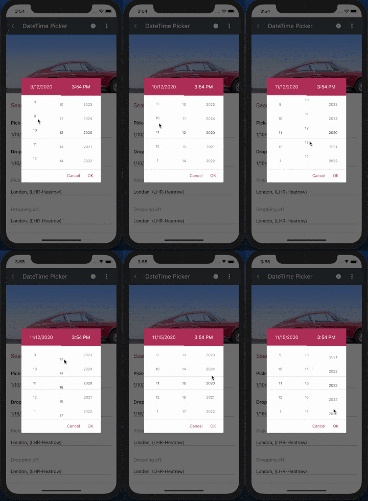
DateTime Picker

The DateTime Picker for Xamarin provides an easy way to choose a date, time or a combination of both depending on the used format string. As in the List Picker, its items are visualized inside a popup. The DateTimePicker control has a number of features which allow you to set a date range, DateTime formats and fully customize the dialog appearance such as its header and footer.

Features for DateTime Picker for Xamarin include:

  • String format: set a standard date and time format string, and create a date picker, time picker or combination of both.
  • Date Range: define a start and end date to enable the users to choose a date in between
  • Display string format: choose what text to display when a date/time is picked
  • Templates: templates for header, footer, picker placeholder and displayed text
  • Flexible Styling API: easily style the Spinners, Popup, header, footer and text displayed when date/time is picked
  • Commands Support: commands that clears the selected date/time and allows you to open and close the dialog

You can find more information on the DateTime Picker in the documentation - Getting Started with Date and Time Picker for Xamarin.

Date Time Picker

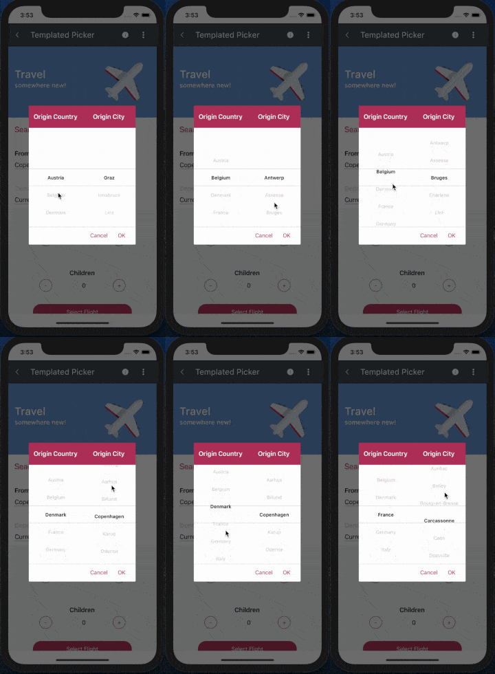
Templated Picker

If the DateTime/List Pickers are not sufficient for you to meet your design requirements, you can use the TemplatedPicker control. It provides you with the ability to set custom content within the picker, making it the most agile option. On top of that, you can still use the template/styling modifications mentioned above.

Features for our Templated Picker for Xamarin include:

  • Selector template: define a template for the items
  • Display string format: chose a text to display when an item is picked
  • Flexible Styling API: style the spinners, popup, its header and footer
  • Commands support: clear a selected item, open and close the dialog via commands

Once again, detailed information about the control can be found in the documentation - Getting Started with Custom Picker for Xamarin.

templated-resized

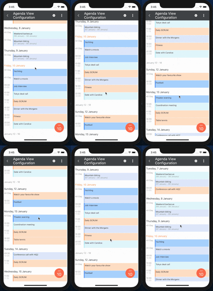
Calendar Agenda View

A new view mode for the RadCalendar control is included - the Agenda View. It shows a list of appointments grouped by date, providing a convenient way to display events chronologically.

agenda_view_resized

You have full control over the way the Agenda view is visualized - you can set custom date and time formats as well as modify the style of each agenda item separately. The AgendaViewSettings class below shows a simple setup:

<telerikInput:RadCalendarx:Name="calendar"
ViewMode="Agenda">
<telerikInput:RadCalendar.AgendaViewSettings>
<telerikInput:AgendaViewSettingsMonthItemFormat="YYYY MMM"
WeekItemStartDateFormat="dd MMMM"
WeekItemEndDateFormat="dd"
DayItemFormat="EEE d MMM"
AppointmentItemTimeFormat="HH mm"
AppointmentItemEndDateFormat="MMM d"
AppointmentItemStartDateFormat="MMM d"/>
</telerikInput:RadCalendar.AgendaViewSettings>
</telerikInput:RadCalendar>

More information on the Agenda View mode can be found in the documentation - View Modes - Agenda View.

Calendar Non-Working Hours Styling

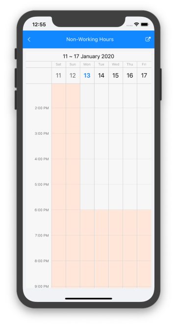
In R3 2019 we introduced the special slots for the RadCalendar control, a feature that lets you easily make specific time ranges in DayView/MultiDayView more prominent. In the latest release, we have added some styling sugar to directly highlight the non-working hours slots as fast as possible. All you need to do is define your work start and end times and apply a specific style for these periods directly in the DayView/MultiDayViewSettings.

<ResourceDictionary>
<telerikInput:CalendarSpecialSlotStylex:Key="MyNonWorkingHoursStyle"BackgroundColor="#FFE6D8"/>
</ResourceDictionary>
<telerikInput:RadCalendarx:Name="calendar"
ViewMode="MultiDay">
<telerikInput:RadCalendar.MultiDayViewSettings>
<telerikInput:MultiDayViewSettingsVisibleDays="7"
WorkStartTime="9:00:00"
WorkEndTime="18:00:00"NonWorkingTimeSlotsStyle="{StaticResource MyNonWorkingHoursStyle}"/>
</telerikInput:RadCalendar.MultiDayViewSettings>
</telerikInput:RadCalendar>

And here is the result:

non-working-hours

RadSpreadProcessing

The SpreadProcessing library enables you to work with spreadsheet documents by creating new ones, modifying existing documents or converting between the most common formats (e.g. XLSX, XLS, CSV, plain text & PDF). RadSpreadProcessing includes, but is not limited to, the following capabilities:

  • Shapes & Images: insert, position and delete images
  • Hyperlinks: add, remove, edit and search for hyperlinks
  • Workbook & worksheet protection: customizable restrictions for users regarding modifying the workbook or the content and structure of the worksheets.
  • Grouping: organize the data in sections, show/hide relevant data
  • Formulas: 200+ built-in functions, as well as an API for plugging custom ones.
  • Styling, Theming & Resizing: apply styles to cells, customize the graphic elements of your document, and auto-fit or resize columns and rows.
  • Data Validation: validation rules for list, number, date, text length or custom
  • Filtering & Sorting: filter and sort the data in a worksheet
  • Find & replace data: find and replace data in a workbook

SpreadProcessing differs from the already existing RadSpreadStreamProcessing library for Xamarin by adding support for reading and modifying the content of documents. You can learn more about the differences between the two here - RadSpreadStreamProcessing vs. RadSpreadProcessing.

Additional Improvements

In addition to the newly introduced features and components, we have applied different improvements across the already existing controls of the suite. Here are some of them:

  • ListView: Added an option to apply a specific style to group headers
  • DataForm: Added support for initially collapsed groups and dynamic property data-source change for editors
  • SideDrawer: Exposed TouchTargetTreshold property to allow users to control how far from the edge the gestures for opening the control should be respected
  • ImageEditor: Added support for single line and multi-line toolbars
  • AutoCompleteView: Added an option to change the input field keyboard type
  • PdfViewer: Support for named destinations in link annotation
  • Path: String to Geometry Parser and Type converter added

Learn More at Our Webinar

For more information about the latest controls and features for Telerik UI for Xamarin, register for our official release on Tuesday, January 21st at 11:00 AM ET - 12:30 PM ET.

Let Us Know What You Think

We are looking forward to receiving any reactions regarding the introduced components and features. The customer's voice has always been a main pillar in our company's culture so do not hesitate to share your thoughts either by leaving a comment or by visiting our Telerik UI for Xamarin Feedback portal.

If you haven’t already had a chance to try our UI toolkits, simply download a trial from the link below:

Try Telerik UI for Xamarin

What's New in the Telerik UI for ASP.NET Core R1 2020 Release

$
0
0

The R1 2020 release for Telerik UI for ASP.NET Core has arrived! Check out the latest additions to the suite of components like the FileManager, Badge, Breadcrumb and new features like Grid Column Virtualization, Search Panel in TreeList, Format Painter in Editor and many more!

Happy 2020 fellow developers! We hope it brings health, peace and prosperity to all of you! With the first release for the year we are excited to share all new components and features that you can plug into your projects and create modern and engaging applications. As always, we listened to your feedback and included in the release many of the most voted items and features. Read ahead and see what’s new in Telerik UI for ASP.NET Core in R1 2020!

New Telerik UI for ASP.NET Core Components

New FileManager Component

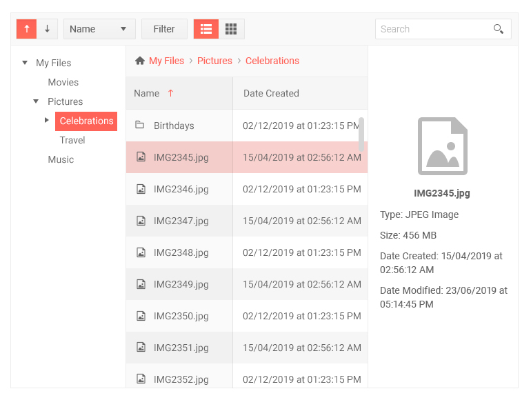
With the new FileManager Component, you can now enable users to perform file management operations from within your ASP.NET Core applications in a familiar Windows Explorer-like fashion.

Telerik UI for ASP.NET File Manager

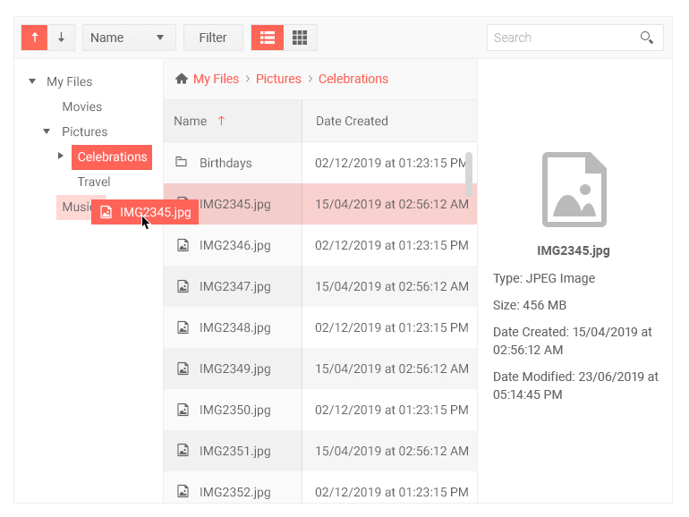
The FileManager can be used as standalone component or combined with other controls and will let users browse folders and files, perform search and filtering operations, switch between different view modes, drag and drop, and upload files. The component can be integrated with multiple backend services and comes with multiple configuration options that will let you customize both its look and feel and behavior.

Telerik UI for ASP.NET Core File Manager Drag and Drop

New Badge Component

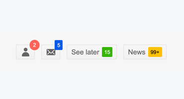
The new Badge Component brings a modern way to notify users or grab their attention to perform a certain activity.

Telerik UI for ASP.NET Core Badge

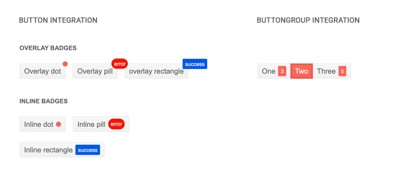
You can use the Badge Component alone or add it to other Telerik UI component – such as Button or ButtonGroup.

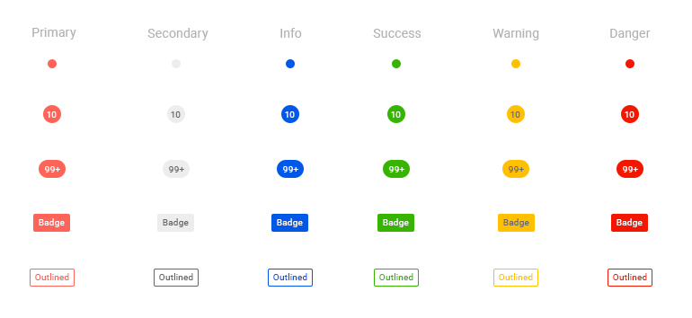
Alerting users of your applications for status changes, notifications or short messages has never been simpler. You will be able to customize it through templates, setting the appearance (dot, pill, rectangle and more) and look (flat and outline), and by selecting different types (figure below).

Telerik UI for ASP.NET Core Badge Configurations

New Breadcrumb Component

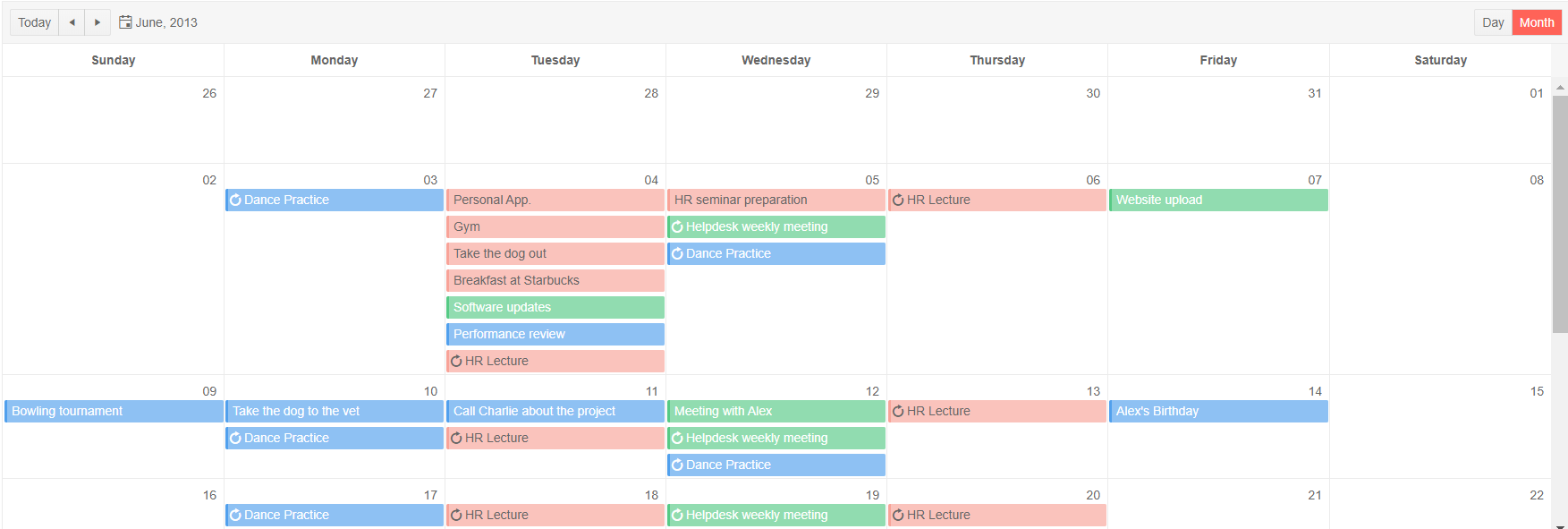
The new Breadcrumb Component provides developers with an easy way to create a sleek navigation in apps with a large amount of content or hierarchical structure. Using the Breadcrumb, you can significantly reduce the number of actions needed by a user to get to a certain app resource.

Telerik UI for ASP.NET Core Breadcrumb

Additionally, the Breadcrumb provides a visual aid that indicates the current location of the user and is a simple way to add contextual information to landing pages. In additional to that, it comes with support for manual editing of the path.

Telerik UI for ASP.NET Core Breadcrumb

Component Enhancements

Grid Column Virtualization

The new Column Virtualization feature of the Grid is a perfect match for everyone dealing with data that has large number of columns. Users can now scroll horizontally through grid column collections of hundreds of columns in a high-performant way.

Telerik Grid Column Virtualization - Demo with 500 columns Telerik UI for ASP.NET Core Grid Column Virtualization - Demo with 500 columns
TreeList Search Panel

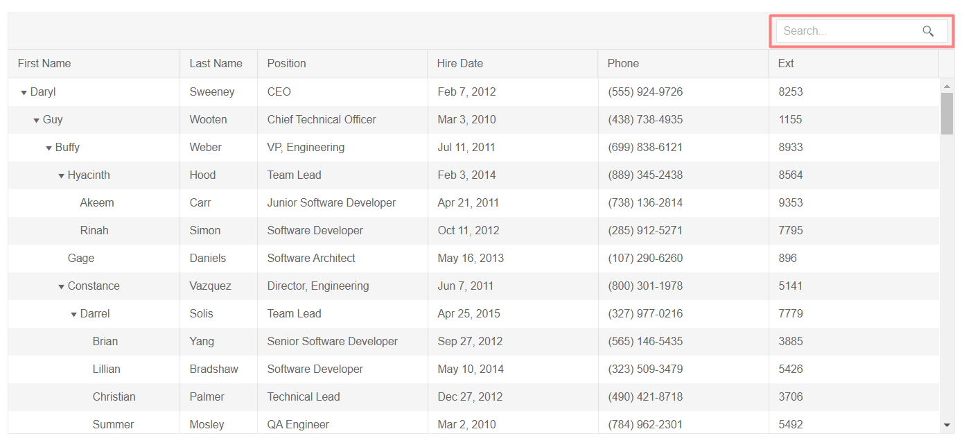
One of your favorite components – the TreeList – is now enriched with a new Search Panel. Your app users can have a quick and easy way to filter the content of the TreeList with a single text input field and find their relevant records instantaneously. The Search Panel allows configuration of filtering options and fields.

Telerik UI for ASP.NET Core TreeList Search Panel

Editor Enhancements

In the R1 2020 release we enhanced the Editor with a couple of desired tools: Format Painter and Merge Table.

  • The Format Painter Tool will allow for users to select a section of text and copy its formatting (font, size, color, etc.) and apply it to another section within the content.

    Telerik UI for ASP.NET Core Editor Format Painter
  • The Merge Table Tool will enable you to effortlessly merge and split table cells both vertically and horizontally.

    Telerik UI for ASP.NET Core Editor Merge Table
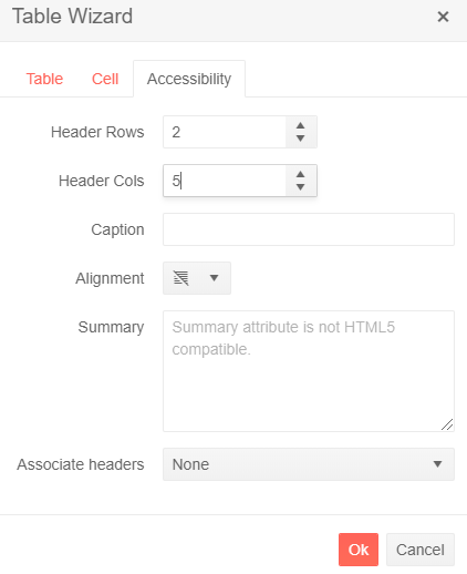
  • The Table Header feature in the Editor will allows users to configure the number of header row and columns. The implementation has taken into consideration the WCAG 2.1 Accessibility guidance.

Telerik UI for ASP.NET Core Editor Table Headers

Scheduler Enhancements

The Scheduler has several new properties to allow for further customization of the already powerful component and allow you to deliver a better visualization of events:

  • Adaptive Slot Height - automatically adapt the slots height depending on number of events.
  • Auto Event Height - will enable you to have events height adapted based on their content.
  • Events per Day - will enable you to control the number of events listed per day. For slots with large number of events, a "More" link will be placed at the bottom of the slot and will let users navigate to a detailed day view when clicked.
  • EventSpacing - will allow you to configure the distance between individual events.

Telerik UI for ASP.NET Core Scheduler

Filter Enhancements

The Filter Component has been expanded with additional functions and settings:

  • New Custom Filter Function will enable you to create your own custom filter functions in addition to the existing Filter component defaults.
  • New Custom Operators per field will enable you to create your own custom operators in addition to the existing default operators (equal, not equal, greater than, etc.) on every field.
  • Formatting Expression Preview in Filter will enable you to format and to visualize the formatted filter expression that will be applied to the datasource.

Checkbox & Radio Button Updates

In R1 2020 we decided to rethink the styling of checkboxes and radio buttons and introduced a more modern approach, taking advantage of the browsers’ native support for styling of checkboxes and radio buttons. Both components are integral part of the pre-built Telerik UI themes and can be further customized using the Telerik ThemeBuilder.

Timeline New Feature: Shared DataSource

The Timeline Component can now share a DataSource with any other data-bound component. Perfect for scenarios where a Timeline is bound to common data set with a Grid, or any other component that represents the underlying data set.

Document Processing Library SpreadProcessing

In R1 2020 we are expanding the available Document Processing Library (DPL) for ASP.NET Core (PDFProcessing, ZipProcessing, WordsProcessing, ZipLibrary, SpreadStreamProcessing) with SpreadProcessing that you can use in your ASP.NET Core applications. You be will enable to manage spreadsheet documents – create new from scratch, modify existing or convert between the most common spreadsheet formats. You can save the generated workbook to a local file, stream, or stream it to the client browser.

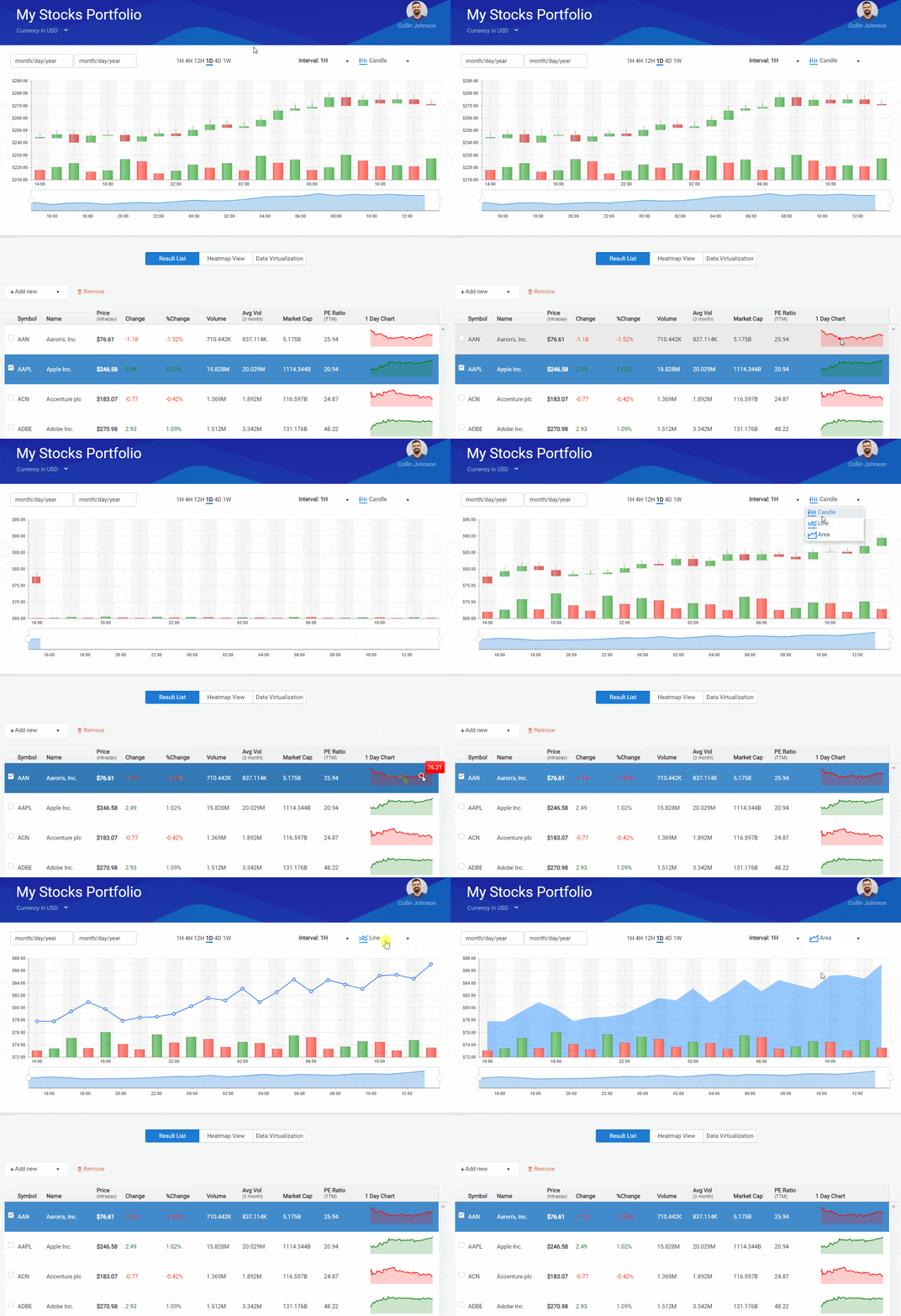
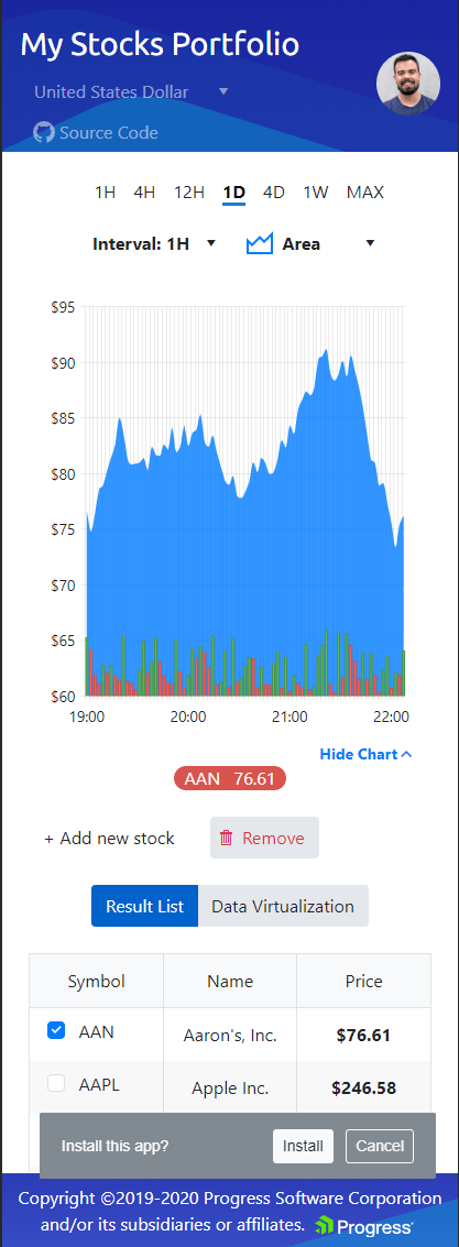
New ASP.NET Core Financial Demo App

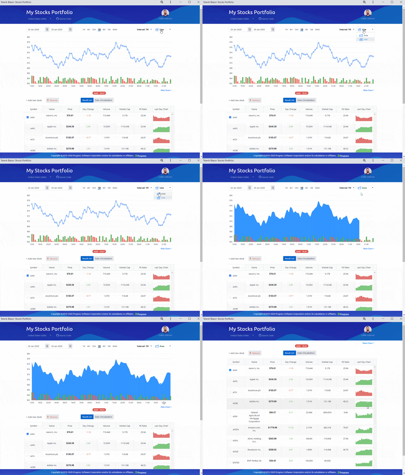
Telerik UI for ASP.NET Core Financial Demo App

You asked us for more examples and demo applications, so the Telerik UI for ASP.NET Core team created a brand new application that replicates a stock portfolio. The new demo solution combines components like our Data Grid, Stock Chart data visualization, and a combination of various navigation and form elements. Head over to the Stock Portfolio sample to find the full app along with the source code!

New Reporting Demo

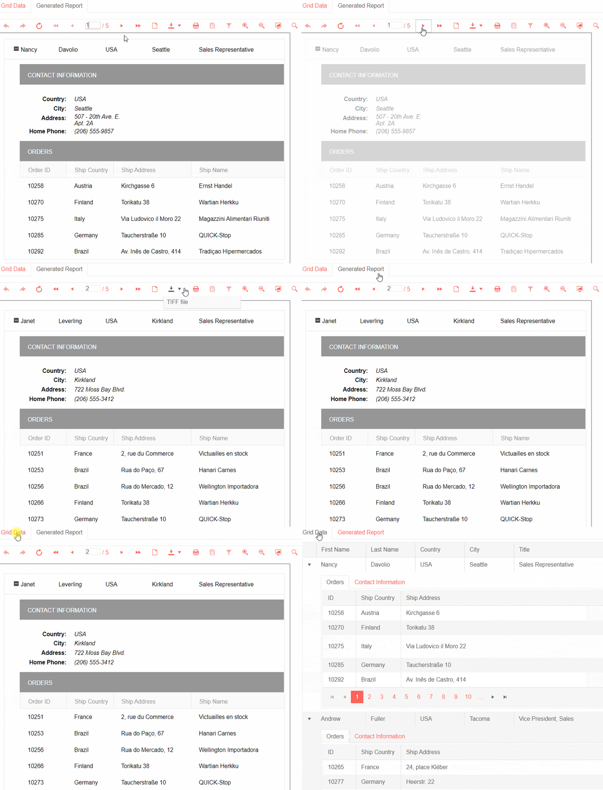
We received a lot of requests for demonstrating Reporting as part of an ASP.NET Core application, so we created an example, showing how data from the Telerik UI for Core Grid is passed to Telerik Reporting and displayed in a HTML5 Report Viewer. With Telerik Reporting, you are armed with everything you need to create, style, view and export rich, interactive and reusable reports.

Telerik UI for ASP.NET Core & Telerik Reporting Demo

Theme Selector in Visual Studio Template

You can now select your preferred app Theme as a Visual Studio Template setup with just a few clicks.

When creating a new project in Visual Studio, you can use one of the predefined templates and pick a theme.

Step 1. Make sure you have installed Visual Studio Extensions for Telerik UI for ASP.NET Core, or download it directly from the Visual Studio Marketplace.

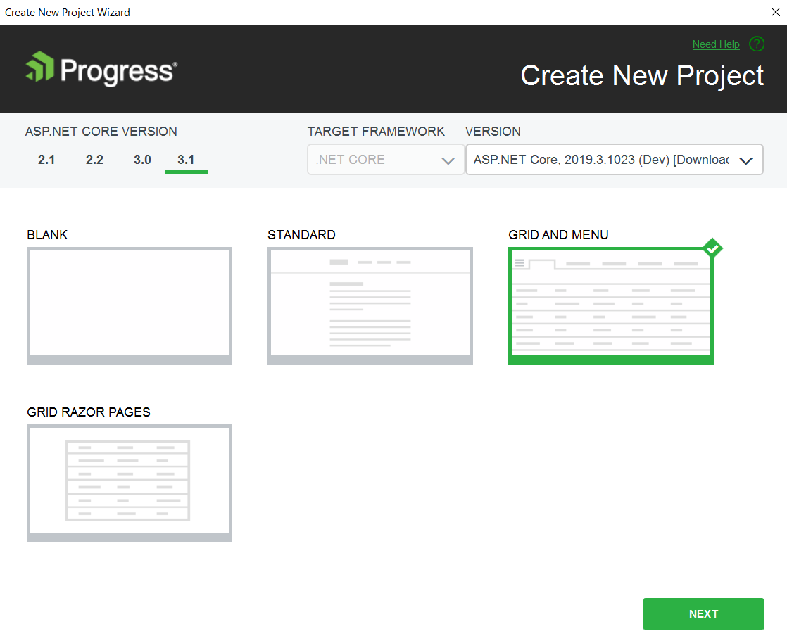
Step 2. Go to the Visual Studio Extensions tab and select Create New Telerik Project

Telerik UI Visual Studio Template

Step 3. Select a template that matches your project requirements

Telerik UI Visual Studio Template

Step 4. Choose an appropriate skin for your app

Telerik UI Theme Selection in Visual Studio Template

Compatibility with Official .NET Core 3.1

Telerik UI for ASP.NET Core is compatible with the official release of .NET Core 3.1. to ensure you can take advantage of all the new features and enhancements of the framework.

Updated Virtual Classroom Trainings

The Telerik UI for ASP.NET Core Virtual Classroom training has been updated and includes a series of technical trainings that will enable you to gain new skills, grow your product knowledge and boost your productivity. The training learning path is also a great way to onboard new team members and includes a sample application with multiple how-to topics and code examples.

Try it Out and Learn More at the Webinar

Download and try a trial version of Telerik UI for ASP.NET Core, or if you are an active license holder you can just grab the latest and greatest from the Your Account page! Share your thoughts with us on our feedback portal and help us shape the future of UI for ASP.NET Core.

Be sure to sign up for the Telerik R1 2020 release webinar on Tuesday, January 21st at 11:00 AM ET for a deeper look at all the new features in the release.

Reserve Your Webinar Seat

Thank you as always for your continuous support, and happy ASP.NET Core coding!

Check Out the New R1 2020 Release for Telerik UI for WinForms

$
0
0

Virtual Keyboard, Syntax Editor and much more - check out everything that's new in the R1 2020 release of Telerik UI for WinForms.

When it comes to a good beginning of a new year, there is no better way than to start it with a new release. I am thrilled to announce that two of the most-wanted controls by our customers, RadVirtualKeyboard and RadSyntaxEditor, are now available in the Telerik UI for WinForms suite. Truck route API for RadMap, Content controls in RadRichTextEditor and the automatic populating of the Quick Access/Favorites items from the Windows FileExplorer in our file dialogs all also contribute to another packed release for our feature-rich WinForms suite.

The happier our customers are, the happier the year would be

Let’s have a look at what is coming in R1 2020.

Virtual Keyboard

RadVirtualKeyboard control is a software component that allows the input of characters without the need for physical keys. The interaction with the virtual keyboard happens mostly via a touchscreen interface but can also take place in a different form in virtual or augmented reality.

Virtual Keyboard

On a desktop computer, a virtual keyboard might provide an alternative input mechanism for users with disabilities who cannot use a conventional keyboard, or for bi- or multi- lingual users who switch frequently between different character sets or alphabets, which may be confusing over time. Although hardware keyboards are available with dual keyboard layouts (e.g. Cyrillic/Latin letters in various national layouts), the on-screen keyboard provides a handy substitute while working at different stations or on laptops, which seldom come with dual layouts.

RadVirtualKeyboard will serve the need of a virtual keyboard with consistent theming for each WinForms application with Telerik UI for WinForms controls. It comes with predefined layouts and support for defining custom layouts. The save/load layout to XML functionality and the system language synchronizations just make the virtual keyboard a nice addition to every application that provides users’ input on a touch device.

Syntax Editor

RadSyntaxEditor is a useful text editor control which provides a built-in syntax highlighting and code editing experience for popular languages. It allows users to create custom syntax highlighting of keywords and operators of their own language.

Syntax Editor

It comes packed with syntax highlighting, code outlining, undo/redo operations, intelliprompts, find and replace functionality and much more.

Truck Route API in RadMap

RadMap supports the Bing Maps Truck Routing API. It provides travel routes which take truck attributes such as size, weight, type of cargo and many others. This is important as not all trucks can travel the same routes as other vehicles.

RadMap

Content Controls in RichTextEditor

Structured Document Tags enable users to add specific semantics to a part of the document: restricting input, modifying editing behavior etc. The content controls in RadRichTextEditor can be defined on Block, Inline, Row or Cell level. The content controls can contain other content controls as well.

Currently, RadRichTextEditor only visualizes the value of the content controls and there is no UI that allows you to interact with them. The import and export operations will work with Office Open XML (docx) and XAML formats. When exporting to other formats the content stored in the content controls will be preserved.

Quick Access/Favorites Items in File Dialogs

The Quick Access/Favorites items from the Windows FileExplorer will now be automatically shown as child nodes in the Custom Places’ tree nodes of our File Dialogs. Currently, it is only applicable for Windows 10 and .NET 4.0.

Last, but not least, as of R1 2020, .NET Core 3.1 is also supported. We addressed 50+ issues reported by our customers and introduced browse editor and breadcrumb examples in the Demo application.

Learn More in Our Webinar

Want to learn more about our upcoming release? Join Telerik's R1 2020 release webinar on January 21st and learn more about other desktop goodie-goodies we have in store for you!

Try it Out and Share Your Feedback

You can learn more about Telerik UI for WinForms via the product page. It comes with a 30-day free trial, giving you some time to explore the toolkit and consider using it for your current or upcoming WinForms development.

We would love to hear what you think, so should you have any questions and/or comments, please share them to our Feedback Portal or in the comment section below.

What's New in the Telerik UI for ASP.NET MVC R1 2020 Release

$
0
0

New year, new Telerik release! The R1 2020 release for Telerik UI for ASP.NET MVC is here - check out the latest including new components like the FileManager, Badge, Breadcrumb or new features like Grid Column Virtualization, Search Panel in TreeList, Format Painter in Editor, enhancements in Scheduler and more!

Happy 2020 fellow developers! We wish you an exciting and prosperous New Year with many successful projects! With the start of the new year we are happy to share with you all the new components and features that Telerik R1 2020 brings. As always, we listened to your feedback and included in the release many of the most requested items and features – read ahead and see what’s new in Telerik UI for ASP.NET MVC R1 2020!

New Telerik UI for ASP.NET MVC Components

New FileManager Component

One of the R1 2020 highlights is the new FileManager Component, which will play an essential role in applications where file management operations are needed. It can be used as a standalone component or combined with other ASP.NET MVC controls and will deliver its functionality with a Windows Explorer look and feel.

The FileManager Component will let users manage (create, update, delete and browse) folders and files, perform search and filtering operations, switch between different view modes, and upload files. The component can be integrated with various backend services. 

Telerik UI for ASP.NET MVC File Manager

For the drag-and-drop fans we have good news – you will be able to seamlessly move folders and files to different locations in the file hierarchy.

Telerik UI for ASP.NET MVC File Manager Drag and Drop 

New Badge Component

The new Badge Component enables a modern, mobile-like way to notify users or grab their attention to perform a certain activity. The Badge Component can be used either alone or added to other Telerik UI components to subtly alert users of your applications for status updates or notifications

Telerik UI for ASP.NET MVC Badge Button and ButtonGroup

You can use the Badge Component either alone or add it to other Telerik UI component – such as Button or ButtonGroup. You will be able to customize it through templates, setting its appearance (dot, pill, rectangle and more), look (flat and outline) and selecting different types (see figure below).

Telerik UI for ASP.NET MVC Badge Configurations

New Breadcrumb Component

Using the new Breadcrumb Componentyou will be equipped with an easy way to create user-friendly navigation in your apps and provide a visual aid that indicates the current location to your users.

Telerik UI for ASP.NET MVC Breadcrumb

The Breadcrumb is a perfect fit for organizing large volumes or hierarchical data and builds a breadcrumb of links based on the page's location in the content hierarchy. It significantly reduces the number of actions needed by a user to get to certain app resources and it comes with support for manual editing of the path.

Telerik UI for ASP.NET MVC Breadcrumb Editing 

Telerik UI for ASP.NET MVC Component Enhancements

Grid Column Virtualization

The new Grid Column Virtualization is perfect for data with a large number of columns. The Column Virtualization feature enables smooth scrolling horizontally through the entire grid column collection in a highly-performant way.

Telerik Grid Column Virtualization - Demo with 500 columns  Telerik UI for ASP.NET MVC Grid Column Virtualization - Demo with 500 columns 
Scheduler Enhancements

The Telerik UI for ASP.NET MVC Scheduler has been enhanced with multiple new properties to allow further customization of the already powerful component. These new properties will enable you to deliver better visualization of events:

  • Adaptive Slot Height: automatically adapt the slots height depending on number of events. 
  • Auto Event Height: enables you to have events height adapted based on their content. 
  • Events per day: enables you to control the number of events listed per day. For slots with a large number of events, a "More" link will be placed at the bottom of the slot and will let users navigate to a detailed day view when clicked.
  • EventSpacing: allows you to configure the distance between individual events.

Telerik UI for ASP.NET MVC Scheduler

Search Panel in TreeList

The TreeList Component is now enriched with a Search Panel, allowing users to quickly and easily filter content and find relevant records. The TreeList Search Panel provides a single text input field and allows configuration of filtering options and fields, giving a deep level of customization.

Telerik UI for ASP.NET MVC TreeList Search Panel

Editor Enhancements

In R1 2020 we added a couple of cool features to enhance the Editor Component, namely:

  • Merge Table Tool– allows users to effortlessly merge and split table cells in the Editor (vertically and horizontally).

    Telerik UI for ASP.NET MVC Editor Merge Table

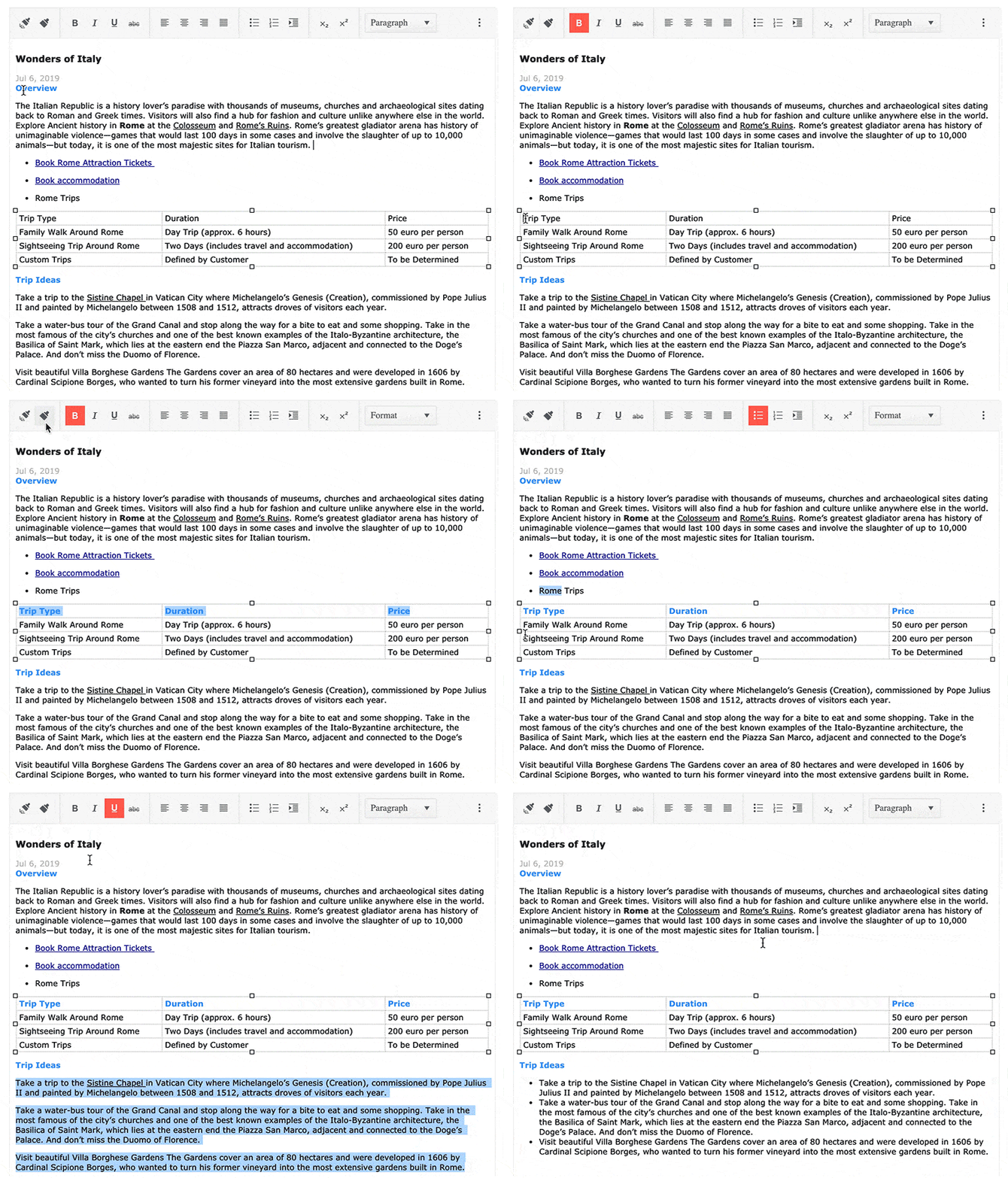
  • Format Painter Tool – enables users to copy, paste and apply formatting from one section within the content to another. The best of all is that you will be able to copy formatting once and apply it to multiple sections within the content.

    Telerik UI for ASP.NET MVC Editor Format Painter

  • Table Header – this feature in the Editor allows users to configure the number of header row and columns. The implementation has taken into consideration the WCAG 2.1 Accessibility guidance.
  • Telerik UI for ASP.NET MVC Editor Table Headers 

Filter Enhancements

Just released in R3 2019, the Filter Component quickly became a favorite, and we are happy to extend its functionally based on your feedback. In R1 2020 we are adding:

  • New Custom Filter Function: enables you to create your own custom filter functions
  • New Custom Operators per field: allows you to create your own custom operators on every field
  • Formatting Expression Preview in Filter: gives you the ability to format and to visualize the formatted filter expression that will be applied to the datasource

Shared DataSource for Timeline Component

The Timeline Component can now share a DataSource with any other data-bound component such as Grid.

Checkbox & Radio Button Updates

In this release we introduce a more modern approach to styling checkboxes and radio buttons. We now take advantage of the fact that modern browsers natively support styling for checkboxes and radio buttons. Both components are integral part of the pre-built Telerik UI themes and can be further customized using the Telerik ThemeBuilder.

Telerik UI for ASP.NET MVC and Telerik Reporting Integration

We received a lot of requests for demonstrating Reporting as part of an ASP.NET MVC application, so we created an example, showing how data from the Telerik UI for MVC Grid is passed to Telerik Reporting and displayed in a HTML5 Report Viewer. With Telerik Reporting, you will be armed with everything you need to create, style, view and export rich, interactive and reusable reports.

Telerik UI for ASP.NET MVC and Telerik Reporting

Updated Virtual Classroom Trainings

The Telerik UI for MVC Virtual Classroom training has been updated and includes a series of technical trainings that will enable you to gain new skills, grow your product knowledge and boost your productivity. The training learning path is also a great way to onboard new team members and includes sample applications with multiple how-to topics and code examples.

Try it Out and Learn More at the Webinar

Download the latest version of Telerik UI for ASP.NET MVC, try it out and let us know what you think on our feedback portal. Be sure to sign up for the Telerik R1 2020 release webinar on Tuesday, January 21st at 11:00 AM ET  for a deeper look at all the goodness in the release, where our developer experts will go over everything in detail.

Reserve Your Webinar Seat

Thank you for your continuous support & happy ASP.NET MVC coding!


What’s New in Telerik UI for ASP.NET AJAX R1 2020

$
0
0

Check out everything that's new in the first release of 2020 for Telerik UI for ASP.NET AJAX, including a new RadMultiSelect component and improved trainings.

Happy 2020 fellow developers! We hope it brings health, peace and many successful projects! With the start of the new year we are happy to share with you what Telerik R1 2020 brings to your ASP.NET AJAX applications. Discover more about what's new in Telerik UI for ASP.NET AJAX– new RadMultiSelect component, updated Virtual Classroom Training Video Series, and improvements in documentation and Knowledge Base!

New ASP.NET AJAX MultiSelect Component

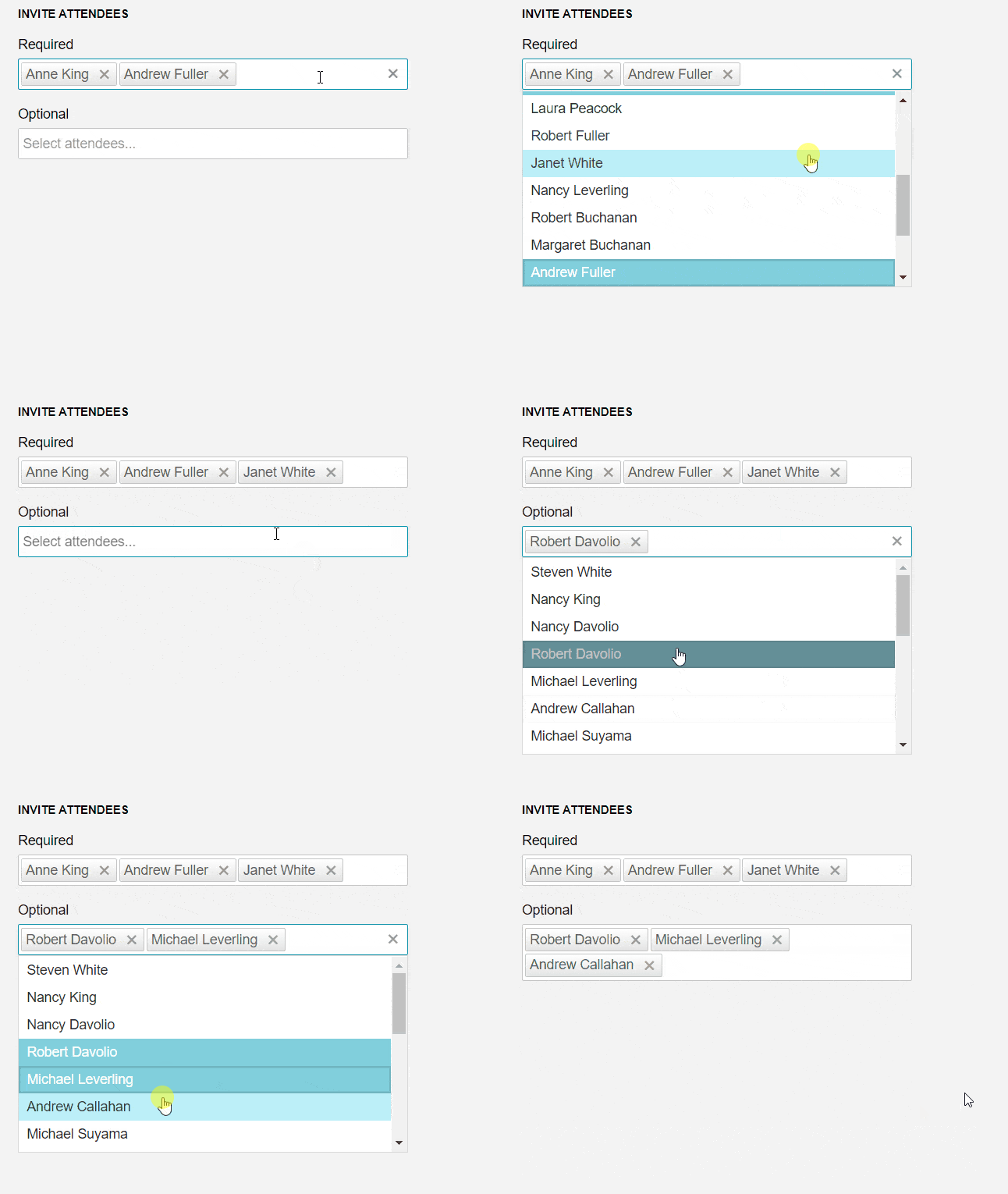
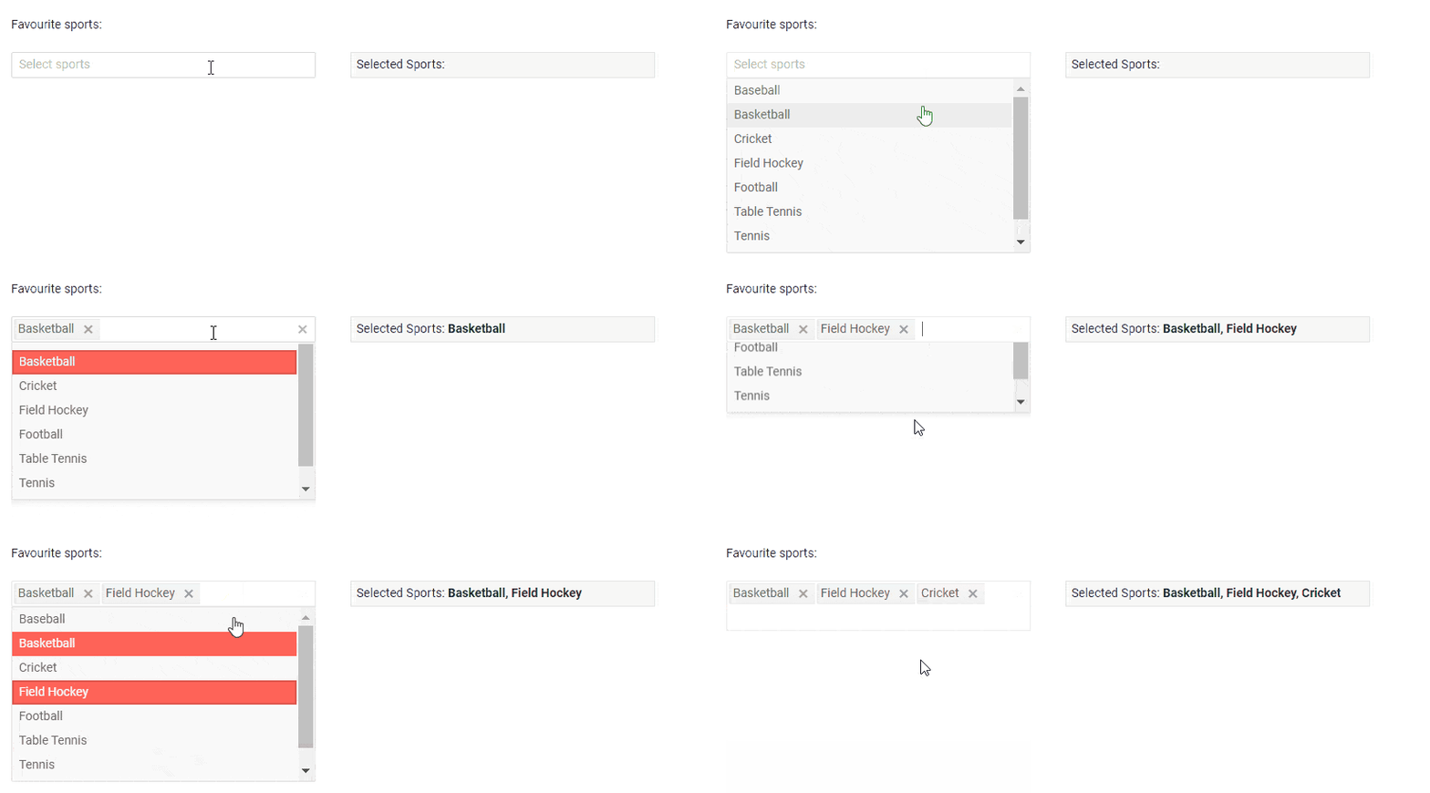
The RadMultiSelect Control displays a list of options and allows you to make multiple selections from this list. It supports custom rendering of popup items and tags, header and footer elements, virtualization, and configurable options for controlling the list look and feel.

Telerik UI for ASP.NET AJAX MultiSelect

Data Binding

The MultiSelect Component supports both server-side (SqlDataSource, List<T> or DataTable) and client-side binding (web service).

Grouping

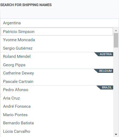
The MultiSelect Component allows binding to a grouped data source and have dropdown list items grouped in a logical way.

Telerik UI for ASP.NET AJAX MultiSelect Grouping

Custom Look and Feel with Templates

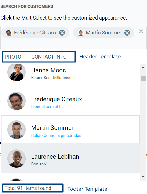
You can completely customize the MultiSelect component and its items rendering by using templates.

The component gives you options to manage the way the pop-up is rendered for the following templates:

  • Header Templates
  • Footer Templates
  • Item Templates
  • Tag Templates 

Telerik UI for ASP.NET AJAX MultiSelect Templates

Virtualization

The Virtualization feature of the MultiSelect component will enable you to display large datasets in a highly performant way.

Single and Multiple Tag Options

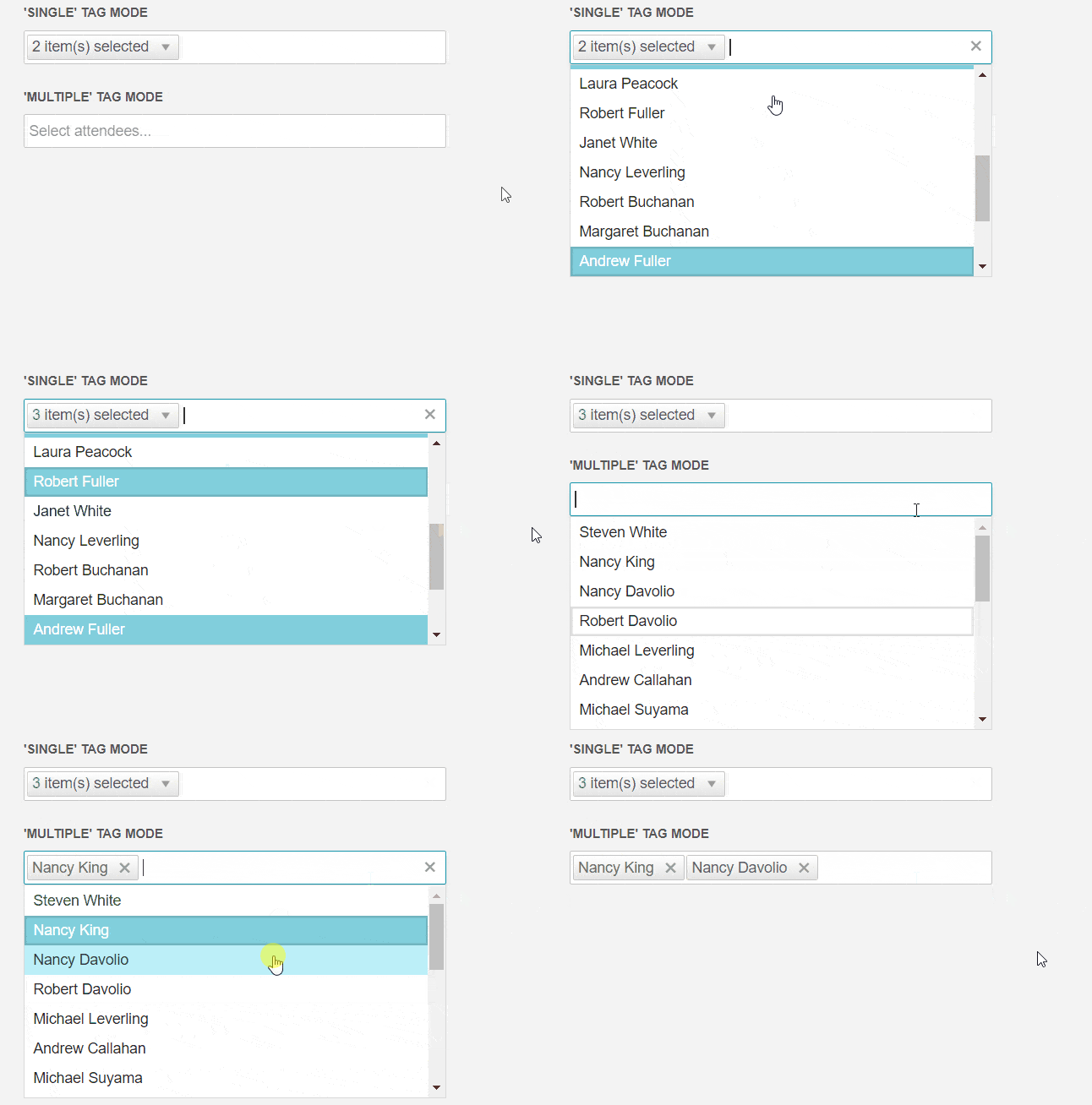
Other handy options of the MultiSelect component are the ‘Single’ and ‘Multiple’ tags, which allow you to customize the way selected values are displayed – either as total number of selected items (count), or as a list of selected values.

Telerik UI for ASP.NET AJAX MultiSelect Tag Options

Multiple Skin Options To Choose From

The RadMultiSelect comes with 21 skins like Material, Bootstrap and Metro to help you fit and adapt the component to match the needs of your website.

RTL and Keyboard Support

In addition to all the above, the MultiSelect component supports Keyboard Navigation and can render its content in a right-to-left direction for languages that require that, such as Arabic, Hebrew, Chinese, or Japanese.

Component Enhancements

In the R1 2020 release we implemented multiple improvements on our most popular components:

  • RadHtmlChart– added Opacity property for the chart series, which would allow control of its transparency
  • RadAutoCompleteBox– added RequestDelay property to allow delay of data retrieval while a user is typing
  • Security improvements in the AsyncUpload (AllowedCustomMetaDataTypes=Telerik.Web.UI.AsyncUploadConfiguration is enabled by default AND fixed incorrect server response in content-type header from AsyncUploadHandler
  • Improvements in the Find and Replace and Table Wizard dialogs of RadEditor
  • Accessibility improvement in the Gantt
  • Exporting to Excel enhancement in the Grid
  • Enhancements in the Spreadsheet, Slider and MultiColoumnCombobox
  • Official Support for Microsoft Edge Chromium

Updated Virtual Classroom Trainings

The Telerik UI for ASP.NET AJAX Virtual Classroom training has been updated and includes a series of technical trainings that will enable you to gain new skills, grow your product knowledge and boost your productivity. The training learning path is also a great way to onboard new team members and includes a sample application with multiple how-to topics and code examples.

Knowledge Base Articles and Documentation Improvement

We listened to your feedback on what resources will be helpful to you when developing ASP.NET AJAX applications. That’s why we added useful how-to and troubleshooting resources under the brand-new Knowledge Base (KB) section. Below are just a few examples of KBs that we added:

In R1 2020 we also placed effort on improving documentation quality of some of most popular articles such as:

Those are just a few examples, but the reality is that your valuable feedback helps us continuously enhance articles and make them up to date. Please keep up sharing it, this is greatly appreciated!

Try it Out and Learn More at the Webinar

We would like to thank you all for the continuous support and encourage you to download new trial, or if you are an active license holder you can just grab the latest and greatest from the Your Account page!

Once you try it out, let us know what you think on our feedback portal. Be sure to sign up for the Telerik R1 2020 release webinar on Tuesday, January 21st at 11:00 AM ET  for a deeper look at all the new features in the release.

Reserve Your Webinar Seat

TaskBoard, SplashScreen, AgendaView and More in Telerik UI for WPF in R1 2020

$
0
0

New TaskBoard and SplashScreen controls, AgendaView for ScheduleView and more are here in the R1 2010 release of Telerik UI for WPF.

Announcing the first official release for this year (and decade) of Telerik UI for WPF and Telerik UI for Silverlight– R1 2020 is live! It brings powerful new controls like TaskBoard and SplashScreen, cool new features like AgendaView for ScheduleView, new Item Templates and .NET Core 3.1 support, as well as many other improvements. Let’s dive in together and explore all the new goodies.

TaskBoard

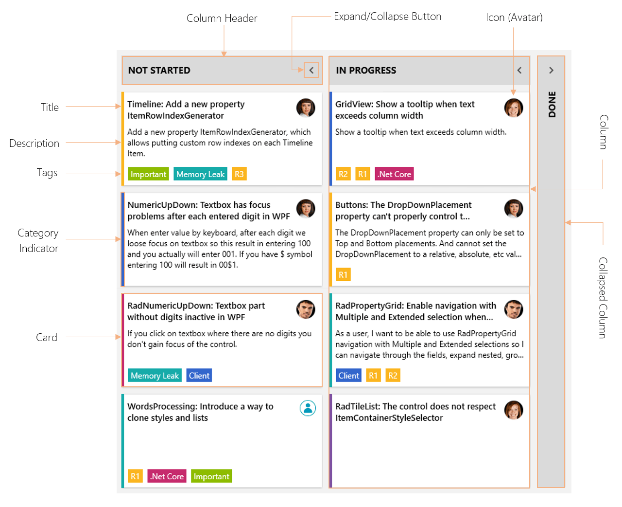
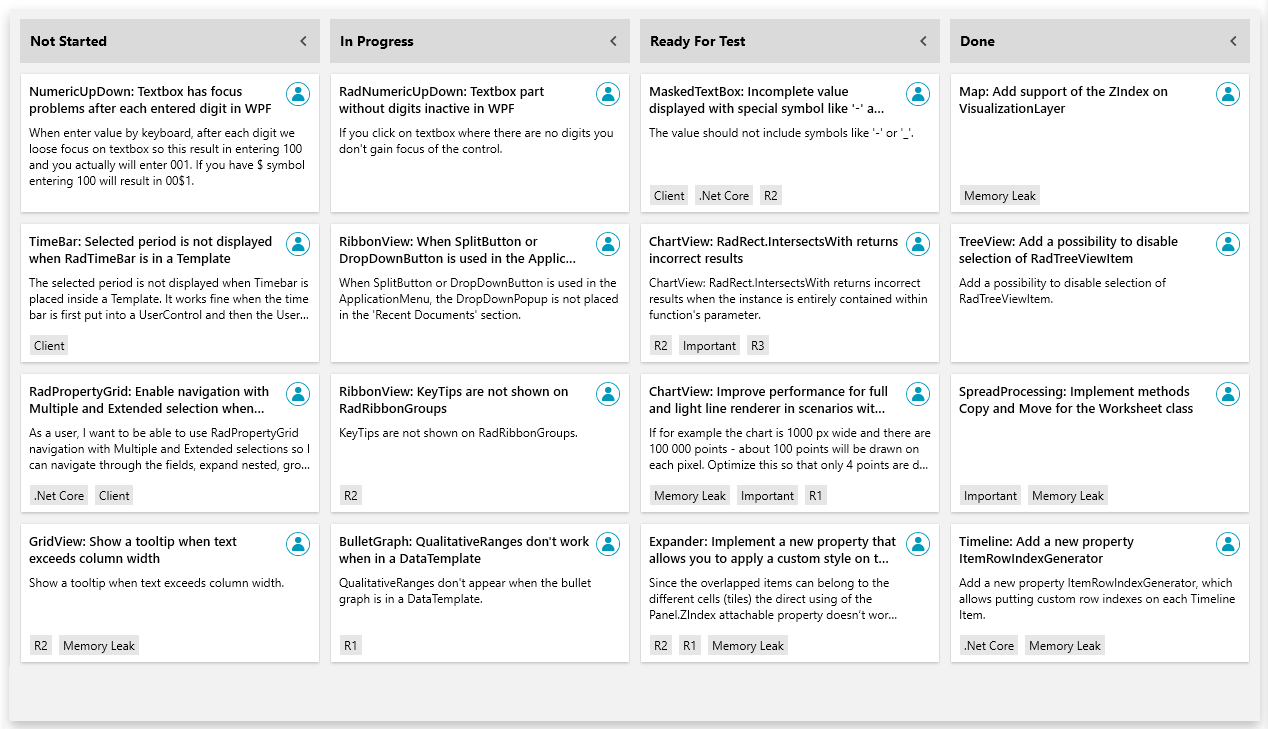
TaskBoard

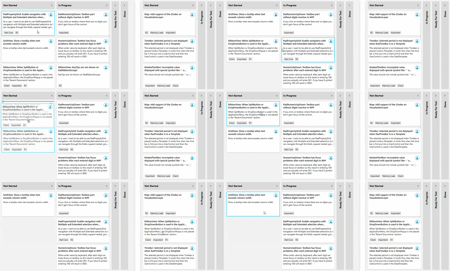
Introducing RadTaskBoard – powerful new control designed to provide a clean and user-friendly interface for task management applications. This Kanban-like board will allow your end-users to track their tasks in a simple, clean, agile-style manner. Check out the key features below:

  • Predefined cards
  • Auto-generated or XAML defined columns
  • Expand/collapse columns support
  • Category (color) indicator of the tasks
  • Tags support
  • Drag and drop support
  • Touch support
  • Single selection support
  • Automation support

See the control in action our WPF demos and be sure to check out the documentation here.

SplashScreen

SplashScreen

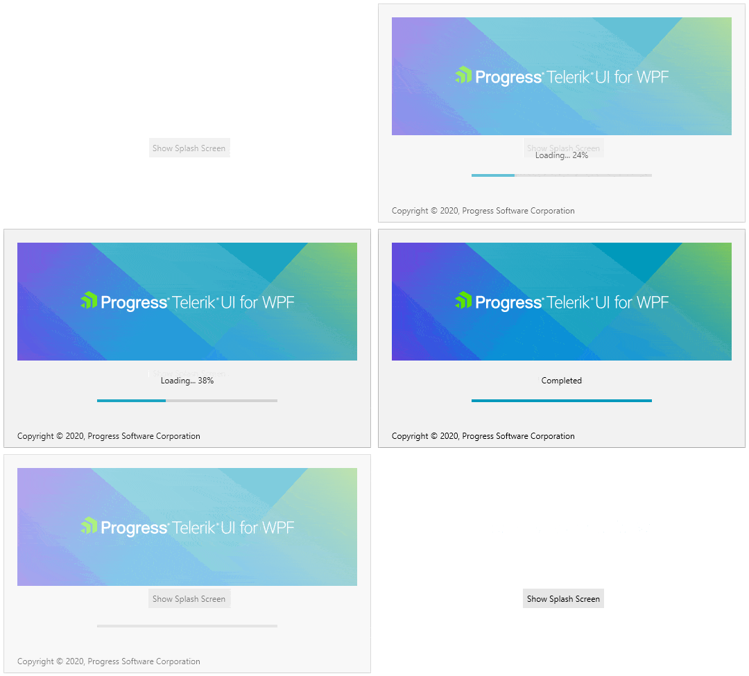
The other new control of this release is RadSplashScreen.  As you already might know – the WPF framework allows you display an image as the SplashScreen of the application, while RadSplashScreen will allow you to crate and show a dynamic SplashScreen that contains WPF controls. You can easily display our beautifully themed controls and indicate the load progress status of your WPF app.

Here are the key features of the control:

  • Animations: Built-in show/hide animations with option to be customized
  • Logo Image: Easily add your logo by setting single property
  • Progress Indicator: Using the built-in ProgressBar you could flawlessly indicate the current progress
  • Loading Content: Display and change the loading text at run time
  • Footer Content: Display your company copyright message there
  • Fully Customizable: Easy to display your own UserControl designed per your needs
  • Theming: Take advantage of the rich set of Telerik UI for WPF themes

For more details please check the SplashScreen online documentation here.

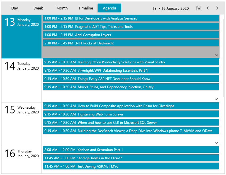
AgendaView for ScheduleView

We are adding brand new view mode to RadScheduleView – Agenda View. Easily see a list of the upcoming appointments in a specific time range grouped by the date. The new view provides all the supported features of the control plus a modern appearance. Where there are no appointments in the current range – a customizable message is displayed. See AgendaViewDefition below:

AgendaView for ScheduleView

For more details please check this article from our documentation.

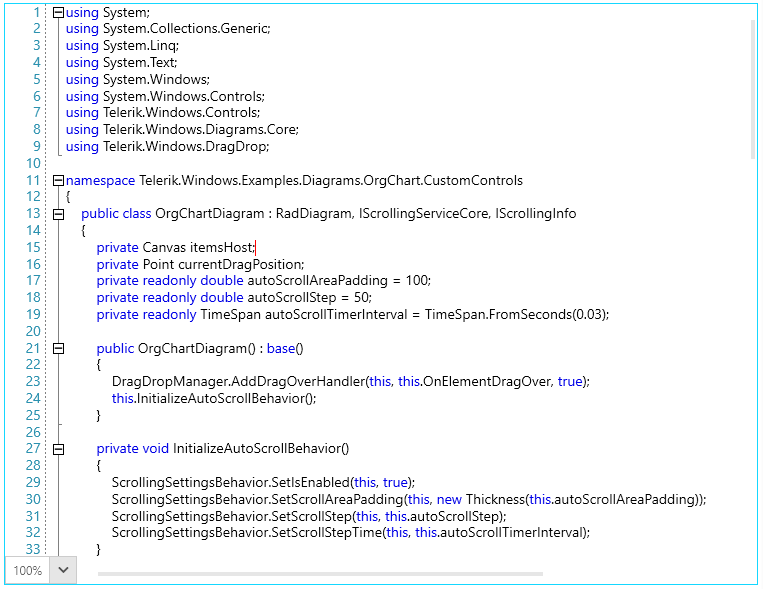
SyntaxEditor (official)

With our previous official release (R3 2019) we introduced the SyntaxEditor control as a beta – a powerful text editor with built-in highlighting and code editing capabilities (in case you missed it check out the release blog here and the dedicated SyntaxEditor blog here). With this release of the RadSyntaxEditor we are bringing in the official version of the control and introducing built-in touch support, enhanced folding taggers, improved folding functionality and a lot of fixes.

SyntaxEditor

We have also added two new examples in our WPF demos– one demonstrating multiple custom taggers in action and another demonstrating different configurations. Make sure to also check the documentation of the control here.

Happy coding ‍

RichTextBox – Content Controls

Structured Document Tags or Content Controls enable users to add specific semantics to the document: provide the user with predefined values, modifying editing behavior (you can lock the content of the controls, or prevent the entire control from deleting). The content controls in RadRichTextBox can be defined on different levels inside the document structure or nested inside each other.

Currently, RadRichTextBox only visualizes the value of the content controls, and there is no UI that allows you to interact with them (the UI is planned for the next official release). The import and export operations will work with Office Open XML (DOCX) and XAML formats. With other formats, only the current value of the content controls will be exported.

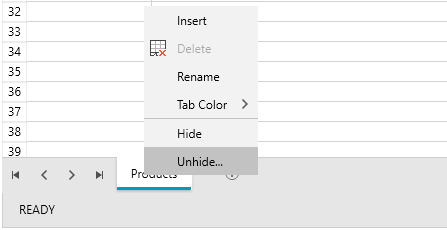
Spreadsheet and SpreadProcessing - Sheets Visibility and New FillSelection Functionality

Sheets Visibility is a mechanism to change the visibility of certain sheets. You can use the context menu or the Hide/Unhide methods to use this functionality.

Spreadsheet Sheets Visibility

We added new properties and events to the FillSelection functionality. This allows you to control how this feature works in the code behind. Detailed information is available here:  Fill Selection.

Map – OpenStreetMapProvider Important Change

In case you missed it OpenStreetMap Foundation has updated its Tile Usage Policy  in order to require a valid UserAgent to be passed with the request. That is why we introduced a way to easily pass your UserAgent string for the Standard mode through XAML as shown below:

1.<telerik:RadMapx:Name="radMap"ZoomLevel="1">
2.    <telerik:RadMap.Provider>
3.        <telerik:OpenStreetMapProviderAPIKey="your-api-key"StandardModeUserAgent="your custom user agent string"/>
4.    </telerik:RadMap.Provider>
5.</telerik:RadMap>

For more info about the Map providers – check out this article.

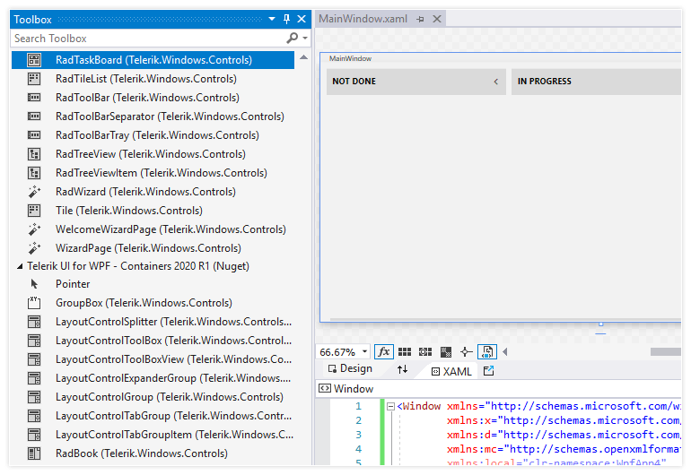
.NET Core – 3.1 Support and Toolbox in the Project Templates

NetCore ToolBox

Microsoft announced .NET Core 3.1 in December last year, and immediately after that we updated the target framework of our WPF .NET Core binaries. With this release they will be built against .NET Core 3.1.

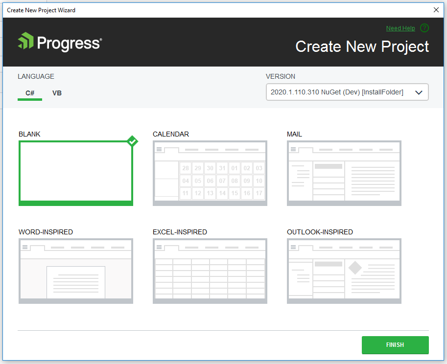
We are also including new Project Templates for .NET Core that refer to our Nuget packages in order to provide you with the same experience as in the .NET Framework project templates. Just create a new Blank project, select the Nuget version and you are ready to take advantage of a fully loaded Toolbox with Telerik UI for WPF controls!

NetCore Project Templates

Item Templates (WPF .NET Framework)

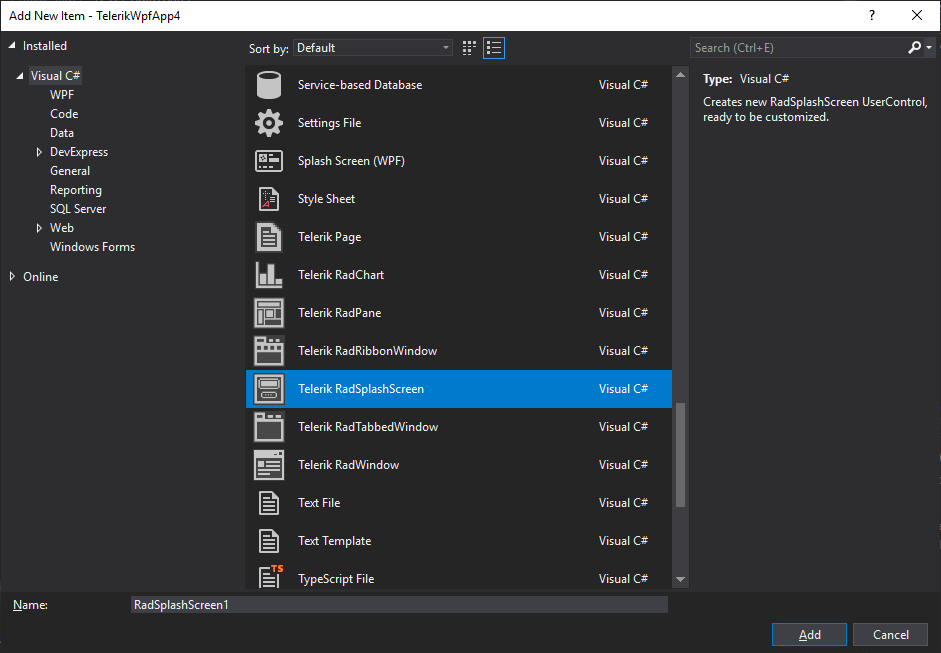
We are introducing WPF Item Templates – they will replace the Telerik Scenario Wizard and will allow you to use the predefined item templates through the Add -> New Item context menu in Visual Studio.

WPF ItemTemplates

Here is list of available templates:

  • Telerik Page: Creates a basic WPF Page, ready to be used with Telerik UI for WPF controls
  • Telerik RadChart: Creates a new UserControl with a RadChartView
  • Telerik RadPane: Creates a new RadPane UserControl (RadPane is the main content unit of the RadDocking control)
  • Telerik RadRibbonWindow: Creates a new RadRibbonWindow UserControl
  • Telerik RadSplashScreen: Creates a new RadSplashScreen UserControl, ready to be customized
  • Telerik RadTabbedWindow: Creates a new RadTabbedWindow UserControl
  • Telerik RadWindow: Creates a new RadWindow UserControl

Other Features

  • Docking: PerMonitor V2 DpiAwareness support
  • GridView: Added option to search Accent Insensitive (link)
  • RichTextBox: Keyboard commands for the new paste options
  • WebCam for NetCore: Uses now SharpDX assemblies built against .NET Core
  • ChartView for NetCore: Uses now SharpDX assemblies built against .NET Core

Check Out the Detailed Release Notes

We have a lot more! To get an overview of all the latest features and improvements we’ve made, check out the release notes for the products below:

Sign Up for the Webinar

To see the new release in action, please join us on the Telerik R1 2020 webinar, on Tuesday, January 21, 2020 11:00 AM ET - 12:30 PM ET.

Save My Seat

Share Your Feedback

Feel free to drop us a comment below sharing your thoughts. Or visit our Feedback portals about UI for WPFSilverlight and Document Processing Libraries and let us know if you have any suggestions or if you need any particular features/controls.

Try out the latest:

UI for WPF  UI for Silverlight

In case you missed it, here are some of the updates from our last release.


Telerik JustMock Gains Improvements for Azure DevOps and More with R1 2020

$
0
0

I am excited to present to you the R1 2020 release of our mocking framework JustMock which includes improvements to the Azure Pipeline task, new integration with Visual Studio code coverage for .NET Core and implementation of ArrangeSet and AssertSet methods to the MockingContainer.

Without further ado let me introduce you the new features and most important fixes.

JustMock Azure Pipeline Task Supports .NET Core Tests

We know your pains and we are addressing them. The execution of JustMock unit tests targeting .NET Core in Azure pipeline had a different approach than those targeting the .NET Framework. With this release, we are unifying how the tests for both platforms are executed and now you can use only the JustMock task to execute your tests without other additional tasks, tooling or settings. The new version of the extension is already uploaded and the task will be automatically updated in your pipeline. If you would like to try it here is the link to the marketplace..

JustMock Azure Pipeline Task Supports .NET Core

JustMock Azure Pipeline Task Supports VS 2019 as a Test Platform version

Another pain you wrote us frequently about is the lack of support for Visual Studio 2019 test platform. With this release we are providing this option for you. In addition to that we have fixed an issue with failing tests when the “Installed by Tools Installer” option is selected for test platform version. With this we have implemented and fixed all known issues and requests related to the test platform version.

Implement VS 2019 as a Test platform option for the Azure Pipeline task

Integration with VS Code Coverage for .NET Core

Many of our clients are using Visual Studio Enterprise and they love the build in code coverage. Actually, this is the tool that JustMock is most frequently integrated with. However, there was a limitation. The integration could be used only for projects targeting .NET Framework. With this new release we are introducing support for projects targeting .NET Core as well.

JustMock is Now Integrated with VS Code Coverage for .NET Core-770

ArrangeSet and AssertSet Methods for MockingContainer

Until now it was difficult and additional efforts were required to arrange and assert the set operation of a property when you used our implementation of an IoC container named MockingContainer. This is why we implemented the ArrangeSet and AssertSet method for the MockingContainer. The API is now similar to the one for mocking normal property set operation.

[TestMethod]
publicvoidShouldAssertAllContainerArrangments()
{
    // Arrange
    var container = newMockingContainer<ClassUnderTest>();
  
    container.Arrange<ISecondDependency>(
       secondDep => secondDep.GetString()).MustBeCalled();
    container.ArrangeSet<IThirdDependency>(
        thirdDep => thirdDep.IntValue = Arg.AnyInt).MustBeCalled();
  
    // Act
    var actualString = container.Instance.StringMethod();
    container.Instance.SetIntMethod(10);
  
    // Assert
    container.AssertSet<IThirdDependency>(thirdDep => thirdDep.IntValue = 10);
    container.AssertAll();
}

Visual Studio Debugger Arrowhead Pointer is Messed when Profiler is Enabled with .NET Core

This issue was very unpleasant. While debugging the code you have mocked in a .NET Core project the debugger arrowhead pointer was at a different line of the code than the actual one. After thorough research of what is causing the issue, we found out that the underlining problem is a bug in the .NET Core CLR. Long story short, Microsoft provided a fix to this bug. If you would like to take advantage of this fix you could upgrade your application to .NET Core 3.1 version, which includes the fix.

Try It Out and Share Your Feedback

The R1 2020 release is already available for download in customers’ accounts. If you are new to Telerik JustMock, you can learn more about it via the product page. It comes with a 30-day free trial, giving you some time to explore the capabilities of JustMock.

Try Now

Be sure to sign up for the Telerik R1 2020 release webinar on Tuesday, January 21st at 11:00 AM ET  for a deeper look at all the goodness in the release, where our developer experts will go over everything in detail.

Reserve Your Webinar Seat

Feel free to drop us a comment below sharing your thoughts. Or visit our Feedback Portal and let us know if you have any suggestions or if you need any particular features.

You can also check our Release History page for a complete list of the included improvements.

Telerik Reporting R1 2020: New and Improved Blazor Report Viewer, Web Report Designer & Crystal Converter

$
0
0

Check out everything that's new in the R1 2020 release of Telerik Reporting.

With R1 2020, we continue the development of the newly released Web-Based Report Designer, introduced a brand new Blazor Report Viewer, extended the Crystal Report Converter capabilities, and added support for Dependency Injection with the .NET Core Web API reporting services.

Improved Web-Based Report Designer 

The designer widget enables developers to bring report editing functionality to their end-users right from their web applications. 

Some of the improvements include the introduction of an SQL DataSource wizard that supports both editing and creating components, user-friendly table/crosstab initial setup panes, an improved explorer tab that lists all data source fields, and report parameters.  Now the designer has complete support for editing all report item properties within the Properties tab. Also, the properties that support expressions utilize the new ExpressionBuilder editor for easier creation of expression formulas by listing all available built-in functions and operators. 

New Report Viewer Component for Blazor 

Blazor is the new hot topic in the .NET world, and if you feel curious to try it in a new project that needs reporting, we've got you covered. In this release, we introduce a new report viewer for Blazor, wrapping the flexible HTML5/JS web report viewer that ensures fast and easy preview of reports directly into a Blazor application. This new addition, we empower any web developer to add reporting functionality to the application built with Blazor using a dedicated Blazor component. Of course, the viewer supports our flexible Kendo UI themes to match the look of the Blazor application 

Crystal Report Converter V.2

If you experience difficulties with Crystal Reports and you feel that it is time to move to another reporting solution, now you can make it easier. With R1 2020 Telerik Reporting becomes the best Crystal Reports alternative with a newly released converter.

In previous versions, the Telerik Crystal Reports Converter was distributed in two versions – one for Crystal Reports 2008 SP7 (assembly version 10.2.3600.0) or later, and another for Crystal Reports Visual Studio 2010 (assembly version 13.0.2000.0) or later. The Telerik Crystal Reports Converter introduced in R1 2020 release is built against Crystal Reports 13.0.20.2399 and the converter for earlier major versions of Crystal Reports is deprecated. The newer version of Crystal reports assemblies provides access to more classes and properties that can be converted to Telerik Reporting items. It adds conversion for data commands with their connections and parameters, summary fields, chart and barcode objects. 
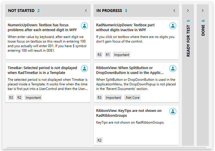
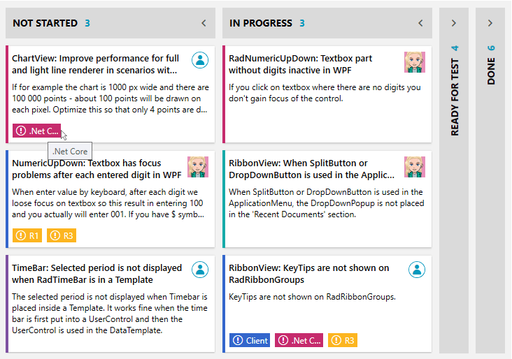
If you are still wondering whether Telerik Reporting is the best alternative to Crystal Reports, read more about how Telerik Reporting works as a Crystal Reports alternative

Add Dependency Injection to the Web API Controllers for Core Projects

Following the best practices, in .NET Core both Telerik.WebReportDesigner.Services.Controllers.ReportDesignerControllerBase and Telerik.Reporting.Services.AspNetCore.ReportsControllerBase now rely on dependency injection to resolve their dependencies. 

Learn More and Share Your Feedback

Learn more about Telerik Reporting or sign up for a free trial and start playing around today. And don't forget to sign up for the Telerik R1 2020 release webinar on Tuesday, January 21st for a deeper look at all the goodness in the release, where our developer experts will go over everything in detail.

Reserve Your Webinar Seat

Feel free to drop us a comment below sharing your thoughts. Or visit our Feedback Portal and let us know if you have any suggestions or if you need any particular features.

What's New in Xamarin.Forms 4

$
0
0

Check out the latest improvements in Xamarin.Forms 4 that will make your Xamarin development faster and easier.

New Features of Xamarin.Forms 4

With the release of Xamarin.Forms 4, developers can look forward to a raft of bug fixes, performance enhancements and a few new headline features.

In this article we'll take a look at a few of those new features and see how they can help give your existing apps a performance boost and make starting a new project even easier and more productive.

Note: This post primarily focuses on fully released features from Xamarin.Forms 4.0.

Android Fast Renderers

Android UI gets special treatment in this release, in the form of fast renderers for the most common controls. Although not strictly a new feature (they were included as "experimental" last time around), they are now the default.

In short, a fast renderer will decrease the inflation and rendering time of a control by creating fewer objects, and in turn reducing complexity and memory usage when compared to the original renderers.

If your app uses a Button, Image, Label or Frame, you are going to get better performance out of the box.

CollectionView

The CollectionView is essentially a more flexible and performant way of displaying anything that implements IEnumerable.

There are options for Horizontal or Vertical lists, ScrollTo methods for moving items fully into view, and single or multiple selections.

<CollectionView ItemsSource="{Binding .}" 
                            ItemsLayout="{x:Static ListItemsLayout.HorizontalList}">
     <CollectionView.ItemTemplate>
         <DataTemplate>
             <StackLayout Spacing="30"
                          Margin="50">
                 <Label Text="{Binding Name}" 
                        FontSize="Large"
                        HorizontalOptions="Center"/>
                 <Image Source="{Binding Image}"
                        WidthRequest="150"/>
             </StackLayout>
         </DataTemplate>
     </CollectionView.ItemTemplate>
 </CollectionView>

CollectionView

ImageSource

In previous versions on Xamarin.Forms, the source properties for icons and images didn't all implement the same types - not a huge problem in itself, but it did cause some confusion, particularly when developers were itching to use the excellent FontImageSource everywhere.

From version 4.0, all of the controls with image sources now consistently implement ImageSource. You can now use embedded resources, FontImageSource, files and URIs without wondering if it's going to work.

Shell

This is a big one, particularly if you are a newcomer to Xamarin.Forms or just thought it took a bit too much effort to get started with anything more than a one-page app.

Shell is designed to allow you to describe the structure of your app in a declarative way and automatically create the main features that many mobile apps require. In a single XAML file, you can easily set up the following:

  • Flyout (hamburger) menu
  • Tabs
  • Navigation
  • Pages
  • Search

You can also create your own custom renderer for the Shell components when some serious customizing is required!

This is going to be a major feature for many developers, so let's take a quick look at an example.

Load up Visual Studio 2019 and create a new Mobile App (Xamarin Forms) project, selecting the Shell template as your starting point.

Flyout, Menus and Pages

Take a look at AppShell.xaml and you'll see that a simple application is ready to go. You've got some Resources declared at the top, followed by what happens to be the entire structure of the app in just a few lines.

Out of the box Tabs

The TabBar is declared along with two Tabs, each setting their own icons, titles and the content to put in them (the Items and About pages).

Hit F5 to launch the app and see the tab navigation in action. Not bad with a few lines of XAML, but let's take a look at a few more features.

Many apps use a flyout or hamburger menu as a form of navigation. Let's take a look at how we can achieve this with Shell components.

I have removed all the XAML after the Resources section and replaced it with some simple Shell components. I already had two simple app pages ready to wire up, StratPage and TelePage - you could just use the AboutPage from the template if you want to just quickly how it works.

<!-- App structure -->

    <Shell.FlyoutHeader>
        <local:UserPage />
    </Shell.FlyoutHeader>

    <FlyoutItem Title="Guitars"
                FlyoutDisplayOptions="AsMultipleItems">
        <Tab Title="Stratocaster"
             Icon="strat.png">
            <ShellContent>
                <local:StratPage />
            </ShellContent>
        </Tab>
        <Tab Title="Telecaster"
             Icon="tele.png">
            <ShellContent>
                <local:TelePage />
            </ShellContent>
        </Tab>
    </FlyoutItem>

You can see that we've got a FlyoutHeader which pulls in a simple ContentView to give us the header for the flyout menu, followed by a FlyoutItem with two Tabs. This simple bit of markup is going to scaffold our app for us, with a tabbed layout and navigation between both tabs also available via the 'hamburger'.

When we launch the app, we can see that the first page to be displayed is the Stratocaster details page. This is because it was the first to be defined.

Our running app

We can also see that the hamburger menu has been created, and tapping the icon reveals the flyout, complete with the UserPage header and other pages.

The flyout menu

Check out the offical documentation for more details.

More to Come

With the release of version 4.0, creating a Xamarin.Forms application has never been easier and so many things "just work." Combine this release with the new Xamarin.Essentials collection of cross platform helpers, and there really is no excuse not to give it a try.

Get Started with the FilePathPicker in Telerik UI for WPF

$
0
0

We've created an easy way to instantly turn your editor control into a file or a folder selector. Now in Telerik UI for WPF, you can take advantage of another powerful control – the RadFilePathPicker.

The RadFilePathPicker is a control which allows users to select a file or a directory from the file system or directly type the full path to it in the editor. Like every control from Telerik UI for WPF, it comes with the complete set of pre-defined themes. Of course, if you choose to do so, you can completely re-design it, depending on your needs.

Template Structure

The control contains an absolutely amazing set of ingredients. It features a dynamically changing Icon, which is fully customizable through an IconTemplateSelector (see below for more on that). A watermark comes next, which has a very important weapon called clear button. Last, but not least – it has a button that opens a RadFileDialog whose type is fully controllable through the DialogType property.

TemplateStructure

Available Dialog Types

Speaking of dialogs, what about the available dialog types? Well, they are determined by the DialogType enumeration, which has the following options – OpenFile, OpenFolder and SaveFile. The control opens our awesome file dialogs by default - if this is the first time you've heard about them, check this article for more. You could always open another window (MS or a custom one) if you want to – just handle the DialogOpening event.

How to use the IconTemplateSelector?

With ease. The default icon is an instance of FilePathPickerIconTemplateSelector. It exposes the EmptyTemplate and NonEmptyTemplate properties. It already flashed across your minds that these two properties are related to the FilePath, didn’t it? Oh, and if you don’t want to have an icon at all, just set the IconVisibility property to Collapsed. Icons are cool. Let’s create a quick custom FilePathPickerIconTemplateSelector:

<StackPanelMargin="50">
    <StackPanel.Resources>
        <DataTemplatex:Key="CustomEmptyTemplate">
            <ImageSource="emptyIcon.png"/>
        </DataTemplate>
        <DataTemplatex:Key="CustomNonEmptyTemplate">
            <ImageSource="nonEmptyIcon.png"/>
        </DataTemplate>
        <telerik:FilePathPickerIconTemplateSelectorx:Key="CustomIconTemplateSelector"
            EmptyTemplate="{StaticResource CustomEmptyTemplate}"
            NonEmptyTemplate="{StaticResource CustomNonEmptyTemplate}"/>
    </StackPanel.Resources>
    <telerik:RadFilePathPickerIconTemplateSelector="{StaticResource CustomIconTemplateSelector}"/>
</StackPanel>

3…2…1… Action!

IconTemplateSelector

Picker Modes

I mentioned hiding the icon but did not mention that you can use the picker in button-only mode by hiding the editor part through the EditorVisibility property. Cool, huh? I think this mode is a perfect match with a label.

<StackPanelMargin="50"Orientation="Horizontal"UseLayoutRounding="True"HorizontalAlignment="Center"VerticalAlignment="Center">
    <StackPanel.Resources>
        <local:FilePathPickerLabelContentConverterx:Key="converter"/>
    </StackPanel.Resources>
    <telerik:LabelContent="{Binding FilePath, ElementName=fpp, Converter={StaticResource converter}}"Margin="0 0 10 0"/>
    <telerik:RadFilePathPickerx:Name="fpp"Width="50"VerticalAlignment="Center"HorizontalAlignment="Center"EditorVisibility="Collapsed"IconVisibility="Collapsed"/>
</StackPanel>

ButtonOnlyMode

The file picker is in read only mode by default, which means that you receive a free insurance against errors! Of course, you can set the IsReadOnly property to False and allow text input. Check it, taste it, or even copy-paste it. Here, the clear button will be your magic mistake eraser. You can customize it as well, by using the file input’s ClearButtonContent and ClearButtonContentTemplate properties by the way .

Featured Events

The events that the file path picker exposes are FilePathChanging, FilePathChanged, DialogOpening and DialogClosed. The first two come in handy for validation scenarios or directory restriction. No need to talk about their arguments, right? Well, if there is, you are more than welcome to enjoy the control’s detailed documentation.

Closing Curtain

I hope that the RadFilePathPicker deserved its round of applause and got you excited to dive into it right away. Looking for the best walkthrough options? I can’t think of anything other than the awesome Telerik UI for WPF Controls Demo application.

P.S. We’d love to hear from you. Your honest and direct feedback is the most efficient way for us to improve. Don’t be shy to drop your thoughts in the comment section below and share your suggestions using our feedback portal.

Get the latest version of: Telerik UI for WPF Telerik UI for Silverlight

A Sprint to the Right Direction with the RadTaskBoard for WPF

$
0
0

WPF developers, let’s rejoice together! What a better way to start the new decade than the brand new R1 2020 Release? No more need to wander the organizational tools labyrinth. Get the new Telerik UI for WPF TaskBoard control and make the most of it. Let me guide you through it.

Have you ever wondered what agile really means? Agile means able to think and move quickly and easily. I believe that agile software development was formed exactly to find a way to develop better and conquer our biggest and bravest dreams quickly and easily.

I know that every single software developer can name at least three agile methodologies, be it Scrum, Kanban, Extreme Programming, etc. It’s not always the methodology which a software organization follows that matters, but the tool used for managing the development process and the outcome quality. This is one of the main reasons why the Telerik UI for WPF family just got that new member - the TaskBoard (a.k.a KanbanBoard) control.

What’s Inside

It’s always better to know what’s inside the dish on the menu that caught your eye before ordering, isn’t it? Now, let’s see what’s inside the RadTaskBoard.

TaskBoard Visual Structure

A task board has zero to many columns, each containing zero to many cards – a layout, commonly seen in Kanban boards. Its visual structure consists of:

  • Column - one of the most essential building blocks of the control, which holds all the cards for a logical group. Can be collapsed, renamed or auto-generated based on the underlying data source.
  • Column Header - represents the logical group member of a data source as a header of the column inside the control.
  • Expand/Collapse Button– a button, situated at the very right of the column header, used for switching between the column’s normal (expanded) and collapsed state.
  • Card – core element of the control, used for visualization of the task on the board. Can be dragged to another column or reordered inside its parent column.
  • Card Title– the element at the very top of the card, which represents the title of a given task.
  • Card Icon– the element at the very right of the card, next to its title. Represents the container for the icon image of a given task.
  • Card Description - the element below the card title, which displays the description of a given task.
  • Card Tags– a collection of highlighted objects applied to a given item, situated at the very bottom of a card.
  • Category Indicator– a tiny visual at the very left of a card, designed to serve as a logical category indicator.

Now that you know what’s inside, I am hopeful that you'd certainly order the dish.

Getting Started in Minutes

Not sure where to start? Time to walk you through the creation of a simple sample app with the brand-new task board then. I promise, it will take just a few minutes.

Needed “materials” – a WPF application with reference to the Telerik.Windows.Controls assembly plus a collection of the control’s built-in TaskBoardCardModel.

public class ViewModel : ViewModelBase
{
    ...
 
    public ViewModel(){Data = GetTasks(); }    
    ...
     
    public ObservableCollection<TaskBoardCardModel> GetTasks()
    {
        ObservableCollection<TaskBoardCardModel> tasks = new ObservableCollection<TaskBoardCardModel>();
 
        tasks.Add(new TaskBoardCardModel() {
            Assignee = "Vicky",
            IconPath= @"/TaskBoardBlogApp;component/vickygr30x30.png",
            Title = "NumericUpDown: Textbox has focus problems after each entered digit in WPF",
            Description = "When enter value by keyboard, after each digit we loose focus on textbox so this result in entering 100 and you actually will enter 001. If you have $ symbol entering 100 will result in 00$1.",
            State = "Not Started",
            CategoryName = Categories[1].CategoryName,
        });
 
        tasks.Add(new TaskBoardCardModel() {
            Assignee = "Vicky",
            IconPath = @"/TaskBoardBlogApp;component/vickygr30x30.png",
            Title = "RadNumericUpDown: Textbox part without digits inactive in WPF",
            Description = "If you click on textbox where there are no digits you don't gain focus of the control.",
            State = "In Progress",
            CategoryName = Categories[0].CategoryName,
        });
 
        tasks.Add(new TaskBoardCardModel() {
            Assignee = "Vicky",
            IconPath = @"/TaskBoardBlogApp;component/vickygr30x30.png",
            Title = "MaskedTextBox: Incomplete value displayed with special symbol like '-' and '_'",
            Description = @"The value should not include symbols like '-' or '_'.",
            State = "Ready For Test",
            CategoryName = Categories[2].CategoryName,
        });
         
        ...
    }      
}

The XAML part is on me, here it goes:

<telerik:RadTaskBoardItemsSource="{Binding Data}"GroupMemberPath="State"/>

Didn’t expect a single line of code, did you? Hitting F5 and the results are there!

TaskBoard Control

You can go backstage at the “Getting started with RadTaskBoard” show to reveal all its wonders on the Telerik UI for WPF TaskBoard documentation. A tip from me - make sure to check all sections of the documentation to explore the full package of opportunities that the control provides.

Dragging and Reordering

The last thing your users need is a non-intuitive UI. Writing this in the context of a task board control, the drag and drop support is an essential one, I believe. And it’s one of my favorite features of the control.

With the RadTaskBoard, you can move items from one column to another by using the built-in drag-drop functionality.

Wait, wait. You can even move cards from one board to another. Yes, we can call that a seamless integration and it does not end here. What do you think about the combination of Drag & Drop and Touch Support? I simply love it.

I just saw the title of this section and forgot to mention a few words about the ability to reorder the items. Well, it’s enabled by default. You can arrange the order of the card items within the columns to your liking.

TaskBoard DragDrop And Reordering

If by some (unimaginable) occasion, you need to prevent the user from moving things around with the mouse or with their fingers, you can do so by setting the IsDragDropEnabled property to false. Oh, and that blue border around the card shows the currently selected card. You can disable it by setting the CanUserSelect property to false.

Flexible Customization and Theming

Now I am the one wondering where to start.

Customizing Columns

The TaskBoardCardModel collections are added to the respective Column depending on the GroupMemberPath property of the RadTaskBoard control. The mechanism for defining those columns is your choice. You can go for an automatic columns definition, or a manual one. If you go for the automatic generation, you can always cancel the same for a specific column.

The properties of the TaskBoard’s columns include GroupName, IsExpanded, ColumnWidth, CollapsedColumnWidth, ColumnHeader, ColumnHeaderTemplate ColumnHeaderHeight, Items, etc. They are all self-explanatory, aren’t they?

One of the most important visual elements of the column is its header. Let’s create a custom column header with uppercase text and information about the items’ count for a column.

<telerik:RadTaskBoard ItemsSource="{Binding Data}" GroupMemberPath="State">
    <telerik:RadTaskBoard.Resources>
        <telerik:UppercaseConverter x:Key="UppercaseConverter"/>
    </telerik:RadTaskBoard.Resources>
    <telerik:RadTaskBoard.ColumnHeaderTemplate>
        <DataTemplate>
            <StackPanel Orientation="Horizontal">
                <TextBlock Text="{Binding GroupName, Converter={StaticResource UppercaseConverter}}" />
                <TextBlock Margin="10 0 0 0" Text="{Binding Items.Count}" Foreground="{telerik:FluentResource ResourceKey=AccentBrush}"/>
            </StackPanel>
        </DataTemplate>
    </telerik:RadTaskBoard.ColumnHeaderTemplate>
</telerik:RadTaskBoard>

And maybe check how it looks?

TaskBoard Custom ColumnHeaderTemplate

See that space between the columns? You can control this one as well with the ColumnOffset property (yes, it’s a double).

Playing with A Deck of Cards

I know that choosing our pre-defined card template is a really nice place to start, but depending on your users’ needs, you might need to design your own cards. You’re the one deciding how to play your cards right. Yet, I’ll do my best to give you an ace up your sleeve. Shall we begin?

<telerik:RadTaskBoard ItemsSource="{Binding Data}" GroupMemberPath="State" Categories="{Binding Categories}">
    <telerik:RadTaskBoard.ItemTemplate>
        <DataTemplate>
            <telerik:RadTaskBoardCard
                Assignee="{Binding Assignee}"
                CategoryName="{Binding CategoryName}"
                ShowCategoryIndicator="True"
                Content="{Binding Description}"
                Header="{Binding Title}"
                Icon="{Binding IconPath}"
                Tags="{Binding Tags}">
                <telerik:RadTaskBoardCard.TagTemplate>
                    <DataTemplate>
                        <Border Background="{Binding TagColor}" BorderThickness="1" Margin="0 0 5 2">
                            <StackPanel Orientation="Horizontal" ToolTip="{Binding TagName}">
                                <telerik:RadGlyph Glyph="&#xe403;" Foreground="White" Margin="4 0 0 0"/>
                                <TextBlock Text="{Binding TagName}" Padding="4 2" MaxWidth="50" Foreground="White" TextWrapping="NoWrap" TextTrimming="CharacterEllipsis"/>
                            </StackPanel>
                        </Border>
                    </DataTemplate>
                </telerik:RadTaskBoardCard.TagTemplate>
            </telerik:RadTaskBoardCard>
        </DataTemplate>
    </telerik:RadTaskBoard.ItemTemplate>
</telerik:RadTaskBoard>

The above snippet uses the RadTaskBoardCard as an ItemTemplate of the RadTaskBoard. It is so fancy and has everything you need, plus a bonus from me – a custom template for the tags. Oh, it also has categories. And tooltips for the tags, and my avatar.

TaskBoard Cards

Theming

Just like all other members of the Telerik UI for WPF’s big family, this too comes with the full variety of themes. If this is the first time you're hearing about them, check the full list here.

Oh, and if you want to customize the theme colors, head to the Color Theme Generator Treasury right away, it already has this new gem included.

TaskBoard Theming

Try It Out and Share Your Feedback

Be the first to get the latest version of Telerik UI for WPF and explore all the “R1 2020 wonders”. And don’t forget to try out the new RadTaskBoard control. For existing users, you can get the latest bits in your account. If you are new to Telerik UI for WPF, you can get a free 30-day trial:

Try UI for WPF 

P.S. One of the keys to a successful project management is undoubtedly the tool used for it. You all know very well that this tool requires a constant improvement. Thus, your feedback is more than welcome and highly appreciated – don’t be shy to share it!

Feel free to send us your comments and feedback by using the comment section below or the Feedback Portal.


Telerik R1 2020 Release Webinar Recap and Video

$
0
0

Did you miss the Telerik R1 2020 release webinar? Check out the recap to find the latest about all our development tools, and answers to audience questions.

As we do with each major release, we took some time last week to share with you what’s new in our Telerik line of products. With Blazor, ASP.NET AJAX, ASP.NET Core, ASP.NET MVC, Xamarin, WPF, WinForms, Reporting, JustMock, and Test Studio, Sam and Ed had a lot to cover. If you missed the webinar, never fear. We’ve recorded it for you. You can watch right here.

If you’d prefer a quick recap, below is a list of all of the new controls and features available in R1 2020. We’ve also included a few of the questions your peers had during the webinar about Blazor, ASP.NET Core, Document Processing Libraries and ASP.NET AJAX. If you have additional questions, feel free to reach out to us via Twitter using the #HeyTelerik hashtag.

And - if you haven’t already, don’t forget to download the latest bits. You can get them here.

Telerik R1 2020 Release Highlights

Telerik UI for Blazor

  • New Grid features: Row Virtualization, Column Reordering and Resizing, Scrolling, Batch Editing
  • New components: Scheduler, ComboBox and Autocomplete
  • New DPL Libraries: PdfProcessing, SpreadProcessing, SpreadStreamProcessing, WordsProcessing and ZipLibrary
  • Globalization and Localization: Accessibility and Keyboard support
  • Official support for .NET Core 3.1

Telerik UI for ASP.NET Core& Telerik UI for ASP.NET MVC

  • New Components: FileManager, Breadcrumb and Badge
  • New DPL Library: SpreadProcessing
  • Enhancements in Grid (Column Virtualization), Scheduler, Editor, Filter and TreeList
  • Telerik UI for ASP.NET Core official support for .NET Core 3.1

Telerik UI for ASP.NET AJAX

  • New MultiSelect component and improvements in UI for ASP.NET AJAX

Telerik UI for WPF

  • New TaskBoard control, Syntax Editor is now RTM, ScheduleView: Agenda View and Splash Screens
  • Official support for .NET Core 3.1 LTS

Telerik UI for WinForms

  • New Syntax Editor control and Touch keyboard control
  • Official support for .NET Core 3.1 LTS

Telerik UI for Xamarin

  • New Components: ListPicker, Template Picker and DateTimePicker
  • SpreadProcessing library for .NET Standard
  • New Calendar View - AgendaView
  • All controls support HotReload

Telerik Reporting

  • New report viewer control for Telerik UI for Blazor
  • Crystal Report Converter v.2 in Telerik Reporting
  • SQL DataSource wizard and dedicated editors for complex properties in Web-based report designer in Telerik Reporting

Telerik Report Server

  • Improved Web-based report designer in Telerik Report Server

Telerik JustMock

  • Implement support for execution of .NET Core tests by the Azure Pipeline task
  • Implement Visual Studio 2019 as a Test platform option for the Azure Pipeline extension

Telerik Test Studio

  • Fits into your CI/CD Pipeline
  • Easy to use for Manual and Dev testers
  • Functional/Regression/Load/API Testing
  • Full Support for Telerik and other 3rd party custom controls

Questions from the Webinar

ASP.NET Core

Q: Do you have full support for ASP.NET Core Tag Helpers, particularly for the Grid?
A: We do have support for TagHelpers and grid you can check this demo - https://demos.telerik.com/aspnet-core/grid/tag-helper

Q: Do you support ASP.NET Core Floating Labels?
A: We have Floating Labels on our plans for R2 2020 due in May.

Q: Can I search (Search Toolbar) a hidden column with the ASP.NET Core Grid control?
A: Indeed, as long as the field of the hidden column is defined in the search fields collection searching will be perform on it. By default, the grid will search on all string fields regardless whether the column is visible or not.

Blazor

Q: Do you have a timeframe for the Blazor file upload component?
A: We do have it on our immediate plans. Check out the Telerik UI for Blazor roadmap page for what's more to come until May 2020. 

Q: Have you added sortable grid column to Telerik UI for Blazor?
A: Adding sortable to the Grid column is planned for the 2.9.0 release of Telerik UI for Blazor in April.

Q: I’m looking for File Upload and Cascading Dropdowns in Telerik UI for Blazor, any idea when they might come?
A: You can expect the File Upload component in March as part of 2.8.0 version of UI for Blazor

Q: When do you expect that we can develop with Telerik for Blazor on Visual Studio Code?
A: We are planning to work on VS Code tool, so you can expect more details on the Roadmap page soon.

Q: Blazor WebAssembly is in preview for ASP.NET Core 3.1.?
A: Yes, it is still in preview with the official release expected late this year. It's important to note that Blazor projects separate from ASP.NET Core, even though you could use Blazor components in a ASP.NET Core web app

Q: Can we use AJAX Web Services instead of SignalR for Blazor?
A: The Server-side flavor of Blazor requires the SignalR connection to the server, that is how it works. You can make HTTP requests from it, but keep in mind that it will be the server issuing them, not the browser. The WASM (client) flavor of Blazor, however, relies entirely on REST API so you can use any service you want (ASP.NET AJAX, MVC, whatever server you have)

Document Processing Library

Q: Can the DPL be run from an AWS Lambda using .NET Core for use with a REST API?
A: We do ship a .NET Standard version of our DPL libraries which you can run in .NET Core environment, yes.

Q: Does PDF convertor work with ASP.NET library?
A: Yes, there are versions of our DPL library for .NET Standard (that is, .NET Core) and for .NET 4.x, so you can use the version appropriate for your project

Q: Does DocxFormatProvider also support custom document properties?
(We use custom document properties to write meta data from the web page directly to DOCX file)
A: These two resources can help you achieve your goal: 

ASP.NET AJAX

Q: Will horizontal grid scrolling be added to the ASP.NET AJAX's grid control?
A: RadGrid already offers horizontal scrolling as shown in the following demo.

As you might have noticed, a lot went into R1 2020. Our engineers are working hard already on R2 – slated for May. Make sure you check the roadmap pages for your favorite products to learn what is coming next. And if there is a specific component or functionality you want, please share that with us. Our roadmap is built based on your input.

Happy Coding!

Telerik UI for Blazor in a PWA—Easy as Pie

$
0
0

We were curious about Blazor in a Progressive Web App - so we built an app. Curious about using Blazor in PWAs? Check out our sample app and what we learned developing it.

Progressive Web Apps (PWAs) can be great, and we were curious to see how building a PWA using Blazor would work. Experience is the best teacher, so we got to work, and are excited to share the results with you.

To build this app, we needed to use the “true” Blazor – its WASM (or WebAssembly) flavor (the Telerik UI for Blazor components work with both, by the way). WebAssembly is pretty cool and basically lets you run C# in the browser instead of JavaScript, and does not need a round trip to the server for every little bit of logic. The caveat is that the client-side Blazor flavor is still in Preview and has a few kinks to iron out, and performance is one of them. Nevertheless, the potential is immense, so we wanted to try it out in a Progressive Web App.

PWAs have been around for a while, and they can be pretty amazing. If you are not familiar with the term – it means Progressive Web Application, and the shortest intro I can do about PWAs is that they:

  • Let you build a web app and then have your mobile users use it almost like a native app (including a shortcut from their home screen)
  • Can be used offline when your (mobile) users don’t have an active Internet connection, which you can’t do with a “plain” web app
  • Can actually be installed on a Desktop as well (with Chrome), not just on a mobile device, and offer the same benefits
  • Are not that different from the basic web app, they are mostly a few extra assets, caching through a service worker, and responsive web design (which should already be in place, it’s 2020)
  • Must be an SPA (Single Page Application), making Blazor a perfect candidate for one

For further reading, you can go to the plethora of resources Google offers (they were the ones who advocated heavily for it, so it makes sense to go to them for info): https://developers.google.com/web/progressive-web-apps.

How Did We Build the PWA?

A Progressive Web App is basically a web app with a few extras, so we started out by having a design and creating the layouts, logic and everything else. You know, like you would usually do with any app. We just knew that we need this to run entirely on the client, so we chose the WASM Blazor flavor (I never get tired of saying this together, it’s like a small poem).

Now, to make it into a PWA, what you need is:

  • A manifest file – This tells the device that this is actually a PWA and links some resources.
  • Icons – Quite self-explanatory, they just need to be with specific dimensions (rather large, because – Apple and Retina displays).
  • A service worker– This is where the magic happens, as it's this piece of code that puts all the web assets of the web app into the browser cache so they can be accessed offline. It’s the heart of the PWA.
  • A little bit of code that initializes the service worker and adds it to the app. You can consider it part of the service worker API, but I list it separately because for Blazor we need to hook JS Interop here so we can customize the installation prompt.

Doesn’t look too hard, or too long, I trust. To make this even easier, you can generate those assets at runtime, so you don’t have to hardcode stuff. We decided to use the Blazor.PWA.MSBuild NuGet package by SQL-MisterMagoo to facilitate this.

In order to focus on building the app itself, we dogfood-ed our own components to better see how native components that work in a server-side Blazor app work in a WASM app. Everything went smoothly here, and the Telerik components are, indeed, production-ready and work the same way between WASM and Server scenarios.

We used the following key things for a financial app:

  • Grid with sorting, and with a template column for charts. There’s also a virtualized grid that updates every 1.5 seconds – in a real app you would be fetching this data from a live service, here we just generate it.
  • Charts – both in the grid, and as the main portion of the app – with a date axis, a few series in place and custom coloring to showcase increases and decreases.
  • Dropdowns and date pickers to get some filtering in place so we can have the chart show different data sets with different settings (those settings are the main business logic of this sample app).

Don’t take my word for it – try it out for yourself. Below is a QR code for easy scanning on your mobile:

QR code to open the Telerik Blazor PWA app on a mobile 

Here’s what you can expect (yes, no phone is that tall, you’ll have to scroll a little):

Blazor financial demo

Check out the full source code at https://github.com/telerik/blazor-stocks and download a free trial to try it by yourself (if you have a commercial license already, just upgrade the app). 

This is just a sample application, so it does not have a full-blown backend, of course – we just decided to have the services generate some data to get the app off the ground. Feel free to rip that out and do your own REST API calls, the Blazor way.

What I Learned in the Process

It was mostly smooth sailing, yet there are a few things that I want to share with you, which will make your experience in building your first PWA better:

  • This should go away by May 2020, but until the WASM Blazor gets proper debugging support, consider starting out in a server-side project so you can debug and fix things easily. I can’t count the Console.WriteLine() statements I wrote, cursed at, then had to remember to delete.
  • Add the PWA bits late in the project lifecycle. They are not the key thing in the app you’re building and can make it a bit harder to debug (see the next points).
  • Test your app in an Incognito (Private) tab while developing. Your first priority is to ensure the app works well, and the PWA functionality caches everything. This includes your app’s assembly where you just fixed a bug, but the service worker caching gives you the old version without the fix and you can spend quite some time fixing it over and over.
  • Make sure you have HTTPS set up, as a PWA only works over HTTPS. Self-signed certificates may not always be enough either, so monitor the Network tab to see how things go.
    • Host the app on IIS, for example, so you can access it easily from a mobile device, from your dev box, and share it with colleagues. This also lets you practice the publish workflow you’ll need to go live.
  • When you are close to ready, test in an actual mobile device. It’s easier to uninstall the PWA from it or to refresh it than it is to remove old cache from the browser without losing all your stored passwords, other site caches and so on.
  • When you test in a non-private tab, always do the following before each test:
    • Go to the Application tab in the dev tools and Clear the application cache
    • Hard-reload the page (Ctrl+F5, or right click the reload button and choose “Clear Cache and hard reset”)
    • When you alter the app’s assets (like adding a new image, or removing something), consider updating the cache version of the service worker. In the package we use it’s a switch in the Client.csproj file. If you don’t do that other people who did not clear their cache may still get the old version and may not get a notification that a new version is available.

What’s Next

Now that we know the Telerik UI for Blazor components work seamlessly in a PWA app, you can go and build your own PWA. Or just transform the existing app you have to a progressive one. In a real app, however, you may need to implement caching for data responses and for offline changes, or at least to disable editing features when the app is offline (the “online” and “offline” JS events let you do that, just raise a flag in your app with them).

If you have any other tips, tricks or tools that help you make PWAs with Blazor, put them in the comments down below, or even open a pull request in the source code of ours.

Last but not least – download a free trial now and explore the PWA app and the capabilities we bring yourself.

Telerik UI for Blazor 2.7.0 - MultiSelect, New Grid Features, WebAssembly Support and More

$
0
0

It's still January but our second release of Telerik UI for Blazor is here! Check out the new MultiSelect component, WASM support, Grid improvements and much more.

We are happy to announce the second release of Telerik UI for Blazor for 2020 and introduce you to the large number of January UI for Blazor goodies!

Earlier this month we released the Document Processing Library (DPL), Keyboard Navigation, Accessibility, AutoComplete Component, Report Viewer for Blazor (thanks to Telerik Reporting Team) and enhanced Scheduler. In the 2.7.0 release we expanded the UI for Blazor library with a brand new MultiSelect component, multiple enhancements to the Grid such as Column Aggregates, Group Footer and Header Templates, Column Header Template, new Progressive Web application built on top of Blazor WebAssembly and more!

Read ahead and find out all about the new additions in the 2.7.0 release.

Telerik UI for Blazor Supports Both Server and WebAssembly 3.2.0 Preview 1

Our goals is to continue to deliver native, production-ready UI components that support both Blazor hosting models: Server and WebAssembly (WASM). We ensured that the 2.7.0 release is compatible and supports the first preview version of Blazor WebAssembly 3.2.0.

To help you get started with Blazor WebAssembly, we created a detailed article describing the steps needed to set up and run your first solution. And for those of you who have existing projects, there are a few steps you need to take to upgrade them to v. 3.2.0 Preview 1 described in the official Microsoft article.

New Blazor MultiSelect Component

Overview

The new Blazor UI MultiSelect Component displays a list of options and allows multiple selections from this list. It provides suggestions as you type, supports customization of the behavior, look and feel through data-biding, events, and setting of dimensions and templates.

Telerik UI for Blazor MultiSelect Component

Telerik UI for Blazor MultiSelect Component

Data Binding

The MultiSelect component can be bound to a simple collection of string values

<TelerikMultiSelectData="@Options"@bind-Value="@TheValues"/>

Or data model with just a line of code:

<TelerikMultiSelectData="@Options"@bind-Value="@TheValues"TextField="StringRepresentation"ValueField="MyValueField"/>

Filtering

For cases with a large number of list values or a need for faster, simplified search of values, you can set the Filtering parameter of the component. This way the MultiSelect component will filter the available suggestions according to the current user input.

To enable filtering, set the Filterable parameter to true.

<TelerikMultiSelectData="@Roles"@bind-Value="@TheValues"Filterable="true"
    Placeholder="Type 'de' to see the filtering"ClearButton="true/>

Additionally, you use the MinLength property to control when the filter list will appear.

<TelerikMultiSelectData="@Roles"@bind-Value="@TheValues"  Filterable="true"MinLength="2"
Placeholder="Type 'de' to see the filtering"ClearButton="true"/>

The filtering default filter operator is “starts with” andignores casing. You can easily set a different operator through the FilterOperator parameter that takes a member of the Telerik.Blazor.StringFilterOperator enum as shown in the example below:

<TelerikMultiSelectData="@Roles"@bind-Value="@TheValues"  Filterable="true"
     FilterOperator="@StringFilterOperator.Contains"/>

Templates

You can customize the MultiSelect component and its items rendering using templates. The following options are available:

  • Header Templates - manages the way the pop-up header of a MultiSelect is rendered
  • Footer Templates - manages the way the pop-up footer of a MultiSelect is rendered
  • Item Templates - manages the way the list items of a MultiSelect are rendered

Telerik UI for Blazor MultiSelect Templates

Telerik UI for Blazor MultiSelect Templates

Events

You have several events available for capturing and handling changes to the values in the MultiSelect component: 

  • OnRead– fires upon component initialization and user filter
  • ValueChanged - fires upon user selection change
  • OnChange- fires only when the user presses Enter, or blurs the input (for example, clicks outside of the component)

Keyboard Support

Like all other Telerik UI for Blazor components, the MultiSelect supports out of the box Keyboard Navigation that will allow easy navigation and interaction with the list values of the component.

Blazor Grid New Features

Column Aggregates, Group Header and Footer Templates

“A Grid without grouping is no Grid,” said a wise customer once. Well, we decided to enhance grouping in this release and add column aggregates as well as group header and footer templates that will let you easily display totals of your grid data and highlight values worth attention.

The Telerik UI for Blazor Grid supports several built-in aggregating functions:

  • Average
  • Count
  • Max
  • Min
  • Sum

Enabling aggregates is easy as 1, 2, 3:

  1. Set the Grid's Groupable property to true
  2. Under the <GridAggregates> tag, define the appropriate aggregate function to a filed in the <GridAggregate> tag
  3. Use the aggregated result in the supported templates

You can use aggregates in the following templates:

  • GroupFooterTemplate of a GridColumn - a footer in the respective column that renders when the grid is grouped.
  • GroupHeaderTemplate of a GridColumn - a header in the respective column that renders when the grid is grouped by that column. The Value field in the context carries the current group value.

Below is a sample code of how to implement Grid Column Aggregates and Group Templates:

<TelerikGridData=@GridData Groupable="true"Pageable="true"Height="650px">
    <GridAggregates>
        <GridAggregateField=@nameof(Employee.Team) Aggregate="@GridAggregateType.Count"/>
        <GridAggregateField=@nameof(Employee.Salary) Aggregate="@GridAggregateType.Max"/>
        <GridAggregateField=@nameof(Employee.Salary) Aggregate="@GridAggregateType.Sum"/>
    </GridAggregates>
    <GridColumns>
<GridColumnField=@nameof(Employee.Name) Groupable="false"/>
        <GridColumnField=@nameof(Employee.Team) Title="Team">
            <GroupFooterTemplate>
                Team Members: <strong>@context.Count</strong>
            </GroupFooterTemplate>
            <GroupHeaderTemplate>
                @context.Value @* the default text you would get without the template *@
                 <span>Team size: @context.Count</span>
            </GroupHeaderTemplate>
        </GridColumn>
</GridColumns>
</TelerikGrid>

Telerik UI for Blazor Column Aggregates and Header Template

Column Header Template

Using the <HeaderTemplate> tag, you can define custom content in the Blazor Grid column headers instead of just the title text. Using the column header templates, you can style headings, visualize images or even add different actions via buttons.

  
<TelerikGridData="@MyData"Height="300px"Pageable="true"Sortable="true"FilterMode="@GridFilterMode.FilterMenu">
    <GridColumns>
        <GridColumnField="@(nameof(SampleData.Name))">
            <HeaderTemplate>
                Employee<br/><strong>Name</strong>
            </HeaderTemplate>
        </GridColumn>
        <GridColumn>
            <HeaderTemplate>
                <spanclass="k-display-flex k-align-items-center">
                    <TelerikIconIcon="@IconName.Image"/>
                    Employee Image
                </span>
            </HeaderTemplate>
        </GridColumn>
    </GridColumns>
</TelerikGrid>

Telerik UI for Blazor Grouping Column Header

New Blazor WebAssembly PWA Sample Application

Progressive Web Applications (PWAs) are on the rise in contemporary web world. Why? Well, PWAs are web apps that uses modern web capabilities to deliver an app-like experience to its users. It can be installed on desktop and mobile, they work offline, and have some nice features like push notifications and so much more.

While dedicated a separate in-depth blog post on building Blazor PWA, we wanted to share with you the new financial demo app built as Blazor WebAssembly PWA.


Progressive Web Application built on top of Blazor WebAssemblyTelerik PWA built on top of Blazor WebAssembly

Download Telerik UI for Blazor 2.7.0

Head over to the the Telerik UI for Blazor page and download the 2.7.0 version of Telerik UI for Blazor Native Components. Let us know what next you would like to see in the suite in the comments section below or our dedicated Blazor feedback portal!

On behalf of the Telerik Blazor Team at Progress – thank you for your continuous active engagement and support!

Real-Time Web Chat Applications

$
0
0

We explore SignalR server/client technologies to build chat applications for the web.

In this day and age, software systems have an undeniable need for real-time communications. Thankfully despite the hurdles, there are several techniques to enable real-time communications and polished frameworks that do much of the heavy lifting for developers. However, it is 2020, and software isn't siloed to specific platforms. As developers try to bring on newer platforms/devices to connect in real time, flexibility is key for technology stacks.

Let's pick one of the most popular real-time communication frameworks to dig into — the beloved SignalR on top of ASP.NET Core. And just like every human for the past million years, let's use chat apps as our playground. In a way, chat applications are the "Hello world" examples to prove real-time actually works. But let's use some fun APIs and try to build the same app across variety of platforms to see how SignalR caters to modern cross-platform needs, starting with web clients. And a little sprinkle of some polished UI never hurt good ole chat apps. Let's go.

SignalR

SignalR facilitates adding real-time communication to web applications running on ASP.NET and connected clients across wide variety of platforms. While SignalR started years back with ASP.NET MVC, the latest reboot is called SignalR Core, which runs on ASP.NET Core and brings a ton of maturity. Developers benefit from SignalR providing a uniform API canvas for connection and client management, as well as scaling to handle increased traffic.

SignalR provides APIs for bidirectional remote procedure calls (RPCs) between server and client and abstracts away real-time communication complexities. This is, by far, the biggest benefit of bringing in SignalR to facilitate real time communications — shield developers from having to deal with network layer implementations. Given a specific server/client pair, SignalR expertly chooses the best transport mechanism for real-time exchanges. The most common techniques used are: WebSockets, Server-Sent Events and Long Polling, in order of gracious fall-back plans.

SignalR Back End

SignalR uses the concept of hubs on the server side — a literal hub in a hub-spoke model. The SignalR Hub works as an in-memory object on the server side that all clients connect up to for real time communications. The hub allows SignalR to send and receive messages across machine boundaries, thus allowing clients to call methods on the server and vice versa. In addition to method invocation across programming paradigms, hubs allows transport of named and strongly typed parameters. SignalR automatically provides object serialization/deserialization to aid the process.

Let's build a quick demo chat application with a SignalR backend. Yes, yet another chat app — but demonstrating quick developer tricks and taking the chat app cross-platform. First, we have to begin with our server-side SignalR Hub. We'll start with a new ASP.NET Core Web Application running on .NET Core 3.0 — you can do this in VS on Windows, VS Code, VS for Mac or plain old CLI commands. We'll define our ChatHub on the server-side like below. If you envision having multiple hubs, it may make sense to organize them in a hubs folder:

using Microsoft.AspNetCore.SignalR;
using System.Threading.Tasks;

namespace SignalRChat.Hubs
{
    public class ChatHub : Hub
    {
        public async Task SendMessage(string user, string message)
        {
            await Clients.All.SendAsync("ReceiveMessage", user, message);
        }
    }
}

Essentially, we're defining a method called SendMessage() on the server that all connected clients can call and send in parameter values. When invoked, this server-side method turns around and tries to call ReceiveMessage() method on clients — in particular, every connected client through Clients.All.SendAsync(). The client-side methods would need to be defined in each client across platforms. Next up is a little bit of configuration in the ASP.NET Core app's Startup.cs file - essentially adding a middleware to route appropriate requests to the SignalR Hub, like so:

using SignalRChat.Hubs;

namespace SignalRChat
{
    public class Startup
    {
        ...

        public void ConfigureServices(IServiceCollection services)
        {
            ...
            services.AddSignalR();
        }

        public void Configure(IApplicationBuilder app, IWebHostEnvironment env)
        {
              ...

            app.UseEndpoints(endpoints =>
            {
                ...
                endpoints.MapHub<ChatHub>("/chatHub");
            });
        }
    }
}

Web Client

With our SignalR server side backend all squared up, we'll begin with clients across various platforms, starting with web. While the SignalR bits to power hubs server side is included in ASP.NET Core 3.0 shared framework, the client side packages need to be brought in manually. Sure NuGet packages can be brought into projects, but a smarter way is to use Library Manager to get the client side dependencies through Unpkg. This ensures the SignalR JS files are being delivered through the Unpkg Content Delivery Network (CDN) — close to anywhere in the world where your users may be. Two CLI commands do the trick, adding the dependencies and moving them into the static files repository:

dotnet tool install -g Microsoft.Web.LibraryManager.Cli

libman install @microsoft/signalr@latest -p unpkg -d wwwroot/js/signalr --files dist/browser/signalr.js --files dist/browser/signalr.min.js

Once done, you should see the static dependencies brought in, as well as, a libman.json file which provides details of provider, packages and destination, like so:

{
  "version": "1.0",
  "defaultProvider": "unpkg",
  "libraries": [
    {
      "library": "@microsoft/signalr@latest",
      "destination": "wwwroot/js/signalr",
      "files": [
        "dist/browser/signalr.js",
        "dist/browser/signalr.min.js"
      ]
    }
  ]
}

Now, let's write some boilerplate code, like in the SignalR docs, to have some UI for our SignalR-powered chat frontend. We essentially need a couple of input controls for chat, and a list to show to display chat messages. This goes in the ASP.NET site's Index.cshtml file in Pages directory:

@page
    <div class="container">
        <div class="row">&nbsp;</div>
        <div class="row">
            <div class="col-2">User</div>
            <div class="col-4"><input type="text" id="userInput" /></div>
        </div>
        <div class="row">
            <div class="col-2">Message</div>
            <div class="col-4"><input type="text" id="messageInput" /></div>
        </div>
        <div class="row">&nbsp;</div>
        <div class="row">
            <div class="col-6">
                <input type="button" id="sendButton" value="Send Message" />
            </div>
        </div>
    </div>
    <div class="row">
        <div class="col-12">
            <hr />
        </div>
    </div>
    <div class="row">
        <div class="col-6">
            <ul id="messagesList"></ul>
        </div>
    </div>
<script src="~/js/signalr/dist/browser/signalr.js"></script>
<script src="~/js/chat.js"></script>

And now we'll add the JavaScript code to power web clients to talk to our SignalR Hub. This could go in a chat.js file:

"use strict";

var connection = new signalR.HubConnectionBuilder().withUrl("/chatHub").build();

document.getElementById("sendButton").disabled = true;

connection.on("ReceiveMessage", function (user, message) {
    var msg = message.replace(/&/g, "&amp;").replace(/</g, "&lt;").replace(/>/g, "&gt;");
    var encodedMsg = user + " says " + msg;
    var li = document.createElement("li");
    li.textContent = encodedMsg;
    document.getElementById("messagesList").appendChild(li);
});

connection.start().then(function () {
    document.getElementById("sendButton").disabled = false;
}).catch(function (err) {
    return console.error(err.toString());
});

document.getElementById("sendButton").addEventListener("click", function (event) {
    var user = document.getElementById("userInput").value;
    var message = document.getElementById("messageInput").value;
    connection.invoke("SendMessage", user, message).catch(function (err) {
        return console.error(err.toString());
    });
    event.preventDefault();
});

The code above essentially does three basic things:

  1. Have the web client open a connection to the SignalR Hub on server and do an invisible handshake to figure our network transport.
  2. Granted we have a connection, on the user's button click, we capture inputs and invoke the SendMessage()method on SignalR Hub with appropriate parameters.
  3. Define the ReceiveMessage() method that the SignalR server would turn around to call — this essentially captures chat messages from server and displays in a list.

That's it for a basic chat application powered by SignalR on both server and client side. Let's fire up two browser instances of our local app — real time chat just works.

ChatWeb

Connection Management

SignalR Hubs on the server side offer a plethora of APIs for connection management. Some really useful ones are:

  • Hubs expose a context property that carries a wealth of information about connection with clients, including unique identifiers for each connection/user
  • A clients property holds the collection of all connected clients and allows for fine tuned management
  • SignalR Hubs can be strongly typed through hub where client methods need to implement interfaces
  • SignalR Hubs raise events when clients connect/disconnect, as well as, having reconnect functionality for select client platforms

Since we started with a chat application, a common business scenario is to build a chatroom. Thankfully, SignalR Hubs offer granular control over how messages are distributed to connected clients. As clients connect up to the hub, they can be put into groups and messages can be streamed to the caller/everyone connected/named groups etc. Here's some sample code in our SignalR Hub:

public Task SendMessageToCaller(string message)
{
    return Clients.Caller.SendAsync("ReceiveMessage", message);
}

public override async Task OnConnectedAsync()
{
    await Groups.AddToGroupAsync(Context.ConnectionId, "ChatRoom");
    await base.OnConnectedAsync();
}

public override async Task OnDisconnectedAsync(Exception exception)
{
    await Groups.RemoveFromGroupAsync(Context.ConnectionId, "ChatRoom");
    await base.OnDisconnectedAsync(exception);
}

public Task SendMessageToGroup(string message)
{
    return Clients.Group("ChatRoom").SendAsync("ReceiveMessage", message);
}

The code above should be self-explanatory; we're simply grouping clients and sending messages selectively. Here's the result, after some UI cleanup:

ChatWithGrouping

Transport Configuration

One other interesting aspect of modern SignalR is configurability of network stack. As mentioned before, SignalR chooses the best possible fit for network transport given the server-client pair, gracefully switching between WebSockets, Server-Sent Events and Long Polling. For most modern web clients using evergreen browsers, the obvious transport choice is WebSockets. You get dependable bi-directional communication between client/server. Developers should never be in doubt as to what SignalR is doing under the covers with network transport. While most browser developer tools will show traffic patterns and content, sophisticated network proxies like Fiddler provide developers with even more ammunition to manipulate/test/record SignalR communications.

SignalR also has serialization/deserialization built-in, so that developers need not be constrained to passing strings back and forth. Full objects can be transported and flattened/hydrated across platform barriers. The most common way to pass around seriliazed data is JSON and SignalR is pre-configured to use JSON - the default is JSON serialization/deserialization built into .NET, but one can also switch to using NewtonSoft.Json. Even with WebSockets network, one can look under the covers to see human-readable JSON being sent across the wire, as seen in Chromium DevTools here:

WebSocketsTraffic

Have performance and bandwidth concerns for passing too much data around for your SignalR app? MessagePack is a popular binary serialization format that is much more compact than JSON, and SignalR supports MessagePack with a tiny bit of configuration on server and client. Binary serialization, however, means that SignalR message content is no longer readable, unless the bytes are passed through a MessagePack parser. So developers lose a bit of transparency, but the app gains efficacy and performance.

To configure MessagePack usage in SignalR communications, developers need to pull in the Microsoft.AspNetCore.SignalR.Protocols.MessagePack NuGet package server-side and explicitly mention the MessagePack protocol when adding the SignalR Middleware, like so:

services.AddSignalR().AddMessagePackProtocol();

One can also customize how MessagePack formats data and simple attributes can define how objects are serialized. On the web client side, MessagePack support with SignalR is provided by the @microsoft/signalr-protocol-msgpack npm package, which can be brought in like so:

npm install @microsoft/signalr-protocol-msgpack

We're essentially referencing some Node modules, which can be linked or the corresponding JS files brought in directly into the web project, like below:

MessagePackDependencies

Once our dependencies are in place, we can initialize the use of MessagePack as our web client goes up to connect to the SignalR Hub on server, like so:

var connection = new signalR.HubConnectionBuilder()
                .withUrl("/chatHub")
                .withHubProtocol(new signalR.protocols.msgpack.MessagePackHubProtocol())
                .build();

With MessagePack protocol in use, we should see network traffic serialized in binary format - better performance through smaller byte packages for the win!

MessagePackTraffic

Conversational UI

Hello world chat applications are fun first steps for real time apps. More realistic real-time apps can help automate complex enterprise workflows and the chat backend could like be an intelligent chatbot. There are a plethora of fabulous bot frameworks to hook up your chat apps to — all with rich tooling and SDKs for most platforms. And SignalR is happy to be the abstraction developers love over network complexities.

One other thing developers may need when building real-world chat apps — yes, polished and performant UI. When your goal is to automate workflows intelligently and deliver value, building chat UI by hand is too laborious and time consuming. Enter Conversational UI - modern UI components for chatbots across Telerik/Kendo UI technologies. With wide framework compatibility, polished chat UI with detailed documentation and flexible APIs, developers can be on their way to implementing natural chat conversational flow quickly.

For SignalR powered web clients, Conversational UI can be brought in for a wide variety of platforms: through Telerik UI for ASP.NET Ajax/MVC/Core or Kendo UI for jQuery/Angular/React/Vue. And these being web apps, they do not need to constrained to desktop browsers. Developers can absolutely build mobile-first PWA apps with polished chat UI. Hallelujah. Check out some of the quick demos of what's possible with real time chat applications that can automate workflows:

Travel

Healthcare

Wrap-Up

Life happens in real time and information exchange should be the same way. Turns out, there are countless modern applications that don't just benefit, but actively depend on real-time communications to be functional. SignalR has tremendous promise as a framework that aids in building real-time apps. With a ton of configurability, SignalR Hubs are easy to set up server-side. And building web clients connected to SignalR Hubs is just as easy, with flexible APIs and wonderful abstraction of network complexities. So SignalR powered web apps are a done deal — easy peasy.

But could we stretch real-time apps to other platforms, like desktop or mobile? Yes, Absolutely. While we take on other platforms to support SignalR in subsequent articles, the web continues to enjoy ubiquity and real time apps grow to be more valuable each day. Developers and consumers rejoice.

Getting Started with List Picker for Xamarin

$
0
0

Need a Picker control which allows you to select a single item from a list of items? – Check out the freshly released Telerik UI for Xamarin List Picker control.

For Xamarin developers, the new List Picker in Telerik UI for Xamarin can be used in various scenarios. For example, you can pick a color from a list of colors, create a list of sizes and pick one of them, etc.

We have added fancy features to the list picker control, as well as the ability to fully customize its look and appearance through the flexible styling API.

list picker for xamarin

In this blog post I will get you familiar with the new List Picker control and the features it provides.

Features:

  • Looping - a very useful feature if you want to loop a list of items and infinitely scroll them
  • Templates-define a template for the list items, as well as the selected one
  • UI Vrtualization -visual elements are reused when scrolling to boost performance
  • Display String Format - chose what text to display when an item from the list is picked
  • Flexible Styling API- style the items, popup, header and footer of the picker
  • Command Support- commands for clearing a selected item, opening and closing the dialog

Looping

The List Picker for Xamarin provides a looping functionality which allows you to loop the list of items after reaching the last item. It is very easy to enable this feature, just set the List Picker IsLooping property to true and your list of items will have the ability to scroll infinitely.

<telerikInput:RadListPickerPlaceholder="Select color:"
ItemsSource="{Binding Colors}"
IsLooping="True">
<telerikInput:RadListPicker.ItemTemplate>
<DataTemplate>
<!-- your datatemplate -->
</DataTemplate>
</telerikInput:RadListPicker.ItemTemplate>
</telerikInput:RadListPicker>

looping list picker for xamarin

Templates

You can fully customize the appearance of the List Picker items through the ItemTemplate property and customize the look of the selected one through the SelectedItemTemplate property. The list itself is visualized inside a popup, so we also give you the option to customize the its header and footer through the HeaderTemplate and the FooterTemplate properties. List Picker for Xamarin offers the useful functionality of placeholder text. Developers can define what text is to be displayed when no item is selected, thus indicating to the end user the data they need to input, e.g. “Select color.” You can set a text using the Placeholder property or customize the default look through the PlaceholderTemplate property.

Sample ItemTemplate definition

<DataTemplatex:Key="itemTemplate">
<LabelText="{Binding Population}"
BackgroundColor="LightYellow"
HorizontalTextAlignment="Center"
VerticalTextAlignment="Center"/>
</DataTemplate>

SelectedItemTemplate

<DataTemplatex:Key="selectedItemTemplate">
<LabelText="{Binding Name}"
BackgroundColor="LightBlue"
HorizontalTextAlignment="Center"
VerticalTextAlignment="Center"/>
</DataTemplate>

PlaceholderTemplate

<ControlTemplatex:Key="footerTemplate">
<StackLayoutOrientation="Horizontal"
Spacing="0"
HorizontalOptions="FillAndExpand"
BackgroundColor="#B73562">
<ButtonText="Cancel"
TextColor="White"
BackgroundColor="Transparent"
Command="{TemplateBinding CancelCommand}"/>
<ButtonText="OK"
TextColor="White"
BackgroundColor="Transparent"
Command="{TemplateBinding AcceptCommand}"/>
</StackLayout>
</ControlTemplate>

For more details about List Picker Templates and a sample demo, visit the Templates article from our documentation.

DisplaySting

The DisplayStringFormat property defines what text will be displayed when an item is selected, and you can also apply it when an item is selected.

display string format list picker xamarin

Additionally, we have added a DisplayMemberPath property which allows you to define the path of the property which is to be displayed as DisplayString.

Flexible Styling API

We have exposed flexible Styling API which allows you easily style the List Picker control. For example:

  • ItemStyle property gives you the opportunity to style the items of the list and the SelectedItemStyle, the selected item
  • SelectionHighlightStyle
  • PlaceholderLabelStyle allows you to style the placeholder of the List Picker, and if the default placeholder does not suit your needs you can customize it using the PlaceholderTemplate property.
  • DisplayLabelStyle gives you the opportunity to style the text displayed when an item from the list is picked.

In addition we have exposed a styling API for the popup. You can easily style its header, footer, cancel and accept buttons. All you need to do is set the ListPicker.SelectorSettings property. The property is of type PickerPopupSelectorSettings and it provides the following styling options for the popup and its header view:

  • PopupHeaderView
  • HeaderStyle
  • HeaderLabelStyle
  • FooterStyle
  • To add the buttons inside the footer, use AcceptButtonStyle and CancelButtonStyle
  • Set a background color outside of the popup using the PopupOutsideBackgroundColor
  • Change the text for the Popup header using the HeaderLabelText
  • Change the text inside the accept and cancel buttons, or for example you can set an icon, through the AcceptButtonText and CancelButtonText properties

We have a styling article in our documentation which describes the styling capabilities of the control.

Demo

Let’s create a demo that allows you to choose a music genre from a list or genres.

Here is a sample Genre model:

publicclassGenre
{
publicGenre(stringmusicGenre)
{
this.MusicGenre = musicGenre;
}
publicstringMusicGenre { get; set; }
}

and the Music model:

publicclassMusic
{
publicMusic(stringartist, stringsong, Color iconColor)
{
this.Artist = artist;
this.Song = song;
this.IconColor = iconColor;
}
publicstringArtist { get; set; }
publicstringSong { get; set; }
publicColor IconColor { get; set; }
}

here is the ViewModel:

publicclassViewModel : NotifyPropertyChangedBase
{
publicViewModel()
{
this.Genres = newObservableItemCollection<Genre>()
{
newGenre("Alternative Rock"),
newGenre("New Wave"),
newGenre("Jazz"),
newGenre("Pop Rock"),
newGenre("Punk Rock"),
newGenre("Progressive House"),
};
this.RecentlyPlayed = newObservableItemCollection<Music>()
{
newMusic("Nirvana","Smells Like Teen Spirit", Color.FromHex("#F3C163")),
newMusic("Queen","I Want To Break Free", Color.FromHex("#007AFF")),
newMusic("Depeche Mode","Personal Jesus", Color.FromHex("#CE3A6D")),
newMusic("The Police","Personal Jesus", Color.FromHex("#CE3A6D")),
newMusic("Green Day ","Basket Case", Color.FromHex("#F3C163")),
newMusic("David Guetta ft. Ne-Yo, Akon","Play Hard", Color.FromHex("#CE3A6D")),
newMusic("Louis Armstrong","What a wonderful world", Color.FromHex("#007AFF")),
newMusic("Radiohead ","Creep", Color.FromHex("#F3C163")),
newMusic("The Clash","Should I Stay or Should I Go ", Color.FromHex("#007AFF")),
newMusic("Blondie","Call Me", Color.FromHex("#CE3A6D")),
newMusic("Calvin Harris","Call Me", Color.FromHex("#CE3A6D")),
newMusic("Ray Charles ","I got a woman", Color.FromHex("#007AFF")),
newMusic("Red Hot Chili Peppers","Aeroplane", Color.FromHex("#F3C163")),
newMusic("The Beatles","Help", Color.FromHex("#007AFF")),
};
}
publicObservableItemCollection<Genre> Genres { get; set; }
publicObservableItemCollection<Music> RecentlyPlayed { get; set; }
}

Here is how the List Picker is defined in XAML:

<ContentPage.BindingContext>
<local:ViewModel/>
</ContentPage.BindingContext>
<ContentPage.Content>
<Grid>
<Grid.RowDefinitions>
<RowDefinitionHeight="60"/>
<RowDefinitionHeight="Auto"/>
<RowDefinitionHeight="*"/>
<RowDefinitionHeight="Auto"/>
</Grid.RowDefinitions>
<StackLayoutGrid.Row="0"BackgroundColor="#EAEAEA"HeightRequest="60">
<ImageSource="music.png"VerticalOptions="End"HorizontalOptions="End"/>
</StackLayout>
<StackLayoutMargin="16, 40, 16, 0"Grid.Row="1">
<LabelText="Listen to Top Music Genres"TextColor="#007AFF"FontSize="22"Margin="0,0,0,24"/>
<LabelText="Music Genre:"TextColor="Black"FontSize="15"FontAttributes="Bold"Margin="0, 0, 0, 21"/>
<telerikInput:RadListPickerx:Name="genrePicker"
Placeholder="Select Music Genre to listen"
ItemsSource="{Binding Genres}"
IsLooping="True"
SelectionHighlightStyle="{StaticResource SelectionHighlightStyle}"
DisplayStringFormat="Your choice is: {0}"
DisplayMemberPath="MusicGenre"
DisplayLabelStyle="{StaticResource displayLabelStyle}"
PlaceholderLabelStyle="{StaticResource placeholderLabelStyle}">
<telerikInput:RadListPicker.ItemTemplate>
<DataTemplate>
<LabelText="{Binding MusicGenre}"
HorizontalTextAlignment="Center"
VerticalTextAlignment="Center"/>
</DataTemplate>
</telerikInput:RadListPicker.ItemTemplate>
<telerikInput:RadListPicker.SelectorSettings>
<telerikInput:PickerPopupSelectorSettingsHeaderLabelText="Genre"
HeaderStyle="{StaticResource HeaderStyle}"
HeaderLabelStyle="{StaticResource HeaderLabelStyle}"/>
</telerikInput:RadListPicker.SelectorSettings>
</telerikInput:RadListPicker>
<telerikPrimitives:RadBorderBorderThickness="0, 0, 0, 1"BorderColor="#919191"/>
<LabelText="Recently Plaied:"TextColor="#919191"FontAttributes="Bold"FontSize="15"Margin="0, 25, 0, 0"/>
</StackLayout>
<telerikDataControls:RadListViewGrid.Row="2"ItemsSource="{Binding RecentlyPlayed}">
<telerikDataControls:RadListView.ItemTemplate>
<DataTemplate>
<listView:ListViewTemplateCell>
<listView:ListViewTemplateCell.View>
<Grid>
<StackLayoutOrientation="Horizontal"Margin="10, 15, 10, 15"VerticalOptions="Center"HorizontalOptions="Start">
<telerikPrimitives:RadBorderBorderColor="{Binding IconColor}"BorderThickness="3"BackgroundColor="{Binding IconColor}"WidthRequest="5"HeightRequest="5"/>
<LabelText="{Binding Artist}"FontSize="12"FontAttributes="Bold"TextColor="Black"/>
<LabelText=" - "/>
<LabelText="{Binding Song}"FontSize="12"TextColor="#919191"/>
</StackLayout>
</Grid>
</listView:ListViewTemplateCell.View>
</listView:ListViewTemplateCell>
</DataTemplate>
</telerikDataControls:RadListView.ItemTemplate>
</telerikDataControls:RadListView>
<StackLayoutGrid.Row="3"BackgroundColor="#EAEAEA"HeightRequest="65">
<telerikPrimitives:RadBorderVerticalOptions="CenterAndExpand"
WidthRequest="200"
HeightRequest="40"
HorizontalOptions="CenterAndExpand">
<telerikInput:RadButtonText="Play Music"
CornerRadius="20"
Padding="10,5,10,5"
BorderColor="#007AFF"
BorderWidth="1"
TextColor="#007AFF"
FontSize="15"
Clicked="OnPlayButtonClicked"
BackgroundColor="Transparent"/>
</telerikPrimitives:RadBorder>
</StackLayout>
</Grid>
</ContentPage.Content>

You also need to add the needed styles to the page Resources:

<ContentPage.Resources>
<ResourceDictionary>
<StyleTargetType="Label"x:Key="placeholderLabelStyle">
<SetterProperty="TextColor"Value="#919191"/>
</Style>
<StyleTargetType="Label"x:Key="displayLabelStyle">
<SetterProperty="TextColor"Value="Black"/>
<SetterProperty="FontAttributes"Value="Bold"/>
</Style>
<StyleTargetType="Label"x:Key="HeaderLabelStyle">
<SetterProperty="TextColor"Value="Black"/>
<SetterProperty="FontAttributes"Value="Bold"/>
<SetterProperty="FontSize"Value="21"/>
<SetterProperty="HorizontalOptions"Value="Center"/>
<SetterProperty="VerticalOptions"Value="Center"/>
</Style>
<StyleTargetType="telerikInput:PickerPopupHeaderView"x:Key="HeaderStyle">
<SetterProperty="BackgroundColor"Value="#F8F8F8"/>
<SetterProperty="HeightRequest"Value="64"/>
</Style>
<StyleTargetType="telerikPrimitives:RadBorder"x:Key="SelectionHighlightStyle">
<SetterProperty="BorderColor"Value="LightGray"/>
<SetterProperty="CornerRadius"Value="2"/>
</Style>
</ResourceDictionary>
</ContentPage.Resources>

This is the final result:

list picker for xamarin

Tell Us What You Think

We would love to hear what you think about the List Picker control and how we can continue to improve it. If you have any ideas for features to add, do not hesitate to share this information with us on our Telerik UI for Xamarin Feedback portal.

Don’t forget to check out the various demos of the control in our SDK Sample Browser and the Telerik UI for Xamarin Demos application.

If you have not yet tried the Telerik UI for Xamarin suite, take it out for a spin with a 30-day free trial, offering all the functionalities and controls at your disposal at zero cost.

Start Your Trial

Happy coding with our controls and stay with us! More blog posts with everything you need to know about our Date and Time Picker and Custom (Templated) Picker controls are on the way.

Viewing all 1954 articles
Browse latest View live